
Editorial Content Finds Its Digital Voice
Most discussion of web design focuses on what happens around the content: page speed, frameworks, accessibility, design systems. Those concerns matter, but they ultimately serve the story itself. The examples below show what happens when editorial teams treat the web as a storytelling medium rather than a publishing pipeline. The formats range from swipe-driven reports to interactive novels, but each proves the same point: the technology should amplify the narrative, not compete with it.
Reuters Breaks Stories Into Swipeable Frames
Reuters’ piece on systemic racism in the US takes a page-turning approach to long-form journalism. Instead of a continuous scroll, the report is broken into digestible chunks that readers advance through with a swipe or click — a structure that feels closer to reading a physical book than browsing a webpage. The mobile experience is especially effective: the flick-to-advance interaction gives the reporting a sense of momentum that traditional scrolling rarely achieves. The accompanying data visualizations only strengthen the piece.
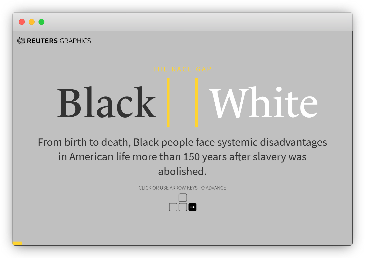
The format acknowledges the mobile-first reality of modern reading. For similar experiments, The New York Times and Input have published their own “tap story” projects, and Mario Garcia’s The Story offers a deeper look at mobile-centric editorial design.
The New York Times Makes Science Tangible
A New York Times interactive from October 2020 tackles a deceptively simple question: how do face masks work? Rather than relying on text alone, the piece brings readers down to particle level, showing exactly how fibers catch airborne droplets and why different masks offer different levels of protection. Graphics, color, and animation do the heavy lifting; there’s even an augmented reality component.

The result transforms what could have been a dry technical explanation into essential, accessible information. The work earned designer Gabriel Gianordoli the title of World’s Best Designer at the 2020 Society for News Design awards.
The Washington Post Simulates Viral Spread
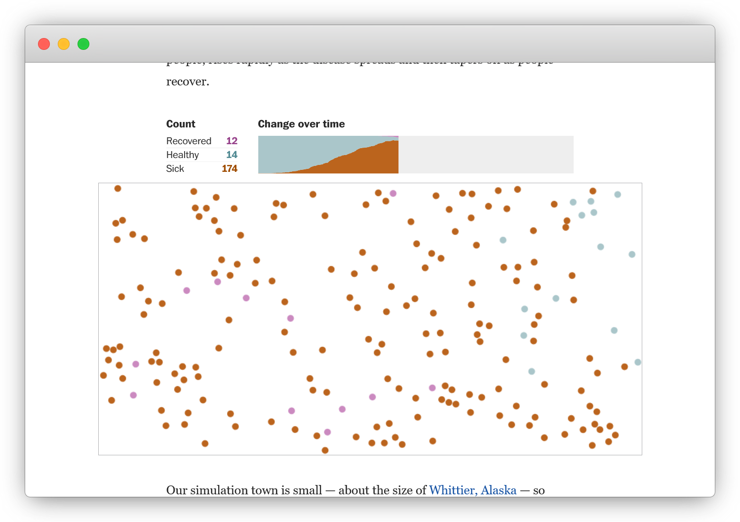
Data visualization became a frontline tool during the pandemic, and this Washington Post piece from March 2020 remains a standout. It uses full-scale simulations and inline sparkline graphs to illustrate why exponential spread turns a virus into a global crisis. Nothing in the piece feels decorative — every visual advances the explanation. The article was also made available in over a dozen languages, a reminder that the web can reach across borders in ways print never could.
The Marshall Project Turns a Paper Into a Storybook
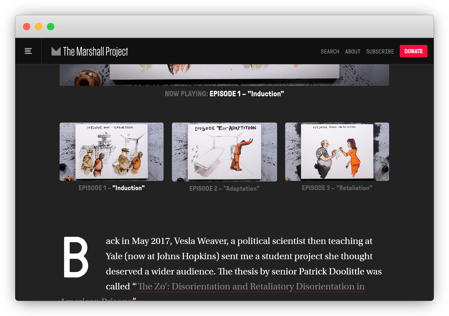
“The Zo” from The Marshall Project takes a 96-page academic paper about the criminal justice system and reimagines it as something closer to a children’s tale. Creative writing, illustration, narration, and animation combine to deliver serious journalism with the bittersweet elegance of a storybook. It’s multimedia editorial at full strength — and it earned two Emmy nominations, proof that serious reporting can find new audiences when it takes an unexpected form.
SBS Rides the Waves With an Interactive Graphic Novel
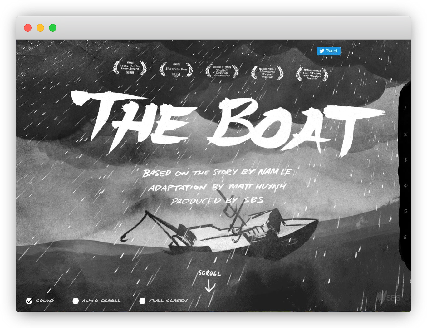
Australian broadcaster SBS adapted “The Boat,” a short story from Nam Le’s collection, into a fully immersive web experience. The opening sequence pulls readers into a storm: words tilt and tumble with the waves while sound fills the scene with thunder and rain. As the narrative settles, Matt Huynh’s illustrations drift by like memories. It’s a striking example of web adaptation, and a clever way to bring literature to readers who might not pick up a physical book.
The Pudding Sets the Infinite Monkey Theorem to Music
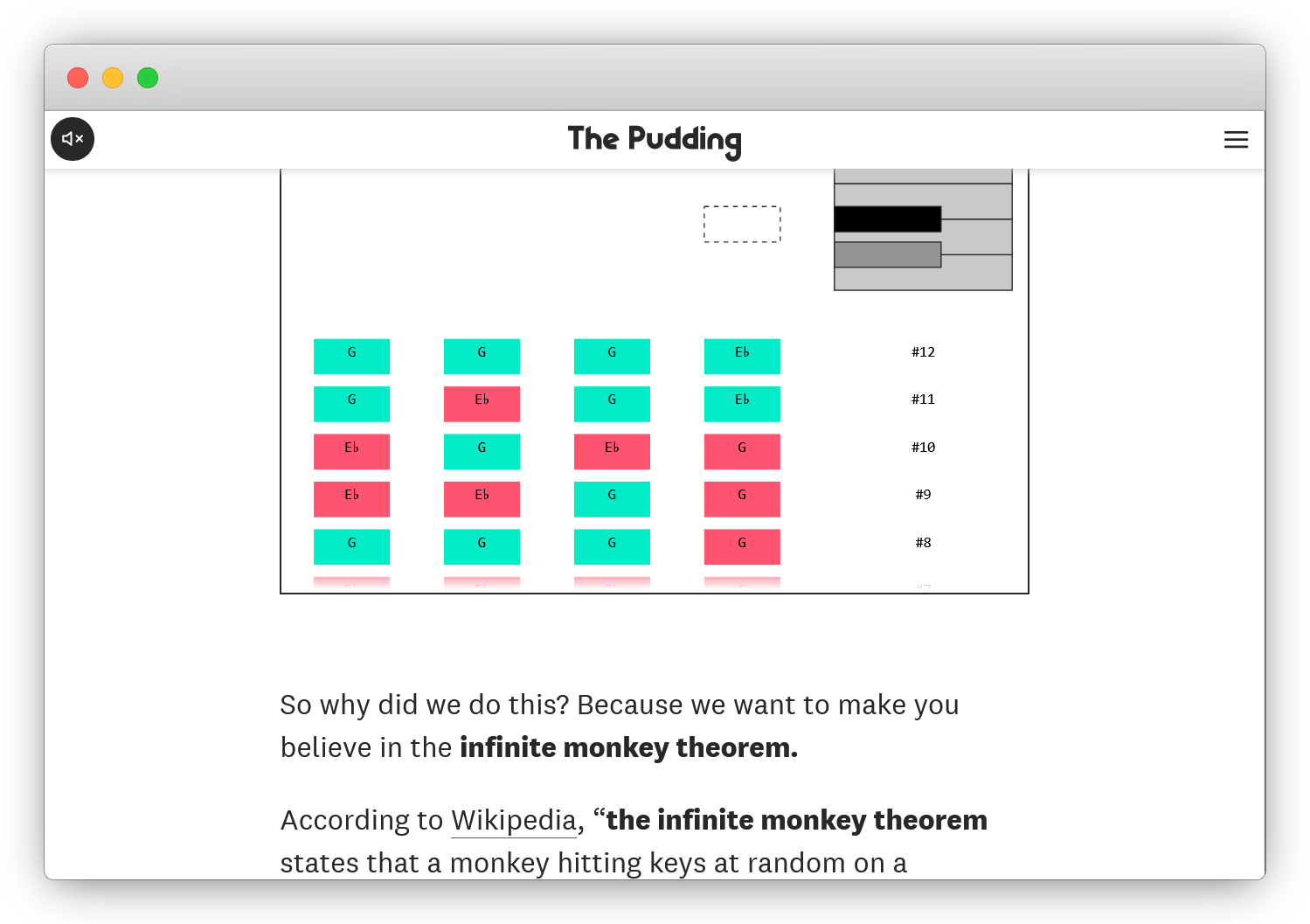
The Pudding’s take on the Infinite Monkey Theorem is less an explanation than a demonstration. The article uses interactive four-note examples to walk readers through the concept step by step, building from simple sequences to increasingly complex compositions. The page itself is a living experiment: it’s randomly working its way through real tunes, with one estimate suggesting it will nail “Seven Nation Army” in about 19 years.
A List Apart Proves the Power of Restraint
Not every editorial website needs multimedia bells and whistles. A List Apart demonstrates that a strong title, a clear illustration, and well-organized text with simple blue hyperlinks can still be beautiful. The site embodies one branch of “brutalist” web design — the resolutely functional kind that lets the writing speak for itself. The web’s multimedia toolkit is a wonderful asset, but there are times when only words will do.

Practical Ways to Refresh Your Content Approach
Most teams don’t have the resources of The Washington Post or The New York Times. But the projects above suggest habits that scale to any size publication or personal blog.
- Question your default format. A photo essay might serve a story better than an article, or a heat map might be clearer than a table. Specialization has its place, but it shouldn’t close off other ways of telling.
- Lean on free tools. Photography, design assets, data visualization libraries, and audio editing software are all freely available. The transformation of a piece of content often starts with a resource that costs nothing.
- Give stories multiple lives. As The Marshall Project showed with “The Zo,” a single story can reach entirely new audiences when it changes shape. An article might become an audio version; a data report might be rendered in D3.
- Experiment and accept failure. The best projects are the result of iteration. Trying something that doesn’t work is the only path to something that does.
Web technologies should support the story, not overshadow it. The most memorable content comes when the narrative and the medium are in harmony — regardless of whether the format is a scroll, a swipe, or a song.