

Start With The Problem
Design systems have become a default assumption for many teams, but it helps to start with a clear-eyed view of what you are actually trying to solve. At Auto Trader, we began with plenty of inconsistency, duplicated effort, and communication gaps. Output quality and speed suffered as a result. Our current practices look very different, but getting there required working through a series of choices about what the system should be and why.
Two questions are worth asking upfront:
What problems do you feel that a design system might address?
Why do you think a design system might ameliorate them?
Being specific about your issues helps shape the solution and gives you a narrative that can resonate with stakeholders. At this stage, language matters. Is what you are proposing a style guide, a component library, a design library, or a fully-rounded system? You do not necessarily need the most elaborate option. Starting with one piece of that puzzle does not prevent you from evolving into something more comprehensive later on.
Whether you are on a greenfield project or retrofitting foundations onto a high-traffic existing site, you can be clearer about benefits and risks before planning anything in detail. Simple lists are a fine way to begin:
| Potential Benefits |
|---|
| + Encourages greater communication between disciplines. |
| + Greater quality and consistency of our output. |
| + Should be able to get new content or features to market quicker. |
| Potential Risks |
|---|
| - Other colleagues might not want to use it. |
| - It takes too much time to get it to a place where it produces value. |
| - We use the wrong tooling or software. |
Where a business case is required, a SWOT analysis can help you examine strengths, weaknesses, opportunities, and risks from multiple viewpoints. It does not have to be a heavy exercise, but it makes your proposed solution more robust by surfacing what could go wrong and what you might do about it. The potential benefits, in turn, point toward what success looks like — your north star.
From that vision you need somewhere to start, which raises more practical questions:
"What kind of a system helps you to progress in a sustainable way for the needs and resources you have?"
"Could a style guide be all you need?"
"Is some form of a component library enough to get you working in a better way?"
"What current and potential audiences might the system have?"
A system may begin as a design-focused project for consistency, but acknowledging that it needs a wider range of skills to evolve means building in a kind of debt. In our case, an initial solution made sense for a time and was later replaced. Letting go of a solution you have invested in is hard, especially if it feels like "your baby", but the north star and the system's purpose provide a healthy reminder of when it is time to move on.
Measuring What Matters
There is plenty that can be measured, from sentiment about the system and experience using it to the number of components that exist versus those actually in use on your site or app. Tracking where a component is used is particularly useful at later stages, since it helps you gauge the risk of a proposed change and anticipate its impact.
Defining success in measurable terms helps you tell your story to stakeholders and gives you a sense of how you are progressing. We did not set out a formal list of KPIs, but we were clear that the system should power the majority of the consumer website, with our team supporting surrounding teams on focus consumer journeys. We were also considering how or when our native apps might work with the system. If we could deliver output to the site on a regular basis, we knew we would meet the vision we had set.
You might often hear the "fail fast, fail often" mantra thrown around, but in the early days of validating how your design system might work, this can be invaluable.
A well-rounded system likely involves designers, content designers, test engineers, front-end and back-end developers, product people, and delivery folks. Shared language across those domains is essential for ensuring you are all pointing at the same thing.
Shared Language, Clear Intent
Naming things clearly across disciplines was one of the most useful things we did. When everyone refers to the same object with the same word, and understands its intent, that purpose transcends specialisms. It gives clarity to what an object in the system is for, what problem it solves, and what role it plays. That clarity pays off over time.
A button is a button — usually. But sometimes what looks like a button in the visual asset needs to be something different in code. Is it actually a button tag, or is it a link styled as a button? In your framework, is it an internal router link? There is legitimate debate here. We ended up in a place where the visual asset gave us a shared word — "button" — while acknowledging that the technical execution may differ based on use case.
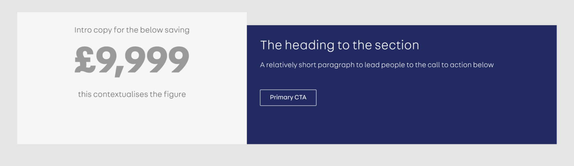
Not every component keeps its name accurately. We have one component we originally called "Promo Section", intended to call out key parts of a value proposition. Its usage has since drifted; it has become a generic content block. The work now is to examine real-world use cases and decide as a team whether to accept that broader role and capture it, or split it into more than one component based on how it is actually being used.

It Takes People, Not Just Files
You might start as a team of one, but defining roles and responsibilities early is important. An excellent Figma library is only a set of pictures if it never becomes code with a release process. Underneath the artifacts, a design system is really a mechanism for fostering better communication and understanding. It may start in any single discipline, but it needs others to be truly impactful.
Not everyone has dedicated time or resources for a design system, so there is a constant balancing act between time invested and value produced. If you cannot build the ideal system straight away, find a way to communicate the value proposition you believe it has. Return to the problem space and pick a great example to start with. Look at your north star and demo the potential through a hack or experiment.
Ownership And Community
Over time I have come to feel less like an owner of the system and more like a shepherd. The system is shared — it is not mine. Responsibility for its persistence should not rest on any individual, because if things go well, the system becomes a major organizational asset.
Designing the "people bit" and the structures around the system pays off. Initially we kept those directly involved to a minimum, both because of availability and by choice. There were fundamental decisions to make, test, and try to break. Working closely with our engineering colleagues, we produced output — the first landing pages — while road-testing and breaking the system mechanism itself. Alongside that, we talked more broadly around the business about what the design system was, how it differed from earlier projects, and what to expect.
Because we were not only building the system but also refreshing the site, we worked in the open. Our plan and breakdown sat on a board, so anyone passing by our area could see progress and give early feedback. We also deliberately spoke about the refresh — and with it, the design system — to departments that would not normally be in the loop.
Gaining Advocates Beyond the Core Team
Explaining the design system’s value in terms each audience understands helps turn users into advocates. Those advocates, in turn, spread the word more effectively than any internal push. Sharing "good news stories" — quick case studies of what the system enabled — proved especially useful early on. In one instance, the team could respond to content requests far more reactively because the system had already solved the underlying layout problems. Conversations focused on the content’s goals rather than implementation details, and new pages went live much faster while matching the quality of the rest of the site.
You cannot force a community into existence. It grows over time, often fueled by a sense of shared ownership. That means having a clear, accessible way for people outside the immediate team to propose changes or additions. The Gov.uk Design System offers a strong example of a transparent feedback and contribution mechanism. This creates an inherent tension: you want open contribution and engagement, but you also need governance with rules and processes. Finding the balance depends on your context. A starting point that people can critique is often easier to work with than a blank slate.
Everything in the system should remain open to debate and challenge from the community. That ongoing scrutiny strengthens the system, whether through design refinements, code improvements, or better documentation. It also reinforces the idea that the design system is not a fixed monument but a living framework for solving problems.
Defining Workflow and Handling Change
The path from a new idea to a live component underpins the system’s value, even before you choose specific tools. A typical workflow might look like this:
- An emerging need is identified.
- The team discusses it and forms a proposal.
- The proposal moves through design and code review sessions.
- The completed component is reviewed and added to the system.
- After testing, it’s released for use.
- Once in production, feedback is gathered to see how it performs.
Managing change is rarely simple. One approach is to start components in an opinionated, single-purpose way with minimal logic. Over-engineering for hypothetical futures is a trap; you cannot predict what change is needed. What matters is enabling and facilitating change when it does arrive. This raises practical questions:
"How should we not just update the component itself but its uses all over the site?"
"Baking in some assumptions, that changes are just possible but actually desirable, is really important."
"How do you roll out a breaking change across your codebase?"
"If you update your component in your design tool of choice, what knock-on effects are there?"
The desire to make updates feel like a “push” — where the live site always reflects the latest component version — drives significant engineering effort. Using conventional commits can automatically trigger versioning and build processes, including automated tests. In a React setup, a new build of the design system can trigger upstream builds for consuming apps, so intentional changes propagate immediately, unless a developer opts out. But a beta release channel allows for manual validation of potentially breaking changes before they become permanent.
Evolution and Technical Debt
Components that start with a shared look or functionality can diverge as better solutions emerge. It’s wise to acknowledge that you are baking in potential tech or design debt from the start. While the external contract between a component and its context must be preserved, its internal construction can and should change. The challenge is balancing initial simplicity against future flexibility.
Consider a Promo Section component used beyond its original intent. You have three paths forward:
"Do we keep it as it is and expand on its intended purpose?"
"Do we look at what use cases have emerged and split this into multiple components?"
"Is it something that needs reevaluating entirely?"
Splitting it into two components is a viable option. If they still look alike, they might share underlying mark-up and styles. But if one diverges visually later, you’ve acquired debt — or you accept that as a cost factored into future work. Realistically, you cannot know if you’ll ever change them, so practical short-term solutions often win.
Proposals and the Source of Truth
An early principle for our system was that live code trumps design. Users experience the live components, not the static designs. As valuable as design tooling is, it’s unrealized potential until it reaches the production site. This doesn’t limit experimentation; it just keeps it outside the system until a concept is ready for prime time. It also keeps naming, structure, and change tightly aligned.
Our proposal structure is still evolving, but the process begins by stating the component’s purpose — the problem it solves. This doubles as the start of its documentation. Proposals are discussed in regular, open-invite sessions where designs are critiqued and code can be submitted as pull requests. The process aims for rigor without becoming burdensome. A proposal typically covers:
- Purpose/Intent
What problem does the suggested component solve? - Use Cases
Often a component is only proposed if needed in multiple places. What uses does it have, and how do they map to its intent? - Anatomy
The elements, spacing units, and typography that make up the component. - Related Components
Alternatives if this component isn’t the right fit.
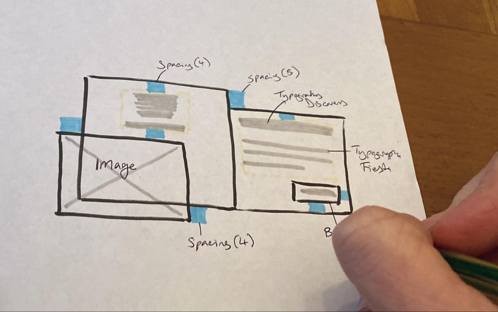
This proposal text often becomes the basis for the component’s eventual documentation, written before the component itself is formally adopted.
Looking at components through different ‘lenses’ — reminders, technical considerations, or other angles — can help teams see them differently. These prompts are not exhaustive but offer a way to think about your own components, based on your specific site context. Developing your own set of prompts can be a useful cross-disciplinary exercise.
| Testing | What kinds of testing gives us confidence in this component? Visual regression (VRT), automated tests, manual testing? |
| Tracking | Is this something that should be tracked in some way? What should we be tracking? Is tracking dependent on a state or interaction? |
| Accessibility | How much can we bake in to ensure that everything is as inclusive as we can make it? Is the mark-up semantic? Does it need to provide options to ensure it is based on context of use? |
| Content | What do our content designers need from this component? Is there guidance we can add with how to get the best use of it? |
| SEO | Is there anything this component should do to consider how it can support search engines beyond the content and accessibility lenses? Is there a relevant schema that may be worth including? |
| Performance | Is there anything we need to consider about how this performs? Does it use a 3rd party or assets that aren’t already present? How can we moderate its impact? What is the component’s responsibility or that of the app it’s consumed in? |
| Motion | Should it have any animations or transitions in the component or a state of it? Ensure it works without (prefer-reduced-motion) |
| States | Loading/unloading Interaction states (focus, hover, disabled, etc) View states (is it in or out of the visible viewport? See intersection observer) |
| Triggers & actions | Should some functionality be triggered? Often this would be linked to an interaction state but could be more open than that |
| Viewport events | Has the resize or orientation change event been triggered on the viewport? |
| Coding defensively | What if we don’t have the data or content we expect to be passed to it? What if we have too much? Can the component fail in a graceful way? |
The Journey Ahead
Governance, workflow, communication, and community are not afterthoughts; they are part of the design system itself. They enable contributions and manage change, allowing patterns to be challenged as easily as they are rolled out. Being explicit about acceptable levels of technical and design debt supports better decision-making over time.
The right approach varies by scale, from a lone freelancer to a large organization. But the broader considerations — community, debt, and relationships — resonate across any system. A design system is never finished; it’s a continuous journey where the process shapes the outcomes.
“A design system isn’t just code, or designs, or documentation. It’s all of these things, plus relationships between the people who make the system and the people who use it.”
— Ryan DeBeasi, Design Systems Are About Relationships
As Ryan DeBeasi notes, the relationships between makers and users are just as crucial as any artifact. Our own journey has taught us a great deal, but there is always further to go.