
Adapting an existing site for mobile browsers
Smartphones outsold PCs for the first time this year, yet many sites still ship desktop-first layouts that degrade poorly on small screens. The question for most teams isn't whether to support mobile, but how much rework is required. Rebuilding a site for mobile and maintaining two codebases is costly; the more practical path is adapting the existing markup, CSS and JavaScript with a few targeted techniques.
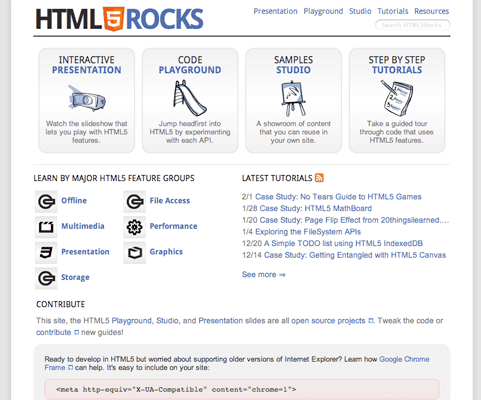
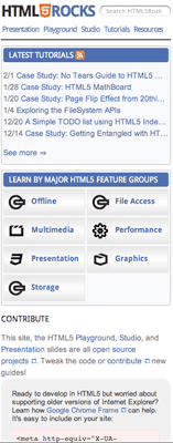
That was the approach taken with html5rocks.com, an HTML5-focused site originally designed primarily for desktop viewing. No separate mobile site, no redirects to a subdomain — just the same URLs serving a layout tuned for handheld screens via CSS media queries, mobile meta tags and a single-column layout.
CSS media queries: targeted styling without new markup
Media-dependent stylesheets have been possible since HTML4 and CSS2. A simple rule like @media print { ... } applies specific styles when content is printed. CSS3 media queries extend that idea, letting developers target styles based on screen width, device width, orientation and other device characteristics. That makes them a natural fit for adjusting an existing layout without touching the content.
Media queries can be used in the media attribute of an external stylesheet to scope which devices receive which rules. For example, a phone stylesheet is applied to devices the browser considers "handheld" or that have screens up to 320px wide:
 <link rel='stylesheet'
  media='handheld, only screen and (max-device-width: 320px)' href='phone.css'>
The only keyword prevents non-CSS3 browsers from applying the rule. To target a wider range of screen sizes, instead:
 <link rel='stylesheet'
  media='only screen and (min-width: 641px) and (max-width: 800px)' href='ipad.css'>
Media queries also work inside inline <style> tags. Here a portrait orientation gets its own rules across all media types:
 <style>
  @media only all and (orientation: portrait) { ... }
 </style>
The media="handheld" problem
In theory, media="handheld" should make it easy to serve mobile styles. In practice, Android and iOS both ignore it. Their stated reasoning: users would miss out on full-featured desktop content, and developers are less likely to keep a secondary, lower-quality handheld stylesheet current. As part of their push toward "the full web," these browsers simply skip handheld stylesheets.
Other browsers handle the value inconsistently:
- Some read only the handheld stylesheet.
- Some read only the handheld stylesheet if present, falling back to the screen stylesheet otherwise.
- Some read both handheld and screen stylesheets.
- Some read only the screen stylesheet.
Opera Mini is one exception. Windows Mobile, however, only recognizes media="handheld" if the screen stylesheet's media attribute value is capitalized:
 <!-- media="handheld" trick for Windows Mobile -->
 <link rel="stylesheet" href="screen.css" media="Screen">
 <link rel="stylesheet" href="mobile.css" media="handheld">
Applying media queries at html5rocks
Media queries drove the html5rocks mobile adaptation without requiring significant Django template changes. The head of each page loads two stylesheets:
 <link rel='stylesheet'
  media='all' href='/static/css/base.min.css' />
 <link rel='stylesheet'
  media='only screen and (max-width: 800px)' href='/static/css/mobile.min.css' />
base.css continues to define the site's primary look and feel. mobile.css applies new rules only for screen widths under 800px — a range that covers both smartphones (~320px) and the iPad (~768px). That lets developers incrementally override base styles only where mobile presentation differs. Among the adjustments mobile.css makes:
- Reduces whitespace and padding, since horizontal space is limited on small screens.
- Drops
:hoverstates, which are never triggered on a touch device. - Restructures the layout into a single column.
- Removes the
box-shadowon the main container div, since large shadows hurt page performance. - Uses the flex box model's
box-ordinal-groupproperty to reorder homepage sections — the "LEARN BY MAJOR HTML5 FEATURE GROUPS" section appears first on the homepage but is reordered after TUTORIALS in the mobile view, without markup changes. - Eliminates
opacitytransitions, as changing alpha values is costly on mobile devices.
Mobile meta tags for the right fit
Mobile WebKit supports meta tags that improve the browsing experience on devices that honor them.
Viewport settings
The viewport property tells the browser how content should fit on the screen and signals that the site is optimized for mobile:
<meta name="viewport" content="width=device-width, initial-scale=1.0, user-scalable=yes">
That directive sets the viewport to the device's width with an initial scale of 1 and permits zooming — appropriate for a website. An application-style page could prevent zooming entirely or cap it:
 <meta name=viewport
  content="width=device-width, initial-scale=1.0, minimum-scale=0.5 maximum-scale=1.0">
Android adds a further option for specifying the screen resolution the site was developed against:
<meta name="viewport" content="target-densitydpi=device-dpi">
Valid target-densitydpi values are device-dpi, high-dpi, medium-dpi and low-dpi. To adapt a page for different screen densities, use the -webkit-device-pixel-ratio CSS media query or the window.devicePixelRatio JavaScript property, then set target-densitydpi to device-dpi. That stops Android from automatically scaling the page and lets CSS and JavaScript make density-specific adjustments.
Full-screen and home-screen extras
Two additional values provide app-like behavior on iOS: apple-mobile-web-app-capable renders content full-screen, and apple-mobile-web-app-status-bar-style makes the status bar translucent:
 <meta name="apple-mobile-web-app-capable" content="yes">
 <meta name="apple-mobile-web-app-status-bar-style" content="black-translucent">
iOS and Android also accept rel="apple-touch-icon" and rel="apple-touch-icon-precomposed" links, respectively. These generate an app-style icon when a user bookmarks the site to their home screen:
 <link rel="apple-touch-icon"
      href="https://web.dev/static/images/identity/HTML5_Badge_64.png" />
 <link rel="apple-touch-icon-precomposed"
      href="https://web.dev/static/images/identity/HTML5_Badge_64.png" />
The html5rocks head
Combining all of the above, here is the relevant head section:
 <head>
  ...
   <meta name="viewport"
        content="width=device-width, initial-scale=1.0, minimum-scale=1.0" />

   <link rel="apple-touch-icon"
        href="https://web.dev/static/images/identity/HTML5_Badge_64.png" />
   <link rel="apple-touch-icon-precomposed"
        href="https://web.dev/static/images/identity/HTML5_Badge_64.png" />
  ...
 </head>
Switching to a vertical layout
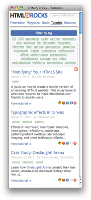
Web users on small screens scroll vertically more naturally than horizontally. A single-column layout eliminates horizontal scrolling entirely. Using CSS3 media queries for that layout, html5rocks again avoided modifying its markup.



Cutting requests and bytes on mobile
Many of the performance fixes that went into the mobile version of html5rocks were standard best practices that should have been in place from the start. Reducing network requests, compressing CSS and JavaScript, gzipping (free on App Engine), and minimizing DOM manipulation all fall into this category. On a phone, though, each of these matters a bit more: mobile browsers cap concurrent connections more aggressively than desktop browsers, and every wasted kilobyte can cost the user real money on a metered plan.
Hiding the address bar
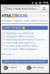
Mobile screens have less room to work with, and some browsers keep the address bar on screen even after the page finishes loading. A one-pixel programmatic scroll forces those browsers to tuck it away. We attached an onload handler to the window object to do this, and guarded the listener with an is_mobile template variable so it never runs on the desktop site:
  // Hides mobile browser's address bar when page is done loading.
  window.addEventListener('load', function(e) {
    setTimeout(function() { window.scrollTo(0, 1); }, 1);
  }, false);
Eliminating unnecessary network activity
The biggest latency contributors on tutorial pages were third-party sharing widgets (Buzz, Google Friend Connect, Twitter, Facebook). These were included through <script> tags and create iframes, which are notoriously slow. For the mobile experience, they were removed entirely.
Hiding elements with display:none does not prevent the browser from downloading the resources inside them. The four rounded boxes at the top of the homepage, each with its own icon, are omitted from the mobile site via an is_mobile boolean in the Django template rather than hidden with CSS. This conditionally omits the HTML sections when a smart device is detected:

Additional request and bandwidth savings came from a few specific decisions:
- Application Cache gave us offline support as well as faster startup.
- YUI compressor handles both JS and CSS, which is why we chose it over the Closure compiler. A bug in YUI compressor 2.4.2 broke inline media queries inside stylesheets; upgrading to 2.4.4 or later resolved it.
- CSS sprites were used wherever possible, and pngcrush handled image compression.
- dataURIs inlined small images. Base64 encoding increases size by roughly 30% but saves the network request entirely.
- Google Custom Search now loads via a single script tag rather than dynamically through
google.load(), which incurred an extra request.
<script src="//www.google.com/jsapi?autoload={"modules":[{"name":"search","version":"1"}]}"> </script>
- The code pretty printer and Modernizr were previously loaded on every page, even when unused. Modernizr runs a battery of tests on each load, and some cause costly DOM modifications. These libraries are now included only where they're actually needed, saving two requests per page.
Other performance tweaks included moving all JavaScript to the bottom of the page where feasible, removing inline <style> tags, and caching DOM lookups. Each DOM touch can trigger a browser reflow, which is particularly expensive on mobile hardware. One specific chunk of client-side navigation styling was moved to the server entirely. And fixed-width elements were replaced with fluid width:100% or width:auto.
Application Cache with safety in mind
The mobile site uses Application Cache for offline reading and faster startup. The most important implementation detail is to never let the manifest file itself be cached, either explicitly in the manifest or implicitly through aggressive cache-control headers. A cached manifest is painful to debug, and iOS and Android are especially aggressive about caching it while offering no convenient flush mechanism like desktop browsers. Our defense was twofold: App Engine was configured to never cache manifest files:
- url: /(.*\.(appcache|manifest))
  static_files: \1
  mime_type: text/cache-manifest
  upload: (.*\.(appcache|manifest))
  expiration: "0s"
And the JavaScript API detects when a new manifest has finished downloading, prompting the user to refresh:
window.applicationCache.addEventListener('updateready', function(e) {
  if (window.applicationCache.status == window.applicationCache.UPDATEREADY) {
    window.applicationCache.swapCache();
    if (confirm('A new version of this site is available. Load it?')) {
      window.location.reload();
    }
  }
}, false);
Keep the manifest lean. Don't list every page on the site; just the important images, CSS, and JavaScript files. Any page visited with the <html manifest="..."> attribute is implicitly cached by the browser anyway. A large manifest means the mobile browser downloads many assets on every appcache update, and that's precisely the kind of traffic you're trying to avoid.


