

Reading the Room: Matching Interactions to the Right Pointer
The :hover pseudo-class is one of the web’s most universal signals that an element is interactive. Change a background, add an underline, nudge the layout — it’s an immediate, intuitive cue for anyone with a cursor. The trouble starts when that cue is the only way a user finds out an element does something. On a touchscreen, a hover state only appears after a tap, and by then the interaction has already fired. On a TV remote, there is no hover at all.
CSS media features let you detect what kind of input a device actually has and adapt your UI accordingly. Four features matter here: hover, pointer, any-hover, and any-pointer. The first two check the primary input mechanism; the any- variants check whether any of the available input mechanisms supports the capability.
Checking for Hover Support with hover
The hover media feature reports whether the primary input mechanism can hover over elements. It accepts two values:
none: the primary input cannot hover, or can’t do so conveniently (most phones and tablets).hover: the primary input can hover (desktop mice, trackpads, and stylus-equipped devices).
Touchscreens can emulate hover with a long press, but this is slow and error-prone — treat it as a workaround, not a feature. The safe pattern is to put hover-dependent interactions inside @media (hover: hover) so non-hover devices get a sensible default state.
Consider a basic button that changes color and size on hover. Wrapping the .button:hover rule inside the media query ensures the effect only appears where a cursor exists:
<style>
  .button {
    padding: 0.5em 1em;
    font-size: 1.125rem;
    border-radius: 0.6em;
    background-color: coral;
    font-weight: bold;
    border: 1px solid transparent;
    transition: background-color 200ms ease-in-out;
  }

  @media (hover: hover) {
    .button:hover {
      background-color: hotpink;
    }
  }
</style>

<button class="button">Hover over me</button>
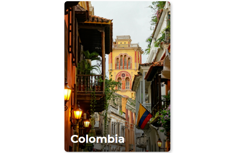
A more complex case: a card that reveals its full content only after a hover interaction. The initial state shows just the title. On hover, the card lifts, the background image zooms, an underline draws across the title, and then the body text and button fade in. That’s a delightful effect on a desktop, but on a touch device the user has to tap the card and hope it reveals the details.

The fix is straightforward: place all animation-related rules inside @media (hover: hover). The card’s static markup and styles remain outside, so non-hover devices always see the full content without requiring any interaction.
<article class="card">
  <img
    class="card__background"
    src="https://i.imgur.com/QYWAcXk.jpeg"
    alt="Photo of Cartagena's cathedral at the background and some colonial style houses"
    width="1920"
    height="2193"
  />
  <div class="card__content | flow">
    <div class="card__content--container | flow">
      <h2 class="card__title">Colombia</h2>
      <p class="card__description">
        Lorem ipsum dolor sit amet, consectetur adipisicing elit. Rerum in
        labore laudantium deserunt fugiat numquam.
      </p>
    </div>
    <button class="card__button">Read more</button>
  </div>
</article>
@import url("https://fonts.googleapis.com/css2?family=Lato:wght@400;700&family=Montserrat:wght@700&display=swap");

:root {
  /* Colors */
  --brand-color: hsl(46, 100%, 50%);
  --black: hsl(0, 0%, 0%);
  --white: hsl(0, 0%, 100%);
  /* Fonts */
  --font-title: "Montserrat", sans-serif;
  --font-text: "Lato", sans-serif;
}

/* RESET */

/* Box sizing rules */
*,
*::before,
*::after {
  box-sizing: border-box;
}

/* Remove default margin */
body,
h2,
p {
  margin: 0;
}

/* GLOBAL STYLES */
body {
  display: grid;
  place-items: center;
  height: 100vh;
}

h2 {
  font-size: 2.25rem;
  font-family: var(--font-title);
  color: var(--white);
  line-height: 1.1;
}

p {
  font-family: var(--font-text);
  font-size: 1rem;
  line-height: 1.5;
  color: var(--white);
}

.flow > * + * {
  margin-top: var(--flow-space, 1em);
}

/* CARD COMPONENT */

.card {
  display: grid;
  place-items: center;
  width: 80vw;
  max-width: 21.875rem;
  height: 31.25rem;
  overflow: hidden;
  border-radius: 0.625rem;
  box-shadow: 0.25rem 0.25rem 0.5rem rgba(0, 0, 0, 0.25);
}

.card > * {
  grid-column: 1 / 2;
  grid-row: 1 / 2;
}

.card__background {
  object-fit: cover;
  max-width: 100%;
  height: 100%;
}

.card__content {
  --flow-space: 0.9375rem;
  display: flex;
  flex-direction: column;
  justify-content: space-between;
  align-self: flex-end;
  height: 55%;
  padding: 12% 1.25rem 1.875rem;
  background: linear-gradient(
    180deg,
    hsla(0, 0%, 0%, 0) 0%,
    hsla(0, 0%, 0%, 0.3) 10%,
    hsl(0, 0%, 0%) 100%
  );
}

.card__content--container {
  --flow-space: 1.25rem;
}

.card__title {
  position: relative;
  width: fit-content;
  width: -moz-fit-content; /* Prefijo necesario para Firefox  */
}

.card__title::after {
  content: "";
  position: absolute;
  height: 0.3125rem;
  width: calc(100% + 1.25rem);
  bottom: calc((1.25rem - 0.5rem) * -1);
  left: -1.25rem;
  background-color: var(--brand-color);
}

.card__button {
  padding: 0.75em 1.6em;
  width: fit-content;
  width: -moz-fit-content; /* Prefijo necesario para Firefox  */
  font-variant: small-caps;
  font-weight: bold;
  border-radius: 0.45em;
  border: none;
  background-color: var(--brand-color);
  font-family: var(--font-title);
  font-size: 1.125rem;
  color: var(--black);
}

.card__button:focus {
  outline: 2px solid black;
  outline-offset: -5px;
}
@media (hover: hover) {
  .card__content {
    transform: translateY(62%);
    transition: transform 500ms ease-out;
    transition-delay: 500ms;
  }

  .card__title::after {
    opacity: 0;
    transform: scaleX(0);
    transition: opacity 1000ms ease-in, transform 500ms ease-out;
    transition-delay: 500ms;
    transform-origin: right;
  }

  .card__background {
    transition: transform 500ms ease-in;
  }

  .card__content--container > :not(.card__title),
  .card__button {
    opacity: 0;
    transition: transform 500ms ease-out, opacity 500ms ease-out;
  }

  .card:hover,
  .card:focus-within {
    transform: scale(1.05);
    transition: transform 500ms ease-in;
  }

  .card:hover .card__content,
  .card:focus-within .card__content {
    transform: translateY(0);
    transition: transform 500ms ease-in;
  }

  .card:focus-within .card__content {
    transition-duration: 0ms;
  }

  .card:hover .card__background,
  .card:focus-within .card__background {
    transform: scale(1.3);
  }

  .card:hover .card__content--container > :not(.card__title),
  .card:hover .card__button,
  .card:focus-within .card__content--container > :not(.card__title),
  .card:focus-within .card__button {
    opacity: 1;
    transition: opacity 500ms ease-in;
    transition-delay: 1000ms;
  }

  .card:hover .card__title::after,
  .card:focus-within .card__title::after {
    opacity: 1;
    transform: scaleX(1);
    transform-origin: left;
    transition: opacity 500ms ease-in, transform 500ms ease-in;
    transition-delay: 500ms;
  }
}
Gauging Pointer Precision with pointer
Hover support tells you whether a cursor exists, but not how precise it is. The pointer media feature fills that gap, distinguishing three levels of accuracy:
none: the primary input has no pointing device (a typical phone).coarse: the primary pointer has limited accuracy (Smart TV remote, game controller).fine: the primary pointer is precise (mouse, trackpad, stylus).
This distinction matters most for touch targets. A row of radio buttons that’s perfectly tappable with a mouse can be infuriating on a touchscreen — adjacent options are too close, and fingers land on the wrong choice. Here’s a form laid out for a fine pointer:
<form action="post">
  <fieldset>
    <legend>Which programming languages do you want to learn?</legend>
    <div class="form-grid">
      <label for="c"> <input type="checkbox" id="c" /> C </label>
      <label for="c+"> <input type="checkbox" id="c+" /> C+ </label>
      <label for="c++"> <input type="checkbox" id="c++" /> C++ </label>
      <label for="c-sharp"> <input type="checkbox" id="c-sharp" /> C# </label>
      <label for="kotlin"> <input type="checkbox" id="kotlin" /> Kotlin </label>
      <label for="java"> <input type="checkbox" id="java" /> Java </label>
      <label for="javascript">
        <input type="checkbox" id="javascript" /> JavaScript
      </label>
      <label for="go"> <input type="checkbox" id="go" /> Go </label>
      <label for="objective-c">
        <input type="checkbox" id="objective-c" /> Objective-C
      </label>
      <label for="php"> <input type="checkbox" id="php" /> PHP </label>
      <label for="python"> <input type="checkbox" id="python" /> Python </label>
      <label for="ruby"> <input type="checkbox" id="ruby" /> Ruby </label>
      <label for="rust"> <input type="checkbox" id="rust" /> Rust </label>
      <label for="scala"> <input type="checkbox" id="scala" /> Scala </label>
      <label for="swift"> <input type="checkbox" id="swift" /> Swift </label>
      <label for="other"> <input type="checkbox" id="other" /> Another </label>
    </div>
    <button type="button">Submit</button>
  </fieldset>
</form>
@import url("https://fonts.googleapis.com/css2?family=Fira+Sans:wght@400;700&display=swap");

body {
  font-family: "Fira Sans", sans-serif;
}

fieldset {
  padding: 0.6em 1em 2em;
  border-radius: 1em;
  border-color: #722f37;
  box-shadow: 0.25rem 0.25rem 0.2rem rgba(0, 0, 0, 0.25);
}

legend {
  font-size: 1.3rem;
  text-align: center;
  font-weight: bold;
}

form {
  max-width: 53.125rem;
  margin: 0 auto;
}

input[type="checkbox"] {
  margin-inline-end: 0.5em;
  accent-color: #722f37;
}

input[type="checkbox"]:focus {
  outline: 2px solid #722f37;
  outline-offset: 0.2em;
}

label {
  display: flex;
  align-items: center;
}

.form-grid {
  display: grid;
  grid-template-columns: repeat(auto-fit, minmax(8rem, 1fr));
  gap: 0.3em;
  margin-bottom: 1.2em;
  align-items: center;
}

button[type="button"] {
  display: block;
  margin: 0 auto;
  padding: 0.3em 1em;
  color: white;
  font-weight: bold;
  background-color: #722f37;
  font-size: 1.25rem;
  border: none;
  border-radius: 0.5em;
}

button[type="button"]:focus {
  outline: 2px solid #722f37;
  outline-offset: 0.4em;
}
For coarse pointers, subtle changes in spacing and sizing dramatically improve usability:
@media screen and (pointer: coarse) {
  .form-grid {
    gap: 0.5em;
  }

  label {
    font-size: 1.05em;
  }

  input[type="checkbox"] {
    width: 1.625rem;
    height: 1.625rem;
  }

  button[type="button"] {
    min-height: 3rem;
  }
}
The adjustments are minor but effective:
- Increase the gap between options from 4.8px to 8px (the recommended minimum spacing between tappable elements).
- Enlarge the input elements from 16px to 26px, and match the label size to keep proportions balanced.
- Raise the submit button’s height to 48px, the average comfortable tap area size.
Combining Queries for Precise Targeting
Used alone, hover and pointer can mislead you. A stylus-equipped phone, for example, reports hover: hover and pointer: fine — technically accurate, but most users of that phone will tap with a thumb. Animations gated only by hover: hover would still trigger, forcing a tap-to-reveal on a device where most people prefer direct interaction.
To restrict a hover-driven interaction to actual desktops and laptops, combine the two conditions. Desktop hardware has an accurate pointer that can hover, so the query is:
@media (hover: hover) and (pointer: fine) { ... }Putting animation rules inside that combined query limits the effect to devices with a precise, hover-capable primary input. The table shows which device categories match each combination of hover and pointer values:
| Media query hover’s value | Media query pointer’s value | Device |
|---|---|---|
| none | coarse | Smartphones, touchscreens |
| none | fine | Stylus-based screens |
| hover | coarse | Smart TVs, video game consoles |
| hover | fine | Desktop computers, laptops, touchpads |
This pairing covers most real-world hardware, but not every edge case. Some devices offer multiple input methods, and a primary input may change depending on how the device is held or used. Cases where a secondary input is more appropriate require the any-hover and any-pointer variants, which take all available inputs into account — a scenario worth examining when your interface depends on input precision.
Reaching Beyond the Primary Pointer
The standard hover and pointer queries only inspect the device's primary input mechanism. Yet hardware often comes with more than one way to navigate. A phone connected to a Bluetooth mouse still has a touchscreen as its main input, while a smart TV remote with a tiny touchpad adds genuinely fine pointer control to an otherwise coarse interface.
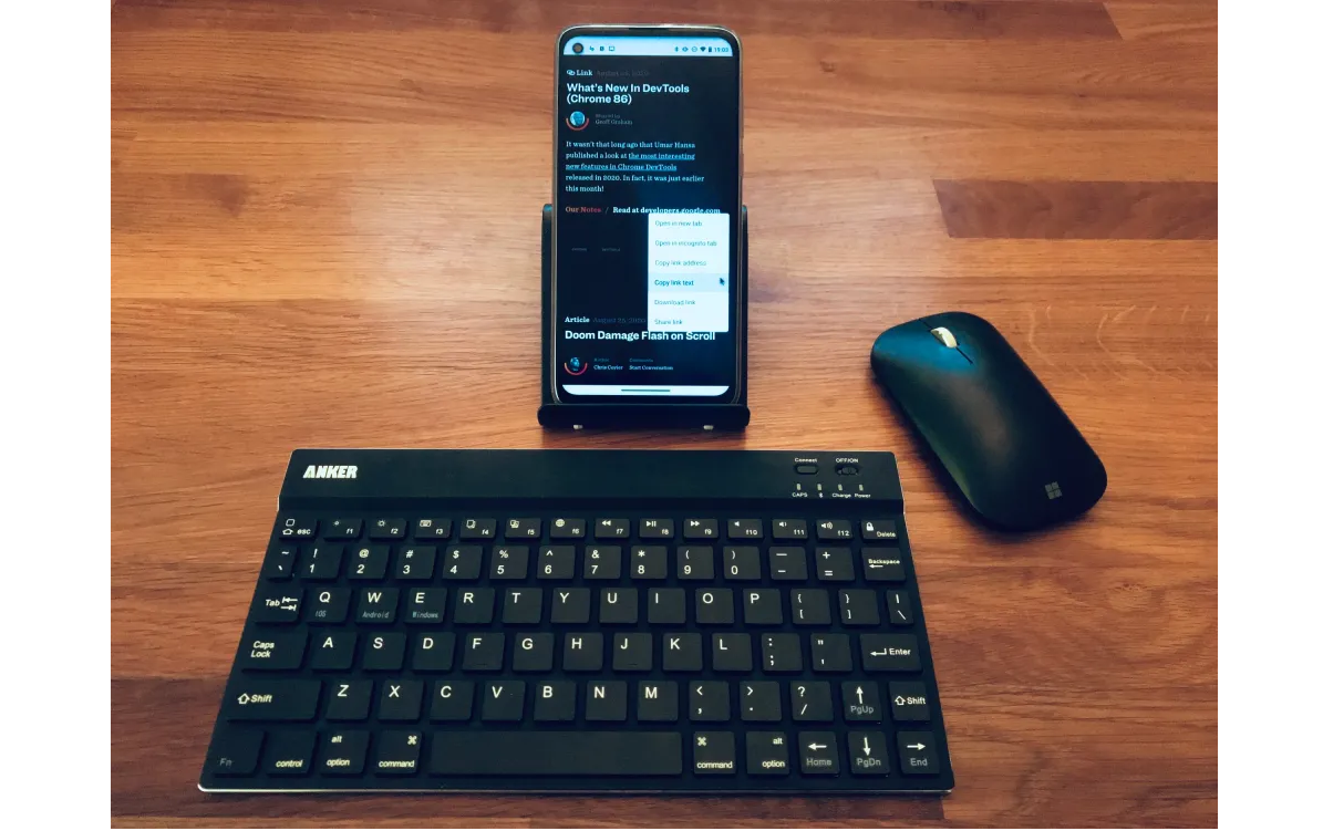
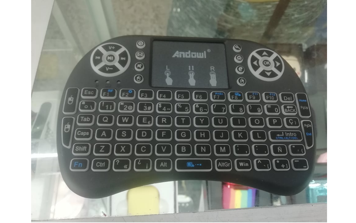
CSS anticipates these mixed setups with two additional media features: any-hover and any-pointer.
These take the same values as their single-pointer counterparts — hover and none for any-hover; none, coarse, and fine for any-pointer — but instead of testing only the main input, they return true if any input mechanism on the device matches the condition. For instance, (any-pointer: coarse) will detect a touchscreen, even when a mouse is also connected.
With all four features available, combinations become possible. Querying @media (pointer: fine) and (any-pointer: coarse) identifies devices whose primary pointer is accurate but which also offer a less precise touch interface. That includes stylus-centric phones and touchscreen laptops or desktops. Styling interactive elements to respond comfortably to all available inputs — not just the assumed one — becomes far more straightforward.
Caution With Abstractions
Despite their power, these queries are not without pitfalls. The interaction between particular browsers and hardware can yield misleading or just flat-out wrong results, as documented in compatibility data compiled by Patrick H. Lauke. Keep in mind the foundational philosophy of CSS itself, which discourages tightly controlling the final rendering in favor of giving the browser intent and context to make smart adaptation choices. Users will always change how they interact with a site — a laptop user who switches to the touchscreen or a tablet user who pairs a keyboard — so designing only for the primary input mechanism can create usability gaps at unexpected moments.
A more robust strategy is to treat pointer detection as a set of broad directives rather than a set of specific conditions:
- Prioritize a touch-first experience. Mobile remains the default browsing context. Use
any-pointer: coarseto ensure inputs and buttons are oversized and spaced comfortably for finger use. - Use
pointerandhoversparingly. They are good for device-specific adaptation, but they assume a single way of working. Check them but do not let them become your only gates. - Never forget keyboard-only users. If a hover action is complex, mirror it for focus. Implement this with
:focus-withinand, where the markup needs it, atabindex="0"attribute. - Test across hardware and browsers. Because combos produce odd behavior, verify that interactions perform as intended across as many edge-case pairings as you can access.
What About JavaScript?
Historically, JavaScript delivered hacky solutions to pointer detection because these CSS media features lacked widespread support. Now, web developers are better served leaving this job to the CSS layer entirely. Pure JavaScript approaches rarely age well:
- Disabled JavaScript removes the detection logic entirely for those who opt out.
- Scripts cannot predict future devices, and they fail to adapt gracefully when hardware shifts.
- Component-based frameworks with encapsulated styles must rely on a global class that spans the entire app — an architectural chore that threads through every hover effect.
CSS remains the resilient choice for this kind of environment-adaptive UI. However, JavaScript still has useful territory here: offering visitors the ability to explicitly toggle between a mouse-first or touch-first layout — much like a light/dark mode switch — can complement the automatic media-query behavior with an extra layer of user control.
Further Reading
- "Interaction Media Features And Their Potential (For Incorrect Assumptions)," Patrick H. Lauke
- "Detect A Touch Device With Only CSS," Riccardo Andreatta
- "Accessible Tap Targets," Dave Gash, Meggin Kearney, Rachel Andrew and Rob Dodson
- Media Queries
hover,pointer,any-hoverandany-pointer, MDN Web Docs



