Column grids arrived in web design by way of print, and the twelve-column version became the convention largely because twelve divides neatly into halves, thirds and quarters. That convenience produced the familiar 2-up, 3-up and 4-up component patterns seen across the web. The problem isn't the grid itself, but the habit of dividing or overlaying a page before asking what a particular company needs to communicate.
From tables to twelve columns
Early page layout relied on HTML tables and spacer GIFs, a technique popularised by the book Creating Killer Web Sites. CSS later offered floats and positioning, neither of which was designed for layout, and inconsistent browser behaviour made both frustrating to use. Frameworks eventually supplied ready-made grid systems as a shared structure:
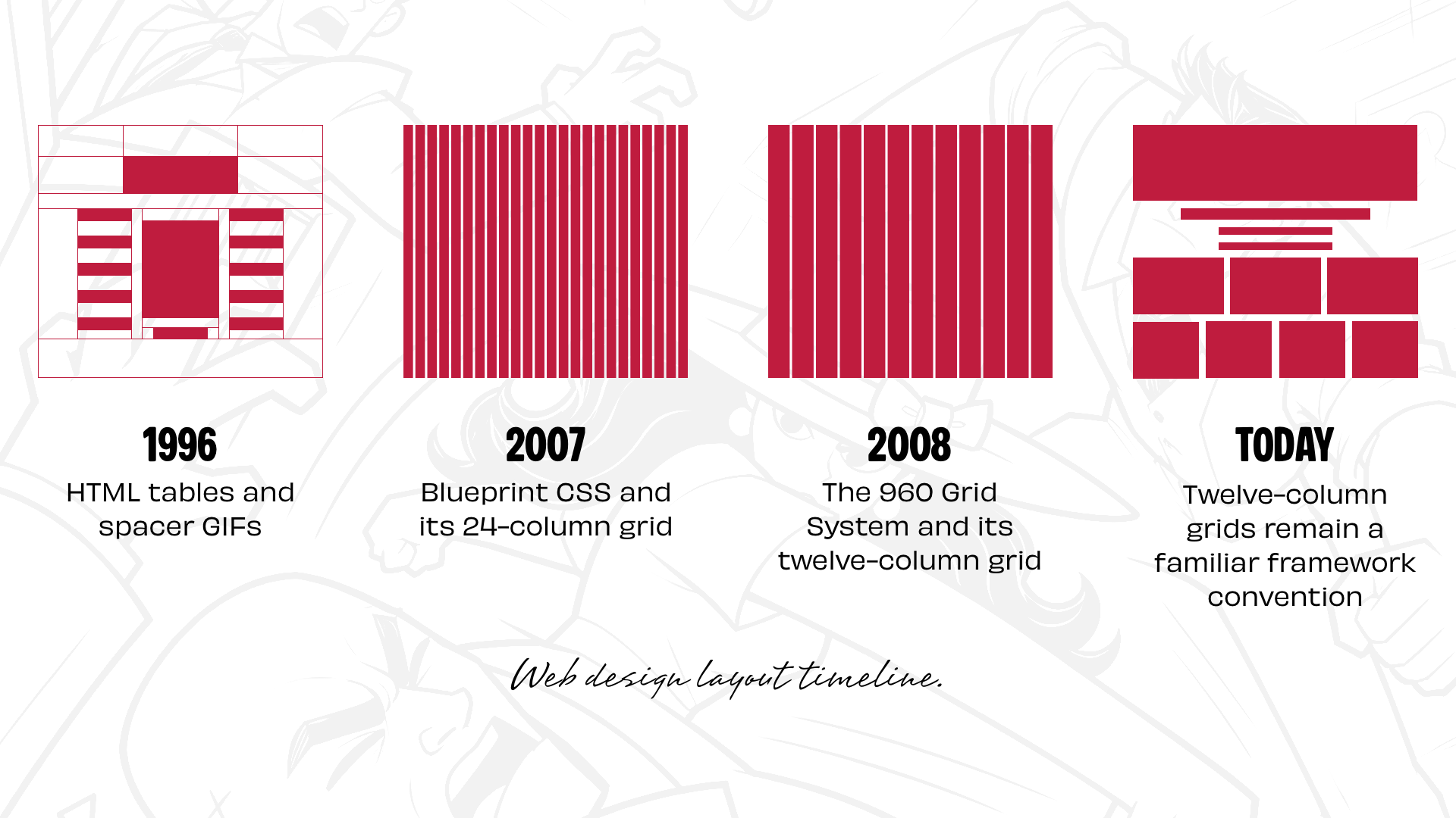
- 1996: HTML tables and spacer GIFs
- 2007: Blueprint CSS and its 24-column grid
- 2008: The 960 Grid System and its twelve-column grid
- Today: Twelve-column grids remain a familiar framework convention.
Bootstrap and Foundation helped cement twelve columns as the de facto standard. CSS Grid has since expanded what page layouts can do, yet designers still frequently begin by dividing a page into twelve equal columns and fitting content into them, producing designs that can look remarkably similar.
Begin with the company, not the grid
Before deciding on column counts, it helps to establish what distinguishes the company, what it wants people to remember, and whether it has a personality that should shape how the site looks and feels. Layout does more than arrange content: the size, position and relationships between elements change how a site is experienced, and a restrained, orderly composition communicates something very different from an energetic one.
A fictional example makes this concrete. Wheelman provides products and services for getaway drivers — legal advice, robbery insurance, an online shop selling break-in essentials — and publishes a magazine with advice, news and stories about life behind the wheel.
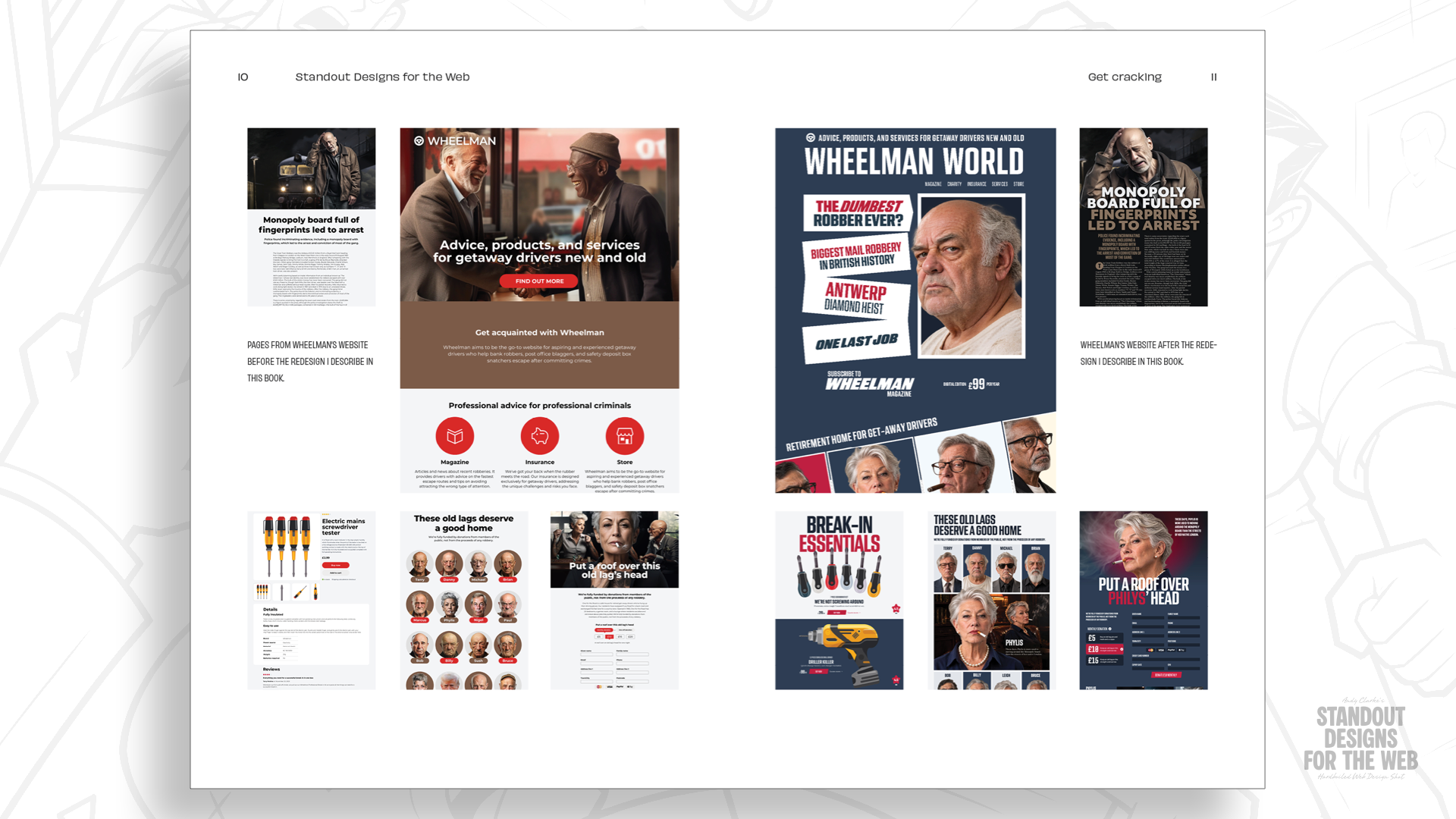
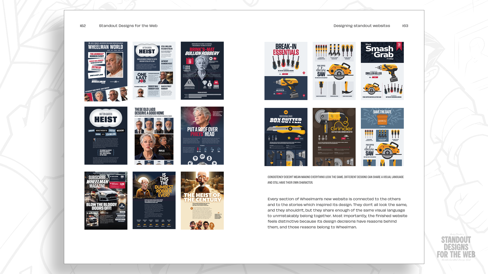
Wheelman is rebellious without being off-putting, takes its business seriously, and serves an audience that demands professionalism. Its customers still need to find what they're looking for, understand what it offers and buy its products and services; the aim is to make those experiences memorable through layouts that fit the company rather than settling for familiar arrangements.
For a new shop landing page holding two products, including a gigantic headline, product images, and the functionality and information common to most stores, the questions come before the visual decisions: which elements deserve the most attention, what belongs together, and whether there's a natural order to the information. Only then do visual questions follow — whether a large photograph sets the scene, whether the introduction should be more prominent, how whitespace can lead the eye and create pauses, and how images and text come together into a considered composition.
A single column would simplify responsive design, but a more energetic layout suits Wheelman's personality, with a clear hierarchy between products and their information. Two equal-width columns give both products equal prominence; changing their proportions creates hierarchy even when most elements stay the same size.


Those proportions could be based on a twelve-column grid, but columns only divide space vertically. Adding rows creates a second dimension.
Modular grids and compound layouts
Where columns and rows intersect they form rectangular or square units called modules. Combining modules creates larger spatial zones that establish hierarchy, control whitespace and add variety to a composition.
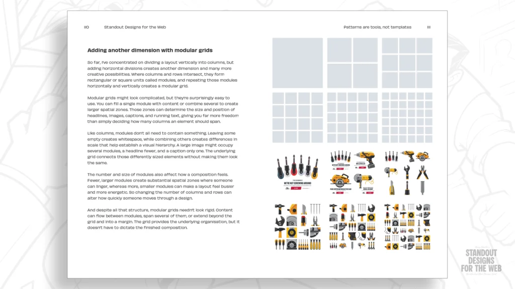
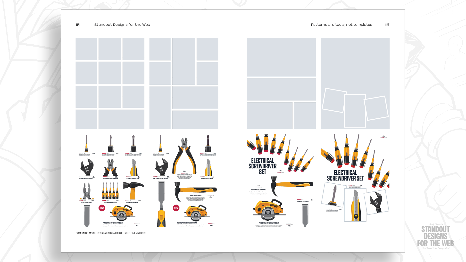
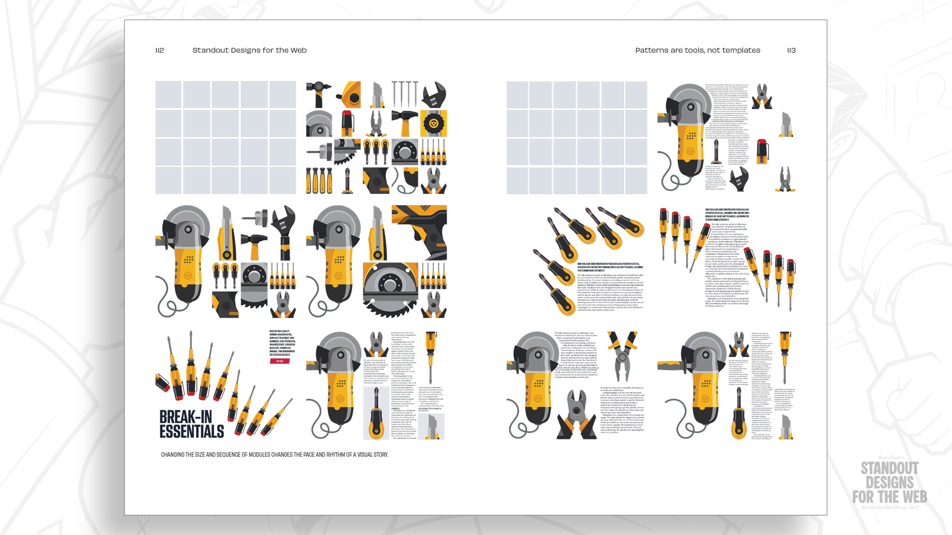
Starting with four columns and four rows yields sixteen modules, which need not all be filled. Spreading a large graphic headline and product image across four modules while product information and shopping tools occupy one module each creates drama and hierarchy through scale. In a grid of alternative products, most occupy one module while others fill two, horizontally or vertically, giving some products more prominence and making the arrangement less predictable. The page still reads as a product page with a clear reading order and breathing room, but feels like something Wheelman would publish. Module size and quantity can be adjusted per screen size to improve the reading experience.

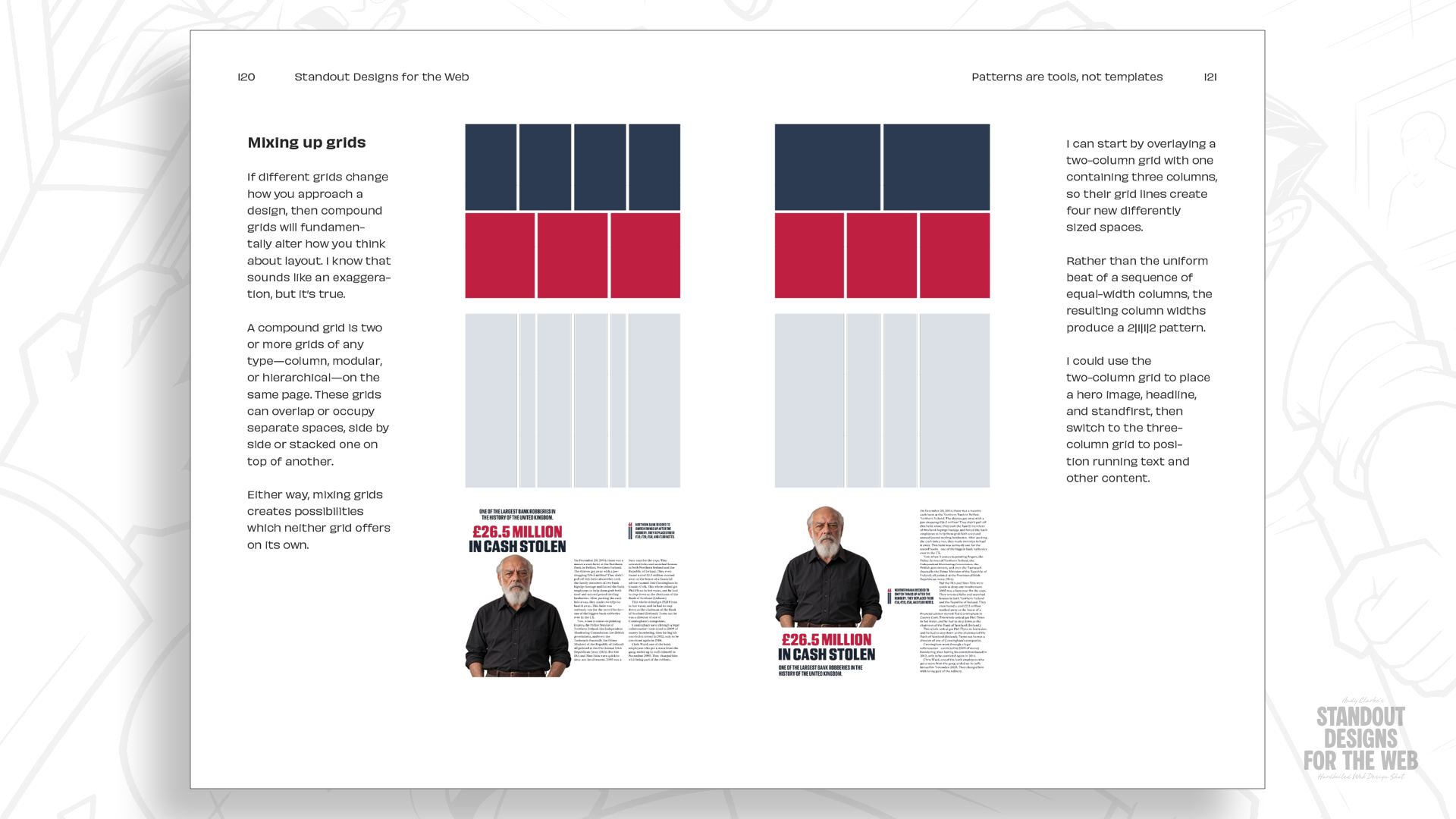
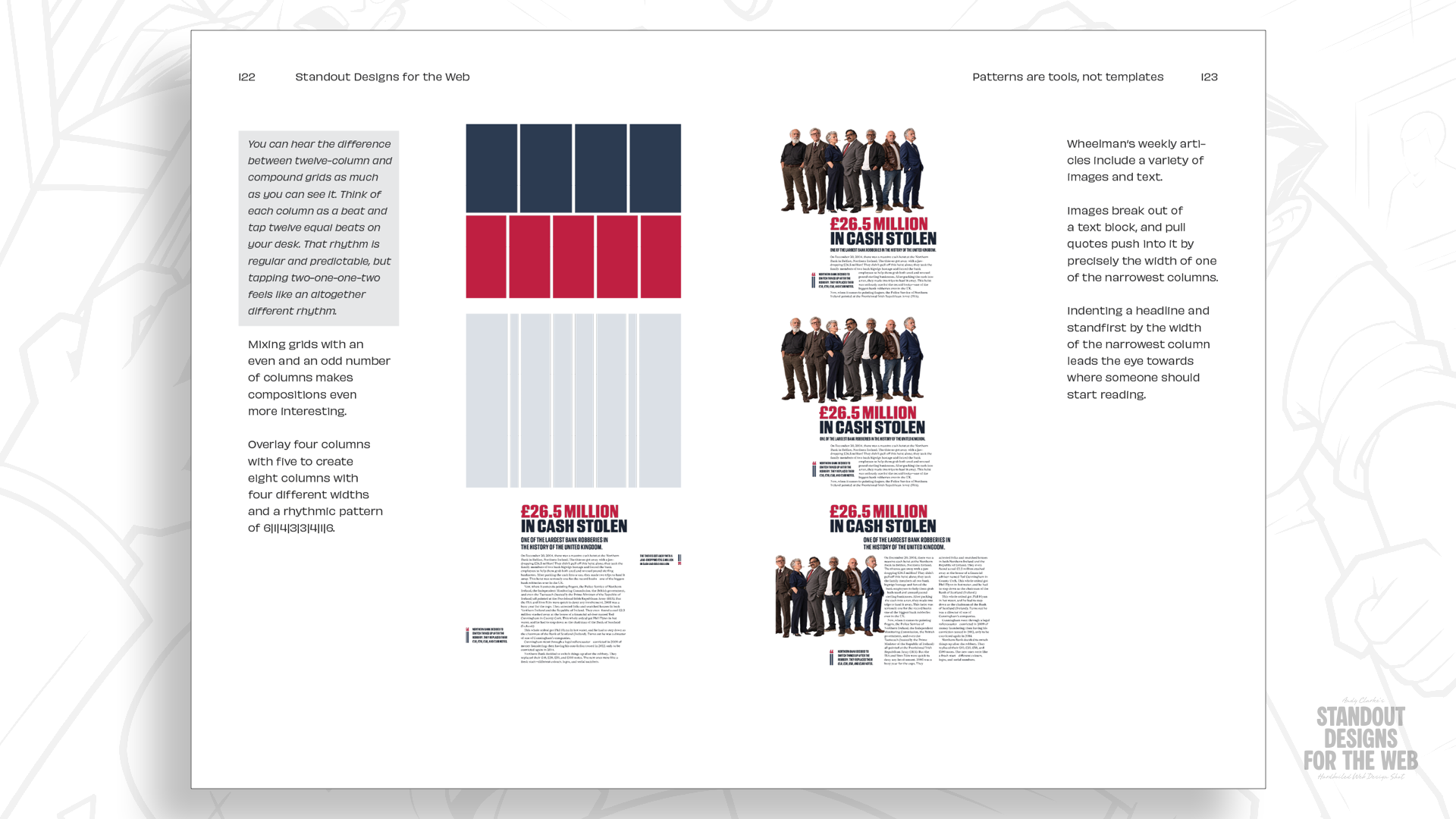
Variety across a site is where compound grids help. A compound grid combines two or more grids of any type — column, modular or hierarchical — on the same page; they can overlap, sit side by side, or stack. Overlaying a two-column grid with a three-column grid produces four columns of two different widths, whose proportions allow a wider area for a photograph or headline alongside narrower spaces for a pullquote. The same underlying grid can be combined differently on another page to suit another story, and combining grids with higher column counts opens further possibilities — mixing four- and five-column grids, for instance, gives Wheelman's pages different compositions while maintaining a connected visual structure.
The goal isn't difference for its own sake, but giving each section a layout that suits its content while keeping it part of the same company.
Familiarity as a default
Twelve-column grids remain useful and there is nothing inherently wrong with the 2-up, 3-up and 4-up patterns they inspire; sometimes they are exactly what's needed. Reaching for them automatically, though, leaves little room for the character that makes websites memorable. Wheelman's stories, products and services don't all need the same arrangements, and the grids are simply tools for putting those ideas into practice.
The same reasoning extends beyond layout to colour, typography, commissioned imagery, and how all of these come together — decisions made deliberately rather than by default, so a website looks and feels like it belongs to the company behind it and no one else.