
The Origins of a Misapplied Rule
Most designers recognize Fitts’ Law in some form: “The amount of time required for a person to move a pointer to a target area is a function of the distance to the target divided by the size of the target.” From that simple statement come the standard takeaways: the point under the cursor is free, bigger targets are easier to hit, and screen edges and corners are “infinitely deep” because a mouse stops there.
Paul Fitts was a psychologist and Air Force officer whose work on human factors was motivated by needless losses of aircraft and crew. But the lessons drawn from that era carry baggage. The studies assumed a very particular user — fit, young, not colorblind, generally white and male — and a very particular environment. When you move that legacy into interface design, you inherit those assumptions without always checking whether they still hold.
Those assumptions start to break down quickly. The pixel under the cursor is only “free” if the user is already holding the mouse and hasn’t just been typing, writing, or reaching for a phone. The bottom edge of a browser window is not the edge of the display — viewports sit inside OS chrome, and maximized Windows applications still stop above the Task Bar. Your “infinite” edge has a finite depth. For touchscreens, the assumptions don’t just weaken; they stop being useful at all.
You Don’t Know Where a User’s Hands Are
For a mouse-driven system, Fitts’ work maps distance and target size onto a model where the hand is on the pointer and the pointer is visible. Touch breaks the model at the first step. A phone, tablet, or touchscreen computer cannot detect where the user’s hand is. There is no pointer, and no way to calculate which target is nearer or farther from it.
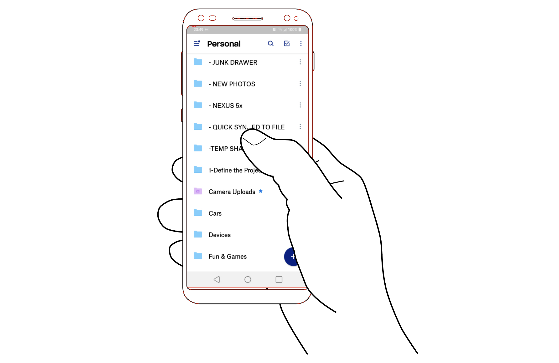
Designers often imagine the canonical grip: one hand holding the phone, thumb tapping. Real usage does not conform. People hold their devices in a wide range of grips and shift between them constantly, even within a single task type. No grip is dominant enough to predict, so no part of the screen is reliably “closer” to the user than any other.

Beyond Efficiency
The “one best way” mindset that underpins much of this thinking predates Fitts. F.W. Taylor’s scientific management and the Gilbreths’ time-and-motion studies were built to optimize output by finding a single ideal method for a task. That model was already oversimplified for aviation safety, where practices like Crew Resource Management shifted toward human-centered coordination. In product design, however, the mindset persists — teams optimize for the happy path and treat other user behaviors as errors.
Being a user advocate means rejecting that rigidity. Touch and mobile computing demand admitting what we do not know about a user’s physical context. We can predict tendencies, but we cannot assume a workstation posture, a stable environment, or a hand that is always in place. Interface design has long been loose about what and where a computer is; on portable devices, loose assumptions become active failures.
Why the Math Doesn’t Carry Over
Fitts’ underlying equations describe one-dimensional movement — moving a control from one position to another with precision. Even for mouse interfaces, that interpretation assumes the distance measured is horizontal, regardless of where the cursor starts relative to a wider target. For touch, the situation only gets more complicated.
After tapping a control, most users pull their hand back from the screen entirely. Sometimes they watch the results; often they disengage completely — setting the phone down, putting it in a pocket, or shifting attention elsewhere for some time. The device is then not merely a thumb-length away but effectively far off, requiring a cognitive shift to re-enter an interaction state.
Applying Fitts’ Index of Difficulty to experimental touch data and fitting a slope of time values to it is a fool’s errand: too many variables intervene. Even in its native domain, Fitts’ law is known to work best for whole-limb movement — an arm driving a mouse, trackpad, yoke, or pen tablet — not finger motion. Force-sensing controls like isometric joysticks already need separate models or modifications. Touch interactions are similarly resistant to a single clean formula.
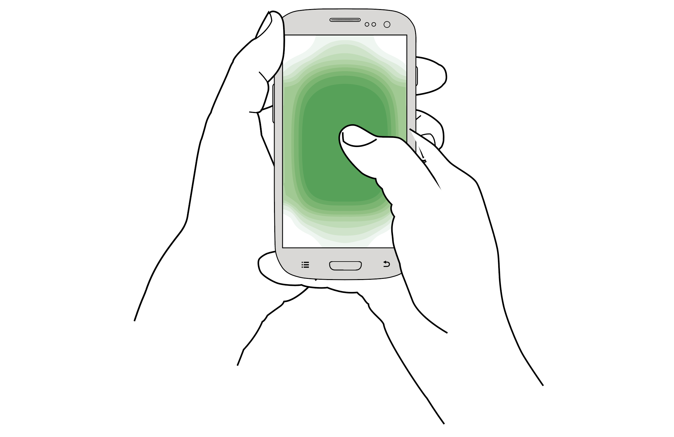
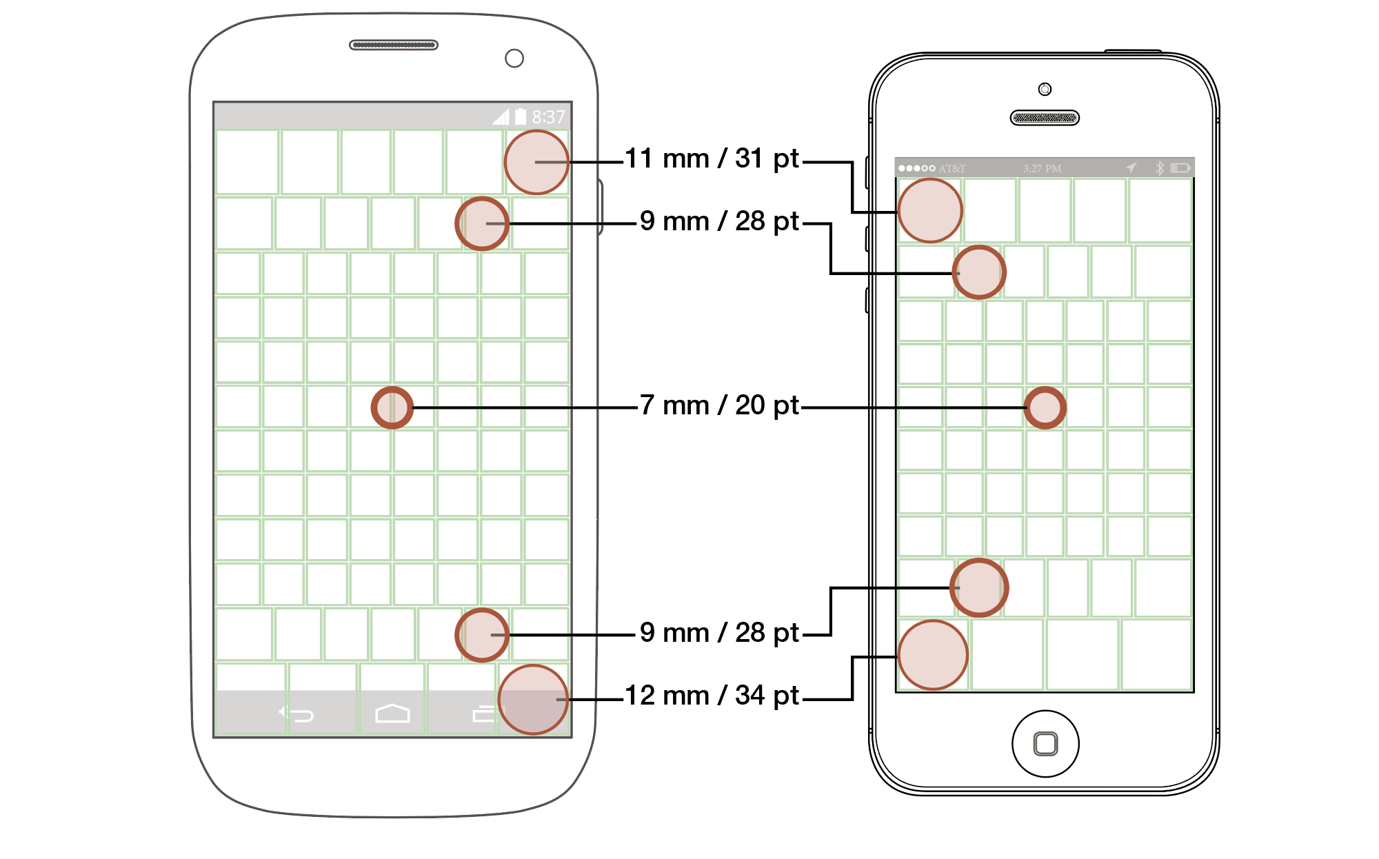
Rather than a mathematical model, what works is a set of practical findings: people touch the center of a portable touchscreen faster and more accurately than they do the edges. For target sizing, that leads to a set of concrete guidelines, along with a reminder that confounding factors always exist.
Touch Changes the Tempo of Interaction
Time-to-tap metrics are highly context-dependent, which is why they haven’t been published widely. The bigger point is that mobile usage doesn’t match the workstation model of focused, mouse-driven attention. Designs should stop assuming that environment.
Disappearing controls illustrate the problem well. On a video player, controls fade out after a few seconds so the content is unobstructed. With a mouse and full attention, that’s acceptable: an impatient viewer can nudge the pointer and skip the credits immediately. If you want to scrub ahead, you move the cursor over the timeline and then settle back.
On touch, the same fade timing applies, but the user’s situation is different. Fingers are opaque, so you tap and then pull your hand away. If you later realize you need to skip a section, you must shift your brain back into interactive mode, reorient on the screen, and reach out again. By the time you do, the controls — designed for mouse hover and instant access — have already disappeared.
Giving precise timing guidelines for touch is difficult without comparable data for mouse systems. General observation suggests times would be similar for similar interactions, but not all interactions and environments are equal. To evaluate a design properly, try the physical context: put the phone in your pocket, sit back, watch, and only move to interact when needed. Usability tests often produce too much user attention, setting unrealistic expectations. Analytics, ethnography, and simply observing users in real life are better guides to actual use modes.
From WIMP Conventions to Touch Best Practice
Turning this into actionable advice requires a checklist, as with other design topics. The challenge is separating good current guidance from the substantial amount of bad advice circulating about Fitts’s Law and touch UI design.
The table below translates existing mouse-oriented guidance — both good and bad — into what I consider the best current advice for touch interfaces.
| Conventional Wisdom for Mouse and Desktop | Best Practice for Touch and Mobile |
|---|---|
| Lay out content top to bottom, left to right, with the most important in the top left corner. | People read and interact in the best and fastest way with the center of the screen. Put your key info in the big scrolling area in the middle. |
| Watch for the fold, so users can see all the info they need. Distrust scrolling, as scrollbars are far away. | Everyone scrolls, because a gesture is easy and common. Make sure users know that there is more content, but expect them to discover it on their own. |
| Keep all control options close for less mouse movement. ‘Cancel’ and ‘submit’ must be right next to each other. | Accidents happen, so keep disparate and especially destructive choices far away from positive actions. |
| Guard dialogs (“Are you sure?”) protect from accidental activation well. | Avoid destructive actions at all, and when required make sure they all have undo methods (or fake undo), not guards before the action. |
| People are focused on the task at hand, and want speed above all. | People live in the world, so are distracted. Don’t time out notifications or provide limited time to perform actions. |
| Edges and corners are infinitely deep, so place menus there for quick access. | Edges and corners are the hardest to tap areas, but are great places to hide low use menus and anchored actions. But just a few; make them big to assure users can tap them successfully. |
| Pop-ups are the best, because they can appear under the mouse, so less movement needed, compared to menus and drawers. | Pop-ups are terrible in so many ways, not least, they are disassociated from their context. Place items in the UI, or use drawers, accordions, and other contextual items to select. |
| Provide the user with tools to select quickly, including jumping the mouse to the primary action. | Empower the user to make informed decisions. Give them enough information to make good choices. For consequential choices, the delay for moving to the action is good, and provides a moment to think if they actually wish to carry that out. |
| Bigger is better, so feel free to pad buttons, and use very long labels for the most important buttons. | Make interactive elements like buttons only as big as needed for the expected location on the screen. Make labels clear and succinct, so users can read them. |
| Radial menus are the fastest possible ones, as all options have equal distance from the initial point. | Radial menus lose much of their value when you get away from the cursor, and they are unexpected, so the learning curve gets in the way of their theoretical value. |
Questioning the Assumptions
A common assumption in many workplaces is that everyone else knows what they are doing. That mindset leads teams to copy Apple or Amazon, adopt Material Design uncritically, and borrow “inspiration” from competitors without questioning whether the underlying advice is sound.
As demonstrated, standards and conventions can be wrong. They may be outdated, tied to technologies no longer in use, too narrowly applicable, over-applied, oversimplified, or simply misapplied. Technology, workplace habits, and daily life shift in ways that invalidate prior assumptions. The move from mouse-and-keyboard PCs to mobile touchscreens is one such major shift.
More important than any single guideline is the habit of always asking questions and seeking deeper understanding. Guidelines should inform decisions, not replace thinking about what they mean for your users and your product.


