Checklist Cards for Interface Design Decisions
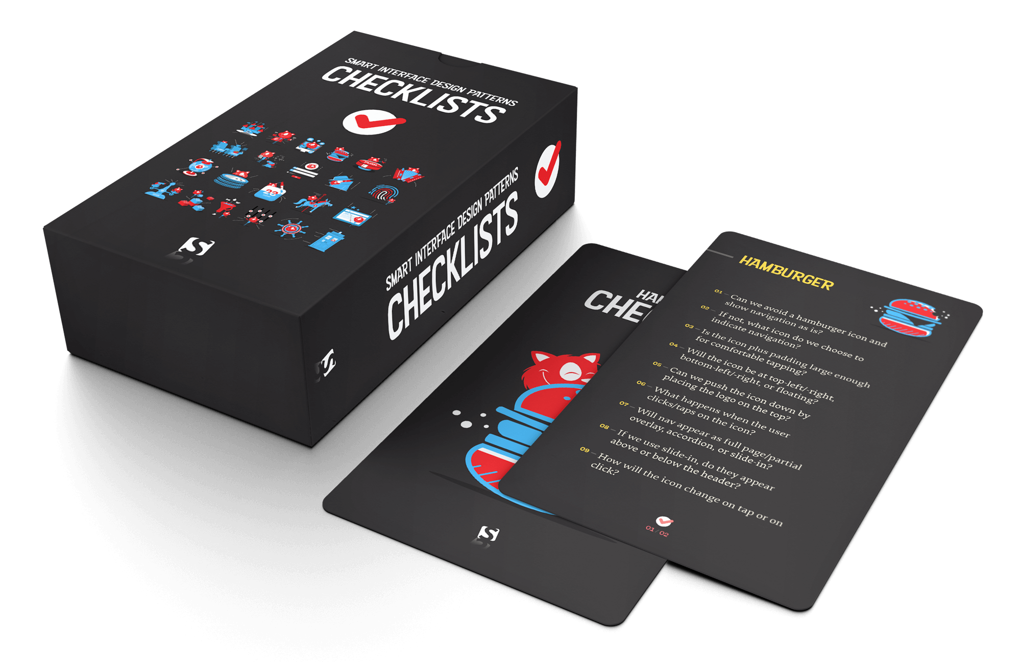
The Smart Interface Design Patterns Checklist Cards condense years of usability sessions, design iterations and A/B tests into a deck of 100 cards. Each card poses the questions worth asking before you design or build a component — carousel, hamburger menu, data table, date picker, autocomplete, onboarding flow, pricing plan, authentication screen or web form. A preview of the deck is available as a PDF; the full set also includes practical interface examples and action points.
Beyond serving as a last-minute reference, the cards are meant to push important conversations earlier in the workflow. Their purpose is to get designers and developers to surface misunderstandings — and settle them — before mock-ups turn into HTML and CSS. That way, fine UX details survive the handoff, and costly rework is avoided.
Steering Design Decisions Early
Most contemporary projects are built from design systems, which means components are architected rather than improvised. Teams decide on guidelines and principles first, then design, name and build families of components across sizes, colors and contexts. During those early sketch and prototype phases, checklists help designers spot missing details and settle on a consistent direction — even if that conversation is internal.
Print + PDF
$39.00 — Hardcover print with a card box and PDF. Free worldwide shipping, 100-day money-back guarantee.
PDF Only
$30.00, free for Smashing Members. DRM-free PDF.
Aligning Designers and Developers
Once mock-ups for narrow and wide screens exist, it pays to step back and talk big picture before diving into prototypes. Too often, the specifics of a design intent are lost between layers, pixels and Slack messages — developers never hear the rationale behind a decision, while designers are unaware of the technical cost it carries.
A dedicated meeting between design and development to walk through each component in a mock-up prevents that. The checklists provide the framework: for every card, both sides discuss the designer's intent and the developer's view on its complexity, from layout and target sizes to interaction details and accessible states. Notes from these sessions go into a collaborative document that later serves as a reference or guideline for other teams.
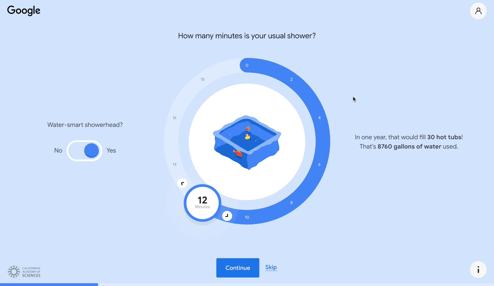
This approach brings to the surface issues that often surface only later in usability testing — forgotten swipe support for a carousel, the performance footprint of a background video, or an effect that demands overly expensive DOM manipulation. Discussed up front, those problems become manageable adjustments instead of last-minute redesigns.
Print + PDF
$39.00 — Hardcover print with a card box and PDF. Free worldwide shipping, 100-day money-back guarantee.
PDF Only
$30.00, free for Smashing Members. DRM-free PDF.
Using Cards as a Reliable Reference
Once checklists are part of the routine, they become a dependable point of reference. The cards can be customized to cross off decided details and focus on what is still open, which helps ensure no critical implementation detail is forgotten before code gets written. The deck covers design for touch, hamburger menus and accordions, carousels and navigation, filtering and search, tables and feature comparison, pricing and product pages, sliders and players, configurators and wizards, date pickers and calendars, timelines and maps, privacy and authentication, onboarding, reviews and testimonials, and web and donation forms — plus 400 practical UI examples. The plain-text versions can be adapted to any workflow.
The deck's owner gets lifetime access to the PDF and updates.
Print + PDF
$39.00 — Hardcover print with a card box and PDF. Free worldwide shipping, 100-day money-back guarantee.
PDF Only
$30.00, free for Smashing Members. DRM-free PDF.
Checklist Coverage, Pattern by Pattern
The deck organizes its questions into focused sets for individual components. Each card set targets the decisions that typically trip up designers, from basic layout choices to edge cases around accessibility and state handling.
For touch interfaces, the core concern is precision: hit targets should be at least 48×48px, and users need a way to undo actions by tapping the same spot. Mobile navigation deserves special attention, with questions about whether critical actions sit at the bottom of the screen.
Accordions raise structural questions: which icon signals expansion, whether open sections collapse automatically, and if the page should scroll when an item expands. Navigation patterns branch into behavior (hover versus tap/click), presentation (overlays versus slide-ins), and mobile sub-menu splitting.
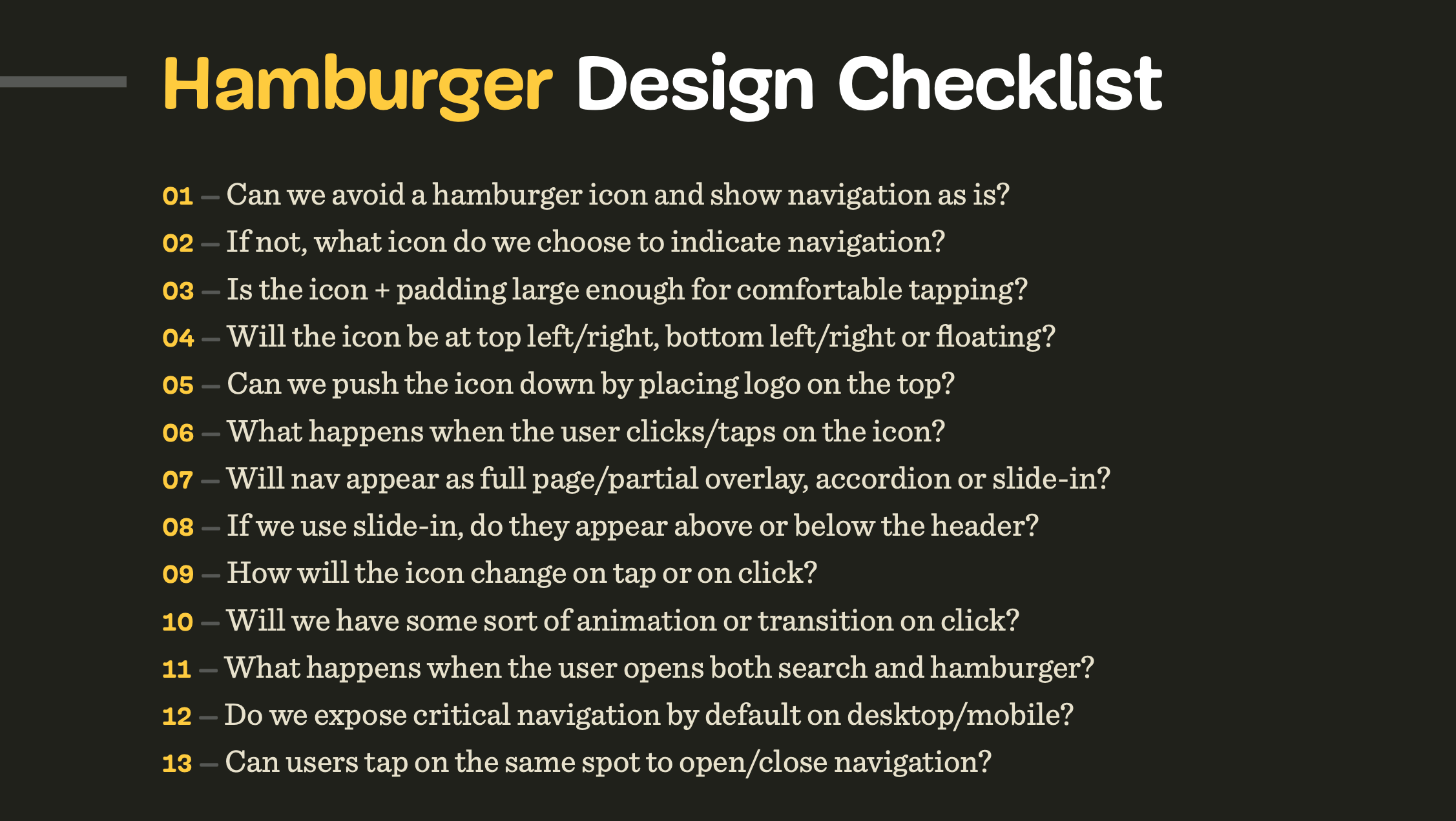
Hamburger menus prompt a first-principles check — can you avoid the icon entirely by showing navigation directly? Other considerations include how search and menu interactions coexist and whether key links stay visible by default on each device.
Filtering checklists ask whether popular filters appear up front, if result counts are shown per option, and whether filters apply instantly or require an explicit "Apply" action. Sorting decks cover placement, label clarity, and whether the default order reflects the range of available products.
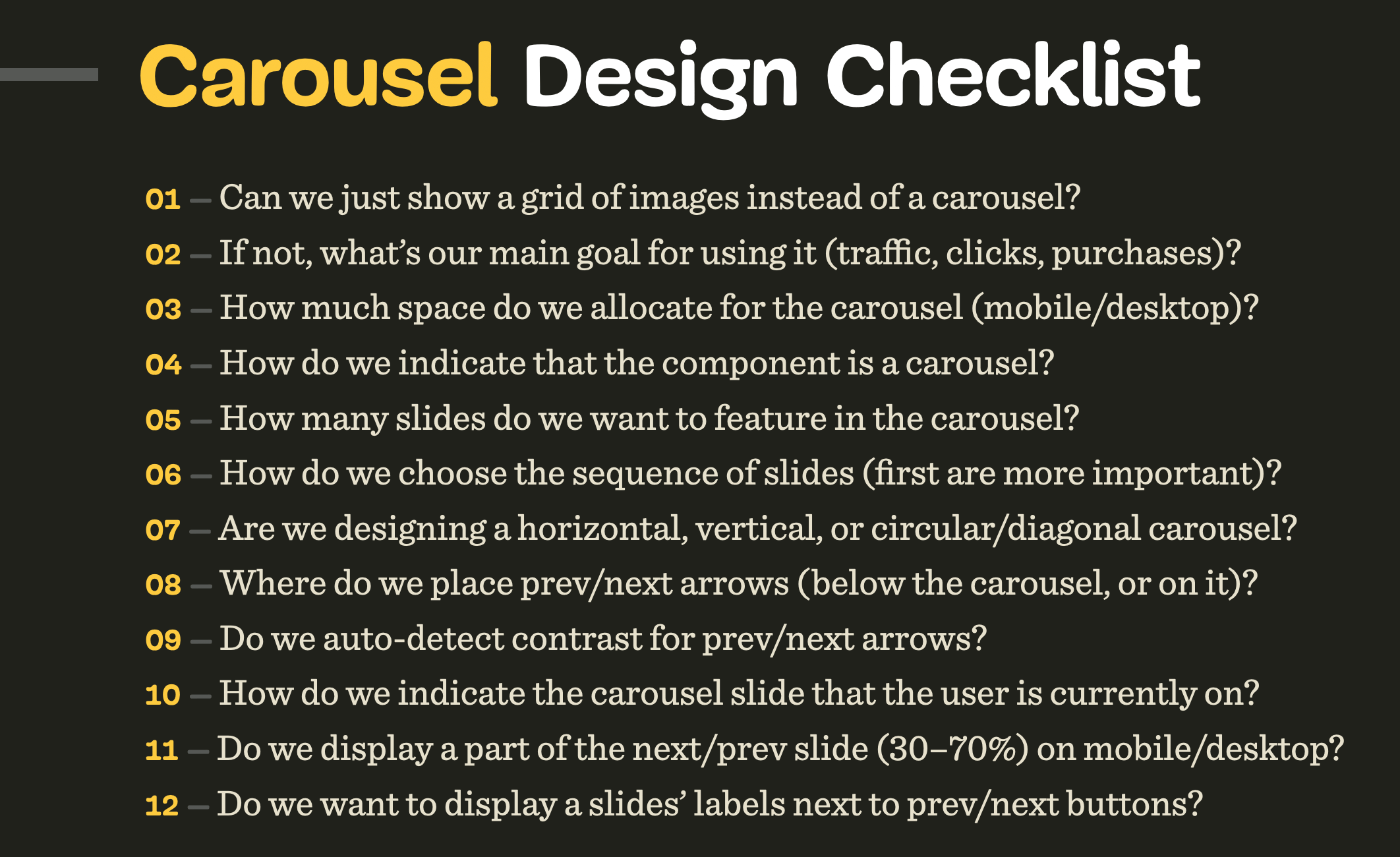
Search autocomplete should surface frequent hits and popular categories, with decisions on the trigger character and look-ahead patterns. Carousels get scrutinized hard: can a static grid replace them, is auto-rotation pausable, and how is slide order determined?
Tables need predictable navigation, tap highlighting, and a mobile strategy where rows become cards while retaining comparability. Pricing pages carry a heavy load of 51 questions, from feature count per plan and currency switching to avoiding credit card requirements for trials.
Sliders require text input fallbacks, value validation, and optional "locking" of certain points. Date pickers cover presets, color-coded dots for rates, and how to hide unavailable dates. Configurators ask about entry points, auto-advance between steps, and explaining dependencies for each stage.
Comparison tables should let users isolate differences or similarities, reorder columns, and optionally choose which attributes matter most. Timelines need critical event visibility, fixed time segments, and ways to show changes over time. Schedules and calendars should support quick track jumps and indicate current and upcoming items.
Maps raise questions about zoom depth and autocomplete search, plus a note on flipping chart axes for better space use. Seating plans consider pricing tiers, multi-level venues, and per-seat experience scores. Privacy prompts suggest grouping data by sensitivity and requesting permissions gradually, only when likely to be granted.
Onboarding lists cautions against intro tours and tooltips that get skipped, favoring empty states and well-timed feature reveals. Reviews and testimonials can be grouped by impact, with counts highlighted and author details displayed for credibility.
Web forms top the count at 76 questions, covering floating label accessibility, country selector defaults, and error display above the submit button plus in the tab title. Donation forms ask about adjacent stories, suggested amounts, and donation frequency options. Authentication questions cover password rules, CAPTCHA necessity versus honeypots, and rate limiting recovery attempts.
Product pages tackle layout structure, true final pricing including shipping and taxes, and out-of-stock notifications. Video players should optimize for precise control via keyboard and buttons, use preview clips and popularity indicators, and persist playback position on refresh.
Format and Availability
A printed hardcover version of the deck remains unavailable for now, as worldwide printing and shipping are currently difficult and costly. The digital edition comes with a discount toward the eventual printed set.
The checklist collection is curated by Vitaly Friedman, who also runs a five-session online workshop series covering these interface patterns in depth. Sessions run 2.5 hours each and include live design work and peer review. Attendees come away with practical techniques applicable to websites, desktop apps, and mobile products.
Pricing for the downloadable PDF is $30, DRM-free, and included with a Smashing Membership. The print-plus-PDF bundle is $39 with free worldwide shipping and a 100-day money-back guarantee.