

Filters Rarely Work in Isolation
Too often the filtering experience on the web is broken and frustrating, making it unnecessarily difficult for customers to reach that comfortable range of relevant results. Filters appear in nearly every interface that presents more than a handful of data points — flight bookings, eCommerce storefronts, data grids, enterprise dashboards, vaccine trackers and public records registries.
The problem is rarely the sheer volume of data. It is the complexity and lack of consistency inherent in the data that demands filtering in the first place. Filtering is usually broken down into a set of available features, which the user translates into a specific intent. The design should therefore minimize the time needed to move from a default state (no filters selected) to the final state (all relevant filters applied).

Applying relevant filters is the easy part. Showing just enough relevant results is more difficult. Recall that for every interface, and for every user intent, there is a comfortable range — a preferred number of options that users feel they can process relatively effortlessly. The comfortable range does not need to fit on a single screen or page; it can span dozens to hundreds of items across multiple pages.
What matters is that the range meets a few expectations:
- the options shown are highly relevant;
- the results are easy to scan and understand;
- differences between options are obvious;
- the user can process the entire set within a foreseeable timeframe.
Unlike sorting, which only rearranges results according to preferred attributes (soft boundaries), filters impose hard boundaries. They strictly limit the scope of results. With too few proper filters users overshoot the comfortable range; with too many, they hit zero-results and abandon the site.
The comfortable range varies significantly by product. Usability tests show people handling 20–30 kinds of vehicles, 40–50 kinds of sneakers, 70–80 bouquets of flowers, and even paginating through 100–200 payment slips, yet feeling overwhelmed by 15 types of sharpies or AAA batteries. As a general rule, the more diverse the options, the larger the tolerable result set.
The Real Difficulties of Filtering
Filtering seems simple — a set of form elements, after all. But there are several dimensions that make the design task quite difficult:
- filters come in many shapes: pricing, ratings, colors, dates, times, sizes, brands, capacities, symptoms, experience levels, product status;
- they usually appear in large numbers spanning different screens;
- they have multiple states: selected, unselected, disabled;
- they often rely on sensible defaults and must preserve input;
- they can be interdependent, so dependencies must be obvious;
- they are hard to validate when users can type complex data like times or dates;
- they need meaningful error messages.
Filters never exist in a vacuum. They are always connected to the results they act upon, which makes them roughly synchronous with whatever speed the UI registers input and processes results.
Tiny Scrollable Panes
One of the most frequent usability pitfalls comes from long filter sections — often brand lists with dozens or hundreds of options — squeezed into a tiny scrollable pane that shows only 3–4 entries at a time. Users must scroll slowly, carefully, and, on mobile, run the risk of accidentally toggling filters while scrolling.
A better approach is to show more options at once — 7–10 entries — and let an accordion expand to reveal the full list on tap or click. If the options do need a scrollable container, they should not be activated by scrolling through the pane. Supplement the filter with a search autocomplete and an alphabetical view when popular options can be pinned at the top, as seen at retailer Rozetka.ua.
Sliders Need a Text Fallback
For any scenario where a user must define a large range of values — pricing, travel duration, insurance coverage — a slider is a common choice. Sliders work beautifully when the goal is quick exploration; they fail when a target value is already in the user’s mind.
Moving a price by three dollars, for instance, becomes an act of extreme precision and repeated correction. Whatever the domain, sliders must support three distinct interaction modes:
- free exploration, where a standard track-and-thumb slider works well;
- targeted fine-tuning, aided by steppers (+/-) for controlled jumps;
- exact input, via dedicated text fields for min/max values so users can skip the slider entirely.
All of these must remain keyboard accessible. Lloydsbank’s personal loan calculator demonstrates the right combination: slider, text input fields for precise values, visible focus styles when the thumb is activated, and a contextual range displayed below the rate slider so users see where their adjustment lands.
Made.com’s Sozasizer shows another solid interpretation of the same principle. Rather than a conventional slider, it uses a visual resizing handle bound to a “Resize” icon, but with equivalent options to drag and to enter exact height and width values directly in input fields.
Don’t Jump the User Around the Filter Pane
A familiar pattern on many retail sites: pick a filter, and the page responds by registering that single input, refreshing, and snapping you back to the top of the filtering sidebar. Dell.com is a typical case. The intent is to show the top of the product results with the new filter applied, but the side effect is that the user is yanked away from the controls they were just using. Select six or eight features one after another and you're in a scrolling fight, re-orienting yourself after every single click.
The core problem is that only one filter is registered at a time, and the UI doesn't signal that. A better approach would be to drop the auto-scroll on the filter area entirely and instead communicate clearly that only one input is accepted per refresh cycle. Freezing the whole interface until the server responds is one possible fix, but that approach drags in problems of its own.
Don’t Block Input While Waiting for Results
When the UI freezes on every single input, you actively slow down the user's ability to express intent. Sears.com demonstrates the frustration: a full UI block and a forced jump to the top of the page on every selection. For filters tucked inside accordions (the “Brand” section, for instance), this means scrolling back down, re-opening the accordion, and hunting for the next attribute each time. Walmart follows the same pattern.
The success of this approach depends on JavaScript reliably toggling between a frozen state and a working state, even when the server is slow or returns malformed data. That’s fragile. The user has no way to indicate they’re “done” with input, but the interface still blocks all interaction with every single change. What’s more, shoppers frequently stack several filters in quick succession, and this pattern gives them no support for that behavior.
An obvious alternative is to hand control back to the user in the form of an “Apply” button, letting them layer on all the filters they want and then refresh the results in one deliberate action. But there’s a middle path that gives live updates without freezing input: shift from synchronous rendering to asynchronous rendering.
Render Filters and Results Independently
Instead of coupling the filter pane and the product list into one synchronous refresh, split them. On each filter input, update the matching results in the background, and leave the filter controls untouched and always in place. BestBuy’s layout is a solid example: the sidebar stays live while the product grid receives new content streamed in whenever the data arrives — no disabled state, no waiting on a full page refresh.
Coolblue makes the asynchronous loading visually explicit with an animated sidebar filter UI. Every input is logged and applied to the list. It’s worth restating that until a design has an “Apply” button permanently in view, users will expect every selection to be registered and applied as they go.
Keep the Page Still While Filters Change
Even with input unblocked, the page can shift around the user in other ways. On VictoriaPlum, each new filter causes a subtle movement in the filtering area as new items arrive. This is generally caused by three repeating issues:
- expanded filter sections collapse on every fresh input,
- options that disappear after a filter is applied are suddenly hidden, shrinking the height of the filter panel,
- the list of applied filters, which sits above the filter pane, grows with each new selection and pushes the pane further down the page.
The first issue is solved by preserving accordion state — keep sections open across page refreshes and filter selections. The second calls for a more transparent treatment of removed options: disable and explain them, perhaps offering a “hide all unavailable options” toggle, rather than silently removing them. For the third, the least disruptive place to pile up active filters is directly above the product results, not above the filter controls.
Anchor Active Filters to the Results
Putting active filters above the results keeps the filter area steady and predictable, and it doesn't need to be permanent real estate. Crate & Barrel demonstrates a collapsible filter bar with applied filters and a clear “clear all” action anchored over the product grid.
Another route is turning each filter category into an overlay that opens on demand. Adidas keeps a persistent filter bar within scroll reach, and the filter overlay respects user control — it won’t vanish of its own accord, although it still collapses after a single selection, forcing repeat opening for multi-attribute filtering. A variation that keeps the overlay persistent as users refine several facets is the better version of that idea.
Not every implementation of filters over results avoids the earlier pitfalls. On Asos, every filter click still yanks the user to the top of the page, meaning a manual scroll back to the controls each time — a scenario that would be remedied entirely by rendering the refreshes of filters and product list separately.
Make the Apply Button Count
The “Apply” button can also serve as live feedback. Ikea uses an asynchronous sidebar overlay that updates the product list as filters are toggled, and repurposes its Apply button as a result counter — the label reads the number of currently matching products. Each input triggers a request for a fresh result count, which is immediately reflected. This gives shoppers a concrete sense of how far a given selection has narrowed the playing field.
Galaxus.ch shows the pattern refined: filters above the products, click-to-open overlays, fast asynchronous responses, and active filter chips that integrate cleanly with the rest of the controls. The overall model that seems most dependable is an “Apply” button that doubles as a result indicator, with the product area streaming live as the user fine-tunes their selection.
Mobile Filtering Needs a Different Approach
The problems discussed so far affect large and small screens alike, but they become more acute on mobile — and especially on slow connections. A common failure is blocking the entire interface around a single filter input, which punishes customers who are on the go. Some sites try to fix that by splitting the screen: a filters overlay on one side, the product list updating behind it. That approach is seen on retail sites like Nordstrom.
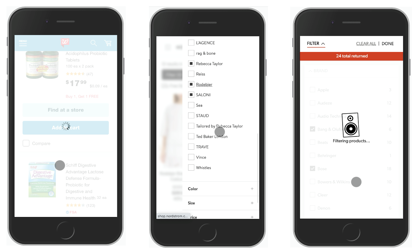 Walgreens, Nordstrom, Crutchfield.">
Before committing to a split view, it is worth testing a full-page overlay for filters. That layout gives more room for a multi-column filter layout, or even a swipeable area for moving between filter categories without page navigation. Accordions that expand and collapse in place — rather than sending users to a separate page — are another option, and they build on the same logic that applies to mega-dropdown menus.
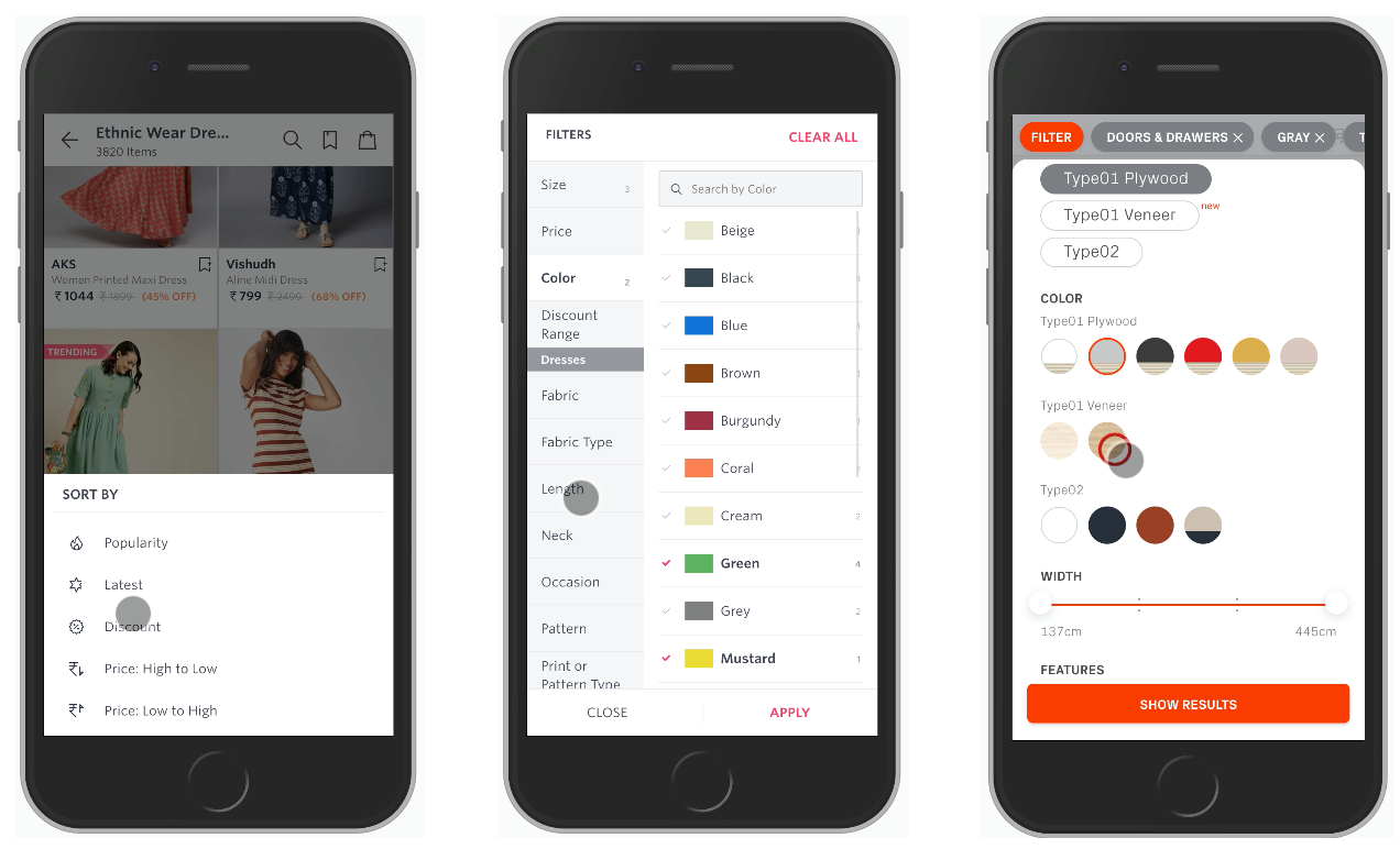
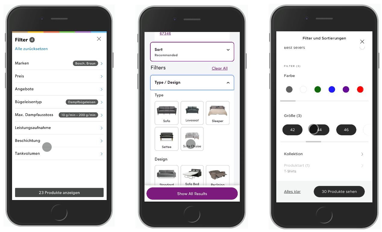 Galaxus.ch, Wayfair and Lacoste.">
On mobile, an “Apply” button is essential in each of these patterns. Make it more useful by labeling it with the resulting product count and keep it sticky at the bottom of the screen while the user scrolls.
A Filtering Checklist
The points below consolidate the questions worth asking before you design or build any filter. Treat them as a conversation starter with your design and development teams.
- Can we show filters openly instead of hiding them behind an icon?
- If an icon is required, which one best communicates filtering?
- Is the icon and its tappable area large enough for comfortable touch?
- Should the icon sit at the top, bottom, or float (on mobile or desktop)?
- What should happen when the user activates the icon?
- How does the icon state change on tap or click?
- Will the opening interaction include animation or transition?
- Should filters appear as a full page, partial overlay, or slide-in panel?
- Can we avoid sidebar filtering, which is often slow?
- Do we surface popular or contextually relevant filters by default?
- Do we show expected result counts next to each filter?
- Can we allow horizontal swiping to move across filter groups?
- Can we replace drop-downs with buttons, chips, and toggles?
- For complex filters, do we offer search inside the filter list?
- Are icons used consistently to distinguish filter types?
- Are the right widgets used per filter — sliders, buttons, toggles?
- Should filters apply automatically (yes, for slide-ins)?
- Should changes apply only after an explicit “Apply” action (yes, for overlays)?
- How are active filters communicated to the user?
- Can selected filters be displayed as removable pills, chips, or tags?
- Do we recommend filters based on the current selection?
- Is there logic to flag incompatible filter combinations?
- How do errors or warnings present themselves in the UI?
- Can customers reset all filters with one action?
- Does the filter control stay floating or sticky on scroll (mobile and desktop)?
- Can users open and close filters by tapping the same spot?
What to Take Into Your Next Filter Design
Broken filtering makes otherwise useful interfaces feel unnecessarily difficult. Customers just want to reach a comfortable, relevant set of results without friction. The recommendations below summarize the traps to avoid and the behaviors to prioritize.
- Design for a comfortable range of options that allows a customer to combine several filters quickly, one after another.
- For long filter groups, avoid small scrollable panes. Instead, show 7–10 options at once and use an accordion to reveal everything else. Add autocomplete search and an alphabetical listing where appropriate.
- When using sliders, always include steppers (+/-) and text input fields alongside them.
- Customers often apply several filters of the same type. Never auto-scroll the page on a single filter input, and do not collapse a filter group automatically after a selection.
- Do not block the interface while filtering. Customers should never be forced to wait for the page to respond before making another choice.
- Keep filters and result updates asynchronous. Each input should refresh matching results in the background while the filter controls stay put and remain usable.
- Avoid layout shifts when filters change. Consider placing filters above the result list for stable navigation.
- On mobile, keep the “Apply” button sticky at the bottom, and display the product count directly on that button.


