

Auditing edX: A Practical UX Case Study
A UX audit is an efficient way to verify that design elements serve their intended purpose and to view an existing interface with fresh eyes. This case study examines how edX, a major non-profit educational platform with over 20 million users, holds up against Jakob Nielsen’s ten usability heuristics and the actual needs of its audience.
Given the return on investment—roughly $100 for every dollar spent on UX—it is worth scrutinizing even market-leading products. edX was chosen for this audit because of its non-profit status, its massive user base, and the substantial volume of negative UX feedback found in public reviews.
Audit Scope and Methodology
The audit was structured in two stages. First, user needs were identified through surveys and statistical analysis. Second, the platform’s key interface elements were weighed against Nielsen’s ten usability heuristics, which serve as foundational guidelines for interface design.
A complete audit would normally take weeks, so the work was scoped to the three pages that matter most to edX users: the home page, the user profile, and the search page. This focused approach yielded sufficient insight to inform a redesign concept.
Stage One: Identifying User Needs
Understanding user expectations required a mix of quantitative and qualitative data. Tools like SimilarWeb provided statistical insights into edX’s traffic and audience interests, revealing that "Computer Electronics" and "Technology" are the most popular course categories. Reviews on Trustpilot consistently praised the quality of course content but flagged the platform’s verification process as time-consuming and its customer support as poor.
To complement this data, interviews were conducted with students in design communities on Facebook and LinkedIn. Survey responses revealed two distinct user scenarios:
- Exploratory learners compare various platforms, seeking a course that captures their attention. They do not come with a specific course in mind.
- Goal-oriented learners know exactly which course they want and rely on effective search functionality and clear progress tracking to achieve their goal.
These profiles, combined with the statistical evidence, pointed to five recurring problems that edX users encounter.
Problem 1: Establishing Credibility
Trustworthiness is built through visible signals: logos, reviews, feedback, and clear pricing. edX’s home page does display the logos of its partner universities prominently, which lends immediate credibility.
However, it fails to highlight the platform’s specific benefits or showcase user feedback. These elements are frequently deciding factors for users choosing between competing educational platforms.
For contrast, Khan Academy’s home page explicitly introduces the platform, explains its benefits, and prominently features positive user testimonials, addressing the credibility question directly.
Problem 2: Course Card Information Gaps
Users often need to scan course listings quickly and make a decision based on the available description. edX’s course cards currently display the course name, institution, and certificate level.
Essential decision-making data—such as pricing, course ratings, enrollment numbers, and start dates—is missing. This violates the principle of recognition rather than recall, which holds that all valuable information should be available to the user without requiring them to search elsewhere.
Udemy demonstrates a more complete approach: its course cards show the course name, instructor, rating, number of reviews, and price, providing users with the context they need at a glance.
Problem 3: Friction in the Signup Flow
Research shows that users are almost twice as likely to complete a registration form successfully when it adheres to basic usability guidelines and avoids errors. The edX signup form introduces several sources of unnecessary friction:
- Users cannot type their country name or date of birth; they must scroll through lengthy option lists.
- Passwords cannot be revealed even upon request.
- No verification email is sent to confirm the entered address.
- Required fields are not marked with an asterisk.
Each of these issues slows down the user and increases the chance of abandonment. Udemy, for example, offers the straightforward option to show and hide an inputted password, a small change that significantly improves the form-filling experience.
Problem 4: Search and Filtering Shortfalls
Search is one of the most critical features for massive online open courses. An analysis of edX’s search page using Google PageSpeed revealed a performance grade of just 12 out of 100, indicating severe speed issues that can frustrate users.
Furthermore, edX lacks any filtering mechanism on its category pages. When users select a category like electronics, they are forced to scroll through a list that can exceed 100 items. Coursera provides a more effective model by displaying a comprehensive array of filter options directly on the page, enabling users to narrow their results instantly.
Problem 5: Lack of Progress Motivation
While EdTech platforms enjoy higher retention rates than most websites, they still rely on strong feedback systems to keep learners engaged. The edX user profile is remarkably sparse, offering little in the way of motivational data.
Khan Academy demonstrates a better practice here. Its user profile displays detailed statistics such as join date, points earned, and the user’s longest learning streak, creating a tangible record of achievement that encourages learners to continue their studies.
Running the Ten-Heuristic Check
The next stage of the edX audit applies the ten usability heuristics defined by Nielsen Norman Group. Even without a dedicated UX designer on staff, you can perform a basic check against these principles using the extensive examples and guidance on NNGroup's site. A shared Notion checklist with over a hundred usability criteria makes the process even simpler, as it formats the heuristics into a practical, editable worksheet.
Keep Users Informed
Systems should always provide clear feedback. edX's course cards, for instance, don't indicate whether a course is currently available. Users must click through to the course page to learn this basic fact.

Bright, upfront labels stating "available" or "not available" would resolve this ambiguity immediately - a small UI adjustment that prevents a dead-end interaction.
Speak the User's Language
The platform largely adheres to this heuristic, employing common phrasing, familiar gestures, and standard icons throughout its interface. The language is accessible and the information architecture is logically ordered.

Supplementing this with clear section breakdowns for courses and intuitive icons would further cement this match between the user's mental model and the system's representation.
Offer Escape Routes
Users should always retain control. This is problematic on edX when it comes to username changes—once set, it's an irreversible action. While this is often a security measure, the rigidity hampers user freedom.
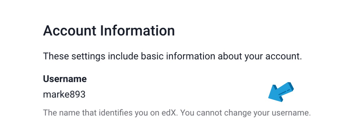
Providing users with alternate options would mitigate this. Letting them add or remove courses with ease, or edit profile details without friction, reinforces the sense of user control and freedom.
Maintain Internal Consistency
Design elements should be predictable and unified. edX has room for improvement here, and the inconsistency extends below the surface level of external standards (which it does meet). Internally, the platform sometimes uses different visual treatments for elements with the same function.

The "Explore" button is a clear example, rendered in different styles in different places. Though not critical, these visual variants for identical functions add noise and degrade the overall experience.
Prevent Errors at the Source
Good design intervenes before a mistake is made. The email verification flow on edX is a clear case where this is lacking. If a typo is made in an email address, it isn't flagged until the user attempts verification.
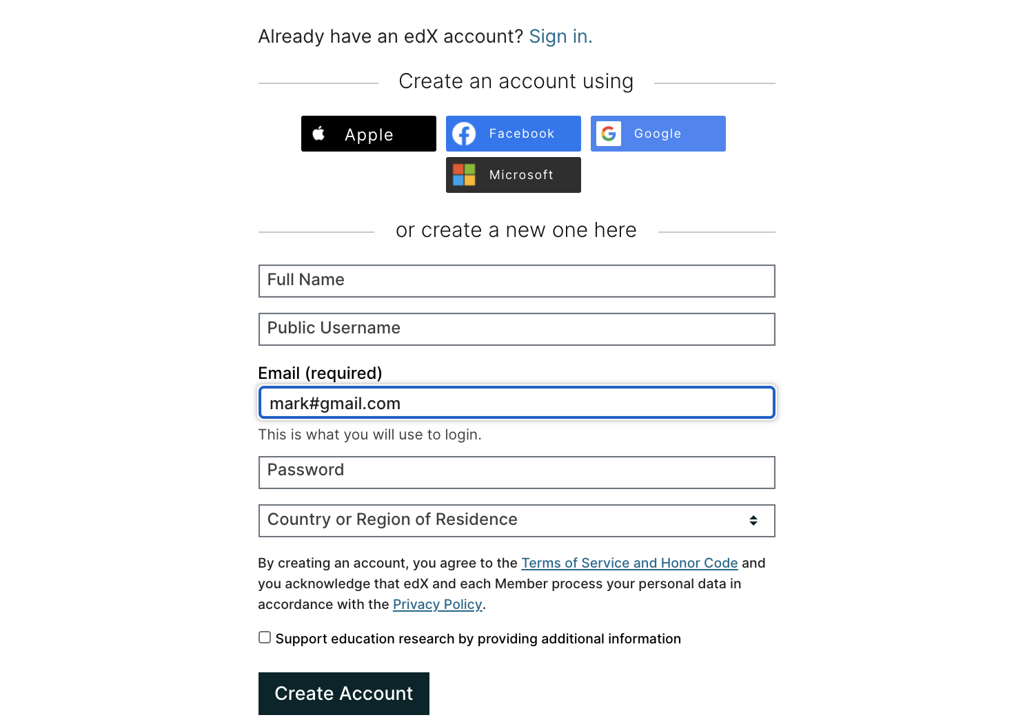
Live validation, however, is not universally beneficial; some argue it can be distracting and create confusion. The best approach depends on the design context. Always center on the user's primary goal—whether you implement real-time or post-submit validation, prioritize a smooth, frustration-free experience.
Favor Recognition Over Recall
Users shouldn't need to recall where things are or what they mean. edX's homepage is an example here: it displays university logos without their full names, making them less recognizable to visitors who don't have that information in short-term memory. Similarly, the user profile page doesn't show a history of completed courses.
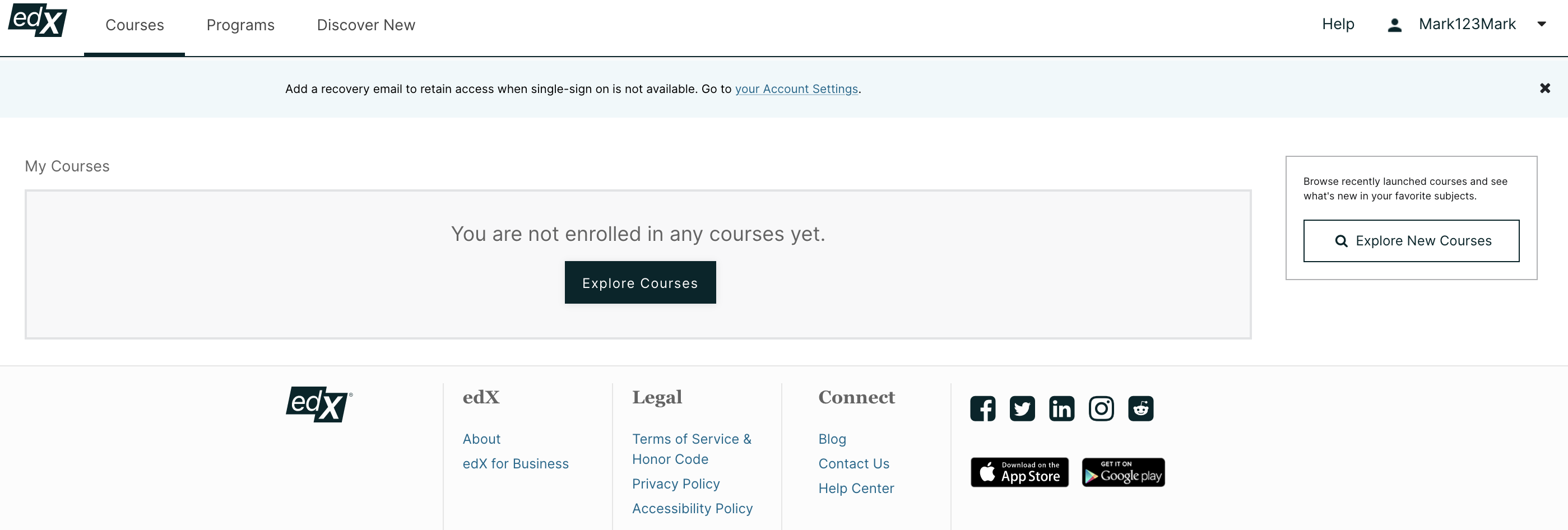
Enabling users to clearly see their completed coursework and then recommending similar paths would significantly improve how easily they process and navigate the platform.
Design for Flexibility and Efficiency
Speeding up interactions is critical. edX’s search functionality falls short here, lacking robust filtering options. Users are forced to spend more time than necessary scanning for the right course.
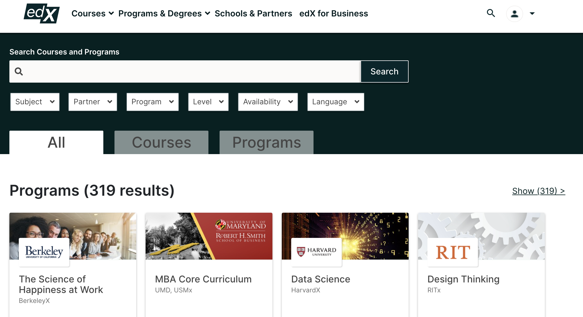
Search is a pivotal conversion stage. Implementing filters is a high-impact accelerator that gets users to their desired outcome quickly, moving them from passive searchers to engaged learners.
Prioritize Aesthetic and Minimalist Design
This heuristic demands stripping away what isn't necessary and maximizing the signal-to-noise ratio. The recent redesign of the homepage is a marked improvement. The hero imagery is now directly relevant and the inclusion of user and course counts adds concrete signals of authority and scale.
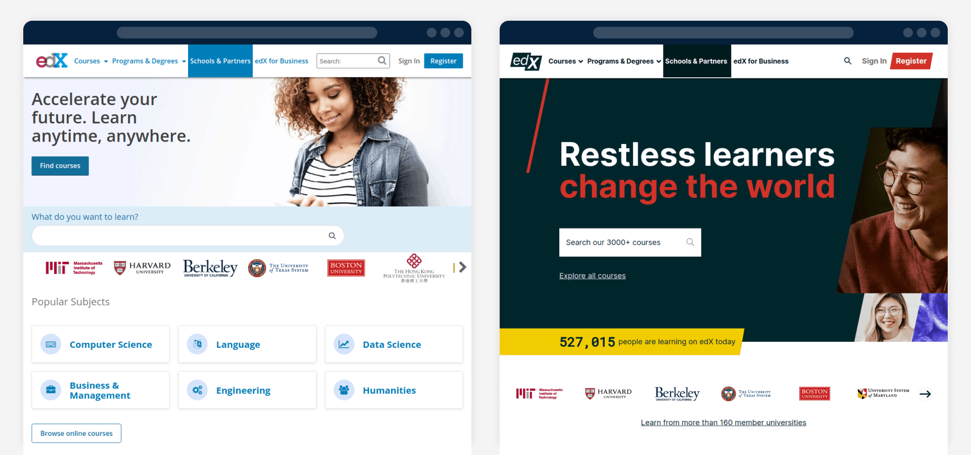
The cleaner, more purpose-driven visuals are a clear step toward communicating rather than decorating.
Help Users Diagnose and Recover from Errors
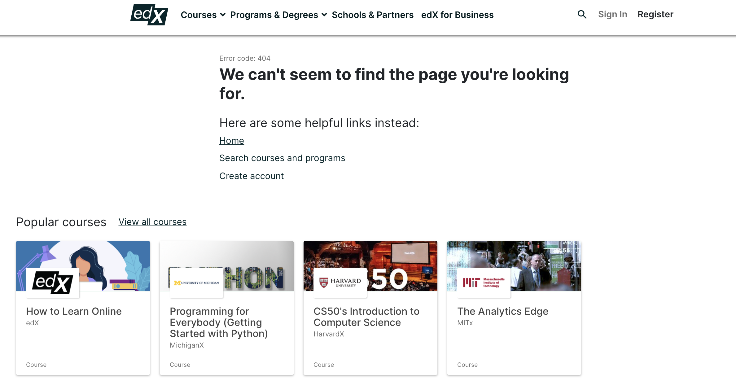
Problem messages should be clear and offer a path forward. edX's 404 page performs this well, stating precisely what the problem is ("We can't seem to find the page you're looking for") and providing it with immediately useful links to the homepage, search, and course catalog, in addition to popular courses.
Provide Help in Key Moments
Support and documentation are vital. edX's help center is accessible from the footer and is well-organized with sections and autocomplete suggestions on its search bar.
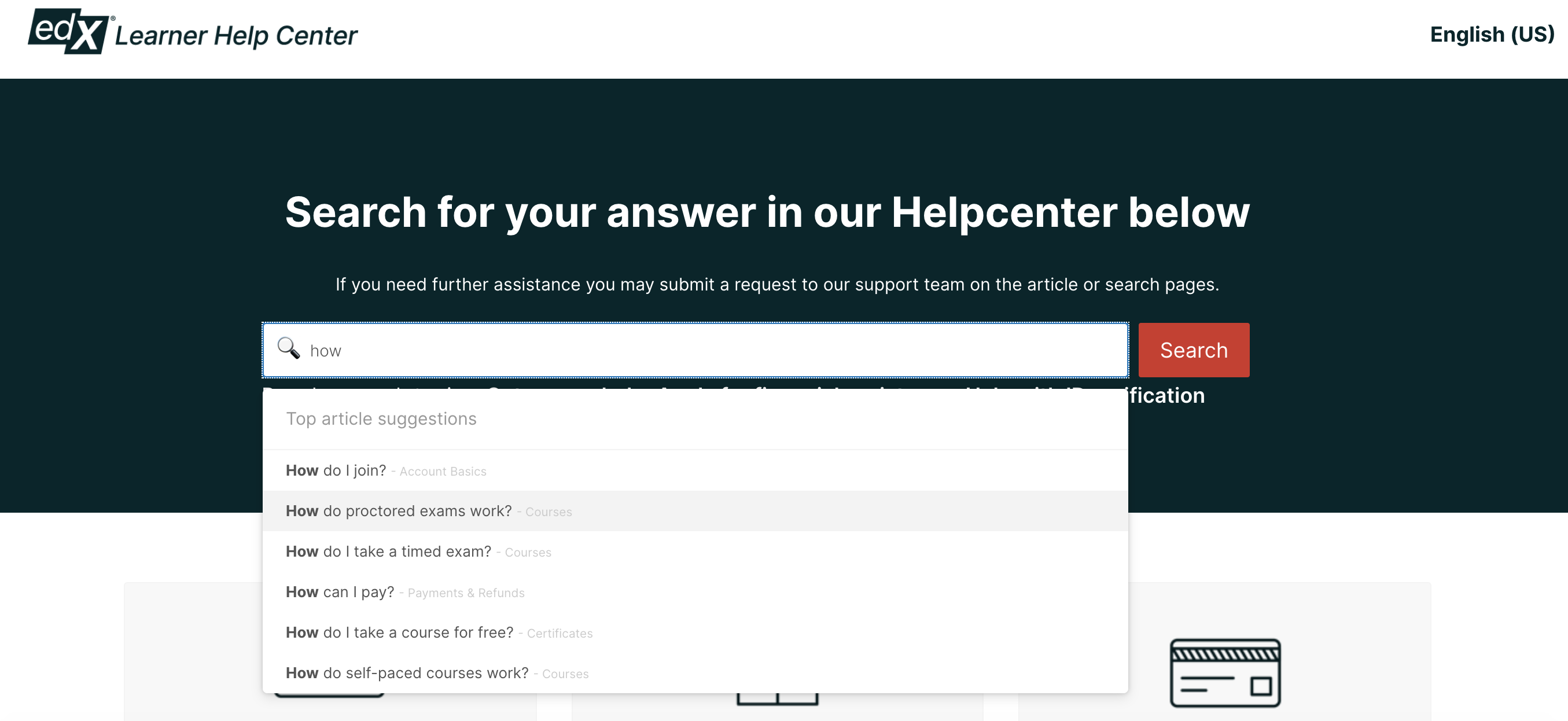
There's a critical navigation flaw here, however. Users cannot click the logo to return to the homepage from the help center, leaving them unable to navigate back without using the browser's back button. Enabling a path back to the homepage from anywhere on the site is a basic usability must.
Translating Findings into a Revised Design
The audit pointed to a concept redesign that targeted the home page, user profile, and search results. The full 500px previews are available in the Figma project.
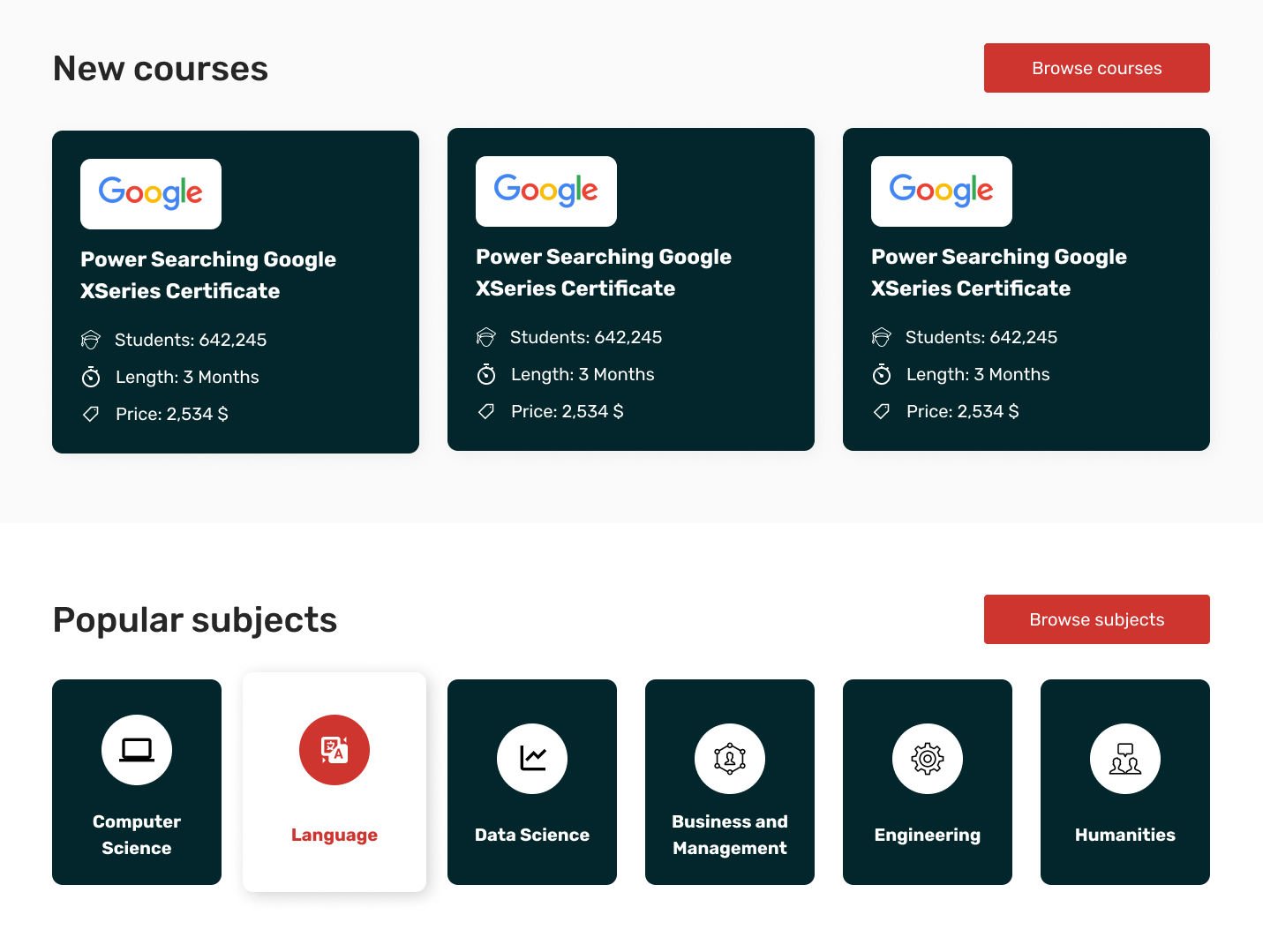
A Focused, Purposeful Homepage
The redesign begins by addressing heuristic 8, notably reducing the layout's signal-to-noise ratio with cleaner spacing. It positions edX's central mission—education for everyone, everywhere—boldly on the page.
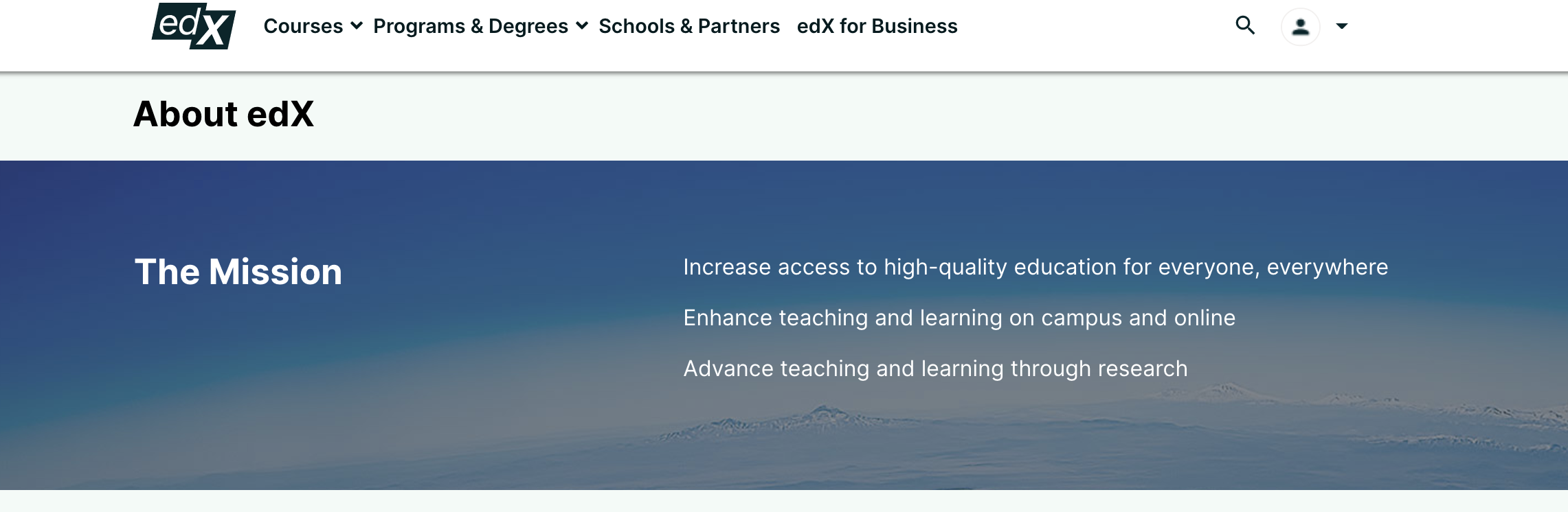
The imagery was updated to narrate the mission story more cogently, using illustrations that align directly with the accompanying text.

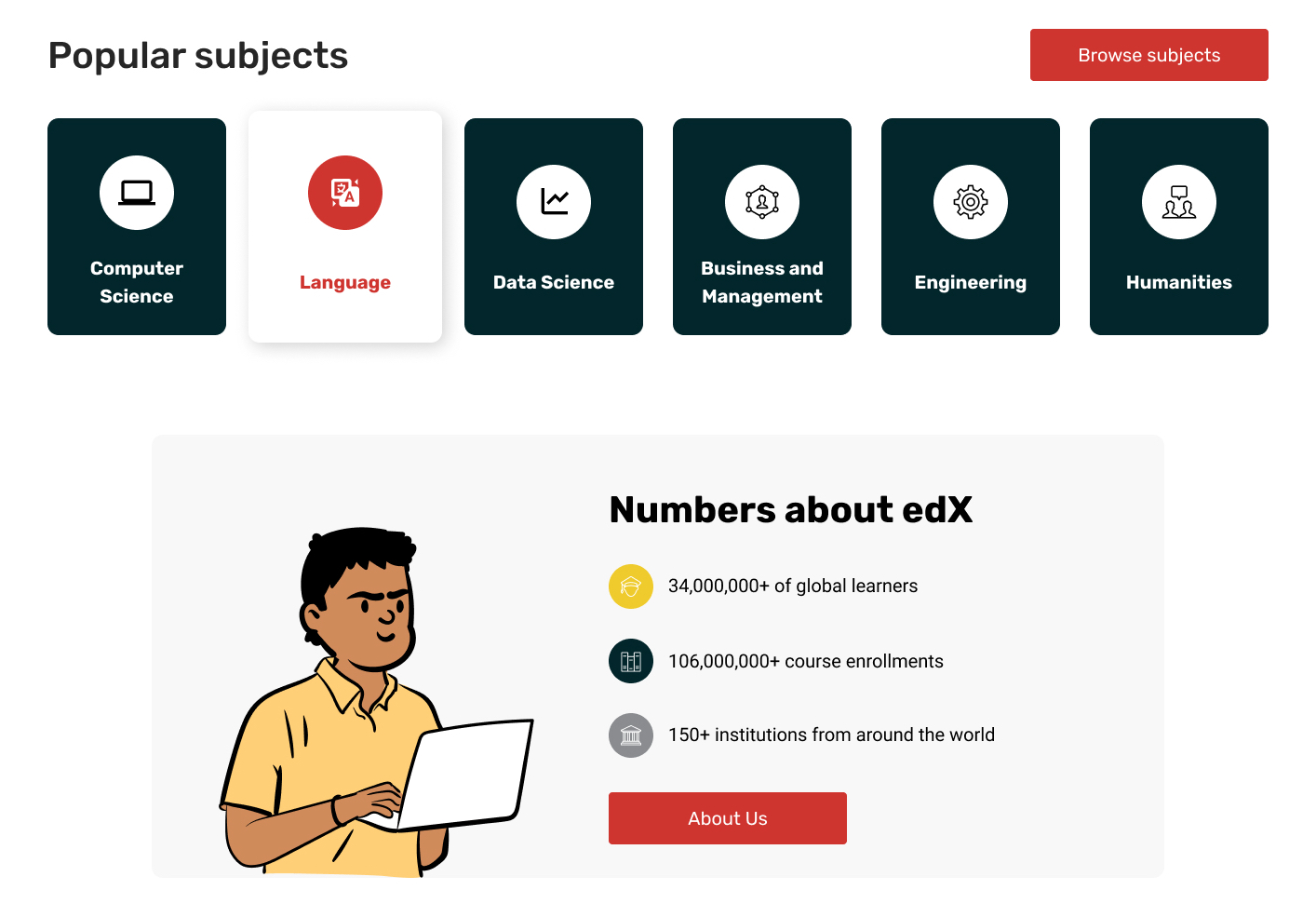
In the course cards, essential information that wasn't surfaced before is now prominent, making each card a richer marketing asset. To guide browsing, icons for popular subjects have been added to the display. A fact sheet with platform stats was also introduced, lending direct credibility which the design reinforces.
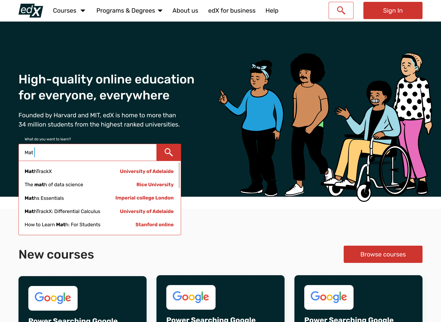
A More Guiding Search Experience
The new search process revamped the search interface to offer auto-suggestions. In the new flow below, keyword input pulls up possible matches for a much faster selection process.
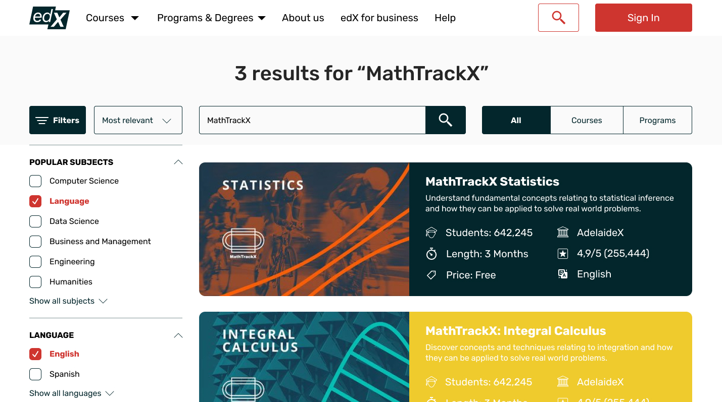
For the search results, the UI adds a left-hand sidebar for filtering. Coupled with updated, more descriptive course cards, search becomes a manageable path to learning.
A Profile that Motivates Progress
To address user motivation, the profile redesign closely references the engaging formats of platforms like Khan Academy. A progress bar now communicates remaining lessons toward a certificate, directly inspiring users to continue.

The revised profile also improves navigation by placing it prominently at the top. While the underlying profile settings behavior is retained, the color palette has been refreshed.
Key Takeaways from the Audit
The audit demonstrates that a heuristic method is effective for scrutinizing design functionality, offering a valuable perspective on existing products. It's clear from this edX case that even a platform in a leading industry stands to gain from updated UX; learning is challenging enough without the added barrier of a poorly designed interface.
Ultimately, the audit validates the crucial need to identify and meet user needs. A focused, continuous improvement loop based on user behavior and expectations is what determines both user satisfaction and their commitment to the platform.


