
Why Stakeholders Shouldn't Set the Site Structure
Organizations tend to build website structures around internal politics and departmental agendas rather than user needs. Each team wants its content featured prominently in the main navigation, and business owners prioritize what they want to communicate over what visitors actually need to find. The result is an architecture that fails because users can't locate answers or critical messages.
To change this approach, stakeholders need to understand mental models — the internal frameworks everyone uses to organize information. An expert in fruits would classify a tomato as a fruit, while most people would place it in the salad category. Similarly, ornithologists will insist there is no such thing as a "seagull," even though the rest of us use that term freely.
The key issue is that expertise diverges from common understanding. Stakeholders are experts in their products and services, which means their mental models differ significantly from those of typical website visitors. That makes them the least qualified people to determine how content should be organized for a general audience. Their expert perspective doesn't just create poor structure — it can undermine the content itself.
Start With What Users Want to Know
Before organizing anything, you must define the content that belongs on the site. Organizations typically make two mistakes here: they blindly migrate old content without questioning its relevance, and they begin with "what do we want to say" instead of "what does our audience want to know?"
The right starting point for an information architecture project is to identify the questions, objections, and tasks users bring to the site:
- Questions: These range from broad inquiries ("what is this site about?") to specific ones about your products or services.
- Objections: The reasons users might hesitate to take action — concerns about spam, privacy, or how difficult unsubscribing will be. If these aren't addressed, users won't convert.
- Tasks: Actions users want to complete, such as booking an event, subscribing to a newsletter, or contacting the organization. For e-commerce, these include finding a product, adding it to the cart, and checking out.
Social proof and value propositions can help answer questions and overcome objections, but the architecture itself should be built around user needs. Once you've gathered this list — which can be extensive — you need to prioritize it.
Identify the Content That Matters Most
Not all questions, objections, and tasks carry equal weight. Some will be far more common and important than others, and those deserve priority placement in the site structure.
The most rigorous method for prioritizing content is top task analysis, a survey-based approach developed by Gerry McGovern. If time or budget is limited, a conversation with customer-facing staff — sales reps or call center teams — can reliably surface the inquiries that come up most frequently.
In either case, you'll likely find that a large share of user inquiries center on a relatively small set of concerns. That concentrated list becomes the focus of your initial architecture draft.
Draft the Architecture with Open Card Sorting
For the first draft, work only with the top-priority content — ideally 30 to 60 cards. This keeps the exercise manageable for both you and any participants.
Begin by simplifying and merging similar items. A question like "how much does it cost" can be reduced to "pricing," and "are there any extra charges" can share the same card. Once simplified, these cards need to be organized into top-level sections.
You could make educated guesses at this stage, planning to test later. But stakeholders will likely push back, and you'll end up redoing the work — often a false economy. A more defensible approach is an open card sort, where users freely create and name their own groups.
Online tools like UX Metrics streamline the process: create a card for each content area, share the URL with participants, and let them define the groupings that feel natural. Each participant's groups represent their preferred site sections.
For meaningful results, aim for at least 13 participants to filter out outliers — though more is better. The tool's report shows the groupings users created and how frequently each occurred. Merge similar groups and choose a small number of top-level sections, favoring the most common groupings.
Keep the total number of groups as low as possible — roughly four where feasible, since that matches short-term memory capacity. Avoid exceeding eight elements. If you need more sections, use chunking: a primary navigation bar for main content and a secondary utility bar for help, login, and contact links.
Don't worry about getting the structure perfect now. The report can also hint at potential subsections, but these will be refined in the next stage.
Validate with Closed Card Sorting
Closed card sorting reverses the process: instead of users creating their own groups, you provide predefined sections and ask participants to assign cards to them.
Because closed sorts require less cognitive effort, you can include significantly more cards. This lets you test whether your draft architecture accommodates all your content, not just the top-priority items.
If running the closed sort through UX Metrics, add one extra top-level section labeled "I don't know." This catches cards users can't place, highlighting where your structure fails.
After reviewing results, most content should fit comfortably within a top-level section. If a substantial amount doesn't, you'll need to revise the draft and repeat the closed sort.
But this leaves a practical question: how deep does the card sorting need to go?
Stop at the First Level
For most sites — unless you have an extensive budget for information architecture — card sorting only needs to happen at the top level. Below that, make educated guesses based on how users grouped content within each section.
That pragmatic approach is defensible because the first navigational click is the one that matters most. In a landmark usability study on first-click testing, Bob Bailey and Cari Wolfson found that users who clicked in the right place on their first attempt had an 87% chance of finding their content, versus just 46% for those whose first click was wrong.
Card sorting at only the top level still doubles the odds of user success. If time and budget permit, though, run open card sorts for each section to design the subsections, and closed sorts beneath those for very large sites like universities or government bodies.
Whichever depth you choose, a final round of testing on the complete architecture is a worthwhile safeguard.
Validate the Structure With a Tree Test
Before committing to your final information architecture, run a tree test. Most card-sorting tools, including UX Metrics, support this exercise, so you can reuse the same platform.
To build the test, recreate your proposed architecture as a simple hierarchical tree. Then pick a handful of pages you want to verify users can locate. Frame each as a task, such as finding the page they would use to answer a specific question or complete an action.
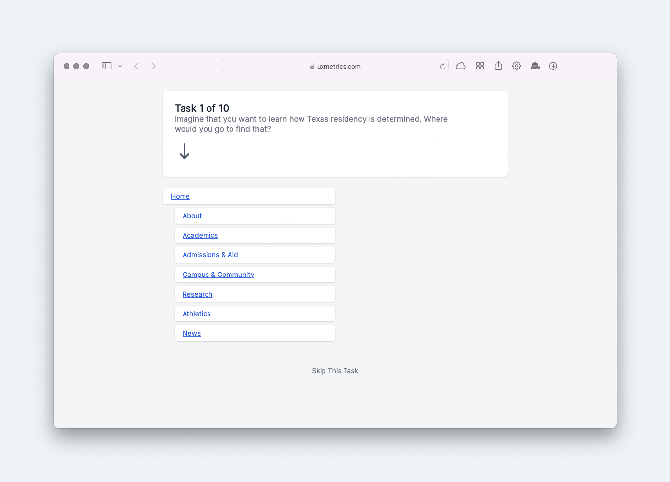
Choose test targets wisely. Focus on three groups:
- Content that matters most to users or to the success of the site.
- Content that people placed in different sections during card sorting, which signals ambiguity.
- Content that may sit too deep in the hierarchy to be discoverable.
You then tell the tool the most direct path to each piece of content. Distribute the test the same way you did the card sort. Participants indicate where they would look for each item, and the results show success rates, completion time, and whether users followed an optimal path.
For a brand-new architecture, prioritize whether people finish the task successfully in a reasonable amount of time. The exact route they take matters less than whether they get there at all.
If the tree test reveals problems, do not assume the entire structure is broken. Users often struggle most with secondary content, and the hierarchy is not the only way people find things on a site.
Make the Structure Resilient With Cross-Links
Site search is an obvious complement to your architecture, but the most effective way to improve findability is cross-linking. Tree tests frequently expose a common failure mode: users cannot decide between two plausible sections, guess wrong, and abandon the task before trying the alternative.
Cross-linking solves this directly. For pages that users hesitate over, include links in every section where they might look, even if the page lives in only one of those places in the hierarchy. This gives users a recovery path when their first guess is wrong.
Your closed card sort is a good source for identifying these pages. Look for items that users repeatedly placed in different sections, then ensure each of those sections links to the content.
Also, surface important content that lives deeper in the tree. A section landing page should point to the most useful items within that section, and the homepage should offer quick access to the most critical content anywhere on the site.
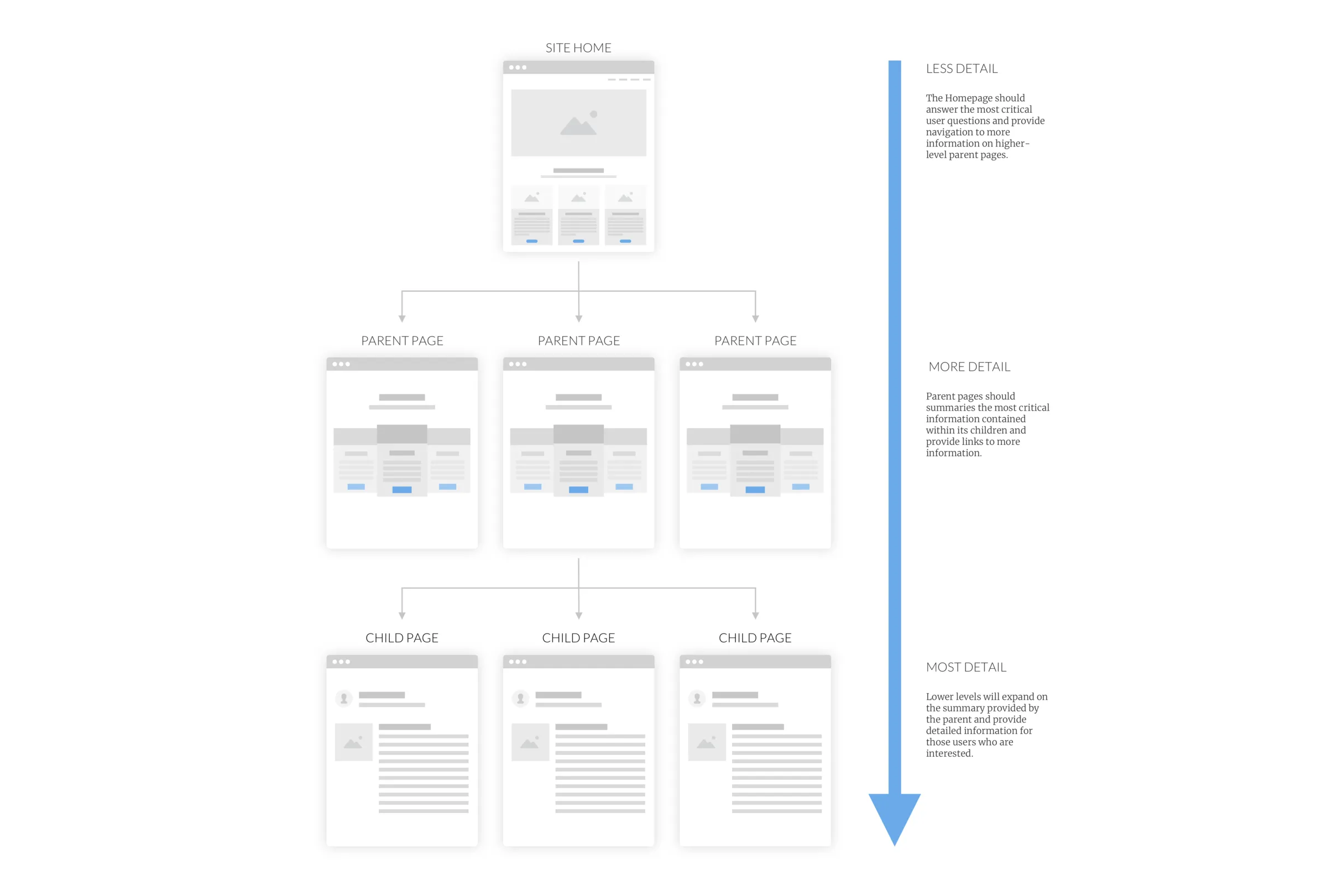
A tested architecture combined with thoughtful cross-linking means users can resolve their questions and complete their tasks without hitting dead ends.