

Why Live Validation Fails So Often
Live validation has a clear promise: catch errors the moment they happen so users can fix them immediately. Done well, it gives people a sequence of green checkmarks as they move through a form, which builds confidence and a sense of progress. That works beautifully for inputs like password strength or username availability, where rapid feedback genuinely helps.
The problem is that live validation only works if we know when a user is done typing. We typically can't know that. Submitting a form is an explicit signal of completion, but our implementations usually treat leaving an input field (a blur event) as a strong enough proxy. Often that assumption is correct. But eventually, for some users, it won't be. We just don't know how many people will be affected, or how often.
When that assumption fails, users get hit with a cascade of problems:
- Constant interruptions. Error messages flash while users are still typing, disrupting their flow and making the form feel hostile.
- Errors arrive at the wrong moment. Messages appear either too early (mid-typing) or too late (after the user has already moved on to the next question and is focused on it).
- Unreliable validation. A "correct" format that passes client-side checks can still fail server-side re-validation. Format errors and accuracy errors aren't the same thing.
- Overly rigid rules. Validation logic rarely accounts for the range of exceptions real users need, relying on assumptions that will eventually fail for someone.
- Forced attention shifts. When errors pop up one after another, users keep jumping to fix each one immediately, switching constantly between keyboard, mouse, and screen instead of finishing the form.
- Stale error messages. While the user edits a field to fix a problem, the error often stays on screen until they leave the field, leaving them unsure whether they've actually solved it.
The root difficulty is timing. Over the years, the industry has cycled through several approaches, each with its own tradeoffs. Premature validation fires on focus, showing errors on empty fields before the user has had a chance to type anything. Real-time validation sets a character threshold and validates as the user types, which only delays frustration rather than eliminating it. Late validation fires on blur and avoids most mid-typing flashes, but it assumes users progress linearly through a form. In usability testing, users appreciate both live and late validation when everything goes smoothly — and are equally frustrated by either once errors start appearing in succession.
The solution isn't to pick one technique but to decide per-field which kind of feedback makes sense.
When To Validate Immediately
Some errors are severe enough that showing them as early as possible is the right call. If the first few characters a user types can't possibly form a valid input, don't make them finish the string before telling them.
Classic examples are standardized inputs: VAT numbers that must start with a two-digit country code like DE or LT, IBAN numbers, credit card numbers, prefixed insurance policy numbers, or digit-only gift coupon codes. If a Latin character appears in a field that only permits digits, no amount of further typing will fix that. Pointing it out immediately prevents wasted effort and unnecessary typing. The more severe the error, the more likely users will welcome seeing it sooner rather than later — provided the message genuinely helps them.
Late Validation Is The Safe Default
For most fields, especially in complex forms with many columns, view switchers, and filters, premature error messages are a distraction users don't need. Any interruption while someone is filling in data reduces accuracy, increases completion times, and can trigger even more errors.
Late validation (on blur) almost always performs better, because by then we're reasonably confident the user has finished entering data. The notable exception is input where users genuinely benefit from real-time feedback: password strength meters, username availability checks, or character count limits. In those cases, delaying feedback would only slow users down as they try to meet system requirements.
This means there's no single validation rule that fits an entire form. Each input deserves a review of what kind of feedback it needs, with a few validation modes applied selectively.
Leave Empty Fields Alone Until Submit
Required fields that are left empty pose a special challenge — not all errors are equally severe. The user might have overlooked the field, but they might equally have landed in the wrong field by mistake and left quickly, jumped back to an earlier field to fix a previous error, skipped ahead intentionally, or simply paused to copy something from another tab. A form-filling experience is rarely linear, and designers shouldn't assume a particular order or tabbing behavior.
In practice, flagging empty fields early causes far more false positives than it catches real oversights. The calmer approach is to validate empty required fields only when the user submits the form, since that's the explicit signal that they intended to move forward. The earliest reasonable moment to show an error for any field is when a user leaves a non-empty input field, or after a predefined minimum character threshold is reached.
Tracking Edits: Reward Early, Punish Late
When a user returns to a field that has already been validated, what happens next depends on the field's state. Following what's sometimes called the Reward Early, Punish Late pattern, the logic should differ based on whether the field was valid or not:
- If the field had an error, validate immediately as the user edits. Remove the error message the moment the problem is fixed and confirm the correction as quickly as possible.
- If the field was valid, don't interrupt the editing. Wait until the user leaves the field again before re-validating and flagging anything that went wrong.
Implementing this requires carefully tracking the state and contents of every input, knowing when to start validating, and handling edits to already-validated or error-containing fields. That's not trivial logic, and it becomes harder to maintain when fields have dependencies or appear conditionally. But the result is an interface that rewards progress promptly and avoids punishing users who are still mid-edit.
Copy-Paste Should Win Over Validation
Most real-world forms will see copy-paste at some point. Users believe it is more accurate than typing, and for repetitive enterprise tasks it is often the default behavior. Yet pasted content is frequently messy: values arrive with stray delimiters, extra spaces, line breaks, or appended strings that the source site conveniently added. When validation then reacts with a burst of errors, the friction is not the user's fault.
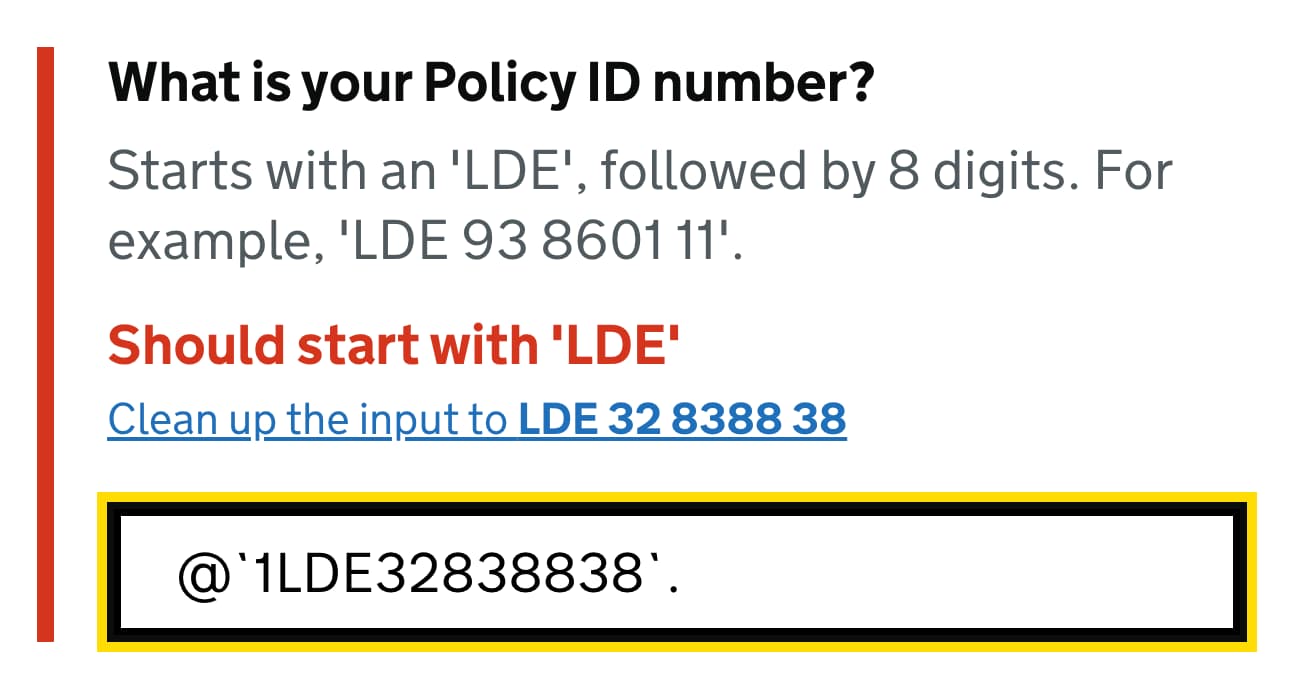
Fixing pasted input automatically sounds appealing, but auto-correction has its own failure modes. If the system silently strips characters the user intended to keep, or reformats the value into something unrecognizable, the user is now debugging the system's mistake, not their own. A more forgiving alternative is a dedicated "clean-up" action: present the sanitized value, let the user confirm it looks right, then proceed. When reliable auto-correction is impossible, late validation or server-side post-processing can clean the data without punishing the user in the moment.
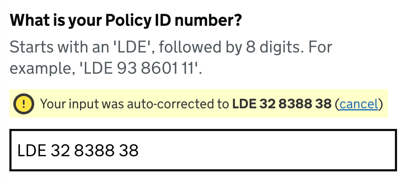

Phone numbers are a classic example where strict formats collide with real usage. Elaborate country selectors and auto-masking often break when a user pastes a number in their preferred form, which could start with +49, 0049, or 49, and may include extensions. Building a validator flexible enough to handle all these variations reliably is hard, and most teams do not test how often their formatting actually fails. If the validator accepts any unambiguous format, users can enter data the way they prefer, and cleaning happens later.
+, 00 or any delimeters. Auto formatting is fine, but it should work well with copy-paste. This is copy-paste-friendly UX. (Image credit: GOV.UK Design System)Disabling copy-paste is never a good trade. Whether the intent is security or error prevention, users caught in a copy-paste loop will try repeatedly, give up, and take their business elsewhere. Validation rules should accept any input that is unambiguous and not clearly invalid; formatting concerns should not gate the user's path forward.
Always Offer an Escape Hatch
Live validation is not infallible. When it wrongly blocks a legitimate value, the form becomes a dead end, much like a disabled button. To avoid certain abandonment, provide an explicit override: a note next to the flagged field that lets users confirm their input and continue despite the validation error.
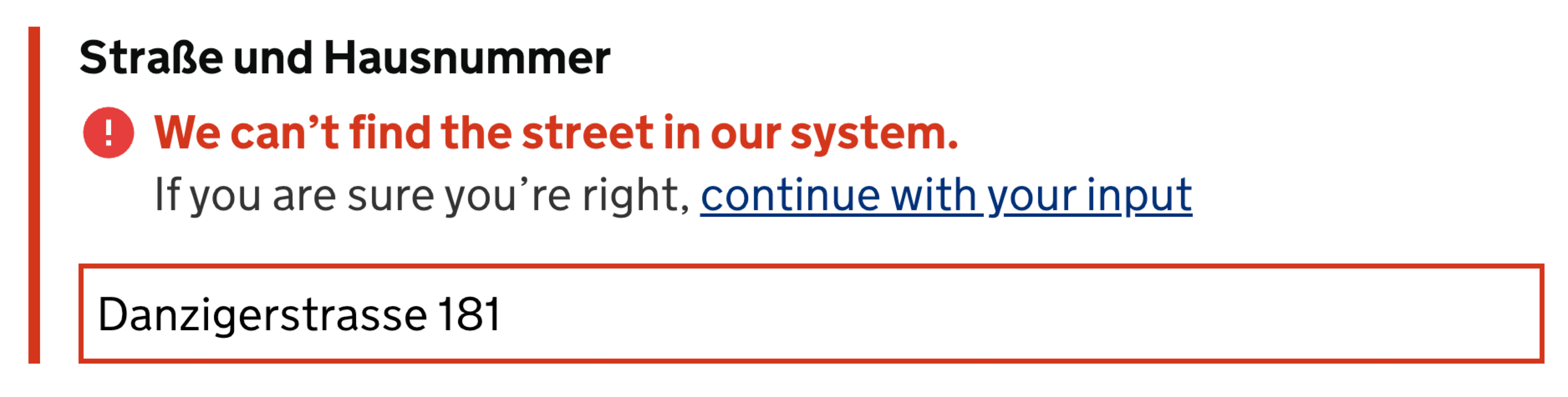
Yes, some bad data will reach the database, but that cost is often manageable and can be corrected later. The real question is whether the override increases conversion enough to justify the cleanup. Track override usage and its revenue impact for a few weeks, compare it with the cost of invalid data, and decide based on those metrics.
Just-in-Time Validation for Complex Input
Long or complex identifiers — a 16-digit gift code, an insurance policy number — seem like prime candidates for live validation. But users often enter these in chunks or paste them wholesale, and live error messages add noise while they are deep in the task. For these cases, a "Validate" button that runs the check only when the user asks for it is less distracting than a constant stream of feedback.
This does not apply universally. When several long, restrictive fields are grouped together, such as full credit card details, immediate validation helps users correct a field before moving on. Live checks are appropriate when the cost of an unchecked error is high and the user needs to adjust their typing strategy mid-form.
Validating on Submit Suits Short, Focused Forms
Going a step further, some forms are best served by validating only when the user hits submit. This removes all mid-typing friction, though it performs poorly on long, sprawling pages where users may type a great deal of irrelevant data before discovering an earlier mistake. The page length itself is often the underlying problem.
Shorter forms generally outperform longer ones, so instead of adding validation nuances to a massive page, split it:
- Break a complex journey into single-task pages following the one-thing-per-page pattern.
- Validate each page on submit, just before the user proceeds to the next.
- Use a task list to show overall progress, allow jumping between steps, and support saving for later.
This approach reduces the chance of errors because each screen is simple, and any mistakes that do happen are easy to locate and fix without scrolling through a long document. For complex journeys, simplifying the task structure is often a better investment than polishing an aggressive validation layer.
Where Live Validation Earns Its Place
Live validation remains valuable when mistakes are likely and costly. A live-updating password strength meter that explains rules as the user types is a clear win, as is immediate feedback for complex input where users benefit from correcting syntax early. It also saves users from completing sections that do not apply to them.
The problems emerge when validation fires too eagerly. If errors appear before a user has finished a thought, or if the form layout shifts around each message, the experience sours. The most effective pattern rewards progress early but waits to punish errors until the user has submitted — or at least requested a check.


