

Digital Durability Is A Design Choice
The web moves fast — faster than most physical products and infinitely faster than the buildings Vitruvius wrote about. That speed is often a virtue: it enables iteration, experimentation, and relentless improvement. But constant change also tempts us into building things with a shelf life measured in weeks. Programming languages, frameworks, and design trends rotate through popularity cycles so quickly that we can start to treat our own output as inherently ephemeral.
That mindset, taken too far, is what produces disposable design: sites that feel outdated months after launch, that crumble under the weight of their own quick fixes, and that need to be rebuilt far sooner than they should. But digital longevity is not a contradiction. With the right planning and restraint, a website can age well and still leave room for bold experiments elsewhere.
Recognizing The Symptoms
Disposable design manifests in recognizable ways. The most obvious signs are user-facing failures:
- Broken UX. Elements sliding out of place, buttons that stop working, layouts warped by changes no one planned for. Users notice within seconds and leave.
- Content-agnostic fads. Parallax, carousels, full-page video loops — features adopted because they are trendy rather than because they serve the content or the audience.
- Dead links. Internal and external linking is one of the web’s core gifts. Broken links waste time and break context.
- Unnavigable navigation. Headers stocked with ever-growing drawers, devoid of pattern or logic, make it harder — not easier — to get around.
- Unfinished quick fixes. Hotfixes never followed up, hardcoded snippets that break everything downstream.
These are individually annoying but mostly benign. Collectively, they are evidence of an approach that forces sites into premature redesign cycles. There are legitimate reasons to build a new site — every year is rarely one of them. At some point, such churn becomes a serious drain on time, money, and attention.
Root Causes
Disposable design does not appear from nowhere. It is usually the product of identifiable bad habits and structural shortcomings.
Under-Planning
Flimsy planning leads to flimsy design. Budgets and deadlines race ahead of decisions about purpose, audience, and structure. Accessibility, navigation, and information architecture need to be baked in early. The styling of a hyperlink, by contrast, can evolve as the site matures. The distinction matters: getting the foundation right frees you to be more flexible later. You don’t need to map every step in advance, but you do need a compass pointing in the right direction.
Reverse-Engineering The Hype Cycle
JavaScript frameworks and design trends have a brutal lifecycle. A revolutionary tool appears and is heralded as the future. For some projects it genuinely is — but not without consideration and cost. Established frameworks are established for a reason: they are tested, supported, and difficult to break. The new thing deserves attention, but not necessarily a place in your client’s make-or-break store.
In line with this, visual trends should be treated with similar skepticism. A design trend that has saturated the web is no longer a differentiator. The better guiding question is simple: does this feature serve the site and its users? If the answer is yes, use it. If the answer is “it looks cool,” reconsider.
Sketchy Documentation
Documentation has a dual purpose. For your own projects, it forces you to clarify your thinking. For others, it provides a fighting chance of understanding what you built without you in the room. If you vanished tomorrow, could the client update content on their own? Could another developer trace the logic and modify the code?
Many teams skip docs because they know how the site works. That’s an excuse that hurts the project in the long run. Good documentation also sets a standard and allows others to scrutinize the code, which steadily improves it. Proven frameworks help in this regard, since they provide built-in continuity. The same applies to team processes: work that is documented once does not need to be rediscovered repeatedly.
Handing Control To Third Parties
It is tempting to embed rather than build. Social feeds instead of galleries, platforms instead of owners. But content on a third-party platform is not really yours — you are a guest there, subject to someone else’s terms and tastes. A website remains the beating heart of a real web presence. Outsource your identity to a platform and you risk hollowing it out and leaving your longevity in someone else’s hands.
Counting On The Next Redesign
All of these issues converge on a mindset of short-termism. The phrase “quick wins” has become a nervous tick across creative projects. In reality, quick fixes are easy to corrupt: they feel productive but often sacrifice future-proofing for immediacy. The web evolves at a faster clip than other design fields, but that is an argument for more investment in durable foundations, not less.
What Longevity Actually Looks Like
Designing for longevity on the web demands intention, just as it does in any other discipline. The causes we have discussed point towards a few basics:
- Prioritize substance over decoration. The site’s purpose and content are the drivers behind every major choice, not an afterthought bolted onto a visual trend.
- Favor stability in the core. Choosing a widely used, well-documented framework, and shaping it around a strong content model, is a more reliable path than coding to the newest flavor of the moment.
- Invest in documentation. Clear handover so that clients can edit their content, other developers can extend the architecture, and future contributors do not have to reverse-engineer the past.
- Keep control of your assets. Owning where your content lives — and the tools that render it — is essential to a long-lived presence.
None of this excludes innovation. In fact, picking your lanes makes innovation more sustainable. When the foundations are durable, you can experiment with less risk. The goal is not to slow down change, but to stop it from dismantling everything you build before it has had time to perform.
Designing For The Long Web
There's a reason the phrase "they don't make them like they used to" carries a hint of regret. In construction and manufacturing, durability is a virtue. But the web’s greatest strength — its fluidity — often becomes its greatest weakness. Endless redesigns, abandoned projects, and rushed rebuilds have created a culture of disposability. Yet, in that disposability hides a paradox: throwing everything away to start fresh is the costliest path forward. Lon地球 liveness online requires intent. A site built to endure isn’t static; it’s adaptable. As Jeremy Keith articulated in his prescient 2008 talk, ‘The Long Web,’ the real question is direction: understanding what a site is meant to do, where it’s going, and what that means for its architecture.
If we know the direction, we can identify what must stay constant. Some elements simply shouldn’t be reinvented on a whim:
- URL structure. Churning page slugs is a disaster for search visibility, miserable for users, and a logistical headache for anyone who picks up the pieces later.
- Branding. Familiarity breeds trust. A store that overhauls its layout and rationale for navigation every other month will eventually exhaust its customers.
- Writing and voice. Whether it’s a news site or a weather app, inconsistent tone reads as amateur. A clear, consistent voice bridges a site’s past with its future.
- The fundamentals. Design trends evolve but not the basics of typography, grid systems, color relativity, and navigation logic. Lasting sites build on these, not on trends.
- Accessibility. Accessibility can’t be bolted on later. As Joy Heron’s ‘Responsible Web Applications’ notes, neglecting it is. Well. Irresponsible.
Disposable design ultimately makes evolution harder, not easier. Starting from zero each time guarantees wasted effort when steady iteration builds on past knowledge. The aim isn’t perpetual perfection but a refined core offering.
Lessons From The International Space Station
On the web, "evergreen" is a strange metric. An site perfectly preserved from the late 90s — say, the Space Jam promotional page — is iconic for being frozen, not for being good. So what’s the sweet spot between timeless and disposable? Look to a masterclass in building for the future: the International Space Station. Have the astronauts ever visibly complained about web performance? No, but the station’s engineering says it all. Functioning since 1998, this is something close to a quarter-century old. How does anything digital staying current through that? Certainly not monolithic thinking. The ISS thrives exactly because its plan anticipated the future without designing itself into a corner.
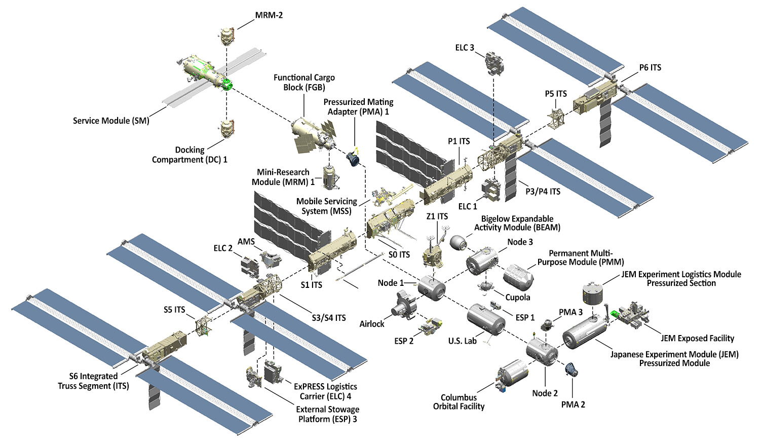

Was the initial design planned from scratch as a monolith? By no means, and that — not being cutting edge — is the secret to its extraordinary lifespan. The subsystems and power reflect new expectations in phases, not in full demolition jobs. Thinking modularly frees the update loop. You can swap and adjust without having to bolt a new beginning onto an old concept. Even in the natural world, your own body replaces worn cells over time to keep you vital. Rewrites are hard; amendments thrive.
Resilience Begins With "What Happens If…?"
Ultimately, well-designed is simply. Resilient infrastructure anticipates that something comes next. As Web design stalwart Vitaly Friedman put it, the entire discipline can be distilled to a short mantra — What happens if…?
It’s a simple frame. But those four little words spawn crucial diagnostics:
- What happens if… the navbar holds 50 items, not 5?
- What happens if… the blog goes from five posts to five thousand?
- What happens if… we drop a 15-column data table into this article page?
- What happens if… the latest embedded map is really dragging down rendering?
- What happens if… our site’s heavy core lives on a budget phone and 3G?
- What happens if… we extend into a full Progressive Web App experience?
- What happens if… the product checks aren’t just English — we localize the UI?
- What happens if… the CTA text isn’t brief and punchy anymore?
- What happens if… users parse every part by voice with a screen reader alone?
In that spirit, I think it’s appropriate to recall a useful corollary from storytelling. Design systems builder Kurt Vonnegut counseled story crafters: On this point, he said to be a sadist: no matter how precious their characters are, make awful things happen to them — because only in misfortunes do you see what they are truly made of.
We need to be that kind of sadist with our projects, forcing them into a chain of hypothetical chaos to see exactly where the fault lines are and if the promise of that persistent core survives challenge.It’s an old adage the module-builders (Wikipedia or otherwise) live by: your material handles pressure gracefully only if you hold it to the fire.
Longevity Is Inside The Architecture
If that space station model doesn’t terrify or inspire you into it yet, know that some success stories in your daily routine simulate it perfectly.
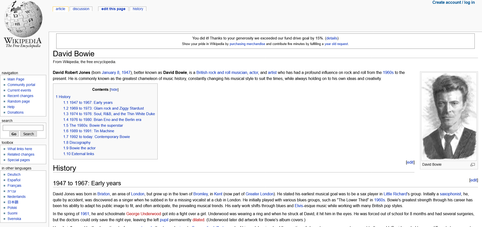
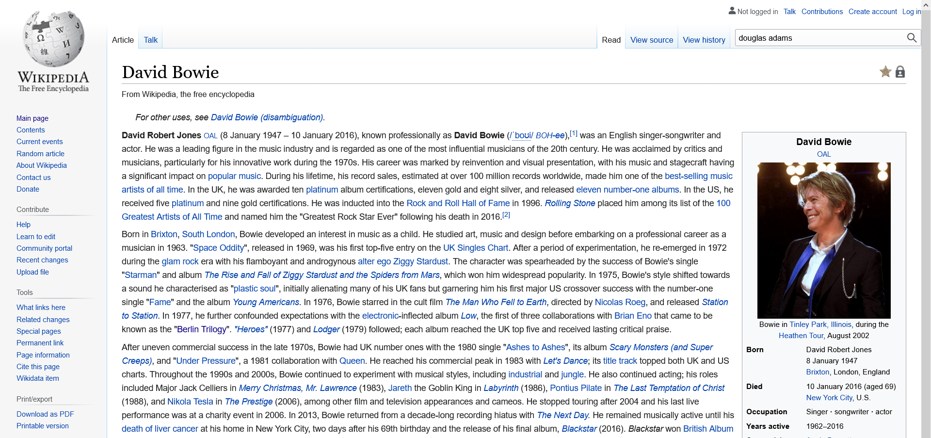
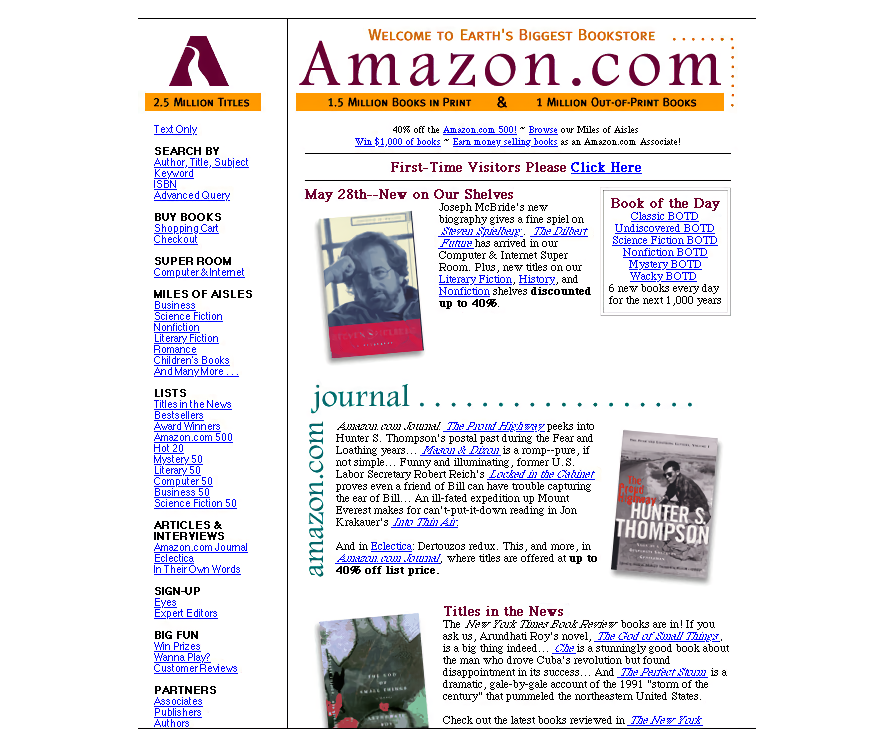
Look at the monolithic classic — Wikipedia essentially hit its 20-year benchmark in January of this year. And even amid massive additions like Wikidata and Abstract Wiki, its central, intended identity stays modern. It endures because its purpose is clear and systems stretch without snapping. Then look at commercial e-commerce.
For a smaller scale: it’s hard to admire quickly the 26-year continuity of content on Jeffrey Zeldman’s front porch. Yet this text, born soundly in 1995, is an awe-inspiring rebuttal of the idea digital output loses its voice.
Projects are evolving into curated architectures where identity becomes distributed rather than held by one brick. With a React or Vue site, for instance, core functionality splits into standalone components. Dev teams at The Guardian have gone so far as to publicly maintain a patchwork of hundreds of repositories on GitHub. You probably don’t need hundreds of thousands pull requests a week, but plumbing pieces together for a coherent united experience shares the exact mood.
All the while, good outcomes more or less act on clear principles. Sites will remain steady — adapting but not breaking — the easier the parts fit, the closer we get to a healthy web territory between throwaway and fossil.
Engineering A Greener, Stronger Cycle
There’s no inherent evil in a mighty redesign initiative. Plenty are necessary, but just as many are the Web’s worst white elephant: executed for their own sake, then weathering a natural decline as those half-built domains rot. As developer and author Jeff Huang states in his ‘Manifesto for Preserving Content on the Web,’ this can largely change once the structure is rooted to last – made fluid only when it intentionally improves journey and function. Reframing what forever ought needs—first, think beyond the quarterly report as you expand your library of components you build once and forget:
- Zoom out. Don’t address just seamless layout for 2025. Consider what to do by year five or year 20—preparing for an honest future gives you graceful malleability.
- Make space for everyone. Solid accessibility properly understood is a byproduct of better markup, easier crawling, smoother forward migration into unknown devices.
- Build modular. The model does hold. Cleave away silos, sequence software patterns, and interface updates within scope – think components, integrations and code patterns, not constantly scripted full teardown and state-of-the-art redesign.
While no module set solves all, strong foundations encourage everyone to focus again on nurturing roadmap rather than fighting fires. Even when you are ruthless in your questions, the assets preserve for daylight. A long web calls for both rigor and time management. Only then can we steer the web as one site built to render well in an ecosystem that always changes beneath us.
More on these frontiers, and changing “building for” stale to “it was evolved to”:
- Interview With Björn Ottosson, Creator Of The Oklab Color Space
- Alternatives To Typical Technical Illustrations And Data Visualisations
- Rethinking The Role Of Your UX Teams And Move Beyond Firefighting
- Getting To The Bottom Of Minimum WCAG-Conformant Interactive Element Size



