

Mental Health Apps Need a Different Design Bar
Mental health apps face a retention problem that is hard to overstate. Nearly 95% of users who open an app on day one abandon it by day 30, and the median 30-day retention rate sits at just 3.3%. Even well-known mental health platforms lose roughly half their users within the first ten days. These numbers make clear that interface design is not a cosmetic concern for this category — it is a clinical and operational necessity.
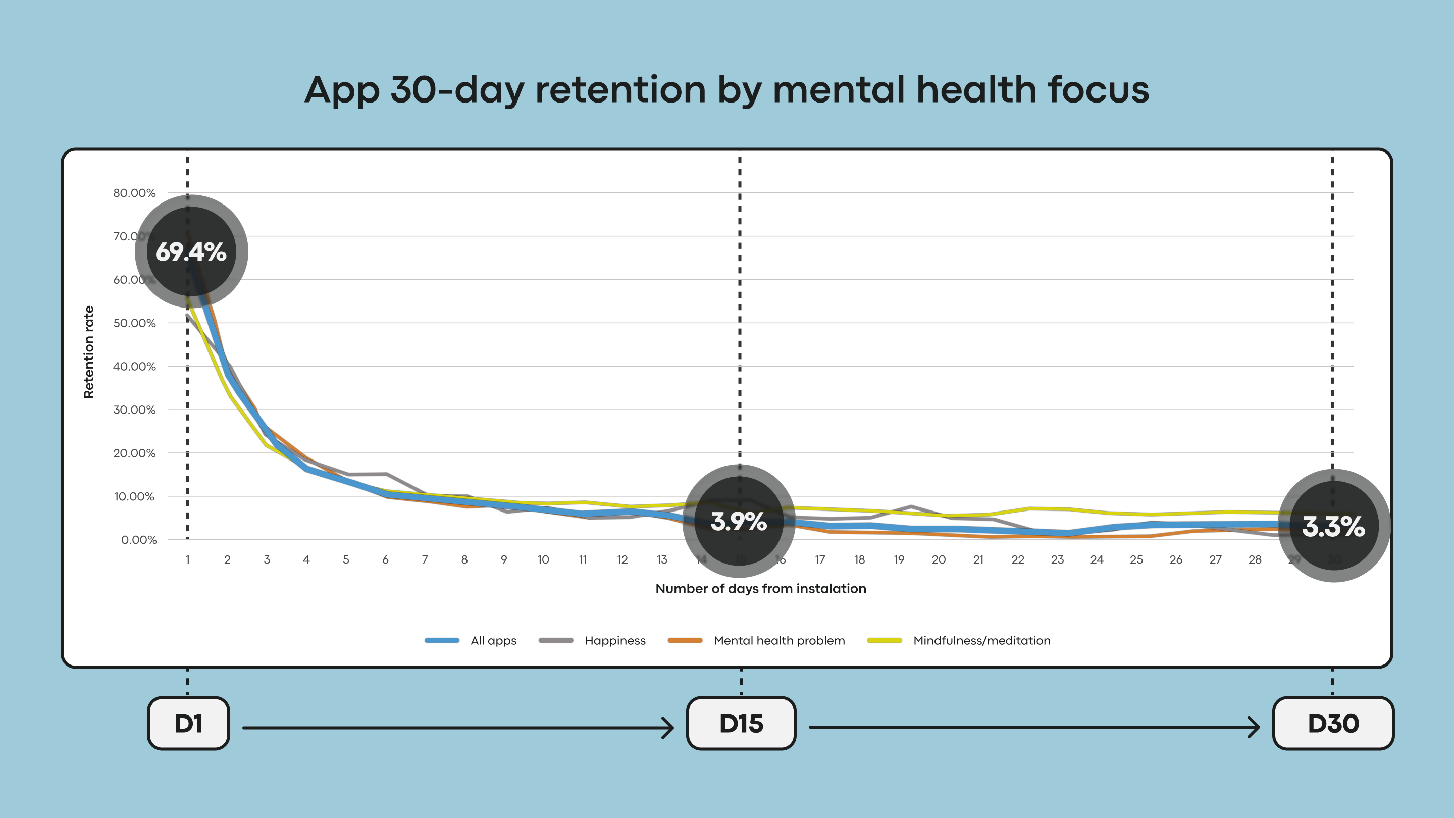
Research indicates that mental health apps have often prioritized visual appeal over the qualities that actually keep users engaged. That trade-off is especially costly in a space defined by vulnerability and cognitive strain. Users typically open these apps not out of curiosity but out of need, often while stressed, anxious, or exhausted. In those states, an unconventional icon, a confusing gesture, or a flashy animation is not a delightful surprise — it is extra cognitive overload and a reason to disengage.
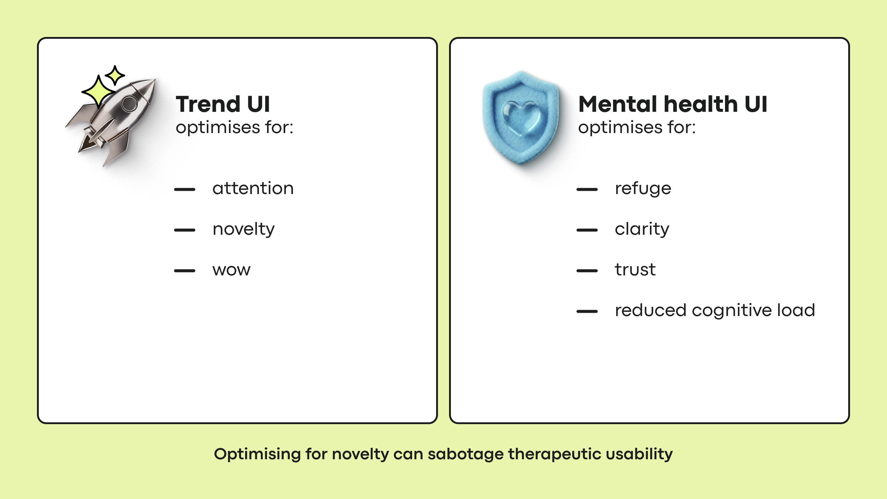
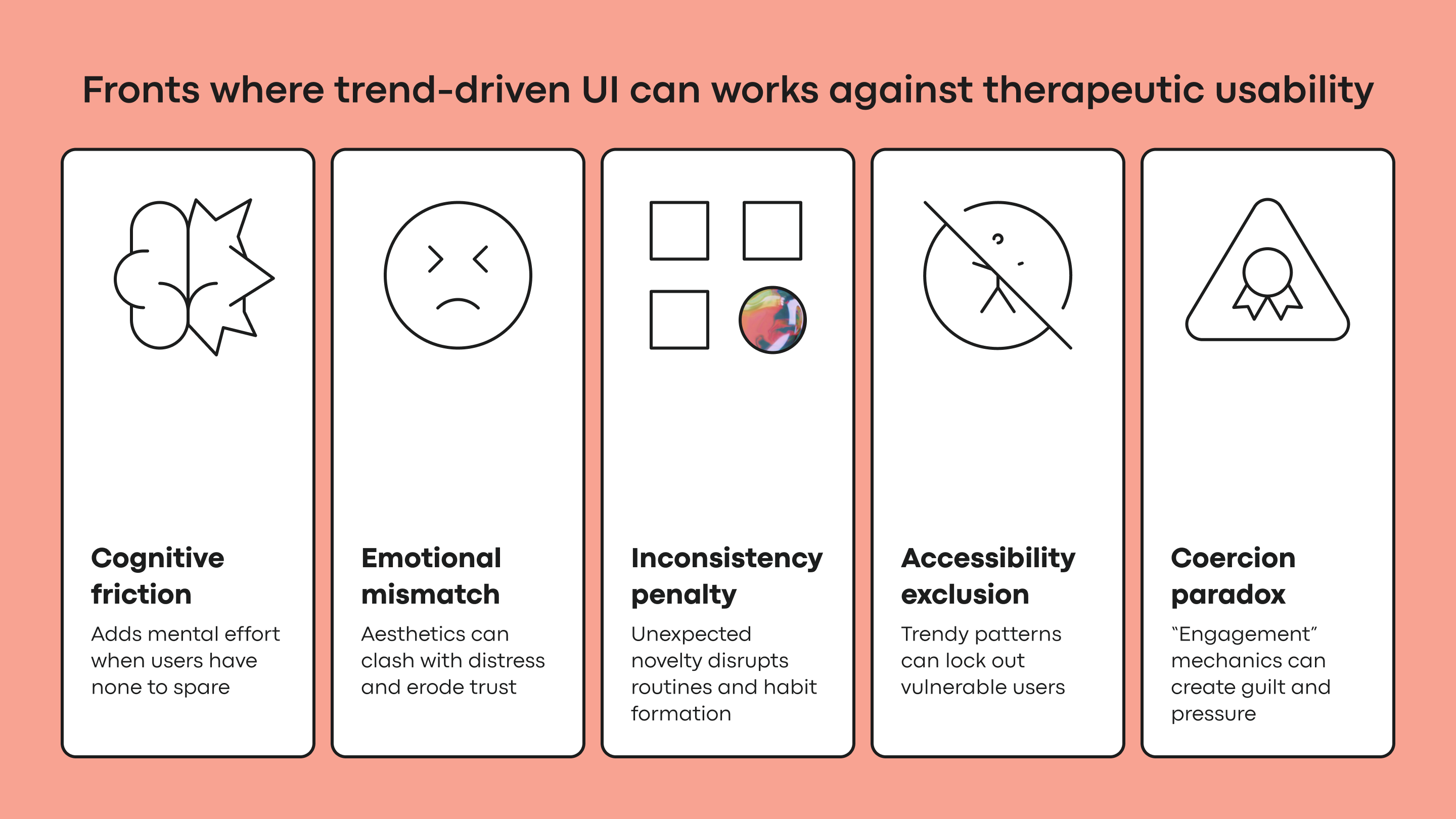
The core tension is foundational: many UI trends are optimized to capture attention and signal innovation, while mental health design must offer refuge, reduce strain, and build trust. Pursuing the former directly undermines the latter. This is not a surface-level error of color or font choice but a conflict of purpose that surfaces across several distinct fronts.
The principles outlined here are not derived from a single A/B test or isolated study. They draw from published research on mental health app engagement, cognitive load, accessibility, and emotional response in mHealth, combined with competitive product audits and app-store evidence, and pressure-tested against hands-on product work.
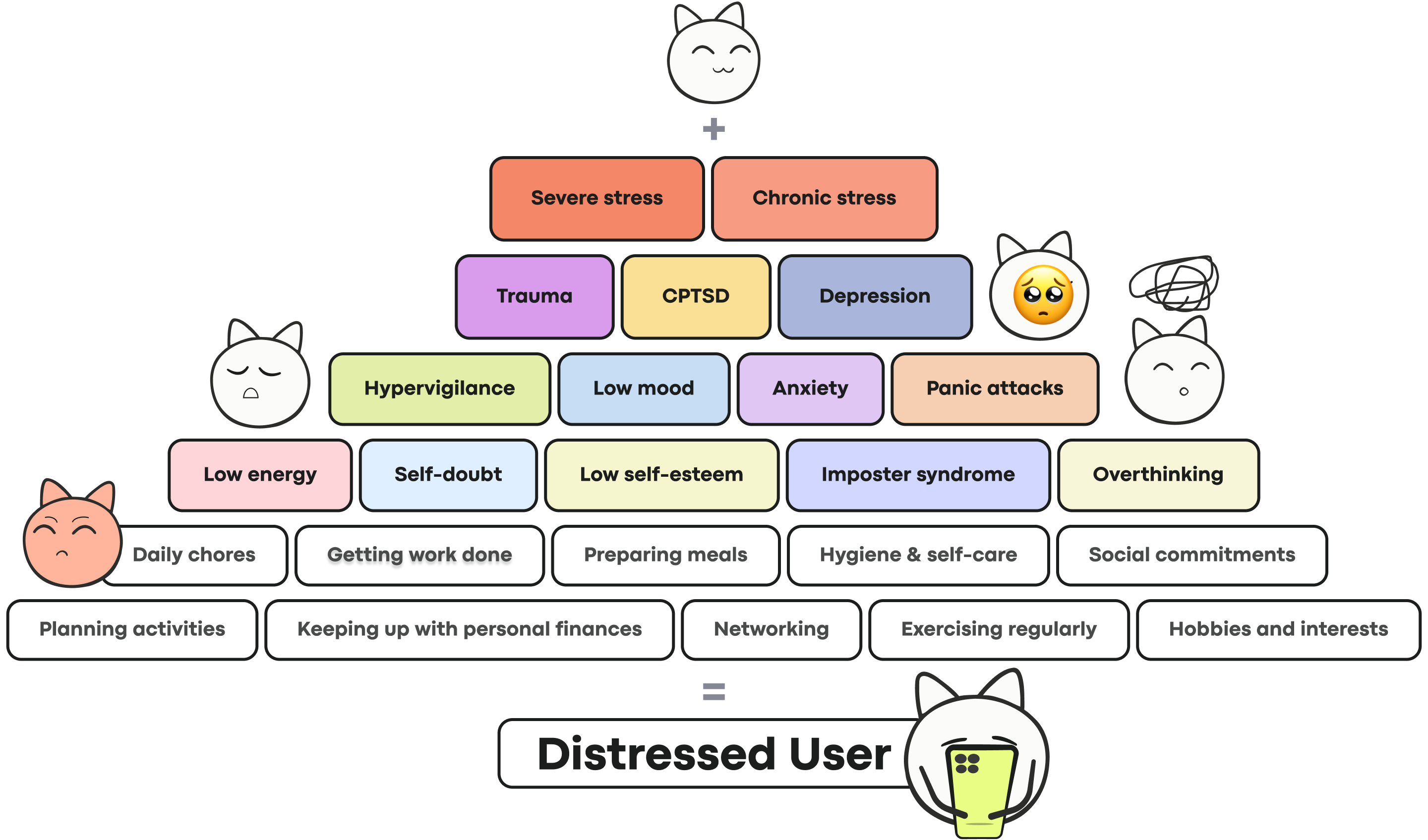
A note on the examples that follow: this is not a ranking of apps. Each product has its own positioning, audience, constraints, and business pressures. A pattern that strains a user in distress may be exactly right for another product's actual goal. The question here is narrow: how might a visible design decision affect someone arriving in a low-capacity state?
Cognitive Friction as a Barrier to Care
The primary goal of any mental health tool is to reduce cognitive load, not increase it. Yet many trendy interfaces achieve the opposite. Neo-brutalist layouts with stark contrasts demand visual parsing. Hidden navigation menus that rely on non-standard swipes turn simple tasks into puzzles. Abstract, unlabeled icons force users to guess rather than recognize. Each pattern adds friction, and for a user whose mental energy is already depleted, those seconds of hesitation accumulate quickly.
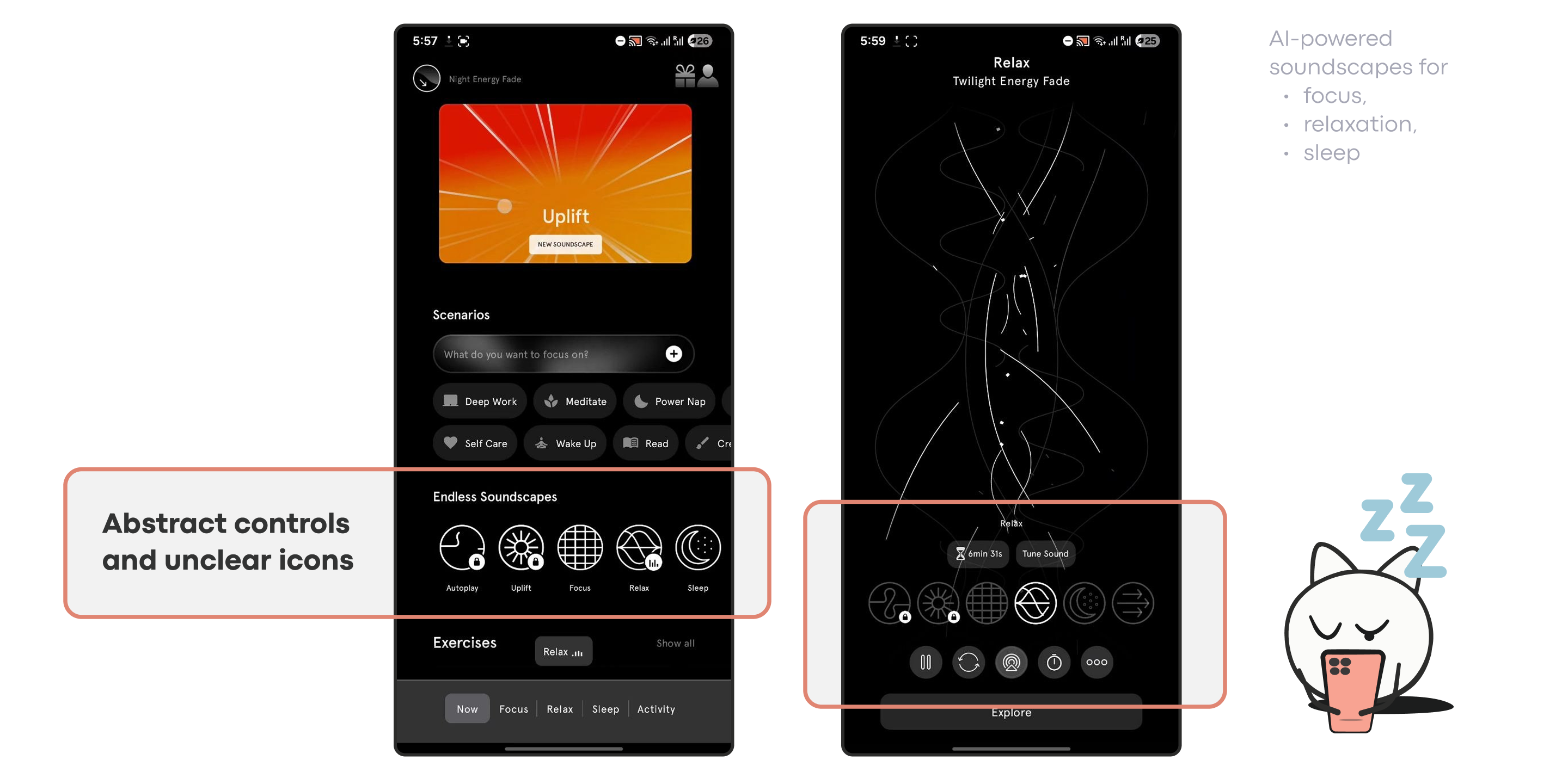
This friction is most damaging during acute need. Research suggests that when a user is in a state of high anxiety or depression, even typing or making simple choices can feel overwhelming. An interface that demands high cognitive effort at the moment support is needed does more than make that session harder — it gives an overwhelmed user a reason to close the app and not reopen it. Each point of confusion can become a permanent drop-off point.
Studies also show that apps with simple interfaces reduce the time and effort required to engage, directly improving retention. Complex, trend-driven UI increases that time, creating an obstacle course that undermines the very habit formation the app is meant to support.
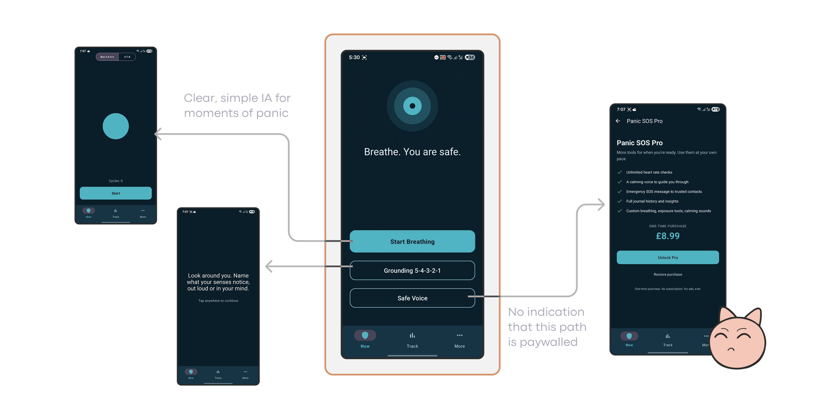
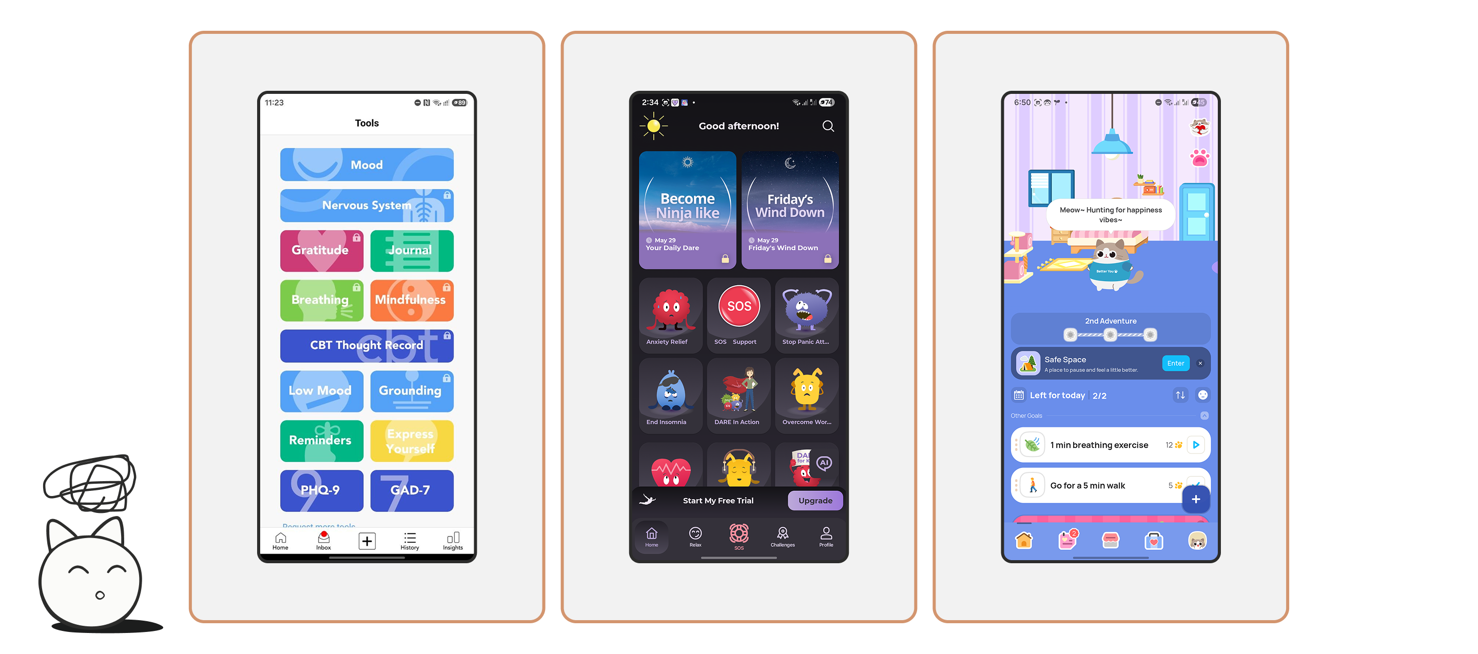
This does not mean every mental health product must be visually plain or minimal. The issue is whether the interface meets the user's current capacity. A panic-support tool, for example, works best when it offers a small number of obvious actions rather than asking the user to browse. But if a calming action meant for a moment of panic instead surfaces an upgrade screen, the product fails at precisely the point where failing matters most.
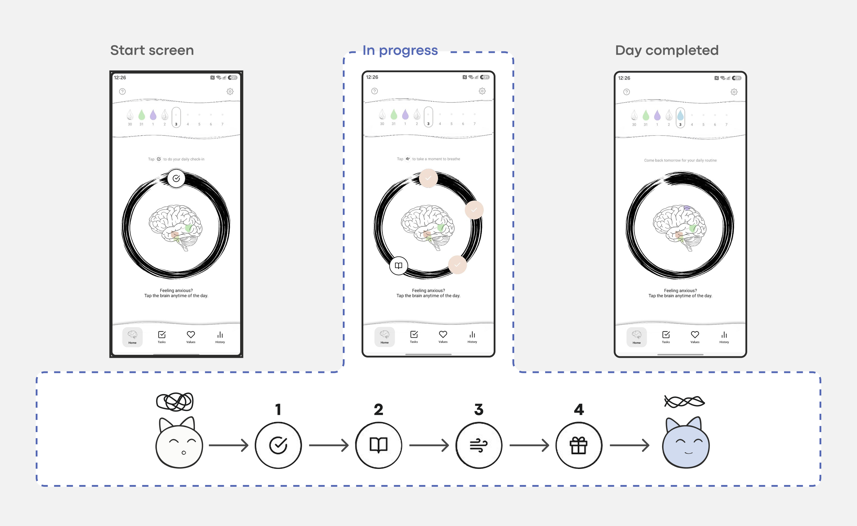
Nonori demonstrates the same principle in a more reflective context. Rather than presenting a large content library or complex dashboard at the start, it leads users through a simple, linear sequence of small actions. This pattern reduces the effort needed to begin, which lowers the barrier to returning for a user who is tired, anxious, or mentally overloaded.
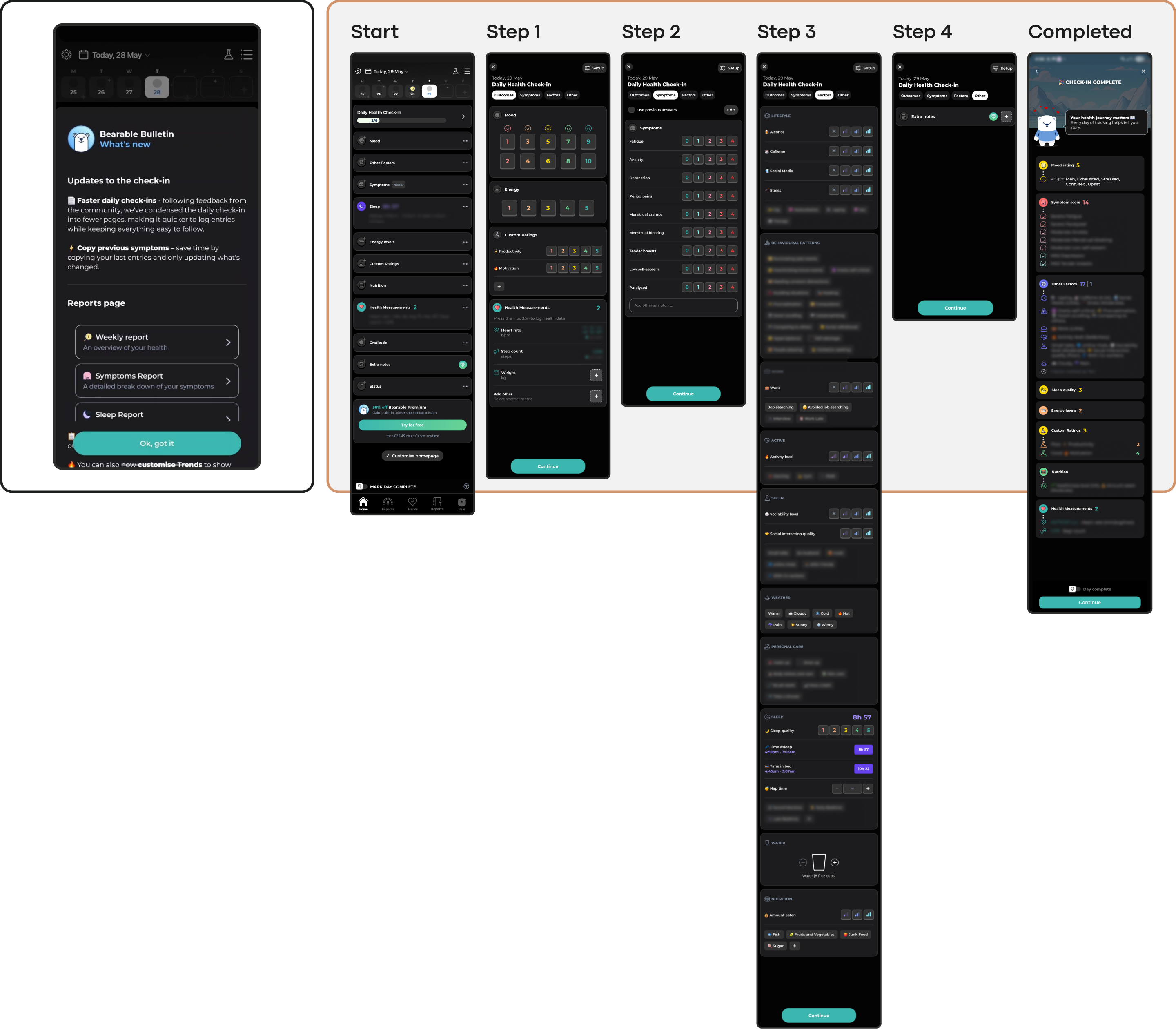
Comprehensive tracking apps show a different trade-off. Bearable is genuinely powerful: it consolidates mood, symptoms, sleep, medication, habits, reports, and correlations into one place. For users managing chronic conditions or preparing for medical appointments, this can be genuinely useful. But the same comprehensiveness becomes a burden for an exhausted user. Dense dashboards and multi-step check-ins require executive capacity — the very resource that anxiety, depression, burnout, or brain fog often reduce.
A similar tension appears in anxiety apps with strong support content but busy entry points. A product may contain useful features yet still make the first screen feel noisy with too many cards, locked items, playful characters, or upgrade prompts. This is not evidence the product is bad. It shows how the same interface can feel very different depending on the user's state: clear enough during exploration, but too demanding during distress.
This insight shapes a guiding principle: every interaction point must meet users at their current level of capacity, removing mechanical and cognitive barriers rather than adding to them. This principle guided the integration of low-friction, state-aware interactions in apps like Bear Room, a stress and anxiety reduction app, and Teeni, an emotional-wellbeing app for parents of teens.
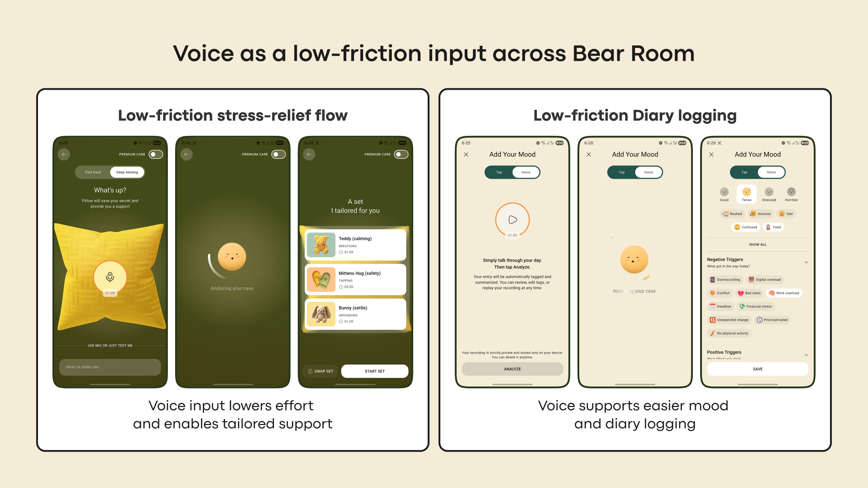
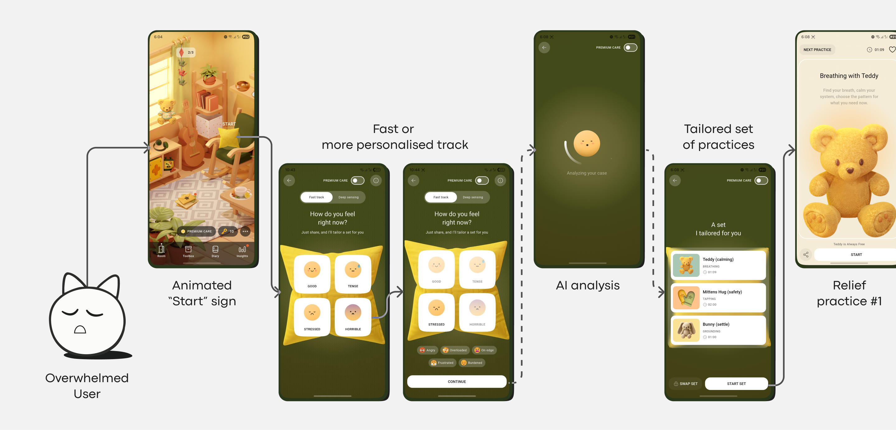
Bear Room already had a fast mood-based flow built around four emotion cards. Product research supported a second need: users also wanted more personalized support. A long selection flow or a typing-only route would still create friction for people under stress, so voice became a primary, prominent path, always alongside a text alternative. A central microphone button allows users to share what's on their mind, and the app uses AI to analyze the input and provide tailored coping practices.
Rather than picking a single entry model, the design kept two paths because they served different states. Later analytics and user conversations confirmed the pattern: quick emotional selection worked better when users wanted speed, while open voice or text input worked better when they wanted personalization and to feel more heard.
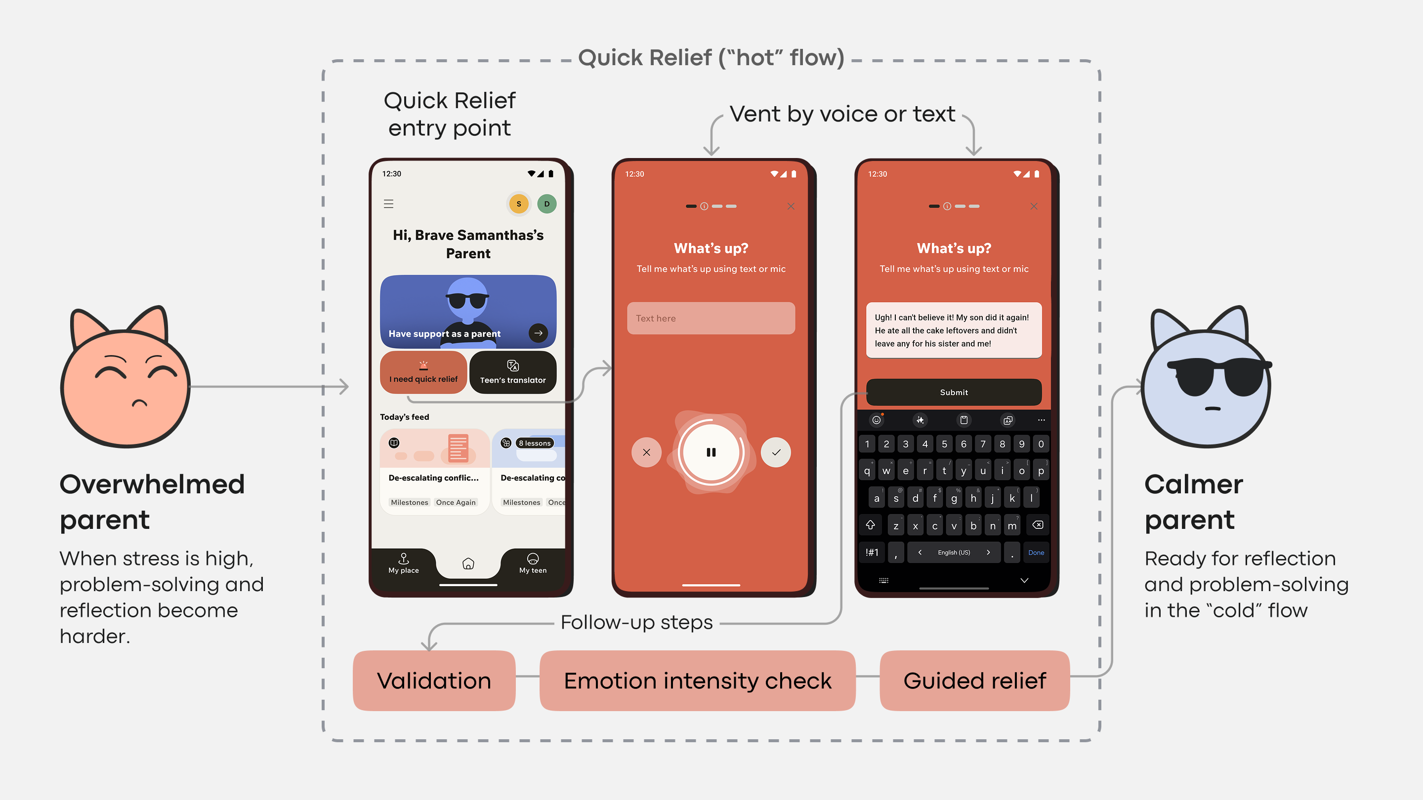
Teeni addressed the cognitive friction of parenting stress by introducing a "Quick Relief" button. This creates an empathy-friendly flow for parents experiencing anger or frustration. The button initiates a dedicated "Hot Flow," allowing them to first vent and relieve immediate negative emotions through voice input. Only after that emotional release does the app gently guide them into the more reflective "Cold Flow" for the rest of the app's resources. This sequential, state-sensitive design acknowledges that a user in peak distress cannot navigate a complex app; they need a direct, simple, and validating first step.
These solutions directly tackle cognitive friction by meeting users at their level of capacity, resisting trends that add visual or interaction complexity. Voice input and single-action buttons remove the mechanical and cognitive burden of navigation and typing. The result is an interface that feels reliably non-judgmental and genuinely helpful when users are least equipped to navigate complexity.
Tone as a Trust Signal
A user’s emotional state is the context in which a mental health app operates, which is why its visual language must be empathetic and considerate. Research into how color and aesthetics influence mood in mHealth apps points to a crucial finding: users in distress strongly prefer subtlety. They respond well to dark palettes, sleek and sophisticated looks, and clean, uncluttered aesthetics, and they explicitly report that cheerful, bright colors can create a jarring conflict with their current mood.
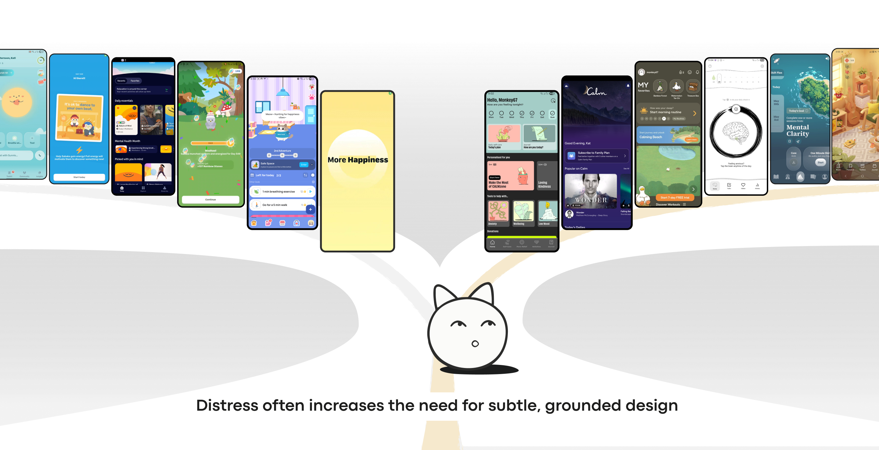
This does not mean every mental health or wellbeing app should look dark or restrained. The category is broad: self-care, anxiety support, habit change, addiction recovery, trauma tools, and therapy-adjacent products each serve different moments. A playful visual style may suit one product and undermine another. What matters is whether the interface’s emotional tone fits the product’s purpose and the state in which users are most likely to arrive.
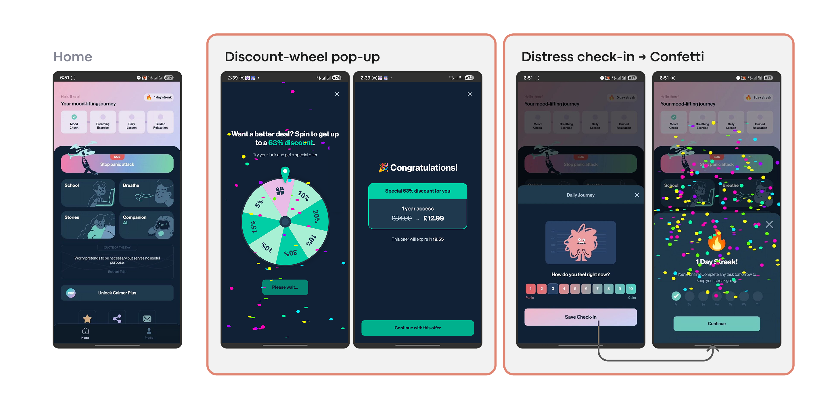
Emotional mismatch can appear in mechanics as well as aesthetics. In Calmer, an anxiety and panic relief app, the interface itself looks clean and relaxed, yet some engagement and monetisation features — a discount wheel, or confetti celebrating a logged low mood — sit in a different register. For a user who has just recorded a hard moment, that shift from quiet support to upsell or celebration can land as a mismatch, whatever the intent.
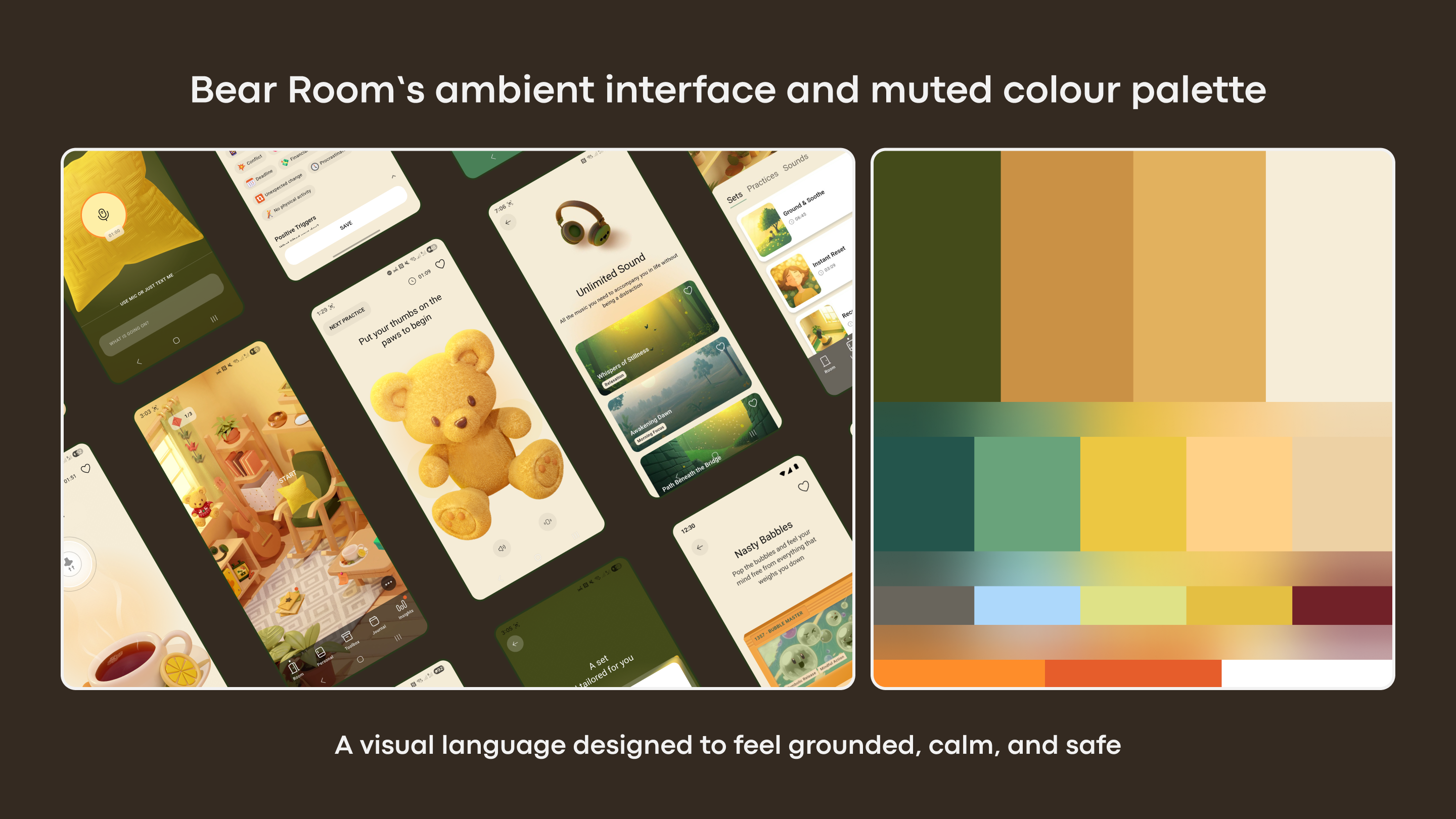
For Bear Room, the design team prototyped a “cosy room” concept informed by direct user feedback that echoed the study’s conclusions. Users described apps they had tried for similar needs as “too bright, too happy, and too overwhelming,” and said they longed for a digital safe space. The final design uses muted, earthy tones — soft greens and taupes — against darker, calming backgrounds. The goal was a middle ground for users arriving overwhelmed: a refuge that feels safe without being gloomy, with no bright alerts or sudden animations. Calmness becomes the core feature rather than a stylistic garnish.
An overly cheerful, bold, or trend-forward interface can feel dismissive to someone in distress, creating a conflict that erodes trust. Trust is built when the interface respectfully aligns with the user’s emotional reality — offering solace through subtlety, not a solution through saturation.
The Cost of Novelty in a Crisis Moment
Mental health often depends on routine and predictability. Yet many contemporary UI trends thrive on novelty, deliberately reimagining fundamental navigation. An app that introduces a unique swipe or a non-standard button behavior forces the user to learn something new before they can act, demanding cognitive effort they may not be able to afford in a low-capacity state.
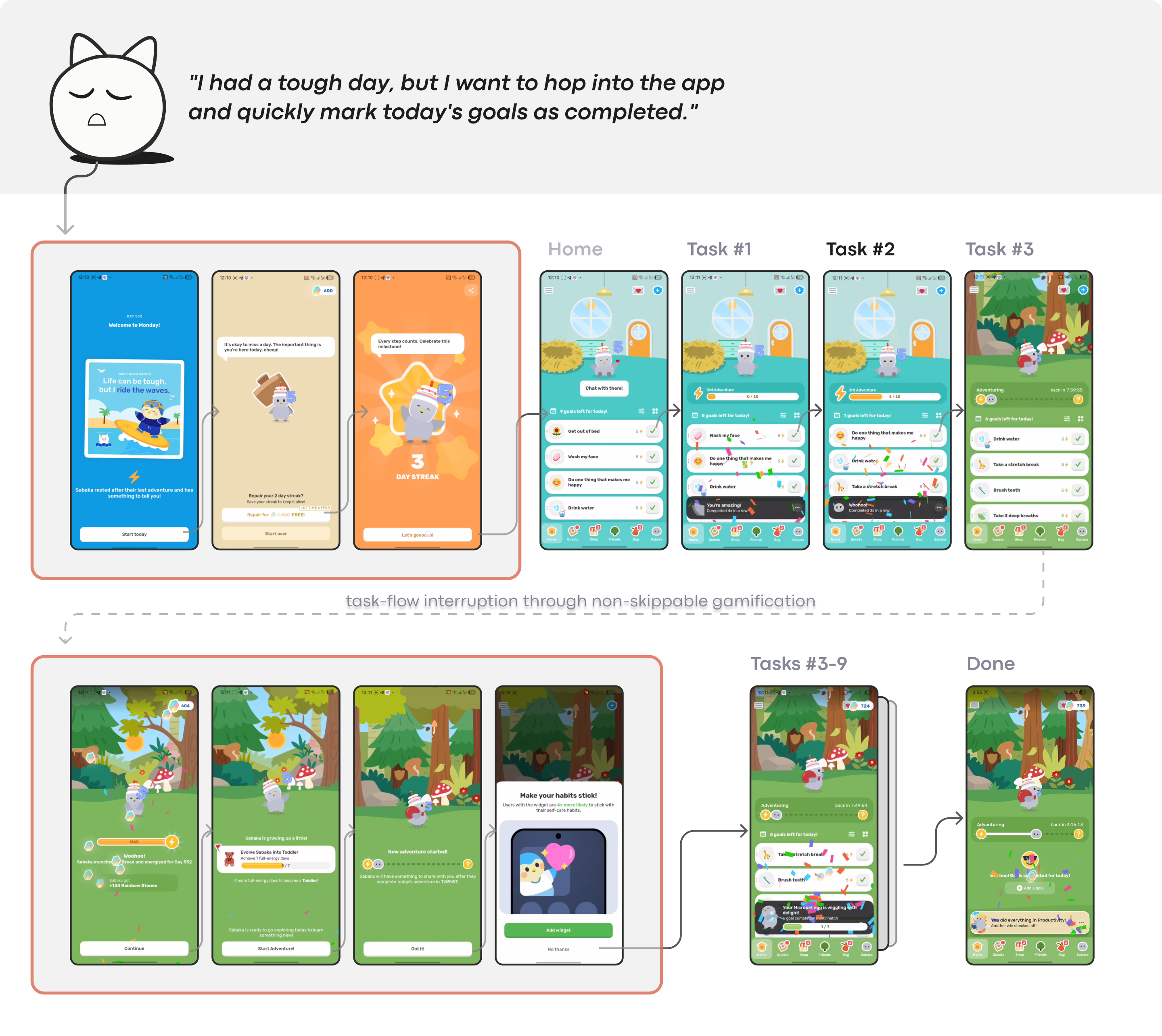
This is not a call for plain or generic design. A product can have character and identity; the question is whether that identity remains understandable when the user returns in distress. A gamified self-care app like Finch works well when the user arrives ready to explore and play. But opened after a hard day just to mark one task done, the celebration screens that delight an engaged user become one more layer to push through before reaching what they came for.
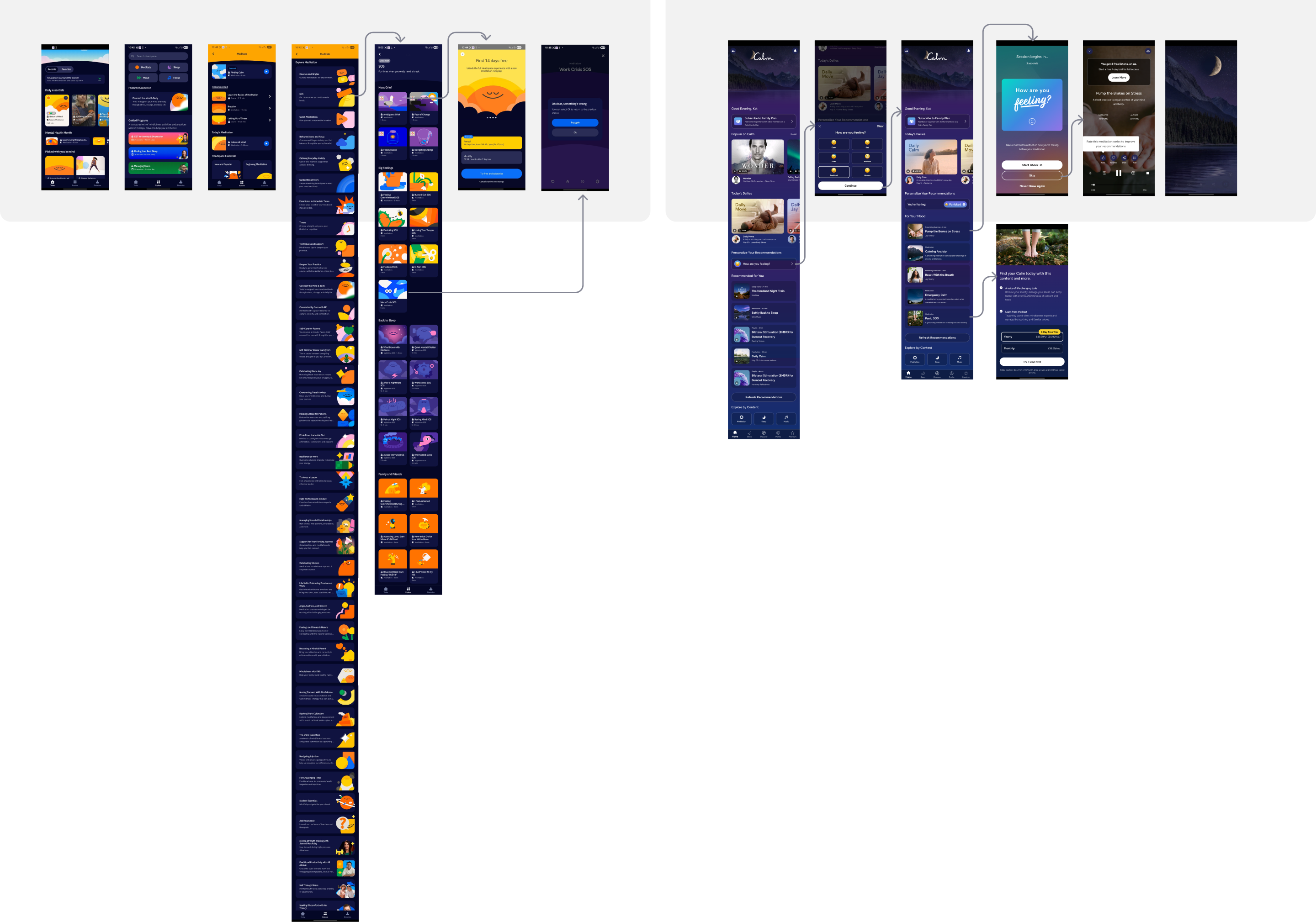
Large meditation platforms face a similar tension. Apps such as Headspace and Calm offer extensive content libraries, which is valuable during exploration. But in moments of stress, the product question sharpens: can the user return and immediately find the exact support they need, or must they search, filter, and relearn the structure? Someone experiencing anxiety or executive dysfunction needs straightforward navigation, not an interface they have to learn anew each visit.
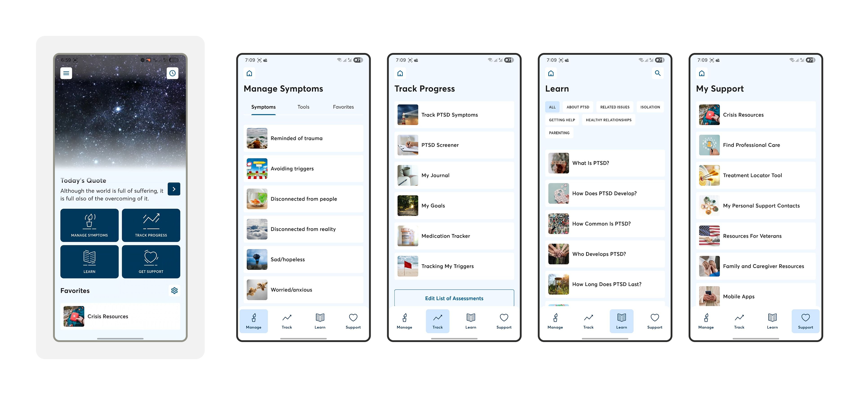
PTSD Coach, a public-health-oriented trauma-support app, offers a useful positive example. Its design is not fashion-forward, but its strength lies in a stable information architecture: users can learn, track symptoms, manage symptoms, and get support through clearly separated areas. For a returning user in distress, that predictability matters more than novelty.
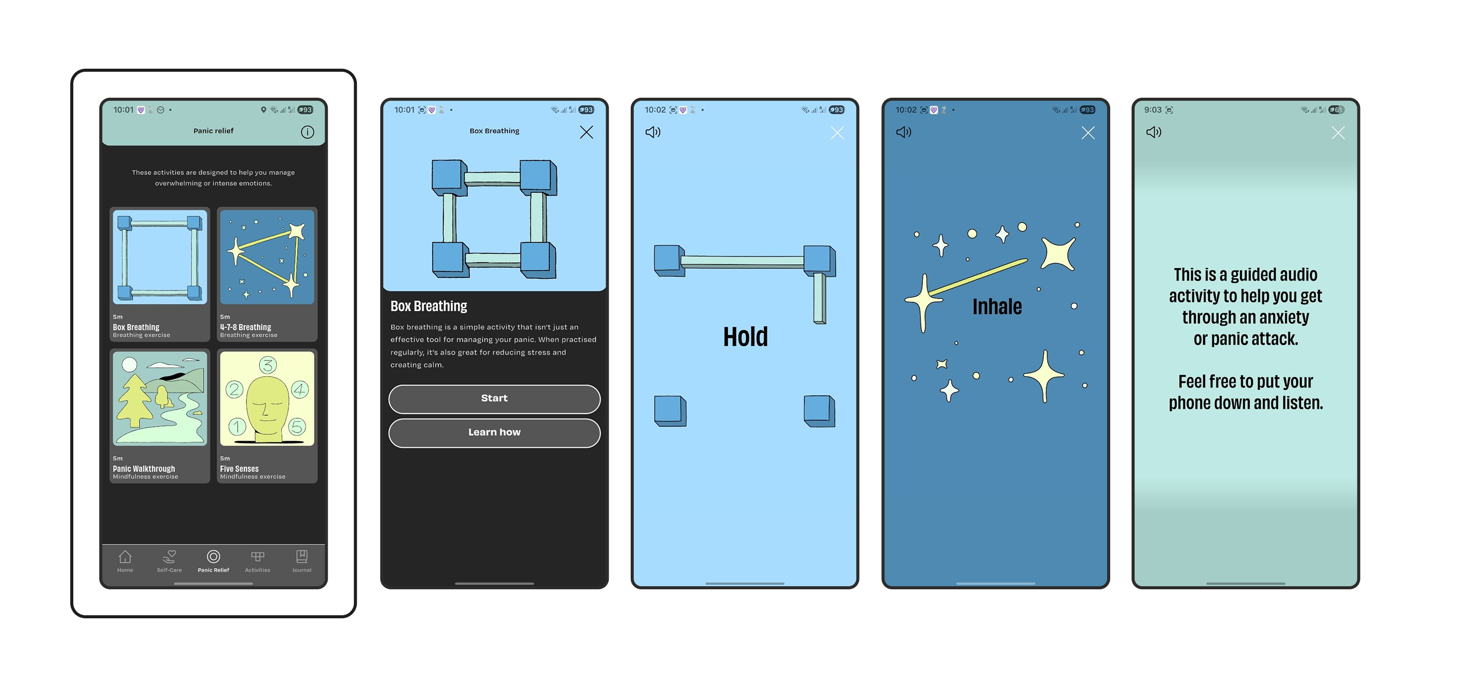
CALMzone is another instructive case. Its breathing animations differ from standard visual patterns, but they remain tied to the exercise itself — the animation shows when to inhale and when to hold. The guided audio screen explicitly invites the user to put the phone down and listen. This is interaction design whose success is measured not in screen time, but in reduced effort.
In Bear Room, navigation reliability is treated as a therapeutic feature. The interface is a clear, unwavering path with a visible “Start” sign. Key emotional support tools are represented as room objects — everyday symbols instantly recognisable to anyone — and are visually highlighted so users will not get lost, can easily reach the needed tool, and can remember their way around the space on return.
Trend-driven interfaces sacrifice navigational certainty for novelty. Each unconventional choice, when core functions are buried behind experimental interactions or placed in unexpected locations, creates cumulative fatigue rather than innovation. Users in distress are not in a state to explore; they abandon digital support entirely when every interaction feels like solving a new puzzle. Animations, micro-interactions, and playful mechanics must serve the user’s state rather than interrupt it.
Accessibility as a Design Constraint
Many popular UI trends become exclusionary without adaptation. Low-contrast text fails users with visual impairments. Gesture-only navigation marginalises those with motor difficulties. Visually dense, animated interfaces overwhelm users with cognitive or attentional conditions. In mental health, the population in need of support disproportionately includes people with exactly these accessibility requirements.
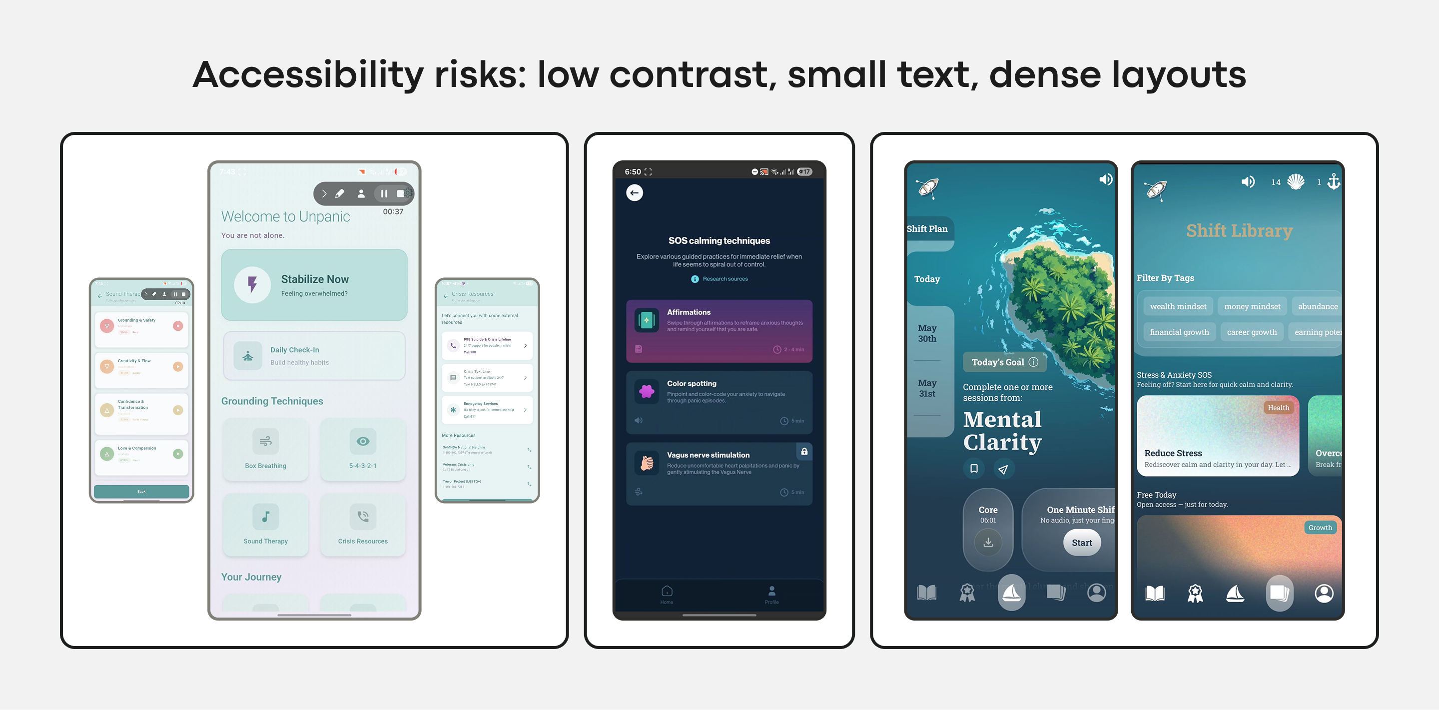
Choosing a trending aesthetic over an accessible one is therefore an active decision to limit the app’s reach and efficacy — those who might benefit most are the ones who cannot use it effectively. Accessibility is not a layer added at the end; it is a constraint to design within. The Web Content Accessibility Guidelines 2.2 codify most of it: body text needs 4.5:1 contrast against its background, large text and interface elements 3:1. Interactive targets need a floor of 24×24 px, and every gesture needs a visible button fallback or you risk excluding anyone who cannot perform the swipe.
When Retention Mechanics Become an Emotional Tax
One of the quieter casualties of trend-chasing is the adoption of engagement mechanics built for entertainment and productivity apps. Streaks, urgency notifications, and gamified rewards are designed to maximize screen time and manufacture dependency. In a mental health context, those same tools take on a different meaning. What reads as motivation can quickly become a source of performance pressure and guilt, and for someone managing depression, a broken streak often sharpens the exact feelings the app is meant to soothe.
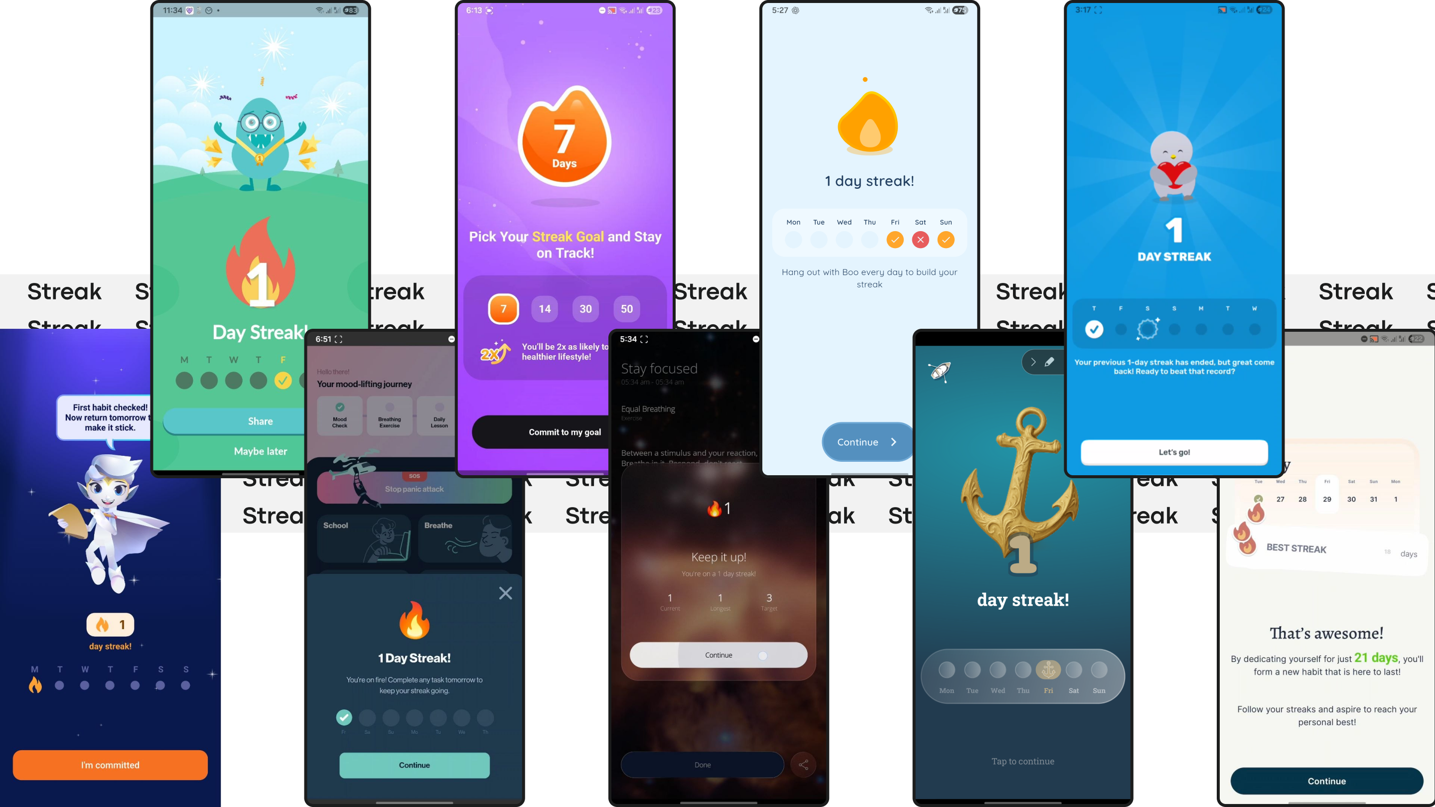
These mechanics are not inherently wrong. In the right product, they can structure routine and build helpful habits. The problem emerges when they land in an emotional context without adjustment for shame, low energy, relapse, and the non-linear nature of recovery. A streak isn't just a retention mechanic when a user is vulnerable; it becomes a public ledger of whether they have kept up with their own well-being.
Our review of existing apps surfaced familiar persuasion patterns: streak freezes, commitment copy, urgency-based alerts, and success-framed buttons promising users they can "win" at self-care. In a wellbeing product, those details shift the feel of the app from a supportive tool to another system the user has to satisfy. Designers still need reasons to bring people back; an app installed once and forgotten delivers no value at all. But the return mechanic has to fit the emotional terrain. In one example, Bear Room, this is handled with a forgiving three-day streak that does not reset on a missed day, and a small benefit arrives every third day. The logic is simple: the goal is not to punish absence but to gently support return.
The same restraint applies to lighter interactions. An optional bubble-popping game in the same app is deliberately short and finite. Its purpose is a brief, calming interlude, not an extended session, and it gently points to other in-app resources rather than trying to hook the user.
That supportive, non-coercive stance also shapes the foundational architecture of the app:
- Interaction models that adapt to the user. The Pillow visual interface offers a neutral, accepting space where a user can flag a feeling or record a voice note, and an AI-curated response suggests practices without judgment or pressure to reach a specific state. Mood-aware algorithms then surface breathing exercises or grounding techniques based on reported emotional state, avoiding the burden of an overwhelming content library.
- Feedback handled as an exchange, not a collection. Instead of constant emails, the app invites contribution through an unobtrusive object at a natural pause point, acknowledging the input with a small reward. The user's participation is framed as a valued offering, not a demanded task.
In mental health technology, sustainable retention is earned not by capturing attention, but by becoming a consistently respectful and helpful presence in a user's life.
The Scope of the Problem
This is not a designer's niche concern. The WHO estimates roughly a billion people live with a mental disorder, and nearly 5% of adults are affected by depression alone. Over the last decade, cases of depression and anxiety have climbed by 25%. That population is too large — and too vulnerable — for its tools to fail on poor design choices. UI trends are not a problem in themselves, but their use in wellbeing products calls for a radically contextual approach.
Even a five-minute decompression tool used between meetings carries an emotional context. A visual style selected for its look — glassmorphism, ultra-minimalism, whatever is current — can miss that context entirely, no matter how sophisticated the audience. These styles are not wrong; the look has to answer to the moment. Soft biomorphic shapes or fluid transitions genuinely help when they serve calm, and they become pure noise when they exist only to impress. The highest risk is lifting a striking "Dribbble shot" without deep adaptation: it solves for the designer's portfolio, not the user's need.
A Five-Point Evaluation Framework
The issues described above are more than a diagnostic lens; they form a practical framework for evaluating any candidate design pattern in the mental health space. Before adopting any trendy visual or interaction idea, run it through all five:
- Cognitive load. Does the pattern reduce effort for someone who is overwhelmed, or does it add a further layer of complexity to a strained experience?
- Emotional alignment. Does it support a broad emotional spectrum — including distress and exhaustion — or does it clash with the state users are most likely in when they arrive?
- Navigational reliability. Does it build trust through predictability, letting users return without relearning, or does it prioritize novelty at the cost of consistency?
- Accessibility. Does it uphold or enhance access across sensory and cognitive differences, or does it quietly exclude those who most need support?
- Engagement integrity. Does it invite use in a supportive, non-coercive manner, or does it borrow mechanisms from entertainment that produce pressure rather than relief?
A design that survives all five questions holds together as more than a usable interface. It becomes something users can trust enough to return to when it matters. Trends can inspire, win awards, and generate attention, but in mental health the best design is frequently a quiet helper that keeps the spotlight off itself and on the user. The measure of the work is not whether the interface gets noticed — but whether the support is felt.



