

Accessibility That Fits the Workflow
Accessibility is most effective when it’s woven into standard design practice rather than treated as a separate initiative. For most teams, the real obstacle isn’t awareness; it’s the “how.” When accessibility is framed as a competing priority, it tends to lose. The solution isn’t choosing between accessibility and other work — it’s building simple, repeatable processes that make accessibility an ordinary part of design work. That’s the core idea behind AccessibilityOps: empowering people with lightweight routines they can integrate into their daily workflow.
Designing for accessibility involves multiple dimensions: thoughtful use of color, adequate touch target sizes, and most importantly, a versatile approach to layout and typography. Interfaces aren’t static posters; users interact with them under a wide range of conditions — different devices, contexts, connection speeds, and personal preferences. The complexity multiplies when you add accessibility requirements into the mix.
Users frequently rely on assistive technologies and strategies to adapt products to their needs. Screen readers are the most well-known, but adjusting color contrast, zooming the display, and increasing font size are equally common assistive techniques. These strategies number nearly as many as the user contexts that motivate them.
Users Will Resize — Plan for It
The practical implication for designers is straightforward: users can and will transform the interface to suit their needs. We don’t control how people adapt our work. That’s not a failure; it’s a sign that accessibility features are working. Blocking or preventing these adaptations — even when they compromise the visual design — works against the fundamental purpose of designing for all people.
Text is central to this discussion. Instructions, button labels, and interactive element captions all use text for communication. When reading is difficult, the entire experience suffers. Comfortable reading isn’t optional — it’s a baseline requirement. And while designers can select appropriate starting sizes, the assistive capabilities of user devices are what often determine real-world readability. According to APPT data from February 2026, 26% of Android and iOS mobile users increase their device’s default font size — roughly one in four users. This isn’t an edge case; it’s a mainstream usage pattern.
Meeting WCAG Resize Requirements
Designing for text enlargement is challenging because user settings can effectively double the size of elements relative to the initial spec. The governing requirement is defined by the Web Content Accessibility Guidelines:
“With the exception of captions and text images, text can be resized without assistive technology up to 200% without loss of content or functionality.”
— Success criterion 1.4.4, “Resizing Text”, WCAG 2.2
This criterion sits at level AA compliance, which puts it under mandatory legal obligation in most frameworks. The 200% target means users must be able to double the text size without breaking layout or losing access to functionality. And no — this doesn’t mean building zoom controls into your interface. Modern operating systems and browsers already provide these settings natively. Users who need them know where to find them. Redundant in-app controls simply clutter the interface and don’t add practical value.
Built-In System Controls
A key advantage of text-resize functionality is that it’s nearly always included by default on modern platforms. Users don’t have to buy third-party software or specialized hardware — the settings are already preinstalled on their phones and browsers.
Apple iOS
On iPhones, dynamic text is a standard accessibility feature. Users navigate to the “Settings” app, select “Accessibility,” and under the “Vision” options, open “Text Size and Display” to adjust the preferred font size.
Google Chrome (Desktop)
In Chrome, navigate to the “Options” menu, find the “Appearance” section, and open the “Font size” dropdown. The default value is “Medium — Recommended.” For testing purposes, switch to “Very large” to preview how your design holds up at extreme scaling.
Running the Scale Test in Figma
For accessibility work to stick, it has to fit into a team's normal routine. Simple, repeatable processes are far more likely to be adopted than dramatic overhauls. The tools now available make it easier than ever to build such checks into design work. Teams that remember laying out UI in Photoshop will appreciate how far we've come. With Figma, testing font size increases can be baked directly into the design process, making it almost unavoidable to skip.
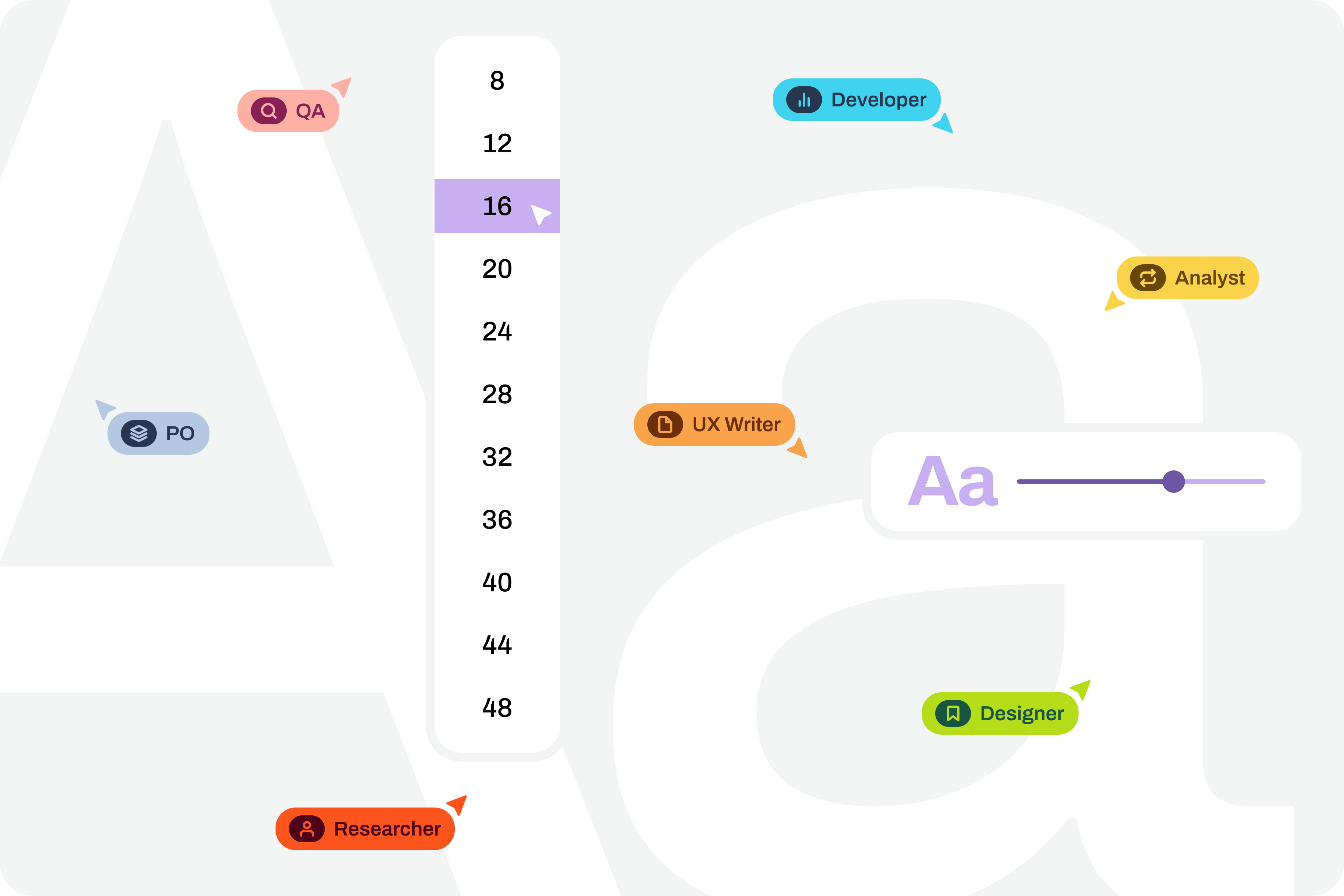
Note: Before attempting this test, you should be comfortable with Figma's text styles, auto layouts, and variables. These three features are the foundation for making this work without extra effort. If you're not fluent in them yet, start there. Learning is a gradual process, so don't skip ahead.
Setting the Goal
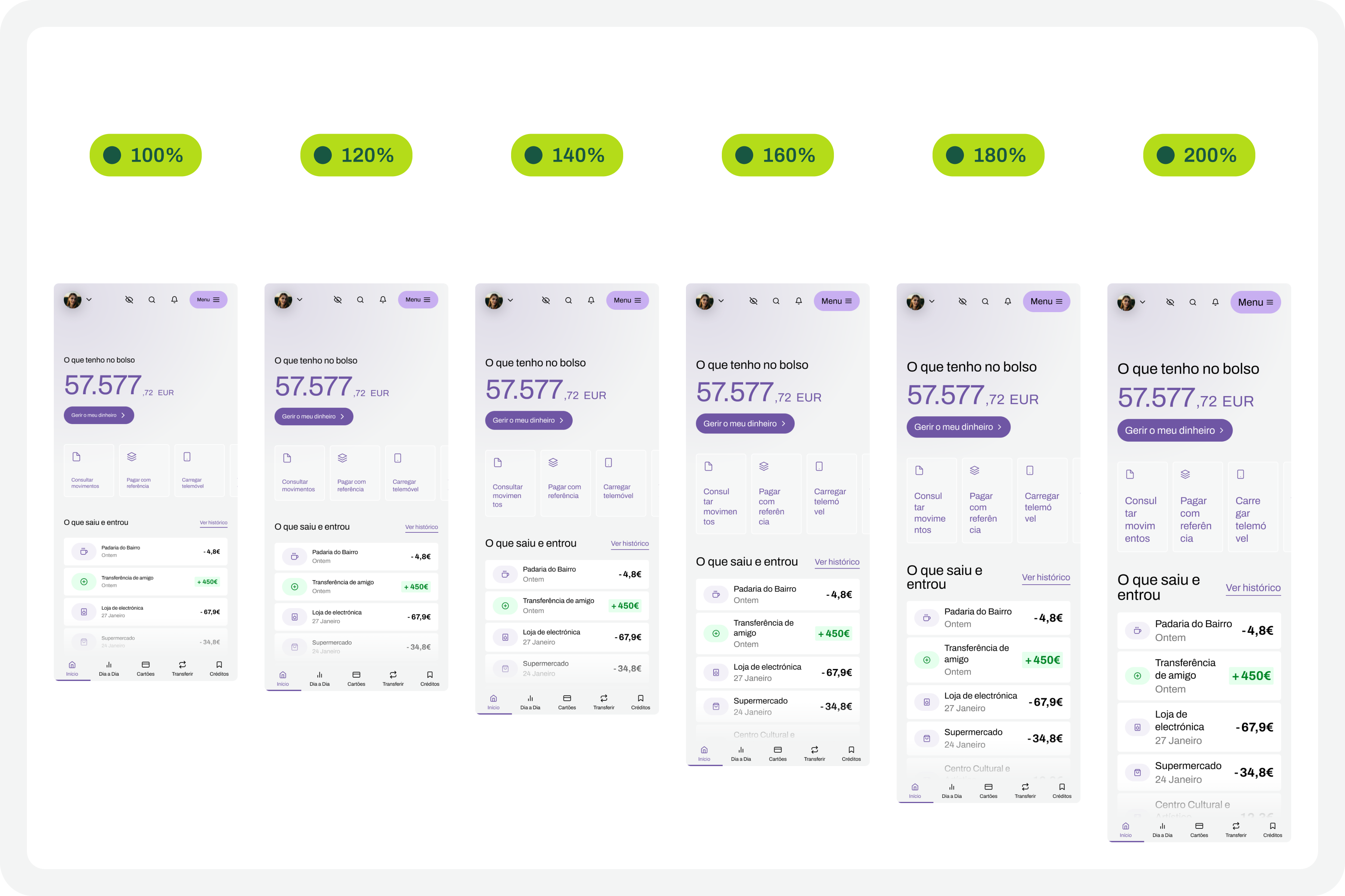
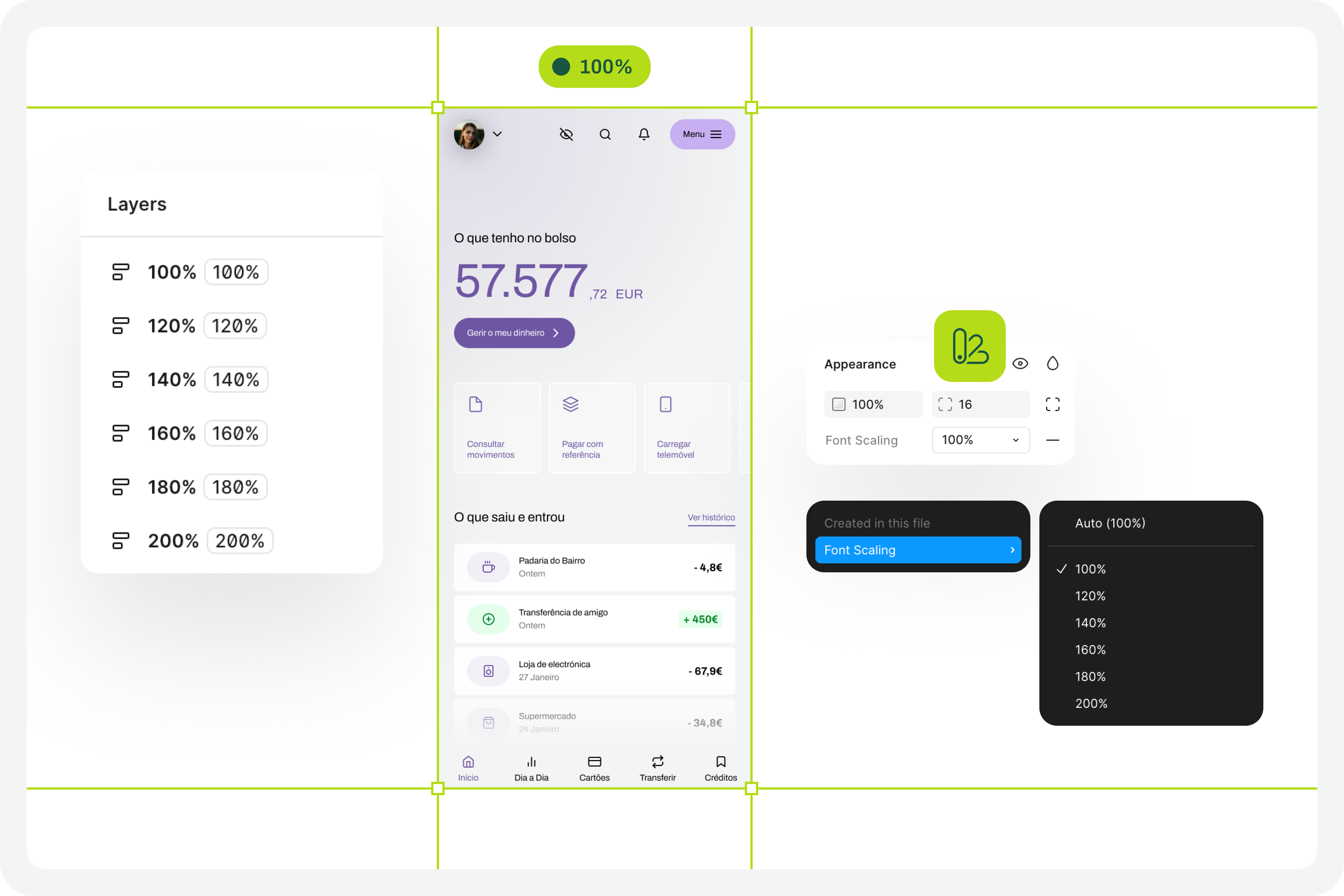
The goal of this test is straightforward: have a set of variables for every text style in your interface that lets you switch between scales of 100%, 120%, 140%, 160%, 180%, and 200%. Applying these variables, much like toggling between light and dark mode, will show you how your UI transforms at each typographic scale and where adaptations are needed.
Preparing the Groundwork
Getting this test to run smoothly requires serious organization. Design systems can help optimize much of the initial setup, but the real requirement is a highly systematized design file. This isn't a rigid guide—every team has its own model—but the following steps describe the assumptions your file needs to meet. They phase the implementation of this test model so you can execute it in the simplest way possible.
1. Design the Interfaces
Everything starts with the design itself. At this point, there's no specific concern with the scaling test. The focus is on designing each interface to meet basic accessibility recommendations from the start.
2. Apply Auto Layout Everywhere
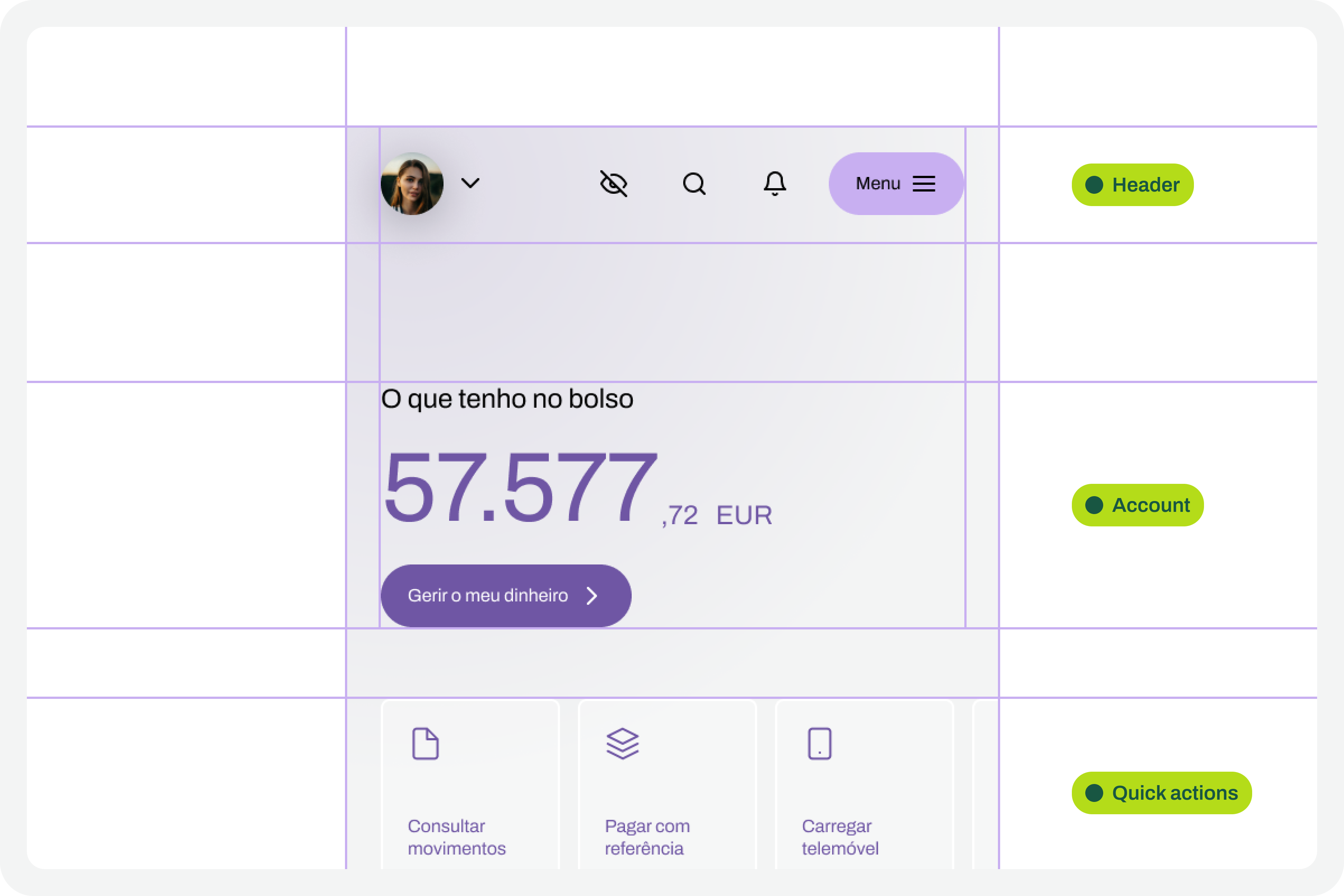
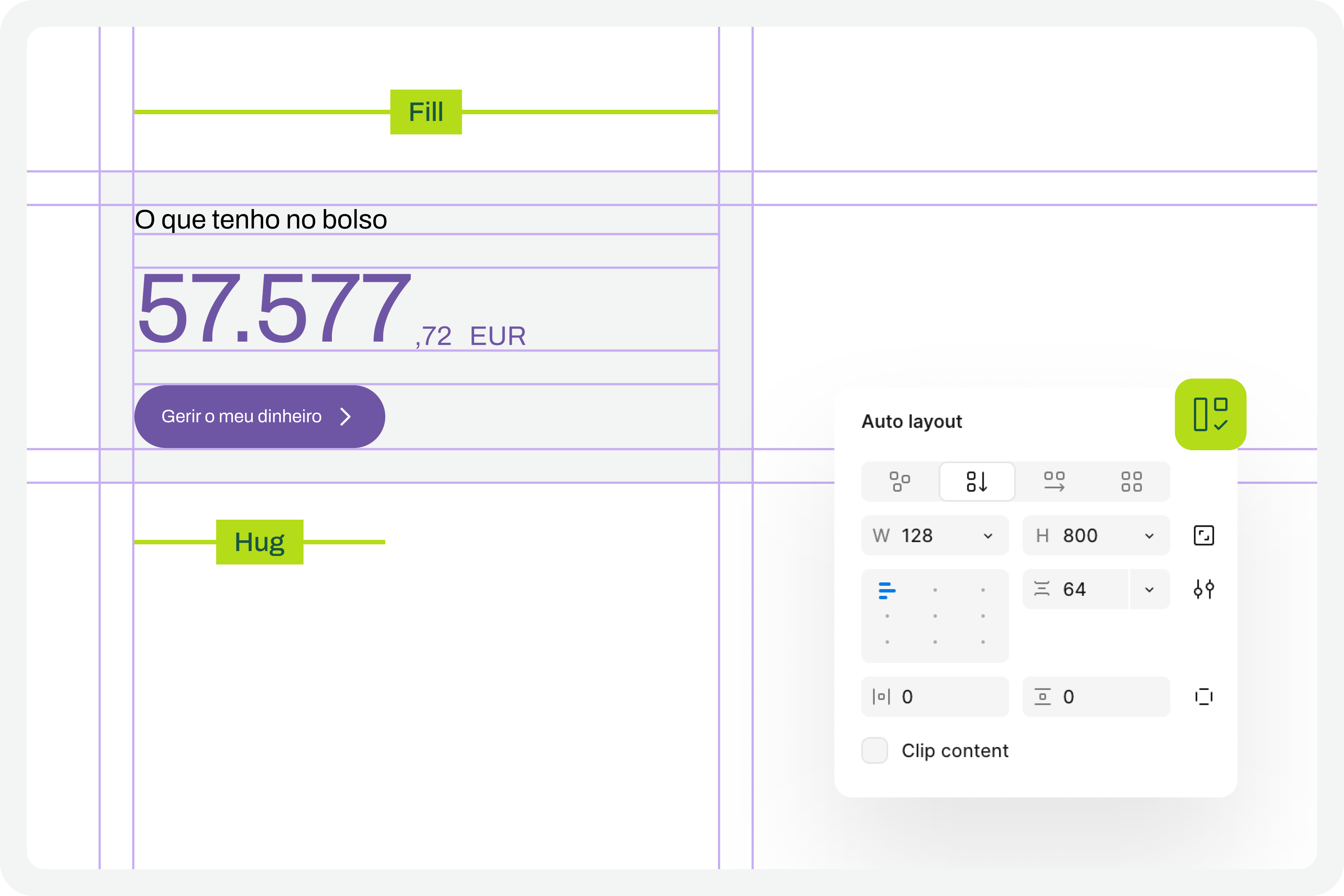
Every screen you create must apply auto layouts consistently. This step is crucial. Only with a perfectly structured auto layout framework will the interface scale cleanly when font sizes increase. If this is neglected, the interface will break apart when the test is run—like an elephant in a china shop.
3. Structure Text Styles
The test also requires that every text element in your design has a text style applied. If you've been creating them as you design, great. If not, do it now. For this test to work perfectly, no text element can be left without a text style.
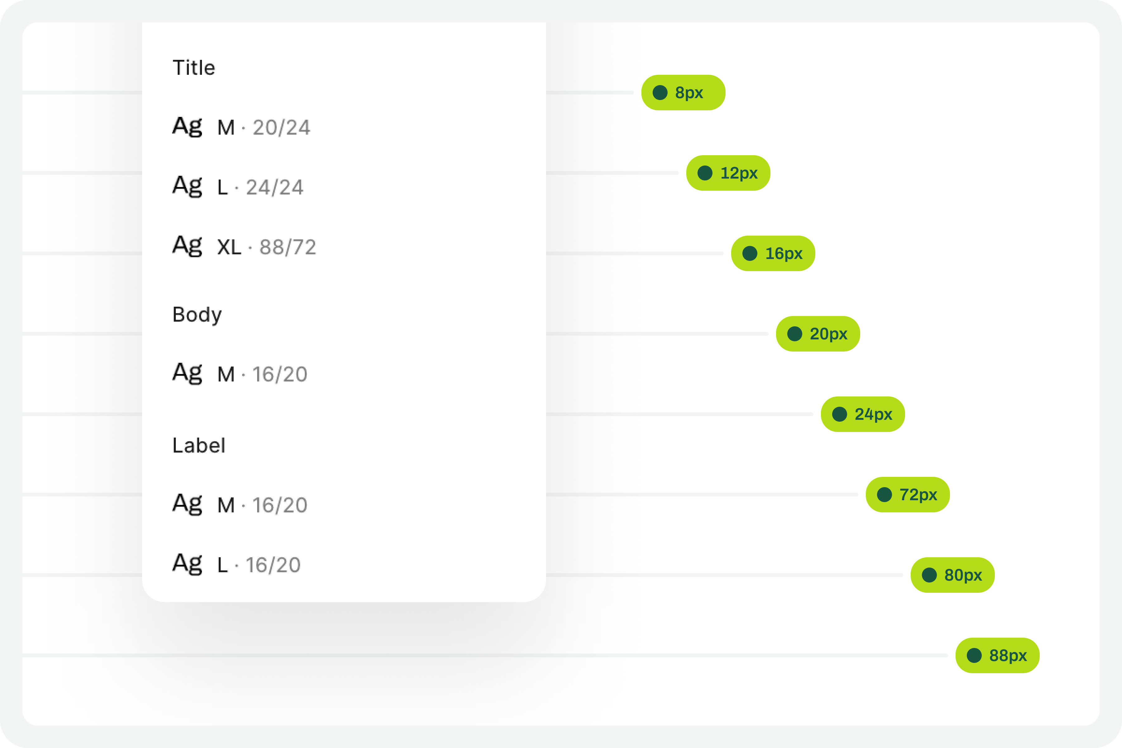
4. Define the 100% Variable Set
This test demands a high degree of optimization, meaning Figma variables must be used for all text style characteristics. At minimum, define "number" variables for the font-size and line-height of each applied text style. This defines the baseline for the 100% visualization model, which is the reference version. Structuring variables per text style is necessary because the enlargement scale must be calculated for each of them later.
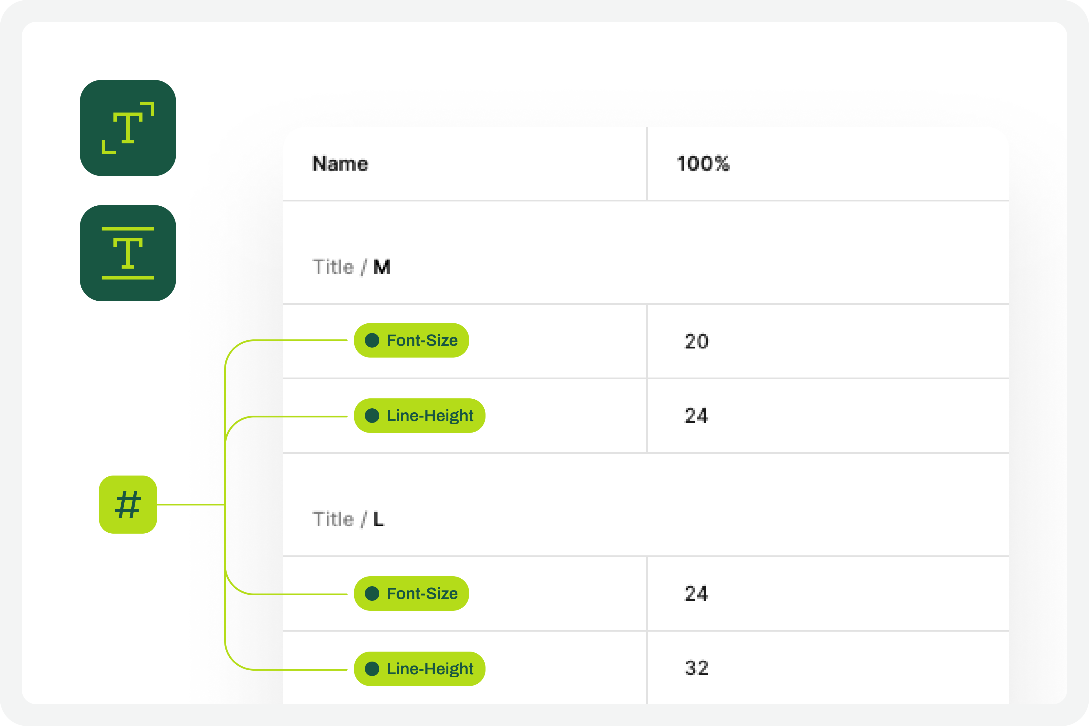
5. Apply Variables to Text Styles
Once the 100% scale variables are defined, apply them to the elements of the text styles already created. At the very least, variables need to be attached to the font-size and line-height properties. Applying them to other typographic characteristics is fine, but these two are essential.
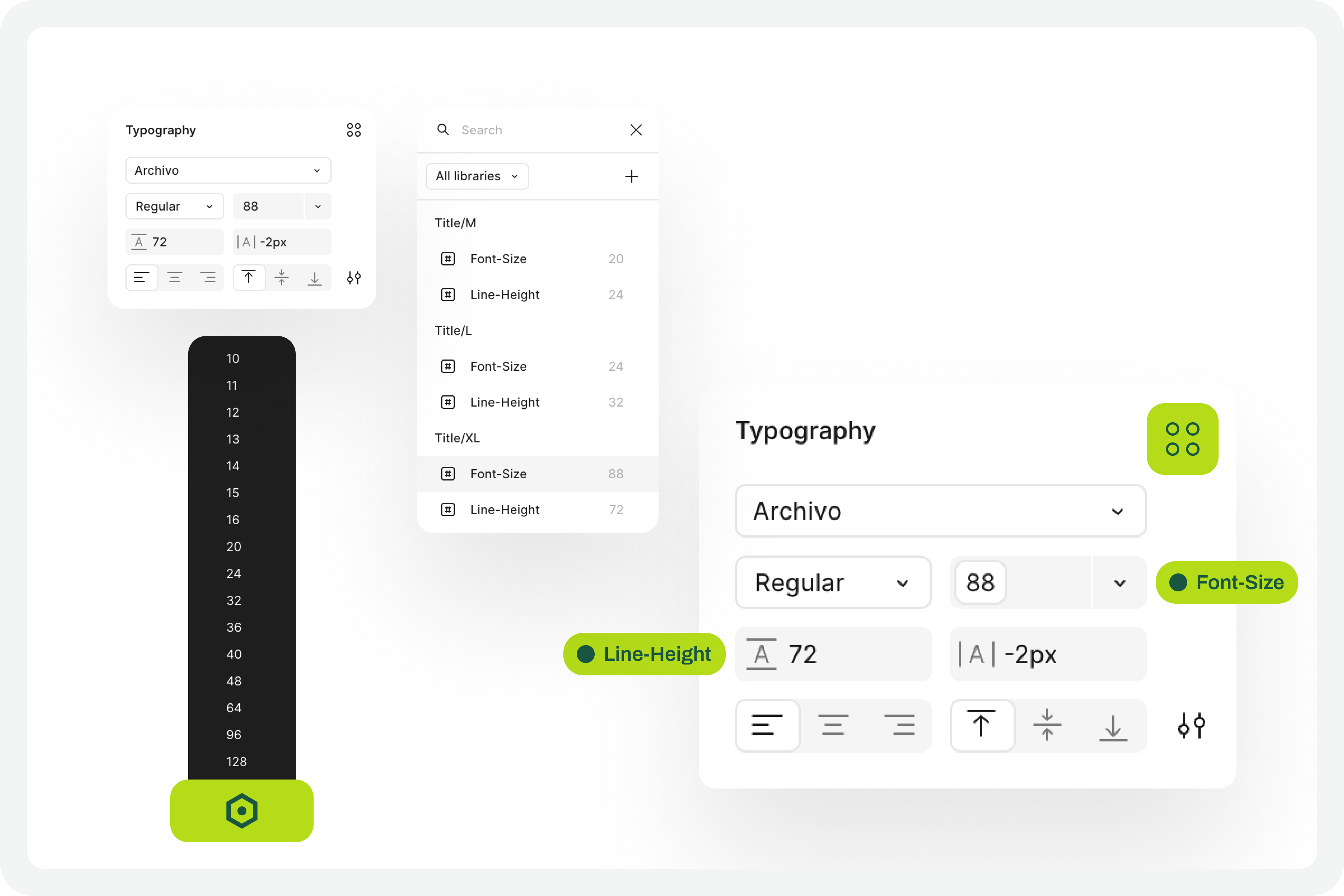
6. Define Variables for Larger Scales
Next, create the variables for the remaining scales—the ones that will tell the system what size each text style becomes at 120%, 140%, 160%, and so on. To get the font-size and line-height values, multiply the initial value by the scale. For example, a 16px font size at 120% becomes 16 * 1.2 = 19.2. Run this calculation for every text style at each scale percentage you choose to support.
Whether to round the final values is up to you. This is an approximate test, so rounding differences won't affect the overall perception of the results.
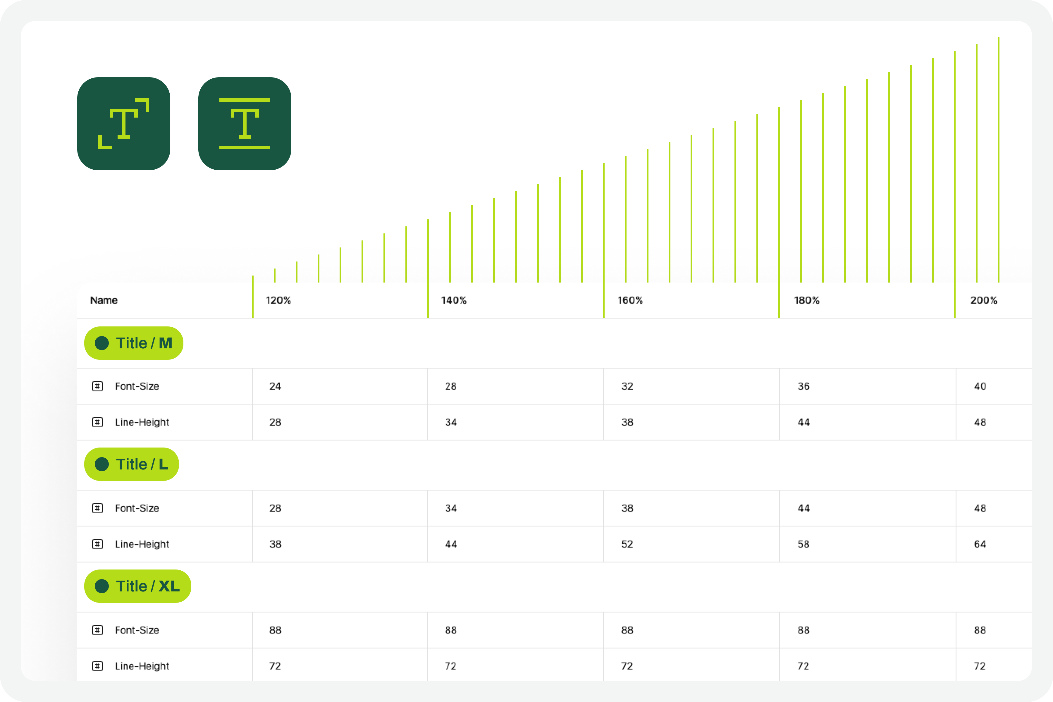
7. Apply Variables to Different Scale Versions
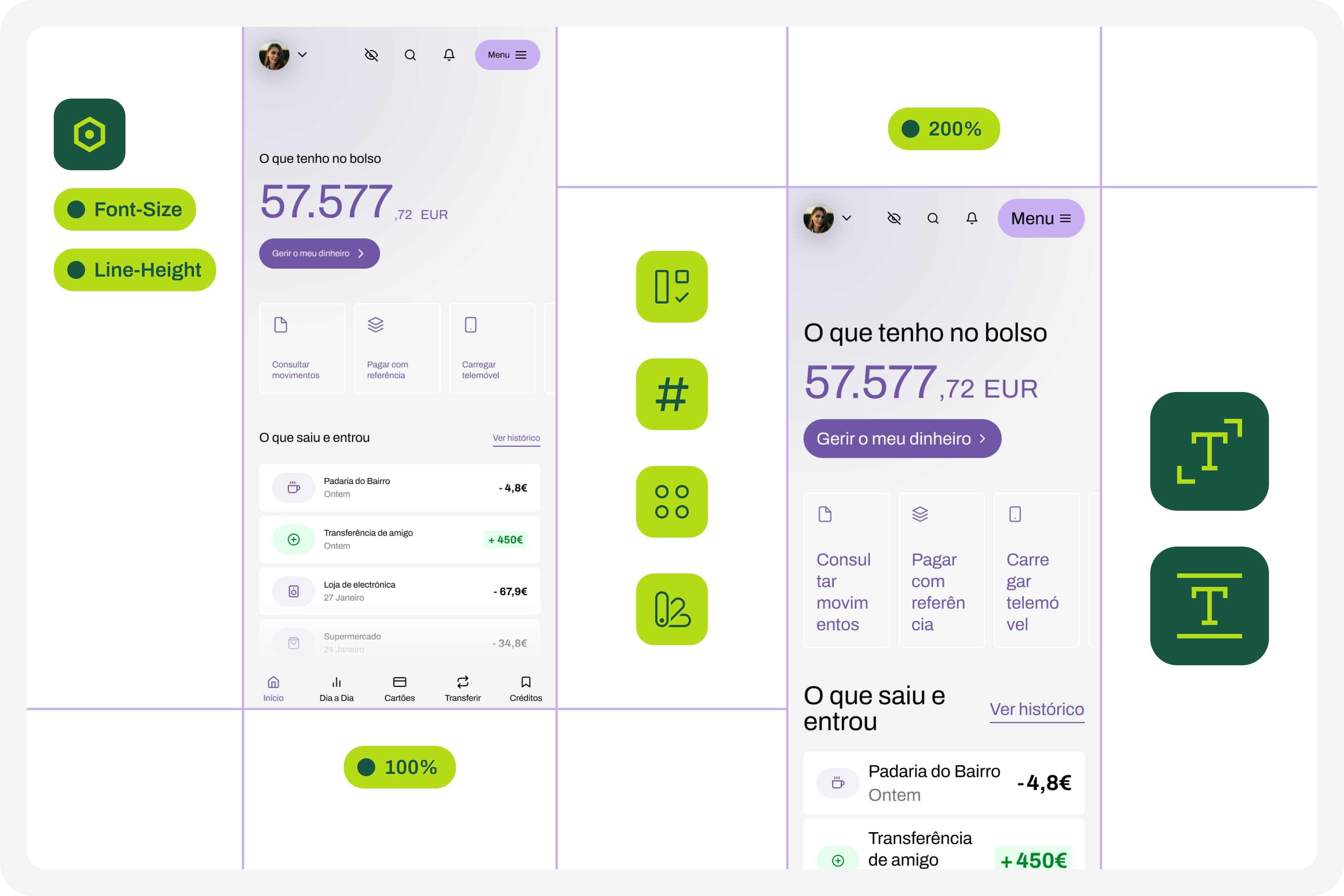
Now the test can run. Duplicate the original interface and apply the variable set for each scale rate that makes sense to you. Repeat for all defined percentages. As a suggestion, work with 120%, 140%, 160%, 180%, and 200%. You can reduce that list if you want to simplify, but always include the minimum of 100% and 200%.
8. Identify Areas for Improvement
With different scales applied to the same screen, it becomes easy to spot where improvements are needed. This is where the real accessibility work begins. While analyzing the screens, keep these considerations in mind:
- Large text isn't a design flaw. It can be the difference between someone using your product and not being able to at all.
- An accessibility problem exists only when increased font size prevents reading text or activating controls.
- For already very large text, increasing the size may not make sense—it could become disproportionate without improving readability.
- If elements appear to be breaking out of the screen, first check how auto layout is being applied. Many issues are resolved by its correct use.
- At every scale, the visual hierarchy of the typography must be preserved, as this supports the perception of different information levels.
- The test can reveal elements that need code-level adjustments to function at a given scale. Not everything is solvable in design alone—accessibility is a team effort.

9. Correct and Adjust the Design
Based on the various scaled versions, make the design changes that are sensible. Some adjustments are only possible in code; in those cases, document the suggestions for the development team. Remember again that many design-side issues are quickly resolved by the simple and consistent application of auto-layout properties.
10. Repeat the Process
This is a cyclical approach. Repeat these steps, or variations, as many times as necessary throughout the project. Over time, some steps may become unnecessary as the team's process improves—that's fine. The key insight is that accessibility testing isn't a one-time effort. It's a process to run many times during the day-to-day work of any project.
How Design Systems Help
This list of steps may look complex, but it isn't. Almost all of them are easy to execute in a context where a design system exists. Design systems have become an unavoidable standard in product design. Whatever a team calls theirs, it's rare to find one without at least a minimally structured library of components and styles.

With that foundation in place, applying this font sizing test is straightforward. In fact, if your system already has structured variables for light and dark mode, you're already applying the same principles this test relies on. There's nothing new to learn.
Design systems require a level of structuring and organization that is useful here. The idea that they limit creativity is a myth. By handling the bureaucratic side of design, they free up time for what matters—testing accessibility and building products that serve more people.
An Example File
Seeing an example is often more instructive than reading a description, and that's especially true in design. So, this Figma file is publicly available as a practical example of the whole process described here. It's just one approach; there are countless ways to run this kind of test in Figma.
Approach this with some skepticism. The suggested workflow follows a specific logic that should be adapted to your team's reality, processes, and maturity. Copying another team's formulas without understanding if they fit your context is a sure way to make accessibility work disproportionate. Every situation is unique. What this approach tries to do is simplify accessibility work within its own scenario. And remember: any small step forward is still progress—and that should be celebrated by everyone.