

Signals That Go Beyond Save Data
Delivering less content based on user signals is essentially a form of progressive enhancement in reverse: core functionality remains intact, while optional extras are only loaded when appropriate. The Save Data API is a good starting point, but it has a fundamental limitation — it requires users to know about the setting and enable it manually. Beyond that, it is only exposed in Chromium-based browsers, though this may matter less than it seems given that Android devices dominate in regions with slower networks and more expensive data plans.
Still, for users who never touch their browser settings, Save Data will never be active. That means it is worth considering other signals that might indicate a user would benefit from a lighter experience, even without an explicit preference. The key difference: acting on these is a decision made on the user's behalf, so it deserves more care.
Memory and Hardware Constraints
The navigator.deviceMemory API exposes the approximate amount of device RAM to JavaScript. It is expressed in gibibytes, and values are capped at 8 for reporting purposes. This is useful because low-memory devices are often older, low-end Android phones that may struggle with JavaScript-heavy sites or large DOMs, regardless of network speed.
There is also a Device-Memory Client Hint header that can be sent on HTTP requests, allowing server-side decisions before any HTML is delivered. On the client side, JavaScript can check the value directly. In Chromium browsers, the number of device logical processors is exposed via navigator.hardwareConcurrency, which can serve as another rough signal for device capability. More processors usually indicate a more powerful device. Combining memory and processor counts can help infer a device class that may need a reduced experience.
The CPU and Network Signals
Another useful signal is navigator.connection.effectiveType, which classifies the estimated connection speed as one of four values: slow-2g, 2g, 3g, or 4g. Unlike Save Data, this is not a user preference but a browser estimate based on observed network conditions. It can be used to decide whether to defer non-critical resources, such as below-the-fold images or third-party scripts.
One point worth noting: connection speed can change. The Network Information API provides a change event for this purpose, so sites can adapt when the network improves or degrades during a session. There is also an RTT property that gives an estimate of the round-trip time, though effectiveType tends to be simpler and more actionable.
Like Save Data, these are all Chromium-only for now. But again, focusing on Chromium browsers is not about ignoring other users — it is about serving the users who are most likely to be on constrained devices and networks.
Battery Status as a Signal
The Battery Status API allows sites to check whether a device is charging and the current battery level. This is more controversial as a signal, since acting on it can interfere with user expectations. The API is also not available in all Chromium browsers and has been removed from some due to privacy concerns, since battery level can theoretically be used for tracking.
That said, for a media-heavy site, checking whether a device is charging could be a reasonable way to avoid autoplaying video or triggering heavy animations for users on battery power. The trade-off is that saving battery is a different goal from saving data — the correct response to a battery warning may not be the same as the correct response to a data cap. It should likely be used with caution, if at all.
Prefers-Reduced-Motion
The prefers-reduced-motion media query is a well-supported signal across modern browsers. It indicates a user's system-level preference to minimise non-essential motion. This is different from the other signals here because it is about user comfort, not data or performance constraints. Still, cutting decorative CSS animations and JavaScript-driven effects can also reduce CPU usage and improve perceived performance on low-end devices.
The media query applies in CSS automatically:
@media (prefers-reduced-motion: reduce) {
  /* disable animations and transitions */
}
This can also be used as a progressive enhancement baseline for users who may not have Save Data enabled but might still want a calmer, lighter experience.
Putting It All Together
These signals are not mutually exclusive, and they are best layered. A user on a low-memory device with a slow connection is a stronger candidate for a reduced experience than a user with only one of those signals. The following logic illustrates how to combine them into a decision about whether to deliver enhanced content:
const cv = navigator.connection;

if (cv.effectiveType === 'slow-2g' || cv.effectiveType === '2g') {
  // Serve a reduced experience.
}

if (navigator.deviceMemory && navigator.deviceMemory <= 2) {
  // Handle low-memory devices.
}

if ('saveData' in navigator && navigator.saveData) {
  // User explicitly requested less data.
}
A key consideration: when a reduced experience is applied based on such signals, the user may not know why the site looks different. For Save Data, it is reasonable to assume the user asked for it. For the rest, it is safer to take a conservative approach; apply only the most impactful changes first, and consider whether the user needs a way to opt out.
Acting On the Signals Without Breaking Core Functionality
It is important to be explicit about what should change. The goal is not to strip an article of its images or a video page of its player entirely. It is to de-prioritise elements that are nice to have but not required for the main purpose of the page. Suggested reductions include:
- Switching to lower-resolution images or removing high-DPI (e.g.,
2x) versions - Deferring or omitting embedded video and autoplay content
- Removing web fonts and falling back to system fonts
- Cutting back on third-party widgets and social embeds
- Loading fewer articles in infinite scroll lists
- Disabling prefetching or prerendering of future pages
None of these need to change the core text, navigation, or basic function of the page. The outcome should be a page that still answers the user's query or displays the requested content, just with less overhead.
Tim Vereecke's collection of "data shaver" strategies covers many of these, with one caveat worth repeating: a reduced experience does not always mean a faster one. Proactively cutting back can occasionally increase load time for a subsequent request if it removes prefetching. On balance, however, cutting data nearly always yields performance gains.
Beyond Save-Data: Preference-Based Media Queries
Save-Data is not the only user preference you can react to. The Media Queries Level 5 draft specification standardizes a family of user-preference media queries, and most are already available in browsers:
prefers-reduced-motion— signals that the user wants less animation, typically due to vestibular motion disorders. Reduced motion does not mean no motion; as Adam Argyle has pointed out, you should tone it down, not eliminate it.prefers-reduced-transparency— helps people who have trouble reading content against translucent backgrounds.prefers-contrast— a request to increase contrast between elements.forced-colors— indicates the user agent is using a reduced color palette, such as Windows High Contrast mode.prefers-color-scheme— reports alightordarkpreference.prefers-reduced-data— the CSS media query equivalent of Save-Data.
Not all of these have a direct performance impact, but they are important user preferences—especially for accessibility around motion sensitivity and vision issues. prefers-reduced-motion is the oldest and best-supported of these options and deserves particular attention.
Connection Quality Signals
The Effective Connection Type (ECT) API is a property of the Network Information API, queryable in JavaScript (Chromium browsers only):
navigator.connection.effectiveType;It returns one of four strings: 4g, 3g, 2g, or slow-2g. The idea is that you can dial back network-heavy content for users on slower connections. The problem: those four categories are fixed and based on relatively old network data, so nearly everyone today falls into 4g. Among Indian mobile users we examined in the previous article—users who were getting markedly worse experiences—84.2% are reported as 4g, 15.1% as 3g, and less than 1% combined as 2g or slow-2g. Catching 16% of slowest users is useful, but it is far from the 63% who request Save-Data in that region.
The navigator.connection API offers other fields for finer-grained measurement:
navigator.connection.rtt;
navigator.connection.downlink;
These values are deliberately rounded for privacy, to prevent fingerprinting. For non-tracking purposes, that imprecision is all we need. The bigger limitation is that these APIs exist only as JavaScript APIs or as Client Hint HTTP headers, not as simple always-on headers.
Opt-In With Client Hints
The Save-Data HTTP header is sent on every request when enabled, making it trivial for backends to consume. Other details like ECT cannot be sent the same way without bloating every request and exposing more user information than needed.
Client Hints solve this with opt-in. A site tells the browser which hints it will use, via the Accept CH header in the initial response:
accept-ch: ect, rtt, downlinkOr via a meta element on the page:
<meta http-equiv="Accept-CH" content="ECT, RTT, Downlink">Subsequent requests to that origin then include those Client Hint headers:
downlink: 10
ect: 4g
rtt: 50
Important: If you return different content based on Client Hints, include those same headers in your Vary response header. Otherwise caches may serve the wrong variant for later visits.
You can inspect what your browser exposes at https://browserleaks.com/client-hints (use Chromium). Client Hints are only sent to the original origin, not to third-party requests, unless you enable them via a Permission Policy header.
The catch with the two-step opt-in is that the very first request to a site—arguably the one that would benefit most from optimization—does not yet carry any Client Hints. The BrowserLeaks demo sidesteps this by loading data in an iframe, but that is not a realistic pattern for most sites. Alternatives: use the JavaScript APIs, optimize only for repeat visits, or apply Client Hints to independent subresources such as media, CSS, or JavaScript files. Image CDNs are a particularly good fit, but the fastest website still starts rendering critical content from the first response.
Device Capability Hints
The final category covers device capabilities rather than network state:
| API | JavaScript API | Client Hint | Example Output |
|---|---|---|---|
| Number of processors | navigator.hardwareConcurrency | N/A | 4 |
| Device Pixel Ratio | devicePixelRatio | Sec-CH-DPR, DPR | 3 |
| Device Memory | navigator.deviceMemory | Sec-CH-Device-Memory, Device-Memory | 8 |
The number of logical processors is of limited value since essentially every device now has multiple cores; what matters more is their power. Device pixel ratio and Device Memory have far more optimization potential.
DPR has long driven responsive images via srcset and media queries. The JavaScript API and Client Hint header variants have seen less adoption, though many image CDNs support them, and broader use could open up optimizations beyond static media.
Device Memory may be the most useful performance signal of the three. RAM is often a solid proxy for device tier: a 1 GB or 2 GB device is likely low-end, older, or budget-constrained. Correlating this against Core Web Vitals, using a customized four-dimensional version of the Web Vitals Report, shows clear patterns.
Largest Contentful Paint (LCP):
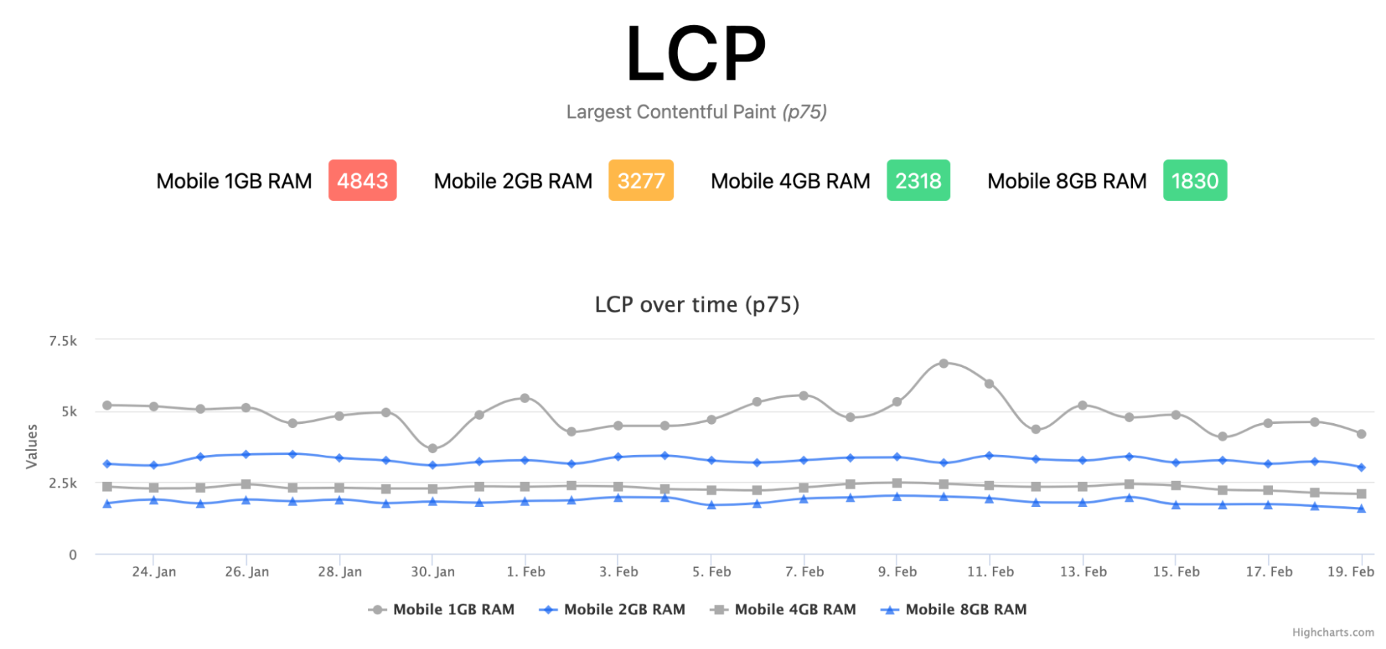
There is a clear relationship between low RAM and poor LCP. The p75 score for 1 GB and 2 GB devices is red or amber, and even among devices with green overall scores, higher RAM visibly correlates with faster LCP. Whether RAM is the direct cause or just a proxy for device class—network conditions, age, and so on—does not matter much. If it flags users likely to have a worse experience, it is a usable signal.
Cumulative Layout Shift (CLS):
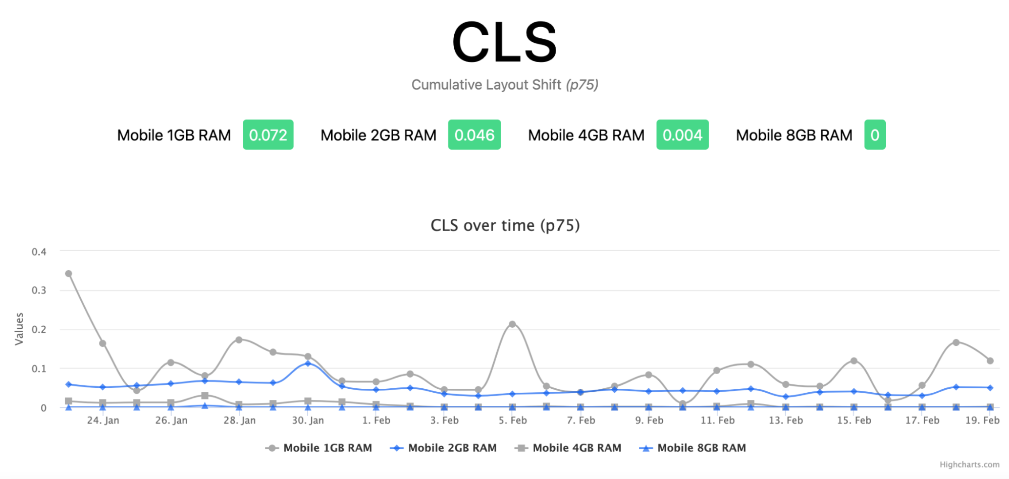
CLS shows some correlation with memory, but remains green even at the lowest tier. That is unsurprising: a layout shift happens regardless of device power or network speed, and the browser registers it even if it happens faster than the user can perceive.
First Input Delay (FID):
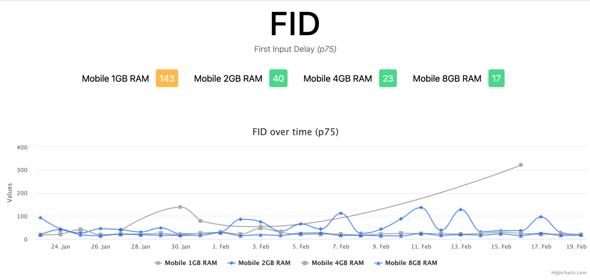
FID shows far less correlation with device memory, and note the gaps in the chart—FID is often not measured for low-traffic segments like the 1 GB devices. One might expect memory to matter more here, but FID is simply not that hard to pass for many sites, a limitation the Chrome team acknowledges as it works on a better responsiveness metric.
For privacy, device memory is reported only as one of a capped set of values: 0.25, 0.5, 1, 2, 4, or 8. Even a 32 GB machine reports 8. That granularity is fine, since the interesting thresholds are at 2 GB and below. The risk over time is that, as with ECT, the signal degrades when everything clusters in the top bucket; that is at least easier to fix by raising the cap.
Measure Before You Optimize
The Core Web Vitals correlation above makes a broader point: do not assume which signals matter for your site. Measure your actual user population.
A simple approach is to log these values in a Google Analytics Custom Dimension. That is exactly what we did at Smashing, allowing us to slice the data against Core Web Vitals we already tracked via the web-vitals library and produce the charts above.
If you already use a RUM solution, it may already collect some or all of these signals, and the data may already be in hand to guide your decisions. If it does not, consider requesting the feature—it would benefit you and other users of that tool.
Putting Performance Signals to Work
The techniques covered above are not confined to complex web applications. Even a static article site can use them to tailor the experience to the people who need it most. The real challenge is identifying which parts of your interface are candidates for conditional loading.
Smashing Magazine itself is a working example. The site consults the Save Data API to decide whether to skip web fonts entirely. It also relies on the instant.page library to prefetch articles when a user hovers over a link — but only when the effective connection type is reasonable and the user has not opted into data saving.
The Web Almanac offers a more layered example. Each chapter is packed with charts and figures, which are initially presented as lazy-loaded images. For users who can handle the overhead, those images are upgraded to interactive Google Sheet embeds with hover tooltips showing data points. That upgrade is gated on several conditions: a desktop viewport, Save Data enabled, a fast effective connection type, and support for high-resolution canvases (a capability that older iPads claimed but did not actually provide). The embeds are noticeably resource-hungry, so this staged approach keeps the experience smooth for low-end devices while still delivering the rich interaction where it is sustainable.
The common thread is intentionality. Rather than serving one version of a page to everyone, you decide which features are essential for all users and which are enhancements for a subset. Performance signals give you a principled way to draw that line.



