

One Equation To Rule Them All
CSS has evolved to the point where we can control fluid values directly with the clamp() function, eliminating the need for multiple media queries that simply adjust font-size, padding, or margin. You write one rule with a preferred value and min/max bounds, and the browser handles everything in between. That said, media queries are still essential for changing colors, borders, shadows, and other styles that don't scale linearly.
The key trade-off is that while a simple fluid adjustment is trivial with clamp(), many developers still write several breakpoints for what is essentially the same underlying problem: a value that must change linearly within a specified viewport range, but stay constant outside of it. Consider this typical pattern:
.block{
 font-size: 2rem;
}
@media (max-width: 1200px) {
 .block{
   font-size: calc(-1rem + 4vw);
 }
}
@media (max-width: 800px) {
 .block{
   font-size: 1rem;
 }
}
…which can be replaced by the single clamp() expression below:
.block{
 font-size: clamp(1rem, -1rem + 4vw, 2rem);
}
But real layouts often have more nuanced behavior, with different rates of change across different screen widths. That’s when a more complex set of rules appears:
.block{
 font-size: calc(-4rem + 8vw);
}
@media (max-width: 1200px) {
 .block{
   font-size: calc(-1rem + 4vw);
 }
}
@media (max-width: 800px) {
 .block{
   font-size: calc(0.5rem + 0.8vw);
 }
}
The question is whether clamp() can also handle these piecewise-linear cases without piling on breakpoints.
Calculating The Interpolation
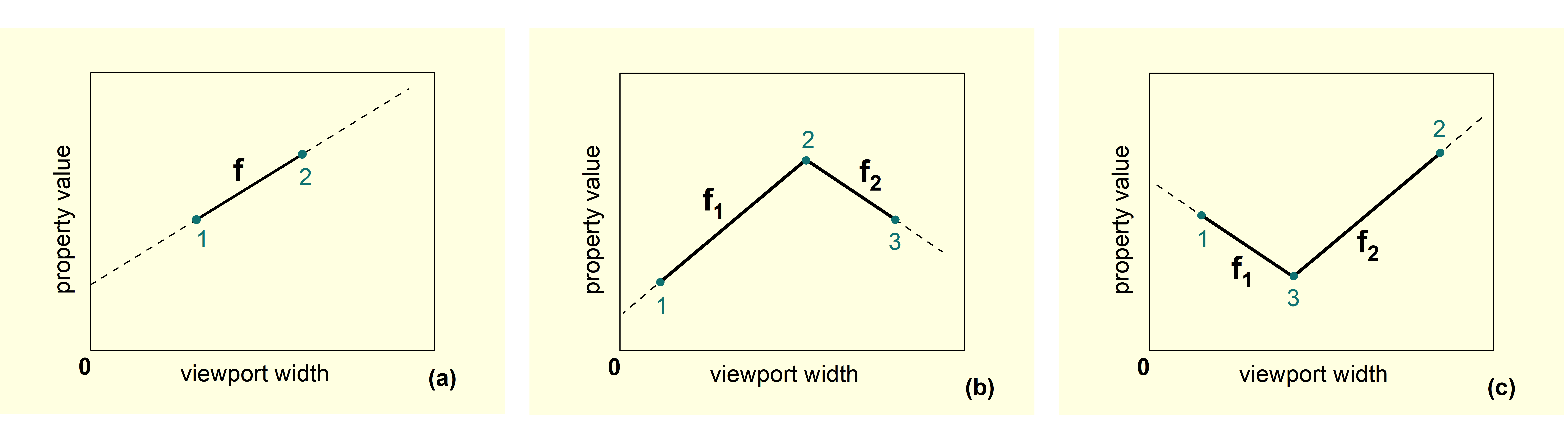
The answer lies in a small piece of math: there is exactly one straight line that passes through any two given points. Standard line notation y = y0 + k*x describes where that line crosses the Y-axis (y0) and how steeply it rises or falls (k). For our purposes, a “point” is a (viewport width, property value) pair, and we need to express both in units CSS understands.
Pixels are the natural unit for defining the two points, because that’s how design specs typically communicate breakpoints and values. However, the final CSS margin, padding, or font size should ideally be declared in relative units like rem so that user preferences and zoom settings are respected. And because the viewport width in CSS is always 100vw, the line equation becomes:
y = y0 + k*100vw
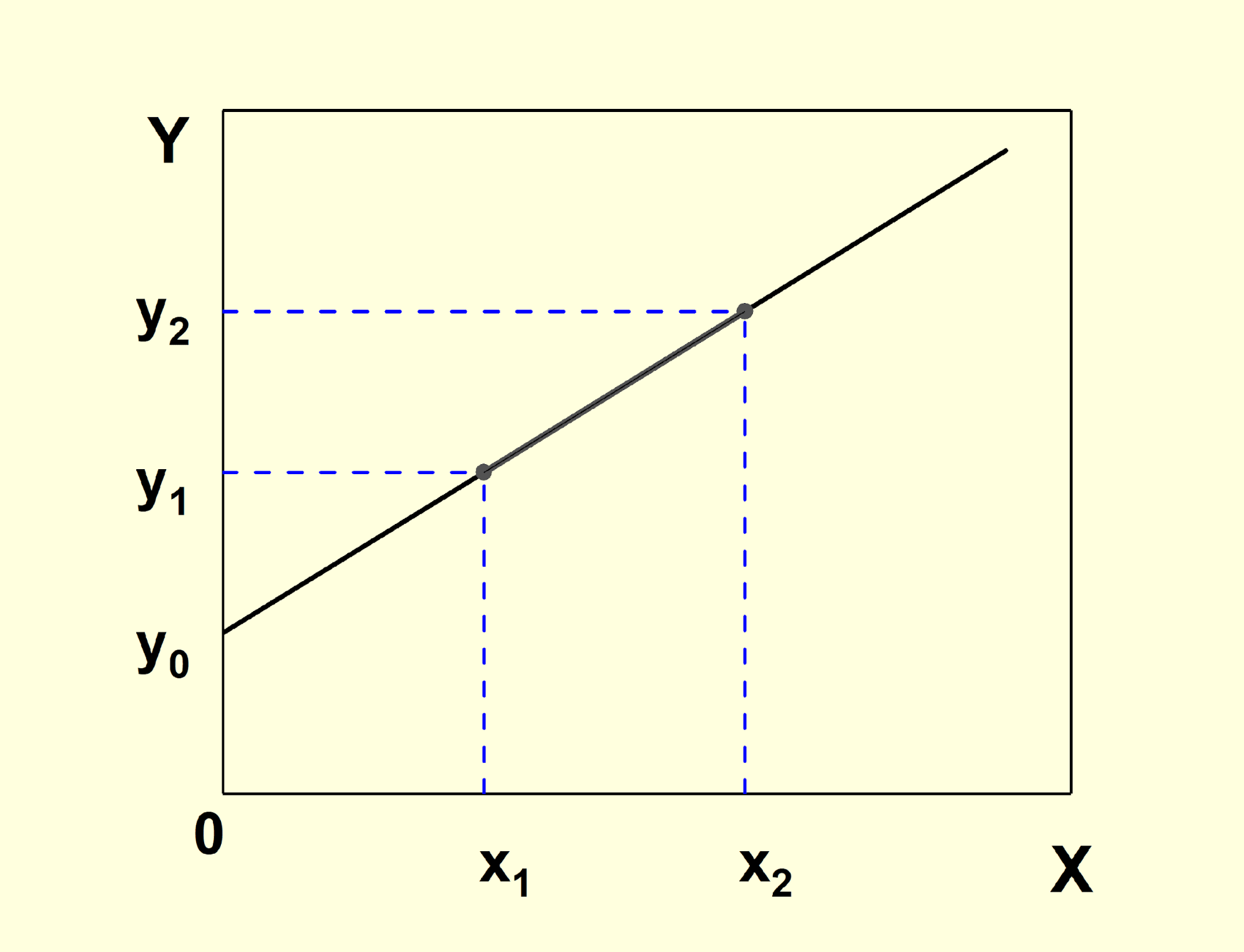
That is why you constantly see expressions such as 1rem + 2.5vw inside clamp() or calc(). The first term is the Y-axis intercept y0 expressed in rem, and the second term is the slope k multiplied by 100vw. Choosing rem for the output and vw for the viewport input keeps the result both accessible and responsive.
So with a simple formula connecting the slope and intercept to the coordinates of the two given points, you can compute the exact clamp() argument for any fluid property that changes linearly between two viewport widths. The same calculation scales to multi-range layouts: instead of four media queries, you derive a piecewise definition from several line segments, each clamped to its own min and max.
Deriving the General Formula
Let’s derive a general equation for a function F(x) that reproduces a piecewise-linear property behavior. The property is defined by N points (xi, yi), with straight lines fi(x) drawn through consecutive points, giving (N-1) line segments. The goal is a single function equal to fi(x) on each interval [xi, xi+1].
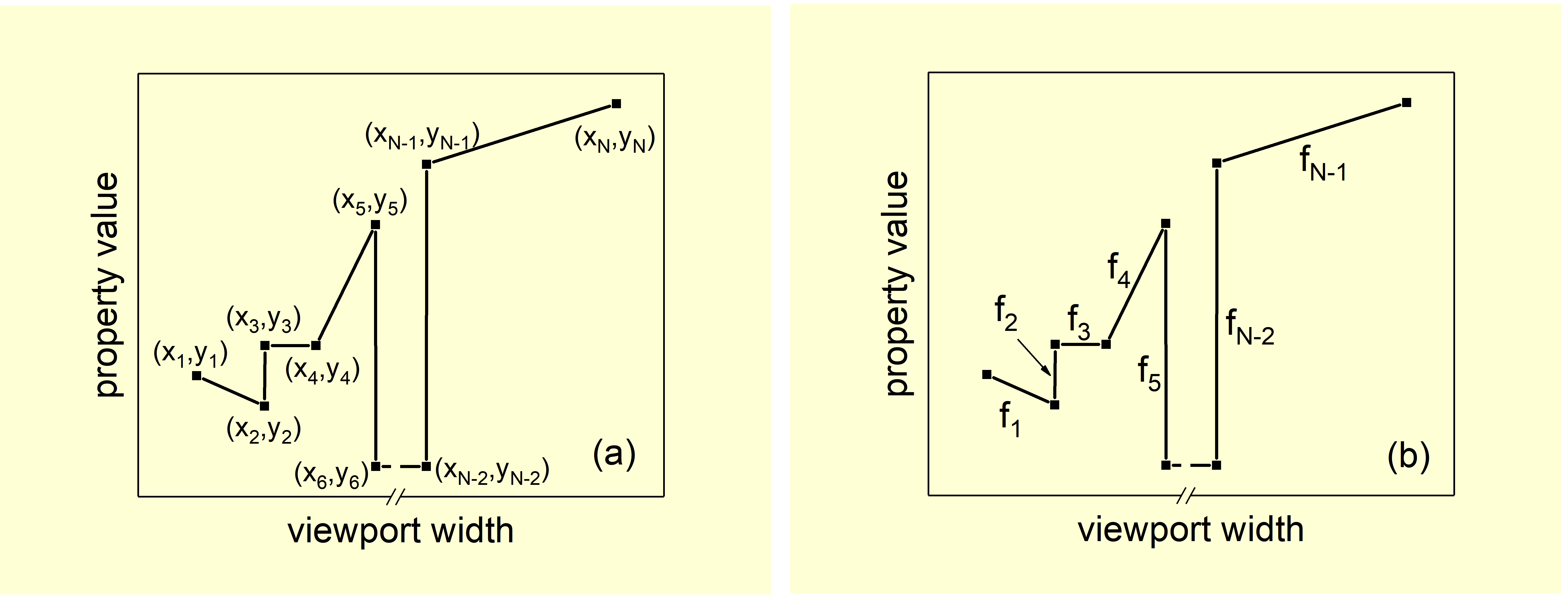
Define each segment function gi(x) using the clamp function:
gi(x) = clamp(yi, fi(x), yi+1)
By the definition of clamp, this equals yi when x < xi, equals fi(x) when xi ≤ x < xi+1, and equals yi+1 when x ≥ xi+1.
Now sum all gi(x) functions. Call the result G(x). Evaluating G(x) on the interval [xi, xi+1] gives fi(x) plus a constant term equal to the sum of all yj values except y1 and yN. Subtracting that constant yields the final formula:
F(x) = Σi=1N-1 clamp(yi, fi(x), yi+1) − Σi=2N-1 yi
This is equation (3), the complete solution.
Notes and Edge Cases
- If yi = yi+1, the segment is flat and
clamp(yi, yi, yi) = yi, which simplifies the expression. - For a segment where yi > yi+1, the gi(x) function must be written in a different order due to the definition of
clamp:

- Outside the defined range, equation (3) produces constant values y1 for x < x1 and yN for x > xN. To let the property continue changing beyond the endpoints, replace g1(x) with a
minormaxfunction (depending on the slope direction), and likewise for gN-1(x):


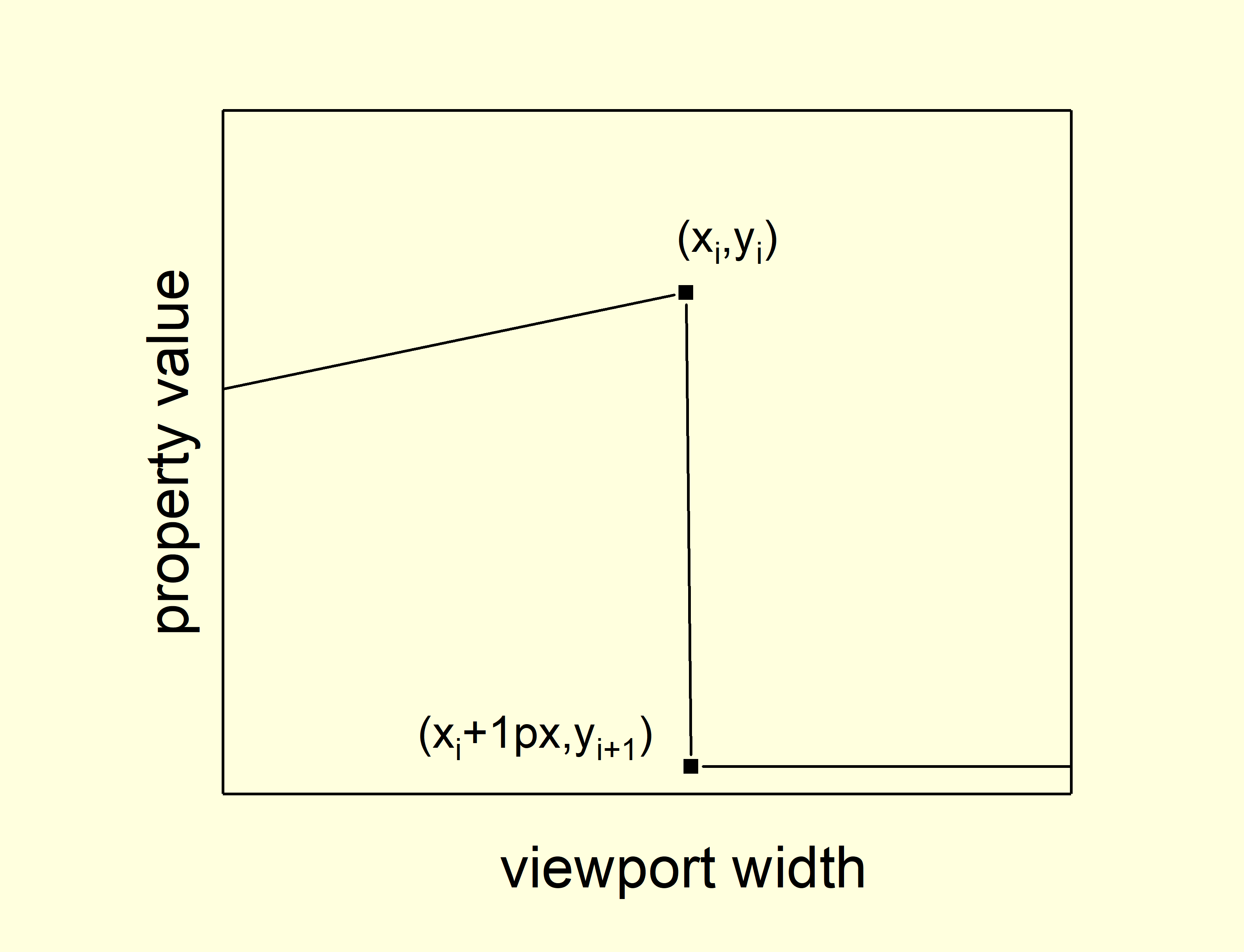
- An abrupt change can be represented by setting the interval width to
1pxor less. - The more segments the behavior has, the longer the resulting function becomes.
- Due to its possible complexity, the function from equation (3) must be used inside a CSS
calc()expression.
Worked Example: Responsive Font Size
Consider a typical responsive design scenario. Menu item font size is 18px at a viewport of 1920px, decreasing to 12px at 768px. Between 320px and 767.98px, the font size is fixed at 20px. This behavior has three linear segments and can be encoded using equation (3).
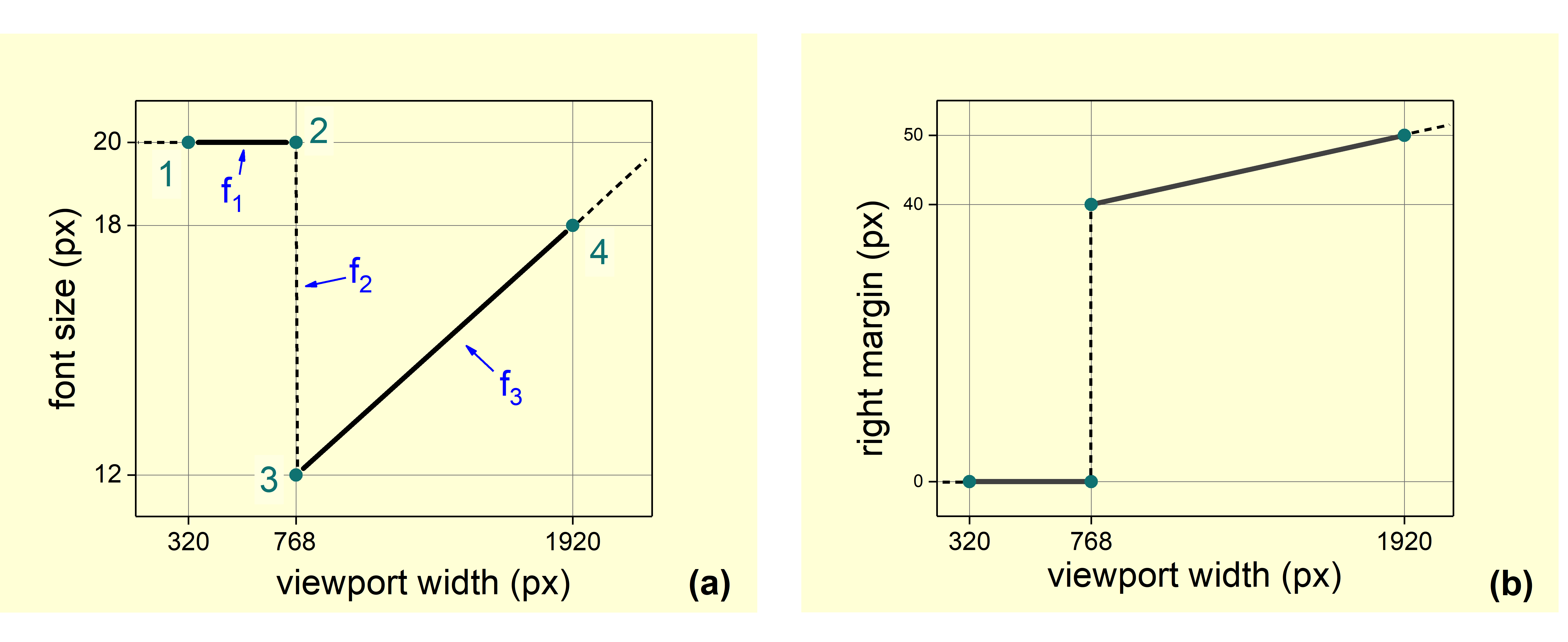
1. Calculate line parameters. Each segment fi(x) is defined by its endpoints. For the first line between (768, 12) and (1920, 18):

Expressed in the slope-intercept form:

Repeating for the second and third line segments gives:



2. Construct segment functions gi using equation (2):

3. Determine the constant term in equation (3):

4. Assemble the final expression from equation (3):


5. Write the CSS, wrapping the result in calc():
.block{
 font-size: calc(clamp(0.75rem, 19200.75rem – 40000vw, 1.25rem) + max(0.75rem, 0.5rem + 0.5208333vw) – 0.75rem);
}
This is fully equivalent to the traditional media-query-based approach:
.block{
 font-size: calc(0.5rem + 0.5208333333vw);
}
@media (max-width: 767px) {
 .block {
  font-size: 1.25rem;
 }
}
Applying the same procedure to model responsive right margin behavior produces:

A live demo is available:
See the Pen [Header [forked]](https://codepen.io/smashingmag/pen/qBxdpqx) by Ruslan.
Practical Considerations
Equation (3) can describe any arbitrary property behavior as a function of viewport width without a single media query. However, its use is currently limited to properties whose values are lengths, because CSS does not yet support mathematical operations on dimensioned values (e.g., (2px*6px)/4px is not possible).
For simpler cases, more direct approaches are preferable:
- A continuous monotonic change defined by two points uses a simple
calc(f(x)). This covers typical fluid typography. - With three points where the slope decreases (k1 > k2), use
min(f1, f2). - With three points where the slope increases (k1 < k2), use
max(f1, f2).
See the Pen [Quick CSS example [forked]](https://codepen.io/smashingmag/pen/qBxdpKy) by Ruslan.
Prebuilt implementations are available, such as CSS functions on GitHub that handle both the full equation and the primitive edge cases.
A working flexbox example demonstrates the technique. Four flex items initially take 25% width each, then transition to 50% and finally 100% as the viewport narrows. However, this example breaks when vertical scrollbars appear, since vw units do not account for the scrollbar width. Replacing vw with % would solve that problem, but CSS cannot apply equation (3) to percentage values yet, so the approach remains limited to length-based properties.
Trade-Offs Worth Weighing
The core purpose of this exercise is to demonstrate that fluid sizing without a pile of media queries is technically possible. Whether you adopt it in production is a separate call. The most obvious drawback is readability: the resulting CSS is denser and harder to scan at a glance. What you gain is a cleaner separation of concerns. Media queries stay focused on structural and adaptive layout changes, uncluttered by repetitive lines that adjust font sizes, paddings, or margins for each breakpoint.
A practical next step would be a small utility that lets developers define value changes and generates these intricate queries automatically. The maintenance burden, however, could quickly become significant unless wrapped in a Sass mixin. Either way, the experiment shows that the boundaries of CSS custom properties and clamp() are broader than they first appear.
Credits and Further Reading
Thanks go to Evgeniy Andrikanich and his YouTube channel “FreelancerStyle” for producing free, high-quality educational content on HTML, CSS, and JS.
For deeper context, the approach builds on prior work around one-line responsive properties and modern fluid typography. The original Russian article on Habr explores the “responsible property” technique, while Adrian Bece’s piece on Smashing Magazine covers clamp()-based typography in detail. Both are useful references if you want to push the idea further.


