Container queries have been around long enough to reach roughly 94% browser support, yet they remain both underused and widely misunderstood. The State of CSS survey puts awareness at 86% of developers against actual use at just 41.4% — and while no survey fully represents the field, it is the best signal available. The same gap showed up in Kevin Powell's SmashingConf Amsterdam 2026 talk, where he described container query adoption as terrible, which is odd given how long component-level responsiveness sat atop CSS wishlists.
The more useful question is not how many people reach for container queries but how they use them. The recurring mistake traces back to first impressions: they look almost identical to media queries, so it is natural to assume they behave the same way. They do not. What follows concerns container size queries — responding to a container's dimensions. Container style queries, which respond to computed styles, are experimental at the time of writing.
The Viewport Is Only a Proxy
When you write @media, the question you are really asking the browser is simple: how wide is the screen right now? Media queries answer that well, but the answer is a stand-in for what you usually care about. Put a .card in a grid cell that is 300px wide on a 1920px desktop and the viewport is still 1920px, so min-width: 1024px matches and its styles apply — even though the card has only 300px to work with. The card deforms, overflows or cramps.
Media queries are dumb. Not dumb in terms of the concept, but dumb in that they don't know very much. In fact, most people assume that they know more than they do.
— Kevin Powell
It is tempting to treat responsive design purely as whole-page rearrangement: two columns on a large screen, one on a small one. Container queries instead ask how much space is available in this specific spot right now.
.card-wrapper {
  container-name: card;
  container-type: inline-size;
}

@container card (min-width: 450px) {
  .card {
    display: flex;
    flex-direction: row;
  }
}
Here the card ignores the viewport entirely. Its only condition is whether the parent wrapper of .card has at least 450px of inline space (horizontal in a left-to-right writing mode). When that holds, the component goes horizontal; when it doesn't, it falls back to block display.
See the Pen [Viewport vs Container [forked]](https://codepen.io/smashingmag/pen/01a0a73d-6f39-709f-8dae-037f6b588852) by Vayo.
Page Layout Versus Component Layout
The cleanest way to separate the two mechanisms is by layout type. Media queries handle the macro layout, looking outward: page structure, the header spanning the window, footers, the main grid, system preferences such as prefers-color-scheme, device capabilities like touch screens. Container queries handle the micro layout — the content living inside that macro structure, wherever it needs to fit the space it is allocated: cards, widgets, forms, navigation.
An element should not become "tablet-sized" merely because the viewport crosses an abstract threshold like 768px. It should switch layout when it has the space to do so, on a phone or inside a desktop sidebar. With over 2,300 unique viewport sizes on the modern web, accounting for them all is not a realistic goal.
I'm not hating on media queries. It's that in this era of responsiveness and component re-use, layout logic is closer to the container than the viewport. When we think in terms of containers and components, we're effectively relying on the content to determine layout, not the viewport.
Where Container Queries Pull Ahead
Fluid typography scoped to a component
Typography is a common place to lean on media queries, not least because their units — vw, vh and friends — are relative to the viewport. That looks convincing until the component moves into a sidebar, where the viewport is irrelevant and the scaled type grows oversized or too small, because responsiveness is tied to the wrong reference point.
.card-title {
  font-size: clamp(100%, 1rem + 2vw, 24px);
}
Container queries ship their own units — cqi, cqw, cqb among others — which pair with the CSS clamp() function for fluid typography that scales with the component rather than the viewport:
.card-title {
  font-size: clamp(1rem, .5rem + 3cqi, 2rem);
}
See the Pen [Fluid Typography [forked]](https://codepen.io/smashingmag/pen/01a0a73f-1a44-750c-8b40-9b0ab774d981) by Vayo.
The complete code is then self-contained within that element's container.
Detecting flex wrap without JavaScript
Container queries can also reveal something about a component's internal layout. It isn't bulletproof, but media queries cannot do it at all: they observe only the browser window and are structurally blind to internal events such as flex items wrapping onto a new line. CSS has no :wrapped pseudo-class and no @media (flex-wrapped: true) to fall back on. Without a workaround, you would need ResizeObserver in JavaScript to learn when a flex row has wrapped.
When container queries are nested inside flex items, there is a way to get that signal without JavaScript, using a technique from Kevin Powell. The core idea: allow a flex item to flex-grow: 1 when querying the container's inline size.
See the Pen [Fluid Typography [forked]](https://codepen.io/smashingmag/pen/01a0a73f-1a44-750c-8b40-9b0ab774d981) by Vayo.
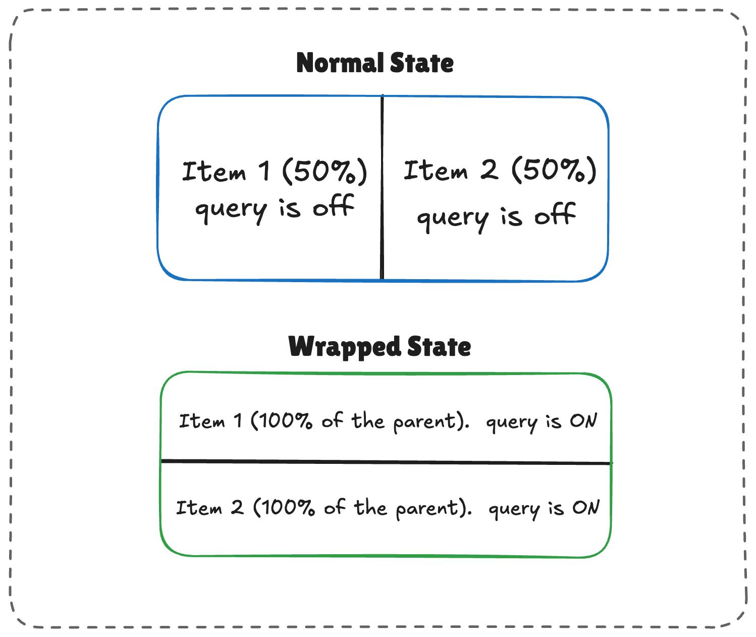
The mechanics are straightforward:
- With enough room, both
.flex-itemelements sit side by side, each exactly half the parent container's width. - With limited space, the second item wraps to the next line.
- Because
flex-growis active, the wrapped items stretch to fill most of the parent's width. - If the item is itself a container, it detects that sudden width expansion and fires.
/* The flex parent */
.flex-layout {
  display: flex;
  flex-wrap: wrap;
}

/* Register a flex item as a container */
.flex-item {
  container-type: inline-size;
  flex: 1 1 390px; /* Grow to fill space, wrap at 390px */
}

/* Default Card Styles (narrow / side-by-side) */
.card {
  display: flex;
  flex-direction: column;
  background: #f4f4f4;
}

/* Once there's enough room for a full row */
@container (min-width: 600px) {
  .card {
    flex-direction: row;
    align-items: center;
    background: #e2f0d9;
  }
}
It works: as the parent shrinks and the cards wrap onto two lines, the card expands, the container query fires, and the styles are applied.
See the Pen [Flex Wrap Detection Using Container Queries [forked]](https://codepen.io/smashingmag/pen/01a0a752-150a-754e-a77a-07fe1b046658) by Vayo.
Side Effects Worth Knowing Before You Reach For Them
An extra wrapper is usually required
Container queries need a parent-child relationship to function. Given this markup:
<div class="card">
  <div class="card-content">...</div>
</div>
You cannot query .card in order to adjust .card-content like this:
/* DOES NOT WORK */
.card {
  container-name: card;
  container-type: inline-size;
}

@container card (min-width: 400px) {
  .card {
    display: flex;
  }
}
A container cannot query itself. That example queries a card container and then tries to adjust that same container's display from its own size — an infinite loop. The fix is an additional wrapper that makes .card a descendant of the container:
<div class="cards">
  <div class="card">
    <div class="card-content">...</div>
  </div>
</div>
From there the .cards container can be queried and the .card layout adjusted accordingly:
.cards {
  container-name: cards;
  container-type: inline-size;
}

@container cards (min-width: 400px) {
  .card {
    display: flex;
  }
}
Media queries are indifferent to all this. @media does not care which element you style inside the block; it only ever consults the viewport, which is always available. You can attach a condition to any element and move on.
Querying size can collapse your layout
Querying a container's size — its block, or vertical, dimension — rather than its inline-size can flatten the layout:
/* Collapses to 0px even if it has content inside */
.hero-banner {
  container-type: size;
}
The browser calculates container dimensions without looking at its children. With no explicit height (or min-height, or aspect-ratio) on .hero-banner, that height resolves to 0px. Querying by inline-size is therefore usually the safer choice, unless the block size is genuinely what you need to test. Media queries are immune to this, since @media (min-height: ...) simply asks the viewport.
Custom properties are not queryable
Container queries also cannot test against a custom property value:
:root {
  --breakpoint-lg: 1600px;
}

/* DOES NOT WORK */
@container (min-width: var(--breakpoint-lg)) {
  /* ... */
}
Custom properties depend on values that cascade down the DOM tree, which opens the possibility of a container query relying on a custom property that the query itself changes. That gets complicated quickly:
:root {
  --breakpoint-lg: 1600px;
}

/* DOES NOT WORK */
@container cards (min-width: var(--breakpoint-lg)) {
  .card {
    --breakpoint-lg: 1000px;
  }
}
Choosing Between the Two
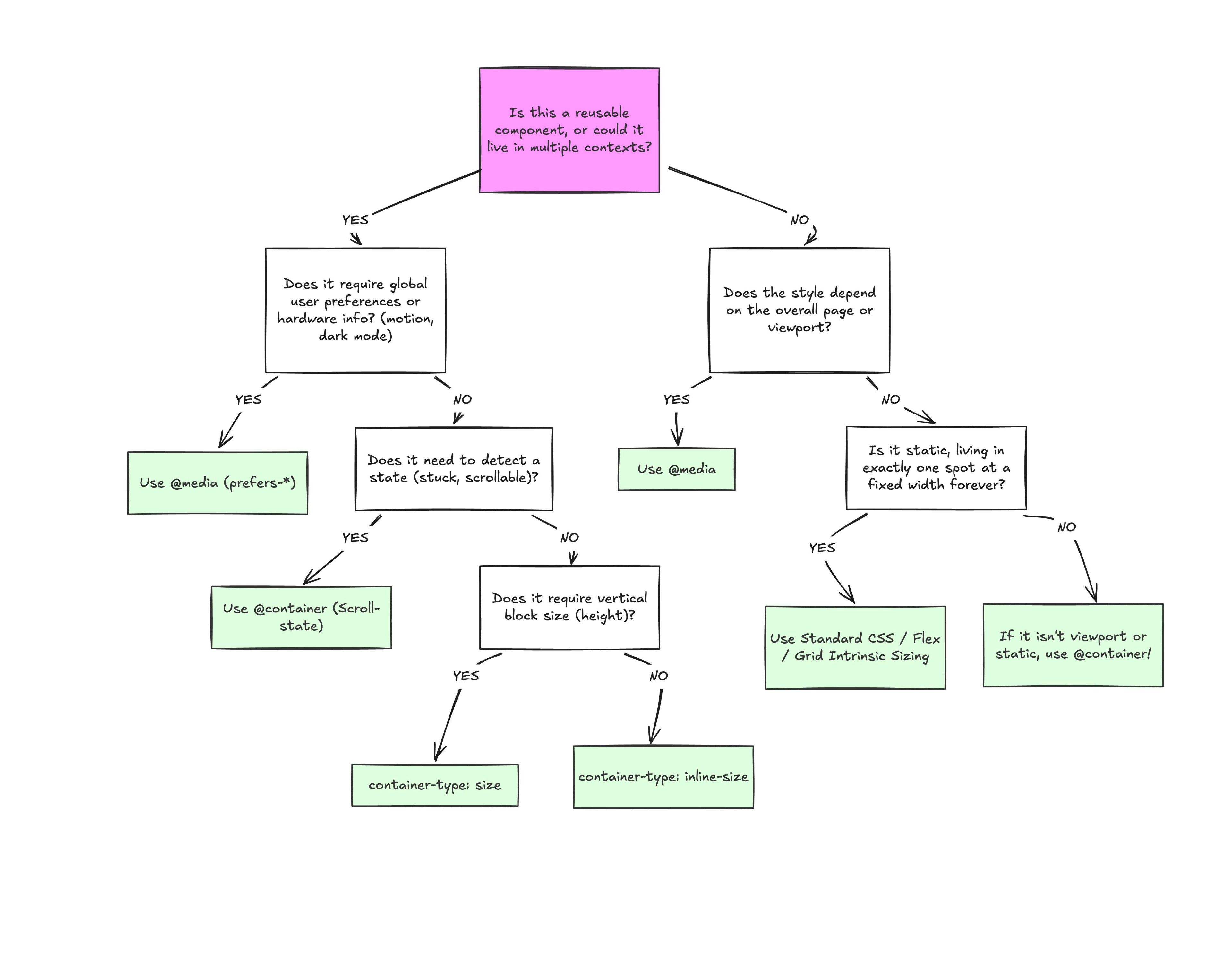
Container queries are not a wholesale replacement for media queries. Both belong in a responsive codebase, and the decision comes down to separation of concerns: whether the element being styled responds to its own context or to the viewport that contains the page.
Reach for @container When the Component Travels
If a component appears in more than one layout context, its styles should be driven by the space it is given rather than the size of the window. A .card that can sit in a full-width grid in one place and a narrow sidebar in another is the canonical case: a media query only sees the viewport, while the card needs to know when its own box stops fitting its content.
Reach for @media When the Component Owns the Page
Components that exist solely at the page level are a different story. A main navigation permanently anchored at the top of the page is directly affected by viewport size, so the viewport is a reliable reference for deciding when it should change. This maps onto the same split as before: macro layout belongs to media queries, micro layout to container queries.
Why the Confusion Persists
The syntax overlap between the two features is mostly a matter of familiarity. Container queries are not exactly new, but they are far less understood and far less widely adopted than media queries. That familiarity gap explains why the two are so often read as interchangeable.
Media queries also come with limits of their own; without those limits there would be no gap for container queries to close. What container queries add is a more effective way to detect when a specific component's context changes, and to adjust its styles according to that context — which is the behavior you want once a component can live in multiple places.