

What Fluid Typography Actually Means
Fluid typography scales smoothly between a minimum and maximum value based on viewport width. A typical setup keeps a constant minimum size until a certain screen width, then scales up as the viewport grows, and finally locks at a maximum size beyond another breakpoint. The same pattern can run in reverse, starting large and shrinking down.
This approach is not a replacement for regular responsive typography, where values change only at explicitly defined breakpoints. Each method has its appropriate use cases, and fluid sizing also works well for margins, padding, and gaps — not just text.
The early implementations relied on JavaScript libraries such as FlowType.JS. Later, CSS calc combined with viewport units (vw, vh) made a pure CSS solution possible. That approach required three separate rules: one to pin the minimum value, a media query for the fluid range, and another to lock the maximum. The math in the fluid rule was dense, and the boilerplate made the intent hard to read and maintain.
How CSS clamp Simplifies the Problem
The CSS clamp function accepts three arguments: a minimum bound, a preferred value, and a maximum bound. It selects the preferred value as long as it falls between the two bounds, otherwise it clamps to whichever bound is crossed. The preferred value usually contains viewport units, percentages, or other relative units to produce the fluid effect. The function works with any property that accepts lengths, percentages, numbers, angles, times, and similar value types, so it can size elements beyond just typography.
Browser support is above 90% at the time of writing. For older browsers that cannot parse clamp, a fallback declaration placed before it works since unsupported rules are ignored entirely.
A Basic clamp Example
Setting a font size between 32px and 48px with a fluid middle value looks like this:
font-size: clamp(32px, 4vw, 48px);Here, the minimum is 32px, the maximum is 48px, and the preferred value is 4vw — meaning 4% of the current viewport width determines the size whenever it lands inside those bounds.
Fix the Accessibility Gaps in clamp
That basic clamp expression has two accessibility problems and one clarity problem:
- Pixel bounds ignore user preferences. If a user has changed their default browser font size, pixel values will not scale to match.
- The
vwpreferred value also ignores preferences. It responds only to viewport width. - Magic numbers are hard to maintain. The
4vwvalue does not reveal when fluid scaling starts or stops.
Convert the minimum and maximum bounds from px to rem by dividing the pixel values by 16, the default browser font size:
font-size: clamp(2rem, 4vw, 3rem);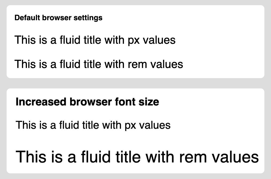
rem and em values do adapt. (Large preview)The preferred value needs a different treatment since it must react to viewport width. You can mix a relative rem value into the expression to let it respect user font preferences:
font-size: clamp(2rem, 4vw + 1rem, 3rem);This does not solve every accessibility concern. You still need to verify that fluid text can be zoomed enough and that it responds adequately to user accessibility preferences. The conversion only makes the base values scale with user settings; it does not guarantee sufficient contrast, legibility, or zoom behavior on its own.
The Math Behind the Preferred Value
The preferred value inside clamp() determines how fluid type behaves across viewport widths. Specifically, it controls the viewport range over which the minimum value transitions to the maximum value. Different minimum and maximum bounds require different preferred values, otherwise multiple fluid elements on the same page can begin scaling at different viewport points, which looks inconsistent.
To calculate the correct preferred value, treat fluid sizing as a linear function:
font-size: clamp([min]rem, [v]vw + [r]rem, [max]rem);
Where:
- x — current viewport width in
px. - y — resulting font size in
pxfor that viewport. - v — viewport-relative value in
vw(rate of change). - r — relative size equal to browser font size, default
16px.
For example, a minimum size of 2rem (32px) with a viewport value of 4vw stays constant up to 400px viewport width. At that point the preferred value expression calc(4vw + 16px) equals 32px, so fluid scaling begins. Beyond 800px viewport width, the same expression reaches 48px (3rem).
Solving for Real Breakpoints
A more practical scenario: a designer specifies a minimum font size of 36px, a maximum of 52px, where the minimum is used up to 600px viewport width and the maximum is reached at 1400px. Using the linear equation y = (v/100)*x + r with these two pairs of (x, y), we have two equations with two unknowns:
$$y_1 = \frac{v}{100} · x_1 + r$$
$$y_2 = \frac{v}{100} · x_2 + r$$
Solving for v:
$$v = \frac{100 · (y_2 - y_1)}{x_2 - x_1}$$
With the given values: v = 100 · (52 - 36) / (1400 - 600) = 2, i.e. 2vw.
Solving for r:
$$r = \frac{x_1y_2 - x_2y_1}{x_1 - x_2}$$
With the given values: r = (600·52 - 1400·36) / (600 - 1400) = 24px. Convert this to rem by dividing by 16: 1.5rem. The clamp() therefore becomes:
font-size: clamp(2.25rem, 2vw + 1.5rem, 3.25rem);Reversing the Direction
Fluid sizing can also scale down as the viewport grows. This requires a negative vw value in the preferred value. The same two equations determine the correct relative value to make the scaling start and stop at chosen breakpoints:
font-size: clamp(3rem, -4vw + 6rem, 4.5rem);This configuration is rarely needed in practice but is valid when text must grow on smaller screens.
A Fine-Tuning Tool
Manually calculating and syncing multiple fluid configurations is tedious. To that end, the author built Modern Fluid Typography Tool, an open-source visualizer inspired by a demo from Josh Comeau's CSS course. The tool shows fluid behavior on a chart, generates the corresponding CSS clamp() snippet, and can produce a shareable link to embed in documentation.

Zoom and Accessibility Caveats
Using vw units inside clamp() means text does not always scale to meet WCAG's requirement that users can resize text to 200%. Adrian Roselli has documented this problem and warns that if users cannot zoom sufficiently, it is a failure of criterion 1.4.4 Resize Text (AA).
"When you usevwunits or limit how large text can get withclamp(), there is a chance a user may be unable to scale the text to 200% of its original size. If that happens, it is WCAG failure under 1.4.4 Resize text (AA) so be certain to test the results with zoom." — Adrian Roselli
A potential fix is to override fluid sizing with fixed rem values when zoom is detected. JavaScript, however, cannot reliably detect zoom events. The Visual Viewport API has broad browser support but its scale property does not actually reflect the zoom level in practice, despite the API specification. Existing workarounds only detect zoom changes after the fact — not when a page first loads zoomed in. Until these API issues are resolved, the safest approach is to use clamp() sparingly and manually test zoom levels against WCAG thresholds.
Where Fluid Type Fits
Fluid typography is most effective for large, prominent headings where the difference between minimum and maximum sizes is significant. On small viewports, oversized display text with a large vw component looks out of place. Fluid scaling also helps keep a consistent measure — e.g., line length for paragraphs.
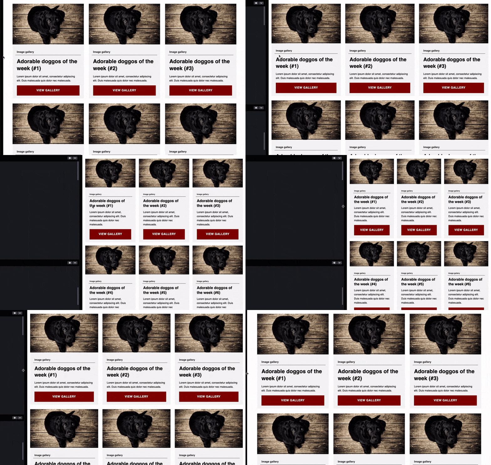
For body text, where the size range may be just a few pixels, standard breakpoint-based typography is usually sufficient and safer. The visual payoff of fluid scaling at a 2–4px delta is negligible.
Key Takeaways
- Use fluid typography as a supplement to, not replacement for, responsive breakpoint typography.
- Sync multiple fluid elements by calculating the same
vandrparameters, then reusing those as preferred values. - Always express sizes as
remso text respects user font-size preferences (butremalone does not solve zoom scaling). - The Visual Viewport API cannot currently be used to gracefully disable
vw-based sizing under zoom, so thorough testing is required.


