
Prioritize Delivery Over Raw Size
Cutting down the total weight of a page matters, but how those bytes arrive matters just as much. If critical CSS is buried in a single bundled file or the first paint depends on a slow API response, users will stare at a blank screen regardless of how light the page is. Focus on what the browser must fetch and execute before it can render anything useful.
Begin with the minimal CSS needed for the initial render, and load everything else lazily. The same logic applies to scripts: parse and execute only what's necessary for interaction, and defer the rest. This is less about being clever and more about sequence — the order in which resources are requested is the direct driver of perceived speed.
Simplify the Critical Path
Goal-oriented teams often track three primary factors in delivery: the time to first byte (TTFB), the critical rendering path length, and the size of critical resources. These are interrelated, and improving one often impacts the others. Set internal targets rather than relying solely on third-party checklists. For example, know your TTFB variance across regions, and keep the sum of critical request sizes well under compression-friendly limits.
Each request on the critical path adds latency. A round-trip is not just a network delay — it can wipe out any gain from a smaller file size. Serve critical CSS and JavaScript as inline <style> and <script> blocks where reasonable to skip the discovery phase entirely. Avoid loading external scripts that render-block. Remove unused CSS rules and split large, non-critical stylesheets into media-query-matched groups.
Trade Round Trips for Smart Requests
Where possible, redirects should be removed. Each redirect creates an extra request and delay, so audit for chains that go one hop too many. Eliminate any redirect that leads to a page that does not immediately supply full content — a redirect to a "flash" page is worse than a direct request.
Syndication approach: Request fewer, more complete files. HTTP/2 eases the burden of multiple requests previously seen under HTTP/1.1, but browsers still have connection limits. Under heavy request counts, these limits are being tested — especially when third-party widgets and trusted CDNs are mixed together.
Remove anything that does not add meaningful value. This applies to plugins, trackers, and slow third-party scripts. Third-party code is one of the top culprits that stalls a page's critical path. Track each external widget's impact on core user tasks. Terminate whatever fails to justify its effect on performance or user privacy.
For performance budgets, address not just total page size, but also how many milliseconds of CPU it takes to render at average hardware speeds. Run a Lighthouse run only against the critical-route page, and monitor the trend reports with a fixed throttling profile.
The Concrete Cost of Large Favicons (plus Touch Icons)
Even if a page loads quickly on desktop, tasks on a mid-level mobile device can decelerate hardware. A key question is whether the main thread activity matches user expectations for your specific content type — not numbers on a lab report. Every front-end work item should answer what you are fixing by improving infrastructure or delivery. Performance work needs concrete call-outs that anyone in product ownership or development can relay clearly.
Art direction matters once the page loads. Implement price-conscious lazy loading on product imagery: load what's visible, swap in high-resolution variants close to when they enter the viewport, and rely on width/height attributes to prevent layout shifts. Resize with srcset and format negotiation where browser support and workflow allow. Ask to postpone the full-size original image download.
Optimize background textures and any decorative imagery the same way. Then set about the actual payload budget process. Many budgets are optimized under byte counts. This flags a key problem: not all server pushes and connection-wise asset placements are equal. Custom behavior analysis permits nuanced comparison for image types. Tracking loading of real routes triggers discoveries about page-specific resources the developer cannot easily guess ahead of time. That drives the type of judgment calls that reduce bytes.
Script Delivery: Defer Over Async, and Lazy Loading Done Right
When the browser fetches a page and finds JavaScript that needs to be resolved, it won't render the page until that JavaScript is handled. The defer and async attributes are how you tell the browser it can proceed without waiting.
In most cases, defer is the safer choice. With async, the script executes as soon as it arrives, which can block the HTML parser if the file happens to load very quickly—for instance, when it's already in cache. defer, on the other hand, ensures scripts wait until the HTML is fully parsed before executing. Deferred scripts also run in order, while multiple async files execute in a non-deterministic order.
Two common misconceptions are worth clearing up: async doesn't mean the script runs the instant it's ready—it runs when it's ready and when all preceding synchronous work has finished. And you should never use both attributes together; modern browsers give async precedence whenever both are present.
Lazy Loading Expensive Components
Native lazy-loading via the loading attribute is available for images and iframes in Chromium. The browser calculates a distance threshold based on factors like resource type and effective connection type. Testing on Chrome for Android shows that on 4G, 97.5% of below-the-fold lazy-loaded images finished loading within 10ms of becoming visible.
<!-- Lazy loading for images, iframes, scripts.
Probably for images outside of the viewport. -->
<img ... />
<iframe ... />

<!-- Prompt an early download of an asset.
For critical images, e.g. hero images. -->
<img ... />
<iframe ... />
For finer control, the Intersection Observer API lets you watch a target element asynchronously and trigger callbacks when it crosses the viewport. You can tune behavior with rootMargin and threshold, which control the margin around the root and the percentage of visibility that fires the callback.
<!--
When the browser assigns "High" priority to an image,
but we don’t actually want that.
-->
<img src="less-important-image.svg" fetchpriority="low" ... />

<!--
We want to initiate an early fetch for a resource,
but also deprioritize it.
-->
<link rel="preload" fetchpriority="low" href="https://www.smashingmagazine.com/script.js" as="script" />
This technique extends beyond images: performant scrollytelling, translation strings, and even emoji can all be lazy-loaded. Twitter reported an 80% faster JavaScript execution from lazy-loading in its new internationalization pipeline. One caveat: lazy loading should be an exception, not the norm. Product-page images, hero images, and scripts needed for main navigation to become interactive should not be lazy-loaded.
Progressive Image Loading
You can pair lazy loading with progressive rendering, the approach used by Facebook, Pinterest, and Medium. Load a low-quality or blurry placeholder first, then swap in the full-quality asset as the page loads. The BlurHash technique or LQIP (Low Quality Image Placeholders) handles the placeholder side.
Tools like SQIP generate SVG placeholders automatically, and gradient placeholders built with CSS linear gradients are another lightweight option. Since SVG and CSS-based placeholders compress well with text compression, they can be embedded directly in the HTML. For browsers without Intersection Observer support, load a polyfill or images immediately. Some implementations go further, tracing images with primitive shapes and edges, then transitioning from the vector placeholder to the loaded bitmap.

Deferring Rendering Outside the Viewport
For pages with many content blocks, decoding data and rendering pixels can be expensive—especially on low-end devices. The content-visibility: auto property instructs the browser to skip layout for children while the container is off-screen.
footer {
  content-visibility: auto;
  contain-intrinsic-size: 1000px;
  /* 1000px is an estimated height for sections that are not rendered yet. */
}
Note that content-visibility: auto behaves like overflow: hidden. Using padding-left and padding-right rather than auto margins and a declared width lets elements overflow into the padding box instead of getting cut off.
Because layout shifts can occur when off-screen content eventually renders, pair the property with contain-intrinsic-size and a properly sized placeholder. If you need even more granularity, CSS Containment lets you manually skip layout, style, and paint work for descendants of a DOM node when you only need size or alignment information.
Deferred Decoding and Critical CSS
The decoding="async" attribute gives the browser permission to decode images off the main thread, avoiding CPU-related delays. For offscreen images, you can display a placeholder, then trigger a network download via IntersectionObserver once the image approaches the viewport. The Image Decode API (img.decode()) offers another path to defer rendering until decode finishes.
<img … />
Critical CSS—the styles required to render the first visible portion of the page—should be collected per template and inlined in the <head>, keeping the budget near 14KB to avoid extra roundtrips. Tools like CriticalCSS and Critical automate extraction, though manual collection per template often produces better results. The remaining CSS can be lazy-loaded or handled with media="print" to trick the browser into asynchronous fetching.
<!-- Via Scott Jehl. https://www.filamentgroup.com/lab/load-css-simpler/ -->
<!-- Load CSS asynchronously, with low priority -->
<link rel="stylesheet"
  href="full.css"
  media="print"
  onload="this.media='all'" />
Two pitfalls with critical CSS: when a user lands mid-page, hiding non-critical content until full CSS arrives can leave users on slow connections unable to read anything—content should stay visible. And while inlining is common, serving critical CSS as a separate file on the root domain can win on caching, since Chrome speculatively opens a second connection to the root domain. HTTP/2 server push was once considered for this, but it's being removed from Chrome due to race conditions and caching issues.
Regrouping CSS Rules
Splitting the main CSS file into individual media queries lets the browser fetch critical styles at high priority while everything else loads off the critical path at low priority. Placement matters too: avoid putting <link rel="stylesheet" /> ahead of async snippets. If scripts don't depend on stylesheets, load blocking scripts above blocking styles; if they do, split the JavaScript and load it on both sides of the CSS.
When critical CSS is inlined, caching it becomes a problem for repeat visits. One workaround adds an ID to the <style> element, uses JavaScript to find and store it via the Cache API with a text/css content type, then sets a cookie so subsequent pages reference the cached asset externally.
CSS-in-JS carries its own costs, usually when many composed components render concurrently. Make sure the library optimizes execution when CSS has no theme or prop dependencies, and avoid over-composing styled components.
Streaming Responses
Streams let a page work with a response as soon as the first chunk arrives. A service worker can construct a stream where the UI shell comes from cache but the body streams from the network. This model maps well to CMS setups that assemble HTML from partial templates—the templating logic moves into the service worker.
Streaming the entire HTML response has a key advantage: chunks rendered during the initial navigation use the browser's streaming HTML parser. Content inserted via JavaScript after page load can't take advantage of this optimization. Support is partial in Chrome, Firefox, Safari, and Edge. Streaming requests—sending a request while still generating its body—are experimental and available in Chrome 85.
Connection-Aware Components
With 18% of global Android Chrome users running Lite Mode (with Save-Data enabled), the Save-Data client hint header offers a way to tailor payloads. When it's on, Chrome Mobile already provides proxied experiences with deferred scripts, enforced font-display: swap, and lazy loading—but building the experience yourself beats relying on the browser.
Save-Data lets you rewrite high-DPI image requests to lower resolutions, remove web fonts or parallax effects, disable autoplay, or downgrade image quality. Opt-in rates vary widely: over 34% of users in Canada enable it versus ~7% in the US.
The Network Information API, specifically navigator.connection.effectiveType, uses RTT, downlink, and effectiveType values to represent connection quality. A media component might render a placeholder with alt text offline, a low-resolution image on 2G with save-data, mid-resolution on 3G non-Retina, high-resolution Retina on 3G, and HD video on 4G.
For videos, display the poster by default, then add the play icon and player shell on better connections. Fallback strategies include listening for the canplaythrough event and using Promise.race() to time out source loading after two seconds.
Device Memory-Aware Components
Network quality is only one variable. The Device Memory API exposes navigator.deviceMemory, returning RAM in gigabytes rounded down to the nearest power of two. The Device-Memory Client Hints Header reports the same value. You can combine both with hardware concurrency to defer expensive scripts via dynamic imports based on the user's full device context.
Warming Up Connections
Resource hints offer the easiest performance win. dns-prefetch performs DNS lookups in the background, preconnect starts the connection handshake, prefetch requests resources for future navigations, and preload fetches resources without executing them. These are well supported; only prerender has a complicated history.
The old prerender hint was deprecated for its memory and bandwidth costs. Chrome now treats it as NoState Prefetch, which fetches resources in advance but doesn't execute JavaScript or render pages. It uses about 45MiB of memory and adds a Purpose: Prefetch header to requests. Portals are a newer effort toward privacy-conscious prerendering with inset previews.
Most sites should use at least preconnect and dns-prefetch, ordered by priority since browsers limit parallel lookups. Be cautious with prefetch, preload, and prerender.
Preloading fonts can hurt performance by leapfrogging more critical resources like critical CSS. Since <link rel="preload"> accepts a media attribute, you can download resources conditionally based on media queries:
<!-- Loading two rendering-critical fonts, but not all their weights. -->
<!--
crossorigin="anonymous" is required due to CORS.
Without it, preloaded fonts will be ignored.
https://github.com/w3c/preload/issues/32
via https://twitter.com/iamakulov/status/1275790151642423303
-->
<link rel="preload" as="font"
      href="Elena-Regular.woff2"
      type="font/woff2"
      crossorigin="anonymous"
      media="only screen and (min-width: 48rem)" />
<link rel="preload" as="font"
      href="Mija-Bold.woff2"
      type="font/woff2"
      crossorigin="anonymous"
      media="only screen and (min-width: 48rem)" />
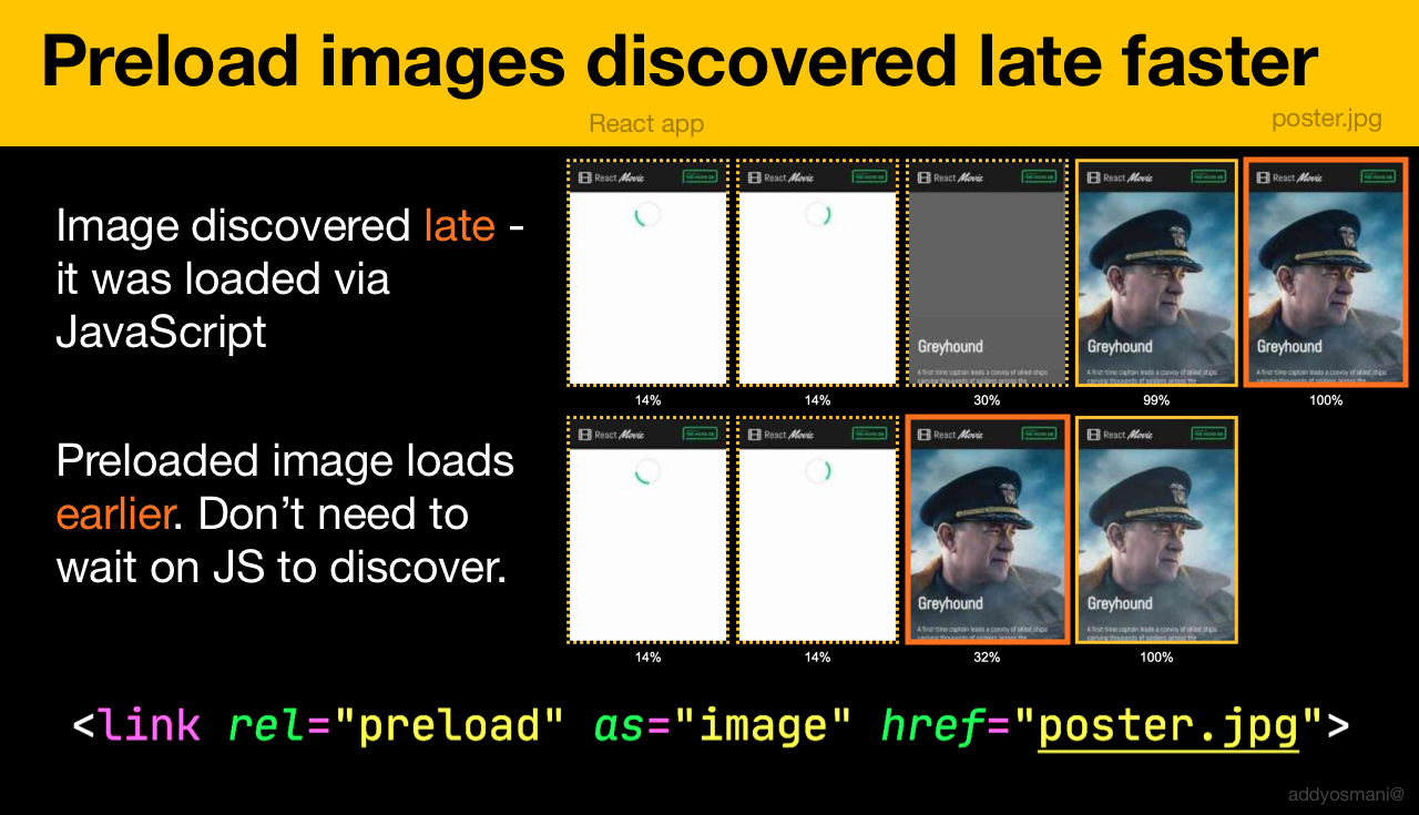
Preload hero images or late-discovered JavaScript-loaded images using imagesrcset and imagesizes:
<!-- Addy Osmani. https://addyosmani.com/blog/preload-hero-images/ -->
<link rel="preload" as="image"
     href="poster.jpg"
     imagesrcset="
        poster_400px.jpg 400w,
        poster_800px.jpg 800w,
        poster_1600px.jpg 1600w"
    imagesizes="50vw">
JSON can be preloaded as fetch so it's discovered before JavaScript requests it:
<!-- Addy Osmani. https://addyosmani.com/blog/preload-hero-images/ -->
<link rel="preload" as="fetch" href="foo.com/api/movies.json" crossorigin>
Dynamic loading via preload enables lazy script execution:
/* Adding a preload hint to the head */
var preload = document.createElement("link");
link.href = "myscript.js";
link.rel = "preload";
link.as = "script";
document.head.appendChild(link);

/* Injecting a script when we want it to execute */
var script = document.createElement("script");
script.src = "myscript.js";
document.body.appendChild(script);
Preloaded assets land in the memory cache tied to the requesting page, so it works best with HTTP cache—no network request goes out if the item is already cached. It's useful for late-discovered resources, hero images loaded via background-image, and splitting critical CSS or JavaScript from the rest.
Preload via HTTP header can start faster than an HTML tag since it doesn't wait for lookahead parsing. Early Hints will push this further by enabling preload before response headers are sent. Priority Hints will eventually let you indicate script loading priorities.
Two gotchas: as must be defined on preload or nothing loads, and preloaded fonts without the crossorigin attribute will double-fetch.
Service Workers for Cache and Fallbacks
A local cache beats any network optimization. On HTTPS, service workers can cache static assets, offline fallbacks, and entire pages—retrieving them locally rather than from the network.
Service workers also enable smaller HTML payloads: the worker requests raw data (HTML partials, Markdown, JSON) and programmatically assembles the full document. After the first visit, users never request a full HTML page again. Support is wide, with the network as natural fallback.
Use cases include save-for-offline features, handling broken images, tab-to-tab messaging, and caching strategies based on request types. Watch for Safari's range request issues (Workbox has a module for this) and DOMException: Quota exceeded errors. Caching CDN-served static assets can bloat storage: ensure proper CORS response headers exist for cross-origin resources, don't cache opaque responses unintentionally, and opt cross-origin images into CORS mode with the crossorigin attribute.
Resources for getting started include the Service Worker Mindset guide, Chris Ferdinandi's article series, "Service Worker Pitfalls and Best Practices," Ire Aderinokun's "Offline First" series, Jake Archibald's Offline Cookbook, and Workbox.
Service workers also run on CDN edges. For A/B testing where HTML varies per user, edge workers can handle the serving logic, and streaming HTML rewriting can speed up sites using Google Fonts.
Rendering Performance
Sluggishness is immediately noticeable. Aim for a consistent 60 frames per second; a steady rate matters more than spiking to 60 and dropping to 15. Use will-change to inform the browser about elements and properties that will animate.
When debugging repaints:
- Measure runtime rendering performance in DevTools (check the Performance reference for tips).
- Enable Paint Flashing in More tools → Rendering in Firefox DevTools.
- In React DevTools, check "Highlight updates" and enable "Record why each component rendered."
- Use the Why Did You Render library to flash when components re-render.

GPU-composited layer changes are the least expensive, so triggering only compositing via opacity and transform is the most performant path. Additionally, CSS grid alone can build Masonry layouts soon, avoiding heavier scripted solutions.
Shipping Strategies: Critical CSS and HTML Streaming
The order in which assets reach the browser often matters as much as their size. For CSS, the standard advice remains: identify what is needed for first paint, inline it in the <head>, and load the rest asynchronously. Tools like critical extract the above-the-fold styles, and the remainder can be fetched with preload and applied only when needed. This avoids render-blocking delays without forcing a separate round trip for the initial view.
For more advanced setups, server-side rendering paired with streaming via the Transfer-Encoding: chunked mechanism allows the browser to receive and render the HTML shell before the full document is ready. Combined with route-based code splitting, this gives faster time-to-interactive on slower connections. The approach is not new, but it has become more practical with React's renderToNodeStream and similar APIs in other frameworks.
Removing Unused JavaScript
Performance budgets must include byte-for-byte scrutiny of the final bundle. Beyond tree shaking, you should examine dependency weight with tools like webpack-bundle-analyzer or source-map-explorer. A common pattern is to replace heavy libraries with smaller alternatives: moment.js can often be swapped for date-fns or native Intl, and utility libraries such as lodash can be reduced to cherry-picked functions.
Never ship polyfills blindly. Use @babel/preset-env with the useBuiltIns option set to "usage", targeting only the browsers you actually support. Consider differential serving: ship modern ES2015+ code to capable browsers and a transpiled fallback only to legacy ones, using <script type="module"> and nomodule.
Legacy Code Budgets
A dedicated budget for legacy JavaScript is wise. Code that requires transpilation and polyfills often has disproportionately large overhead compared to its value. If legacy support is mandatory, keep that payload under a strict limit, and measure it separately from the modern build in your CI pipeline.
Optimizing Web Fonts
Fonts are a frequent hidden cost. Self-host whenever possible to avoid third-party DNS lookups and connection setups. Use font-display: swap to prevent invisible text, but be aware of layout shift; preloading the most important font file can mitigate this. Subsetting fonts to the character sets you use is often the single biggest win here.
The preload hint should point to the WOFF2 file, not an HTML or CSS file. Also, avoid loading multiple weights and styles unless they are on the page; consider using a variable font to cover multiple weights in one file. An all-too-common mistake is downloading fonts for every @font-face declared when only a couple are actually in use.
Image Delivery and Client Hints
Images remain the largest single category of transferred bytes. The <picture> element with srcset and sizes handles responsive delivery, but server-side negotiation can go further. Client Hints (DPR, Width, Viewport-Width) allow the server to select the optimal file without markup changes. When they are enabled, the request headers guide transformations, and you can enforce a cap on the image quality to avoid inflated file sizes on high-DPI screens.
Another delivery tactic is lazy loading, but define the thresholds carefully. Native loading="lazy" is now well-supported; however, be careful with images placed above the fold — they must remain eager to avoid delaying the Largest Contentful Paint. The combination of the IntersectionObserver API and placeholder techniques still works for controlling what loads precisely when the user approaches it.
Serving Images with CDNs
Always terminate TLS close to the user and consider image-oriented CDN features: automatic WebP or AVIF conversion, compression adjustments, and media resizing via query parameters. This shifts processing cost to the edge and lets you skip bespoke local pipelines. The point is to keep origin responses light and cached aggressively with long Cache-Control or immutable flags for hashed assets.
Edge Caching and Cache Invalidation
A CDN helps only if cache-hit rates are high. For versioned assets such as scripts and stylesheets, use permanent caching (Cache-Control: max-age=31536000, immutable) so browsers do not revalidate. For HTML, use short or no caching, and rely on the CDN to persist copies while you purge them on deploy.
Modern CDNs support stale-while-revalidate. This header serves old content instantly to users while triggering an update in the background, which is a robust response when the origin slows down or failing. Combining it with conditionals looks good for slow paths: ETag and Last-Modified make sure a 304 Not Modified is already available
Prefetch and Preconnect for the Next Steps
Hinting the browser about future navigations is an effective delivery trick. Use preconnect to warm up connections to origins that will be hit soon, and dns-prefetch as a fallback. But do not overdo it — every connection has an upfront cost, and cross-origin resources that the page does not actually use in the end are wasted.
For transition-heavy sites or pagination, consider prefetching the next page or its critical chunks when the expiration is in the near future. The JavaScript execution must be budgeted, so use prefetch only for resources the next route will genuinely need, not all routes at once. For same-origin navigation, <link rel="prefetch"> and modulepreload can make the difference appear instant.
Finally, assess the details on the browser's own heuristic. The resource hints work best when layered with HTTP/2 or HTTP/3, as multiplexing reduces the cost of parallel requests. A well-thought-out delivery plan accounts for reducing average one-way-time as much as server round trips.