

Why Performance Still Comes Down to JavaScript
Web performance remains one of the highest-leverage factors in any online project’s success. Slow sites lose users, and lost users translate directly into lost revenue. But performance is not just a matter of raw speed; it is about both objective measurements and perceived user experience. The challenge is getting a page to load quickly, become interactive as soon as possible, and remain pleasant to use throughout.
For developers, two factors tend to dominate the effort. One is image optimization, which has been covered extensively elsewhere. The other is the amount of JavaScript shipped to the browser. Large bundles take longer to transmit, parse, and execute, which delays both initial load and Time to Interactive. Modern frontend frameworks that rely on client-side rendering offer impressive developer experience and app-like behavior, but they come with a heavy cost: their JavaScript payloads are substantial, and that weight is paid on every page load.
For content-driven websites — marketing sites, documentation portals, eCommerce storefronts — most of the page does not actually need JavaScript at all. The bulk of the content can be served as static HTML. The question is whether you can get the best of both worlds: a great developer experience and a minimal runtime footprint.
Astro: Static by Default, Interactive on Demand
Astro is an all-in-one web framework built specifically for fast, content-focused websites. Its core approach is to replace unused JavaScript with server-rendered HTML, which means sites ship zero JavaScript out of the box. That directly improves load times and interactivity. Astro is candid about its scope: if your project is a web application rather than a content-driven site, another framework may be a better fit.
The framework’s Islands architecture enables partial hydration. Only the components that genuinely need interactivity are hydrated, and they are hydrated in isolation. The rest of the page remains static HTML. This has a significant impact on performance, yet it does not sacrifice the developer experience. In fact, Astro supports bringing your own framework — Vue, Svelte, React, and others can be used side by side in the same project.
This model is particularly well suited to collaborative projects where content creators and developers work together. A headless CMS fits naturally into that workflow, letting the team manage content without compromising the architecture’s performance benefits.
Pairing Astro with a Headless CMS
Storyblok is a headless CMS designed for both developers and content creators. It is framework-agnostic, so it can be connected to an Astro project quickly. Its Visual Editor supports complex layouts, and content localization and personalization are built in. The API-first design also makes it possible to deliver content across multiple platforms from the same source.
Combining Astro’s static-first, islands-based rendering with a headless CMS gives teams a workflow where the frontend is fast by default and content management remains flexible. The result is an architecture that meets the needs of users, developers, and content editors alike.
Building A Tabbed Content Island With Storyblok And Astro
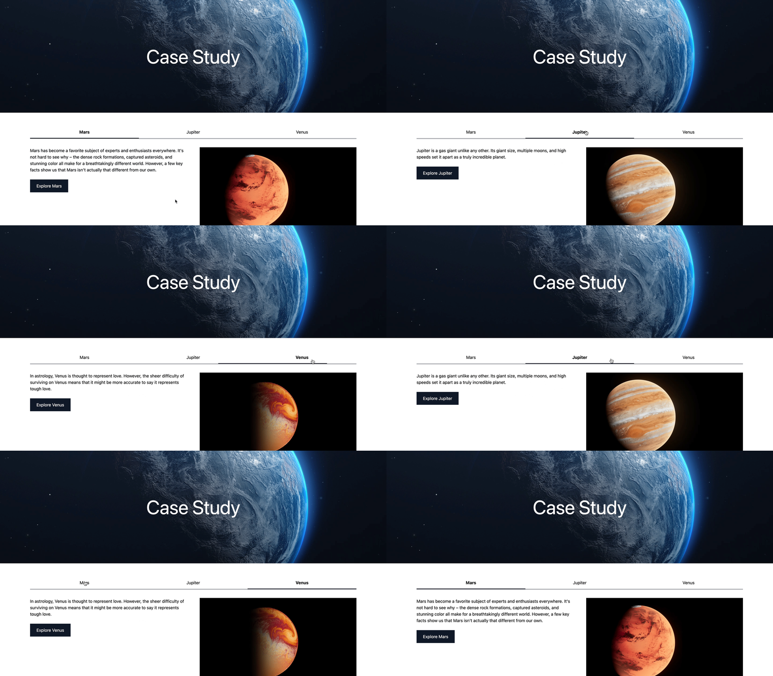
To show how interactive components fit into an Astro and Storyblok workflow, we’ll build a landing page with a static hero section and a tabbed content section rendered as a dynamic island. The same component will be implemented twice — once in Vue and once in Svelte — to highlight the flexibility of this stack.
Setting Up The Project
After creating a Storyblok account and space (the Community plan works fine), use Storyblok’s CLI to scaffold a project connected to that space:
npx @storyblok/create-demo@latest --key <your-access-token>
The complete command, including your personal access token, is available in the Get Started section of your space.

During scaffolding, select Astro, your preferred package manager, the region of your space, and a local folder. Then run npm install && npm run dev.
For the Visual Editor to work, go to Settings > Visual Editor and set the default environment to https://127.0.0.1:3000/. Then open the Home story, go to Entry configuration, and set the Real path to / so that src/pages/index.astro loads the story correctly. After saving, the page should render in the Visual Editor.
Creating The Static Hero Component
In the Block Library, delete the default nestable blocks (Grid, Teaser, Feature) — we only need the Page content type block. Then create a new nestable block called Hero (hero) with these fields:
caption(Text)image(Asset > Images)
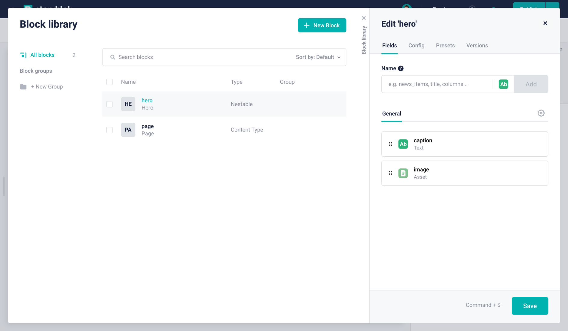
Back in the Home story, delete the existing Teaser and Grid instances, then add a Hero with a caption and image of your choice.
In your Astro project, register the component in astro.config.mjs:
storyblok({
  accessToken: '<your-access-token>', // ideally, you would want to use an environment variable for the token
  components: {
    page: 'storyblok/Page',
    hero: 'storyblok/Hero',
  },
})
Delete the Grid, Feature, and Teaser components in src/storyblok, then create src/storyblok/Hero.astro:
---
import { storyblokEditable } from '@storyblok/astro'

const { blok } = Astro.props
---

<section
  {...storyblokEditable(blok)}
  class='relative w-full h-[50vh] min-h-[400px] max-h-[800px] flex items-center justify-center'
>
  <h2 class='relative z-10 text-white text-7xl'>{blok.caption}</h2>
  <img
    src={blok.image?.filename}
    alt={blok.image?.alt}
    class='absolute top-0 left-0 object-cover w-full h-full z-0'
  />
</section>
The Hero block now renders as pure static HTML with zero JavaScript — a native Astro component.
Building The Tabbed Content Blocks
For interactivity, we need a two-level component structure in Storyblok. First, create a nestable block Tabbed Content Entry (tabbed_content_entry) with:
headline(Text)description(Textarea)image(Asset > Images)

Then create a superordinate nestable block Tabbed Content (tabbed_content) with:
entries(Blocks > Allow onlytabbed_content_entry)directive(Single-Option > Source: Self) with options: load →load, idle →idle, visible →visible(Default:idle)

The entries field restricts nested blocks to tabbed_content_entry types. The directive field maps to Astro’s client directives, letting content creators choose when the component hydrates: at the highest priority (load), after initial load (idle), or when it scrolls into view (visible).
Using visible yields the biggest performance gain for below-the-fold content. The default idle hydrates on page load — but in every case, the rest of the page stays static HTML.
Before moving to code, add a Tabbed Content component to your page with three example entries.
Registering The Wrapper Component In Astro
First, register the new component in astro.config.mjs:
storyblok({
  accessToken: '<your-access-token>',
  components: {
    page: 'storyblok/Page',
    hero: 'storyblok/Hero',
    tabbed_content: 'storyblok/TabbedContent',
  },
}),
Then create storyblok/TabbedContent.astro as a preliminary wrapper:
---
import { storyblokEditable } from '@storyblok/astro'

const { blok } = Astro.props
---

<section {...storyblokEditable(blok)}></section>
This wrapper will import the actual framework component and assign the client directive dynamically based on the value from Storyblok.
Rendering With Vue
Install Vue in the Astro project:
npx astro add vue
Create the Vue component at storyblok/TabbedContent.vue:
<script setup lang="ts">
import { ref } from 'vue'
const props = defineProps({ blok: Object })

const activeTab = ref(0)

const setActiveTab = (index) => {
  activeTab.value = index
}

const tabWidth = ref(100 / props.blok.entries.length)
</script>

<template>
  <ul class="relative border-b border-gray-900 mb-8 flex">
    <li
      v-for="(entry, index) in blok.entries"
      :key="entry._uid"
      :style="'width:' + tabWidth + '%'"
    >
      <button
        @click.prevent="setActiveTab(index)"
        class="cursor-pointer p-3 text-center"
        :class="index === activeTab ? 'font-bold' : ''"
      >
        {{ entry.headline }}
      </button>
    </li>
  </ul>
  <section
    v-for="(entry, index) in blok.entries"
    :key="entry._uid"
    :id="'entry-' + entry._uid"
  >
    <div v-if="index === activeTab" class="grid grid-cols-2 gap-12">
      <div>
        <p>{{ entry.description }}</p>
        <a
          :href="entry.link?.cached_url"
          class="inline-flex bg-gray-900 text-white py-3 px-6 mt-6"
          >Explore {{ entry.headline }}</a
        >
      </div>
      <img :src="entry.image?.filename" :alt="entry.image?.alt" />
    </div>
  </section>
</template>

<style scoped>
ul:after {
  content: '';
  @apply absolute bottom-0 left-0 h-0.5 bg-gray-900 transition-all duration-500;
  width: v-bind(tabWidth + '%');
  margin-left: v-bind(activeTab * tabWidth + '%');
}
</style>
Now update the Astro wrapper to import the Vue component, pass the entire blok object as a property, and set the directive based on the Storyblok value:
---
import { storyblokEditable } from '@storyblok/astro'
import TabbedContent from './TabbedContent.vue'

const { blok } = Astro.props
---

<section {...storyblokEditable(blok)} class='container py-12'>
  {blok.directive === 'load' && <TabbedContent blok={blok} client:load />}
  {blok.directive === 'idle' && <TabbedContent blok={blok} client:idle />}
  {blok.directive === 'visible' && <TabbedContent blok={blok} client:visible />}
</section>
The Astro wrapper is the correct place to manage hydration. By mapping the Storyblok directive value to Astro’s client directive, you give editors control over performance without touching code.
Switching To Svelte
To demonstrate how easily the framework can be swapped, install Svelte instead:
npx astro add svelte
Create the Svelte component at storyblok/TabbedContent.svelte:
<script>
  export let blok

  let tabWidth = 100 / blok.entries.length
  let activeTab = 0
  let marginLeft = 0

  const setActiveTab = (index) => {
    activeTab = index
    marginLeft = activeTab * tabWidth
  }
</script>

<ul
  class="relative border-b border-gray-900 mb-8 flex"
  style="--tab-width: {tabWidth}%; --margin-left: {marginLeft}%;"
>
  {#each blok.entries as entry, index (entry._uid)}
    <li style="width: var(--tab-width)">
      <button
        class="{index === activeTab
          ? 'font-bold'
          : ''} w-full cursor-pointer p-3 text-center"
        on:click={() => setActiveTab(index)}>{entry.headline}</button
      >
    </li>
  {/each}
</ul>
{#each blok.entries as entry, index (entry._uid)}
  {#if index === activeTab}
    <section id={entry._uid}>
      <div class="grid grid-cols-2 gap-12">
        <div>
          <p>{entry.description}</p>
          <a
            href={entry.link?.cached_url}
            class="inline-flex bg-gray-900 text-white py-3 px-6 mt-6"
            >Explore {entry.headline}</a
          >
        </div>
        <img src={entry.image?.filename} alt={entry.image?.alt} />
      </div>
    </section>
  {/if}
{/each}

<style>
  ul:after {
    content: '';
    @apply absolute bottom-0 left-0 h-0.5 bg-gray-900 transition-all duration-500;
    width: var(--tab-width);
    margin-left: var(--margin-left);
  }
</style>
Then change only the import in TabbedContent.astro:
//import TabbedContent from './TabbedContent.vue'
import TabbedContent from './TabbedContent.svelte'
Everything else — the props, the data flow from Storyblok, and the directive logic — stays the same. The component now runs on Svelte instead of Vue. Because Astro passes the blok object down as a property, the same content can be reused across different framework implementations.
Why This Stack Holds Up
Astro gives developers strong DX, fast performance by default, and the freedom to use — or mix — component frameworks. That flexibility extends into the future: swapping from Vue to Svelte, or React to Vue, requires changing the component layer, not the project foundation.
Storyblok gives editorial teams the autonomy to build pages quickly while reusing the interactive components you’ve built. Because the interactive parts are lazy-loaded only when needed, page performance stays high regardless of how many dynamic blocks a page contains.
Resources
- Astro Case Study Smashing Magazine on GitHub



