

Auditing Color And Contrast In The Styles Pane
Chrome DevTools includes a contrast ratio checker inside its color picker, giving you an immediate yes/no answer on whether the selected text color meets minimum contrast standards. This matters because a high level of contrast between text and its background means more legible content for users of different abilities — including those reading on a phone with reduced brightness or outdoors in direct sunlight.
To check a text element's contrast ratio:
- Inspect the text element with DevTools open.
- In the Styles pane, click the small colored square next to a color property.
- In the color picker, click the text that says
Contrast ratio.
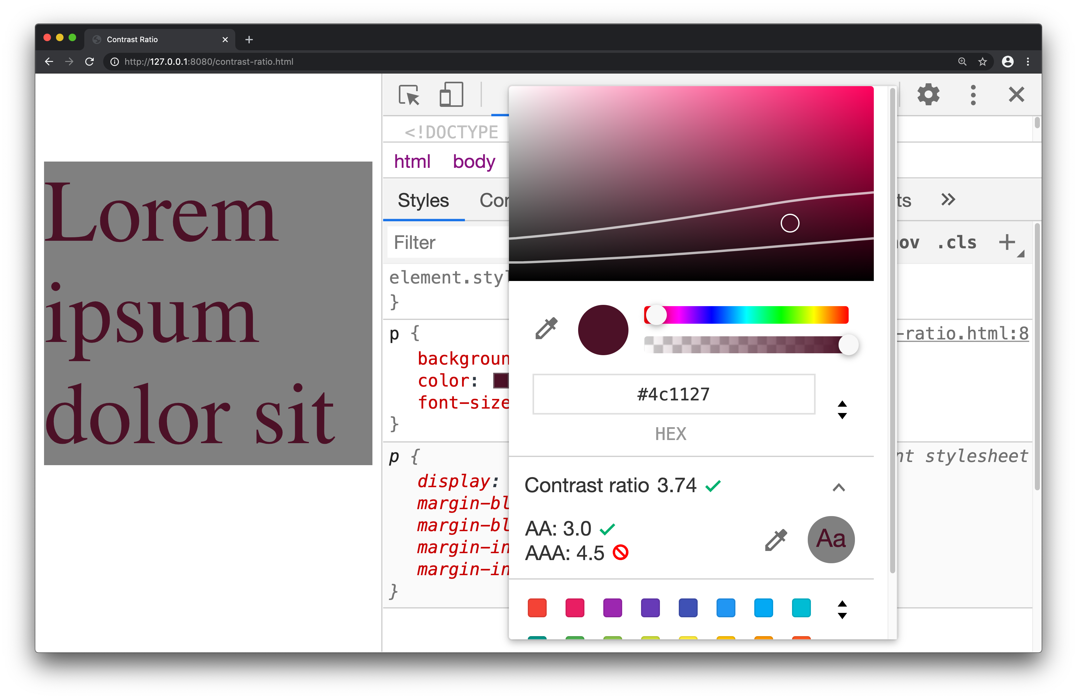
The three ratios displayed are your current contrast ratio, the AA minimum, and the AAA enhanced threshold. To get a feel for the feature, drag the circular picker across the color spectrum and note the points where each threshold is met.
<p class="alert" role="alert">
    That transaction was successful
</p>
Reviewing ARIA And Accessibility Properties
The Accessibility pane in the Elements panel exposes DOM node properties relevant to assistive technology. It shows the accessibility tree, ARIA attributes, and computed properties like focusability or editability. When you inspect an element — a hyperlink or a search box, for instance — the pane reveals whether it carries roles such as alert, which a screen reader can announce to the user.
To open the pane, inspect any element, then find Accessibility in the Elements panel. Since it isn't open by default, the quickest route is usually the Command Menu (Cmd + Shift + P), where you can search for Show Accessibility.
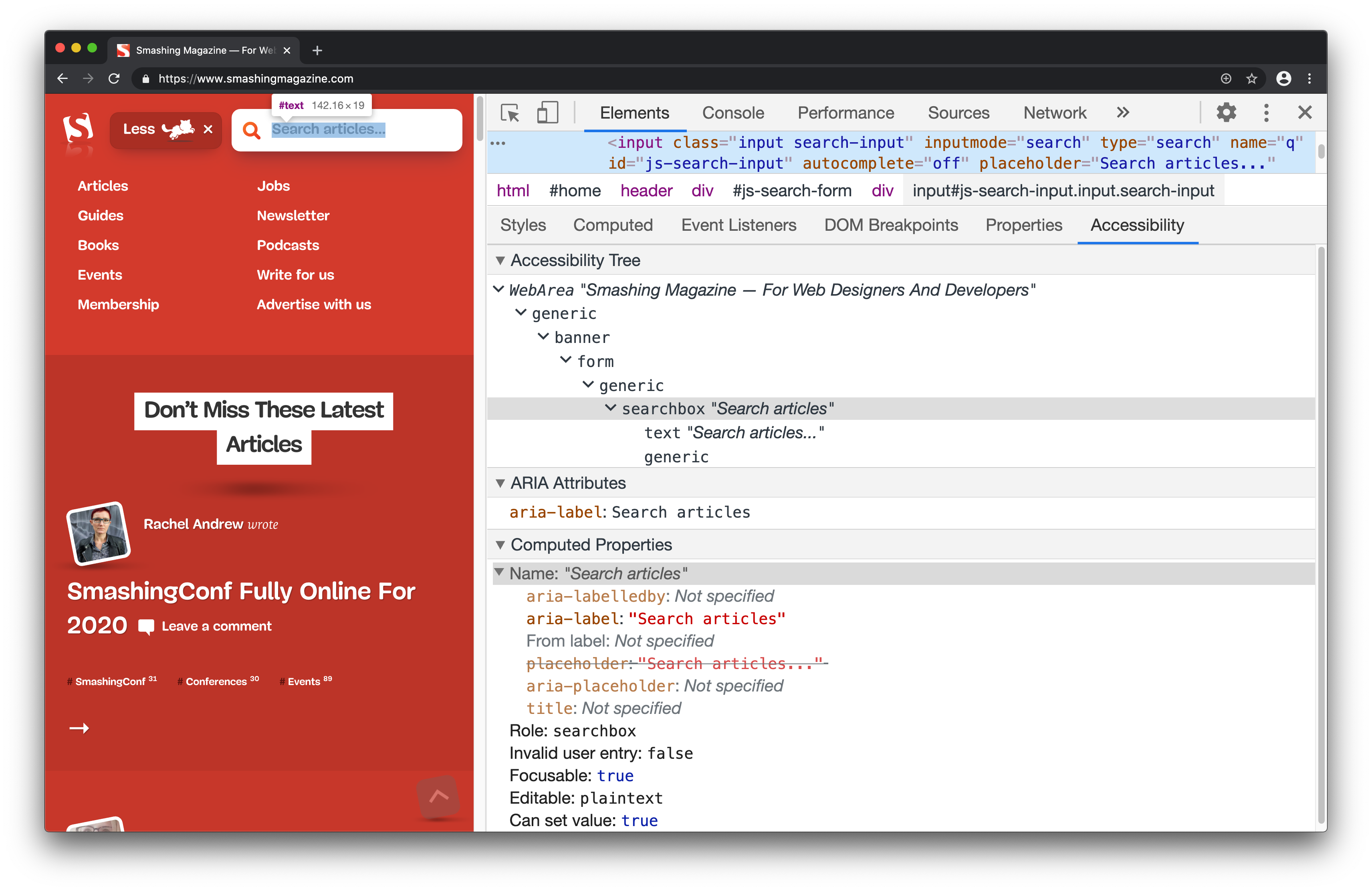
What you see is live: edits made in the DOM tree reflect immediately in the Accessibility pane, which helps when fixing misspelled ARIA attributes. Note that some elements legitimately need no ARIA properties at all, so the absence of attributes isn't necessarily an error. And if you already rely on an automated tool like axe to validate your markup, you may rarely need this pane — that's fine.
Automated Audits With Lighthouse
Lighthouse combines best-practice, performance, security, and accessibility checks into a single report — no installation required. Its audits are instructional by nature: each failed check links to dedicated documentation explaining what went wrong and how to fix it, which makes the tool a solid on-ramp for clicking through accessibility theory in practice.
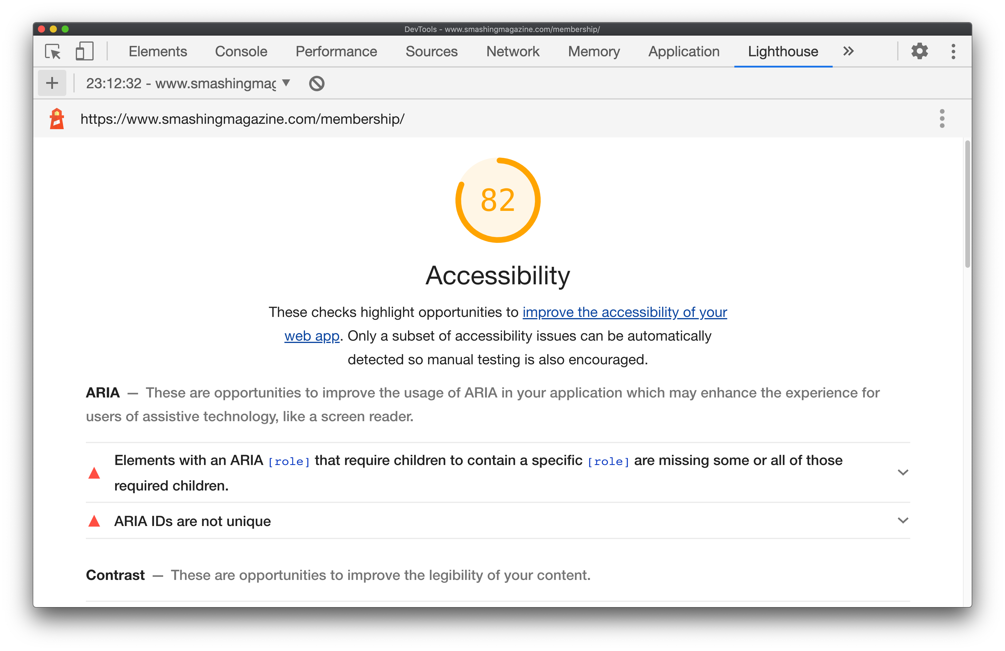
To run an accessibility-only audit:
- Open the Lighthouse panel in DevTools.
- Uncheck all categories except Accessibility.
- Click Generate Report.
- Work through the audits to learn what failed and why.
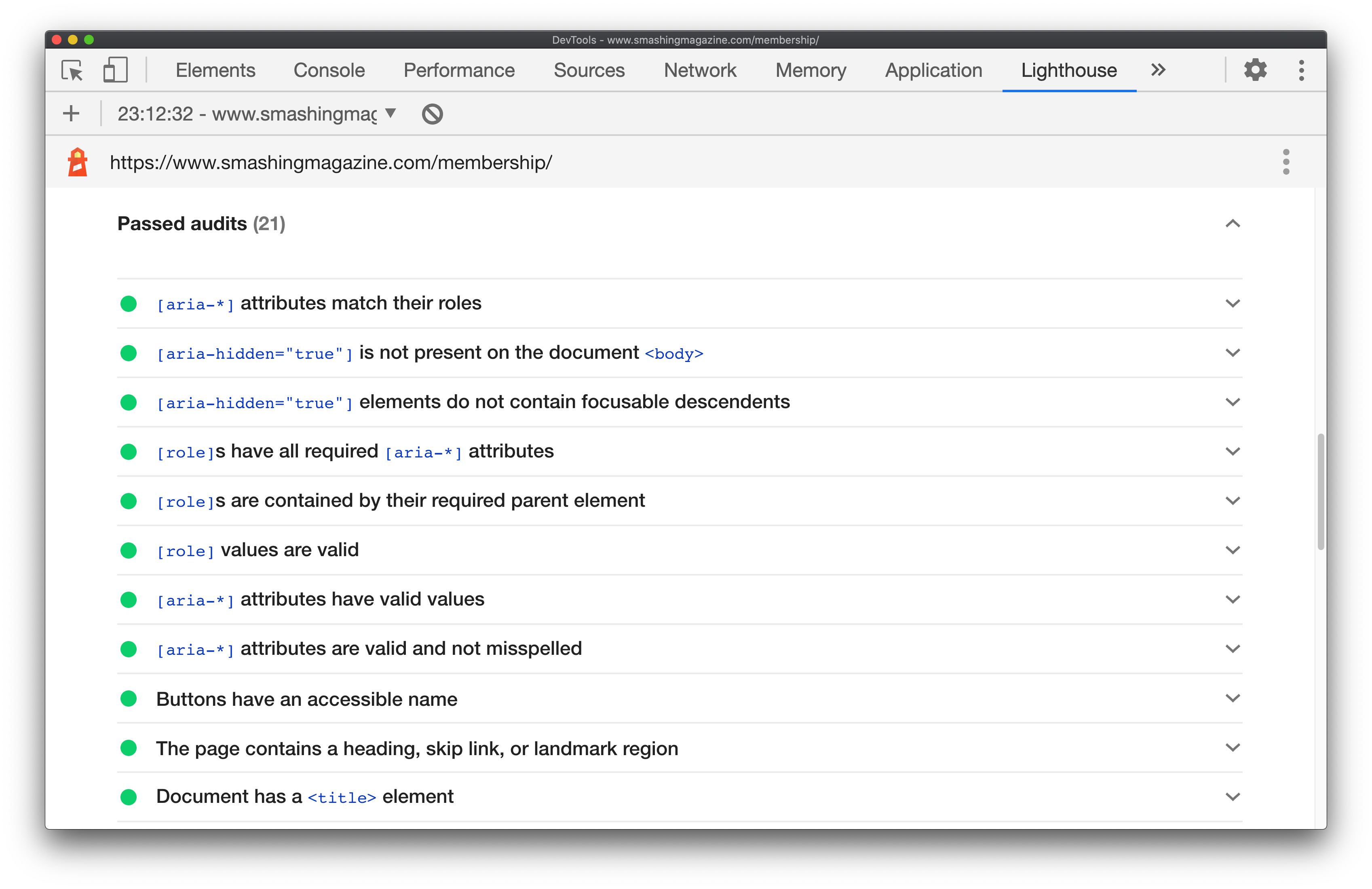
Even passing audits are worth opening. Most documentation pages are brief — the one on ensuring a document <title> exists covers failure conditions, how to add a title, tips for strong titles, and examples of weak versus strong titles in roughly 300 words.
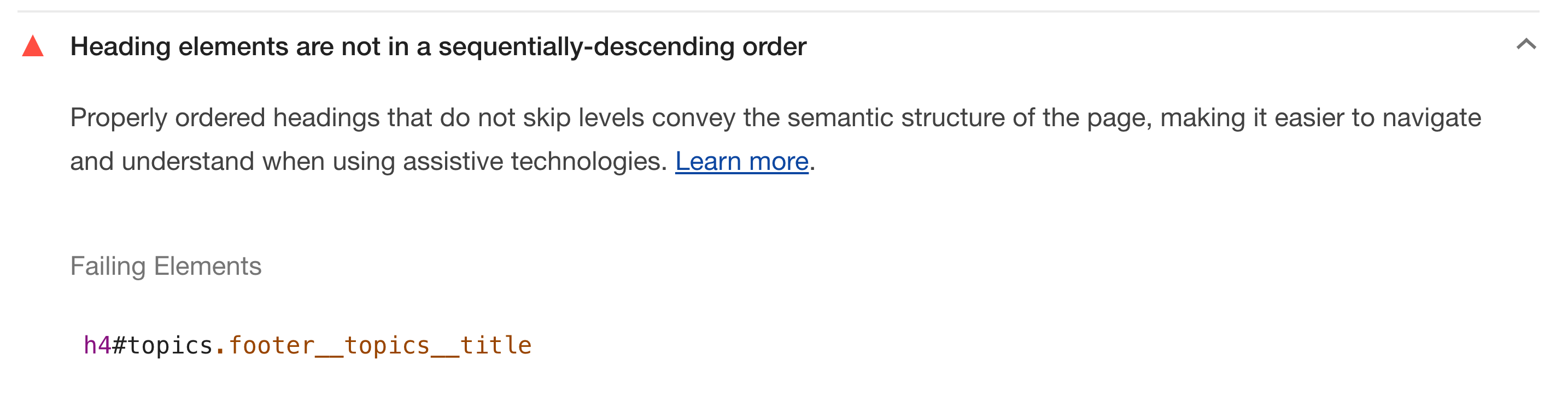
As you get deeper into accessible markup, you may find yourself shifting from these pre-defined audits toward the richer, live inspection workflow of the Accessibility pane.
Simulating Vision Deficiencies
You can apply vision deficiencies like blurred vision directly to the rendered page via DevTools. Roughly 1 in 12 men and 1 in 200 women have color vision deficiencies, and some low visual acuity cannot be fully corrected with glasses or surgery — so testing under these conditions is a legitimate part of page verification.
A common finding involves imagery: an important image that is comprehensible in ideal conditions can become difficult to parse for someone with tritanopia or blurred vision. You may discover, for example, that a lower-resolution image becomes illegible while a higher-resolution alternative remains usable.
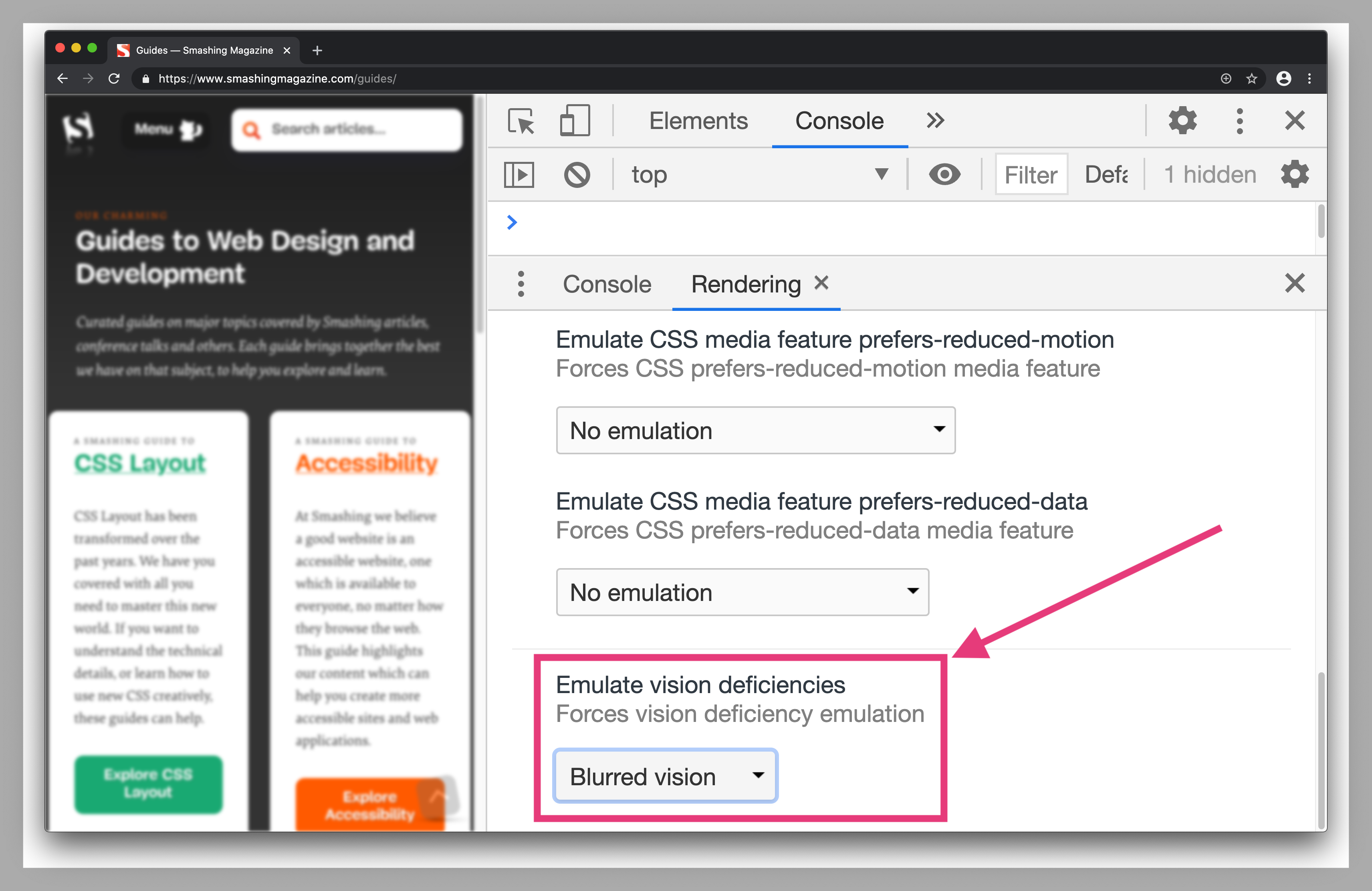
To try this:
- Open the Command Menu (
Cmd+Shift+PorCtrl+Shift+Pon Windows). - Search for and select Show rendering.
- Under Emulate vision deficiencies, pick Blurred vision, Protanopia (red-light insensitivity), or Tritanopia (impaired blue and yellow vision).
These simulations won't fully reproduce the nuance of real-world deficiencies, but they remain a useful check while designing and building pages.
The Accessibility-Focused Inspect Tooltip
Chrome DevTools has extended its Inspect Element tooltip to include an accessibility section. While the other DevTools features for accessibility require deliberate navigation, this one surfaces information during one of the most everyday workflows: hovering over an element to inspect it.
What the Tooltip Shows
When you trigger the Inspect Element feature, the tooltip now displays a dedicated accessibility area. It borrows the same properties covered in the Contrast Ratio section and the Accessibility Inspector, presenting them in a condensed format so you can spot potential issues at a glance.
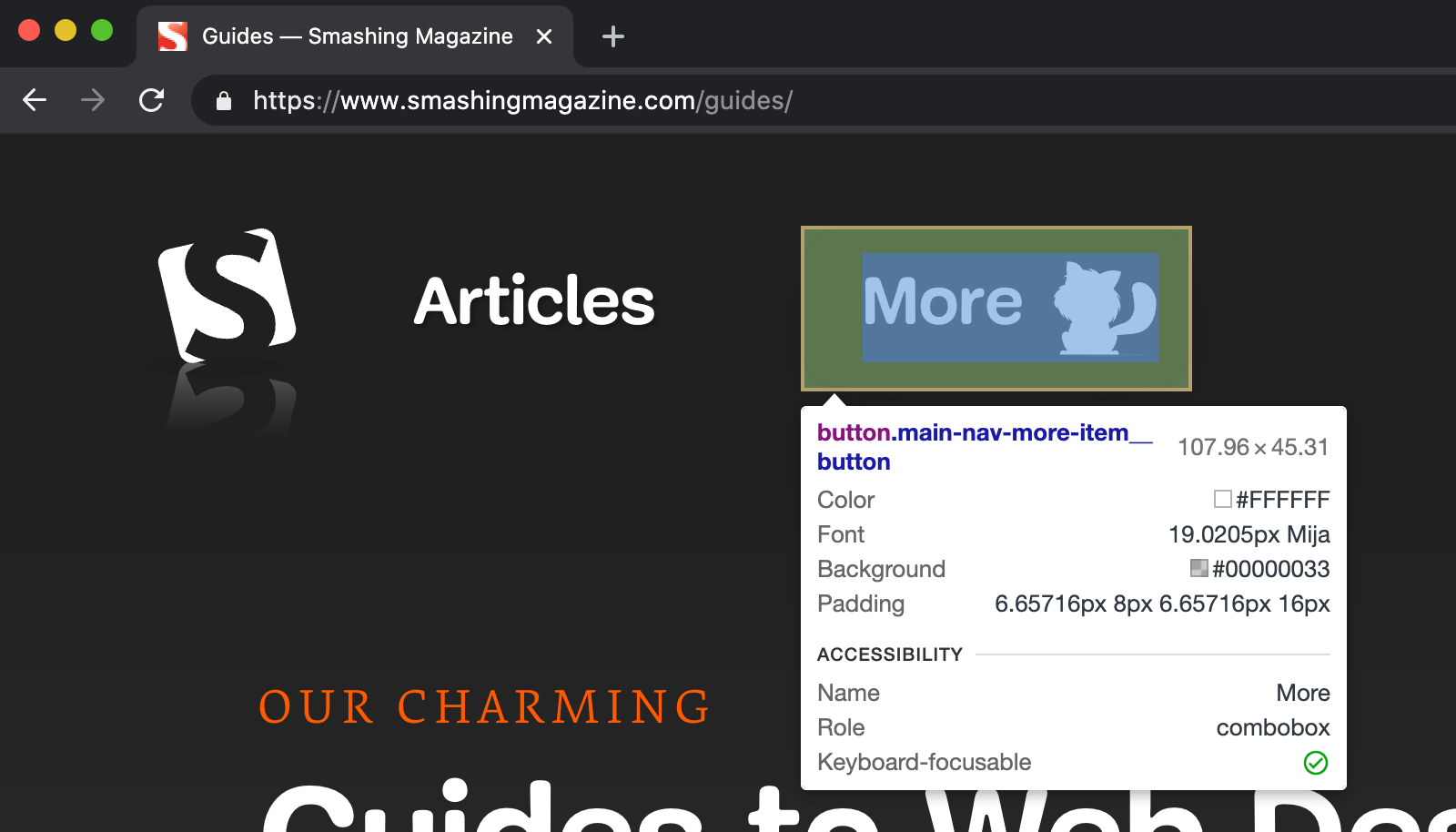
Among the properties listed is a “Keyboard-focusable” flag, which indicates whether the element can be reached via the Tab key. This is a quick signal for keyboard accessibility: if the value is true, the element is typically focusable through tabbing.
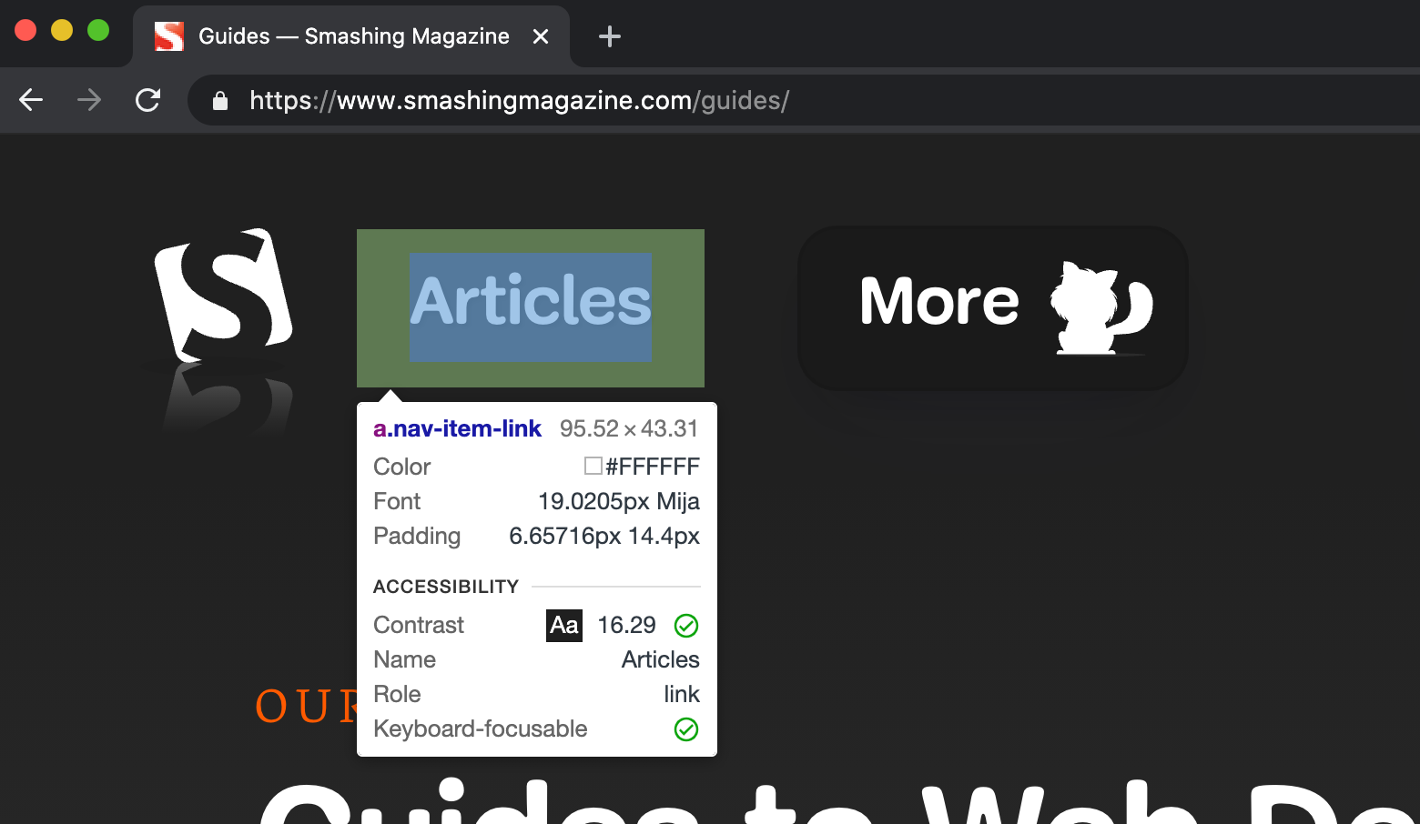
Why It Matters
Because Inspect Element is so commonly used, placing these accessibility details directly in the tooltip acts as a natural checkpoint. It serves as a light reminder to look deeper into the rendered element and verify that what you are building is accessible, without requiring you to open dedicated panels or run audits first.
Reviewing the Full Set of Accessibility Tools
These five features — span across well-known checks like Lighthouse, more targeted utilities like the Accessibility Inspector and contrast evaluation, and the experimental simulated visual impairments — round out a practical toolkit for building inclusive web experiences. Each addresses a different layer of the accessibility review process, from automated page audits to manual inspection and visual testing.



