
JavaScript: The Missing Piece For Keyboard Accessibility
HTML and CSS can take you a long way toward keyboard accessibility, but certain components simply demand more elaborate interactions. That's where JavaScript completes the picture. This part of the guide focuses on the core tools you'll reach for most often, using event listeners and methods from a couple of Web APIs to handle the work.
The Core Tools
The bulk of JavaScript-based keyboard accessibility work comes down to a small set of utilities: event listeners and a few methods from Web APIs that let you control focus and behavior.
Using The keydown Event
Events are how you respond to changes in the interface, and the keydown event fires whenever a key is pressed. This isn't the event you'd use for buttons or links—those already trigger click events when activated via Enter (for both) or Space (buttons only). Instead, keydown is for when you need to respond to specific keys beyond default activation.
Consider the tooltip from the previous part of this guide. It requires dismissal with the Esc key. To achieve this, listen for keydown and inspect the event's key property, which will be "Escape". While e.keyCode and e.which exist and would return 27, they're deprecated; e.key is the modern choice.
A practical pattern: use keydown to add a class that suppresses the tooltip, but only when the Esc key is pressed. This way, the tooltip stays shown when focus arrives normally. The CSS would use the :not() pseudo-class to exclude elements with that suppression class.
button:not(.hide-tooltip):hover + [role="tooltip"],
button:not(.hide-tooltip):focus + [role="tooltip"],
[role="tooltip"]:hover {
  display: block;
}
// Assuming "tooltipTrigger" is your button element
const tooltipTrigger = document.querySelector('[data-tooltip-trigger]');

tooltipTrigger.addEventListener('keydown', (event) => {
  if (event.key === 'Escape') {
    event.currentTarget.classList.add('hide-tooltip');
  }
});
const buttons = [...document.querySelectorAll("button")]
buttons.forEach(element => {
element.addEventListener("keydown", (e) => {
if (e.key === "Escape") {
element.classList.add("hide-tooltip")
}
})
})
The blur Event For Cleanup
The blur event fires when an element loses focus. It's the ideal place to reverse any changes made by keydown handlers. In the tooltip example above, pressing Esc adds the hide-tooltip class, but the class is never removed. Consequently, refocusing the same element later won't show the tooltip. Use a blur listener to remove that class and reset the state.
element.addEventListener("blur", (e) => {
  if (element.classList.contains("hide-tooltip")) {
    element.classList.remove("hide-tooltip");
  }
});
Skip focus Event (Mostly)
Other events like focusout and focus exist, but legitimate use cases are rare. Be especially cautious with focus: mishandling it can create a "change of context." WCAG defines this as a major change that can disorient users, such as opening a new window, significantly altering the layout, or moving focus elsewhere. Triggering a change of context on focus violates SC 3.2.1 (Focus Order).
In practice, you'll rarely need the focus event—CSS's :focus pseudo-class covers most needs. There are a few exception patterns, which we'll revisit in the components section.
The focus() Method
This HTMLElement method lets you programmatically move keyboard focus to an element. Its default behavior includes drawing the focus indicator and scrolling the page. Both behaviors are adjustable:
preventScroll: whentrue, prevents the page from scrolling to the element.focusVisible: whenfalse, suppresses the focus indicator. Note: this only works in Firefox at present.
For focus() to succeed, the element must be focusable (which often means having a tabindex). If an element isn't natively tabbable, such as a dialog, set tabindex="-1" to make it focusable without adding it to the tab order. You can then call focus() on it after triggering it with a button.
<button id="openModal">Bring focus</button>
<div id="modal" role="dialog" tabindex="-1">
  <h2>Modal content</h2>
</div>
const dialogButton = document.getElementById('open-dialog');
const dialogElement = document.getElementById('my-dialog');

dialogButton.addEventListener('click', () => {
  dialogElement.focus();
});
const button = document.querySelector("#openModal");
const modal = document.querySelector("#modal")
button.addEventListener("click", () => {
modal.focus()
})
Modifying HTML Attributes
Some components need attributes updated dynamically via JavaScript to stay accessible. The two most relevant are tabindex and inert.
For tabindex, use the setAttribute method:
element.setAttribute('tabindex', '-1');setAttribute takes the attribute name and its value. For boolean-like attributes (e.g., hidden), pass an empty string. It's also your tool for updating ARIA attributes when needed, but for keyboard accessibility, tabindex will be your primary target.
For the inert attribute, the HTMLElement.inert property offers a direct, boolean-based toggle. Note that the attribute is relatively new; a near-official polyfill is available. Both the property and setAttribute work with it, so the choice is yours.
const button = document.querySelector("button")

button.setAttribute("tabindex", "-1")
const button = document.querySelector("button")

// Syntax with HTMLElement.inert
button.inert = true

// Syntax with Element.setAttribute()
button.setAttribute("inert", "")
These core utilities repeatedly surface across keyboard-accessible components. Next, we'll put them together in a series of design patterns.
Component Patterns
Toggletips
A toggletip takes the tooltip concept and flips the interaction: the information appears when the button is clicked, not when hovered. The key difference from a standard tooltip is that pressing the button again does not close it. Instead, the toggletip dismisses when you click outside, move focus away from the button, or press the Esc key.

The markup follows Heydon Pickering's approach from Inclusive Components: HTML gets injected into an element with role="status", which makes screen readers announce the content on click. A regular button element keeps the control tabbable.
<p>If you need to check more information, check here
  <span class="toggletip-container">
    <button class="toggletip-button">
      <span class="toggletip-icon" aria-hidden="true">?</span>
      <div class="sr-only">Más información</div>
    </button>
    <span role="status" class="toggletip-info"></span>
  </span>
</p>
toggletipButton.addEventListener("click", () => {
  toggletipInfo.innerHTML = "";
  setTimeout(() => {
    toggletipInfo.innerHTML = toggletipContent;
  }, 100);
});
The show/hide logic uses a setTimeout after clearing the container's content, ensuring every activation gets announced to screen reader users. Closing behavior mirrors what we covered with tooltips in the previous part: listen for the Esc key and the blur event on the button itself.
document.addEventListener("click", (e) => {
  if (toggletipContainer !== e.target) {
    toggletipInfo.innerHTML = ""
  }
})
toggletipContainer.addEventListener("keydown", (e) => {
  if (e.key === "Escape") {
    toggletipInfo.innerHTML = ""
    }
})
toggletipButton.addEventListener("blur", () => {
  toggletipInfo.innerHTML = "";
});
The pattern here is worth noting because it repeats across components. Stephanie Eckles' article "4 Required Tests Before Shipping New Features" highlights the expectations keyboard users carry with them: closing something you just opened with Esc, or moving through a group of related options with the Arrow keys. Recognizing these predictable behaviors early will make your JavaScript for keyboard accessibility shorter and more consistent.
Tabs
Tabbed interfaces are among the few remaining patterns where the Tab key doesn't cycle through every control. Pressing Tab lands on the active panel; the Arrow keys move within the tab list. This is roving tabindex: non-active elements get tabindex="-1" so they leave the tab order, while other keys provide navigation.
- Left or Up moves focus to the previous tab, wrapping to the last tab at the beginning.
- Right or Down moves focus to the next tab, wrapping to the first tab at the end.
Implementing this combines three techniques from earlier: changing tabindex via setAttribute, listening to keydown, and calling focus().
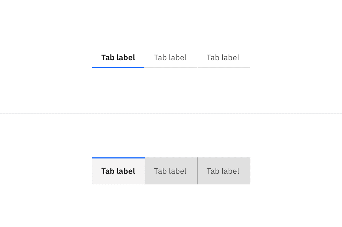
The active tab has aria-selected="true", and inactive tabs get tabindex="-1". Tab panels should be reachable by keyboard if they hold no other tabbable content, so each panel carries tabindex="0" while hidden panels use hidden.
<ul role="tablist">
  <li role="presentation">
    <button id="tab1" role="tab" aria-selected="true">Tomato</button>
  </li>
  <li role="presentation">
    <button id="tab2" role="tab" tabindex="-1">Onion</button>
  </li>
  <li role="presentation">
    <button id="tab3" role="tab" tabindex="-1">Celery</button>
  </li>
  <li role="presentation">
    <button id="tab4" role="tab" tabindex="-1">Carrot</button>
  </li>
</ul>
<div class="tablist-container">
  <section role="tabpanel" aria-labelledby="tab1" tabindex="0">
  </section>
  <section role="tabpanel" aria-labelledby="tab2" tabindex="0" hidden>
  </section>
  <section role="tabpanel" aria-labelledby="tab3" tabindex="0" hidden>
  </section>
  <section role="tabpanel" aria-labelledby="tab4" tabindex="0" hidden>
  </section>
</div>
Start the navigation logic by building an array of tabs and identifying the first and last elements, since the behavior differs at those boundaries.
const TABS = [...TABLIST.querySelectorAll("[role='tab']")];

const createKeyboardNavigation = () => {
  const firstTab = TABS[0];
  const lastTab = TABS[TABS.length - 1];
}
// Previous code of the createKeyboardNavigation function
TABS.forEach((element) => {
  element.addEventListener("keydown", function (e) {
    if (e.key === "ArrowUp" || e.key === "ArrowLeft") {
      e.preventDefault();
      if (element === firstTab) {
        lastTab.focus();
      } else {
        const focusableElement = TABS.indexOf(element) - 1;
        TABS[focusableElement].focus();
      }
    }
  }
}
The left/up arrow handler has five steps:
- Check the pressed key with
event.key. - Prevent the default page scrolling via
e.preventDefault(). - If focus sits on the first tab, move focus to the last using
focus()on the stored variable. - For all other cases, locate the current position via
indexOf()on theTABSarray. - Subtract
1from the index and focus the corresponding element.
The right/down arrow handler is the same process, only adding 1 to the indexOf() result to move toward the next element.
// Previous code of the createKeyboardNavigation function
else if (e.key === "ArrowDown" || e.key === "ArrowRight") {
  e.preventDefault();
  if (element == lastTab) {
    firstTab.focus();
  } else {
    const focusableElement = TABS.indexOf(element) + 1;
    TABS[focusableElement].focus();
  }
}
Showing Content And Updating Attributes
Navigation alone isn't enough; the panel content and its ARIA state need to change when the active tab changes. When you press Shift + Tab from a panel, focus should land on the active tab, not the first one.
const showActivePanel = (element) => {
  const selectedId = element.target.id;
  TABPANELS.forEach((e) => {
    e.hidden = "true";
  });
  const activePanel = document.querySelector(
    `[aria-labelledby="${selectedId}"]`
  );
  activePanel.removeAttribute("hidden");
};
<
First, the display function: take the pressed tab's id, hide every panel, then find the panel whose aria-labelledby matches and remove its hidden attribute.
const handleSelectedTab = (element) => {
  const selectedId = element.target.id;
  TABS.forEach((e) => {
    const id = e.getAttribute("id");
    if (id === selectedId) {
      e.removeAttribute("tabindex", "0");
      e.setAttribute("aria-selected", "true");
    } else {
      e.setAttribute("tabindex", "-1");
      e.setAttribute("aria-selected", "false");
    }
  });
};
Next, the attribute update: loops over each tab, comparing its id with the pressed element's id. On a match, make the tab keyboard reachable — either by removing tabindex (since button elements are tabbable by default) or setting tabindex="0" — and add aria-selected="true". Mismatched tabs get tabindex="-1" and aria-selected="false".
TABS.forEach((element) => {
  element.addEventListener("click", (element) => {
    showActivePanel(element),
    handleSelectedTab(element);
  });
});
Activating On Focus
The focus event gets a legitimate use here. The ARIA Authoring Practices Guide permits showing content when a tab receives focus, letting keyboard and screen reader users browse content without extra clicks. Two conditions should be checked first:
- If displaying content requires heavy network requests, defer activation until the user clicks; following focus would degrade performance.
- If revealing the content alters the layout substantially, that counts as a change of context, which creates accessibility problems.
Since neither condition applies to this example, duplicate the existing event listener and swap click for focus.
TABS.forEach((element) => {
  element.addEventListener("click", (element) => {
    showActivePanel(element),
    handleSelectedTab(element);
  });

  element.addEventListener("focus", (element) => {
    showActivePanel(element),
    handleSelectedTab(element);
  });
});
Which behavior to ship — focus-triggered or click-only — is a design decision worth testing with users. My own instinct leans toward click-only activation, because updating aria-selected purely by focus movement can disorient people navigating quickly, but that is a hypothesis to validate, not a ruling.
Extra Keys In keydown
The navigation handler can also respond to Home and End, jumping focus to the first and last tab in the list. It is optional but demonstrates how one listener accommodates many keys. Since the first and last tab variables already exist, the added if statements are minimal.
// Previous code of the createKeyboardNavigation function
else if (e.key === "Home") {
  e.preventDefault();
  firstTab.focus()
} else if (e.key === "End") {
  e.preventDefault();
  lastTab.focus()
}
See the Pen [Tab demo [forked]](https://codepen.io/smashingmag/pen/YzvVXWw) by Cristian Diaz.
The tab component now works for keyboard and screen reader users, demonstrating how keydown, focus(), and setAttribute build on each other for intricate widgets.
Modals
Opening And Closing
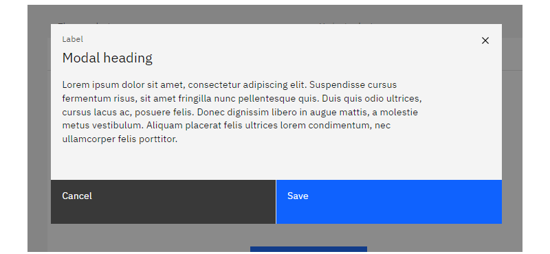
Modals need one thing remembered well: the open button and the modal usually sit in different parts of the DOM, so focus must be managed programmatically — and the originating element needs to be saved, so closing the dialog restores the tab order to where it left off.
<body>
  <header>
    <!-- Header's content -->
  </header>
  <main>
    <!-- Main's content -->
    <button id="openModal">Open modal</button>
  </main>
  <footer>
    <!-- Footer's content -->
  </footer>
  <div role="dialog"
    aria-modal="true"
    aria-labelledby="modal-title"
    hidden
    tabindex="-1">
    <div class="dialog__overlay"></div>
    <div class="dialog__content">
      <h2 id="modal-title">Modal content</h2>
      <ul>
        <li><a href="#">Modal link 1</a></li>
        <li><a href="#">Modal link 2</a></li>
        <li><a href="#">Modal link 3</a></li>
      </ul>
      <button id="closeModal">Close modal</button>
    </div>
  </div>
</body>
The markup semantics matter:
role="dialog"provides the dialog role to screen readers; it must be labelled, usingaria-labelledbyto point at the modal's title.aria-modal="true"helps some but not all screen readers limit reading to the dialog's children; see the a11ysupport entry for the gaps. It should not be the only safeguard.tabindex="-1"allows the dialog container itself to receive programmatic focus.
The open function records the current element via document.activeElement, stores it in a variable, removes hidden from the modal, then moves focus onto it.
let focusedElementBeforeModal

const modal = document.querySelector("[role='dialog']");
const modalOpenButton = document.querySelector("#openModal")
const modalCloseButton = document.querySelector("#closeModal")

const openModal = () => {
  focusedElementBeforeModal = document.activeElement

  modal.hidden = false;
  modal.focus();
};
const closeModal = () => {
  modal.hidden = true;
  focusedElementBeforeModal.focus()
}
The stored element is what makes the close function straightforward — it returns focus to exactly where it was before opening. Event listeners wire the two functions, and closing also fires on the Esc key.
modalOpenButton.addEventListener("click", () => openModal())
modalCloseButton.addEventListener("click", () => closeModal())
modal.addEventListener("keydown", (e) => {
  if (e.key === "Escape") {
    closeModal()
  }
})
Simple open-close logic doesn't make a dialog accessible. The missing piece is containing navigational focus while the modal is active, and there are two ways to get there.
Focus Traps
A focus trap prevents the keyboard user from tabbing beyond the modal's limits: with Shift + Tab on the first focusable element, jump to the last; with Tab on the last, wrap to the first.
A11y Solutions has a solid manual trap implementation worth reviewing. But that approach of enumerating every tabbable element has meaningful gaps.
Mobile screen readers present the first problem. On TalkBack and VoiceOver, users navigate with gestures and double taps — events that never reach the browser's event listeners. Rahul Kumar discusses this in "Focus Trapping for Accessibility (A11Y)", and it renders the scripted trap ineffective for a large portion of assistive tech users.
Certain DOM combinations also produce erratic behavior. Consider a form where every visible input precedes the single confirm button:

The first technically focusable element is the first input, but a proper trap should move focus to the last tabbable button when the user reverse-tabs from any input, not just the first one. That nuance overstates most hand-written traps.
A more dependable route is the inert attribute: mark everything except the modal as inert, and both keyboard and screen readers lose the ability to reach anything outside it. Remember to include the inert polyfill in your bundle for robustness across browsers.
Note: A manual focus trap and inert are not interchangeable in outcome. The inert approach keeps the web page isolated, but it does not block movement to browser chrome like the address bar — a manual trap never lets a user leave the dialog incrementally. Security posture and UX goals will determine which you choose.
Applying inert means selecting content outside the dialog. Keep modal containers as direct children of body, alongside siblings like header, main, or footer, so you can select only direct children and not accidentally disable the dialog's own descendants.
// This selector works well for this specific HTML structure. Adapt according to your project.
const nonModalAreas = document.querySelectorAll("body > *:not([role='dialog'])")
With the element array in hand, append the inert attribute at the end of openModal.
const openModal = () => {
  // Previously added code
  nonModalAreas.forEach((element) => {
    element.inert = true
  })
};
When closing, remove inert from those same nodes before any other statement runs — returning focus to the original button won't work while it still carries inert.
const closeModal = () => {
  nonModalAreas.forEach((element) => {
    element.inert = false;
  });
// Previously added code
};
If you stick with a manual focus trap and worry about screen reader confinement, the fallback is the same structure of non-modal siblings decorated with aria-hidden="true", complementing the shaky aria-modal support.
See the Pen [Modal test [forked]](https://codepen.io/smashingmag/pen/NWzjqYM) by Cristian Diaz.
Both the inert method and a manual trap can give keyboard and screen reader users a contained, predictable way through a modal; the difference is in control vs. trust in browser primitives.
The <dialog> Element
The markup for this series intentionally bypassses the newer <dialog> element. It handles focus management to and from the dialog well, but Scott O'Hara's "Having an open dialog" documents remaining accessibility defects that polyfills don't fully mend, so a semantically explicit custom setup was safer for this guide.
This isn't an argument against <dialog> forever. Support is improving, and early adopters should understand the caveats rather than assume the element eliminates their testing obligations. Kevin Powell's video on the element is useful when you explore it on your own.
Where To Go From Here
What this series deliberately doesn't give you is a roster of every possible widget, because the patterns genuinely repeat. Openable groups need close-on-Esc; lists of siblings need arrow key traversal; different DOM positions need programmatic focus transfers. Everything else follows from test results.
Figuring out exactly which requirements apply to a component requires validation rather than speculation. Start points include Scott O'Hara's component repository and the UK government's design system, but the only trustworthy verdict comes from running real accessibility tests with disabled users before shipping.
The Core Toolkit
Keyboard accessibility in JavaScript rarely demands exotic techniques. Most of the work comes down to a handful of primitives: understanding event order, managing focus explicitly, and deciding when to attach keydown handlers versus relying on built-in behavior.
A common mistake is to treat every key press as a candidate for custom logic. In practice, you only need to intercept keys when the default browser action is insufficient. For interactive components like menus, dialogs, or tabs, the missing piece is almost always focus management—ensuring that when the user activates a control, the keyboard focus lands somewhere predictable and does not get trapped.
Event Ordering and Default Behavior
When you do attach handlers, remember that keydown fires before any default action. Calling preventDefault() inside that handler stops the browser from doing its usual thing. This is useful for arrow-key navigation in custom widgets, but it also means you take full responsibility for what happens next. If you prevent default for a key that also has a browser shortcut (like Space or Enter on a button), you must provide an alternative trigger or the widget becomes unusable.
For most cases, using real <button> and <a> elements means you never have to simulate activation. Their native click events already fire on both keyboard and mouse input. Writing separate keydown logic for these elements usually adds complexity without improving accessibility.
Focus Trapping Done Well
A modal dialog is the classic case where focus must stay inside a container until dismissed. The reliable pattern is to listen for keydown on the dialog itself, check if the pressed key is Tab, and cycle focus among the focusable elements within.
There is no need to manually track every focusable node. Instead, query the dialog for all focusable elements using a selector, then compute the first and last item. When Shift+Tab is pressed on the first element, move focus to the last; when Tab is pressed on the last element, move focus back to the first.
One important detail is that focus should move into the dialog immediately when it opens, typically to the first focusable element or the close button. When the dialog closes, focus must return to the element that opened it. Storing a reference to that triggering element before opening makes restoration trivial.
Managing Dynamic Content
When content appears or changes in response to a user action, keyboard users need an explicit signal. Two attributes handle this cleanly:
aria-liveregions announce changes without moving focus. Usearia-live="polite"for updates that can wait, andaria-live="assertive"for time-sensitive messages.aria-expandedon a toggle button tells assistive technology whether the connected panel is open or closed, so the user understands the state before interacting further.
These attributes work best when combined with visible state changes, not instead of them. A screen reader announcement does not help a sighted keyboard user who relies on visual cues like borders or background shifts.
Roving Tabindex
For composite widgets like toolbars, menus, or tab lists, the roving tabindex pattern keeps the tab order manageable. Only one element inside the group is focusable via Tab (tabindex="0"); all others are marked with tabindex="-1" so they can be focused programmatically but not by sequential navigation.
Arrow keys then move focus among the group members. After a focus change, update the tabindex values: set the newly focused element to 0 and the previously focused one back to -1. This way, pressing Tab again exits the group as one unit, rather than visiting every child.
Guard Against Unnecessary Handlers
It is tempting to add keydown handlers to every focusable element to cover edge cases. But most widgets work perfectly with native semantics and a single delegated handler. Attaching many handlers increases the chance of conflicting behavior and makes debugging harder.
Before writing a key handler, ask whether the default action already does what is needed. For a list box, arrow keys already move focus if the items are <option> elements inside a <select>. Only custom-built components need custom logic.

Keyboard accessibility is achievable once you shift from treating it as a bolt-on feature to seeing it as a consequence of predictable focus and minimal intervention. Most of the time, the answer is not more JavaScript, but less of it—applied precisely where the browser's default behavior falls short.


