
What Keyboard Users Expect From Your Markup
Keyboard accessibility is one of the WCAG success criteria that often gets neglected, yet it affects a wide range of users — especially those with motor disabilities such as arthritis, muscular dystrophy, or a temporary injury like a broken arm. These users may not be able to operate a mouse at all, and many rely on alternatives like switches controlled by hand or head movements, which interface with the keyboard input model. Making your site keyboard-navigable is therefore not just a feature; it’s a foundation for broader assistive technology support.
Native Keyboard Behavior in HTML
The starting point for keyboard accessibility is understanding which elements should receive focus. Native interactive elements — button, a, input, summary, textarea, select, and media elements with the controls attribute — are focusable by default. The contenteditable and tabindex attributes can also make elements reachable via the Tab key, and in Firefox, scrollable areas are keyboard-focusable as well.
Browsers also provide built-in keyboard interactions you should not override without good reason:
- Enter activates
button,select,summary, andaelements; the Space key also activates all of these excepta. - Arrow keys move between
radioinputs that share anameattribute, with the newly focused option becoming checked.checkboxinputs, however, require the Space key to change state. - Up and down arrows cycle through options in a
selectand can close its popup list. Arrow keys also scroll the document vertically or horizontally.
This default behavior covers most cases, but not all interactive elements behave consistently. Date-related input types such as date, datetime-local, week, time, and month are a good example. In Chrome, pressing Enter or Space on a dedicated button opens the picker; Firefox requires the same keys pressed on the day, month, or year field itself to display the popup. Neither approach is wrong, but the inconsistency means pure HTML cannot deliver a uniform keyboard experience for these controls. If cross-browser consistency matters for your users, custom components or additional scripting may be necessary.
Controlling Focus With tabindex
Semantic HTML gives you solid defaults, but complex patterns often require manual focus management. The tabindex attribute is the primary tool for this, and its behavior depends on the value you assign.
tabindex="0" for Non-Interactive Scrollers
Setting tabindex="0" adds an element to the natural keyboard tab order. Its main legitimate use is making scrollable containers reachable when they are not the document body. Without this, keyboard users cannot scroll through a horizontal carousel, a wide table, or a long code block. Prism.js is a well-known example: it applies tabindex="0" to its code snippets so users can focus them and control overflow with arrow keys.
Developers new to accessibility sometimes apply tabindex="0" across all elements, assuming it helps screen reader users. That assumption is wrong for two reasons. Screen readers have their own navigation modes — landmark, heading, and form-element jumps — that do not rely on the DOM tab order. More importantly, every element you make tabbable adds another keypress; for users with motor impairments, an excessive number of tab stops can become genuinely painful. Reserve tabindex="0" for specific, justified scenarios.
Negative tabindex for Focusable but Not Tabbable Elements
A clear distinction exists between an element being focusable (reachable programmatically via JavaScript’s focus() method) and being tabbable (selectable by pressing Tab). Negative values make an element focusable but remove it from the tab order.
This is essential for component patterns like tabs. In a well-implemented tabbed interface, pressing Tab from the active tab should move focus into the associated tabpanel, not to the next tab in the list. To achieve this, you set the inactive tabs with a negative tabindex, leaving the active tab as the sole tabbable item in that group.
Any negative integer works identically — -1 and -1000 produce the same result — but -1 is the de facto convention.
Avoid Positive tabindex Values
Positive integers make an element focusable and place it into an explicit priority order defined by the numeric value. Keyboard users will first tab through all elements with tabindex="1", then tabindex="2", and so on; only after all positively-ranked elements are visited does the browser move to standard interactive elements and those with tabindex="0". This sequence is formally described as the tabindex-ordered focus navigation scope.
In practice, this pattern should be avoided. A logical DOM order is almost always the better solution, and positive values risk violating WCAG 2.4.3, which requires that focus order preserves meaning and operability. There are edge cases where you might want certain widgets focused before page content, but for assistive technology users, that kind of reordering tends to create more confusion than it resolves.
The inert Attribute: A Future Solution
An upcoming attribute called inert promises to simplify focus management considerably. Applying it to an element makes its entire subtree inaccessible to assistive technologies and removes it from the tab order. The most natural application is modal dialogs: marking everything outside the modal with inert instantly creates a focus trap without the intricate JavaScript that is currently required to manage it.
Browser support, however, is not yet production-ready. As of this writing, recent support arrives in Firefox 105, Opera still lacks implementation, and the attribute is newly available in other major engines. The existing polyfill from the WICG works but imposes a noticeable performance cost. Treat inert as a promising pattern for future projects, but do not build production code around it yet — manual focus management remains the reliable path for now.
Focus Indicators Beyond the Browser Default
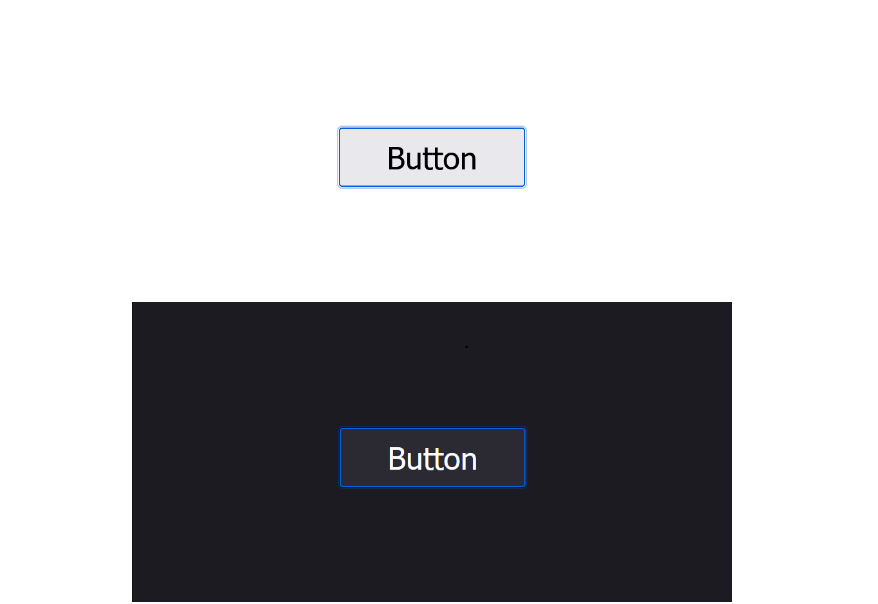
Every keyboard-focusable element needs a visible indicator of where focus currently sits. The default outline each browser paints satisfies the baseline WCAG success criterion for visible focus, but these defaults vary from browser to browser and are not always prominent enough for users with low vision.
Chromium-based browsers like Chrome and Edge draw a black-and-white outline that holds up in both light and dark color schemes. Firefox uses a blue outline that similarly works in both modes. Safari — and WebKit-based browsers, which currently includes all iOS browsers — renders an outline close to Firefox’s, though it gets noticeably subtler in a dark color scheme.


Meeting WCAG 2.4.11 Focus Appearance
Although still a Candidate Recommendation in WCAG 2.2, Success Criterion 2.4.11 Focus Appearance is unlikely to change substantially. The criterion gives two acceptable paths for a visible focus indicator:
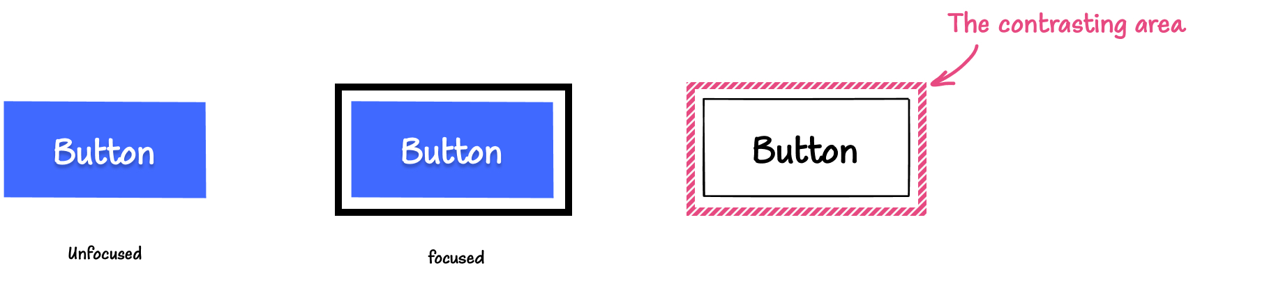
- The indicator encloses the component, has a contrast ratio of at least 3:1 between focused and unfocused states, and another 3:1 contrast against adjacent colors.
- An area of the indicator is at least as large as the perimeter of a 1 CSS pixel thick outline of the unfocused component (or a 4 CSS pixel line along the shortest side of its bounding box), while meeting the same two contrast requirements unless it is at least 2 CSS pixels thick.
The size of that contrasting area matters as much as the colors themselves. For components with active sub-components, the requirements can apply to the sub-component that actually receives focus.
A Practical Sizing Formula
Stephanie Eckles’ approach in her talk “Modern CSS Upgrades To Improve Accessibility” offers an easy, compliant starting point. Define the focus thickness once, then attach it to the interactive elements that need it:
/* Add more selectors inside the :is rule if needed */

:is(a, button, input, textarea, summary) {
    --outline-size: max(2px, 0.08em);
    --outline-style: solid;
    --outline-color: currentColor;
}
A global rule for focusable elements then applies the indicator consistently:
:is(a, button, input, textarea, summary):focus {
    outline:
      var(--outline-size)
      var(--outline-style)
      var(--outline-color);
    outline-offset: var(--outline-offset, var(--outline-size));
}
The relative 0.08em thickness scales the indicator with the element’s font size, which keeps a sufficient contrasting area on larger text and larger controls.
While the criterion allows an indicator as thin as 1 CSS pixel in some cases, the safest minimum is the alternative path: 2 CSS pixels. A dashed or dotted outline reduces the painted area by roughly half, so it needs to be thicker to compensate. A negative outline-offset also shortens the perimeter and therefore calls for a thicker line.
Choosing the Right Focus Pseudo-Class
The :focus pseudo-class applies whenever an element is focused, regardless of input method. That creates a mismatch where mouse clicks also trigger focus styles. Two modern pseudo-classes refine control:
:focus-within
This pseudo-class styles an element when it, or any of its descendants, receives focus. The demo below uses it with a label/input wrapper:
<form>
  <label for="name">
    Name:
    <input id="name" type="text">
  </label>
  <label for="email">
    Email:
    <input for="email" type="email">
  </label>
  <button>Submit</button>
</form>
form {
  display: grid;
  gap: 1em;
}

label {
  display: grid;
  gap: 1em;
  padding: 1em;
}

label:focus-within {
  background-color: rebeccapurple;
  color: white
}

As an aside, avoid wrapping an
inputin alabelelement. Every browser supports the pattern, but Dragon speech recognition software fails to interpret it correctly.
Wraping hover-triggered content in a rule that also fires on :focus-within lets keyboard users reach the same expanded states that mouse users get on hover, without duplicating any styles. A card component that reveals its content on hover can simply add the same reveal rule under the focus-within state.
See the Pen [Keyboard accessible animated card [forked]](https://codepen.io/smashingmag/pen/mdLKPWZ) by Cristian Diaz.
:focus-visible
:focus-visible limits focus styles to keyboard interaction. Browser heuristics make the distinction: button, a, and most input elements such checkboxes, radios, and submit buttons show a focus-visible state only for keyboard use, while text-entry fields and select also draw focus on click. Because modern browsers use focus-visible styling for their own default indicators, you want the same selector when restyling outlines — otherwise you’ll override the browser’s distinction and reintroduce the same false positives.
Browser support for :focus-visible is broad. Safari enabled it in 15.4 (March 2022), so some users may lag an update or two behind. Wrapping the rule in an @supports feature query leaves a visible default for those users while applying a bespoke style where supported:
@supports selector(:focus-visible) {
  *:focus {
      outline: none
  }

  *:focus-visible {
      outline:
        var(--outline-size)
        var(--outline-style)
        var(--outline-color);
      outline-offset: var(--outline-offset, var(--outline-size));
  }
}
A temporary outline: none replacement inside the :focus-visible branch is acceptable — it’s entirely replaced by the supporting rule and is never doing the same “remove everything” damage that applying it unconditionally would do.
Layouts That Stumble on Focus Order
Flexbox and grid can reorder visible content in ways that break logical keyboard flow. Several common patterns behave exactly as expected visually but leave the tab order following the source order, which can quickly become incoherent for keyboard users.
display: contents
The property removes an element’s box while preserving its semantics, making its children appear as siblings of that element:
<header>
  <a href="#">Go to home</a>
  <nav>
    <ul>
      <li>
        <a href="#">Clothes</a>
      </li>
      <li>
        <a href="#">Accessories</a>
      </li>
      <li>
        <a href="#">Shoes</a>
      </li>
    </ul>
  </nav>
</header>
With the property applied to the ul, the li items become grid/flex children of the container without losing list semantics:
<header>
  <a href="#">Go to home</a>
  <nav>
    <li><a href="#">Clothes</a></li>
    <li>
      <a href="#">Accessories</a>
    </li>
    <li>
      <a href="#">Shoes</a>
    </li>
  </nav>
</header>
The danger is with interactive elements. Applying display: contents to a keyboard-focusable element makes it impossible to focus with the Tab key. The scenario is rare in practice — resetting a button’s appearance would be one of few reasons someone might reach for it. And the property has additional bugs to consider: Safari 16 strips semantics from table and button elements entirely. Either way, skip this pattern for focusable elements.
Grid and Flex Order vs. DOM Order
Since grid and flexbox reorder visually without altering the source order, tab navigation continues to follow DOM order after text selection and layout shifts. WCAG 2.4.3 Focus Order requires this navigation order to preserve meaning and operability. The mismatch breeds confusing experiences.
Try this demo with a few grid cells:
<ul role="list">
  <li><button>1</button></li>
  <li><button>2</button></li>
  <li><button>3</button></li>
  <li><button>4</button></li>
  <li><button>5</button></li>
  <li><button>6</button></li>
  <li><button>7</button></li>
  <li><button>8</button></li>
  <li><button>9</button></li>
</ul>
button:focus {
  outline: max(2px, 0.08em) solid currentColor;
  outline-offset: -7px;
}

@supports selector(:focus-visible) {
  button:focus {
    outline: none;
  }

  button:focus-visible {
    outline: max(2px, 0.08em) solid currentColor;
    outline-offset: -7px;
  }
}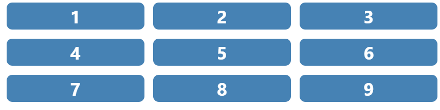
The layout runs left-to-right, top-to-bottom, matching the natural source reading order. Shuffle the items with grid placement properties, however, and the result meanders unpredictably:
ul li:where(:nth-child(1), :nth-child(5), :nth-child(7), :nth-child(9)) {
  grid-row: span 2;
  grid-column: span 2
}

ul li:where(:nth-child(1), :nth-child(5)) {
  order: 2;
}

ul li:where(:nth-child(7), :nth-child(8)) {
  order: -1;
}

ul li:nth-child(4) {
  grid-row: 3;
  grid-column: 2 / span 2;
}

ul li:nth-child(3) {
  grid-row: 5 / span 3;
  grid-column: 3;
}
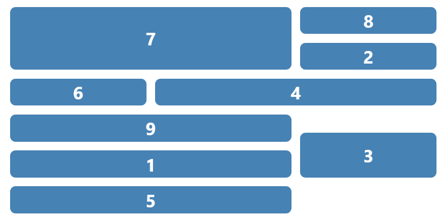
Numbered buttons make the chaos noticeable; with real labels it would be impossible to anticipate what comes next. Reordering with explicit grid coordinates or the order property is not forbidden — the advice is simply to consciously align the visible order of focusable elements with their DOM order whenever the page is meant to be keyboard operable.
See the Pen [Focus order demo [forked]](https://codepen.io/smashingmag/pen/GRdGZYJ) by Cristian Diaz.
Three Keyboard-Friendly Components, Built With HTML and CSS
Applying the HTML and CSS fundamentals of keyboard accessibility, we can construct common interface components that work reliably for keyboard users — often with little or no JavaScript.
Accordions With details and summary
The details and summary elements give us a keyboard-accessible accordion out of the box. Keyboard navigation is built in, and screen reader support is generally solid, though some browser and screen reader combinations may not expose state changes clearly. Scott O’Hara covers those edge cases in his write-up on the elements; you may want to enhance behavior with JavaScript for full support, but the baseline is strong for keyboard users.
<details>
  <summary>
    <h2>Title</h2>
    <span aria-hidden="true"></span>
  </summary>
  <p>
    <!-- Content -->
  </p>
</details>
When collapsed and expanded, the default rendering looks like this:


To customize the indicator, we first remove the browser’s default disclosure triangle:
summary {
  list-style: none;
}
Then we add a child element inside the summary to serve as our own visual state indicator. That element needs aria-hidden="true" so screen readers ignore the text we manipulate via CSS:
<summary>
  <p>
    How much does shipping cost?
  </p>
  <span aria-hidden="true"></span>
</summary>
Because the browser toggles the open attribute on the details container, we can style the pseudo-element ::before conditionally:
summary span[aria-hidden="true"]::before {
  content: "+";
}

details[open] summary span[aria-hidden="true"]::before {
  content: "-";
}
Add your own styles — ensure focus states are visible — and the accordion works with only a keyboard. You can test a live example to confirm. Note that this native pattern isn’t the only viable markup; Sara Soueidan has written a thorough breakdown of alternative structures for accordions.
Skip Links for Bypassing Repeated Blocks
Pages with long navigational menus can force keyboard users, especially those relying on switch controls, to tab through many items before reaching meaningful content. The Web Content Accessibility Guidelines address this directly:
“A mechanism is available to bypass blocks of content that are repeated on multiple Web pages.”
— Success Criterion 2.4.1: Bypass Blocks
Skip links are the standard mechanism. They typically stay hidden until the user presses Tab, then appear to jump to a main region or other page landmarks. Many sites offer multiple skip links — YouTube and Smashing Magazine both expose them on first focus — and they can even appear inline within a page, as Manuel Matuzović demonstrated with a project embedding a map with many tab stops.
Building a skip link is straightforward. Start with an anchor pointing to the target element:
<header>
  <a class="skip-link" href="#main-content">Go to main content</a>
</header>
<main id="main-content"></main>
Visually hide it, for example by translating it off-screen:
.skip-link {
    display: block;
    transform: translate(-9999px);
}
Then bring it into view when it receives focus:
.skip-link:focus {
  transform: translate(0)
}
That’s the whole pattern — a simple, high-impact accessibility improvement.
Tooltips: Show on Hover and Focus
Tooltips are commonly triggered only by mouse hover, leaving keyboard users without access to the information. A button is the correct trigger since it is naturally focusable and activates with the keyboard. The markup follows a pattern Heydon Pickering describes in Inclusive Components.
<div class="tooltip-container">
  <button>
  </button>
  <div role="tooltip"></div>
</div>
The role="tooltip" attribute alone doesn’t provide the needed semantics. You must link the tooltip to its button. Use aria-labelledby when the tooltip serves as the element’s accessible name:
<div class="tooltip-container">
  <button aria-labelledby="tooltip1">
    <svg aria-hidden="true">
      <!--  SVG Content  -->
    </svg>
  </button>
        <div id="tooltip1" role="tooltip">Shopping cart</div>
</div>
Use aria-describedby when the tooltip offers supplementary description:
<div class="tooltip-container">
  <button aria-label="Shopping cart" aria-describedby="tooltip2">
    <svg aria-hidden="true">
      <!--  SVG Content  -->
    </svg>
  </button>
  <div id="tooltip2" role="tooltip">Check, modify and finish your purchase</div>
</div>
Keep descriptions auxiliary. Screen reader users generating a list of form controls will not see the described-by text unless they focus the button, as Adrian Roselli’s research on accessible description exposure shows.
For keyboard accessibility, show the tooltip when the button receives focus, not just hover. We can do that with :hover, :focus, and the adjacent sibling combinator. Also let users hover over the tooltip itself, per WCAG Criterion 1.4.13 (Content on Hover or Focus).
[role="tooltip"] {
  position: absolute;
  bottom: 0;
  left: 50%;
  display: none;
  transform: translate(-50%, 100%);
}

button:hover + [role="tooltip"], button:focus + [role="tooltip"], [role="tooltip"]:hover {
  display: block;
}
The CSS-based tooltip works with both pointer and keyboard input. This pattern is not production-ready yet: closing the tooltip with the Esc key requires JavaScript, which we will address in the next installment. Also note that touch devices without a pointer need a different approach; media queries like hover and pointer help conditionally adapt the behavior.
Where This Leaves Us
These three patterns demonstrate that keyboard accessibility often starts with choosing the right semantic HTML and applying focused CSS. Native elements like details handle much of the work; skip links and tooltips require a bit more styling but no scripting. Advanced components will demand JavaScript to handle states like dismissable tooltips, keyboard trap management, and dynamic focus movement — the topics we will take up in the next part.


