When the platform doesn’t handle focus
Most input handling on modern platforms—Windows, iOS, Android TV—is taken care of by the OS or framework. But building a hybrid web app for smart TVs and gaming consoles means giving up that built-in support. The Spotify big-screen client is a web application rendered inside native shells for each TV manufacturer, so the team had to solve TV spatial navigation themselves: guiding focus through a two-dimensional view using only arrow keys or a gamepad joystick, with no mouse cursor to make selection intuitive.
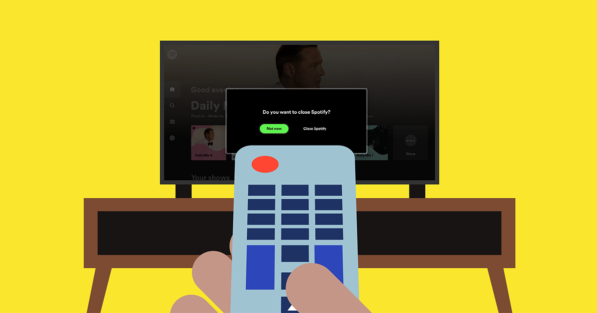
Native apps get this for free—Android TV uses the Android SDK, Apple TV its proprietary stack, Roku its BrightScript language. Web browsers, however, have no standard for this yet; the W3C’s CSS Spatial Navigation Level 1 draft exists but is far from implementation. So Spotify built its own solution, and it turned into a project involving geometry, React internals, and some classic computer science.
Three navigation scenarios
The requirements for TV spatial navigation fall into three broad cases, each with different rules for focus movement.
Basic navigation
On the Home view, not everything on screen is actionable. Only elements that trigger something—navigating to a new view, favoriting, starting playback—should be reachable. After filtering those out, the focusable elements form a two-dimensional layout: a left menu alongside content tiles like albums, playlists, and shows.
Skeleton of the UI with selectable elements.
The Search view presents a more complex structure: a matrix of category tiles. Here, users generally expect strict boundaries—moving down past the last row should not wrap around—though other views may need different behavior.
Cycle navigation
Long menus are a case where wrapping is desirable. When the user reaches the last item and presses down again, focus should loop back to the first item, and similarly in the other direction. This cycle navigation removes the dead-end feeling of hitting a boundary.
Example of cyclic navigation on the Side menu.
Blocked regions
Modals and alerts present the third scenario. While an alert is visible—say, a sign-out confirmation—all other focusable elements behind it must be temporarily unreachable. Only the alert’s prominent action can be selected.
Example of the navigation up and down blocked on modal elements.
Iteration one: a manual navigation tree
The first implementation took a React-centric approach. Since the app uses React, it was natural to keep a navigation map in memory, parallel to how React maintains its virtual DOM.
Home view and its representation as a navigation tree.
Three new component types were introduced to encode this map:
<NavNode /> — the leaves
Every selectable element lives inside a NavNode. This component registers the element in the navigable tree, tells its parent which siblings exist, and handles selection when the user presses Enter. Each node carries a unique navId so the system knows where to move focus.
<NavNode navId="toplist-link" nextRight="news-link">
  <a href="/playlist/123">
    <img src="/sweden-toplist-cover.png />
    <span>Sweden’s top list</span>
  </a>
</NavNode>
<NavRoot /> — the branches
Menus and other containers with special behavior—like cyclic navigation or blocking events from bubbling—wrap their children in a NavRoot.
<nav>
  <NavContainer navId="sidebar-menu" cycle>
    <NavNode navId="search-item">
      <a href="/search">Search</a>
    </NavNode>
    <NavNode navId="settings-item" nextTop="search-item">
      <a href="/settings">Settings</a>
    </NavNode>
    ...
  </NavContainer>
</nav>
<main>
  <h1>Good morning, User!</h1>
  ...
Root component — the coordinator
At the top of the app sits a root component that registers new elements, tracks where focus currently is, processes incoming navigation events, and updates the tree when the user changes pages.
function MyApp({ children }) {
  return (    <NavRoot navId="root">
      <nav>
        <NavContainer navId="sidebar-menu" cycle>
          <NavNode navId="search-item">
            <a href="/search">Search</a>
          </NavNode>
          ...
    </NavRoot>
  );
}
Where that first attempt fell short
The component-based approach worked but had clear pain points:
- Manual direction logic. Developers had to spell out each element’s neighbors with
nextRight/Left/Up/Downattributes, which weren’t always knowable, plus uniquenavIds. - Heavier DOM. Every focusable element was wrapped in extra components, making the page structure harder to read and trickier to debug.
- High onboarding cost. New developers had to understand the library’s internals before they could contribute.
Iteration two: hooks and geometry
The rewrite aimed at two goals: simplify the API and decouple the internal modules. React Hooks made that possible. Instead of wrapping elements in components, the team built a Hook that returns a reference to the actual DOM node:
Before... | After... |
| |
The highlights are immediate:
- No wrapper DOM elements. The Hook registers the element on mount via its reference, avoiding extra nodes.
- No direction attributes. The library computes everything from geometry.
The key enabler is the DOM API’s Element.getBoundingClientRect, which returns an element’s position and size relative to the viewport. With that information, the library can build its own navigable tree from real layout data and determine the next focus target from the user’s input direction alone.
Source: https://developer.mozilla.org/en-US/docs/Web/API/Element/getBoundingClientRect
Splitting responsibilities
The old root component had too many jobs. It was divided into three focused modules:
NavEngine— maintains the navigable tree, adding and removing elements as they mount and unmount.FindFocusIn— tracks which element currently has focus.Navigate— the motion component: given an arrow-key press, finds the next element to focus.
The last one is where the computer science comes in. Since the focusable elements form a tree, the module uses the lowest common ancestor algorithm to find the right parent—essential for cyclic navigation where moving past the bottom of a menu must wrap to its top.
Lowest common ancestor in a binary tree.
Source: https://www.geeksforgeeks.org/lowest-common-ancestor-binary-tree-set-1/
Selecting the next element is easy in straight rows or matrices, but trickier where the layout is irregular—like moving from the main content back across to the left menu. Distance and alignment calculations handle those ambiguous transitions.
|
|
Testing without a TV
The navigation module’s geometry-based logic needs deterministic tests, which meant simulating layouts outside the running app. The team built a drawing tool that lets users position selectable elements and produces a navigable tree as JSON output. That same JSON feeds the unit test suite, so complex focus paths can be validated without booting the application.
Our tooling for creating a JSON representation of a view to be unit tested.
Cost Considerations
Since integrating the spatial navigation library and avoiding major updates since, the team considers the implementation to satisfy the core requirement: an input system that is intuitive for end users and straightforward for the development team to work with. The immediate priority is monitoring performance overhead, a concern that grows more significant as Spotify's TV footprint expands. On low-end hardware and across varying content layouts, the library's per-frame costs need close scrutiny to ensure no regressions in responsiveness.