Animations can distinguish a site or wreck it. Common failures include motion with no purpose, durations that are too long or too short, and choosing the wrong animation type entirely. Even when those choices are right, an animation style can feel wrong if it is out of sync with surrounding animations or with the personality of the site.
Product websites also differ from marketing sites and mobile apps. The same principles of motion apply, but content type and screen size introduce nuance. A delightful animation in each step of a form is questionable if users must revisit and fill that form often — the repetition becomes irritating.
Where animation earns its place
Used well, an animation behaves almost like content: it supplies context and signals that something happened, and even what comes next.
Transitioning UI blocks
The most common use case. When a UI block moves from its original position, or is added to or removed from the DOM, users should be able to see that happen.


Loading content
Loading animations stand in as placeholders for content, hinting at what will appear while assuring users that something is loading. Beyond making the site feel fast, they prevent janky content reflow, which is disorienting when elements render at different times.

Loading placeholders work best when the height of content blocks is known ahead of time.
Hinting
Usually a one-time animation that shows users where to look or what to do next. Some UIs are complex by nature; a small glow or ripple can guide users through a task or call attention to a feature without taking over the experience.

Micro-interactions
Applied to individual elements, micro-interactions give instant visual feedback after an action, confirming that it took place and that something resulted from it, with a bit of delight along the way. They need not be elaborate like Twitter's heart animation, but they should indicate a response to the user's action.


Where animation should stay out
The inverse conditions hold as well: situations where animations contribute little or nothing, becoming noticeable for the wrong reasons.
Route transitions
Rarely seen on product websites, and worth explaining. These transitions suit mobile apps because of the small screen area. On desktop there is far more area to animate, and smoothing the whole content requires a longer duration than on mobile. That makes users wait for content when the web has trained them to expect instant visibility. In the worst cases route transitions are not just distracting but a severe accessibility concern for motion sensitivity.

Page content on initial load
Marketing sites may do this to educate users or shift focus to a particular block. On product sites the same animation on every page navigation becomes annoying.

Unexpected moments
Consider the user's state of mind. Is visual feedback expected where the animation appears? If not, it can confuse more than it helps. A calculator app is a case in point: entering numbers and running calculations is an established UI pattern, and users already know where to focus. Making them wait for results, or surprising them with something that adds no meaning, has no benefit.


Unverified performance
Devices, connections and browsers are not equal in the eyes of animation. As Eric Bailey notes in his deep-dive on the prefers-reduced-motion media query, not every device that can access the web can render animation, or render it smoothly; on low-power or low-quality devices that "technically" support it, the experience suffers.
We also need to acknowledge that not every device that can access the web can also render animation, or render animation smoothly. When animation is used on a low-power or low quality device that “technically” supports it, the overall user experience suffers. Some people even deliberately seek this experience out as a feature.
The operative rule is that animation is progressive enhancement. Any animation, especially one that threatens to dominate the experience, needs a considered way to opt out — and a check that the experience still works without it. prefers-reduced-motion is the best starting point.
Unclear purpose
If the purpose of an animation isn't absolutely clear, don't add it. Superfluous animation distracts and hurts more than it helps.
Setting duration
Duration matters as much as type. Too long and the animation drags; too fast and its details get lost — or, worse, users are disoriented. How long is right? It depends.
Distance and motion
Short animations suit the cases above. A massive transition in which an object travels a long distance may need somewhat longer so it doesn't move too fast — but avoid durations longer than 400ms.

Large animations can still be optimized to feel shorter without losing the effect: if the departing object fades into the entering one, and the entering object travels a shorter distance rather than crossing the entire screen, it doesn't need to last as long.
User-triggered versus system-triggered
When the user triggers an action and focus is already where it should be, don't make them wait seconds for what they already expect. This is a common mistake.


System-triggered changes are the opposite: a longer duration lets users catch up with what changed. Tooltips or modals that don't require immediate attention fall into this category.


Enter and exit asymmetries
Entering objects can animate faster than exiting ones, particularly when the user expects to see content change. A dropdown menu should reveal its items immediately on click; letting the submenu leave smoothly and more slowly avoids distracting the user once it's no longer needed.
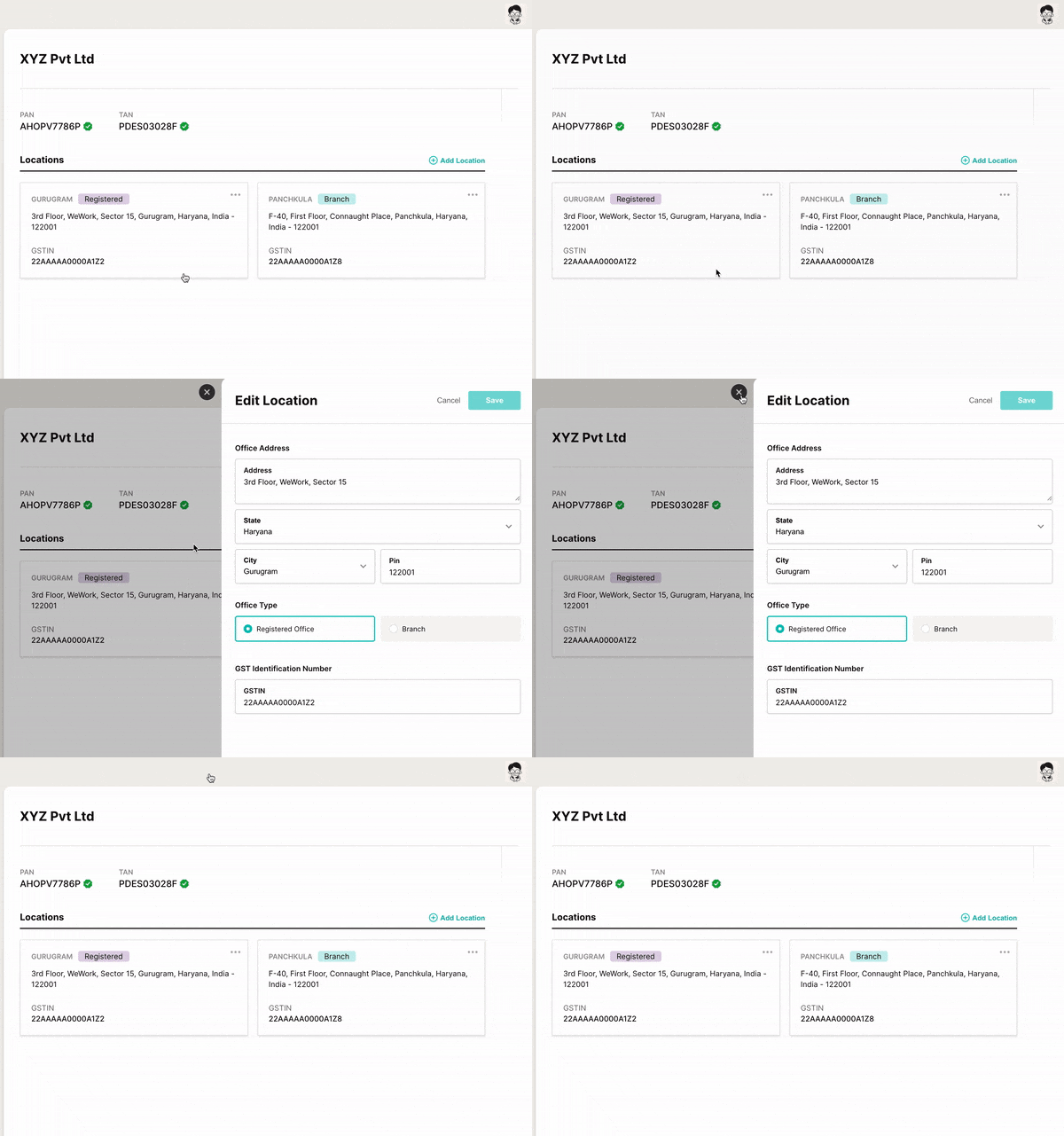
Large UI blocks differ. For most cases a duration longer than 200ms is required, and reversing the durations — exiting faster than entering — keeps a block from obstructing the existing page view.

Consistency across the product
Products often have one feature with polished animations and another that is too quick, too slow or not animated at all; worse is inconsistency within a single feature. A style guide with thoughtful animation guidelines, applied consistently across the experience, is a major help here.

Complexity and frequency
Complexity should follow how often users encounter the animation. The more frequently they're expected to see it, the simpler it should be — and this should override the duration rules where necessary. A staggering effect can work in a main menu, but repeating it in every drop-down menu across a product is too much to take in. Animations have a point of diminishing returns.

Used sparingly and intentionally, complex animation can be delightful. It can also fill waiting time while a decision is pending or data is processing — a network failure or a wrong passcode submission, for example.


Choosing an easing
Ease, ease in, ease out, ease in and out, or a custom cubic bezier? The right easing adheres to the laws of physics, for which Disney's principles of animation are the gold standard. For enter animations, use a bounce when you need the user's immediate attention; otherwise prefer smooth, incremental acceleration and deceleration over linear motion. A bounce should reflect gravity; Brandon Gregory's post on natural-feeling animations offers examples consistent with physical law. For defining easings in CSS, Adam Argyle's Gist is a useful reference.
What separates outstanding animation from the ordinary or broken is attention to detail. Good animation also takes time and practice: learn, try, improve, keep learning — otherwise the result is a collection of animations that deliver poor experiences and can even hurt the accessibility of the site.