
A component can pass every automated audit, apply ARIA roles correctly, and still leave a screen reader user unable to work out how to trigger it. That was the experience behind this post: a shipped control with keyboard navigation that worked on paper, and an interaction that behaved nothing like expected when tested with keyboard-only navigation and NVDA.
Nothing on the checklist flagged an error. Technically everything was "right," yet the component was unpredictable in practice. The markup involved was not complicated:
<button class="cta" role="link">Save changes</button>The fix turned out to be subtractive — deleting the ARIA role attribute that had been added with the best of intentions. The markup got simpler, not more so:
<button class="cta">Save changes</button>The lesson: semantic HTML already does far more accessibility work than it is usually given credit for, and ARIA is easy to abuse when it is treated both as a shortcut and as a supplement. Most developers know the first rule of ARIA — don't use it if the accessible benefits and functionality you need are already built in — but the rule is easier to internalize through a concrete failure than through the checklist.
The investigations discussed here were run using keyboard navigation and a screen reader (NVDA) to observe real interaction behavior across native and ARIA-modified elements.
Step one: the native button, and nothing else
The starting point was a minimal page with a single native <button> and no ARIA. Out of the box it accepts keyboard focus and responds to Tab, Enter, and Space. If an interaction triggers an action, the element is a button — here, one running a script that saves changes to a user profile:
<button>Save changes</button>That one line delivers a surprising amount for free:
- Keyboard activation via
EnterandSpace - Correct focus behavior
- A role assistive technology already understands
- Consistent announcements across screen readers
An existing CSS class handled the button styling:
<button class="cta">Save changes</button>Step two: establish a baseline
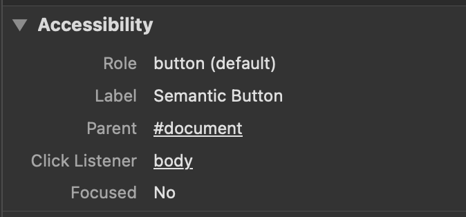
With only the native element in place, three things were tested: keyboard-only operation (Tab, Enter, Space), how a screen reader announced the control, and focus order within the page. Everything behaved predictably — the browser did exactly what users expect. This step matters because it sets a baseline: if something breaks later, HTML is not the cause. The Accessibility panel in DevTools confirmed the element was in perfect working order.
Step three: well-intentioned ARIA
The trouble started with an attempt to make the button behave like a link:
<button class="cta" role="link">Save changes</button>The motivation was styling and routing. The button needed to look different from the default .cta class, and the ARIA attribute seemed preferable to adding a modifier class. That is where styling started dictating functionality. A <button> was still the correct element for the job, but the design called for link-like appearance — so why not give it a link role?
On the surface nothing looked broken, and automated tools stayed quiet. In real use the cracks appeared immediately:
- Space no longer activated the control reliably.
- Screen readers announced conflicting roles.
- Keyboard users hit behavior that matched neither a button nor a link.
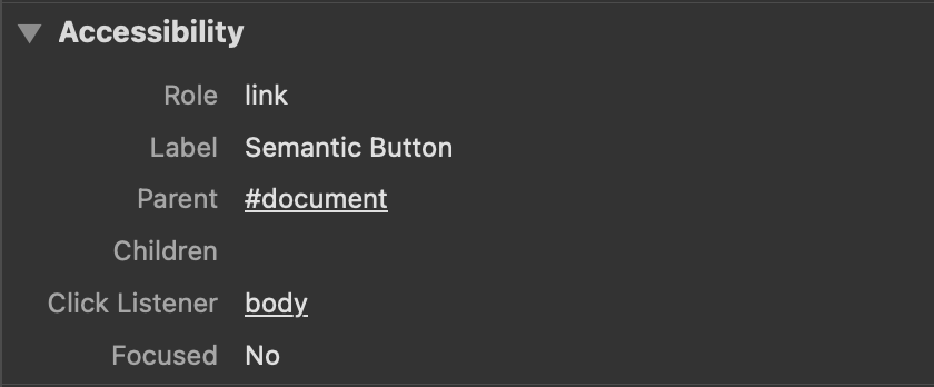
ARIA added no clarity here; it introduced ambiguity. Nothing had screamed that the element's role had been conflated with another element type — a quick look at DevTools shows it, though.
Step four: subtract ARIA, keep the semantics
The fix was not clever: revert the styles, move styling to a class, and return to the semantic markup that existed before the accessible role was changed.
<button class="cta">Save changes</button>If it's an action, use a <button>; if it takes you somewhere, use a link (<a>). That sounds easy, but every keystroke involves a decision, and conflating actions with destinations is easy. The element here was correct all along — the mistake was treating ARIA as a styling hook for CSS.
Once the correct element was in place without ARIA, the issues disappeared. A new classname carried the styles, and the user who reported the problem confirmed everything worked as expected.
<button class="cta cta-alt">Save changes</button>Why the mistake is common
ARIA attributes describe the nature of something, but they do not redefine a native element's behavioral defaults. Overriding semantics means quietly taking responsibility for:
- keyboard interactions,
- focus management,
- expected announcements, and
- platform-specific quirks.
That is a large surface area to maintain, which is why small ARIA changes can have outsized and unpredictable effects.
A workflow that holds up
- Use native HTML to express intent.
- Test with a keyboard and a screen reader.
- Add ARIA only to communicate missing state, never to redefine roles.
If ARIA feels like it is doing heavy lifting, the markup is usually fighting the browser.
What ARIA is actually for
A disclosure widget built on a native <button> plus aria-expanded is a good example: ARIA adds state rather than replacing semantics. The aria-expanded attribute is toggled with a small amount of JavaScript.
const button = document.getElementById("toggle");
const panel = document.getElementById("panel");

button.addEventListener("click", () => {
  const expanded = button.getAttribute("aria-expanded") === "true";
  button.setAttribute("aria-expanded", !expanded);
  panel.hidden = expanded;
});
The accessible state (true/false) is communicated correctly without disturbing the button's semantics. ARIA is essential for communicating expanded or collapsed state, announcing dynamic updates, building truly custom widgets, and exposing relationships HTML cannot express. Used that way, it complements semantic HTML instead of competing with it. Semantic HTML is not a baseline to move past — it is the foundation everything else depends on, and trusting what browsers already understand was a bigger accessibility improvement than learning more attributes.




