
Zero Trickery Custom Radios and Checkboxes
Most "custom-designed radio buttons and checkboxes" really only do two things: make them bigger and colorize them. SurveyMonkey is the usual reference for big chunky controls, and a quick poke at its interface shows such controls in use throughout the app, internally too.
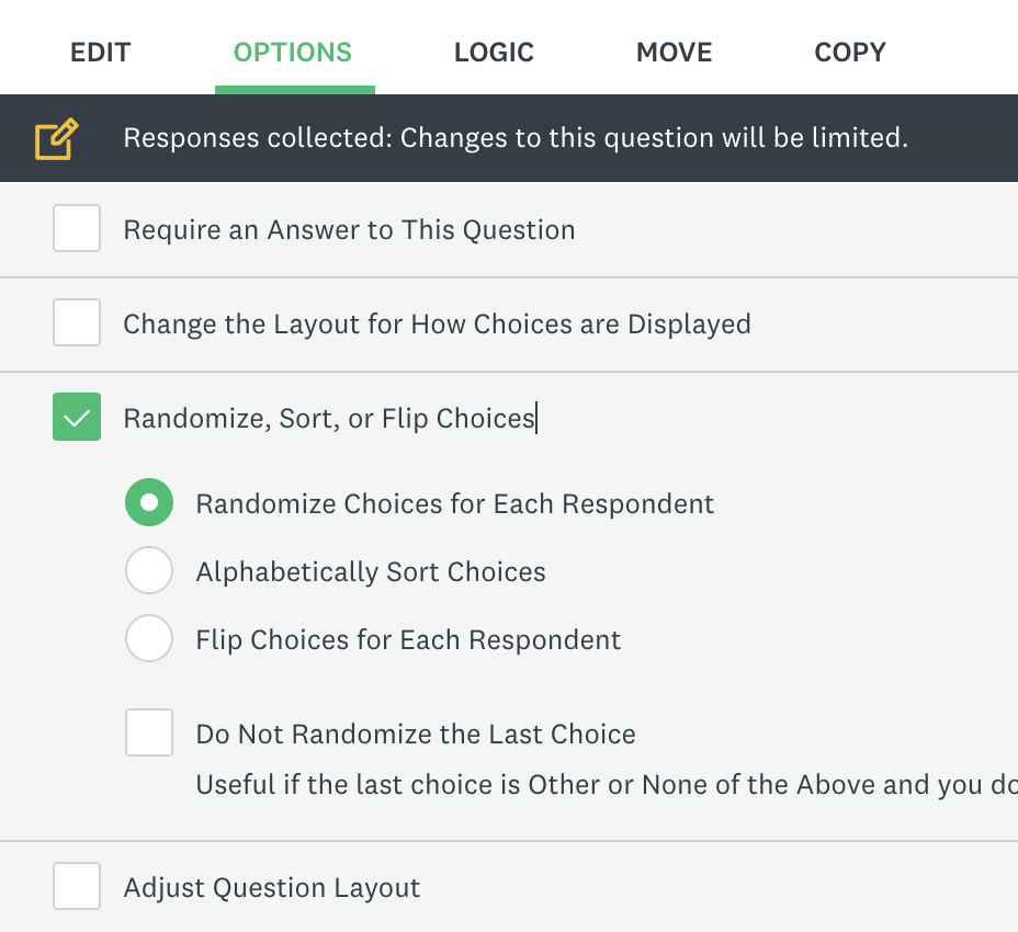
<label> element with icon fonts and such. If that's all you're after, plain CSS may be enough. Simply making the controls bigger and colorizing them chunks them up and adds color pretty well.
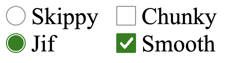
input[type="radio"],
input[type="checkbox"] {
  width: 3em;
  height: 3rem;
  accent-color: green;
}
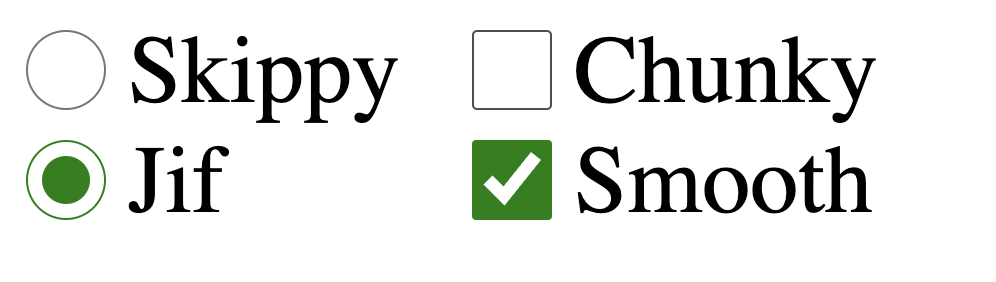
Except in Safari (obligatory sad trombone):
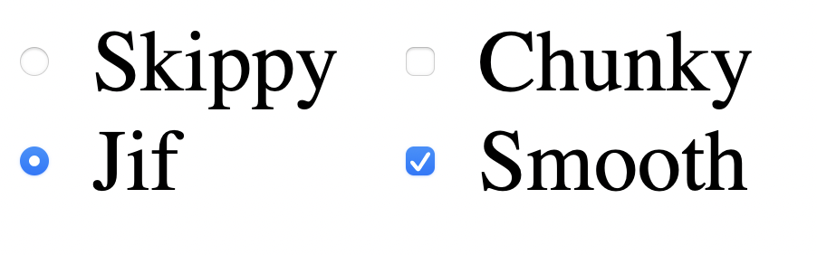
Very simple CSS nearly covers the main use-case for custom checkboxes and radios — but no cigar, unless you're willing to ignore the Safari UI, which remains perfectly functional.
If a completely custom design is required, Stephanie Eckles has two guides:
- Pure CSS Custom Styled Radio Buttons (moderncss.dev)
- Pure CSS Custom Checkbox Style (moderncss.dev)
Separately, a "toggle" control is often thought of as a pair of radio buttons progressively enhanced, but <button> is the way, as Michelle Barker covers at css-irl.info. There is no native UI for slider toggle thingies.
Ads are self-hosted.



