When Hover Is the Wrong Trigger
Large corporate sites and eCommerce retailers commonly rely on mega-dropdowns to expose customers to many options quickly. Usually triggered by a mouse hover, these overlays mix links, buttons and thumbnails in a single panel. The pattern dates back decades, and so does the user complaint: hover-driven navigation gives people little certainty about when a submenu will appear, disappear or unexpectedly pop open while the cursor travels across a page.
The core problem is a mismatch between intention and behavior. Hover tracking tries to infer what a user wants from pointer position, but real-world use rarely matches that assumption. Customers may want to reach a category page directly, or their mouse simply crosses a nav link on the way to another target — say, a utility link in the header or the shopping cart. Other situations make the disconnect worse:
- Typing in a search box while wanting to cross-check navigation options forces repeated opening and closing of the dropdown.
- A trackpad on a large secondary display produces slower, more erratic pointer travel, causing dropdowns to open whenever the user pauses mid-movement.
- Clicking a category link to visit the category page can trigger flickering when the delayed mega-dropdown appears on top of the click.
- Nested menus inside the dropdown require re-traveling the same hover path just to compare similar items within a category.
- Window resizing becomes awkward when drifting toward an edge of the viewport happens to cross a hover target.
- Slow, deliberate scrolling to scan a page is interrupted by a menu that keeps opening, then vanishing when the user bumps the cursor away to read it.
Supporting all of these intents — including the accidental ones — is what separates a usable navigation from a frustrating one. Several techniques attempt to address the problem.
The Cost of Hover Delays
The most common fix is a delay on both entry and exit, typically around 0.5 seconds. This buffer gives users time to travel across a nav item without triggering the menu, to signal intent by lingering on a category link, or to recover from briefly leaving the dropdown's boundaries. The overlay stays visible as long as the cursor remains inside it; it hides only after the cursor has left for at least half a second.
This removes much of the accidental flickering, but it penalizes deliberate users. Every exit from the dropdown now carries a timeout, making every interaction with the navigation feel laggy. Some sites add fade transitions, which dulls the sudden appearance but pushes the effective delay to 0.8–0.9 seconds. ADAC.de, for instance, uses a 100ms fade-in delay and a 300ms fade-out transition. The longer the overlay lingers, the harsher the penalty for users who intentionally escaped it.
Forgiving Trajectories
Rather than adding time, another approach widens the physical paths that users travel. Mouse movement is inherently imprecise, so narrow hover corridors are a common source of frustration. One known strategy, used by Amazon, builds a trajectory triangle connecting the pointer's current position to the upper and lower edges of the dropdown panel that sits beside the category list.
The menu stays open as long as the cursor remains inside that triangle or inside the dropdown itself. Moving outside the triangle changes the displayed content; leaving the category list area entirely closes the menu. Chris Coyier examines the technical details in his piece on more forgiving mouse movement paths, alongside a vanilla JavaScript example. This noticeably reduces accidental disappearance, though it loses its advantage when category links sit tightly together or the trigger is a wide button.
SVG Exit Areas
A refinement of the trajectory approach replaces continuous triangle recalculation with a single dynamically drawn SVG overlay. Having computed that overlay region once, the code only checks whether the pointer is inside it, rather than recomputing geometry on every movement. Hakim el Hattab's implementation demonstrates the technique, drawing the exit areas based on the on-screen position of each navigation item.
His approach is responsive: if the sub-navigation would not fit on screen, it floats beside the main item, and the SVG area recalculates only when the viewport scrolls. A working demo appears in his debug view of the Menu pattern. This eliminates the lag inherent in hover delay times, but it still causes flickering when a user's path crosses several category links, making each one open its dropdown in turn.
All these methods address the mechanics of the hover, but none removes the underlying issue — users neither control when the mega-dropdown opens nor reliably understand when it will close. That unpredictability manifests not only as annoyance but as accessibility barriers for people who navigate, deal with motor limitations or simply want to inspect the options at their own pace.
When Hover Menus Get In The Way
All hover-based mega-dropdown techniques share a core weakness: they try to predict user intent through mouse speed, dwell time, or cursor position. Those predictions inevitably fail for some users, and no amount of fine-tuning eliminates the problem entirely.
Beyond the obvious keyboard and screen-reader support requirements, placement matters. A mega-dropdown positioned near other critical interface elements creates friction that no delay tuning can fix.
The Search Bar Trap
A common disaster scenario: a search bar sits above a mega-dropdown area. Users who move from the search input toward the results will constantly trigger the overlay. On Thesaurus.com, every trip between the search bar and the results passes directly through the mega-dropdown’s hover zone, interrupting the workflow repeatedly.
Compounding Delays
When multiple sub-navigations open on hover with staggered delays, the experience degrades quickly. Vodafone’s site demonstrates the problem: four levels of navigation stacked vertically, with two opening on 300ms transitions. Each category title also doubles as a direct link to its page, which creates a confusing hybrid behavior.
Users who click a category link face a semi-broken menu appearance while the page loads — the hover menu often doesn’t have enough time to transition properly. Add an older device, memory pressure, or browser extensions to the mix, and the result is truly unusable.
The deeper problem: reaching the fourth navigation level requires hover-tunneling through three preceding levels, each with its own delay. Users must remember their exact cursor path and repeat it for every visit to a sub-page. This multiplies both the delays and hover-corridor issues, forcing precision and patience simultaneously.
One alternative worth testing: reduce to one hover menu instead of two, making that single menu larger with options grouped into columns. Or consider a permanent navigation bar (sidebar or sticky top) that shows all category options without any hover interaction.
Category Titles With Split Personalities
Category titles carrying dual functions — both linking to a category page and opening a mega-dropdown — create genuine confusion. Users hovering over a link long enough trigger the overlay, even if they’ve already clicked. The interface gives no hint about what will happen next, so customers develop incorrect expectations.

Several approaches can disambiguate the interaction:
- Underline the category title to signal it’s a link.
- Add a vertical separator plus a chevron icon to visually distinguish the dropdown trigger from the title link.
- Make the title open only the mega-dropdown and place the category’s landing sequence inside the overlay with a “See all options” button.
Usability testing shows a useful pattern: when an icon accompanies the title, users make a mental separation of actions — clicking the icon opens an overlay, while clicking the title goes to the category page. More importantly, test participants tend to expect these menus to open on tap/click rather than hover.
Mailchimp offers a strong counter-example: category titles exist solely to open the mega-dropdown. The menu is keyboard-accessible with :focus styles, and each selected category appears with an underline. That underline is visually identical to the one on the “Pricing” link in the top navigation, so some users may assume the field has become a link — a background highlight might be more unambiguous. Still, it’s the rare example worth studying.
The general principle applies beyond mega-dropdowns: avoid making titles do double duty. Whether in accordions, tooltips, or menus, the entire clickable area should present one clear action — opening expansion and revealing options.
The Case For Tap/Click Navigation
Hover menus remain popular at large sites because they expose the breadth of a catalog quickly, which suits eCommerce retailers in particular. But there’s evidence to question the assumption: testing whether engagement and click-through remain stable when switching to tap/click navigation is worthwhile.
Tap/click navigation eliminates most of the hover-related problems. The overlay opens and closes only on explicit user action, so there’s no pointer tracking or delay optimization needed. Mobile already requires tap/open behaviors anyway, keeping one consistent interaction model going from the smaller screens to the large ones.
The Jewish Museum Berlin’s site demonstrates the pattern: top navigation and the icon sidebar both open mega-dropdowns on tap or click. Active categories get :focus/:active highlighting. No icons indicate open/close status, and menu items don’t double as page links — the interaction feels calm and predictable, if a bit slower at exposing options. For a site with shallow navigation depth, it works remarkably well.
Allianz.de escalates the approach for a deeper hierarchy. Instead of a single expansive overlay, its sub-navigation is split into smaller dropdowns. Each one highlights only the most critical choices, with a “see all options” link at the bottom. The one oversight: some sort of chevron indicator would help users anticipate the click behavior.
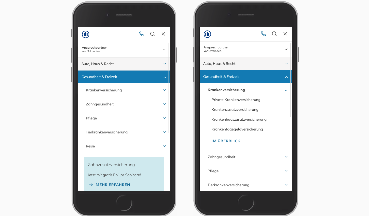
On mobile, the same content transforms into a stack of accordions with no more than four items open at once. The color contrast and indentation clearly convey hierarchy, making it a solid working reference for complex mega-nav that’s fully click-based and predictable.
For a technical starting point, Mark Root-Wiley’s “In Praise of the Unambiguous Click Menu” shows how to build the menu progressively: begin with a CSS hover menu using li:hover > ul and li:focus-within > ul to reveal submenus, then add a layer of JavaScript that creates the button elements, wires up aria attributes, and attaches event handlers. The complete sample is available as a CodePen, with the code stored in a public GitHub repository — a fine point of departure for your own click-based mega-dropdown.
Making the Call: Accordion, Overlay, or Split-Menu
Even when a mega-dropdown opens on tap or click, performance on mobile varies significantly depending on the layout pattern. Target.com offers a good example of an accessible, large navigation that avoids multi-column layouts entirely, displaying only one level of navigation at a time.
The dropdown here presents options in a single column. As the customer drills into a category, each selection takes over the entire overlay, keeping the user focused within a consistent area of the screen. This approach feels predictable, but it does mean the customer sees less of the navigation structure at any given moment than they might with other designs.
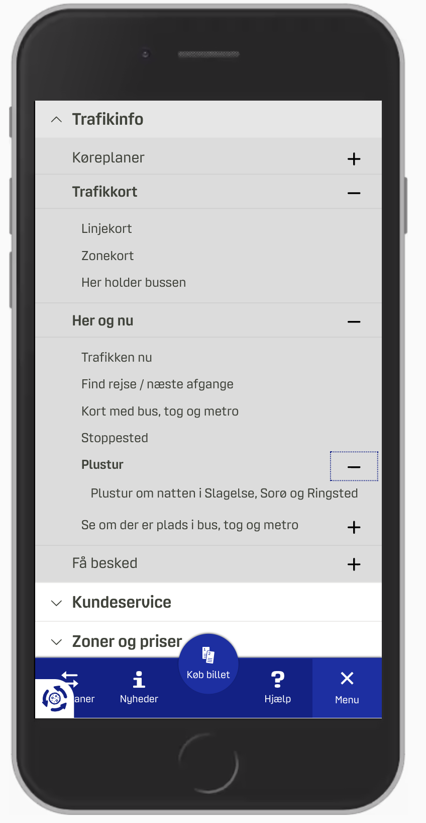
In contrast, Dinoffentligetransport.dk, a Danish public transport site, uses a multi-column overlay with a chevron icon in the top navigation bar, also opening on tap/click.
A more complex variant appears on Unilever’s site, where multiple overlays stack on top of one another. Here, the difficulty shifts to interpreting the interface: the mega-dropdown shows several chevrons simultaneously. Does each one indicate a link to a separate page, or does it open a deeper layer?
 Unilever.com with chevrons in the mega-dropdown.">
Examining the screenshot, “Our brands” leads to a dedicated page, while labels below it open a new overlay on top of the existing menu. The design hints at this with underlines: “All brands” is underlined, signaling it's a standard hyperlink, whereas the other, non-underlined sections trigger additional overlays.
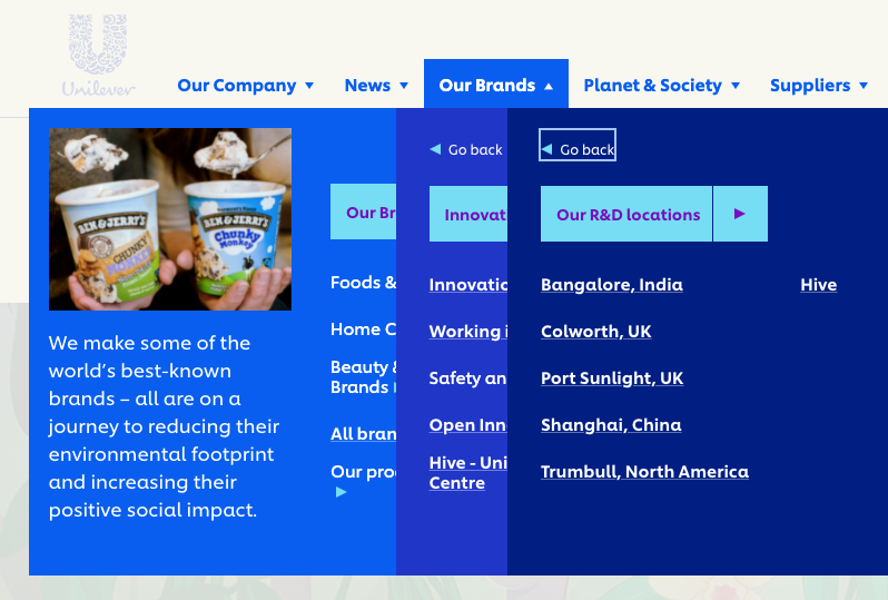
A stacked-overlay structure is problematic on a mobile viewport. With limited screen space, it's hard to visually distinguish different hierarchical levels, and users can quickly lose track of which page they'll land on. The visual hierarchy that keeps multi-level menus organized on a desktop breaks down when squeezed onto a phone.
An accordion structure can mitigate this problem. On Dinoffentligetransport.dk, an accordion makes the current section and its sub-options easier to follow. Further refinements that were noted as valuable: underlining links within each subsection to clarify that they are direct links, and making the entire category bar clickable to toggle the accordion section.

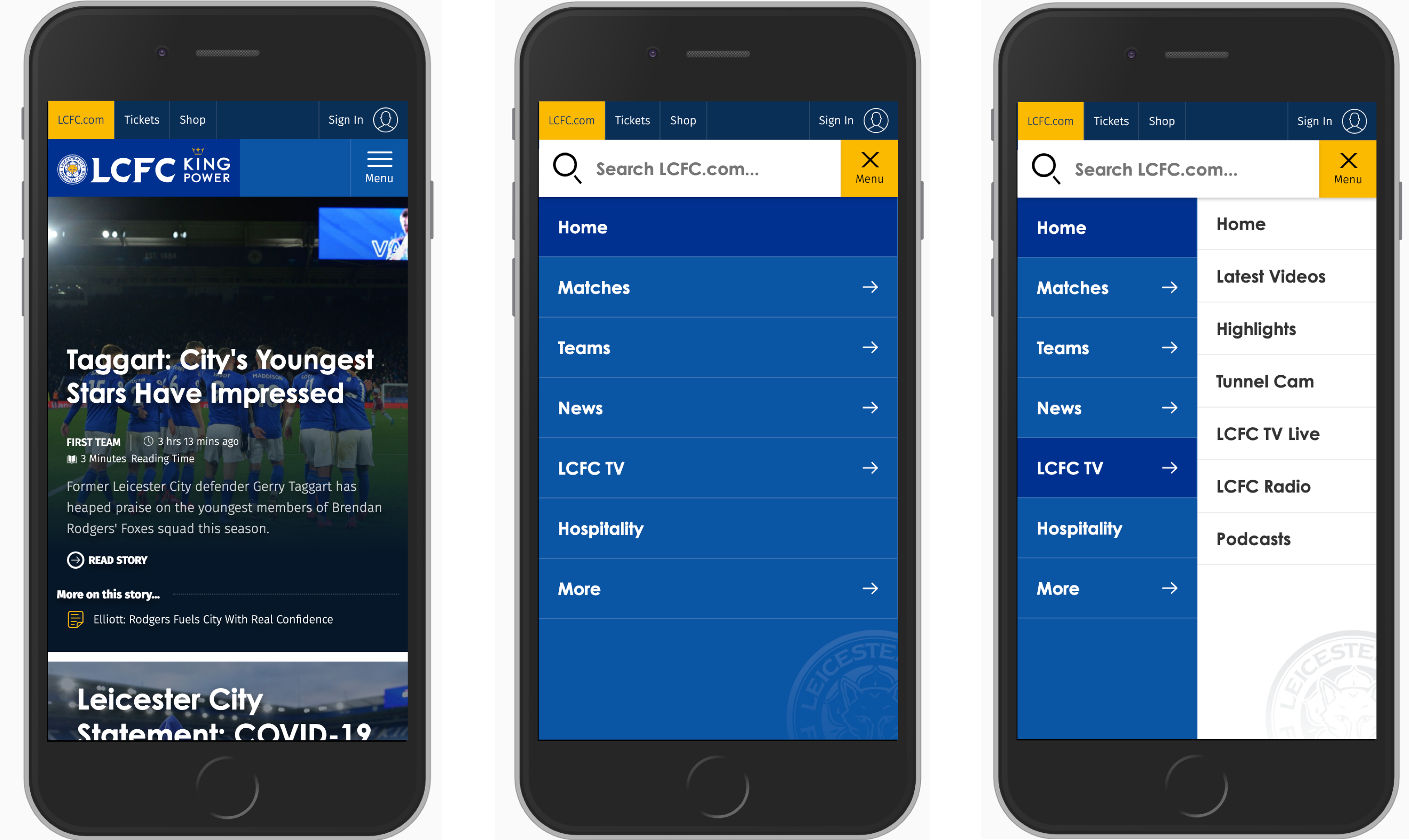
When navigation titles are short, there might be room for a split-screen layout. This approach splits the screen horizontally to reveal multiple levels simultaneously, as implemented on LCFC.com. Such a pattern can shorten the path between a top-level category and its nested pages.
Which Pattern is Best?
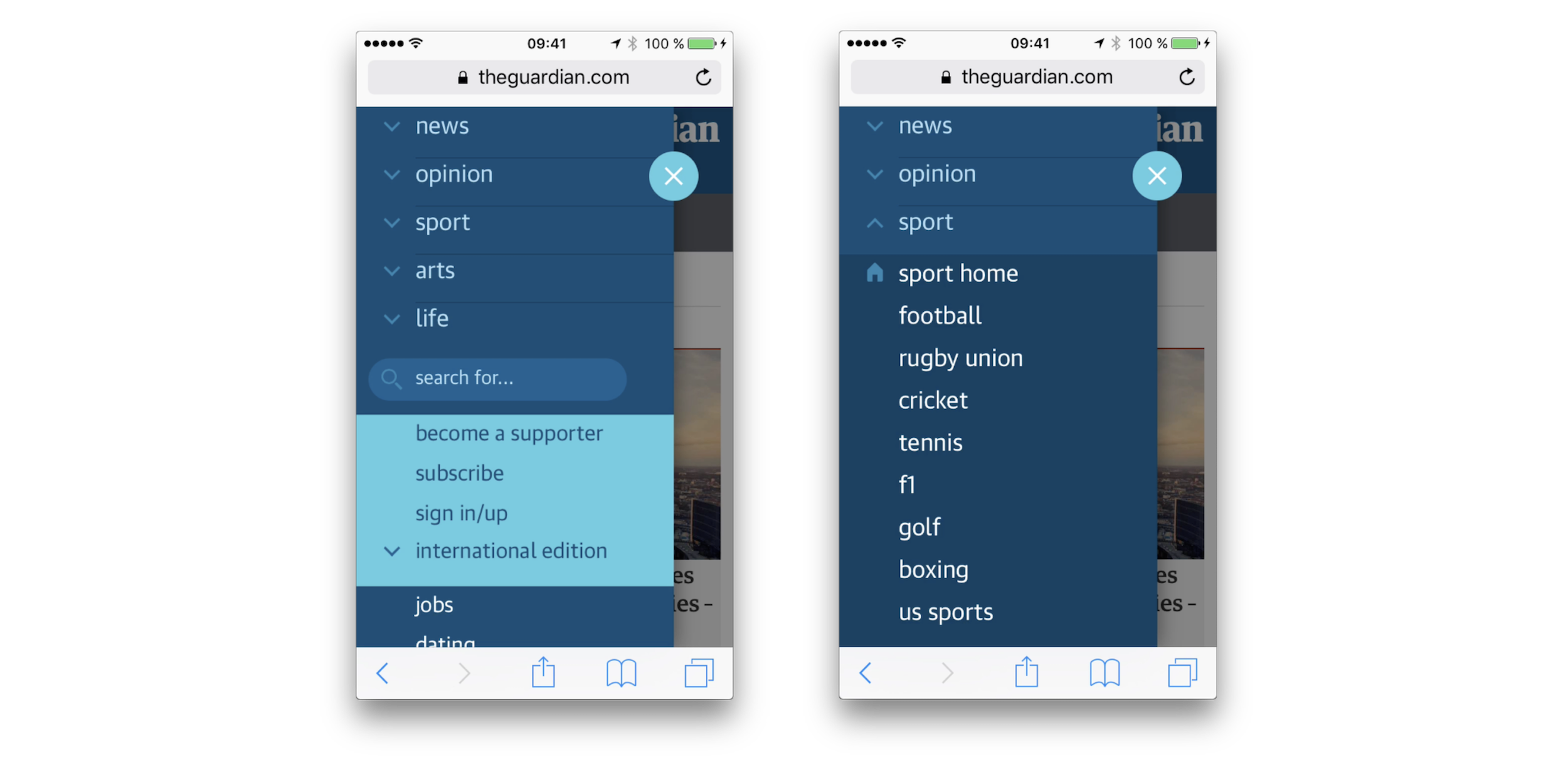
Through practical comparisons, vertical accordions tend to be faster to use and more predictable than either single-column or multi-layer overlay systems on mobile. Split-menus, in turn, are usually faster and more predictable than the accordion methods.
This advantage comes down to how the interaction works. Both accordion and split-menu approaches naturally provide:
- No need for a separate “Back” button to return to the parent navigation.
- Focus retention on the same screen area; the customer need not jump from the top menu bar to the body of the page to navigate.
- Faster switching across levels; customers can jump directly to the section that interests them instead of clicking an iterative "Back" trail.
- The ability to explore multiple sections at once, though this depends on the implementation still allowing multiple open accordions.
The primary issue with these alternatives is their capacity with large volumes of links—when a category contains more than 6–7 items, they can become unwieldy. In these instances, recommended next steps are to include a “Browse all” button after the initial items, or to switch to an overlay. The general escalation path is to begin with a split-menu or accordion pattern, and progressively shift to overlays if there is more navigation to display or if usability degrades.
When the Best Menu Is No Menu
Rather than tackling megacomplex menus at all, some impactful advice comes from Caroline Jarrett's "one thing per page" principle, which the Gov.uk team adopted to simplify its enormous site. The principle states that questions which designers are tempted to group together don't necessarily need to co-exist on a single screen to be effective for users. Originally intended for web forms, it has deep relevance to navigation hierarchies as well.
Successful implementations based on this concept push users through a clear progression of steps with guides, away from a crowded information-dense interface. For instance, Gov.uk has an area to buy a vehicle that doesn't use a mega-dropdown at all. The Kanton Zürich site deploys a similar structure, leading with “Top topics” arranged in a structured layout and displaying a sticky bar for navigation within specific sections.
A different approach is the “I-want-to” navigation pattern. This pairs the standard site menu with an extra utility that constructs a path forward through a sequence of dropdowns. A user can specify an intent—like applying for a service type—and be directed to a specific "output" page. It is a low-jargon, alternative method that unlocks deep content navigation without adding an expansive, heavy navigation layer. The pattern has been deployed by sites like Commonbond and Corkchamber.ie.
Design Guidelines for Safer Menus
When weighing how to build these menus, practices that are consistently robust involve fewer people. The data indicates that tap/click behavior gets less navigation wrong, creates fewer user drop-offs, and is easier to code, rendering a clearer outcome than hover displays. When options appear on hover by default, important and frequently visited page items (search, CTA links) shouldn't sit near their boundary.
A compact list for the final check on the build:
- Skip generic multi-layer menu patterns, or allow double access to standard page links under each sub-navigation.
- Avoid placing latent interactive tags or icons on titles that have another dedicated function (like linking).
- Keep category titles visually unambiguous as either navigational links to respective section landing pages, or controllers to expand/detect menu categories.
- Expose “Home” or “Browse all” controls inside sub-categories to limit deep-cloning; likewise, provide a link or follow as the most natural part of the pattern.
- Do not use horizontal-space-stealing overlay tricks; when possible, use a vertical accordion and split-screen layouts in its place.
- Place an ample and accessible visual affordance (e.g., a chevron), built at tap-friendly scale—around 50x50 px—for clarity.
- Do not animate menus unnecessarily; run any transition within
300msat the outermost limit. - Prevent any stacked multi-second hover delays.
- Consider testing a step-guide or intent-construction pattern to replace the inflated menu on noisy sites.
Different site owners aren't unified on when to trigger dropdown behavior—some see hover as okay, the others as solely tap/click. Of the frameworks mentioned, the lower-latency simple trigger setup—tap/click—offers genuine opportunity for strong user ownership across desktop, and importantly across today's various touch devices. If a huge navigation structure remains a necessity, writing or reviewing it with a careful eye for section size and a decisive accordion-to-overlays breakdown already spells out what content discovery outcome you can reliably meet.