

What Windows High Contrast Mode Actually Does
Windows High Contrast Mode (WHCM) is an accessibility feature that systematically replaces the colors of interface elements — backgrounds, buttons, text — with a user-defined palette. Users enable it through Settings → Accessibility → High Contrast. While the name suggests increased contrast, users can also configure low-contrast palettes, which around 3% of WHCM users do, often to mitigate migraines or light sensitivity.
Usage is significant: roughly 4% of active devices run WHCM, and about 30% of users with low vision rely on it. The feature works by assigning system colors to elements based on their semantics, not their visual appearance outside WHCM. This makes semantic HTML the foundation of WHCM compatibility.
The Core Rule: Usability Over Aesthetics
WHCM strips away much of your visual design, but that is the point. Your job is to ensure readability and usability survive the color replacement. The golden rule: prioritize ease of reading and never harm the user experience for the sake of appearance.
Semantic HTML Determines Styling
Windows applies WHCM styles according to an element's semantic role. A real <button> receives button styles; a <div> with aria-role="button" does not — ARIA roles are irrelevant to WHCM's color assignment. Using a <div> styled as a button may look identical in normal mode, but under WHCM the two elements will take on entirely different colors, confusing users who expect consistent interactive element styling.
Transparent Borders and Outlines Are Your Friends
WHCM completely overwrites background colors. This means components distinguished only by background — like a primary button with a colored fill and no border — become indistinguishable from plain text. The fix is to use transparent borders, outlines, and text decoration. Transparency survives WHCM's color forcing.
For buttons, replacing border: none with border: 2px solid transparent keeps the button visually distinct. Links benefit similarly from text-decoration-color: transparent, which preserves a visual cue even when custom underline animations (e.g., via background-image) are overwritten.
Focus states deserve special attention. Background-color changes and box-shadow tricks are rendered useless in WHCM. The outline property is the only reliable focus indicator under this mode. If you use any non-outline focus style, add outline-color: transparent as a fallback to ensure focus visibility.
Scrollbars Need Borders Too
Styled scrollbars often break in WHCM. A scrollbar thumb with a solid background-color becomes invisible when that color is forcibly replaced. Applying a transparent border to the thumb — e.g., border: 10px solid transparent — makes it appear as a solid bar in WHCM.
Be cautious with thumbs that use inset box-shadow for their appearance. A thick transparent border can make the thumb invisible outside WHCM. Using a smaller border (around 2px) keeps it visible in both modes. These techniques apply to Chromium browsers; Firefox uses scrollbar-color and scrollbar-width, which WHCM overrides automatically, requiring no extra work.
How Images Behave
Image handling under WHCM varies by technique:
- The
<img>tag: Unaffected; displays normally. background-imagewithurl(): Remains visible in WHCM, except on thebodyelement in Firefox, where it is hidden.- Gradients via
background-image: Overwritten by the WHCM background color. - SVGs: Their properties remain unchanged. An SVG using
currentColormatches the link text color in Firefox, including visited states. In Chromium browsers, however, this does not happen — the SVG keeps its own fill. - CSS art: Generally degraded due to reliance on gradients and shadows. This is acceptable unless the artwork serves a functional purpose.
These quirks highlight the need for targeted adjustments in specific cases, which is where the forced-colors media query and its associated tools come into play.
Detecting Forced Colors With CSS
The forced-colors media query, standardized by Microsoft, lets developers detect when the browser or operating system restricts a site’s styles to a user-chosen color palette, with Windows High Contrast Mode (WHCM) being the most common example. The query takes two values: none for when no forced colors mode is active, and active for when one is.
In forced colors mode, the browser overrides these properties with user-defined values:
colorbackground-colortext-decoration-colortext-emphasis-colorborder-coloroutline-colorcolumn-rule-color-webkit-tap-highlight-color- SVG
fillandstrokeattributes
| Property | Value |
|---|---|
box-shadow | none |
text-shadow | none |
background-image | none (unless it’s url() ) |
color-scheme | light dark |
accent-color | auto |
scrollbar-color (Firefox) | auto |
Some properties also behave differently under forced colors. Because the mode prioritizes usability, you should only override its defaults when necessary to keep specific elements legible or functional.
Controlling Overrides With forced-color-adjust
The forced-color-adjust property gives you control over whether an element’s colors get replaced. Its two values — auto and none — respectively allow or prevent the user agent from applying forced colors to that element.
Consider an external-link SVG in a link. In Chromium browsers, SVGs default to forced-color-adjust: none, so they don’t inherit the link’s forced color. Adding forced-color-adjust: auto fixes that:
.inline-icon {
  /* Previous CSS properties */
  forced-color-adjust: auto;
}

You might expect to place this rule inside the media query:
@media screen and (forced-colors: active) {
  .inline-icon {
    forced-color-adjust: auto;
  }
}
That works, but experimentation shows you can also set forced-color-adjust directly on an element without the media query wrapper. Since the property only takes effect under forced colors, it won’t cause unexpected behavior in normal mode.
The none value is useful for content that must keep its colors, such as CSS art. Applying it to the art’s parent makes the whole piece visible in WHCM. A more common real-world case is a color palette swatch, like those generated by mycolor.space, which would otherwise disappear entirely:
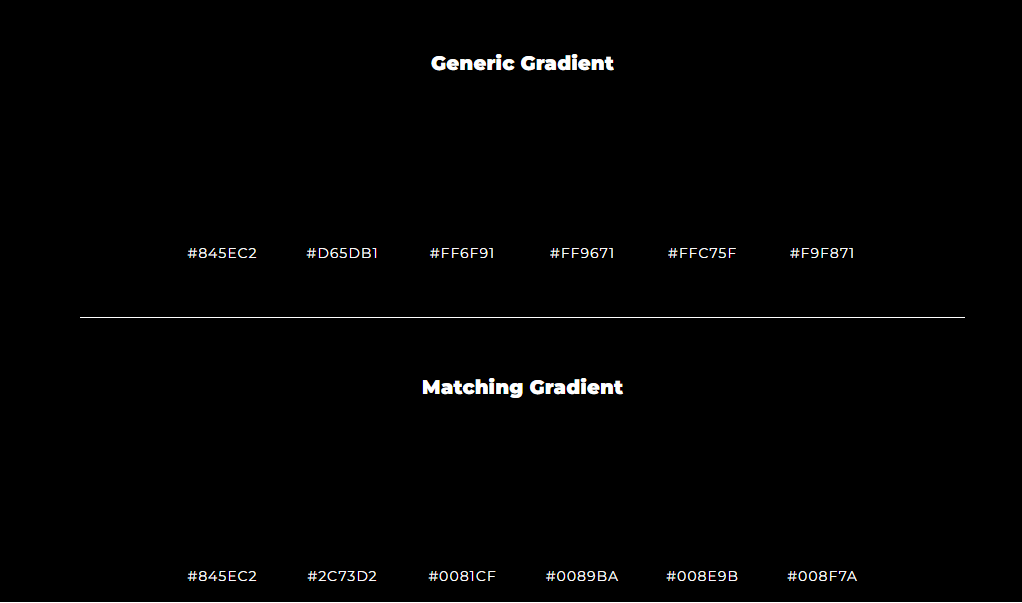
Setting forced-color-adjust: none on the container preserves the palette in WHCM.
Working With System Colors
The forced-colors media query also exposes a set of system colors, documented on MDN. For example, color: LinkText styles an element to look like a link. Because these colors map closely to HTML semantics, it’s often better to use the correct semantic tag rather than restyle an element. Still, there are legitimate uses for complex custom components.
Take a link built with the clip-path property:
.link {
  --clip-path: polygon(0% 0%, calc(100% - 0.8em) 0%, 100% 0.8em, 100% 100%, 0.8em 100%, 0% calc(100% - 0.8em));
  font-size: 2rem;
  padding: 0.1em;
  border: none;
  background-color: #0E0054;
  clip-path: var(--clip-path);
  font-family: sans-serif;
}

.link:focus {
  outline: none;
}

.link:focus span, .link:hover span {
  outline-offset: -0.5em;
  outline: 3px solid transparent;
  background-color: #0E0054;
  color: white;
  text-decoration-color: white;
}

.link span {
  display: inline-block;
  padding: 0.5em 1.2em;
  clip-path: var(--clip-path);
  background-color: white;
  color: #0E0054;
  text-decoration: underline #0E0054;
  text-underline-offset: 2px;
}

.link span {
  display: inline-block;
  padding: 0.5em 1.2em;
  clip-path: var(--clip-path);
  background-color: white;
  color: #0E0054;
  text-decoration: underline #0E0054;
  text-underline-offset: 2px;
}

In WHCM, this element has two problems: its background-color acts as a visible border but gets stripped away, and any transparent outline used for focus gets recolored to the system’s link color instead of the WHCM focus color. You can tune the result with system colors inside the media query:
@media screen and (forced-colors: active) {
  .link {
    background-color: LinkText;
  }

  .link:visited {
    background-color: VisitedText;
  }

  .link:focus span {
    outline-color: Highlight;
  }
}
Firefox additionally has a visited-state color for links, so you should apply the VisitedText system color in the visited pseudo-class as well:

System colors also work for scrollbars when transparent borders aren’t an option. The following example uses the media query to color the scrollbar thumb appropriately:
::-webkit-scrollbar {
  width: 20px;
}

::-webkit-scrollbar-track {
  background-color: #e4e4e4;
  border-radius: 100px;
}

::-webkit-scrollbar-thumb {
  border-radius: 100px;
  background-color: green;
}

@media screen and (forced-colors: active) {
  ::-webkit-scrollbar-thumb {
    background-color: CanvasText;
  }
}
Broader Uses Inside The Media Query
While some properties are restricted under forced colors, most work normally inside the query. That opens room for design adjustments beyond color tweaks. For the clip-path link, you might choose to simplify its appearance entirely, using a straightforward bordered element:
@media screen and (forced-colors: active) {
  .link {
    --clip-path: none;
    border: 3px solid transparent;
    border-radius: 8px;
  }

  .link:focus {
    outline: 3px solid transparent;
    outline-offset: 3px;
  }

  .link:focus span {
    outline: none;
  }
}

This approach still communicates that the element is a link and avoids potential confusion in WHCM. The media query also allows removing purely decorative content — via display: none on an img or background-image: none on a CSS background — when it could distract or bother users. Custom properties work inside the query too, a technique explored in Eric Bailey’s article on Windows High Contrast Mode and CSS custom properties.
Resources And Legacy Support
The forced-colors media query doesn’t work in Internet Explorer. For IE-specific High Contrast Mode support, see articles by Greg Whitworth and Adrian Roselli. Other useful references on the topic include Microsoft Edge’s post on styling for forced colors, Scott O’Hara’s guide to detecting high contrast and dark modes with JavaScript, and a Khan Academy case study on making websites work with WHCM.
WHCM is often overlooked, but the tools are available to make sites work well under it. The forced-colors media query opens useful doors for fine-tuning. Keep in mind that this is an accessibility and usability feature — use its capabilities sparingly and only when they truly improve the experience.


