

Forced Colors: When The OS Dictates Your Palette
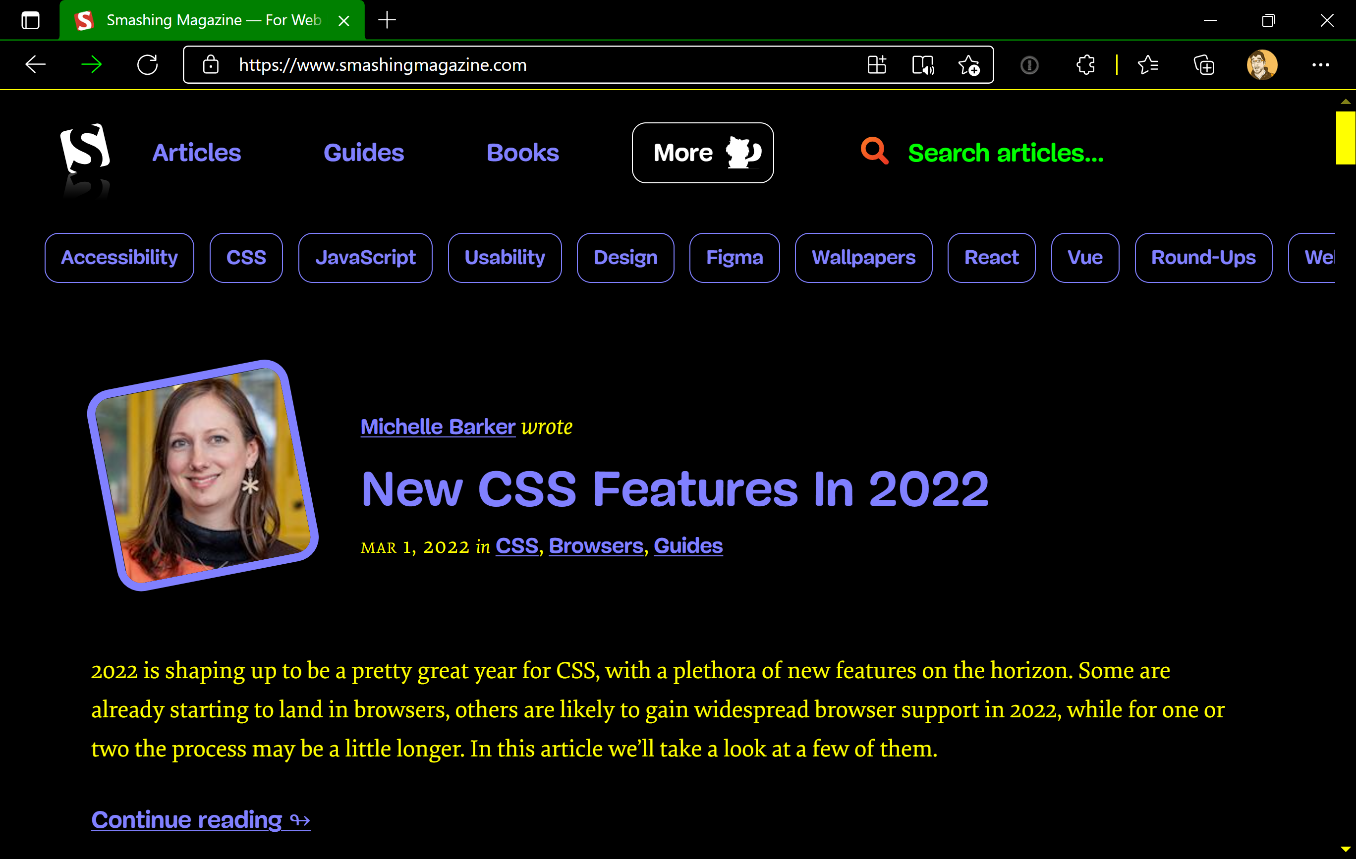
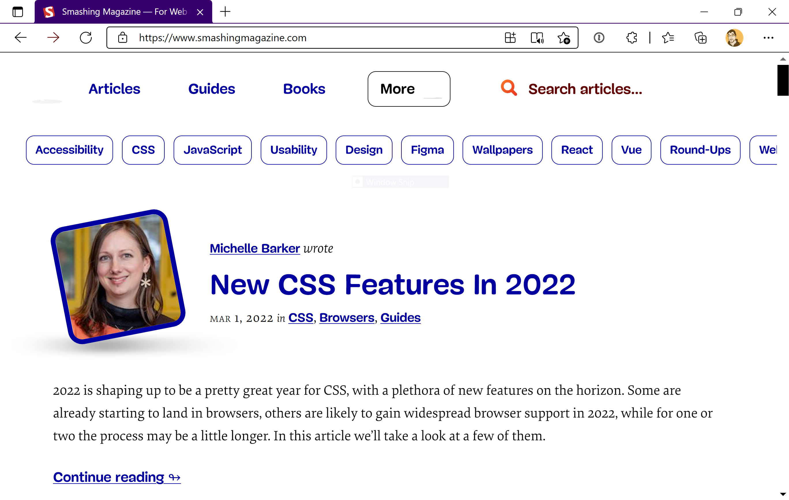
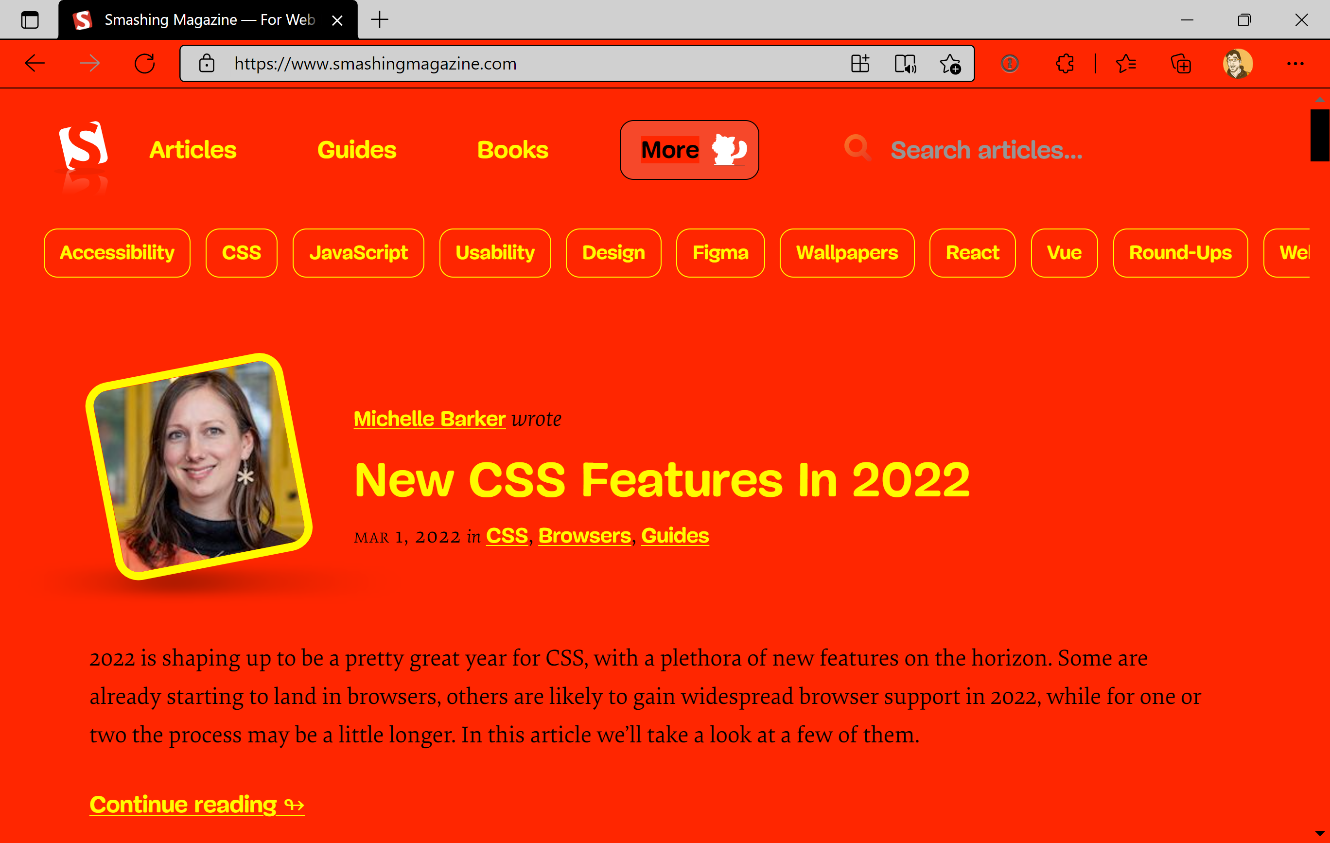
Windows High Contrast mode and its successor, Forced Colors mode, are key examples of assistive technology in action. Both operate at the operating system level, affect the browser, and apply to every piece of web content loaded within that browser. Their primary goal is absolute legibility: ornamentation is stripped away so that content remains clear and readable.
Every element rendered under these modes is mapped to a specific color theme. Users can customize this theme to match their personal access needs, choosing any combination of colors. For some, this is the only way they can view content at all—a deliberate, essential choice. Others might benefit circumstantially, such as using a laptop outside under bright sunlight.
The Current State Of Support And Syntax
Browser support for the newer Forced Colors standard syntax is inconsistent. Internet Explorer will never support it—nor will it ever support CSS Custom Properties—but it does fully support the older High Contrast mode. Edge supports both: it handles the new Forced Colors syntax while maintaining backwards compatibility with legacy High Contrast code. As a result, Internet Explorer understands some, but not all, of the new syntax.
All major evergreen browsers support Forced Colors mode, with the notable exception of Safari. Additionally, macOS, iOS, and Android currently lack a way to define Forced Colors themes, meaning Windows is the only platform capable of a complete Forced Colors experience. For a detailed breakdown, see the following support tables.
| Browser | Supports legacy High Contrast Mode CSS properties? | Supports Forced Colors mode CSS properties? | Supports CSS Custom Properties? |
|---|---|---|---|
| Internet Explorer | ✅ Yes | ⚠ Some | 🚫 No |
| Edge | ✅ Yes | ✅ Yes | ✅ Yes |
| Chrome | 🚫 No | ✅ Yes | ✅ Yes |
| Firefox | 🚫 No | ✅ Yes | ✅ Yes |
| Safari | 🚫 No | ⏳ Soon | ✅ Yes |
| Operating System | Supports switching and creating Forced Color mode themes? |
|---|---|
| Windows | ✅ Yes |
| macOS | 🚫 Not yet |
| iOS | 🚫 Not yet |
| Android | 🚫 Not yet |
An Edge Case: currentColor In SVG
There are known issues with how Forced Colors mode interacts with SVGs that rely on the currentColor keyword for their coloring. These problems are complex enough to warrant their own discussion; Melanie Richards has written an excellent, in-depth article on the specifics and how to handle them.
The key takeaway is that the syntax difference between High Contrast and Forced Colors modes is significant. Because Internet Explorer lacks forward compatibility, content written with the newer syntax may not render correctly for its users. Given that many people cannot upgrade their devices, it is vital to approach this work with caution and to test with actual users whenever possible.
Designing For Forced Colors: Less Is More
The short answer to how you should design for High Contrast and Forced Colors modes is: don’t.
High contrast mode is not about design anymore but strict usability. You should aim for highest readability, not color aesthetics.
— Kitty Giraudel (@KittyGiraudel), June 20, 2017
These modes exist to present all content consistently and predictably. Inherent HTML semantics tell the browser how to render each element. Instead of building a new, bespoke experience, you should only make small, surgical tweaks to content that isn't marked up semantically and might not hold up visually.
The Keyword System
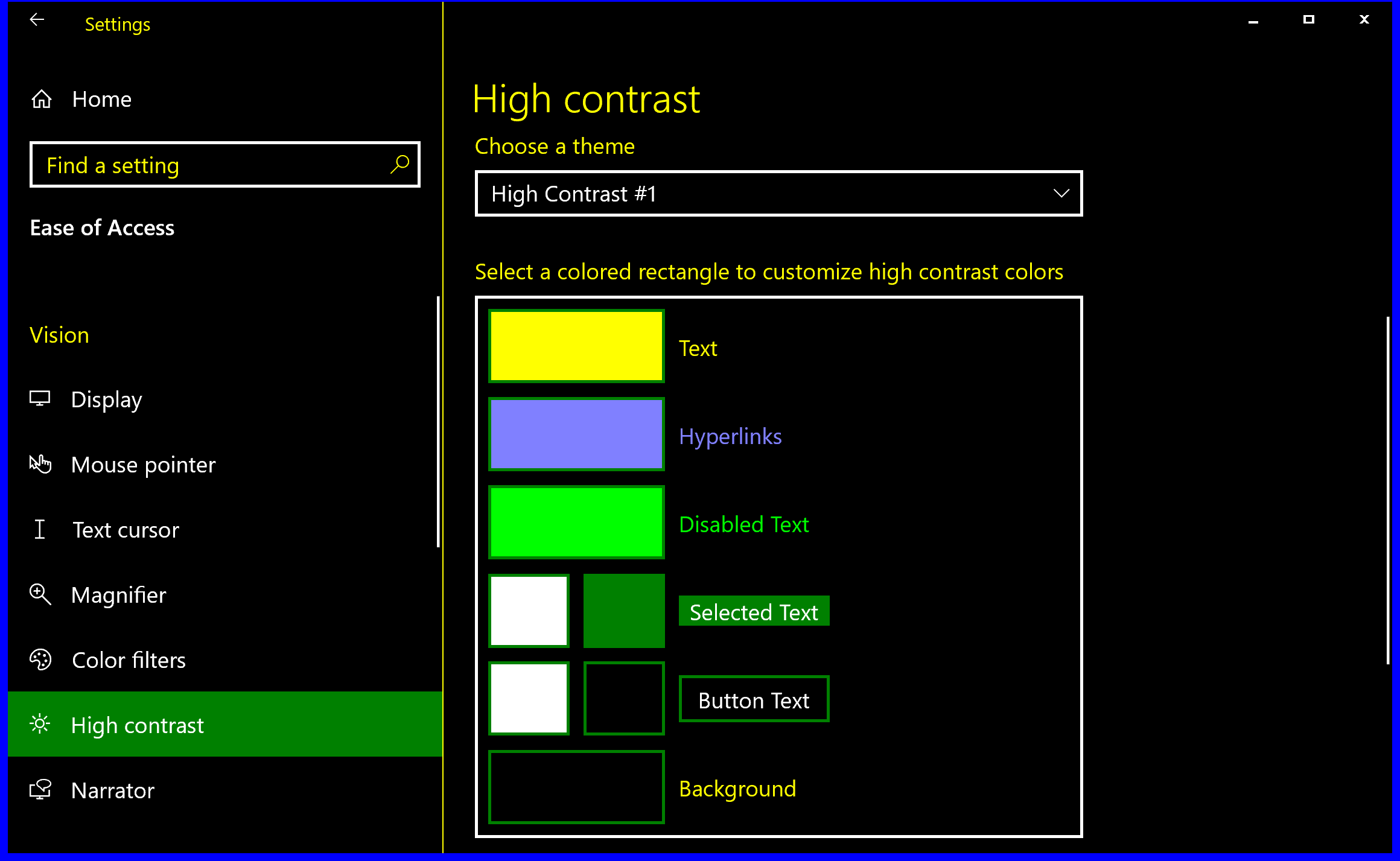
Both Forced Colors and High Contrast modes use a suite of specialized keywords to assign color, mapping each keyword to a specific meaning rather than a specific hue. For instance, all regular text gets the same themed color via the CanvasText keyword. Because themes—including user-generated ones—can assign any color to any keyword, semantic naming is essential.
The complete list of Forced Colors keywords is as follows:
| Content | Keyword |
|---|---|
| Text | CanvasText |
| Hyperlinks | LinkText |
| Disabled Text | GrayText |
| Selected Text, foreground | HighlightText |
| Selected Text, background | Highlight |
| Buttons, foreground | ButtonText |
| Buttons, background | ButtonFace |
| Backgrounds | Canvas |
Here is how these keywords map to the Windows High Contrast theme selection interface:
And here is an example of a custom theme that a user might create:
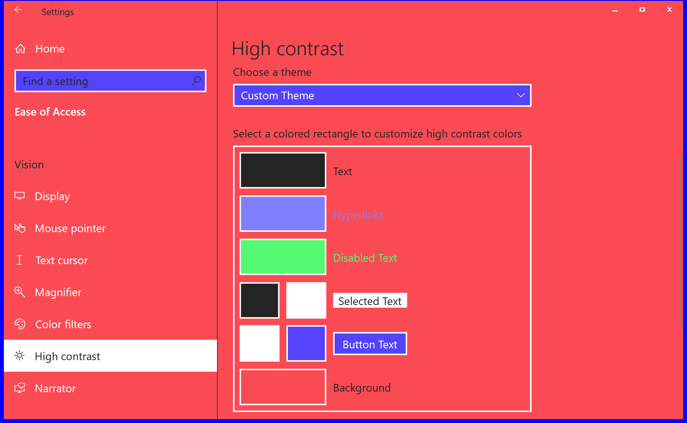
That theme may look visually jarring, but it may be precisely the combination of colors that enables someone to use their device effectively.
Custom Properties: A Perfect Pairing
Forced Colors mode’s transition into a standard pairs incredibly well with CSS Custom Properties. These “variables” in CSS are formalized values that can be dynamically manipulated.
:root {
  --color-background: #ffffff;
  --color-text: #000000;
}

@media (prefers-color-scheme: dark) {
  :root {
    --color-background: #000000;
    --color-text: #ffffff;
  }
}

body {
  background-color: var(--color-background);
  color: var(--color-text);
}
This example defines custom properties at the :root level to control text and background colors. It initially sets black text on a white background, and then updates those properties to white text on a black background when dark mode is enabled. The properties are then invoked within the body selector. Custom Properties are not limited to colors; their realtime updates work with both display mode changes and JavaScript logic via CSSStyleDeclaration.setProperty.
A Practical Example: Styling A Modal
Let's apply these concepts to a concrete scenario: a modal dialog. Because the native dialog element still has assistive technology compatibility issues, a robust solution often relies on ARIA and JavaScript, such as Kitty Giraudel’s a11y-dialog.
Accessibility Workarounds
When a modal is constructed with divs, Forced Colors mode—like Windows High Contrast mode before it—does not recognize it as a dialog. ARIA attributes are ignored when determining color assignment.
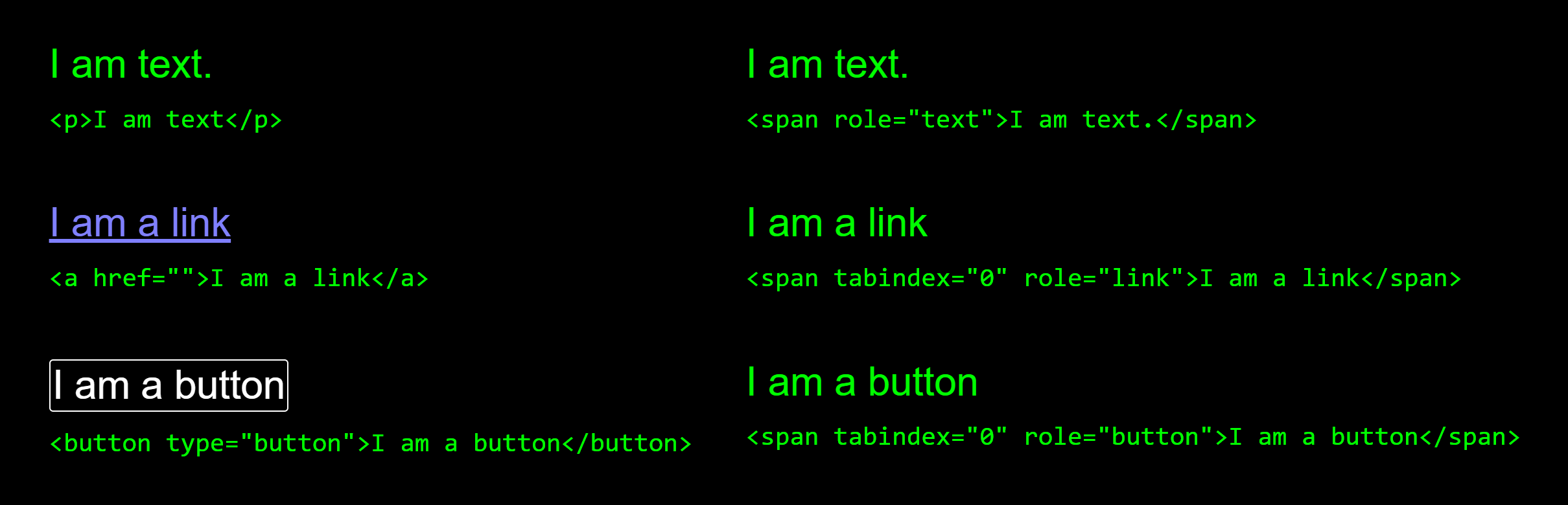
This is precisely why the Forced Colors media query and its keywords exist: to tweak improperly marked-up content until it functions as expected. This is no different from patching vendor-supplied code you cannot directly control.
Before The Tweak
Here is a modal example before our Forced Colors adjustments:
See the Pen [Modal dialog [forked]](https://codepen.io/smashingmag/pen/KKyjovK) by Eric Bailey.
It looks like this without Forced Colors activated:
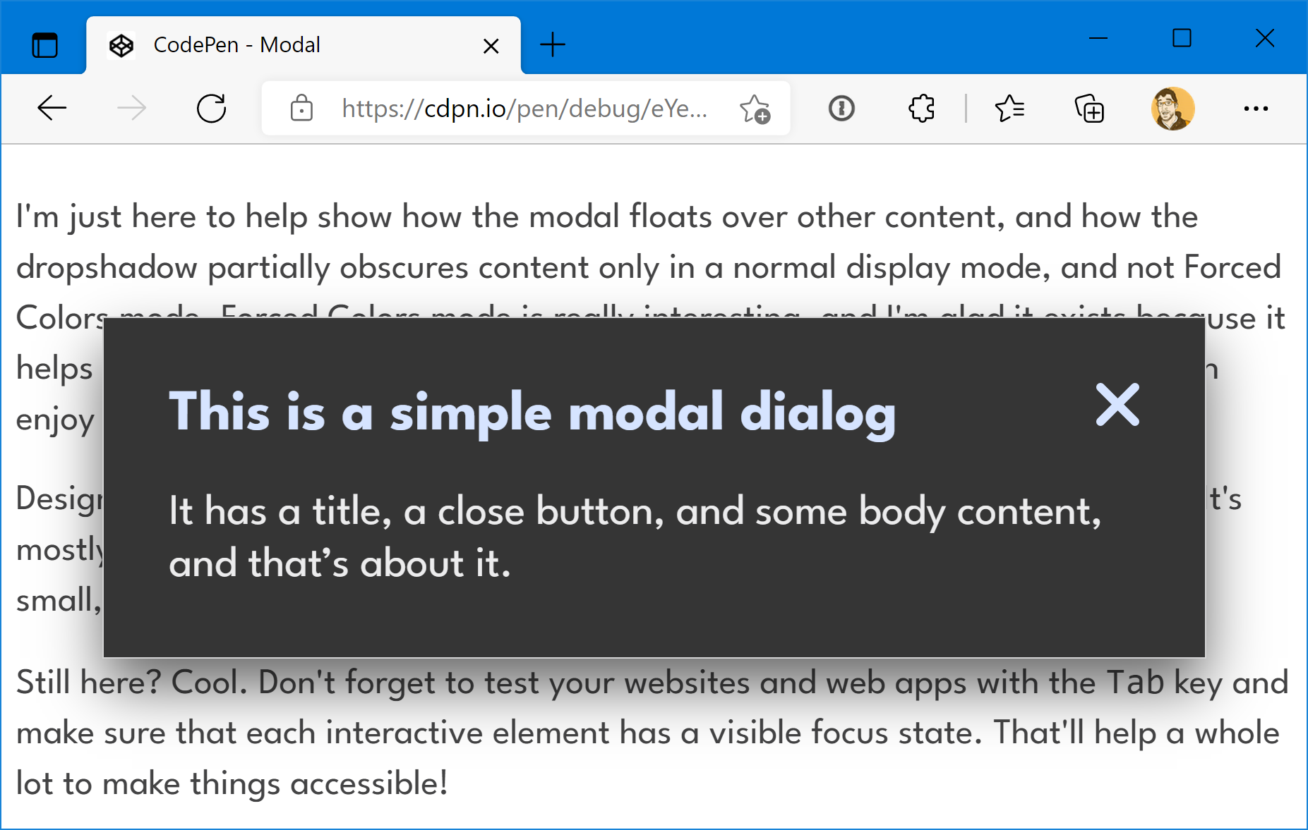
And this is how it appears with Forced Colors enabled:
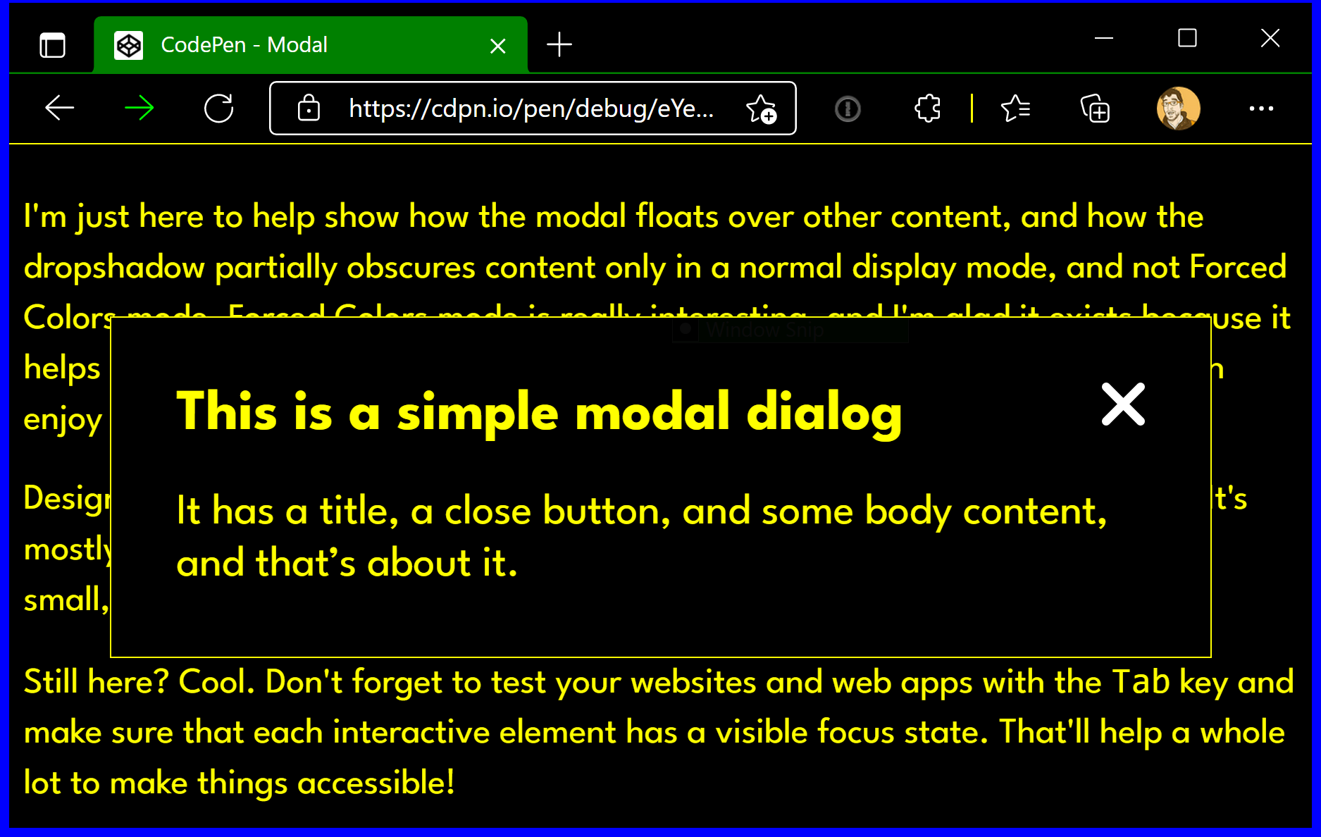
CanvasText color, and the modal’s close button is using the ButtonText color. (Large preview)A screen reader user may be aware a modal is present from the announcement, but a low vision user relying on Forced Colors might find the modal’s boundaries unclear visually. This is further complicated for those who use both a screen reader and Forced Colors.
Notice that while Forced Colors doesn't recognize the dialog role, it does recognize the CSS outline declaration. It takes the thin, light gray border and recolors it with the CanvasText keyword’s value. Also note that the modal’s box-shadow has been removed. This is all by design: Forced Colors prioritizes legibility and makes visual updates to uphold it.
The Intentional Update
Just as we redefine custom properties for states like :hover or :active, we can override them for different display modes. Here is the modal after our Forced Colors tweaks:
See the Pen [Modal dialog with Forced Color mode tweaks [forked]](https://codepen.io/smashingmag/pen/zYPVjPa) by Eric Bailey.
On line 104, the --dialog-border-width property is redefined within a Forced Colors media query. This is a deliberate adjustment that takes the thin outline border and makes it considerably thicker.
 @media (forced-colors: active) {
  --dialog-border-width: var(--size-300);
}
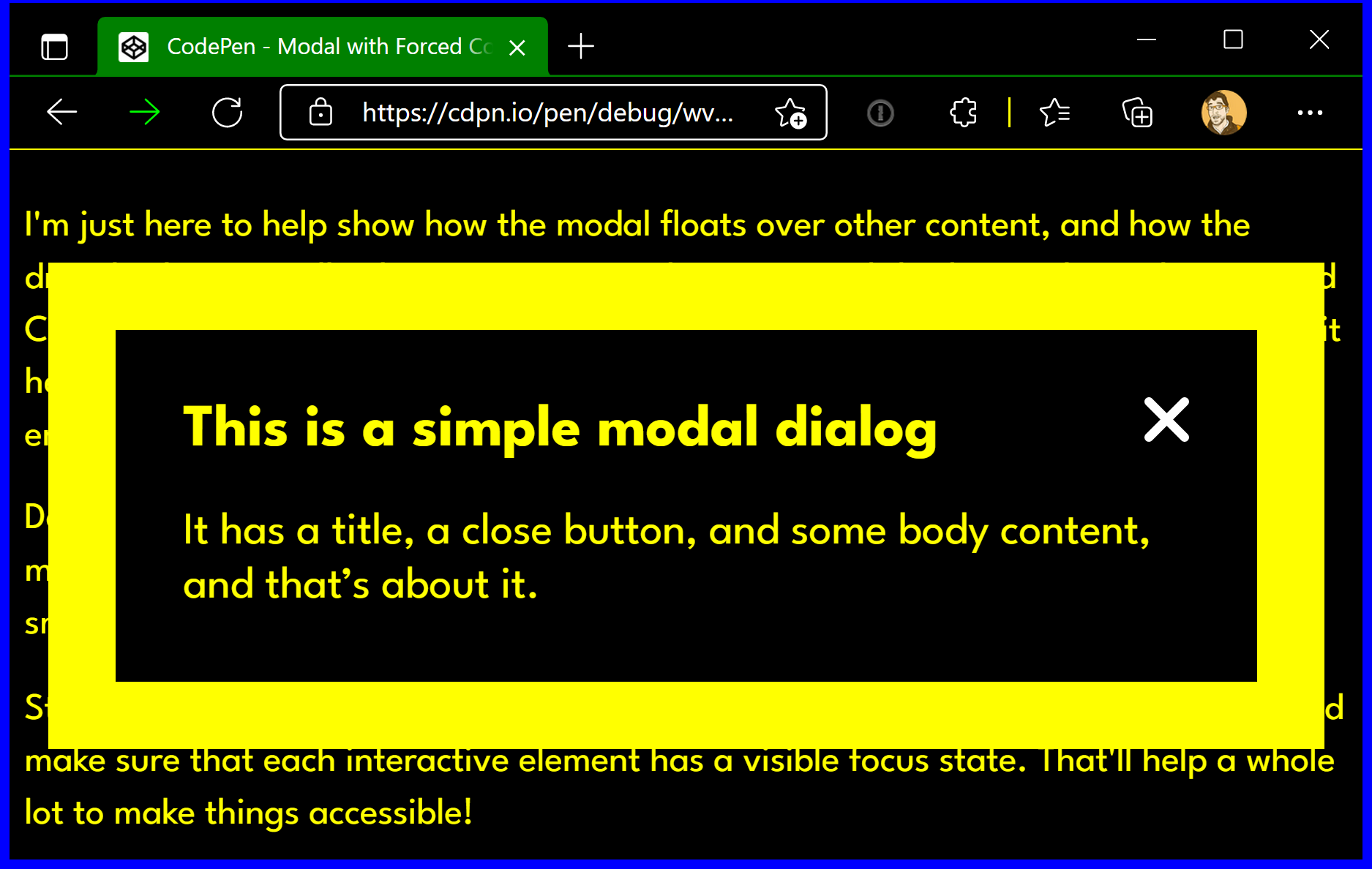
The thicker outline helps communicate the modal’s outer boundary and signals that it's floating above the page content. Since Forced Colors removes the box-shadow, this stronger border becomes an essential visual affordance.
Here is a screenshot of the final result:
How to Test Forced Colors Support
Windows users can enable contrast themes directly through the operating system's accessibility settings. If you're on macOS or Linux, several practical options exist to verify your Forced Color implementations:
- Dedicate a Windows-based "craptop" to testing, using a tunneling service like
ngrokto expose your local development environment. This device doubles as a low-end performance testing tool, which addresses another common access barrier. - Spin up a virtual machine locally using a Windows image provided by Microsoft.
- Leverage a cloud service such as Assistiv Labs, which offers an on-demand Windows VM geared specifically toward accessibility testing without taxing your primary machine's resources.
- Use Polypane's media emulation to simulate the mode.
- Toggle the emulated Forced Color mode directly in Microsoft Edge's DevTools.
Be cautious with the last two emulation options. An emulated experience only renders a single contrast theme, which is not representative of the full range of appearances Forced Color mode can produce across different user configurations. Because Assistiv Labs is purpose-built for accessibility and runs cloud-hosted, it avoids the heavy system load of a local VM while providing a more authentic test environment.
Practical Next Steps
The effort required to support Forced Color mode often comes down to a few strategic updates to CSS Custom Properties. The real value, however, is understanding how a core assistive technology works and how modern CSS features integrate with it to create interfaces that adapt fluidly to user needs.
Now that you understand the mechanics of Forced Color mode, auditing your existing projects is a straightforward process. Small adjustments in how you define colors and system components can dramatically improve the browsing experience for users who depend on forced colors to navigate the web.
Additional Resources and Further Reading
For deeper technical guidance, the following references cover specific aspects of forced colors, system color values, and related accessibility topics:
- "Styling for Windows high contrast with new standards for forced colors" — Microsoft Edge Team
- "CurrentColor SVG in forced colors modes" — Melanie Richards
- "Assistive technology: Operating System and Browser Accessibility Display Modes" — Eric Bailey
- "Working with the text backplate in Windows High Contrast" — Greg Whitworth
- "WHCM and System Colors" — Adrian Roselli
- "Quick Tips for High Contrast Mode" — Sarah Higley
- In Praise Of The Basics
- How OWASP Helps You Secure Your Full-Stack Web Applications
- The Hype Around Signals
- A Designer's Accessibility Advocacy Toolkit



