

Starting With an Audit
Before diving into component anatomy, it helps to take stock of what actually exists in your product. An audit — whether conducted with an online collaboration tool or printouts on an office wall — gives you a clear picture of the design artifacts currently in use. Grouping and categorizing these elements reveals what's really being used "in the wild."
From there, you can zoom in on individual components and ask fundamental questions: What is this component for? What problem does it solve? Your components are essentially a collection of solved problems, and understanding their intent at the outset provides clarity for what you're building toward.
Examining a Simple Form
Consider a sign-in form as a starting point. It's a straightforward composition of text, form inputs, buttons, links, and a divider. Many properties here are likely reusable: typography, colors, and interactive elements. The use case is clear — it enables users to sign in — but a quick audit reveals similar forms exist for account creation and password recovery.
At this stage, it's reasonable to call the component Form, knowing that the name may evolve as the audit uncovers more variants. The key is to abstract the component from its specific user journey and view it from a system perspective:
- What is it?
- What use cases does it support?
- How might teams use it in their work?
This abstraction also informs naming. Calling this component "account sign-in" would make reuse clumsy elsewhere. Instead, "sign in" becomes just one use case of the Form component — an implementation of generic properties satisfying a specific user need.
Recognizing that we can't know everything at the start and building workflows or processes that enable us to adapt as we learn is really vital to the design system's growth over time.
Breaking Down the Components
As you decompose these forms, you find smaller elements with many potential future use cases. You can't predict all their requirements, but you can start by being opinionated — handling the known cases well and planning for change as you learn more.
Label
The form label initially appears simple, but it has a few things going on. It may include additional copy to indicate whether a field is optional, and it can contain a link. Based on the audit, there's currently no scenario where both optional text and a link are present simultaneously — but that assumption should be documented, as combining them may require additional layout work.
Marking up the label's anatomy reveals more than just typography and color. There are optional elements and potentially internal logic governing when they appear — such as preventing both optional indicators from showing at once.
Buttons
The audit surfaces two button instances: primary and secondary, distinguished by their perceived use cases. Both have subtle hover and focus state changes. Redlining these buttons clarifies their composition:
- Text: font size and line height;
- Spacing units;
- Border: radius and width;
- Height;
- Fixed and full-width options.
This set of properties forms the architectural base of the button — something you can create variants from and later apply themes to. Documenting this generic archetype is helpful when questioning why things are a certain way. The initial audit provides context for how things are today; changes from that baseline benefit from this additional understanding.
Annotations are far more explicit than simply interrogating designs to extract values. They get to the core of what a component's visuals are. Note that citing pixel values at this stage doesn't necessarily reflect production output — in live code, you might use a mix of px, %, ems/rems, and other units appropriate for the output medium.
Inputs
The form field comprises a Label component and the input element itself. The same presentation works for text inputs and select/drop-down elements, with a border color change on focus to highlight the field. Combining these elements gives you the overall composition of the Form Field component:
- A label with optional elements;
- An input that may also be a drop-down;
- No supplementary text;
- Spacing at the top, based on current usage.
Stacking heading text with multiple Form Field components, spacing, and buttons produces the full form. Other form instances from the audit simply vary the number of fields or add a divider with a secondary button.
This is where component hierarchy aids composition. Atomic Design provides a useful vocabulary:
- Atoms: Label, Input, and Button;
- Molecule: Form Field;
- Organism: Sign-up Form, Sign-in Form, or Forgot Password Form.
Depending on how much logic you're comfortable embedding in components, you might have one User Access Form handling all use cases, or separate components per use case. Each approach has trade-offs in terms of the design system's scope and how product teams compose their work.
Beyond visual properties, this is an opportunity to consider presentational logic: what should be toggleable, such as showing or hiding elements? Establishing this basic logic early helps connect design tools with coded components. Storybook's "controls" visualization closely mirrors the component properties available in Figma, making this a natural alignment point.
From Properties to Tokens
Working through the composition surfaces a set of properties: typography, colors, spacing, and border-radius. When laid out in isolation, these feel abstract. But in a broader audit, noticing patterns — too many shades of grey, unclear typographic hierarchy, or color usage — becomes easier when each category is viewed together.
Many of these questions resolve over time. For the component at hand, these properties can be exploited directly through design tokens. Encoding each value as a token creates a shared abstraction across design and engineering specialties. Tokens unify how things are named and discussed because they carry shared values rather than values that need inspection or translation between contexts.
By assigning unique values to these properties and treating them as placeholders, components gain flexibility. When values change, they change in one place — and this abstraction also opens up possibilities for theming down the line.
From Components To Themes
A theme is essentially an application of brand — a named set of properties that describe a particular implementation or outcome. All the properties we identified for our input component can be described differently across themes, and new ones can be introduced as needed.
With a single brand and theme, you may not need much structure. But setting up relationships between raw values and their use cases now means you can add themes later without reworking everything.
Design tokens come in many forms, though the W3C community group is working on a standard format. A common approach distinguishes between:
- Core tokens — very specific values such as
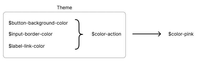
$color-pink-500, useful but inflexible on their own. - Semantic tokens — placeholders for values with a clear purpose, like
$color-actionfor links or buttons. - Component-level tokens — things like
$label-indent, which tie a component’s property to a semantic or core value.
Token aliases make this powerful: $color-action can simply point at $color-pink-500. Your components reference the semantic name, and you’re free to change the underlying relationship per theme. Swapping a token set can therefore ripple broad change across color, typography, spacing, and more.
When you structure themes, consider whether “dark mode” is a separate theme or a sub-theme — often called a mode. It usually implies only a color-palette change. Deciding where modes sit in the hierarchy (inside a theme, or above it) clarifies how to organize your token sets.
A Second Example Theme
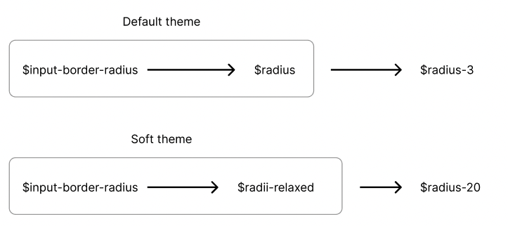
Imagine our default look and feel is stored as “default,” and we add a second theme called “soft.” The goal of the soft theme is a more playful, welcoming UI. For instance, it may expand the range of colors available and introduce more rounded corners:
Our default theme stores one radius value; the soft theme might need several. The differences first show up at the component level — our input’s border radius now has to be a token that responds to the active theme.

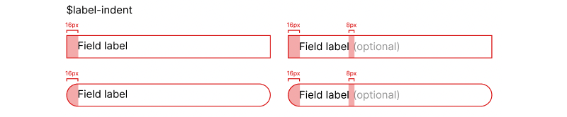
Enabling such targetable changes often means tokenizing a design decision only when a theme calls for it. For example, we might want to indent the label text to align with content inside the input field:
- Add a component token
$label-indent. - In the default theme, store
0(labels currently sit flush left). - In the soft theme, point that token at an existing spacing unit.
You’re unlikely to get an ideal token architecture from day one. Start with core tokens, then introduce semantic tokens when naming becomes unwieldy, and add component-level tokens when you introduce a second theme. Each new design change is an opportunity to refine the system incrementally rather than redesign it wholesale.
Generating Outputs
Design tokens should stay platform-agnostic: they describe decisions, not implementation details. Then tooling like Style Dictionary can read a single token object and generate whatever output your web or native projects need — vanilla CSS, Sass, LESS, CSS-in-JS, even UIColor for Swift.
Transforms let you convert stored values on the way out (say, hex to rgba) so you don’t compromise the source token format for one platform’s preference. The payoff comes quickly — you can stand up a generator fast and customize workflows later through the API.
Auditing what’s already live is natural, but it’s equally useful to audit what exists in the code. A combined view reveals how components actually consume values and helps map a migration path. If an organization has multiple codebases, scoping what your design system formally covers — documentation only, shared tokens, or live code — determines which output formats teams need and how processes must adapt.
Stepping Back
From an initial audit, we went all the way down into atom-like token details and then built relationships across themes. Stepping back again, it becomes clear how many properties components share, and how those commonalities help define intent and naming. Look at the system from different perspectives — a single component in one layout can behave very differently when considered on its own, especially responsively.
These layers matter to different people at different times, yet all must work as one whole. That can be overwhelming, so start somewhere small. Take one important user journey, break it down repeatedly, document what you learn, and do it again. The pattern spotting, questioning, and iteration is what ultimately matures a design system.


