
Rolling Back Prices, and Time, for a ’90s Summer
For its "Summer Like It’s 1999" campaign, Instacart didn’t just adopt a retro aesthetic. The delivery app rolled back prices on iconic snacks like Bagel Bites, Capri-Sun, and Otter Pops to 1999 levels, culminating in a free Third Eye Blind concert in New York City. The goal was to tap into a cultural moment of nostalgia for a simpler time.
"People are pining for a simpler time," says Taylor Erin, executive creative director at Instacart. The campaign’s success, however, rested on engineering a cohesive design system that could stretch across app icons, splash pages, TV commercials, and billboards while still feeling distinctly Instacart.
A Shared Source of Truth
The project’s central coordination point was Figma, which served as a hub for the brand, performance, and commercial marketing teams. "It’s where we made sure everything was cohesive and held live creative reviews where we were making changes in the moment," Erin says. "It’s not only a platform for creatives; it’s also a platform for marketers to see what’s happening."
The first step was building a unified toolkit. Daily meetings aligned the creative studio on typography, color, illustration, and photography reference points. "We went down a rabbit hole of ’90s design elements, way far outside our brand comfort zone, and then stripped it back to the essential parts to find the thread that was bringing these things together," Erin explains.
This process involved continuous, informal collaboration rather than rigid handoffs. "At Instacart, we have a one-team mentality," says Erin. "There aren’t ‘ta-da’ moments of hand-off. The marketers have access to Figma, so we can have micro check-ins and be very open about the messy middle."
Once finalized, the toolkit became a living file that guided all executions. “When you move so quickly with so many different teams and people, you have to have that openness and fluidity.”When you move so quickly with so many different teams and people, you have to have that openness and fluidity.
Art Directing the Photo Brief
To capture the right vibe, the photography brief needed to be highly specific about both subject and technique, especially with featured CPGs in mind. "We had to be specific about how the products were being featured because the brief had to go through a lot of different stakeholders," says Erin. The complexity increased as the team planned to layer illustrations, typography, and textures over the photography to maintain cohesion.
The resulting photos highlighted specific ways people enjoyed treats in 1999—biting the tip of a Drumstick or using a licorice rope as a soda straw.  Characters in casual ’90s attire populated grassy lawns and playgrounds, while fish-eye lenses and low angles evoked old-school music videos and skate tapes. A sepia undertone and grainy texture completed the throwback effect.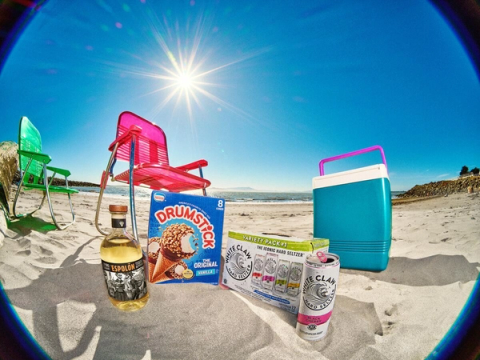
Pushing Beyond the Brand Standard
The campaign also allowed the illustration system to evolve. "As our brand shifts, our illustration system should also evolve," says Erin. "So there was a no-holds-barred feeling to this campaign, and we went far, far away from what would be traditionally Instacart." 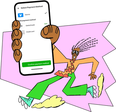
Flexing the Rules for CRM
This boundary-pushing also extended to Customer Relationship Management (CRM) efforts, where engineers typically pull from templatized designs. "For this campaign, we definitely broke the mold," says Belinda Jimenez, program manager of marketing ops at Instacart. Using Figma as a shared space, CRM designers worked closely with developers to ensure the designs were feasible to build and met ADA requirements.
The team had to rethink how banners and ad placements looked across devices, moving beyond the existing design system. "Figma allowed us to create many different ad units based off of one design by changing the messaging or price points," says Robert Paige, creative director at Instacart. 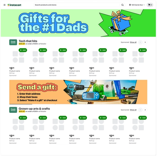
The Concert as a Grand Finale
The free Third Eye Blind concert wasn't part of the initial plan. After the band’s hits were featured in TV commercials, frontman Stephan Jenkins proposed a live show with a setlist of songs from 1999. "It snowballed from there," Erin says. The event grew into an immersive experience with snacks, drinks, and a makeover station with frosted tips and butterfly clips.
The concert required a shift from the broader campaign toolkit. "We went from a more playful, innocent ’90s to a grunge aesthetic that was more in line with what a concert would’ve been in 1999," says Erin. 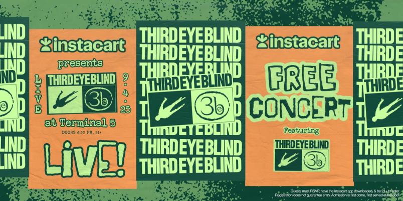
Ultimately, the campaign’s success came from detailed design decisions working in concert to deliver an experience that resonated. "The ’90s are so important to people right now, and we wanted people to open the app and be flooded with memories," Erin says. "We’ve gotten so many organic reactions. It really hit home."


