A Hosting Project That Rebuilt Fonts to Look Old
Vistaserve, a self-described “grass-roots web hosting initiative” from Thornbury, Australia, wants to recreate the quirky web of the 90s by letting users build their own home pages. For Caitlin & Paul—the no-last-name thing seems to be part of the aesthetic—getting the right look meant removing anti-aliasing, the very feature that makes text legible on screens. Standard CSS offered no solution, and the project turned into a deep dive that involved literally rebuilding the fonts to work in modern browsers.


Punctuation Needs Kerning Attention Too
Thomas Bohm points out that kerning around punctuation often deserves special handling. A question mark may need extra breathing room, or a superscript number might sit too close to the preceding letter. Fixing it manually requires inserting entities like   or &hairsp between the characters, which is tedious work best reserved for special projects. For most of us, the practical answer is trusting that a high-quality typeface has already accounted for these details.

Better Proofing Text and Thoughtful Pairings
The classic pangram “The quick brown fox jumps over the lazy dog” is ubiquitous in type testing because it exercises every letter of the alphabet, but Jonathan Hoefler argues it falls short for serious typographers. He has created new proofing text that better serves real design decisions.
More broadly useful is Hoefler's recent writing on font pairings. Where most advice on combining typefaces feels generic, his take stands out for embracing unexpected combinations.
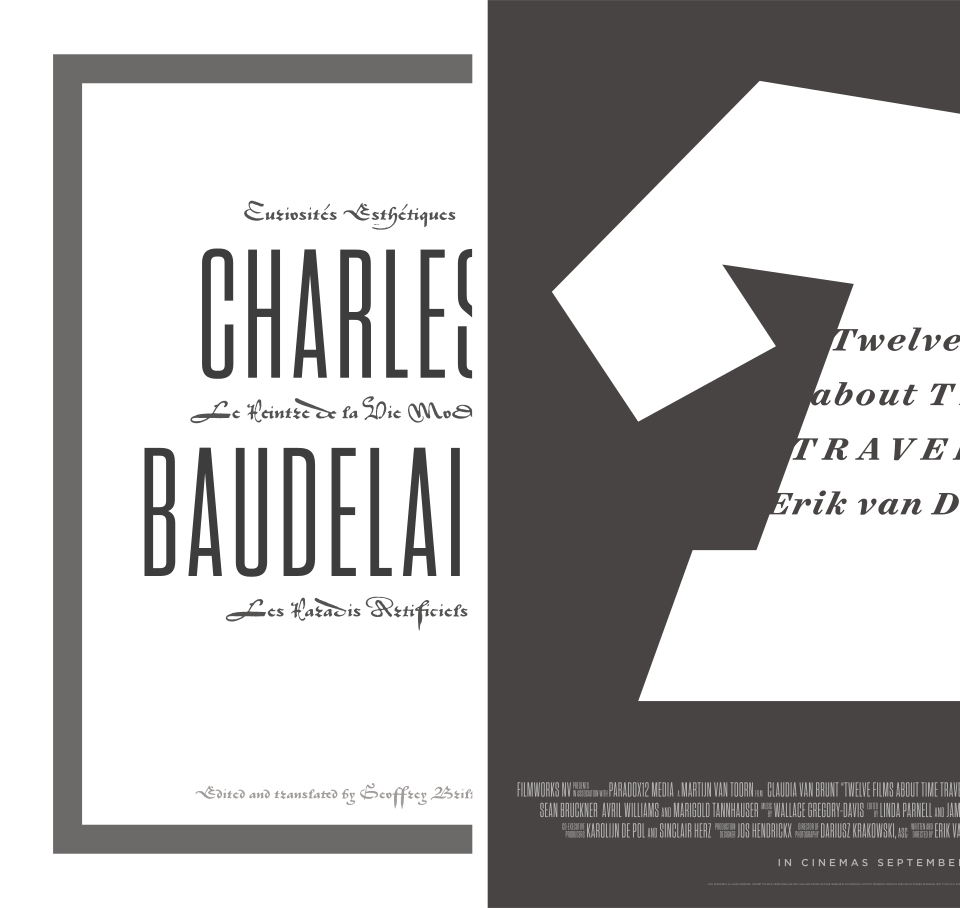
Some of the most dazzling typographic pairings — and certainly my favorites — are those that use unexpected fonts together. At left, the grey flannel suit that is Tungsten Compressed is paired with crimson silk doublet of the St. Augustin Civilité, a fiery sixteenth century typeface that demands a good foil.
Hidden Catalina Fonts Worth Downloading
macOS Catalina ships with several high-quality typefaces that remain hidden unless manually installed, as Ralf Herrmann documents. The lineup includes full families and individual display faces:
- Font families:
- Canela from Commercial Type in 16 styles
- Domaine Display from Klim Type Foundry in 6 styles
- Founders Grotesk by Klim Type Foundry in 17 styles
- Graphik by Commercial Type in 18 styles
- Produkt by Commercial Type in 8 styles
- Proxima Nova by Mark Simonson Studio in 12 styles
- Publico by Commercial Type in 12 styles
- Individual display fonts:
- Sauber Script by TypeJockeys
- Quotes Caps and Quotes Script by Sudtipos


Erik Kennedy of the Learn UI Design newsletter recommended Canela for a recent project, praising its distinctive character.

Overall, Canela walks this balance between the warmth of human handwriting and stately details. It makes me think of something literary, which is why I used it for project in one of the new video lessons in Learn UI Design.
A New Home for Type Specimens
Mark Boulton has launched TypeSpecimens, a site dedicated to the curious objects that sit at the intersection of design, tools, and marketing.

Type specimens are curious objects. They aim to inspire designers. They are tools with which to make design decisions. They are also marketing material for foundries. This project will dig into specimens from these three perspectives: as artefacts made by and for font designers to evolve type culture; as tools for font users to make decisions about choosing and using type; and as effective marketing tools.


