
Why dark mode wasn't a simple color swap
When Figma's users repeatedly asked for dark mode, the request sounded straightforward: flip the light colors to dark ones. But the engineering reality was far more involved. The team needed a solution that wouldn't just deliver a new theme, but would scale as the product evolved, make it easy for new engineers to onboard, and support additional themes down the road—all without breaking existing UI in the process.
Two goals shaped the workstream: enable engineers and designers to build new features in dark mode from the start, and make it simple to introduce new themes across Figma and FigJam. Both had to happen while keeping the door open for future changes to the app.
Auditing surfaces before writing code
Before touching any code, each team member audited the surfaces in the Figma editor to gauge how hard each would be to recreate in dark mode. Some decisions were easy: light panels would become dark with light foreground icons and text, while toolbars and menus that were already dark in light mode would stay dark. Other questions required more thought—whether user-generated canvas content should shift with the theme, and whether colors produced by the C++ engine powering the editor (like the transparency grid) needed to change.
The scope quickly became overwhelming. At project kickoff, ten product engineering teams owned significant parts of the UI—modals, panels, toolbars—each with edge-case states and hidden submodals. Every in-scope surface had to be checked across its various states, and shared components in the UI library needed clean refactoring to behave differently depending on whether they sat on a dark-mode-supported surface or not.
Given the variables, the core team—Software Engineer Qi Linzhi, Engineering Manager Rachel Miller, and the author—couldn't treat this as a one-off effort. Any technical approach they chose had to be understandable and implementable by other engineers across teams.
Semantic tokens instead of literal colors
The central challenge was defining a set of variables to re-theme the app. Light colors don't map one-to-one to dark ones, so the code had to distinguish between surfaces that shift with the theme (like side panels) and those that are always dark (like toolbars and menus).
The team proposed injecting CSS custom variables whose values change dynamically as users toggle themes. Crucially, these variables had to describe the semantic role of the UI element—background-color, not figmaWhite—since the actual color assignment changes. Semantic tokens are standard practice in theming; iOS and macOS expose their own sets for app developers.
The naming schema had to meet several requirements:
- Minimal but sufficient. Too many tokens would make selection overwhelming and inconsistent; too few would force engineers to request additions constantly.
- Predictable naming. A clear structure helps people pick the right token whether they're in Figma design or in code.
- Separate background and foreground tokens. This allows updating all icon or text colors at once, for example to improve contrast.
- Support complex inheritance. More specific versions of a token should be able to point to the same value as its
defaultversion.
Token schema and export pipeline
The resulting schema concatenates levels like type and UI element, omitting "default" levels, to compose token names. Differentiating by type lets the team assign distinct colors to foreground objects (text, icons) versus backgrounds. The UI element level distinguishes surfaces that are always dark—menus, toolbars—from those that toggle, like default panels. Menu colors stay dark across themes, though accent colors still shift slightly, so menus also use semantic tokens.
With the schema defined, designer Ryhan Hassan iterated on color definitions for each token for dark mode and an improved-contrast light mode. The team built a pipeline exporting tokens in the Design Tokens Format Module (DTFM) spec, then generated target outputs for each codebase—CSS for the web app, Swift and XML files for mobile apps. Even though mobile wasn't explicitly in scope, token definitions had to be available there to keep colors consistent.
Migrating 5,100 variable instances
The old codebase relied on PostCSS simple variables, which substituted hex codes at build time—$figmaBlue became #0d99ff in the browser's CSS. Those couldn't support runtime theme switching, so every instance had to become a CSS custom property. The audit found roughly 5,100 instances.
This was mostly manual work. Replacement wasn't one-to-one: going from a small set of literal color variables (figmaBlack, figmaWhite) to a larger, more specific set of semantic variables (background-brand, text-secondary) meant inspecting each color to pick the right token. Hackier shortcuts existed, but the upfront investment paid off—future themes could now be defined by simply reassigning token colors rather than refactoring code.
Spreading the refactor across teams
Rather than tasking a small group with months of work, Figma’s engineering organization ran a focused Dark Mode Week. Engineers from every product team contributed to the migration, spreading the refactoring cost and accelerating the timeline. An estimated 80% of in-scope surfaces were converted by the end of the week.
Involving engineers who knew each feature area well served two purposes. First, it reduced the risk of corner cases being migrated incorrectly or missed entirely. Second, it ensured that every product team had developers familiar with the new semantic token library, ready to onboard teammates and enforce best practices going forward.
This approach made coordination the central challenge. Unlike typical large-scale projects where a small group defines and distributes parallelizable tasks, this effort required quickly onboarding forty engineers without duplicating work or introducing production regressions.
Protecting production with themes and tooling
To prevent regressions, Figma introduced three new themes to the codebase: Dark mode, Light mode (new), and Debug mode. The existing production theme became Legacy mode. Because CSS custom property fallbacks were available, legacy mode simply didn't assign values to semantic tokens, so the old PostCSS variables applied as fallbacks. This kept the light mode users saw in production stable throughout the migration.
/* Previously */
color: $figmaBlue;

/* Now */
color: var(--color-text-brand, $figmaBlue);
/* falls back to $figmaBlue in legacy mode */
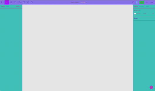
Debug mode was a practical Easter egg for engineers. Every token was assigned a randomly generated, brightly saturated hue, making it instantly visible whether a surface had been converted to semantic tokens or was still using hardcoded colors.
Another tool was a small web app that listed the dark and light mode assignments for all 350 semantic tokens, with search functionality. By mapping queried colors and token colors into the CIELAB color space, the app could surface tokens with the closest perceptual distance to the searched color in light mode. This helped engineers narrow candidate tokens and avoid drastically changing light mode colors during refactoring.
For long-term enforcement, a linter was added to the CI pipeline. It errors on any pull request where a color is assigned without a semantic token, ensuring new code supports dark mode by default.
Beta, polish, and product decisions
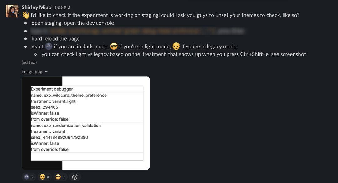
Shortly after Dark Mode Week, Figma launched an internal beta. Each employee was automatically placed into one of three modes — dark, light, or legacy — to catch regressions or bugs across all variants.
The expectation was a long tail of polish work to move from 80% to 100% coverage. The Figma app spans many surfaces, from editor panels and subpanels to file-browser modals and billing flows, and each needed attention. Over the following months, teams addressed dark mode bugs, refined the token schema, and polished complex surfaces such as on-canvas guides. The internal beta surfaced nearly 100 polish tasks before public release.
Product ambiguities resolved into clearer policies as work progressed. For user-generated canvas content, the simplest approach for a multiplayer product was to leave canvas colors untouched when a user switches themes. Dark mode would only apply to objects that aren't user-editable. Some colors rendered by the C++ engine in the editor, such as selection blues and component highlight purples, were selectively updated for dark mode.
A feature that changed the system
Most Figma engineering projects are executed by small teams focused on a specific part of the product or infrastructure. Dark mode was different: it demanded building a new feature while simultaneously introducing a new pattern for designing and engineering across the entire codebase.
The cross-team coordination paid off. User response was positive, with some appreciating the improved color contrast over light mode and others finally able to design in the dark without a bright interface interrupting their workflow.
The work continues. Figma's semantic token schema is now used by hundreds of engineers building dozens of features daily. As the codebase evolves, the color schema requires continuous iteration. The simplest requests, it turns out, can have the most complex answers.


