
From mood boards to Markdown: how GitHub’s homepage story came together
Redesigning GitHub’s homepage meant more than a coat of new paint—it required rethinking the narrative the company wanted to share with its community. The challenge was to convey both the global scale of the platform and the intimate, day-to-day experience of individual developers. After a lengthy exploratory phase, the team landed on the concept of showing a day in the life of a developer using GitHub, from writing code to reviewing pull requests, updating dependencies, and working on the go.
Here’s a look at the design process behind that effort, including how the team iterated on visual identity, collaborated across disciplines, and used GitHub itself as the primary tool for managing the project.
Building on Primer—and then going bolder
GitHub’s marketing pages have long been built on Primer, the company’s open source design system for product UI. But as marketing needs evolved, the team needed to extend that system so logged-out pages could diverge from the product interface and pursue a more distinct visual direction. Early exploration began with mood boards that deliberately tested the edges of GitHub’s brand—some concepts were intentionally wild. Feedback from a leadership presentation was candid and direct: “I hate it.” Still, the team treated that reaction as useful signal and pivoted back toward GitHub’s roots.
The key decision was to recreate actual product interfaces in HTML, CSS, and JavaScript purely for marketing purposes—an approach they called “accurate vignettes.” These were full-featured mockups that omitted minor UI details but captured the core developer experience clearly. The goal was an authentic representation of the product: a subtle acknowledgment to developers that the page was built by people who understand the tool.
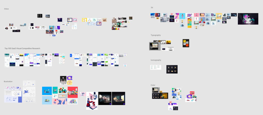
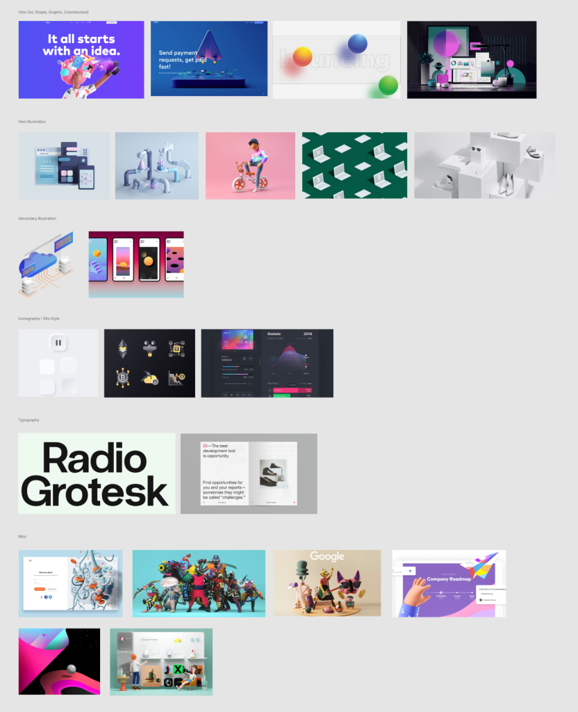
Illustration style followed a similar trajectory. The team had moved away from the highly detailed, handcrafted mascots that once defined GitHub’s visual identity in favor of simpler outline-based octocats. But that shift came at a cost—losing some of the personality and imagination that made the brand distinctive. The redesign reintroduced Mona and friends, paired the new product vignettes with fresh illustrations, and gave the whole system room to breathe.
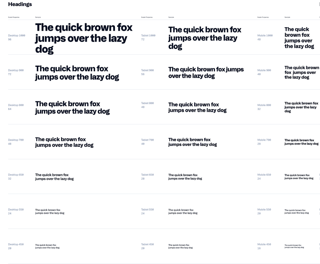
The visual system also gained two new components: a typeface called Alliance, chosen for its range of weights and stylistic variants, and a more saturated color palette derived from GitHub’s product colors. Together, these gave the marketing team a flexible but consistent foundation that could expand the brand without losing cohesion. The result appears across all new marketing sites and brand initiatives, complete with a scaled typographic system.
A workflow built on GitHub itself
Collaboration on the homepage project was asynchronous, following the same pattern GitHub uses internally for most work. Figma served as the hub for design mockups, templates, and feedback, while Slack handled ongoing conversation. GitHub was the source of truth for code, final decisions, documentation, and project tracking. A committed group of stakeholders—spanning product design, marketing, site design, brand, and content—met weekly to review progress.
A notable aspect of the process: designers at GitHub maintain much of the frontend code for the site and work in the Rails monolith alongside engineers. They prototype in code early, open and review pull requests, deploy to production, and use feature flags for internal testing. This approach enabled tight feedback loops and rapid iteration, avoiding the pitfalls of a standard waterfall flow and keeping design and engineering closely aligned.
Outlining the narrative in Markdown
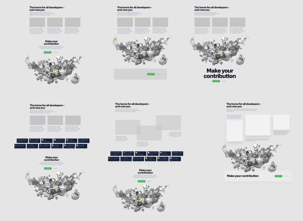
Before any visual polish, the story was drafted in Markdown. Writing the homepage as plain text forced the team to focus on the skeleton of the narrative: the headings and call-to-action buttons that set the rhythm of the page. This high-level outline kept thinking strategic while leaving design details for later.
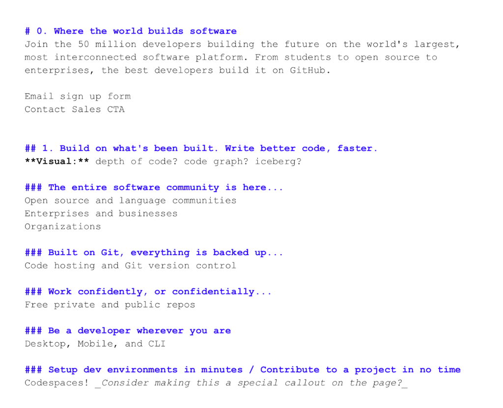
The copy needed to speak honestly to developers. That meant not relying on marketing buzzwords but instead writing content that let the features and product visuals carry the message. Early designs and outlines explored how to represent both foundational developer experience—Git, code hosting, open source—and newer capabilities like Actions and Codespaces.
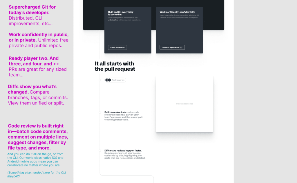
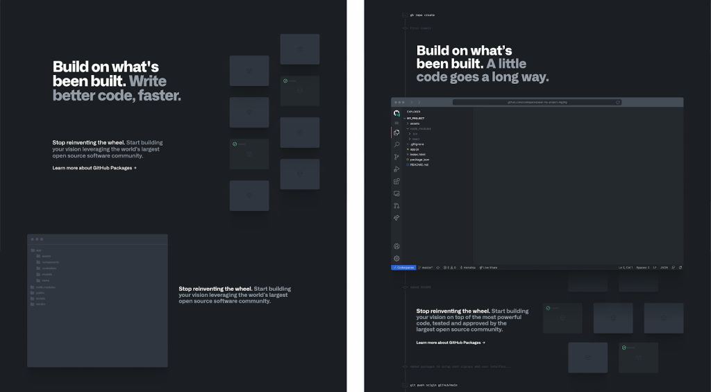
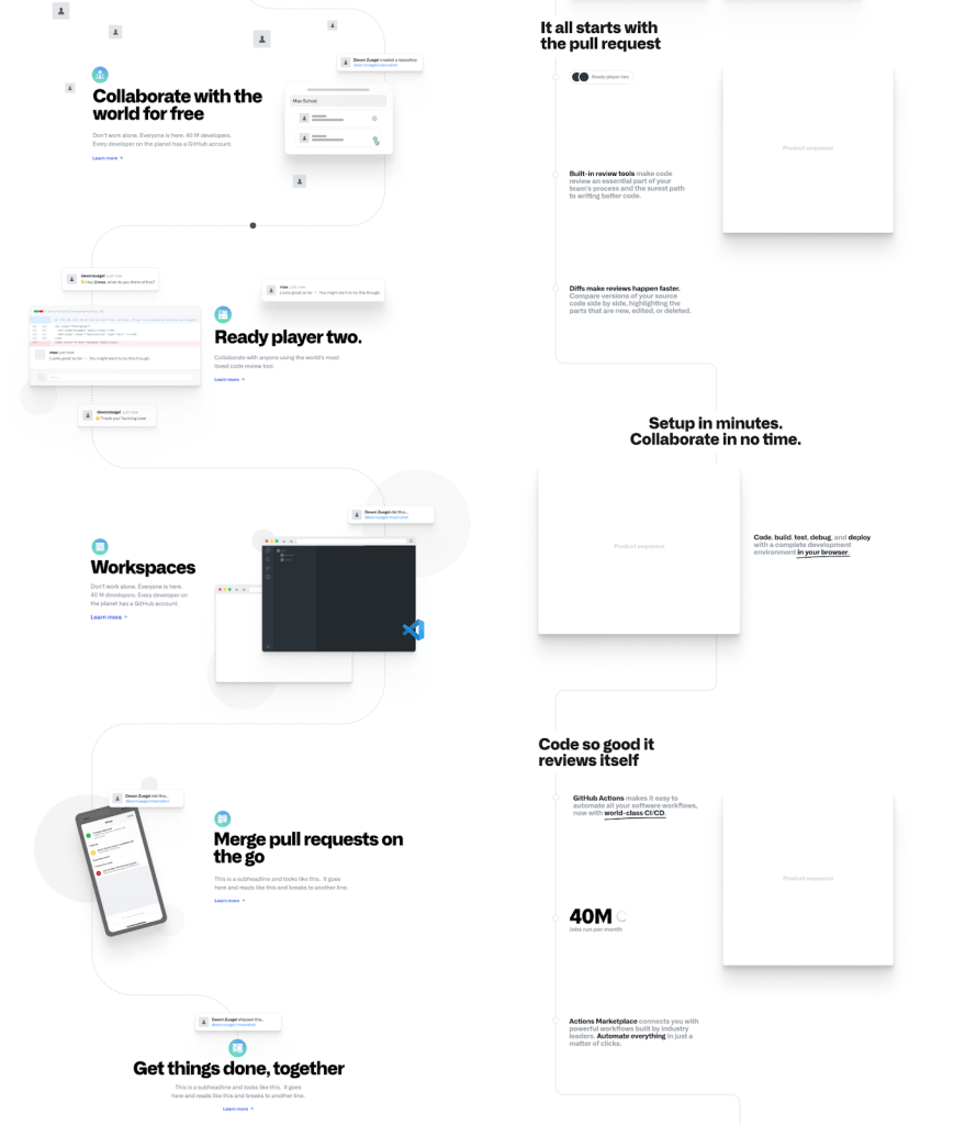
The team experimented with different visual metaphors as the page concept evolved. One early idea involved a timeline of commit history milestones, though this gave way to a structure that broke sections up visually to keep each distinct, rather than repeating the same motif. The team also invested in an animation framework tied to scroll position, which created timely effects without taxing the GPU for elements outside the viewport—a boon for performance as well.
The depth of product knowledge that shaped this page also sets it apart: because it’s built around GitHub’s real interfaces and workflows, the layout and copy wouldn’t translate to another company’s product. That level of authenticity, the team argues, comes from having designers who can code, engineers who understand design, and a shared vocabulary—developers speaking to developers.
From a Globe to a Story
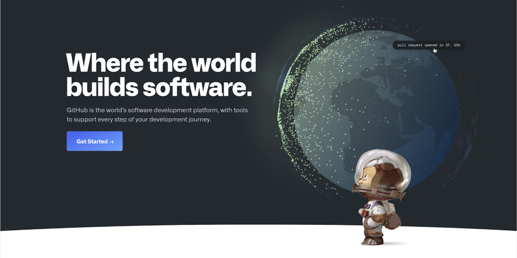
Every visitor to the GitHub homepage is first greeted by the interactive globe, which visualizes the scale of global collaboration unique to the platform by showing real pull requests opening in one country and merging in another. It’s a bold first impression that sets the stage for the rest of the page, where the experience zooms in on the daily realities of the over 56 million developers and 3 million organizations who build their software on GitHub.
Rather than a single static pitch, the homepage is structured as a sequence of chapters, each one telling a different part of a developer’s journey. The sections cover hosting and open source, collaboration through pull requests and code review, new tools for developers regardless of location, Codespaces, automation with GitHub Actions, pre-production security, and the platform’s role as a home for diverse communities. The goal is for every section to augment what developers might think is possible, delivering a visual yet succinct narrative that reflects the many roles developers play on their teams.
Pacing and Decision-Making
The narrative is deliberately paced, with two “record scratch” moments placed in the middle of the page. These are the points where the team wanted visitors to stop and reconsider what’s possible—showing how developers work from anywhere with mobile apps and how Codespaces eliminates the days-long process of setting up a development environment. These moments are the most personal parts of the story, reflecting the fundamental shifts in how we write, review, ship, and maintain software that the entire industry has experienced.
The design and narrative were shaped by AB testing on the live site, which was used to mitigate the risk of negatively impacting sign-ups. While the experiment data offered valuable insights into visitor behavior, it did not dictate every choice. The team prioritized the goal of creating an exceptional experience for developers, allowing internal values to drive the design process.
A Collaborative Effort
The final result is a testament to the diversity of the GitHub community. Distilling the many ways people collaborate into a single story that resonates with both new and seasoned developers was the core challenge. The project started with tough internal feedback but ultimately earned company-wide positive kudos, along with success in core KPIs and a strong community response. The homepage’s design has even begun to influence other experiences within the product. The effort was led by a team of contributors including @trosage, @mdo, @samoshin, @tonyjamarillo, @tobiasahlin, @talsafran, @stefankp, @max, and @leereilly. Their work is ultimately inspired by the small experiments and bold inventions that happen every day on the platform.


