

Sticky Elements: The Mobile Space You’re Probably Wasting
Most mobile websites and PWAs use a fixed navigation bar at the top or bottom of the screen. More often than not, that bar does nothing beyond housing a logo, a hamburger menu, or a search field. That is a missed opportunity. Mobile visitors are ready to act; the trick is removing friction between their intention and the action. Sticky bars are the ideal place to nudge them along.
The core challenge on mobile is that users are comfortable starting a journey on their phone, but they frequently finish it on a desktop—if they finish it at all. Thoughtfully designed fixed elements can change that by making conversion paths available right where the user is, whether they are shopping, reading, or ordering food.
Put the Top Bar to Work
The sticky bar does not have to be a permanent branding billboard. Even with a logo taking up space, you can keep the bar thin enough to add a companion element. The key is making sure that extra element earns its place.
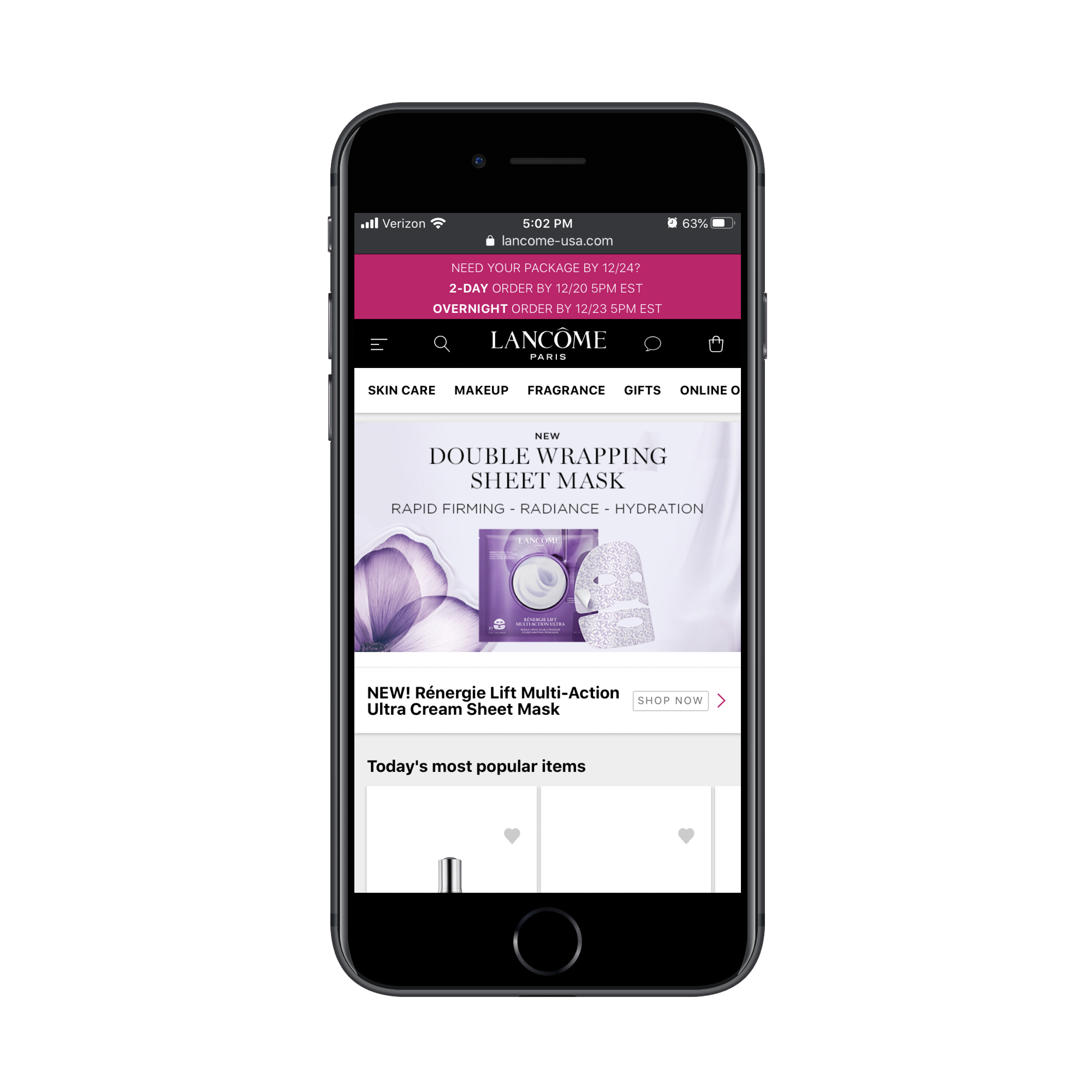
Take Lancôme’s PWA, which stacks three sticky bars on top: a promotional banner, a standard navigation bar, and a secondary bar with shop categories. The dual navigation setup is efficient, giving shoppers quick access to products without excessive scrolling. The promotional banner, however, misses the mark. It is oversized, impossible to dismiss, and follows the user everywhere. If you are going to pin an offer to the top of the screen, provide a way for visitors to close it once they have seen it.
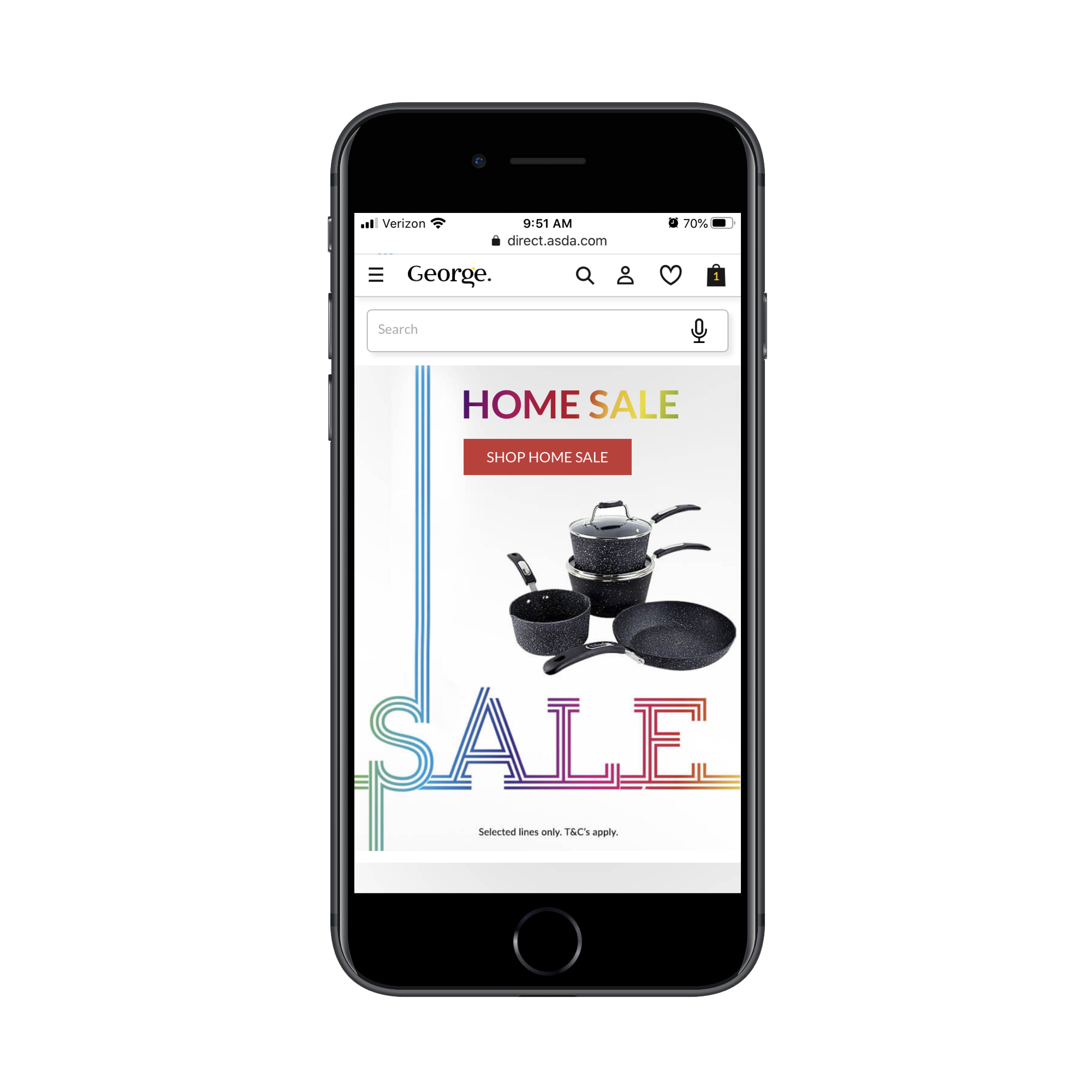
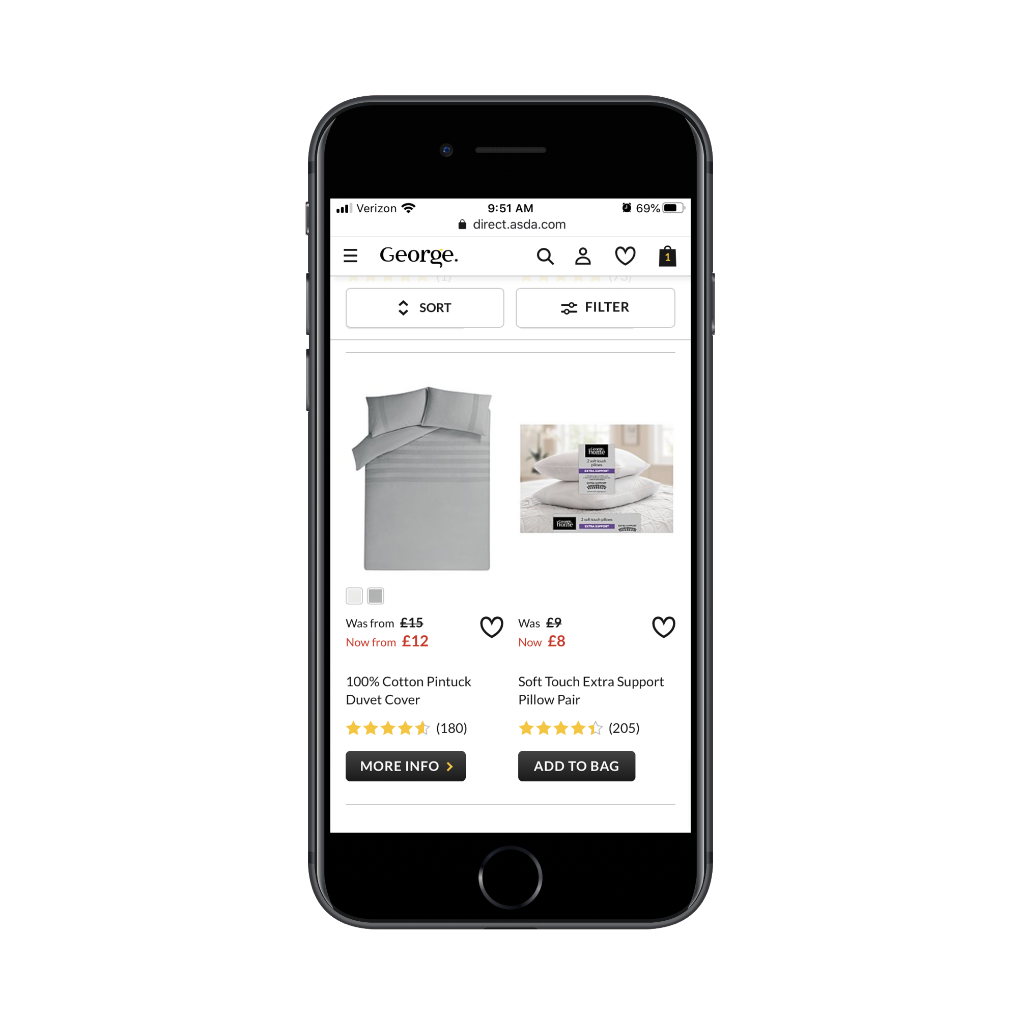
George.com demonstrates a better approach on its home page. The sticky bar holds a search field that supports both typing and voice input, accommodating different user preferences. As shoppers move deeper into the site, that same bar transforms into a Sort and Filter toolbar, allowing them to refine product listings without scrolling back to the top.
E-commerce sites have the most obvious use cases for a sticky top bar, but the principle applies elsewhere. Whatever the vertical, the space should serve a clear purpose tied to the user’s immediate intent.
Bottom Bars for Quick, Frequent Actions
A bottom bar is not always necessary, but it pays off when visitors frequently reach for a handful of common tools. Twitter’s PWA is a case in point: the top bar handles settings, while the bottom bar puts the primary actions—feed, search, notifications, and messages—within thumb’s reach. That layout reflects how people actually use the app, as they rarely adjust settings but constantly jump between feeds and messages.
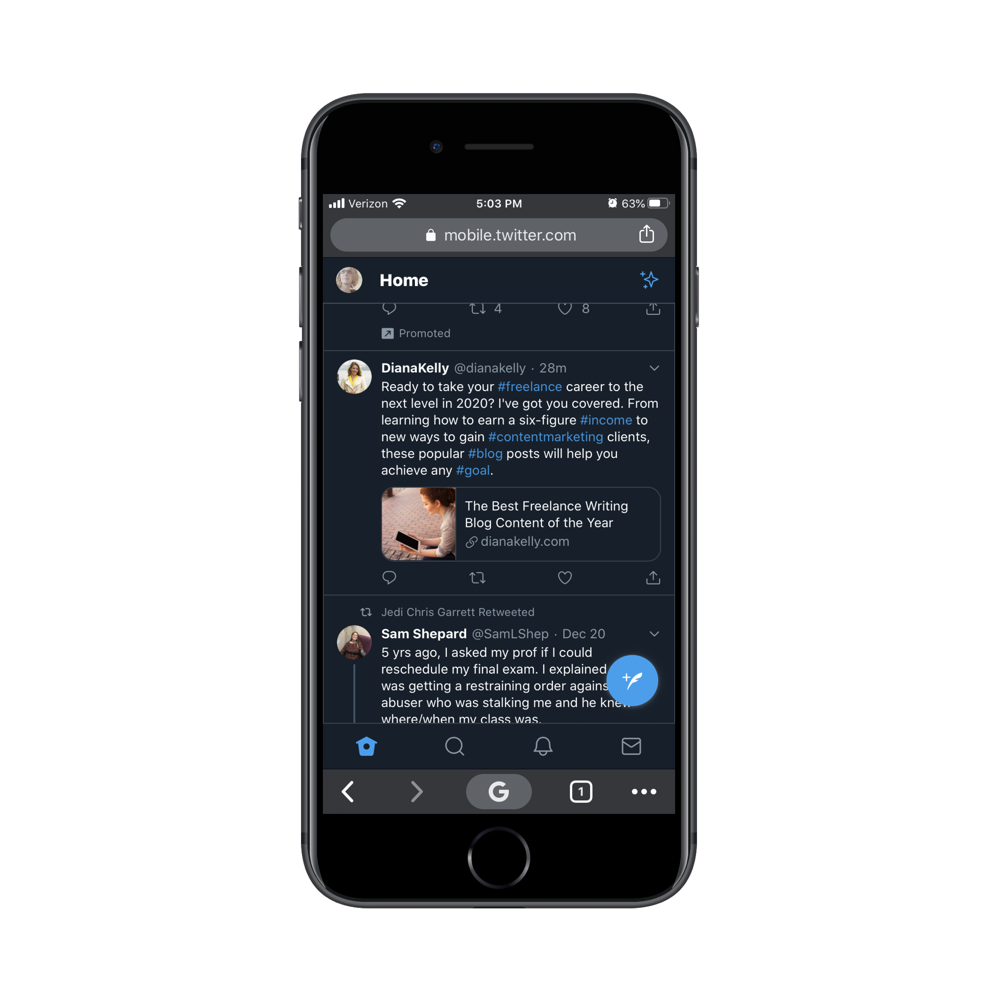
Twitter also illustrates a common pitfall: a floating action button that overlaps content. The click-to-tweet button covers part of the page, echoing the intrusive floating social icons that were rightly abandoned on mobile. If you use a free-standing sticky element, ensure it does not obscure readable content.
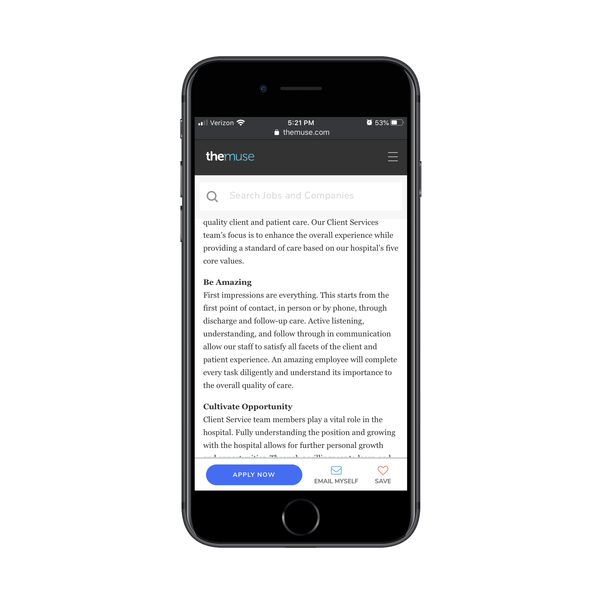
The Weather Channel’s PWA handles this better. Its top bar prioritizes personalization over branding, letting users enter their location early. The bottom navigation then provides quick access to forecasts and other core sections, recognizing that visitors come for weather data, not to read sponsored content.
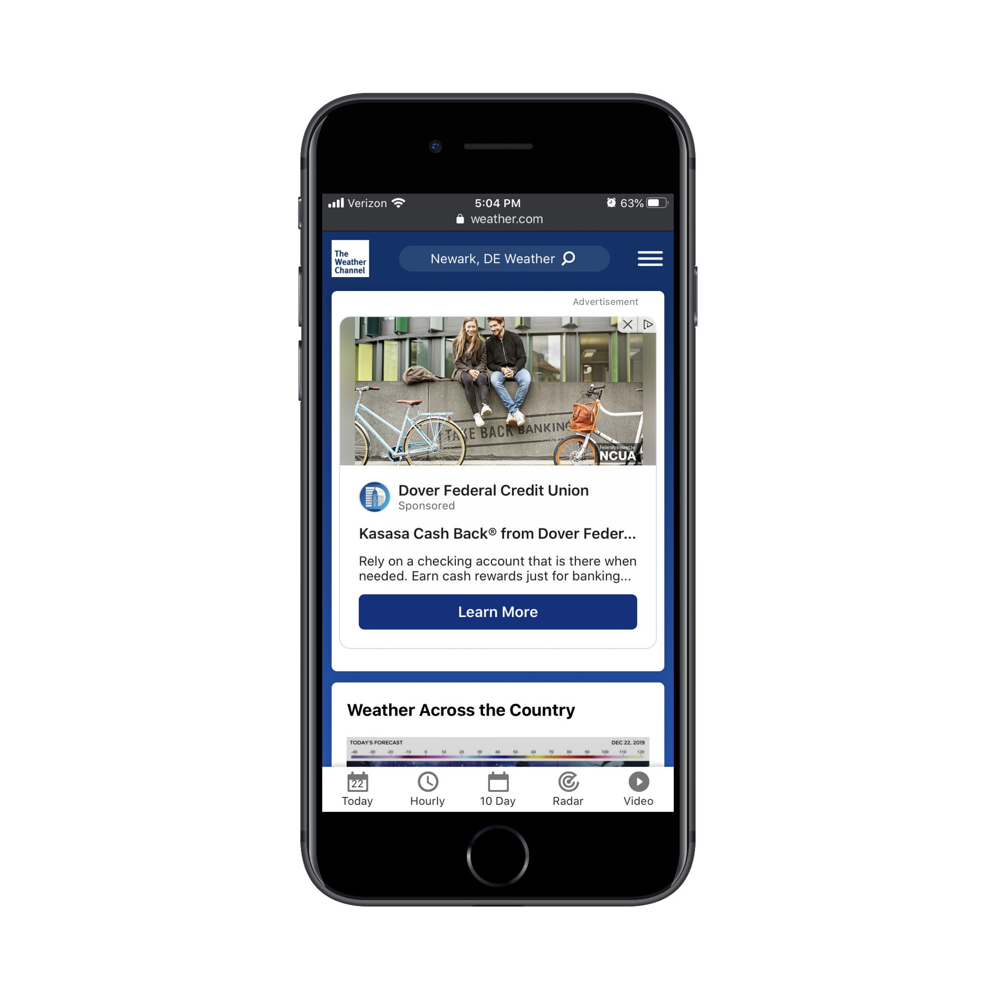
Bottom bars need not be global. The Muse limits its sticky bar to job listing pages, but makes it count by offering "Email Myself" and "Save" alongside an "Apply" button. That reflects a realistic user journey. Job seekers rarely submit an application on first sight—they need time to review and prepare. A custom action bar like this serves the actual step a user is most likely to take next.
Sticky Elements That Ease Ordering and Customization
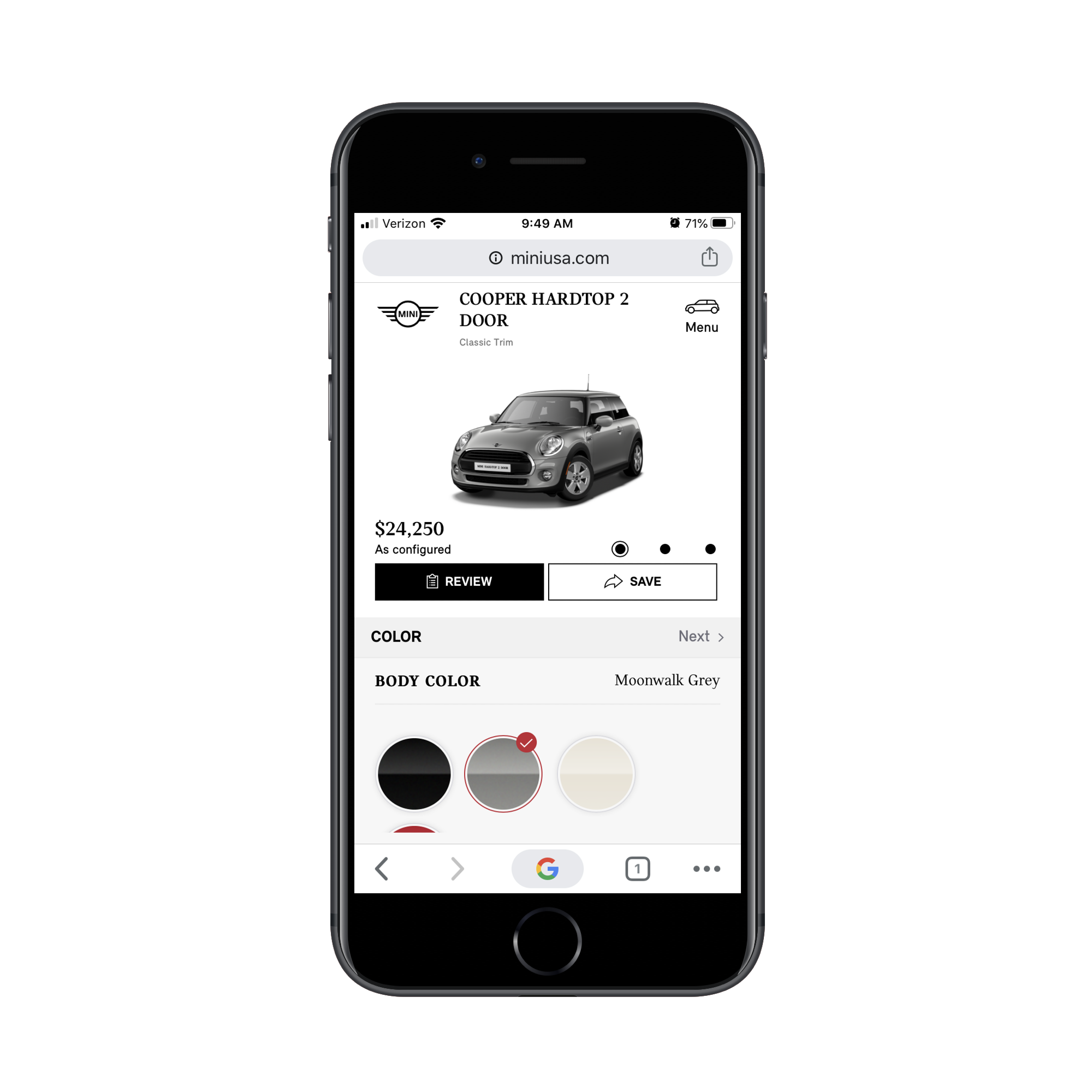
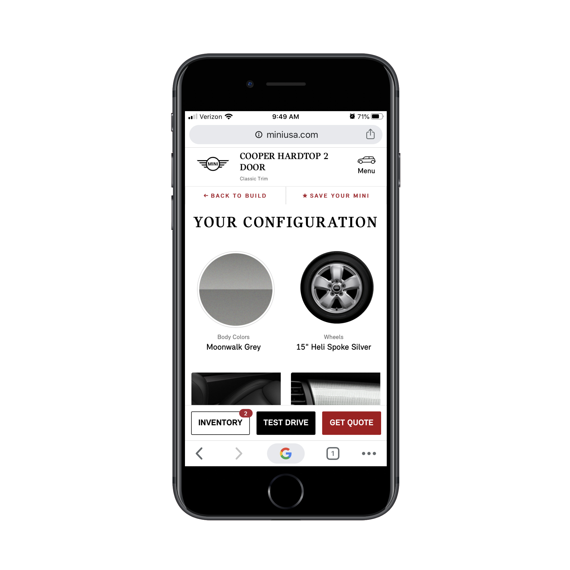
Online ordering experiences, from cars to takeout, reveal another way sticky elements can drive action. A fine idea can go wrong in execution. MINI USA’s car customization PWA pins the configurator, including its Review and Save controls, to the lower portion of the screen. The result is a cramped workspace where customization happens in a fraction of the display. The follow-up Review screen, however, gets it right: the top bar returns to normal dimensions, and a new action bar appears at the bottom, offering multiple paths forward, like saving the build or starting the purchase process.
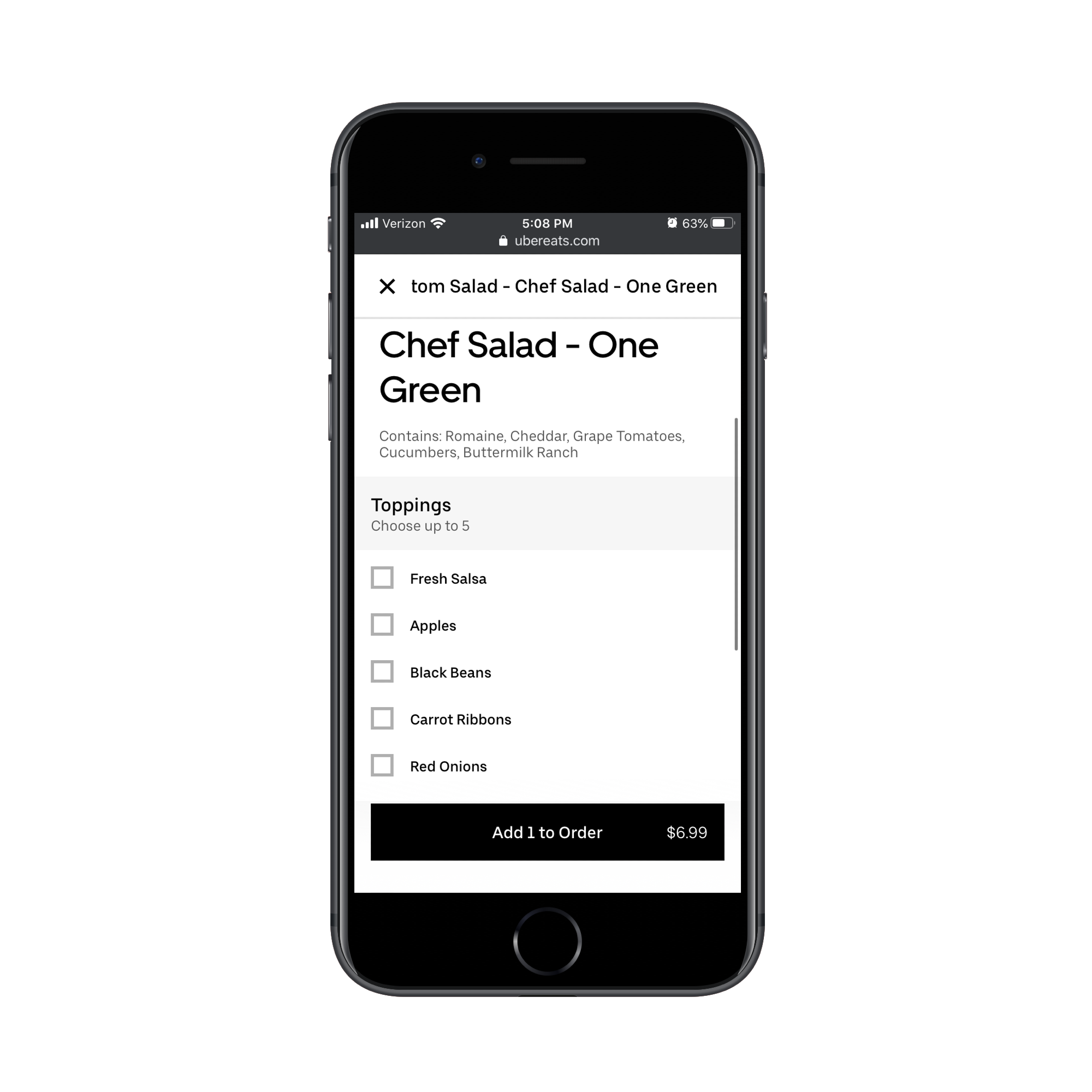
Uber Eats streamlines order construction with sticky features that adapt to the user’s stage in the flow. While browsing a restaurant’s menu, a sticky bar at the top provides quick jumps to meal categories, which is particularly useful for long lists. Once a user selects an item, that bar disappears and is replaced by an "Add to Order" button pinned at the bottom.
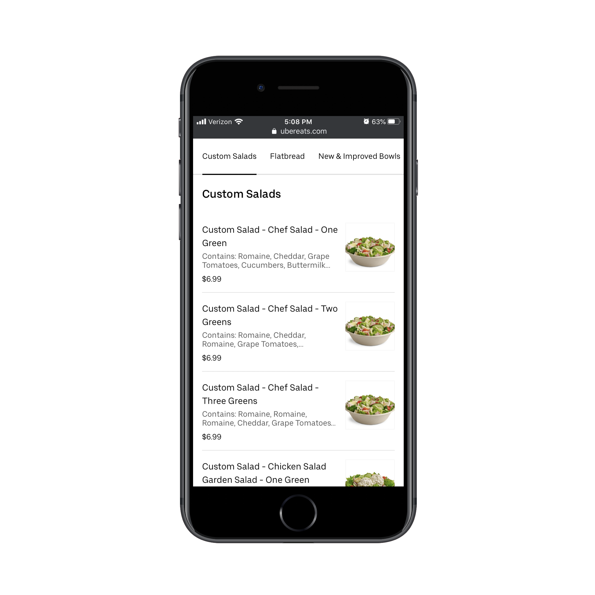
That switch removes the noise of other menu sections and forces the shopper to focus on the item in front of them. The pattern is straightforward: use a sticky top bar for exploration and initial steps, then transition to a bottom bar as the user nears the point of conversion.
A Second Life for "Sidebar" Content on Publications
News and magazine sites lose their sidebars on mobile, and the content that once lived there often ends up at the bottom of the article, where few readers ever see it. Sticky bars offer a way to surface the most valuable sidebar elements without burying them.
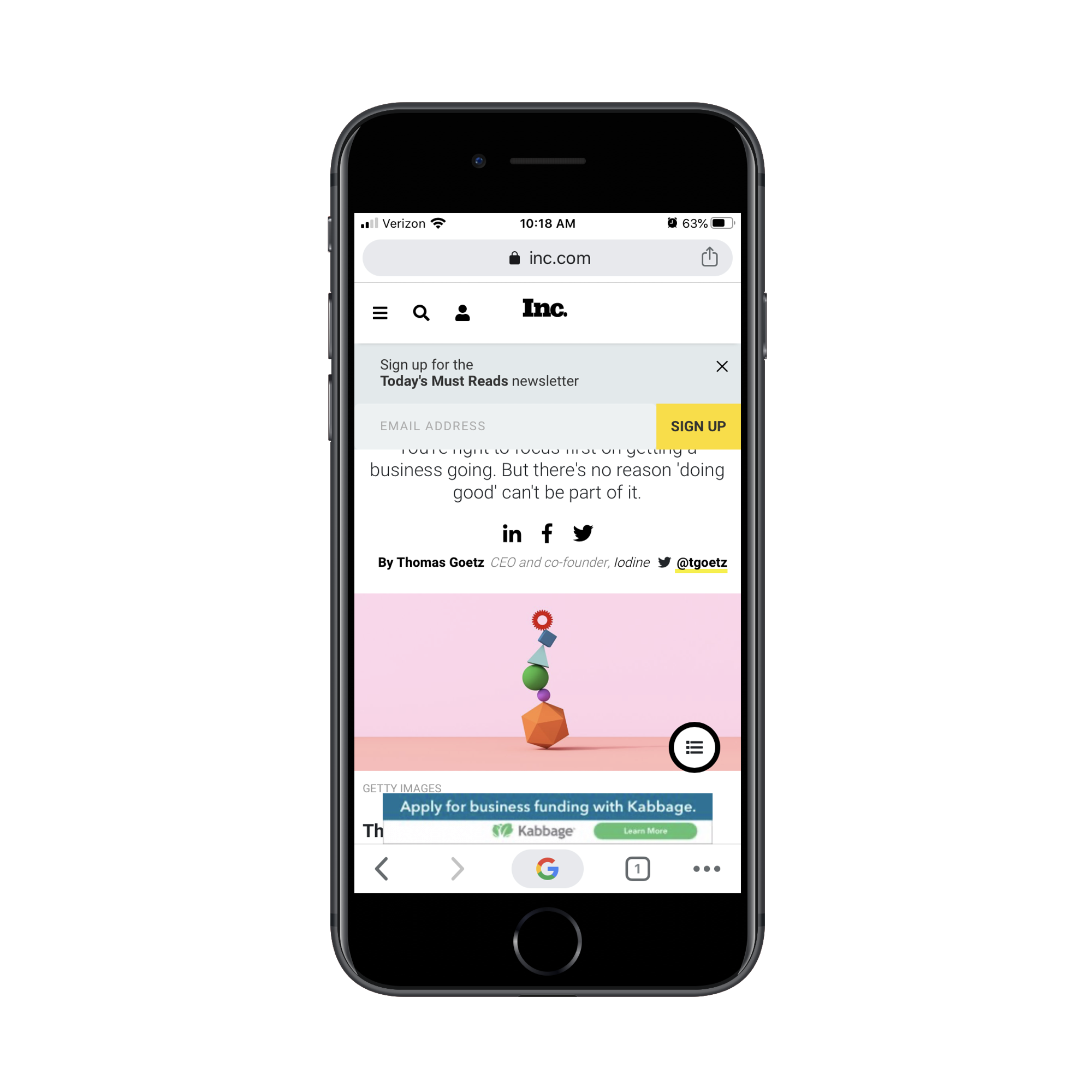
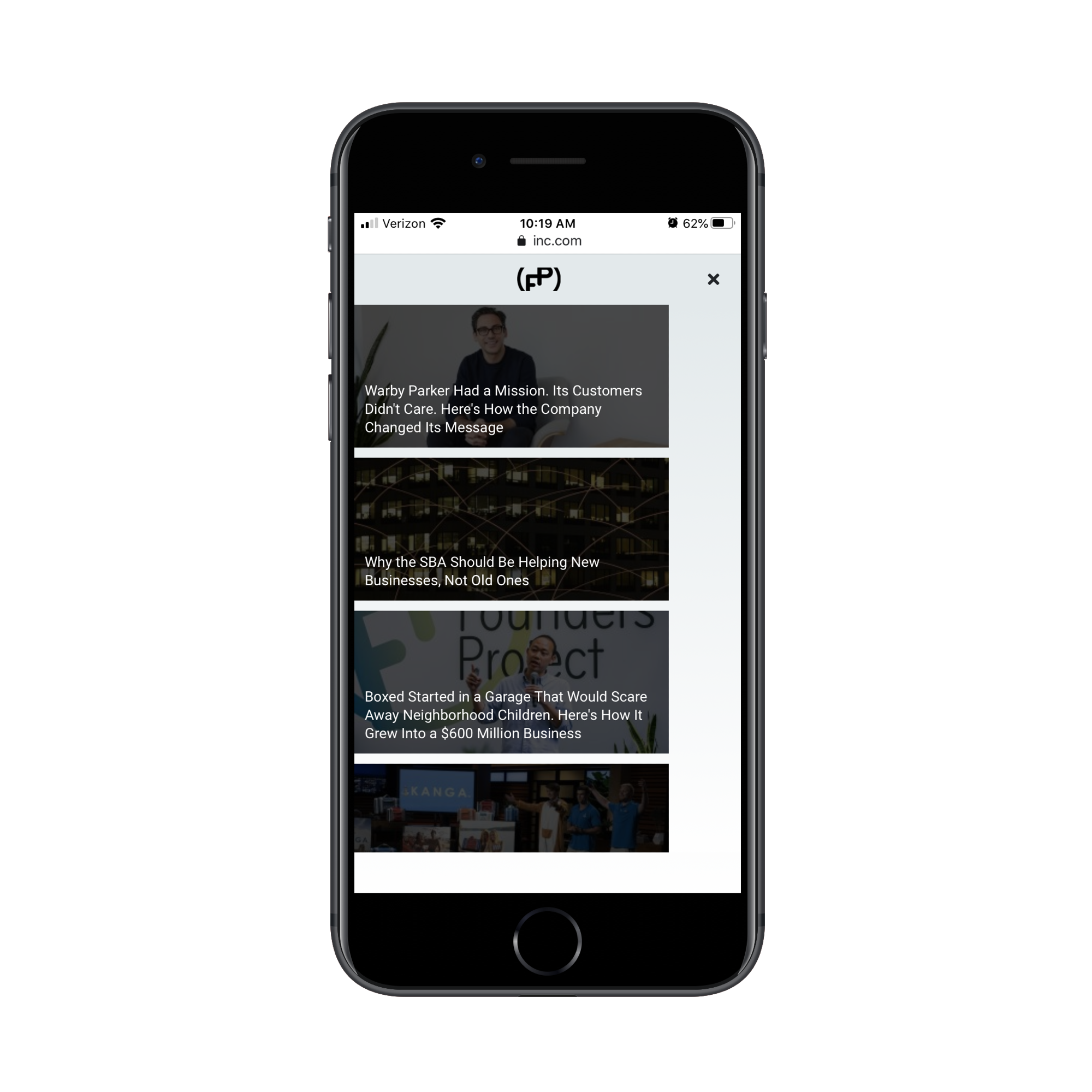
Inc.com surrounds its articles with three fixed items: a dismissible subscription prompt, a persistent banner ad, and a floating hamburger menu. The first two are only mildly intrusive. The floating menu is the real issue: it sits on top of the article text, and tapping it reveals only recommendations for more stories. At that point in the reading experience, presenting other articles is more of a distraction than a value-add. A better approach would be to display the menu only after a reader has scrolled most of the way down the page, when they are actively looking for related content.
Publications that get sticky elements right tend to keep them restrained. The New Yorker uses its top bar for navigation and a compact, unobtrusive bar at the bottom to promote subscriptions—a quiet but persistent call to action for a publication reliant on paid readers.

For outlets more concerned with content distribution, The Billings Gazette offers a strong example. Its sticky bar surfaces a short list of sharing options tailored to mobile platforms: WhatsApp, text, email, and social networks. Tapping an option opens the associated app directly, sparing readers the struggle of copy-pasting links or navigating the browser’s share sheet.
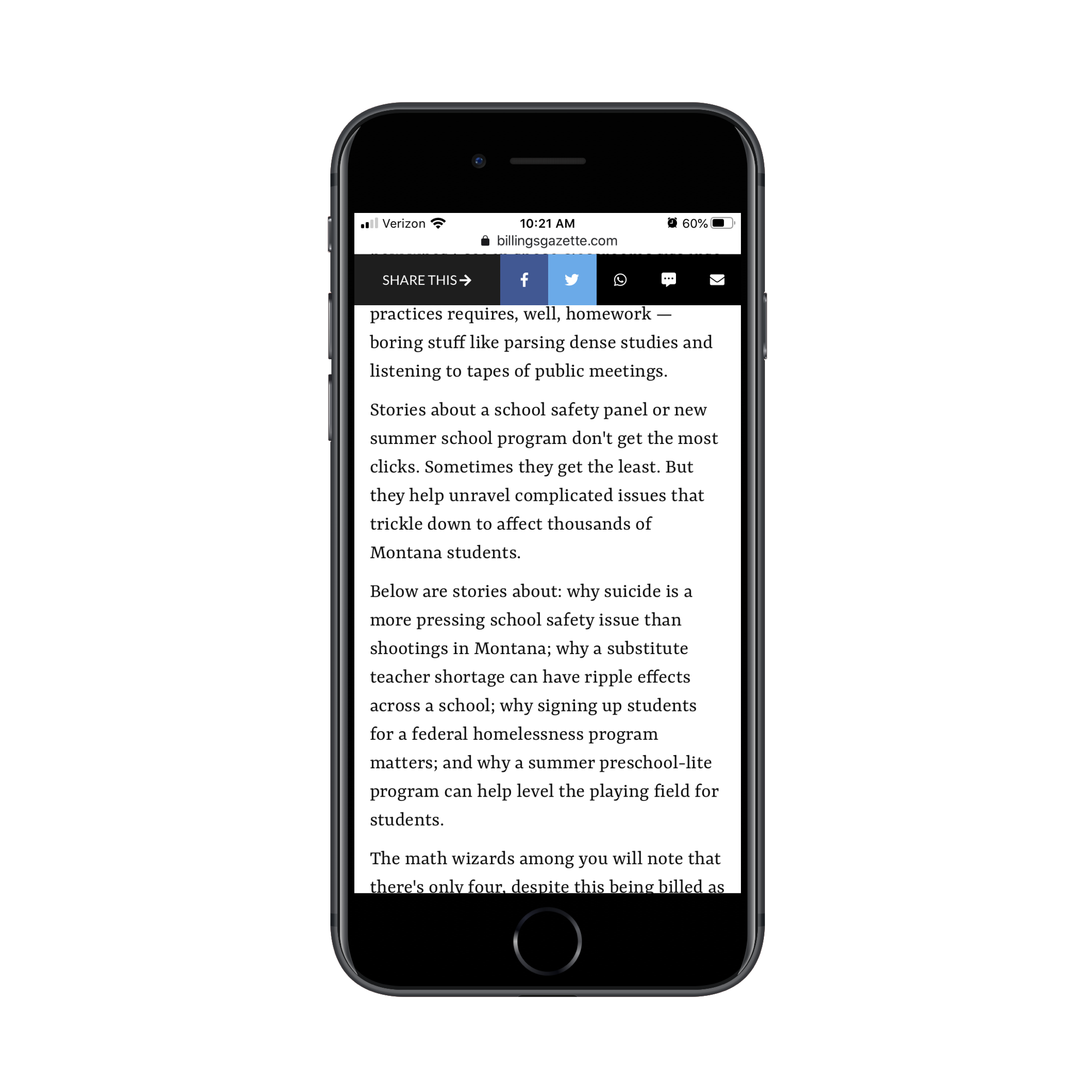
There is no need to choose between these strategies. A top bar can host a dismissible subscription prompt while a bottom bar handles content sharing. Just ensure one of the elements can be moved out of the way, preserving as much reading space as possible.
Prioritize the Shortcut, Not the Branding
The default assumption for sticky mobile elements is often a container for navigation chrome — logo, hamburger menu, search bar. That instinct misses the real opportunity. The fixed space at the top or bottom of the viewport is prime real estate for reducing friction, not for re-asserting your brand.
The deciding factor should be user intent. What is the single action a visitor most frequently needs to perform on a given page or at a given point in the funnel? Once you identify that, the sticky element should become a direct shortcut to that action.
Consider a logistics dashboard where the core task is package tracking. A sticky header might display the current tracking number and a status note, but a more effective element would be a persistent "Track Another Package" button that pre-fills a search form and jumps the user straight to the lookup field. Similarly, on a product page, the sticky bar is better utilized for a persistent "Add to Cart" and "Go to Checkout" pair than for a redundant logo.
The maintenance of this approach is also simpler. You aren't chasing a consistent navigation layout across every screen; you are curating a context-specific tool. For instance, when a user is deep in a multi-step form, a sticky "Save Progress" link is more valuable than a menu. When they are browsing a list, a sticky "Filter" button that reveals sort options is the primary helper.
The technological constraint, however, is real. Just because an element can be position: fixed does not mean it should. The recommended approach is to make the sticky element an independent, lightweight component — not a wrapper for the entire document flow. Keeping it separate avoids layout reflow chaos and makes it easier to load required JavaScript without blocking the rest of the page.
Bringing it all together, the core principle is to treat the sticky area as a service layer. You are making a promise to the user: "The tool you need to finish your next step is right here." A logo does not deliver on that promise as effectively as a well-placed, single-purpose button or a context-aware shortcut does.
There is also a middle ground for those wary of change. You do not have to remove the header entirely. Instead, you can collapse the branding to a smaller footprint — perhaps a small icon on the left — and dedicate the stronger right-hand area to the relevant action previously mentioned. The key is to measure the outcome. Check engagement on that shortcut versus clicks on generic navigation to see if the change actually serves the user.
Sticky elements are effectively a form of persistent UI. Used poorly, they are persistent clutter. Used well, they are persistent assistance. The latter requires you to answer the simple question: what do my users need most from me right now?


