
Under the hood of the new blog
The recently relaunched blog may look similar to its predecessor at first glance, but nearly everything underneath the surface has changed. The project now clocks in at over 100,000 lines of code (excluding content), which signals a level of complexity that demands deliberate technology choices. I want to walk through the major pieces of the new stack, explain why they were chosen, and be honest about the tradeoffs.
The major technologies in play
- Next.js v15.0.0 (beta)
- React v19.0.0 (beta)
- MDX v3.0.1
- Linaria v6.1.0
- Shiki v1.17.7
- Sandpack v2.13.8
- React Spring v9.7.3
- Framer Motion v11.2.10
- MongoDB v6.5.0
- TypeScript v5.6.2
- PartyKit v0.0.108
That list may look excessive for what is, nominally, a blog. I stuck with it for a few reasons. First, all posts are authored in MDX, so first-class support for it is non-negotiable. Second, my course platform runs on Next.js, so keeping the blog on the same framework minimizes context-switching friction. Third, I wanted hands-on experience with the latest React features like Server Components and Actions. Without those last two motivations, Astro or Remix are both options I've been meaning to explore, and both look excellent.
Why MDX for content
MDX is the most critical piece for me. It's a superset of Markdown that adds the ability to embed custom React elements directly in content. This lets me build interactive widgets and drop them into a post as easily as inserting a standard link or table. That capability goes far beyond what traditional Markdown or a rich-text CMS can offer.
An early version of the blog, back in 2017, wrote each post as a raw React component. That approach had two fatal flaws: the writing experience was miserable, with each paragraph needing an explicit <p> wrapper, and content was inaccessible as data. Getting a list of recently-updated posts was impossible because posts were code, not database records. MDX solves both problems without sacrificing any of the flexibility.
Workflow-wise, MDX files are edited directly in VS Code and treated as regular code, committed and versioned. Metadata like title and publish date lives in frontmatter at the top of each file. The main drawback is that fixing even a simple typo requires a full redeployment, but I've concluded that's a price worth paying for the simplicity of the setup.
For integrating MDX with Next.js, I use next-mdx-remote, largely because it's the same tool used over on my course platform. If building a new blog project from scratch, the built-in MDX support that Next.js now offers looks like a more straightforward path.
Styling without a runtime
The styling stack was due for a change. The old blog relied on styled-components, which isn't fully compatible with React Server Components. For the relaunch, I switched to Linaria via the next-with-linaria integration. Linaria offers the familiar styled API but works by compiling to CSS modules at build time. No JavaScript is required at runtime, making it fully compatible with Server Components.
Getting Linaria working with Next.js has been a journey, though. I encountered issues like a baffling "EvalError: TextEncoder is not defined" when importing React in a file without actually using it. The provided error traces were useless, so debugging meant reverting changes and deleting pieces until the problem went away. The errors are at least predictable and consistent, so working around them eventually becomes routine.
Even after solving those puzzles, there's a bigger, independent complication: Next.js optimistically bundles CSS from unrelated routes to speed up subsequent navigation. The result is that a page loads more CSS than it uses—this blog post, for instance, pulls in about 245kb of CSS but only needs 47kb (uncompressed). There is an active GitHub discussion on the subject, and it looks like future configuration options could address it.
All together, I can't wholeheartedly recommend Linaria to most teams at this point, despite how nice it is as a tool. I'm watching Pigment CSS closely, the zero-runtime CSS-in-JS option from the Material UI team. Once it reaches version 1.0—and once it has surely become battle-tested via MUI's widespread adoption—I plan to try migrating. Perhaps by then the Next.js packaging issue will be settled.
Syntax highlighting at compile time
The new blog's code snippets look quite different, thanks to a custom syntax theme. Dark and light variants are available as JSON files, and since they use the same grammar structure as Visual Studio Code, they should be importable into most IDEs that support TextMate themes.
The highlighter of choice is Shiki. While not built specifically for React, it excels at compiling code to static HTML, which aligns perfectly with React Server Components.
The switch from Prism, which was used on the old blog, brings real gains. Prism is a client-side highlighter that adds about 26kb minified and gzipped for its base set of languages. That's small in absolute terms, but it goes in the JavaScript bundle, which induces conservatism about supporting additional languages. Shiki adds zero kilobytes to the JavaScript bundle, uses the same TextMate grammars as VS Code, and enables support for dozens of languages without any output-size consequences. A Haskell snippet from an old post, for example, will now highlight correctly without any bespoke effort.
Shiki is flexible enough to support custom annotations, which let me highlight specific lines of code. It also finally fixes a long-standing pain point: CSS-in-JS syntax highlighting. Previously, styling code inside template strings was treated as a standard string. Reusing the grammar from the styled-components VSCode extension means those snippets now highlight correctly.
Those advantages come with a cost. Shiki is more compute-heavy than Prism, and it's easy to slow down server-side rendering on post pages that hold multiple snippets. The fix is either static generation or aggressive HTTP caching. It's also memory-hungry, and I encountered out-of-memory errors until I refactored to avoid spawning multiple Shiki instances.
A more difficult limitation is that Shiki isn't suitable for dynamic code that only exists after user interaction, like the shadow-palette tool where sample code changes as you tweak a slider. For those cases, the app uses a second, lightweight Shiki instance that supports only a few languages and is lazy-loaded with next/dynamic. To combat the slower highlighting, this lightweight instance defers updates with useDeferredValue to keep the interface responsive. Since the page needs both a static Server Component for the initial HTML and a dynamic Client Component for interactivity, the client swaps between the two after load, ensuring proper server-side rendering.
Code playgrounds and interactive demos
My posts feature two types of hands-on elements: code playgrounds and interactive widgets. For React-based playgrounds, I rely on Sandpack, a full-featured editor from CodeSandbox. Sandpack handles static HTML/CSS templates too, but it leans on Service Workers for those, and Service Workers get blocked by some browser privacy settings. That leads to a broken experience, so for static playgrounds I use a fork of agneym's Playground instead:
import React from 'react';
import range from 'lodash.range';

import styles from './PrideFlag.module.css';
import { COLORS } from './constants';

function PrideFlag({
  variant = 'rainbow', // rainbow | rainbow-original | trans | pan
  width = 200,
  numOfColumns = 10,
  staggeredDelay = 100,
  billow = 2,
}) {
  const colors = COLORS[variant];

  const friendlyWidth =
    Math.round(width / numOfColumns) * numOfColumns;

  const firstColumnDelay = numOfColumns * staggeredDelay * -1;

  return (
    <div className={styles.flag} style={{ width: friendlyWidth }}>
      {range(numOfColumns).map((index) => (
        <div
          key={index}
          className={styles.column}
          style={{
            '--billow': index * billow + 'px',
            background: generateGradientString(colors),
            animationDelay:
              firstColumnDelay + index * staggeredDelay + 'ms',
          }}
        />
      ))}
    </div>
  );
}

function generateGradientString(colors) {
  const numOfColors = colors.length;
  const segmentHeight = 100 / numOfColors;

  const gradientStops = colors.map((color, index) => {
    const from = index * segmentHeight;
    const to = (index + 1) * segmentHeight;

    return `${color} ${from}% ${to}%`;
  });

  return `linear-gradient(to bottom, ${gradientStops.join(', ')})`;
}

export default PrideFlag;
The interactive widgets scattered through my posts are a different beast. I never quite know how to answer when people ask how I built them: they're not powered by any specific widget library, just standard web development. I use a custom <Demo> component that provides the shell and a standard set of controls, and I compose that for each individual demo.

The underlying controls use two animation libraries: React Spring for fluid interpolation between values, and Framer Motion for layout animations. It feels indulgent to ship both — they weigh in at 19.4kb and 44.6kb, respectively. React Spring is bundled as a core library; Framer Motion gets dynamically imported on demand. To be honest, Framer Motion ought to be able to do everything React Spring does, so it would be my desert-island pick.
The "like" button backend
That little like button in the sidebar is mostly for show — there's no discovery algorithm here, so it exists purely to be cute. Visitors can click it up to 16 times; each click is stored in MongoDB in records that look like this:
{
  "slug": "promises",
  "categorySlug": "javascript",
  "hits": 123456,
  "likesByUser": {
    "abc123": 16,
    "def456": 4,
    "ghi789": 16,
    // ...
  }
}
The record ID is derived from the visitor's IP address, hashed with a secret salt for anonymity. The blog runs on Vercel, which passes the IP through as a request header.
My initial implementation used client-generated IDs stored in localStorage before Jane Manchun Wong demonstrated the flaw by spamming the endpoint to rack up tens of thousands of likes. One nice advantage of Next.js here: the like logic lives in a Route Handler, which behaves almost exactly like an Express endpoint, so there's no separate Node backend to manage.
Context-adaptive styling
A great deal of effort went into contextual styles — making my generic "LEGO brick" components compose cleanly. Take the <Aside> component, which renders sidenotes. When a <CodeSnippet> appears inside an <Aside>, it inherits a completely different color treatment: instead of its usual transparent background with gray outline, it gets a brown or golden background depending on the theme, and the annotations and "Copy to Clipboard" button are recolored to match.
function findLargestNum(nums: Array<number>) {
  if (nums.length === 1) {
    return nums[0];
  }

  return Math.max(...nums);
}
I defined custom colors for all four Aside variants (info, success, warning, error) across both light and dark themes. Code snippets also get adjusted margin and padding when nested in an Aside, and that spacing shifts with viewport size and whether the snippet sits last in the container. Many other components received similar adaptive styles, which was a substantial amount of work but yields a cohesive feel.
The rainbow configurator
On the desktop homepage, there's a large decorative rainbow:

It reacts to your cursor — the segments bend toward it like iron shavings to a magnet. If you hover for a few seconds, an "edit" button fades in; clicking it opens the 🌈 Rainbow Configurator.
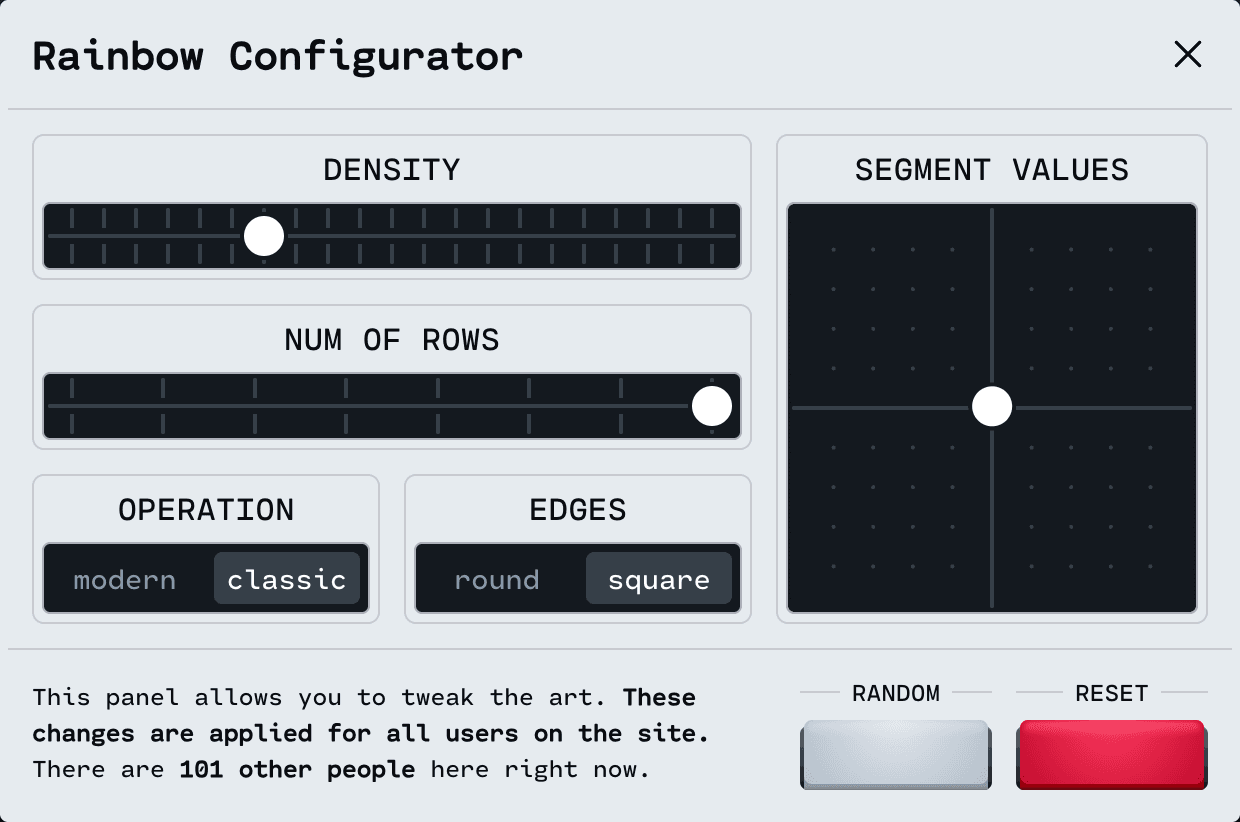
The twist is that the rainbow is shared globally: every change broadcasts worldwide so everyone sees the latest design. This is powered by PartyKit, which runs WebSockets for near-instant updates and boasts a world-class developer experience. What I underestimated was the chaos of hundreds of people simultaneously trying to edit the rainbow. After my site relaunch, people reported the rainbow "glitching" when they didn't realize others were wrestling over controls. It's calmed down, but I should find a way to communicate that the rainbow is a communal object.
Page transitions and search
All page navigation includes a subtle cross-fade via the View Transitions API, which works by capturing virtual snapshots before a transition and manipulating those screenshots alongside the real UI. The API itself isn't universally supported, but it's a nice progressive enhancement. There's no escaping complexity here — the underlying problem space is just hard. Quirks like aspect-ratio shifts and glitchy text appear, and I've relied on Jake Archibald's work on handling aspect-ratio changes to navigate those. Inside the Next.js App Router, I used the use-view-transitions package and wrapped next/link in a low-level component to connect everything.
The blog now has a search overlay, invoked from the magnifying glass in the header. It delegates fuzzy matching to Algolia. A tiny easter egg: clearing the term with the trash icon isn't instantaneous, making it look as though the trash can is gobbling characters one by one.
Icon details and accessibility
Many of the site's icons began as Feather Icons, selected for the aesthetic — then I reconstructed their SVGs so individual parts can animate independently. For example, the arrow bullet that stretches on hover decomposes into a shaft (line) and a tip (polyline), and React Spring tweaks the x/y point values when the icon is triggered:
import { useSpring, animated } from 'react-spring';

const SPRING_CONFIG = {
  tension: 300,
  friction: 16,
};

function IconArrowBullet({
  size = 20,
  isBooped = false,
}: Props) {
  const shaftProps = useSpring({
    x2: isBooped ? 23 : 18,
    config: SPRING_CONFIG,
  });
  const tipProps = useSpring({
    points: isBooped
      ? '17 6 24 12 17 18'
      : '12 5 19 12 12 19',
    config: SPRING_CONFIG,
  });

  return (
    <svg
      fill="none"
      width={size / 16 + 'rem'}
      height={size / 16 + 'rem'}
      viewBox="0 0 24 24"
      stroke="currentColor"
      strokeWidth="2"
      strokeLinecap="round"
      strokeLinejoin="round"
      xmlns="http://www.w3.org/2000/svg"
    >
      <animated.line
        x1="5"
        y1="12"
        y2="12"
        {...shaftProps}
      />
      <animated.polyline {...tipProps} />
    </svg>
  );
}

export default IconArrowBullet;
I tuned those coordinates through trial and error until each movement felt natural. Similar micro-interactions exist on several other icons, and there is still one hidden easter egg planned.
Accessibility has also shaped the build. My article about pixels and accessibility points out that rem-based media queries are more accessible, since they let the layout adapt gracefully when a user raises their browser's default font size. My old blog used pixels, though — I discovered the benefits of rem-based queries while working on my course platform and didn't wait until retrofitting was complete to publish the research. That omission haunts me. This site runs entirely on rem-based media queries, informed by my short-term disability experience. If you find something that doesn't hold up, please tell me.
What the App Router migration really felt like
Switching from the Pages Router to the App Router was the biggest architectural change in this rebuild. It wasn't a clean 1:1 migration — I added new features along the way — but the experience offers some useful signals for anyone weighing the same move.
The good: a better mental model
The Server Components paradigm is a genuine improvement over getServerSideProps. There's a learning curve, but it clicks quickly. The biggest win is flexibility: in the Pages Router, only the top-level route component could do backend work; now any Server Component can.
There's also a bundle-size benefit. Components that don't need interactivity can be omitted from client-side bundles entirely. That means static UI doesn't ship to the browser, and you can safely use heavier server-only libraries like Shiki without worrying about bloat.
The not-so-good: performance trade-offs
In theory, those bundle savings should translate to better performance. In practice, my Lighthouse scores came out slightly worse on the new blog:
Lighthouse Report (Old)

Lighthouse Report (New)

There are important caveats here:
- The comparison isn't apples-to-apples, since the new blog has additional features and polish.
- The CSS bundling issue I mentioned earlier is a major factor — if you're not using CSS Modules or a compatible tool, you won't hit this.
- Because I use React Spring heavily for interactions, a lot of otherwise-static components ended up as Client Components. My Server Component count is actually low.
- I may have missed optimization opportunities or made implementation errors.
Looking at the raw numbers is discouraging, but throttled side-by-side comparisons don't show a perceptible difference. I'm concerned about potential SEO fallout from the lower score, though fixing the CSS bundling issue should bring things back to roughly parity.
Slow development, the bigger problem
Performance-wise, the more persistent pain is the dev server. It's much slower with the App Router, and it's gotten worse as the blog has grown:
- Pages Router boot time: 7–12 seconds. App Router: 30–60+ seconds, depending on cache state.
- Hot reloading was effectively instant with the Pages Router — by the time I switched from editor to browser, the change was live. With the App Router, it takes 1 to 5 seconds.
- Occasionally, a page load just hangs for no obvious reason:

It's noticeably painful. When I work on my course platform, which still uses the Pages Router, the difference feels like a breath of fresh air.
One mitigating note: because I'm on Linaria, I've had to opt out of Turbopack (Next's Rust-based Webpack replacement). It's possible dev performance improves significantly with Turbopack. But that's cold comfort — many projects will be stuck on Webpack for one dependency or another, and the Pages Router was zippy on Webpack.
Early adopter territory
The good news is that the Next.js team is aware of these issues and has made dev performance a stated priority. The App Router is young despite its "stable" label, and there are bound to be growing pains. I've already seen the team address several issues I raised.
The vision behind React Server Components is genuinely inspiring. Once the kinks are worked out, I believe it will be the definitive way to build React applications. Today, though, it feels firmly in early-adopter territory. I'm glad I migrated this blog, and I'd feel even better once the CSS issues are resolved — but I'm in no hurry to move my course platform over.
A reusable foundation
I've been teaching React for about seven years, starting at a local bootcamp where I built the curriculum, and continuing with 22 articles here and The Joy of React course. The course covers core React mechanisms, and its final module is all about the Next.js App Router and React Server Components. The capstone project is an interactive MDX-based blog:
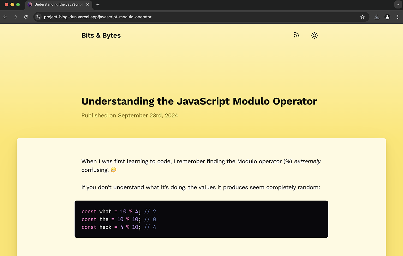
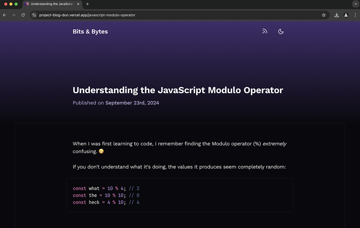
It's not the most complex thing in the course, but it's one of the most practical — and you can use it as the starting point for your own site. It's a real, usable foundation rather than a canned exercise.
Last updated on
May 5th, 2026


