

Standalone fluid images are straightforward today. The harder case is an image embedded in a responsive layout that changes shape — a card that is horizontal on desktop and vertical on mobile. The image shown here is treated as decoration for now, which makes background-image a reasonable starting point.

Why background-size: contain breaks down
Because the image depicts an object, no part of it can be cropped at any width. That rules out background-size: cover and points to background-size: contain. While the card stays horizontal this is fine, but when the layout reflows to a vertical stack — typically with grid or flexbox — the shrinking width forces the image to scale down inside a much taller box.
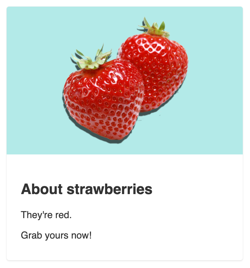
On smaller screens, contain preserves the aspect ratio without trimming detail, leaving a large empty area below the image. Since the picture cannot be cropped, cover is not an option.

Trying an inline image instead
Swapping the background for an inline image works on desktop and is acceptable on mobile.


At smaller widths, however, the various fixed sizes cause the image's proportions to distort.
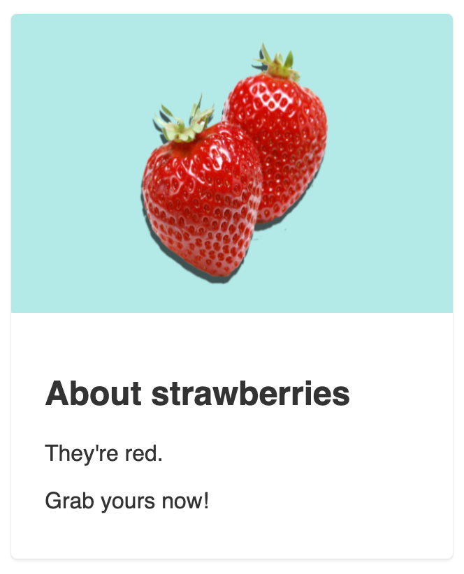
Endless tweaking of the image, card and flex values is one way out. A structural change is the better one.
Separating the foreground from the background
Much more resilience becomes available if the image's own background is removed from the asset. This isn't universally possible, but it's often cheap — particularly when planned during design.
In the next iteration the strawberries sit on a transparent background, and the blue that used to be baked into the raster file is painted with CSS instead. Padding on the image container keeps the berries off the edges and gives precise control over that spacing; negative margins on the outer card wrapper compensate for that padding so no stray whitespace appears around the image.
object-fit for images that are real content
If the illustration is more than decoration, cutting it off amounts to data loss, so markup semantics matter: an inline <img> is preferable to a background. After extracting the strawberries, the element is an inline image while the background color stays on the image div. Pairing object-fit: contain with a width of 100% lets the window resize keep the berries' aspect ratio.
The drawback is that the desktop version needs a fixed image height — otherwise height follows the width proportion and shrinking it disturbs the layout. That is a real constraint when cards must be generated with varying amounts of text that wrap to several lines.
The aspect-ratio property on the horizon
The upcoming aspect-ratio property addresses exactly that concern by fixing an element's ratio directly:
.el {
  aspect-ratio: 16 / 9;
}
A fixed height can then be dropped in favor of a computed ratio. In the desktop breakpoint of the previous example, the dimensions were:
.image {
  /* ... */
  height: 184px;
  width: 318px;
}
Removing the height declaration and doing the math yields the closest ratio equivalent to 184:
.image {
  /* ... */
  width: 318px; /*  Base width */
  height: unset; /* Resets the height that was set outside the media query */
  aspect-ratio: 159 / 92; /* Amounts close to a 184px height */
}
The most reliable path to responsive images in a variable proportion layout is not always pure CSS. Adapting the assets — separating foreground from background, or choosing images that survive having their edges cropped — is often simpler and yields a better result.



