
Flexbox: The Mental Model You Actually Need
Flexbox is a powerful layout mode, but many of us only understand it at a surface level. We know a few properties, copy-paste snippets, and hope for the best. But when I see demos that rearrange entire layouts without a single media query, I know something deeper is going on. Let’s build the intuition that makes those fluid layouts possible.
Here’s the relevant CSS from one such demo, which uses fluid principles instead of arbitrary breakpoints:
form {
  display: flex;
  align-items: flex-end;
  flex-wrap: wrap;
  gap: 16px;
}
.name {
  flex-grow: 1;
  flex-basis: 160px;
}
.email {
  flex-grow: 3;
  flex-basis: 200px;
}
button {
  flex-grow: 1;
  flex-basis: 80px;
}
If that CSS looks like wizardry, don’t worry. It’s not magic—it’s a clear, logical algorithm. Once you understand how Flexbox’s primary axis, cross axis, and size calculations actually work, you can write dynamic layouts confidently.
The Layout Mode Shift
CSS has multiple layout modes, each a separate sub-language. The default is Flow layout, designed for digital documents: headings and paragraphs stack vertically, while inline elements like text and links flow within blocks.
When you set display: flex on a parent, you create a “flex formatting context.” All direct children are now laid out by a different algorithm—one that handles rows and columns with remarkable flexibility.
 Flexbox solves a specific problem: arranging a group of items in a row or column with high control over distribution and alignment. It’s built around flexibility—whether items grow, shrink, or how the extra space gets used.
The Primary Axis Rule
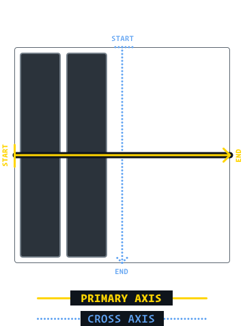
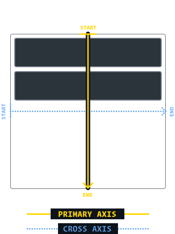
Everything in Flexbox pivots on the primary axis. With flex-direction: row, the primary axis is horizontal, left to right. Flip to flex-direction: column, and the primary axis runs vertically. The algorithm ignores physical directions—it only cares about the primary axis and the perpendicular cross axis.
This is what makes Flexbox special: learn the rules once, and they apply to both horizontal and vertical layouts automatically. By default, children follow two rules on each axis:
- Primary axis: Items bunch at the start of the container.
- Cross axis: Items stretch to fill the container.
Aligning the Group vs. Individual Items
On the primary axis, you control distribution with justify-content. You decide whether the whole group bunches at flex-start, center, or flex-end, or spreads out with space-between, space-around, or space-evenly.
The cross axis is different. You use align-items to set the default alignment for all children, and align-self on individual children to override it. In fact, align-items is just syntactic sugar—it sets the same alignment property on every child at once.
This explains why there’s no justify-self in Flexbox. On the primary axis, items sit side-by-side. A single item can’t move without bumping into neighbors—you can’t position one item individually when the group occupies the line.
Consider a row of items lined up horizontally. The cross axis is vertical, and each item can slide up or down independently without interfering with the others. That’s why align-self exists. But try to move one item left or right along the primary axis? It would collide with the next piece. The only option is to distribute the whole group.
This core asymmetry is why the terminology matters:
justify— positioning along the primary axisalign— positioning along the cross axiscontent— the group of items that gets distributeditems— individual items that can be aligned separately
So justify-content distributes the group along the primary axis, and align-items positions each individual child along the cross axis. There’s no justify-items because, on the primary axis, the items function as a cohesive block of content. As for align-content, it does exist in Flexbox—but it only becomes relevant when you introduce wrapping.
The Hypothetical Size
Here’s a realization that clarifies Flexbox: the width property behaves differently depending on the layout mode. In Flow layout, width: 2000px is a hard constraint. The element will stretch to 2000 pixels wide, even if it overflows the viewport.
.item {
  width: 2000px;
}
In a flex row, it’s a suggestion, not a constraint. Two children with width: 2000px in different layout modes render very differently—the flex child will be squished down to fit the container.
<style> .flex-wrapper { display: flex; } .item { width: 2000px; }</style><div class="item"></div><div class="flex-wrapper"> <div class="item"></div></div>The specification calls this the hypothetical size: the ideal size an element would get in a perfect world with no restrictions. Flexbox assumes that world is rarely real. The container doesn’t have room, so the item shrinks. This is the fluidity at the core of Flexbox—items flex to fit the constraints of their world.
The Three Knobs of Flexibility
The hypothetical sizes we saw earlier already build some fluidity into Flexbox, but the real control comes from three properties: flex-grow, flex-shrink, and flex-basis.
flex-basis: The Primary-Axis Size
flex-basis often seems redundant at first. In a row, it behaves like width; in a column, like height. The key difference: width and height do not care about your flex-direction at all — width is always horizontal. Since everywhere else in Flexbox things are pegged to the primary axis, the spec authors introduced a size property that obeys the same rule.
So flex-basis sets the hypothetical size along the primary axis, whatever direction that happens to be. And just like width, it's a suggestion rather than a boundary; when container space runs short, the children negotiate rather than overflow.
flex-grow: Claiming Extra Space
By default, Flexbox children will shrink to their minimum comfortable size. That frequently leaves unused space in the container. flex-grow decides who gets to claim it. The default value is 0, making growth strictly opt-in.
When more than one child has a positive flex-grow value, leftover space is divided proportionally. Each child's value represents its "unit" of claim. Two children, both at 1, split the extra space evenly; the math is a straight ratio across all growing children.
flex-shrink: Paying Down the Deficit
Now invert the scenario: the children are too big. Each child carries its own flex-basis as its ideal shape, so a 600px container holding a 300px and a 150px item has a total ideal of 450px. Shrink the container, and those two items shrink too — but not arbitrarily. They shrink proportionally to their sizes, preserving the 2:1 ratio. This is because all Flexible items scale together by default, keeping their relative dimensions stable.
If we want a different balance, flex-shrink steps in. It works like flex-grow, but in reverse: the values define a ratio determining what share of the overflow deficit each item must absorb. With a total deficit of 100px, two children at flex-shrink: 1 each lose 50px — they split the bill. Crank one up to flex-shrink: 3, and it pays 75px while the other absorbs just 25px.
In effect, smaller proportion of extra space, the ratio is paired against the values of its siblings, each element pays according to the same ratio regardless of scale.
Manage only one knob at a time, however. When there is extra space, flex-shrink has nothing to act on; when there's a deficit, flex-grow is inert. They are two sides of the same coin.
Opting Out of Shrink: flex-shrink: 0
Sometimes shrinking is unwanted. Rendering an SVG circle into a squeezed oval is a common failure mode in tight layouts. Setting flex-shrink: 0 treats flex-basis (or width) as a hard floor. The element can't go below that constraint.
The Battle Against the Minimum Size
Here's the most valuable trick in Flexbox: when content overflows even though flex-shrink: 1 should allow it to give ground, the culprit is an invisible limit — the minimum size, which Flexbox never crosses, no matter how high flex-shrink is set.
That minimum, default for some elements, can be generous. Text inputs carry a hard-coded floor of 170–200px depending on the browser. For others with text content, the lower bound is the longest unbreakable string of characters.
The fix is direct: declare a smaller minimum with min-width: 0px on the child element, resetting the built-in rule entirely. For columns, the equivalent fix is min-height, although the issue is less often hit in that orientation.
Spacing with Ease: gap and Auto Margins
gap is a relatively late addition to the Flexbox spec, supported by all modern browsers since early 2021. It inserts space strictly between children, solving the awkward task of tracking margin-right on everything except the last item — perfect for navigation bars with justify-content distributing the group itself.
Auto margins are a subtler trick, and perhaps the most beloved one in Flexbox. In their presence, margin: auto behaves differently than in Flow and Positioned layout. Instead of centering the element against the available space, Flexbox auto margins gobble up that excess space and pour it back into the margin itself.
That gives a surgical way to move elements around. A header with a logo anchoring the left side and a nav on the right is trivial: on the logo's item set margin-right: auto. The leftover white space gets pushed to the margin, shoving the rest of the items to the far side of the container. There are alternatives — giving the first flex-grow or nesting the links in their own flex container — but auto margins treat space as a resource you can spend anywhere, which is exactly what a clean layout calls for.
The Multi-Line Reality of Flexbox
Up to this point, the flexible items in our examples have all remained on one line. The flex-wrap property changes that fundamental assumption by allowing items to flow onto multiple lines.
The core difference: with the default nowrap value, items are forced onto a single primary axis line. With flex-wrap: wrap, items will not shrink below their hypothetical size when they have the option to move onto the next line instead. This enables patterns like the "deconstructed pancake" layout, where three fixed-basis items stack responsively on a narrow container.
This shift has a profound conceptual consequence. Our earlier "skewer" metaphor—where the primary axis line runs through each item—no longer holds. With wrapping enabled, each row acts as its own mini flex container. Instead of one large skewer capturing all items, each row receives its own skewer handling its contents independently.

This division of responsibility means the properties you have already learned still apply, but within a reduced scope. For example, justify-content will only distribute the items that share a specific row.
Aligning Items vs. Aligning Content
The appearance of multiple rows raises an important question: how does align-items behave when the cross axis can now intersect more than one item?
Since each row is its own mini environment, align-items moves each item within the invisible box that wraps that specific row. To align the rows themselves, as a collective group, you need a different property.
That's where align-content comes in. With multiple rows present, the cross axis intersects two rows at once. You cannot move those rows individually; you must distribute them as a single group. So, to manage placement along the cross axis in a multi-line flex container:
flex-wrap: wrapcreates multiple rows of flex items.- Individual children are positioned vertically within their respective rows using
align-items. - The rows themselves, as a group, are positioned vertically within the flex container using
align-content. This is content alignment, not item alignment.
Building Better Mental Models
Flexbox is often described as simple, but the complexity scales quickly once you move past the basic scenarios. The result is that many developers hit a plateau early on with CSS. It can feel fragile and unpredictable, leading to a habit of pasting in code snippets without fully understanding the underlying mechanics.
The reality is that the Flexbox algorithm is deeply structured and internally consistent. The difficulty usually lies in incomplete intuition. Building a proper model for how flexible layout actually works—from the primary and cross axes to line wrapping and content distribution—changes CSS from a source of friction into a tool you can confidently reason about. Getting to that level of understanding makes the difference between guessing at solutions and knowing exactly how the layout engine will behave.


