

A new way to move around GitHub
GitHub has rolled out a redesigned, site-wide navigation in public beta. The update is intended to make it faster to reach frequently used areas of the platform and easier to understand where you are within the site's structure.
Finding your way
The new navigation adds breadcrumbs to every page, reflecting GitHub's information architecture. This lets you see your current location and move laterally or vertically through the hierarchy without losing context.
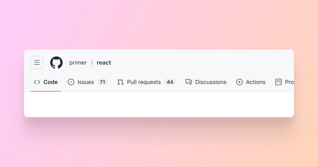
A site-wide menu, opened via the hamburger button, centralizes links to often-visited destinations such as issues, pull requests, and discussions, along with your teams and most-used repositories. You can filter repositories and teams directly within this menu.

Global links to issues, pull requests, and notifications remain fixed in the upper-right corner of each page. Code search and the command palette are integrated into the navigation, letting you jump directly to a repository, organization, user, or code snippet.
Familiar shortcuts persist: the GitHub logo (Mona) returns you to the home dashboard, and your avatar opens the user menu.
Rebuilt for consistency and accessibility
The navigation was rearchitected rather than merely restyled. It now behaves consistently across all pages and devices, with a responsive layout that improves the mobile experience. Accessibility was a primary concern, and the interface has been tested with assistive technology as part of GitHub's broader accessibility efforts.
Under the hood, the navigation is built on Primer, GitHub's open-source design system. It uses the Primer component library and Octicons for icons, which should ensure long-term maintainability and continued accessibility improvements—including the recently updated color system—along with consistent component behavior across the site.
Opting in during the beta
During the beta period, the redesigned navigation can be toggled on and off via the Global navigation update setting in Feature preview. Feedback can be submitted through the feedback portal.


