
Information Architecture, Defined
Information architecture is the practice of deciding how to arrange the parts of something to make it understandable. For user experience, this means understanding how users think, identifying the problems they are trying to solve, and presenting information in a logical way within that context. Whether for a website, software application, or mobile app, the process begins with designing the structure of the information and then translating that structure into a navigation hierarchy that makes sense to the people who will use it.
In a world where we can feel overwhelmed by data, information architecture offers a logical system for organizing that data so it can be located more easily. It matters for both users and the businesses serving them.
Why It Matters for the User
- It reduces cognitive load. An overcrowded screen with no clear path makes it hard to focus. Too many options can lead to choice deferral, where a user decides not to make a decision at all.
- It accelerates finding the right information. Clear navigation choices help users locate what they need quickly instead of abandoning the task.
- It keeps users focused. If a task is straightforward and doesn't include irrelevant navigation elements, users are less likely to get distracted.
- It adds context. A visual navigation path showing where a user is within a process can clarify the content they are viewing. For example, during an online bank application, showing the total number of steps and the current position provides context to the flow.
- It reduces frustration and support requests. When users can clearly see where to find what they need, they don't need to call for help. A customer with a faulty item, for instance, won't need to contact support if the site clearly shows how to handle returns.
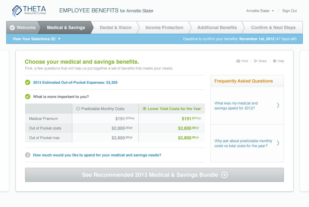
The example above shows a wizard-style application form that demonstrates these principles:
- Navigation steps across the top provide context for where the user is in the process.
- Simple choices guide the user forward.
- Contextual FAQ links relate to the current step.
- A navigation button at the bottom gives specific instructions for the next step.

The Punk Avenue example shows clear main navigation with a summary of what each page contains, along with tabs that keep the user on the same page while visually indicating which content is being viewed.
Why It Matters for Business
- Keeps customers on the site longer. Visitors often leave within 10 to 20 seconds, but a clear purpose can engage them longer. Good design and messaging present the value proposition, and effective navigation supports it.
- Increases conversion. When visitors find what they need with minimal steps, conversion rates are higher than when navigation fails to direct them.
- Reduces the risk of losing customers to competitors. Visitors who can easily find what they need are less likely to go back to Google and click another result.
- Reduces duplication of content. Documenting content structure, especially on information-heavy sites, prevents the same information from being replicated.
- Provides better ROI. Investment in effective information architecture can increase conversions and the income from those sales.
- Lowers support costs. A well-functioning site with clear assistance reduces the burden on customer support teams.
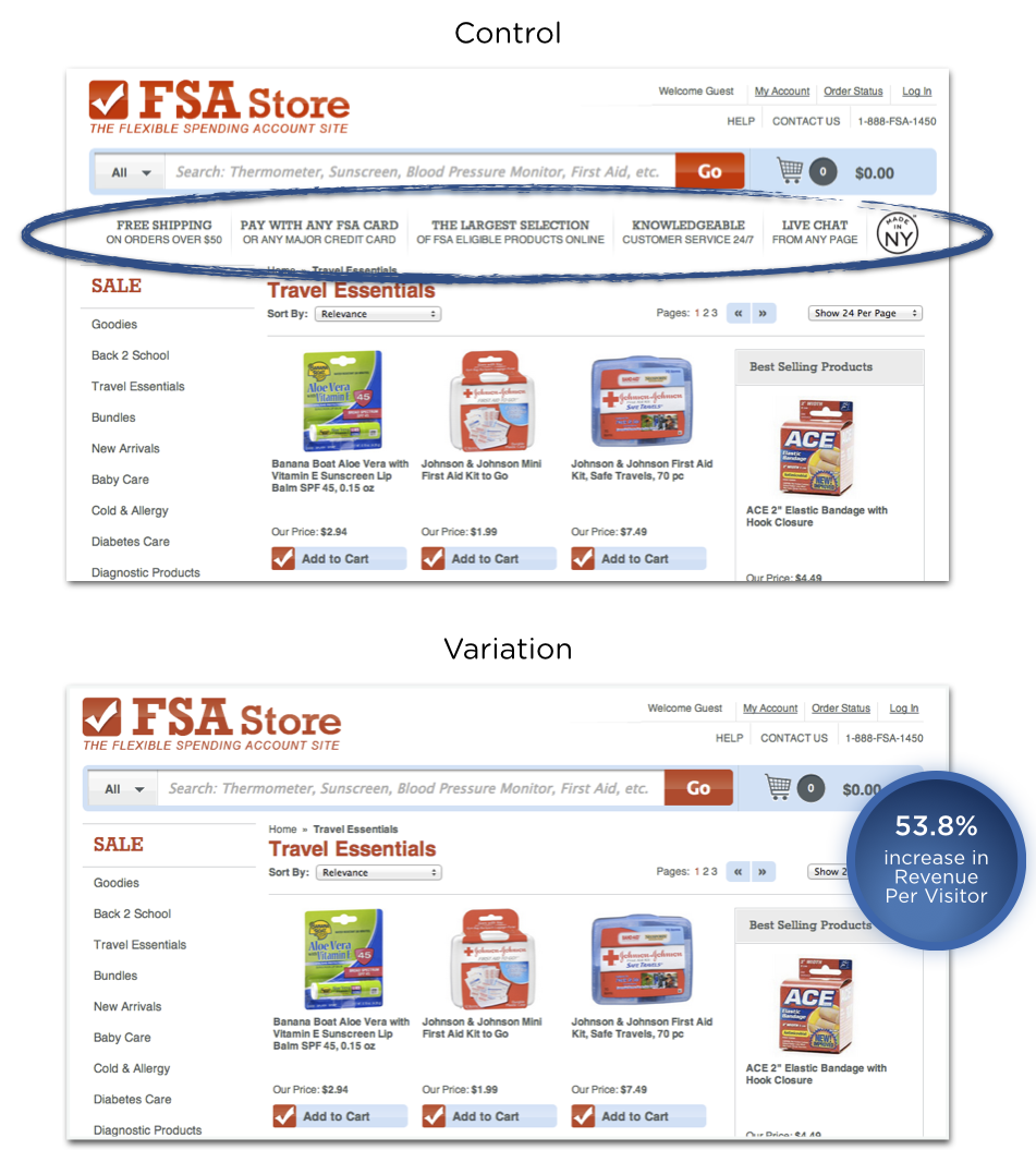
The example above shows how poor navigation displays can harm conversion. In this case study, removing the vertical information between the search bar and the products led to a 53.8% increase in customer revenue. The removed content functioned as what may have been perceived as a superfluous navigation bar or simply irrelevant information during a product search.
Search Versus Navigation
Research over the years has produced varying numbers on whether users prefer site search or navigation. Jakob Nielsen's 1997 study showed that more than 50% of users would use the search function over site navigation. Econsultancy reported in 2012 that 30% of e-commerce visitors use site search. A Kissmetrics study found that 40% of users preferred search. Gerry McGovern's 2010 study demonstrated that 30% of users preferred search.
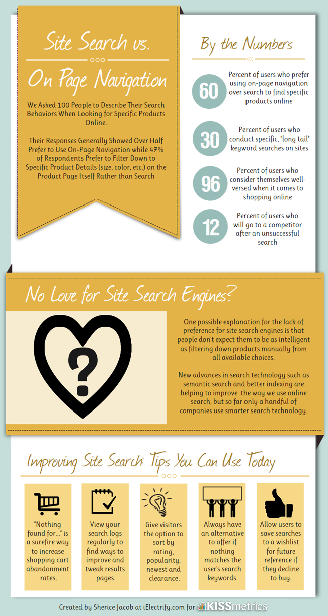
While these findings seem inconsistent, one fact is clear: users employ both search and navigation to find information, in different proportions. For websites with complex structures and large amounts of content, you may need to integrate site search alongside well-designed navigation to provide the best user experience.
A Practical Example
Consider a website selling cleaning and health products, where a visitor wants to buy antibacterial hand wash. The site has two categories: "Body Washing Products" and "Skin Cleansers" — which one should the user choose?


If the categories list products alphabetically, the user might have to scan a long list. Depending on who is searching, "antibacterial hand wash" could also be called:
- hand sanitizer
- sanitizing soap
- hand disinfectant
- disinfectant hand wash
- hand sterilizer
- hygienic soap
- antiseptic handwash
Because it's impractical to build navigation that accounts for all possible synonym variations, a well-designed site search is essential. By adding metatags to each piece of content, one product can include hidden tags covering all these phrases, so users can search for any term and get matching results.
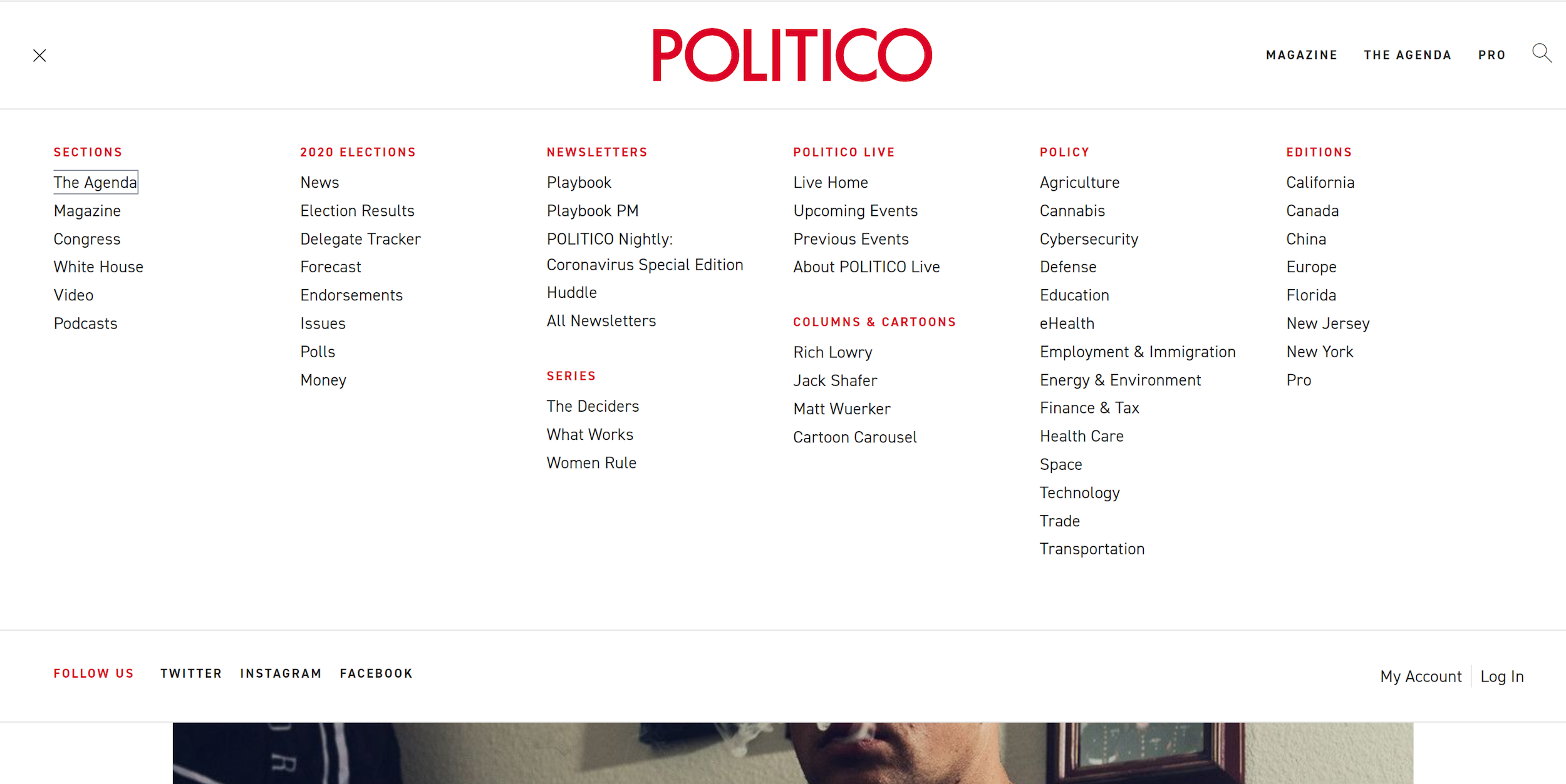
The Politico website might not be a search-friendly e-commerce site, but it demonstrates the common megamenu pattern. This content-heavy site groups information into categories, making browsing easier. The megamenu, accessible from the top left, serves visitors who want to browse, while search allows users to locate a specific piece of information.
Research from measuringu.com suggests that about 14% of users will begin with search, and the majority will start by browsing through navigation options. Understanding this split is key to designing an experience that serves both types of users.
What Good Information Architecture Looks Like
Navigation quality is one of the most direct reflections of underlying information architecture. When the architecture is aligned with what users actually need, navigation feels effortless.
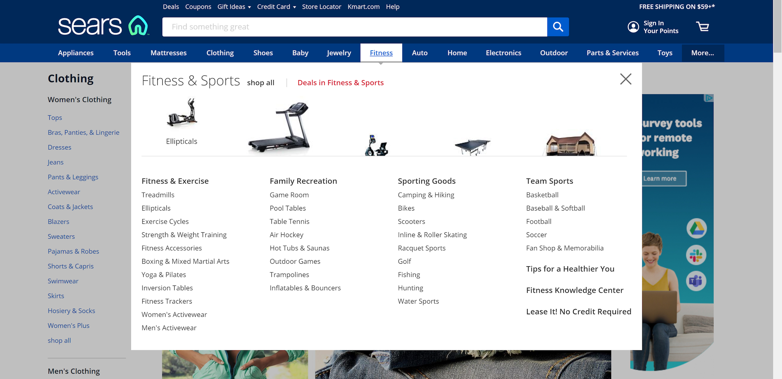
Sears is a solid example of mega drop-down menus done well. The sub-categories are clearly grouped, and supporting images speed up visual recognition far faster than text alone.
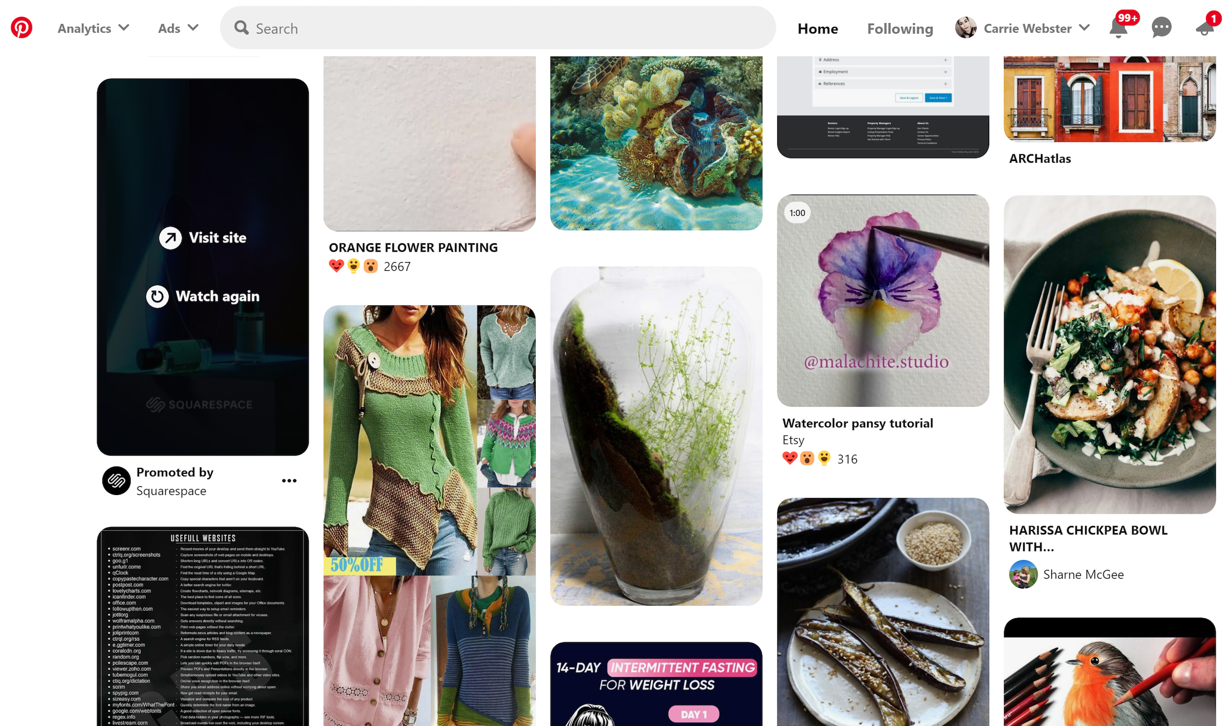
Pinterest takes a different route by making search itself the primary navigation. Given the enormous volume of user-generated content on the platform, a conventional category tree would be unworkable. Search-based navigation scales where fixed hierarchies cannot.
On the opposite end, some sites bury users in too many choices at once, with cramped layouts and little white space. Overwhelming navigation of this kind makes it difficult for users to even identify what their options are, let alone choose among them.

Getting the Structure Right
A handful of principles and practices consistently separate effective information architecture from guesswork.
- Start from user needs. Before structuring anything, understand what problems users are trying to solve. User interviews reveal the tasks that matter, which in turn suggest the pathways users will take through the site.
- Keep hierarchies shallow. Aim for minimal sub-levels so key content is reachable within two clicks.
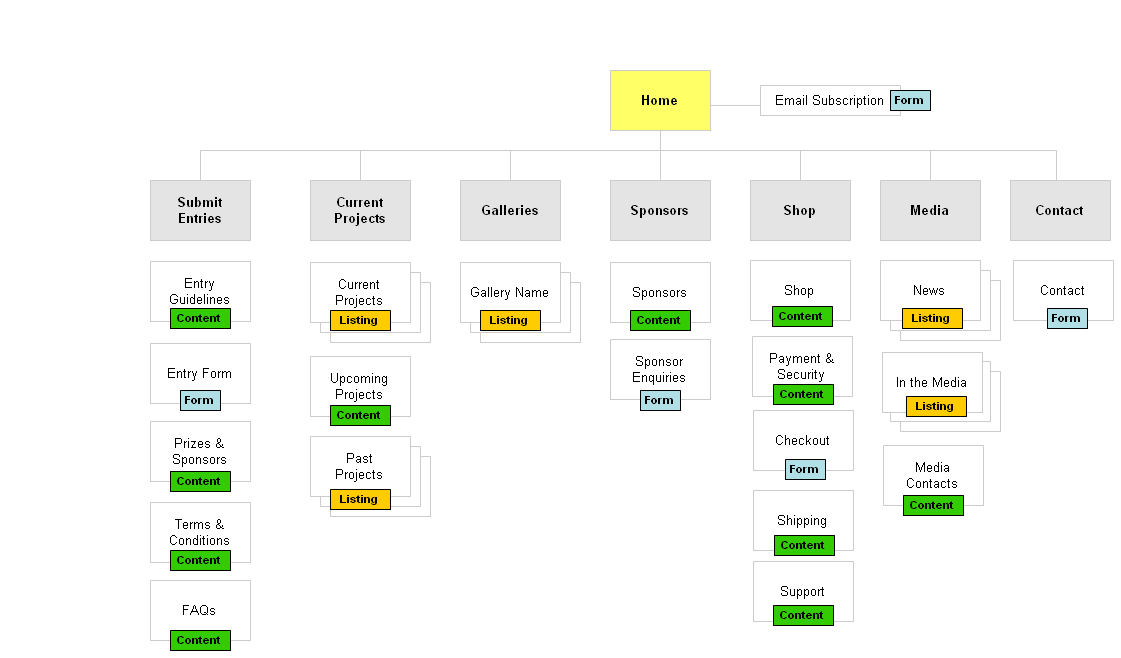
- Speak the user’s language. Navigation labels should be jargon-free. Validate wording with real users to confirm they interpret labels as intended.
- Don’t rely on icons alone. Very few icons — like Help, Error, or Print — are universally understood, and even those can carry different meanings across cultures.


- Show the user’s location. Users need to know where they are in the site structure at all times. Breadcrumb navigation, placed below the main navigation, shows the path taken with the current page at the far right, making it easy to backtrack.
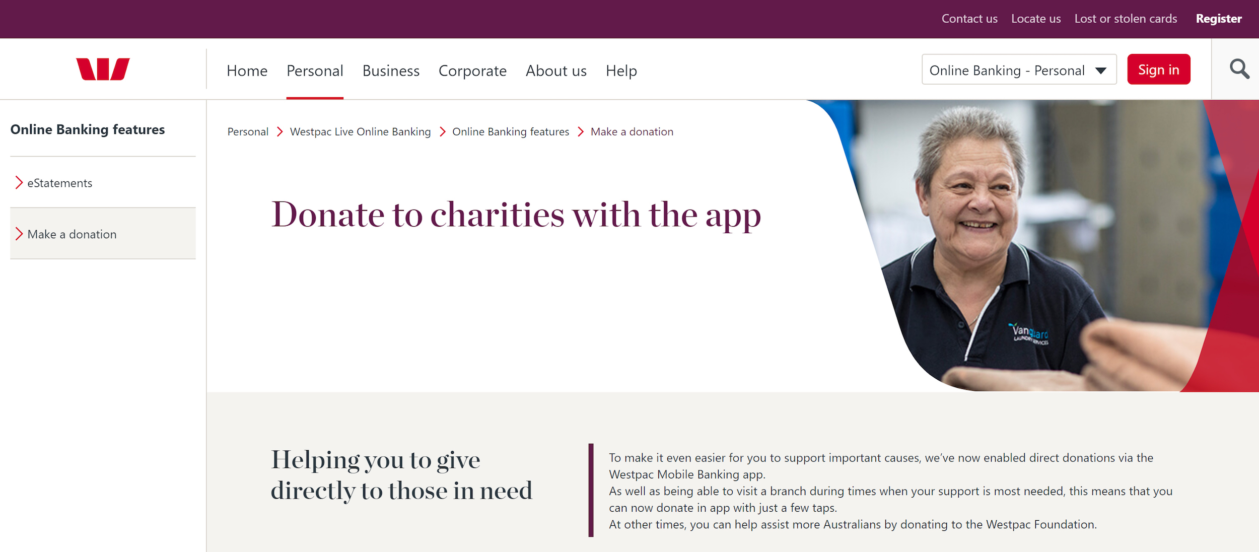
- Differentiate hierarchy levels visually. Larger font sizes for top-level headings and other visual cues direct the eye to important content first. Visual designers play a key role in making these distinctions clear.
Testing Your Navigation
Card Sorting
Card sorting is a low-fidelity technique that reveals how users naturally group content. Participants write or receive cards with navigation section names and sort them into groupings that make sense to them. Running this with at least five participants exposes patterns in how categories and sub-categories are formed.
An open card sort lets participants create whatever groups they want. A closed card sort constrains them to a set of predetermined top-level categories.

Scenario Testing
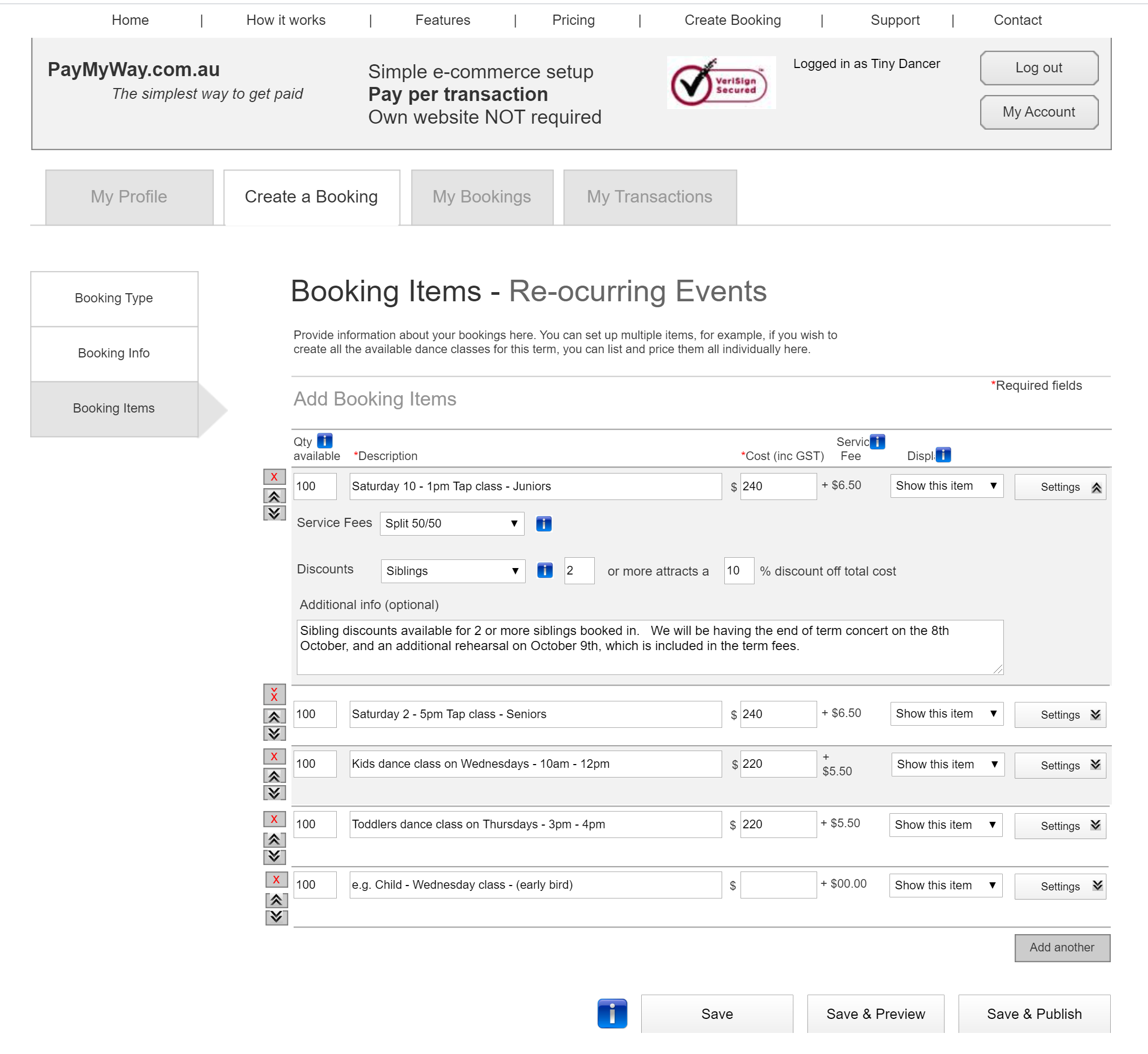
With a clickable wireframe or prototype, you can ask participants to perform concrete tasks. For example, have them register, book a single event, and then publish it. Observing how successfully they complete such tasks reveals how intuitive the structure really is.
Tools for Validation
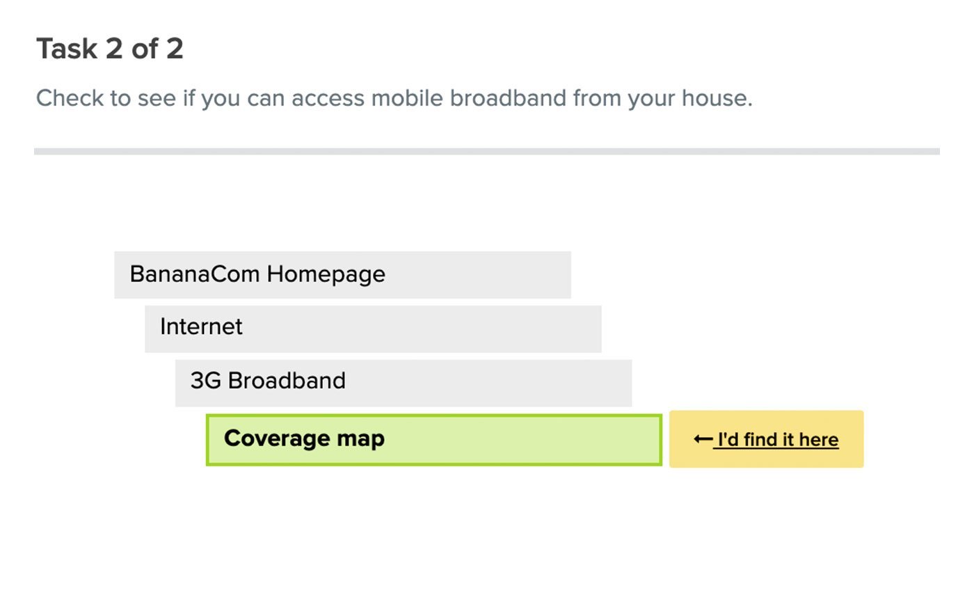
Treejack is one tool designed to validate navigation structure. It asks participants where they would go to find specific information and then reports on their actions, highlighting areas of confusion.
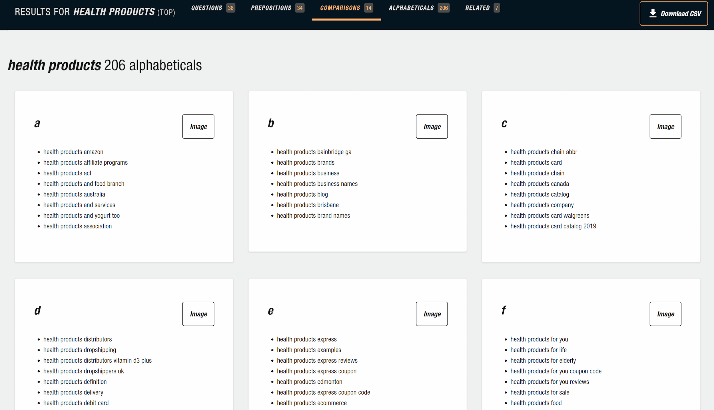
Free keyword research tools can also inform the language choices in your navigation. AnswerThePublic, for instance, accepts a search term and returns related terms that real users are querying.
The Information Age
Access to information today is instantaneous and global. News reaches us as events unfold, communication spans the planet with ease, and Google functions as a limitless personal library. Contextualizing these vast flows of data is not just a philosophical exercise — it shapes how UX designers approach their work.
Facts About Data Growth
- 90% of the world’s data has been created in the past two years.
- The world’s data volume doubles every two years.
- If all the data in the world were stored on 128GB iPads, the stack would reach from the Earth to the Moon 6.6 times.
- Only 37% of all data is considered useful, with a much smaller percentage actually analyzed.
- 33% of managers report that information overload impacts their health.
- 66% of managers report increased conflict with teammates and reduced job satisfaction.
The Power and Risks of Information
Information alone is useless if no one can find it, and once available, it requires action to matter. At scale, it supports public health, better policy, and better lives. It can also fuel propaganda, fear, and manipulation for profit.
Case in Point: Aaron Swartz
Aaron Swartz, original creator of Reddit, died by suicide in 2013. He was fighting felony charges for accessing and downloading academic information illegally. His manifesto called on activists to liberate information held by corporations, and he campaigned against Internet censorship. His story underscores the double-edged nature of information access.
Rapid Policy Shifts
Information can reverse course on world events almost instantly. In Australia, the Prime Minister suspended non-elective surgery effective March 26, only to reschedule it to April 1st after the health minister met with the private hospital sector that afternoon. Updated information about medical staff stand-downs, even as hospitals prepared for a COVID-19 surge, drove the reversal.
Misinformation and Conspiracy
Current events are rife with “fake news” claims and allegations of misinformation. Unfounded conspiracy theories, such as the virus being created in a Wuhan lab, 5G being connected to the pandemic, or Bill Gates being responsible for it, link unrelated data points without evidence. Accusations against individuals, like US Army Reservist Maatje Benassi being patient zero, follow the same pattern.
Data Security Breaches
In 2018, Facebook suffered a massive breach when hackers exploited a vulnerability to access personal data from 50 million user accounts. The consequences can linger for affected individuals for years.
In July 2017, a data breach at Equifax exposed Social Security numbers, birth dates, and credit card details of over 147 million people in the US. Even after $1.4 billion in security upgrades, the company continues to resolve class actions from affected consumers.
The privacy landscape is shifting accordingly: 132 of 194 countries now have legislation protecting personal information and privacy without consent. In 2017–18, the number of countries enacting data privacy laws rose by 10%. Information itself does not discriminate between good and evil — it must be validated, analyzed, and handled with responsibility.
Why Information Architecture Is the Foundation
Information shapes decisions, actions, and understanding. We now generate more data than at any point in history, and that growth brings a serious problem: information overload. When people face too much unstructured content, they struggle to find what they need, lose confidence, and abandon the task. This is why information architecture matters far beyond navigation menus and sitemaps.
Information architecture is about making the invisible structure of content visible and useful. It connects the vast amount of data we create with the people who seek specific answers. A well-designed IA reduces cognitive load and guides users to the right information at the right time, without requiring them to understand how the system was built.
The volume of information is not the only challenge. The power behind information means whoever controls its structure controls its accessibility. Poor organization hides critical content, while thoughtful structure makes it discoverable. For organizations, this distinction directly impacts user satisfaction and operational efficiency.
Information overload is not merely an inconvenience. Research into how people process information shows that too many choices or too much content leads to stress and paralysis. This is why sites that overwhelm visitors lose them. Information architecture counters this by providing clear pathways, logical grouping, and consistent labeling, so users can rely on patterns rather than guesswork.
When IA is treated as an afterthought, users suffer. When it is built deliberately, it becomes the quiet infrastructure that supports every interaction. This applies to websites, applications, and any system holding structured content.
The practical outcome is simple: delivering the right information to the right person at the right time. That requires understanding both the content itself and the mental models of the audience. Information architecture is not a one-time task but an ongoing discipline that adapts as content grows and user needs evolve.
Further Reading
- Is Your Website Stressing Out Visitors?
- What Vitruvius Can Teach Us About Web Design
- Readability Algorithms Should Be Tools, Not Targets
- Designing The Words: Why Copy Is A Design Issue