Importing Data Without Importing Friction
Data importers are a notorious pain point in otherwise polished applications. Users arrive with messy spreadsheets, unclear expectations, and varying levels of technical confidence. When the UI fails them, they often abandon the workflow entirely. The challenge, then, isn't just building an importer that parses files correctly — it's making the experience feel effortless enough that users stick with it.
The UX failures in data importers typically fall into two extremes. On one end, the interface is buried under instructions, warnings, and documentation links, overwhelming the user before they've even selected a file. On the other, the UI is so sparse it offers zero guidance, leaving users to discover error states and data mapping problems entirely on their own. Both extremes damage trust in the product.
The goal is a middle path: an importer that is visually clean yet functionally transparent, giving users just enough direction to proceed confidently without treating them like novices. Building this from scratch or selecting a solution requires paying attention to a few specific design principles.

Frame the Task Clearly
Before users even click the upload button, they need to understand what the importer expects from them. A successful importer opening screen answers three questions immediately: What file format is accepted? What data fields are required? And what happens after upload?
The UI should set expectations upfront rather than waiting to scream at the user after a failed submission. Clearly state the accepted file types (e.g., CSV, XLSX) and the necessary columns, ideally with visual examples of properly formatted rows. This preemptive clarity reduces the cognitive load during the actual import process and prevents frustrating back-and-forth attempts.
Provide a Guided but Flexible Mapping Flow
Most data importers involve some form of column mapping, where the user's spreadsheet headers are matched to the application's database fields. A good importer takes charge of this process. Rather than asking users to manually match every single field, the importer should automatically detect and suggest mappings based on header name similarity. Users should then only be asked to correct matches that are ambiguous or missing.
The interface for this step needs careful wording. "Mapping" and "fields" are internal jargon. For an end-user, the goal is simply "making sure your data aligns with your account setup." The UI should use plain language and offer visual confirmation, such as color-coded columns or checkmarks, to indicate a successful match. This guided flow ensures accuracy without burdening the user with technical decisions.
Catch Errors Proactively for a Smooth Review
Even with a great mapping flow, data quality issues will still appear. Some rows will have invalid email addresses, missing required values, or malformed dates. How the importer handles these errors is the defining test of its design.
A poor importer simply blocks the upload, displaying a generic error message that forces the user to guess which row is the problem. A well-designed importer, however, processes the file and presents the user with a detailed review panel. It should surface a specific list of errors, pinpointing the exact rows and cells that need attention. The UI should clearly explain why a record failed validation (e.g., a value is in the wrong format or missing from a list of allowed options) and offer a preview of the current data alongside the proposed fix.
This approach transforms error handling from a dead-end into a review stage. Users feel in control because the importer shows them exactly what's wrong and what they can do to correct it, without forcing a tedious manual file fix. The best case scenario eliminates blunt errors entirely by offering real-time correction tools integrated directly into the review interface.
Keep Everything in Context
To minimize friction, every part of the importer workflow — file selection, mapping, validation, and review — should feel like a single, connected experience. Avoid bouncing users between different pages for editing. Cloud-provider file selection, field mapping, and error review should ideally occur within a single view or a continuous modal flow. This removes context switches which, in software, invariably lead to user drop-off.
Making Your Data Importer Clear Without Being Verbose
The main importer screen sets the tone for the entire onboarding experience. The goal is to give users the essential constraints — file format, size limits, required fields — without burying them in paragraphs they will skim or skip entirely. The sweet spot is instructions of 100 words or fewer.
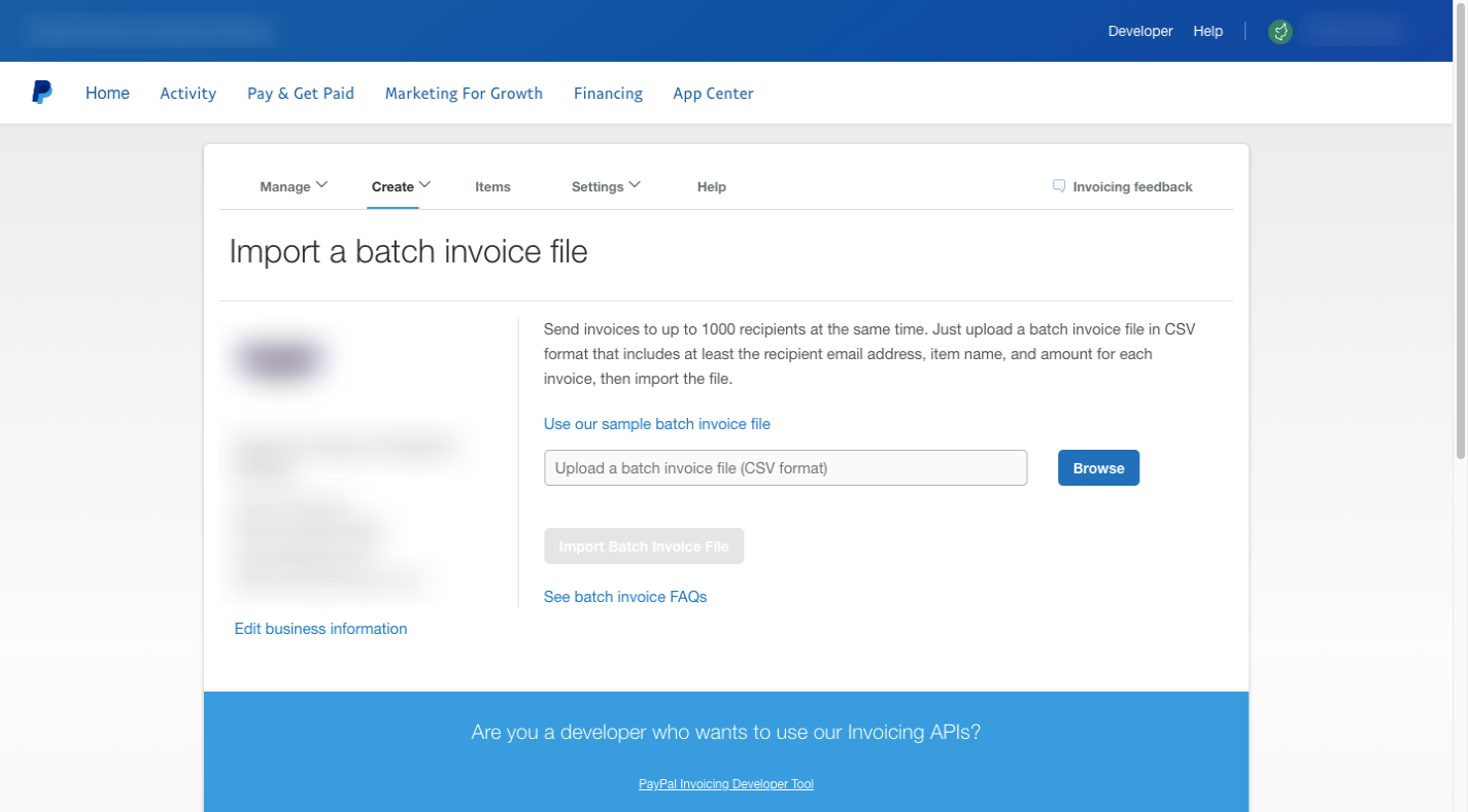
PayPal’s invoice importer handles this well. A single paragraph tells users the file must be in CSV format, include fields for email address, item name, and invoice amount, and contain no more than 1,000 invoices. A reminder about the file format appears again in the upload field itself, while links to a file template and FAQ pages keep the importer page free of clutter.
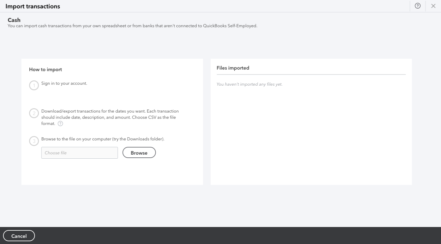
Where you have more to communicate, structure the text for skimming. Break instructions into short, numbered steps with generous spacing, as QuickBooks Self-Employed does for its export and import flow. Bolded headers, bullet points, and white space make a short page feel even less daunting.
For returning users, the clearest shortcut is a prominent import button. A strong fill color and placement in the top-left corner, where the eye lands first, lets repeat users bypass the reminders entirely. A brief note about allowed file types directly beneath the button covers anyone who needs a quick refresher.

Presenting Every Import Path Up Front
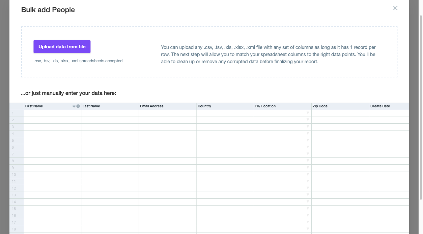
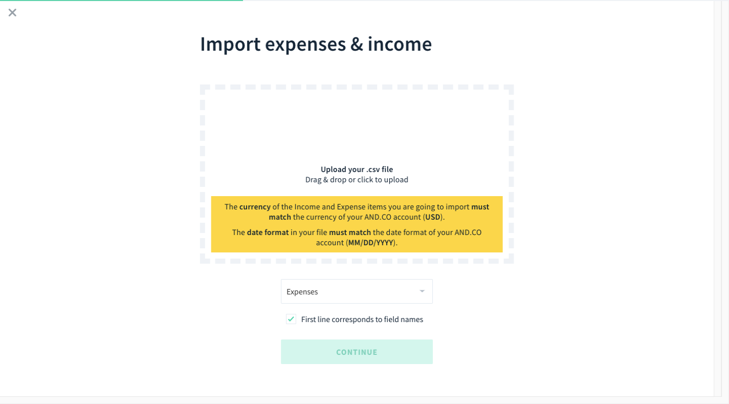
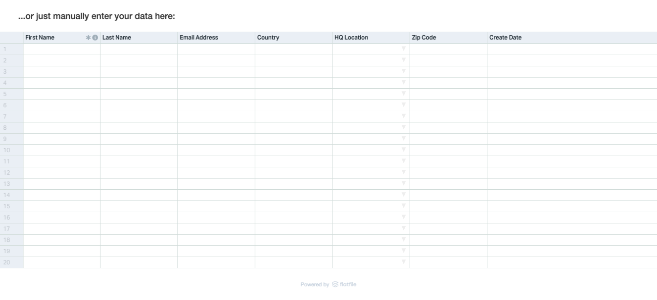
Users appreciate choice, and your importer should make each option obvious at a glance. The recognizable drag-and-drop widget with a dashed border is one familiar pattern, seen in AND.CO’s expense and income importer. Adding an explicit upload button inside that same dashed-border box, as Flatfile does, removes any doubt that both click-to-upload and drag-and-drop are supported. A third option for manual entry makes sense for users who periodically add a few records and do not want to prepare a file each time.
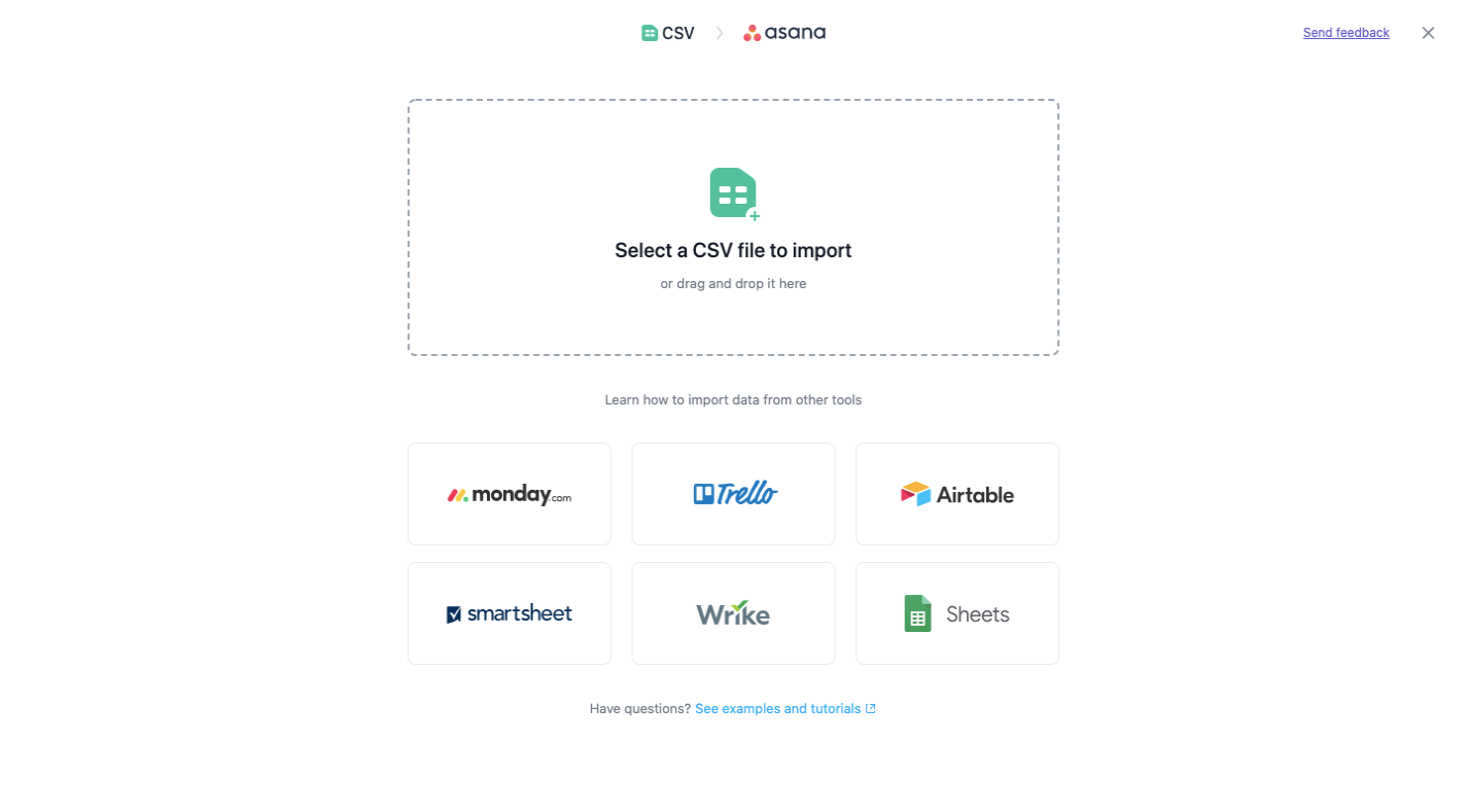
Third-party app logos are another effective visual cue for users who have their data stored elsewhere. Asana places the standard CSV option at the top, then lists the tools its customers are most likely to have used for project data. Familiar branding helps users instantly identify the import path they want instead of forcing them to read descriptions of each option.
Breaking Down Complex Imports
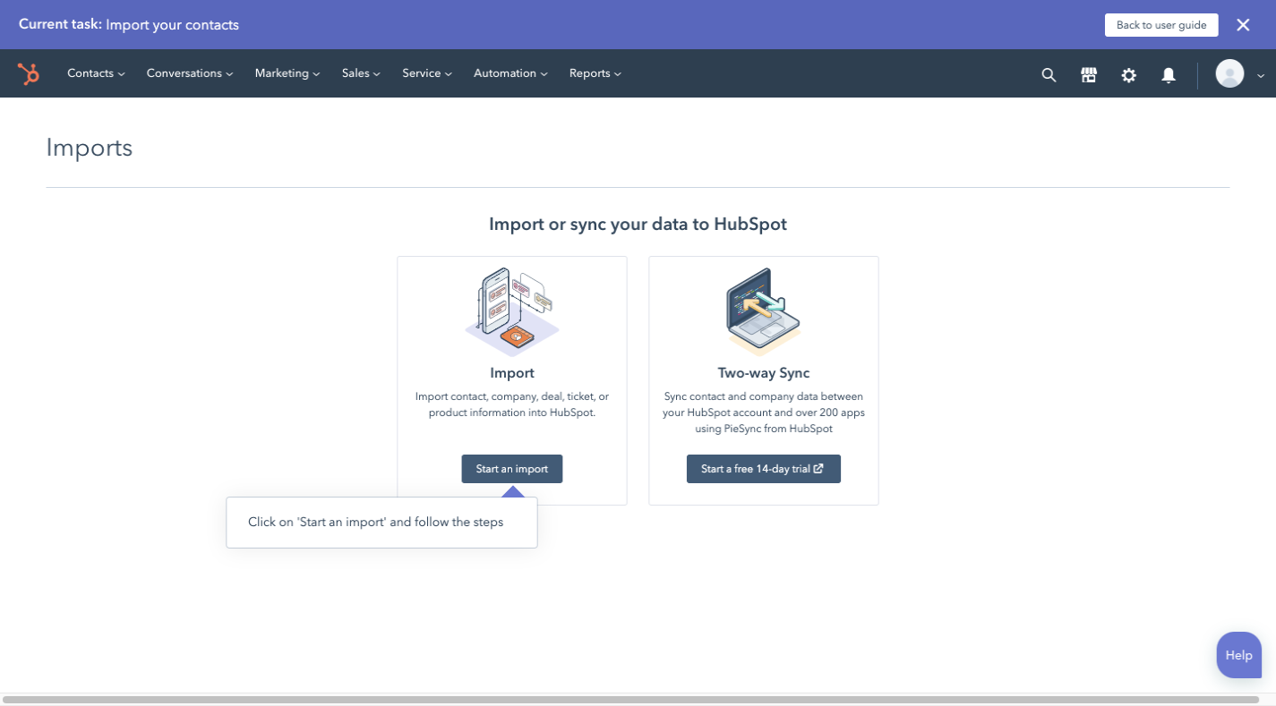
When the backend import process is involved — multiple files, object associations, or format conversions — the UI must not expose that complexity all at once. HubSpot’s import flow demonstrates a stepped approach that asks one question per screen. The first page asks whether the user is importing data or pulling it in from another platform. Although that diverges from the single-page importer design, it prevents users from feeling overwhelmed later.

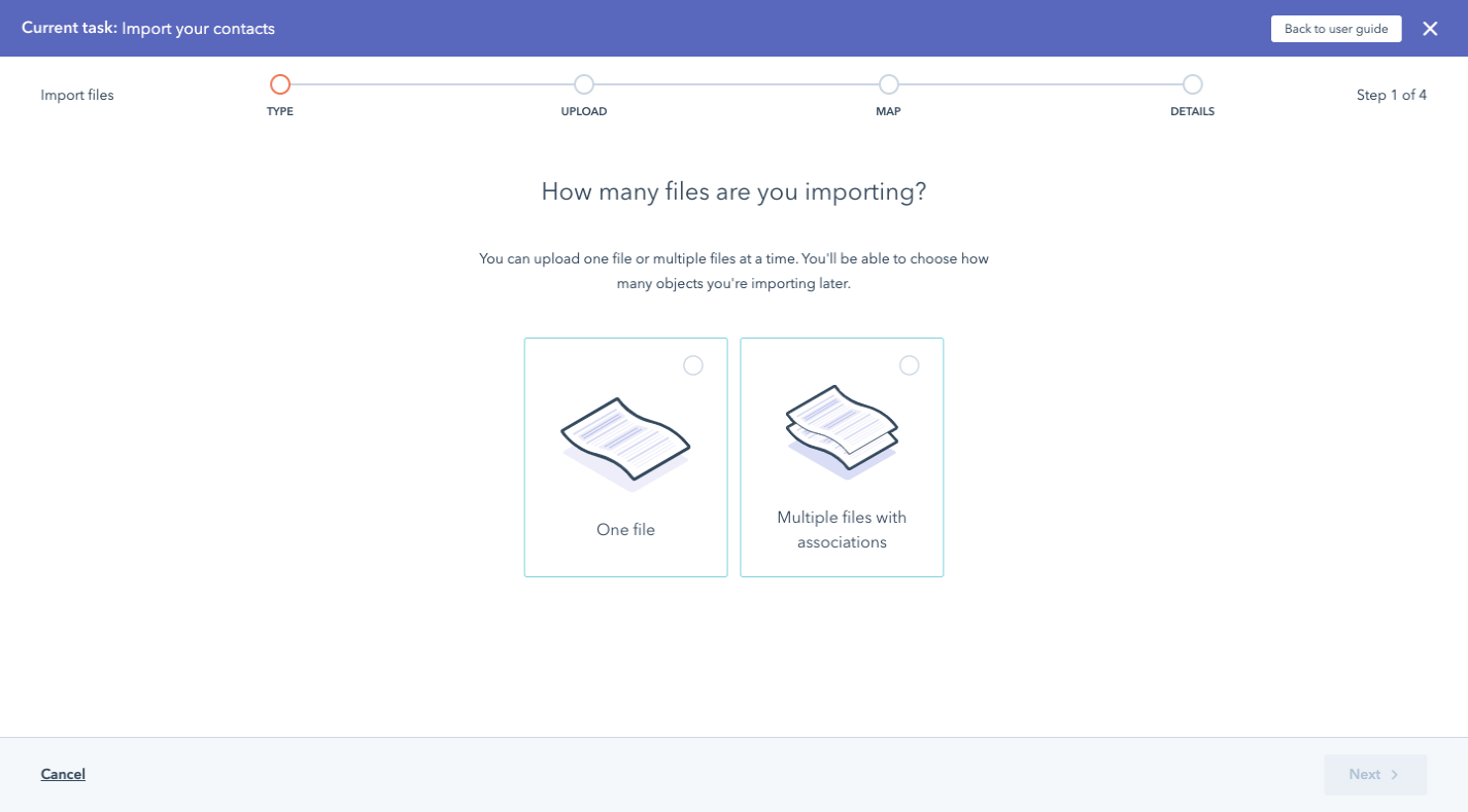
Assuming a CSV, XLS, or XLSX import, the next screen asks whether the user has one file or multiple. The multiple-file option is not merely about volume. It opens a path where the importer can help establish relationships between records across files. This saves users from manually merging data or later cleaning up duplicate or related records inside HubSpot.
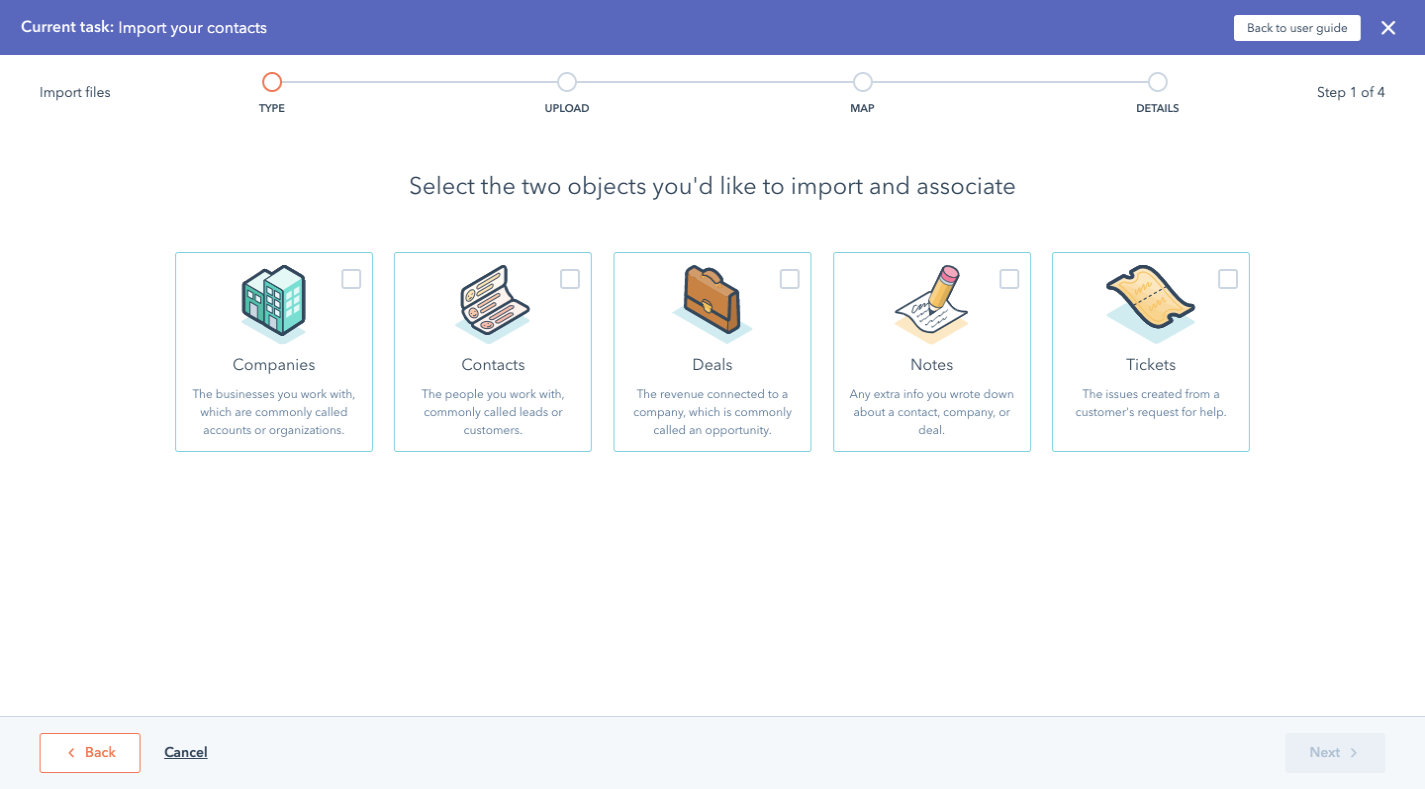

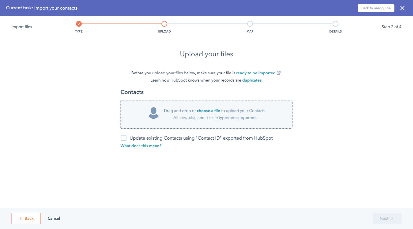
Only after these clarifying questions does the user encounter the upload interface itself. That screen is standard and intuitive, but the preceding steps mean the user is already committed to the correct workflow, with fewer post-import fixes ahead. If your import process has similar branching logic, consider dedicating a page to each key question while keeping the available options visually consistent across screens.
Using Color To Guide Data Review
Data validation and sanitization are the last hurdles before imported records enter the application. Users must review flagged issues and approve the results, and color is the most direct way to make those steps fast.
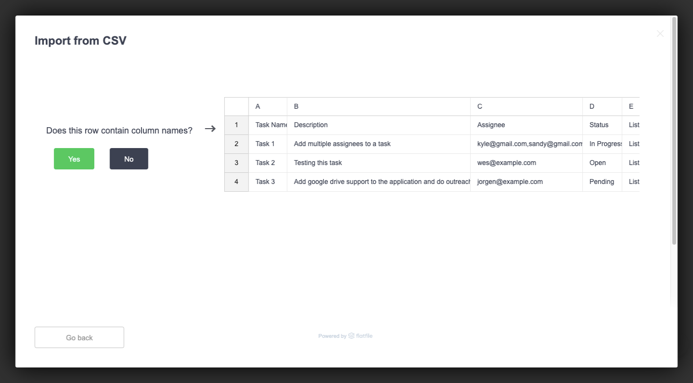
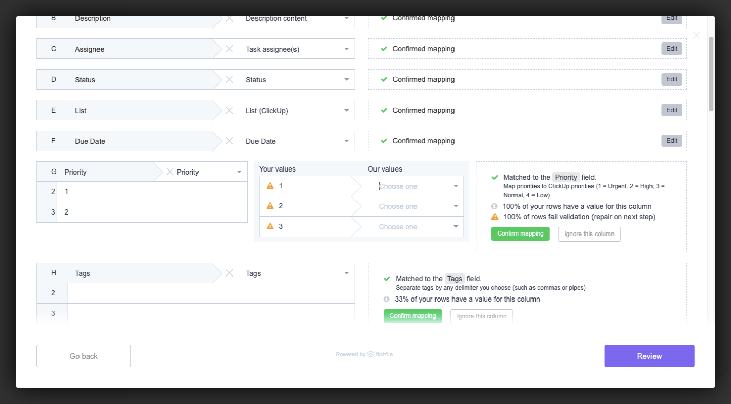
ClickUp, which embeds Flatfile’s importer, uses a few deliberate color choices. At the start of validation, the user confirms whether the first row contains column names. The “Yes” button is green — the same positive call-to-action color used throughout the UI, so users quickly learn which action advances them. Screens that confirm successful column mapping repeat that green button, and grey ghost buttons offer secondary actions like ignoring a column or including it as a custom field.
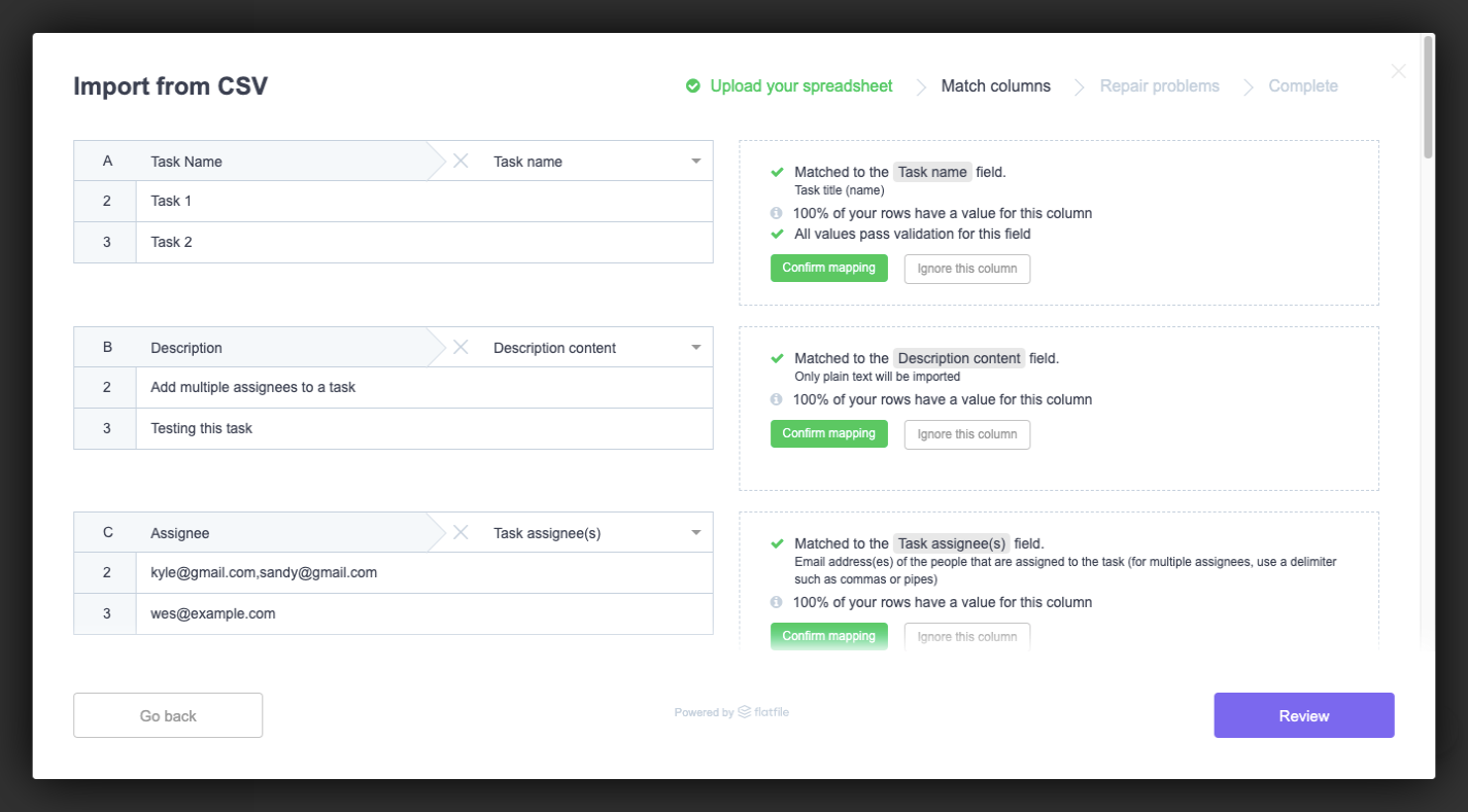
Errors need their own palette so they are distinguishable from confirmations. ClickUp uses an orange warning symbol when column names match but the values in the data do not align with the field expectations. Later, during sanitization, a red highlighter marks fields that are required but empty — the most severe class of problem before upload.
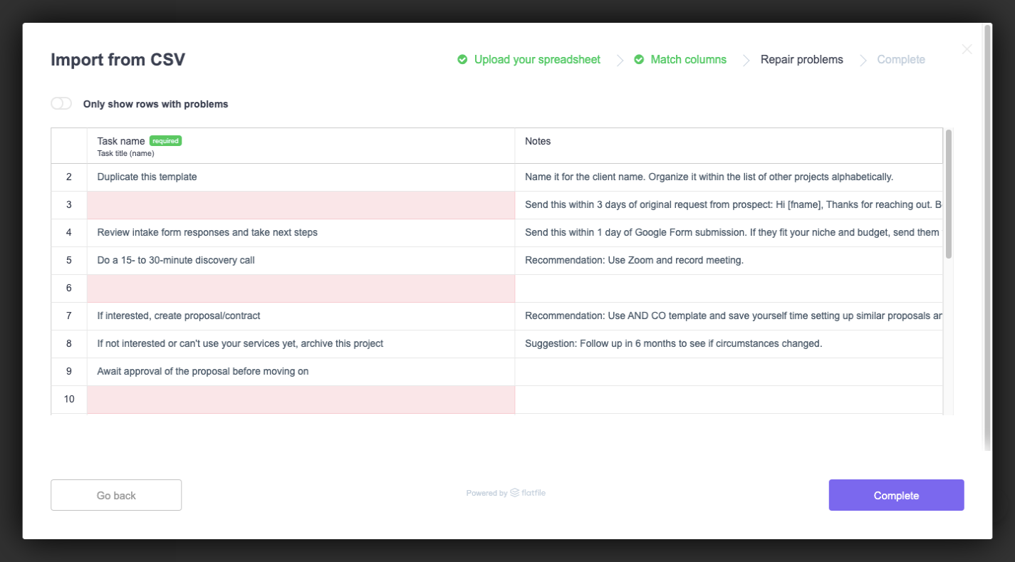
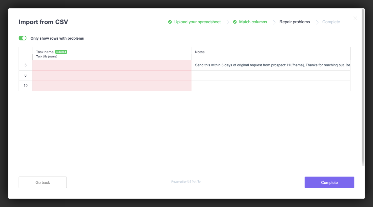
For large imports with hundreds or thousands of rows, the risk is that red highlights go unnoticed. A filter toggle that shows only rows with problems solves that. With this trick, users can zero in on every issue without needing to scroll the entire data set looking for color-coded flags.
Build or Buy?
Designing a data importer that is both attractive and genuinely usable is a difficult balancing act. It’s easy to ship something that works functionally but frustrates users with unclear error states, ambiguous validation, or an interface that feels disconnected from the rest of your product. Getting every detail right takes significant iteration and testing.
If you are not confident you can invest the time needed to make that experience truly frictionless, it may not be worth building from scratch. A poorly executed importer can quickly become a source of churn, no matter how polished the rest of your app is.
For teams in that position, a pre-built solution is a pragmatic alternative. Flatfile Concierge is a data importer that is designed to handle a broad set of import scenarios. It is built to look polished out of the box and to guide users through the process with clear feedback, reducing the risk of silent errors or mismatched fields. By outsourcing the heavy lifting of import infrastructure, your engineering team can stay focused on core product work, and your support team can spend less time walking users through troubleshooting imports.
Recommended Reading
- Embracing Introversion In UX
- How A Bottom-Up Design Approach Enhances Site Accessibility
- Sticky Headers And Full-Height Elements: A Tricky Combination
- How To Build Server-Side Rendered Svelte Apps With SvelteKit