
From WordPress Themes to Gatsby Themes
Gatsby themes represent a fundamentally different approach to theming than what WordPress developers are used to. While a WordPress theme is a mandatory presentation layer with strict separation from plugins, a Gatsby theme is a Node.js package that bundles functionality — it's technically a Gatsby plugin that owns a section, page, or part of a page on a site.
This distinction matters. In WordPress, themes handle only the front end; functionality belongs to plugins. Gatsby collapses that boundary: themes can source data, build pages, and handle UI. And unlike WordPress, Gatsby doesn't require a theme at all. You can build a site from a project structured like this:
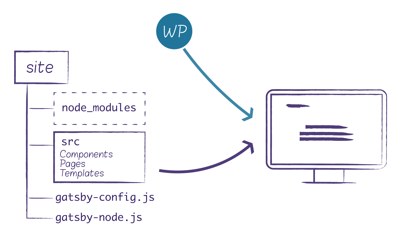
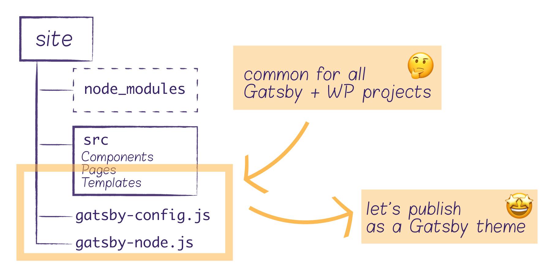
That approach works fine for a single site. But when you maintain multiple sites with shared logic, you'll want to abstract common functionality into reusable packages. Gatsby's theming system lets you bundle, publish, and install those shared packages across projects — and you can combine multiple themes within a single project.
Child Themes and Shadowing
For WordPress-powered Gatsby sites, common core functionality includes sourcing content and building pages dynamically. A logical architecture is a parent theme handling data sourcing and page generation, with child themes overriding presentation as needed.
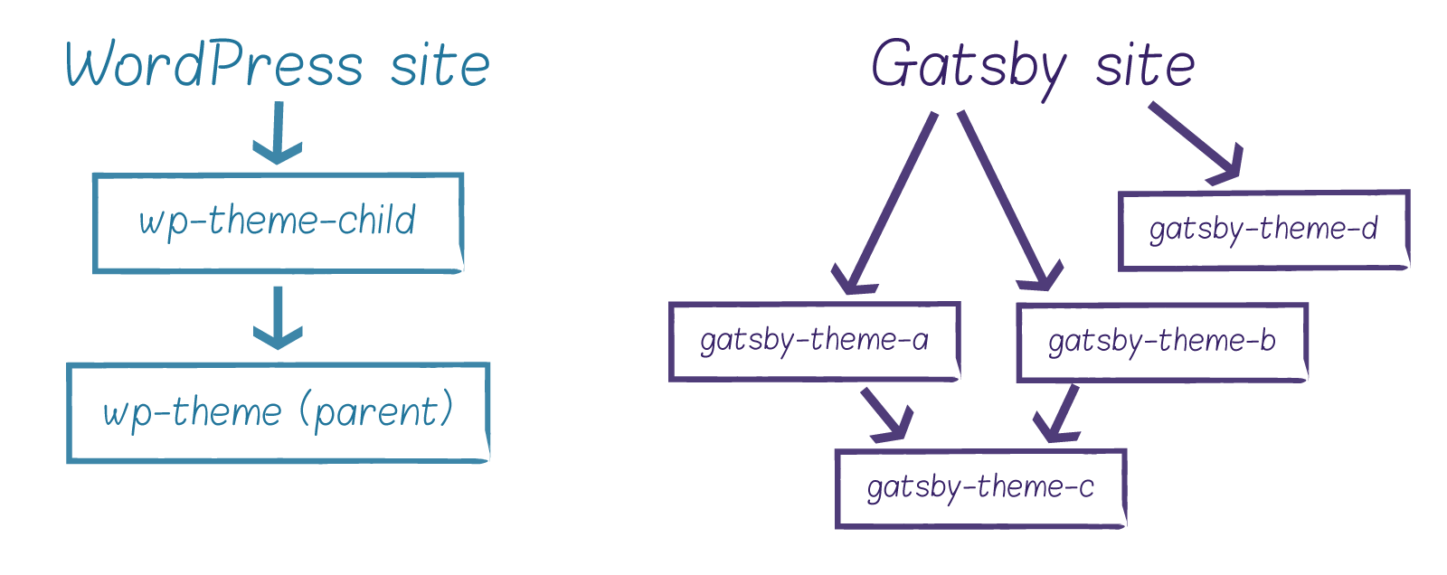
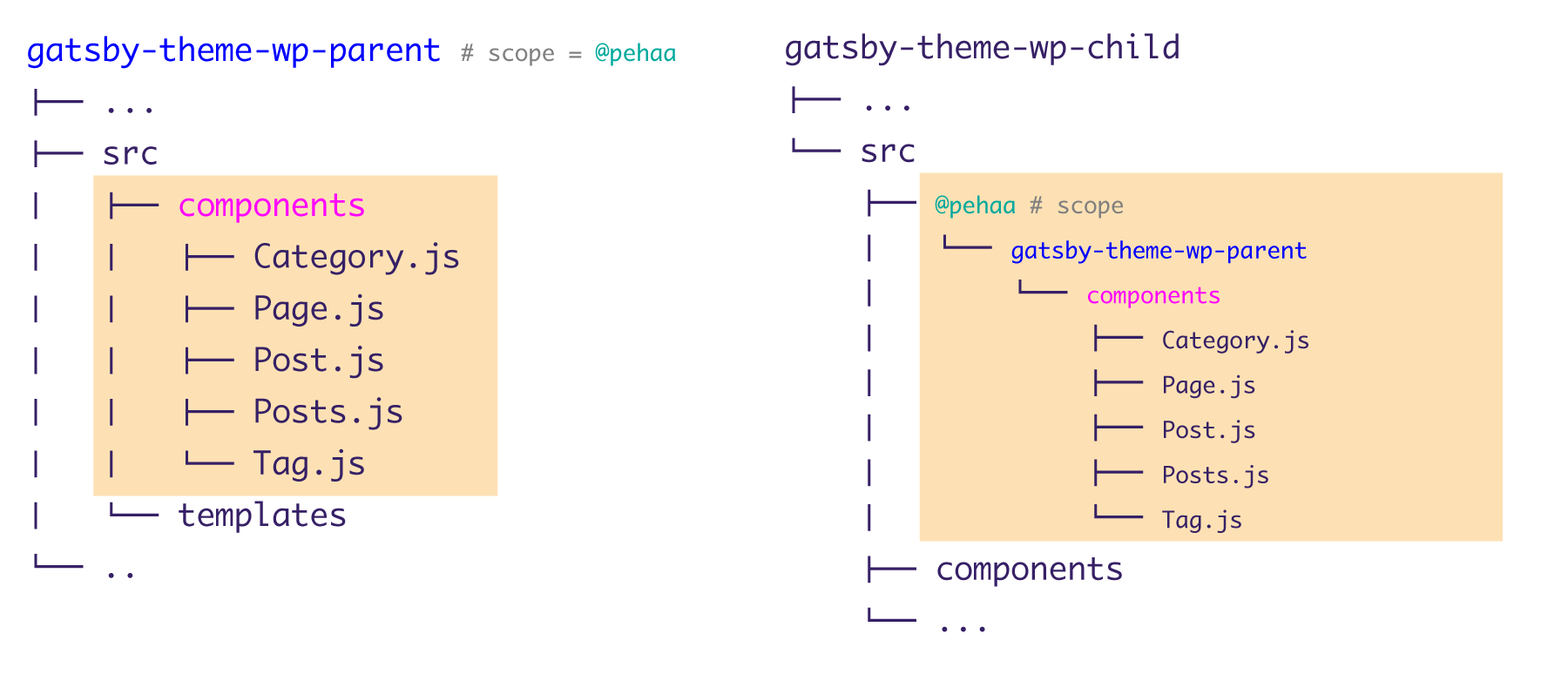
Gatsby child themes work similarly to WordPress child themes: they use a parent theme as their plugin and can override parent theme files via shadowing. Shadowing allows overriding files from the src directory in the webpack bundle, comparable to overriding WordPress templates in a child theme. It works at both the project level and the child theme level.
WordPress limits you to one parent and one child theme with no further chaining. Gatsby is far more flexible — you can build complex child-parent chains:
For our example setup, we'll build two themes: gatsby-theme-wp-parent and its child gatsby-theme-wp-child. This keeps things simple; production scenarios often decompose functionality into more granular themes.
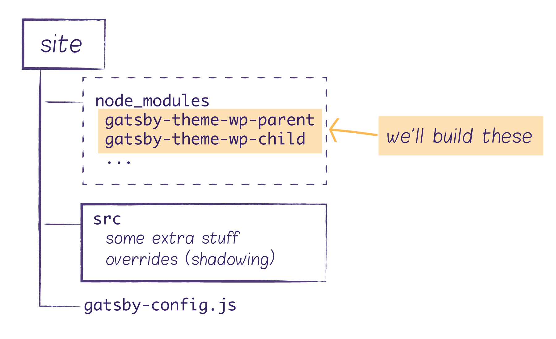
Development Setup with Yarn Workspaces
Since our themes are separate packages we need to develop in parallel, a monorepo with yarn workspaces is the right tool. This gives us a single lock file at the root level while linking local package versions together during development.
To set this up, ensure yarn is installed globally. At the monorepo root, create a package.json specifying the workspaces:
{
  "private": true,
  "workspaces": [
    "packages/*",
    "demo"
  ]
}
Each theme lives in a subfolder under packages with its own package.json and an empty index.js main entry:
mkdir packages/gatsby-theme-wp-parent
touch packages/gatsby-theme-wp-parent/package.json packages/gatsby-theme-wp-parent/index.js
Each theme's package.json:
{
  "name": "@pehaa/gatsby-theme-wp-parent",
  "version": "1.0.0",
  "license": "MIT",
  "main": "index.js"
}
We'll publish themes as scoped packages (the example uses the @pehaa scope). For scoped packages on the public npm registry, you must explicitly declare public access:
"publishConfig": {
  "access": "public"
}
Besides themes, we need a demo workspace—a "private" package not meant for publishing:
// demo/package.json
{
  "private": true,
  "name": "demo",
  "version": "1.0.0",
  "scripts": {
    "build": "gatsby build",
    "develop": "gatsby develop",
    "clean": "gatsby clean"
  }
}
With workspaces configured, run scripts from anywhere in the monorepo like so:
yarn workspace demo developMultiple demos are supported. If our monorepo contains several examples, the root package.json can define workspaces as:
"workspaces": [
  "packages/*",
  "examples/*"
]
Building the Themes
Both themes require react, react-dom, and gatsby as peer dependencies (-P), while the demo declares them as regular dependencies. The child theme also depends on the parent theme, and the demo depends on the child theme:
yarn workspace @pehaa/gatsby-theme-wp-parent add -P react react-dom gatsby
yarn workspace @pehaa/gatsby-theme-wp-child add -P react react-dom gatsby
yarn workspace @pehaa/gatsby-theme-wp-child add "@pehaa/gatsby-theme-wp-parent@*"
yarn workspace demo add react react-dom gatsby "@pehaa/gatsby-theme-wp-child@*"
Note that you can't reference @pehaa/gatsby-theme-wp-parent or @pehaa/gatsby-theme-wp-child without a version — you must use either @* or a version like @1.0.0. Without an explicit version, npm fetches from the registry instead of using your local workspace copy. When publishing with Lerna, all * references get automatically updated and kept in sync.
Parent Theme Responsibilities
The parent theme's dependencies:
yarn workspace @pehaa/gatsby-theme-wp-parent add gatsby-source-wordpress gatsby-plugin-image gatsby-plugin-sharp gatsby-transformer-sharp gatsby-awesome-paginationIts job is to load the gatsby-source-wordpress plugin plus three plugins for image processing and display, all declared in gatsby-config.js:
// gatsby-config.js
module.exports = (options) => {
  return {
    plugins: [
      'gatsby-plugin-sharp', // must have for gatsby
      'gatsby-transformer-sharp', // must have for gatsby images
      'gatsby-plugin-image',
      {
        resolve: 'gatsby-source-wordpress',
        options: {
          url: `${options.wordPressUrl}/graphql`,
        },
      },
    ],
  }
}
Beyond sourcing content, routes for WordPress content are built dynamically. We need routes for static pages, individual posts, the blog archive, and category and tags archives. Gatsby's createPages API, part of the Gatsby Node API, handles this. Here's the pattern for individual posts:
exports.createPages = async ({ graphql, actions }) => {
  const { createPage } = actions
  const postsQuery = await graphql(`
    query GET_POSTS {
      allWpPost(sort: {order: DESC, fields: date}) {
        edges {
          node {
            uri
            id
          }
        }
      }
    }
  `)
  const posts = postsQuery.data.allWpPost.edges
  posts.forEach(({ node }) => {
    createPage({
      path: node.uri,
      component: path.resolve('../src/templates/post-query.js'),
      context: {
        // Data passed to context is available in page queries as GraphQL variables
        // we need to add the post id here
        // so our blog post template knows which blog post it should display
        id: node.id
      },
    })
  })
}
The complete code is available in the GitHub repository. The implementation varies per page type—posts, pages, and archives (the latter with pagination)—but follows a consistent pattern:
- run an async
graphql"get items" query; - loop over results and call
createPagefor each item, passing:- the path,
component— the template file Gatsby uses to display the page,context— any data the template component needs.
The parent theme intentionally avoids UI concerns — it delegates presentation to components we'll shadow in the child theme:
// src/templates/post-query.js
import { graphql } from "gatsby"
import Post from "../components/Post"
export default Post

export const pageQuery = graphql`
  query ($id: String!) {
    wpPost(id: { eq: $id }) {
      # query all usefull data
    }
  }
`
The Post component receives data via props.data from the GraphQL page query defined in the template. By separating the component file from the template, we can shadow Post without touching the query.
// src/components/Post.js
import React from 'react'
const Post = (props) => {
  return <pre>{JSON.stringify(props.data, null, 2)}</pre>
}
export default Post
Child Theme Responsibilities
Adding the child theme's dependencies:
yarn workspace @pehaa/gatsby-theme-wp-child add @chakra-ui/gatsby-plugin @chakra-ui/react @emotion/react @emotion/styled @wordpress/block-library framer-motion gatsby-plugin-webfonts html-react-parserThe child theme handles all UI. To shadow a component, the file structure must mirror the parent's. For example, to override Post.js from gatsby-theme-wp-parent/src/components/Post.js, create a matching file at gatsby-theme-wp-child/src/@pehaa/gatsby-theme-wp-parent/components — the @pehaa folder matches the scoped package name of gatsby-theme-wp-parent:
Making Themes Configurable
Gatsby themes are configured like any other Gatsby plugin: through a gatsby-config.js file. In a layered theming setup, you end up with three config files — one on the demo level, one in the child theme, and one in the parent theme.
├── demo
│      └── gatsby-config.js
├── packages
│   ├── gatsby-theme-wp-child
│   │   └── gatsby-config.js
│   └── gatsby-theme-wp-parent
│       └── gatsby-config.js
└── ...
The demo-level config loads the child theme and passes options to it:
// demo/gatsby-config.js
module.exports = {
  plugins: [
    {
      resolve: '@pehaa/gatsby-theme-wp-child',
      options: {
        wordPressUrl: process.env.GATSBY_WP_URL,
        /* other options */
      },
    },
  ],
}
Because Gatsby plugins can export their config as a function, the options passed from the demo level are available inside the child theme's config. The child theme can then "forward" those options down to the parent theme:
// gatsby-theme-wp-child/gatsby-config.js
const defaultFonts  = ...
module.exports = (options) => {
  // destructure option to extract fonts
  const {fonts, ...rest} = options
  return {
    plugins: [
      {
        resolve: `@pehaa/gatsby-theme-wp-parent`,
        options: {
          // "forward" the options gatsby-theme-wp-child options to its parent theme
          ...rest
        }
      },
      '@chakra-ui/gatsby-plugin',
      {
        resolve: `gatsby-plugin-webfonts`,
        options: {
          fonts: fonts || defaultFonts
        },
      },
    ],
  }
}
// demo/gatsby-config.js
module.exports = {
plugins: [
{
resolve: `@pehaa/gatsby-theme-wp-child`,
options: {
wordPressUrl: process.env.GATSBY_WP_URL,
fonts: {
google: [{family: "Rubik"}],
},
},
},
],
}Since a theme is just a package, the end-user never edits its code directly. This means you should design your theme's options carefully, thinking through which settings need to be exposed. If your theme wraps a plugin that requires configuration, you'll need a path for forwarding those options from the project level down through each theme layer.
Consider the gatsby-source-wordpress plugin wrapped by the parent theme. It comes with a large set of options, some critical to the build, such as schema.requestConcurrency or schema.timeout. An end-user cannot open the parent theme's gatsby-config file to adjust these. The solution is to let the user pass gatsby-plugin-source-wordpress options from the project config:
// user's project gatsby-config.js
module.exports = {
  plugins: [
    {
      resolve: `@pehaa/gatsby-theme-wp-child`,
      options: {
        wordPressUrl: process.env.GATSBY_WP_URL,
        gatsbySourceWordPressOptions: {},
        // ...
      },
    },
  ],
}
Those options then travel through the child theme and parent theme down to the destination plugin:
// packages/gatsby-theme-wp-parent/gatsby-config.js
module.exports = (options) => {
  return {
    plugins: [
      // ...
      {
        resolve: `gatsby-plugin-source-wordpress`,
        options: {
          url: `${options.wordPressUrl}/graphql`,
          ...options.gatsbySourceWordPressOptions
        },
      },
    ],
  }
}
CSS Theming with Chakra UI
CSS-in-JS libraries with theming support pair well with Gatsby themes. In this setup, the child theme uses the Chakra UI framework, which brings its own definition of a "theme": a JavaScript object holding design tokens, style values, and scales. To avoid confusion with Gatsby themes, this is referred to as a CSS theme.
The @chakra-ui/gatsby-plugin package handles the integration by wrapping the application in ChakraProvider and exposing a src/theme.js file that can be shadowed. Defining your own theme is straightforward:
/* packages/gatsby-theme-wp-child/src/@chakra-ui/gatsby-plugin/theme.js */
import { extendTheme } from "@chakra-ui/react"
const theme = {
  fonts: {
    body: "Karma, sans-serif",
    heading: "Poppins, sans-serif",
  },
  styles: {
    global: {
      body: {
        color: "gray.700",
        fontSize: "xl",
      },
    },
  },
  components: {
    Button: {
      baseStyle: {
        borderRadius: "3xl",
      },
      defaultProps: {
        colorScheme: "red",
      },
    },
  },
}
export default extendTheme(theme)
Again, shadowing is the key mechanism here. The location of the theme.js file determines which layer it applies to, and the same file can be shadowed again at the project level for further customization.
Publishing Themed Packages
Once your themes are built, you need to publish them. For public code, the default destination is the public npm registry. To experiment locally before publishing publicly, you can try Verdaccio. The Gatsby WP Themes project uses Cloudsmith, which provides full npm registry support with free public repositories and paid private ones.
After creating a Cloudsmith account and repository, log in from the command line so your credentials are available to the registry tooling:
npm login --registry=https://npm.cloudsmith.io/organistion/repository_name/You'll be prompted for a username, password (which is your API key), and email.
For a multi-package git repository, Lerna simplifies the publishing workflow and works well alongside yarn workspaces. Install the CLI globally with npm install --global lerna, then initialize it:
lerna init --independentThis creates a lerna.json file at the monorepo root. You'll need to manually add "useWorkspaces": true and "npmClient": "yarn". If you're not publishing to the default public npm registry, set command.publish.registry as well.
{
  "npmClient": "yarn",
  "useWorkspaces": true,
  "version": "independent",
  "command": {
    "publish": {
      "registry": "https://cloudsmith.io/organisation/repository_name"
    }
  }
}
Running lerna publish releases only packages that have changed since the last release. By default, Lerna prompts for version changes; you can skip prompts with the --yes flag:
lerna publish [major|minor|patch|premajor|preminor|prepatch|prerelease] --yesLerna can also be wired to the Conventional Commits Specification, which will automatically determine version bumps and generate CHANGELOG.md files. These options let you adapt the publishing workflow to your team's conventions.
Consuming the Theme in a Project
Taking the user's perspective, stop the development server and create a fresh project, gatsby-wp-site, that installs gatsby-theme-wp-child as a dependency. Since the packages are @pehaa-scoped and published to Cloudsmith, the project needs an .npmrc file pointing at the private registry:
mkdir gatsby-wp-site
cd gatsby-wp-site
echo "@pehaa:registry=https://npm.cloudsmith.io/pehaa/gatsby-wp-theming/" >> .npmrc
yarn init -yp
yarn add react react-dom gatsby @pehaa/gatsby-theme-wp-child
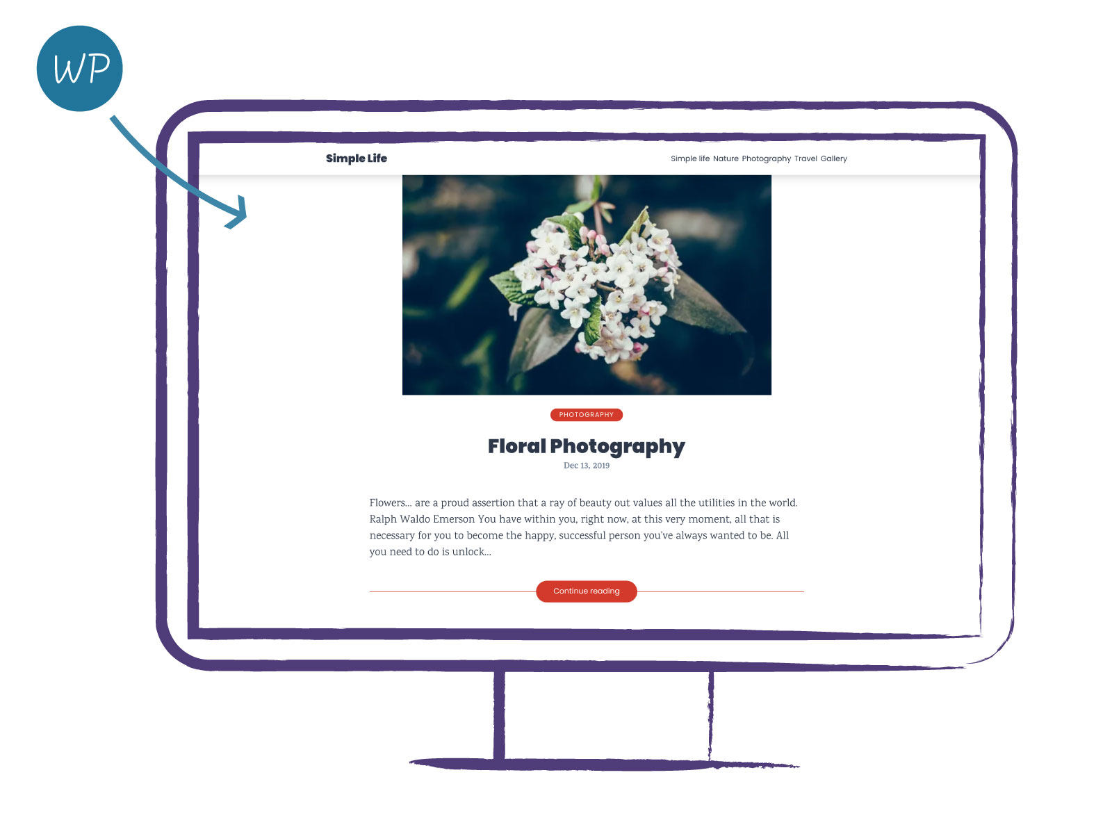
All that remains is a gatsby-config.js that loads the theme and supplies the WordPress URL. After that, gatsby build runs:
// gatsby-config.js
module.exports = {
  plugins: [
    {
      resolve: "@pehaa/gatsby-theme-wp-child",
      options: {
        wordPressUrl: "https://yourwordpress.website"
      }
    }
  ]
}
Runtime customization still goes through shadowing, and the project level takes precedence over any theme layer. To override the footer component, which lives at @pehaa/gatsby-theme-wp-child/src/components/Footer.js, create a matching structure in the project's src folder:
gatsby-wp-site
├── src
│   └── @pehaa
│       └── gatsby-theme-wp-child
│           └── components
│               └── Footer.js
Then provide the replacement footer component:
import React from "react"
import { useStaticQuery, graphql } from "gatsby"
import { Box } from "@chakra-ui/react"
const Footer = () => {
  const data = useStaticQuery(graphql`
    query {
      wp {
        generalSettings {
          title
        }
      }
    }
  `)
  return (
    <Box
      as="footer"
      p="6"
      fontSize="sm"
      bg="gray.700"
      color="white"
      mt="auto"
      textAlign="center"
    >
      <b>{data.wp.generalSettings.title}</b> - Built with WordPress and GatsbyJS
    </Box>
  )
}
export default Footer
CSS theme customization works the same way. Placing a file at src/@chakra-ui/gatsby-plugin/theme.js lets you define a fresh theme:
// src/@chakra-ui/gatsby-plugin/theme.js
import { extendTheme } from "@chakra-ui/react"
const theme = {
  /* ... */
}
export default extendTheme(theme)
That replaces the theme entirely, which usually isn't what you want. To extend the child theme's CSS theme instead, import it and pass it as an additional argument to extendTheme:
// src/@chakra-ui/gatsby-plugin/theme.js
import theme from "@pehaa/gatsby-theme-wp-child/src/@chakra-ui/gatsby-plugin/theme"
import { extendTheme } from "@chakra-ui/react"
const extendedTheme = {
  fonts: {
    body: "Rubik, sans-serif",
    heading: "Rubik, sans-serif",
  },
  /* ... */
}
export default extendTheme(extendedTheme, theme)
The result is visible in the live site deployed from the main branch of this GitHub repository.
Where Theming Fits
Gatsby themes let you spin up many sites while keeping the bulk of the code maintained centrally inside theme packages. Shadowing handles the inevitable per-site differences.
The two-theme parent-child structure works well in this example, but it's not the only approach. When UI customization needs to go especially deep, you might skip the child theme entirely and load the parent theme directly, shadowing what you need. In production, you'd likely split the UI into several child themes — one for comments, another for forms, a third for search — each reusable independently.


