

Reserving space and choosing a hero image
Before an image is visible, the area it will occupy has to exist. Otherwise the page content jumps around as images arrive — exactly what the Cumulative Layout Shift metric punishes. The site you're reading meets that threshold by sizing image containers up front with Tailwind's aspect-ratio utilities, so the browser knows the height-to-width proportion before any bytes of the image have been fetched.
<div class="aspect-[3/4] md:aspect-[3/2]">
	<img src="..." alt="..." class="..." />
</div>
Avoiding layout shift only gets you so far if you ship an oversized asset. The browser's own sizes and srcset attributes solve that: srcset lists alternate resolutions for a single image and sizes tells the browser which resolution fits given the current viewport width and layout. The MDN example below spells out the compromise — on wide screens show the 1600px version, on narrow ones a much smaller file:
<img
	src="/files/16870/new-york-skyline-wide.jpg"
	srcset="
		/files/16870/new-york-skyline-wide.jpg 3724w,
		/files/16869/new-york-skyline-4by3.jpg 1961w,
		/files/16871/new-york-skyline-tall.jpg 1060w
	"
	sizes="((min-width: 50em) and (max-width: 60em)) 50em,
              ((min-width: 30em) and (max-width: 50em)) 30em,
              (max-width: 30em) 20em"
/>
If the browser ignores both attributes it silently falls back to src — the picture still renders, just without the bandwidth savings. On unsplash.com and this site alike, the two attributes are used heavily to serve responsive images. But without a service like Cloudinary doing the heavy lifting, producing that fleet of varied-size files would be a manual chore. The markup for a blog post image here is generated from a helper that builds Cloudinary URLs in a type-safe way:
<img
	title="Photo by Kari Shea"
	class="z-10 rounded-lg object-cover object-center transition-opacity"
	alt="MacBook Pro on top of brown table"
	src="https://res.cloudinary.com/kentcdodds-com/image/upload/w_1517,q_auto,f_auto,b_rgb:e6e9ee/kentcdodds.com/content/blog/how-i-built-a-modern-website-in-2021/banner_iplhop"
	srcset="
		https://res.cloudinary.com/kentcdodds-com/image/upload/w_280,q_auto,f_auto,b_rgb:e6e9ee/kentcdodds.com/content/blog/how-i-built-a-modern-website-in-2021/banner_iplhop   280w,
		https://res.cloudinary.com/kentcdodds-com/image/upload/w_560,q_auto,f_auto,b_rgb:e6e9ee/kentcdodds.com/content/blog/how-i-built-a-modern-website-in-2021/banner_iplhop   560w,
		https://res.cloudinary.com/kentcdodds-com/image/upload/w_840,q_auto,f_auto,b_rgb:e6e9ee/kentcdodds.com/content/blog/how-i-built-a-modern-website-in-2021/banner_iplhop   840w,
		https://res.cloudinary.com/kentcdodds-com/image/upload/w_1100,q_auto,f_auto,b_rgb:e6e9ee/kentcdodds.com/content/blog/how-i-built-a-modern-website-in-2021/banner_iplhop 1100w,
		https://res.cloudinary.com/kentcdodds-com/image/upload/w_1650,q_auto,f_auto,b_rgb:e6e9ee/kentcdodds.com/content/blog/how-i-built-a-modern-website-in-2021/banner_iplhop 1650w,
		https://res.cloudinary.com/kentcdodds-com/image/upload/w_2500,q_auto,f_auto,b_rgb:e6e9ee/kentcdodds.com/content/blog/how-i-built-a-modern-website-in-2021/banner_iplhop 2500w,
		https://res.cloudinary.com/kentcdodds-com/image/upload/w_2100,q_auto,f_auto,b_rgb:e6e9ee/kentcdodds.com/content/blog/how-i-built-a-modern-website-in-2021/banner_iplhop 2100w,
		https://res.cloudinary.com/kentcdodds-com/image/upload/w_3100,q_auto,f_auto,b_rgb:e6e9ee/kentcdodds.com/content/blog/how-i-built-a-modern-website-in-2021/banner_iplhop 3100w
	"
	sizes="(max-width:1023px) 80vw, (min-width:1024px) and (max-width:1620px) 67vw, 1100px"
/>
function getImgProps(
	imageBuilder: ImageBuilder,
	{
		widths,
		sizes,
		transformations,
	}: {
		widths: Array<number>
		sizes: Array<string>
		transformations?: TransformerOption
	},
) {
	const averageSize = Math.ceil(widths.reduce((a, s) => a + s) / widths.length)

	return {
		alt: imageBuilder.alt,
		src: imageBuilder({
			quality: 'auto',
			format: 'auto',
			...transformations,
			resize: { width: averageSize, ...transformations?.resize },
		}),
		srcSet: widths
			.map((width) =>
				[
					imageBuilder({
						quality: 'auto',
						format: 'auto',
						...transformations,
						resize: { width, ...transformations?.resize },
					}),
					`${width}w`,
				].join(' '),
			)
			.join(', '),
		sizes: sizes.join(', '),
	}
}
<img
	key={frontmatter.bannerCloudinaryId}
	title={frontmatter.bannerCredit}
	{...getImgProps(
		getImageBuilder(
			frontmatter.bannerCloudinaryId,
			getBannerAltProp(frontmatter),
		),
		{
			className: 'rounded-lg object-cover object-center',
			widths: [280, 560, 840, 1100, 1650, 2500, 2100, 3100],
			sizes: [
				'(max-width:1023px) 80vw',
				'(min-width:1024px) and (max-width:1620px) 67vw',
				'1100px',
			],
			transformations: {
				background: 'rgb:e6e9ee',
			},
		},
	)}
/>
Placeholder strategies, from solid color to blurhash
A blank rectangle while a photo loads is a poor experience. Medium's early approach — a server-rendered, SVG-drawn approximation of the target image — was an early example, and Unsplash layers three steps: first a server-rendered solid background matching the image's dominant color, then a JavaScript-drawn canvas blur, and finally the image itself. The final image sits on top of the canvas, which sits on the color.
The beauty of the blurhash-style canvas approach is just how little data the intermediate step needs. This hash — the whole representation of a blurry full-size photo:
LGFFaXYk^6#M@-5c,1J5@[or[Q6.
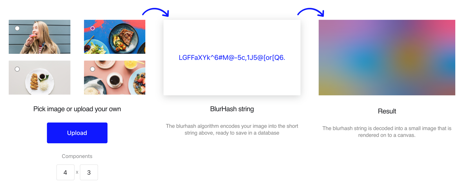
That minimal footprint is worth serious consideration on image-heavy sites with a lot of placeholders, where the size of the client library that decodes such hashes pays for itself quickly.
Why a server-rendered blur?
The version of this site didn't follow Unsplash's layered approach. Loading the page's main photos that way would demand first painting a solid-colored div, later overlaying it with a canvas, and finally the real picture — extra stages that are only noticeable because they appear in that order. More importantly, the solid primary color step was visually unappealing here. A simpler idea felt right: skip straight to a blurred trailer of the final photo, served from the server as a base64 URL inside an img. No canvas is involved; no JavaScript is needed merely to show the placeholder.
Cloudinary's image transformations make the low-res stand-in trivial to create. Downscaling to width 100 and applying a slight blur factor produces a tiny fetch which, base64-encoded, forms a compact standalone image:
https://res.cloudinary.com/kentcdodds-com/image/upload/w_100,q_auto,f_webp,e_blur:1000/kentcdodds.com/content/blog/how-i-built-a-modern-website-in-2021/banner_iplhopdata:image/webp;base64,UklGRhQBAABXRUJQVlA4IAgBAAAQDQCdASpkAEMAPrFGmko7qyWhsls9U3AWCWkGcA01nlwbK5buwWRoA3koD7+5vLBXAtOMrneG2GT90JyrLz+2XeotIAEq5PL4F0N1qTRIJ7LnMa5Zcre8UaDTMRtFt14eXNoGYkhNSt0REMN2PN4FwAD+7s4jHeyE9BXykzZMxIuwC4FSp408GYxRjoczsMvwZlqrnzr4cuA6X6MspvaoVHUro1XNU1SNxrLKLjhZrJ3GmlyoorlW1L532OP9tbhOeQgFiDwE81g+CH4d16xfOjEGrpus0wYxdunoI7Nokc5fnyoAw8pKJEq6cW3Yp4rqZw9fosV61qnAN+ViAH+WOzoqC6R90AA=That string is bigger than a blurhash plus the JavaScript to decode it. And with every page bottom holding image recommendations that try to get your attention, adopting blurhash would probably earn its keep. Yet the desire to avoid the plain color background, plus a philosophical preference for what renders before the main image loads, tipped the scale back toward the old-school data-URL route.
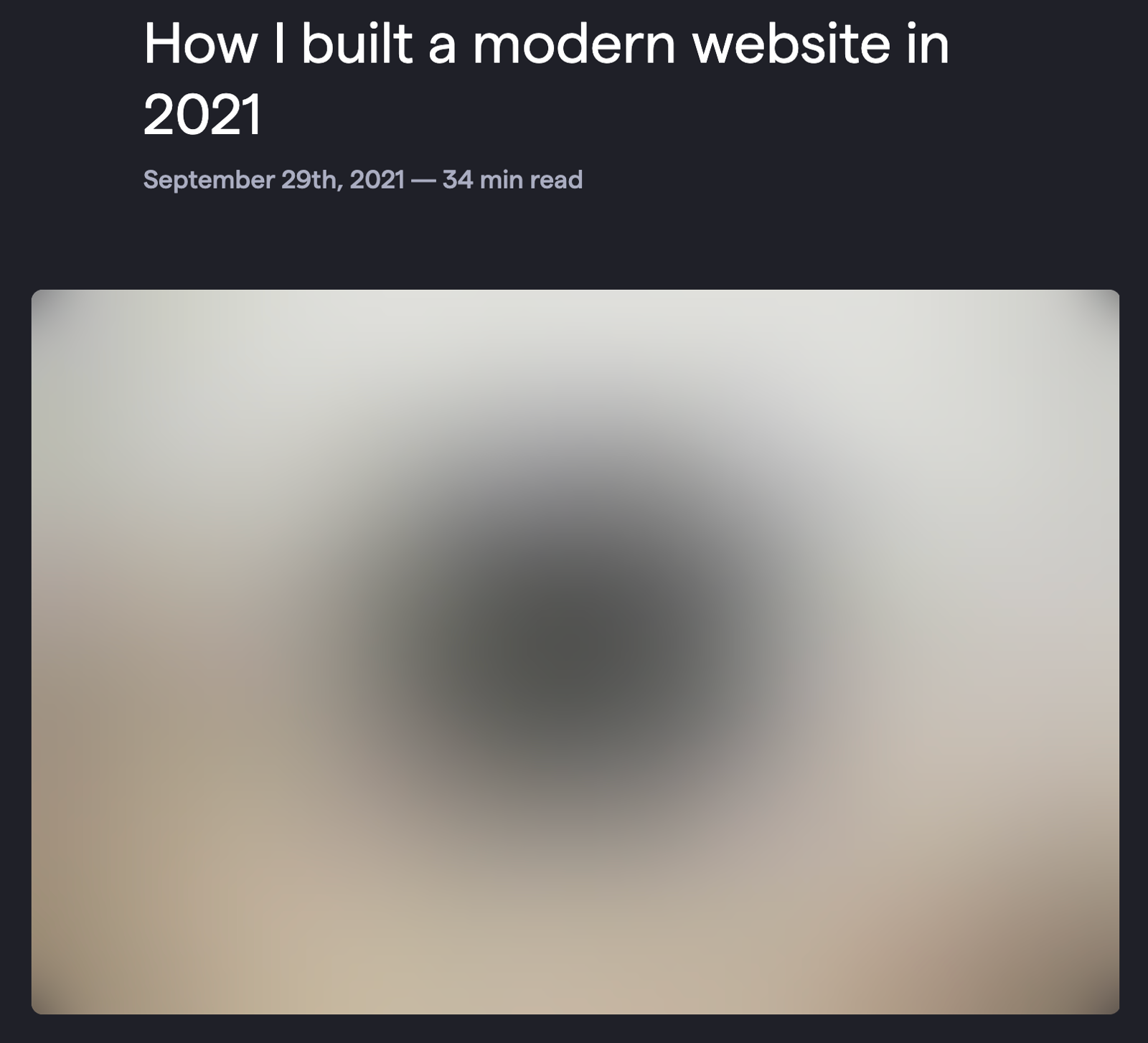
That route introduced a problem: stretch a few-pixel-tall placeholder to the hero's actual size and the result is unspeakably blocky. The browser itself came to the rescue without a line of extra JavaScript — just in time with an SVG filter that applies a perceivable blur on the upscaled image. The blur conveniently softens any harsh pixel edges created by the aggressive scaling. This is applied around the placeholder rather than adding an extra element.

<div class="backdrop-blur-xl"></div>
backdrop-filter: blur(24px);
Fade-in on load, and a copy of the image
With a blurred stand-in in place, the job now was to smooth the handoff from placeholder to final photo. The mechanics of that are in a dedicated React component called BlurrableImage. Below is the JavaScript that affects how it behaves and how it's used from a blog page:
function BlogScreen() {
	// ...
	return (
		// ...
		<div className="col-span-full mt-10 lg:col-span-10 lg:col-start-2 lg:mt-16">
			{frontmatter.bannerCloudinaryId ? (
				<BlurrableImage
					key={frontmatter.bannerCloudinaryId}
					blurDataUrl={frontmatter.bannerBlurDataUrl}
					className="aspect-[3/4] md:aspect-[3/2]"
					img={
						<img
							key={frontmatter.bannerCloudinaryId}
							title={frontmatter.bannerCredit}
							{...getImgProps(
								getImageBuilder(
									frontmatter.bannerCloudinaryId,
									frontmatter.bannerAlt ??
										frontmatter.bannerCredit ??
										frontmatter.title ??
										'Post banner',
								),
								{
									className: 'rounded-lg object-cover object-center',
									widths: [280, 560, 840, 1100, 1650, 2500, 2100, 3100],
									sizes: [
										'(max-width:1023px) 80vw',
										'(min-width:1024px) and (max-width:1620px) 67vw',
										'1100px',
									],
									transformations: {
										background: 'rgb:e6e9ee',
									},
								},
							)}
						/>
					}
				/>
			) : null}
		</div>
		// ...
	)
	// ...
}
import * as React from 'react'
import { clsx } from 'clsx'
import { useSSRLayoutEffect } from '#app/utils/misc'

export function BlurrableImage({
	img,
	blurDataUrl,
	...rest
}: {
	img: React.ReactElement<React.ImgHTMLAttributes<HTMLImageElement>>
	blurDataUrl?: string
} & React.HTMLAttributes<HTMLDivElement>) {
	const [visible, setVisible] = React.useState(false)
	const jsImgElRef = React.useRef<HTMLImageElement>(null)

	React.useEffect(() => {
		if (!jsImgElRef.current) return
		if (jsImgElRef.current.complete) return

		let current = true
		jsImgElRef.current.addEventListener('load', () => {
			if (!jsImgElRef.current || !current) return
			setTimeout(() => {
				setVisible(true)
			}, 0)
		})

		return () => {
			current = false
		}
	}, [])

	const jsImgEl = React.cloneElement(img, {
		ref: jsImgElRef,
		className: clsx(img.props.className, 'transition-opacity', {
			'opacity-0': !visible,
		}),
	})

	return (
		<div {...rest}>
			{blurDataUrl ? (
				<>
					<img
						src={blurDataUrl}
						className={img.props.className}
						alt={img.props.alt}
					/>
					<div className={clsx(img.props.className, 'backdrop-blur-xl')} />
				</>
			) : null}
			{jsImgEl}
			<noscript>{img}</noscript>
		</div>
	)
}
The component takes only three kinds of props: an img element, which points to the high-resolution source; a blurDataUrl, which handles the loading-state look; and any extra props are passed on to a wrapping div — useful for sticking the aspect-ratio key onto the container itself.
Rendering a trio is deliberate: an invisible img containing the blurred fill is below a copy of the main photo, which the actual on-page image swaps in once loaded. By handing the browser the placeholder with a class to begin invisible, its shadow image fires an onLoad to fade in the visual eventually. The absolutely positioned components keep both the blurred and high-resolution assets tied to the same layout box. None of it requires understanding DOM juggling in detail. What matters is the fade that results and the lack of layout movement.
Browsers that don't interpret the extra parts still get the real image from the initial element through a separate <noscript> tag. Very few visitors disable scripting, but the support costs one line and is worth having.
That approach eventually caught up with the rest of the stack in 2023. The image element in documentation used a copy of the real image to layer CSS for fading. A version existed where the second copy had a subtle one-frame flaw at first paint. Rendering the content and handling animation so deliberately means these edge cases surface — but that’s the price for a demo-worthy site performance.
Cutting the blur delay
With the current implementation, the full image won't fade in until the JavaScript bundle has loaded. If the image lives in the browser cache, visitors still catch a flash of the blurred placeholder before the script parses and runs. That lag is unnecessary.
The obvious fix is an inline onload attribute on the image element: inline JavaScript executes the moment the image finishes loading, with no script fetch or compile step in between. For this use case it's a rare but reasonable exception to the "no inline handlers" rule:
// ...
const jsImgEl = React.cloneElement(img, {
	ref: jsImgElRef,
	onload: "this.classList.remove('opacity-0')",
	className: clsx(img.props.className, 'transition-opacity', {
		'opacity-0': !visible,
	}),
})
// ...
React, however, won't accept that. It insists on the camelCase onLoad prop with a function reference, not an inline string of JavaScript. Working around that restriction took some extra plumbing; the details live in this commit. The result:

I unironically deployed an inline event handler in HTML in a production app. I used it to avoid an unnecessary blur. So you still get the nice blur loading experience when the image isn't downloaded yet, but if it's already in your browser cache, you don't get a flash of blur! twitter.com/kentcdodds/status/1630362305409216512
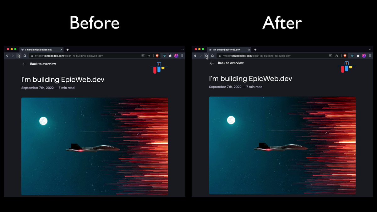
The saved round-trip from cache more than justifies the eyebrow-raising technique.
Putting it together
The complete loading experience rests on four pieces:
- No layout shift — Tailwind's aspect-ratio plugin reserves the correct space before the image arrives.
- Right-sized images — combining
sizesandsrcseton the<img />with Cloudinary transforms serves only the pixels needed. - A blurred preview — a base64-encoded, heavily downscaled version of the image, generated by Cloudinary and cached for performance.
- Server-rendered reveal — the placeholder is inlined in the HTML along with the script that swaps in the full image when it finishes loading.
Performance isn't the only variable in user experience; how a page feels while assets arrive matters just as much. These trade-offs — a custom inline handler, a base64 payload, a slightly more complex render path — are intentional, favoring the perceived speed of browsing over strict purity. It may not be universal, but it delivers exactly the experience intended: blur only while a download is genuinely pending, with zero flicker when it's not.
One project worth tracking: unpic-img, a framework-agnostic attempt at the same problem with server-rendered placeholder support built in.


