
Primer, GitHub's design system, provides the buttons, banners and breadcrumbs that make up much of the product's interface. As the number of components on individual pages grew sharply in 2023, the existing CSS-in-JS solution became a liability in three ways: initial page loads slowed because styles were initialized on the client, server-side rendering suffered as style collection moved to the server, and style updates grew harder to contain as page component counts rose.
The team's conclusion was that the problem had to be solved at its source, with an approach that eliminated both the client and server costs. Any replacement also had to migrate GitHub without breaking it.
CSS Modules as the target format
The solution chosen was CSS Modules. It preserved what the team valued: native CSS authoring with some of the colocation and encapsulation that CSS-in-JS had provided. Styles are written in a CSS file next to the component's JavaScript source, class names are local by default — which avoids the collisions that global selectors invite — and there is no client or server runtime behavior, since styles roll up into stylesheets delivered with the page's HTML.
The catch was scope. Converting meant changing every Primer component and every GitHub component authored with the old technique. A design system is an effective vehicle for that kind of change at scale, but the migration still had to be incremental: shipped components could not break GitHub, and the CSS-in-JS tooling had to keep working for the GitHub components still relying on it.
Feature flags and per-component rollout
The team's per-component procedure was:
- Add a file translating the existing styles to CSS Modules.
- Place the component behind a feature flag toggling between old and new styles.
- Verify with existing visual regression tests that snapshots matched between the CSS-in-JS and CSS Modules versions.
- Roll the flag out progressively: the team first, then GitHub staff, then all GitHub users.
That loop surfaced problems early and, because feature flags were in play, gave the team clean measurements of the performance effect. By December 2024 every Primer component had been migrated. The results included 55% less time to server-side render a page and 25% less time for components on a page to initialize.
With those numbers in hand, the natural questions were whether the same conversions would pay off in other parts of GitHub, and how soon CSS-in-JS could be dropped company-wide.
The sx prop and the duality problem
The sx prop was the sticking point. It was the standard way to style and customize Primer components, accepting an inline object that could change nearly anything about a component. It carried both the strengths of CSS-in-JS — strong TypeScript integration with the design tokens, styles colocated with the component — and its weaknesses: the dynamic inline objects were expensive at runtime, and the cost scaled with the number of components on a page using sx. Reducing sx usage became the first leg of the journey away from CSS-in-JS and set up eventual removal of the whole stack.
The complication was that while the design system was already off styled-components, a large part of the GitHub codebase was not. Years of sx as the de facto styling standard left thousands of props to migrate before GitHub could move to the @primer/react version that did not depend on styled-components.
The bridge was a transitive library called @primer/styled-react, which provided wrapper components allowing sx to be passed into the newly migrated components. UI code importing through @primer/styled-react kept working, and code that did not need sx could import from @primer/react directly and take the performance gains.
Driving sx to zero
The next phase ran package by package: translate all sx usage into equivalent CSS module files (including the CSS variable cross-referencing described in the migration guidance), swap @primer/styled-react imports for @primer/react imports, test in pre-production, deploy. Around this time, the styled-components project announced maintenance mode, which the team read as confirmation of the direction.
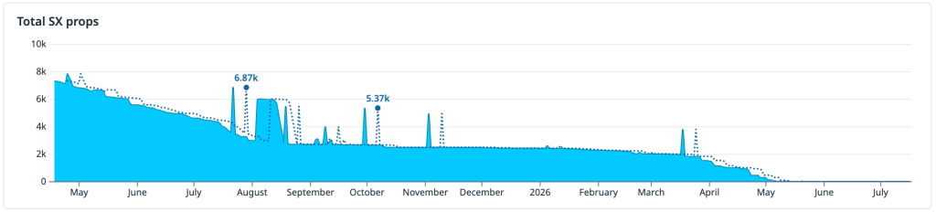
Work began in April 2025 with a peak of roughly 7,760 sx props outstanding, with completion not expected until May 2026. Ian Sanders built a VS Code extension for per-prop migration, and a similar internal codemod handled whole files. Together these made the work largely automated, though manual oversight and validation were still required.
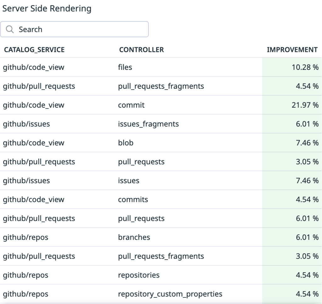
A rotating group of 8 engineers migrated 6,419 props over 6 months, measuring server-side rendering gains from 1% up to 22% on some pages.
Meanwhile, Copilot's capabilities expanded quickly: Copilot coding agent and Copilot code review shipped while the migration was still in progress. When the work resumed in April 2026, the approach had changed — 895 remaining sx props went to 0 in three weeks with two engineers and heavy use of Copilot coding agents.
Theming was the last dependency
Finishing sx did not mean styled-components could simply be deleted. GitHub supports seven themes, each with a high contrast variant, and all of them were enabled through styled-components. Theming had to be decoupled first.
The theming variables themselves were never the problem — they had always been defined in CSS via @primer/css, and non-styled theming had been planned for when @primer/react was migrated in late 2025. What remained was the JavaScript usage and utilities that styled-components provided. That removal followed the established pattern: migrate, roll out gradually, feature flag everything. Two months and a handful of hiccups later, the dependency was gone — feature flagged as well.
Outcome
As of June 2026, GitHub runs on 100% CSS Modules. The migration removed sx, styled-components and styled-system from dotcom without breaking the product, and the process — per-component conversion, feature flags, visual regression testing, progressive rollout — is what made it possible to stress test in production, catch errors and correct course before problems reached everyone. More than a stylesheet swap, the effort re-platformed how GitHub styles, themes and ships its UI at scale.



