
Horizontal alignment got easier with column grids; responsive breakpoints solved one class of layout problem and created another, particularly when elements wrap. A recurring case is a bar containing two button groups, each wrapped in a <fieldset> with a <legend>. On a wide viewport the groups sit side by side cleanly.

A straightforward CSS layout puts them on one row and breaks the row into two at a mobile breakpoint:
.accessibility-tools fieldset {
  width: 48%;
  float: left;
  margin-right: 1%;
}


/* Mobile */
@media only screen and (max-width: 480px) {
  .accessibility-tools fieldset {
    width: 100%;
  }
}
On a small screen the result is:

The failure is vertical alignment: the two fieldsets stack, and the button edges no longer line up. Fixed pixel solutions can force an alignment at each breakpoint using magic numbers.
/* Mobile */
@media only screen and (max-width: 480px) {
  legend {
    width: 160px;
  }
  button {
    width: 130px;
  }
}
That works, but it is rigid: the values are pinned to specific content and rely on media queries. The goal is a layout where every button and label responds to (1) the space available, (2) its own content, and (3) the elements around it.
Why breakpoints and flexbox fall short
Media queries cannot account for the space immediately around the elements being realigned — a point made visually in Heydon Pickering's "The Flexbox holy albatross." What is wanted is for the second <fieldset> to wrap below the first only at the moment the two no longer fit neatly on one row.
Flexbox addresses exactly that responsiveness: components flex into extra space and shrink into tighter space. With flex-wrap: wrap, the fieldsets move onto a second line as soon as they no longer fit.
.wrapper--accessibility-tools {
  display: flex;
  flex-wrap: wrap;
}
The property takes three values: nowrap (the default, keeping items on one line), wrap, and wrap-reverse (which wraps in the opposite direction, so in left-to-right layouts wrapped elements appear above the previous row). Flexbox relaxes the rigidity, but a min-width is still needed to fix the vertical alignment — close, but not sufficient.
Grid without subgrid
Grid is the first CSS module designed specifically for layout, and it is not a flexbox replacement; the two generally work together. Like flexbox, grid lets each <fieldset> take as much or as little space as it needs. The auto-fill and auto-fit keywords inside repeat() let items flow onto multiple lines without media queries; the subtle difference between them is covered by Sara Soueidan. With auto-fit:
.wrapper--accessibility-tools {
  display: grid;
  grid-template-columns: repeat(auto-fit, 450px);
  grid-gap: 10px;
}
As in the flexbox case, an absolute width for the label is still required to align the fieldsets as they stack.
Flexible tracks
Grid also sizes from content. Besides percentages, relative units and pixels, it accepts the fractional unit fr, where 1fr takes one part of the available space, 2fr two parts, and so on. Two equal columns:
.wrapper--accessibility-tools {
  display: grid;
  grid-template-columns: 1fr 1fr;
  grid-gap: 10px;
}
The minmax() function creates tracks that flex to available space but never shrink below a specified size.
.wrapper--accessibility-tools {
  display: grid;
  grid-template-columns: minmax(auto, max-content) minmax(auto, max-content);
  grid-gap: 10px;
}
Both demos eliminate absolute values and device-specific CSS, but the result is still imperfect: the two grids now respond at different points.

The reason is that display: grid makes only direct children grid items, so the intrinsic sizing units used relate only to elements within the same grid.
Subgrid: aligning across sibling grids
The buttons and labels need to react to elements in sibling grid containers. CSS Grid Level 2's subgrid allows nested child grids to use the parent grid's tracks; previously, nested grids were entirely independent of one another. This eases patterns that were hard before — most prominently the "card" pattern. Without subgrid, each card sizes its own tracks and cannot respond to a height change in another card. Using an example from Rachel Andrew, a simple group of cards:

With subgrid the cards use rows defined on the parent, so they react to content in surrounding cards.

Each card still spans three row tracks, but those tracks are now defined by the parent grid, so every card occupies the same vertical space.
For the fieldset bar the need is not rows but columns sized from content in sibling grids. First, make the parent grid hold the two <fieldset> elements, as in the earlier auto-fit demo:
.wrapper--accessibility-tools {
  display: grid;
  grid-template-columns: repeat(auto-fill, minmax(150px, 1fr));
  grid-gap: 10px;
}
Then position each subgrid on the parent grid.
.sub-grid {
  display: grid;
  grid-column: span 3;
  grid-template-columns: subgrid;
  align-items: center;
}
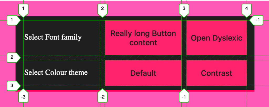
Every label and button is now aligned to parent tracks and stays consistent, each with equal width based on the available space. If the nested grids cannot both fit on one line, the second wraps to a new line.

Here the two nested grid items align exactly, and the layout flexes: a longer title on one button makes the other elements respond in turn.

Support and a wrapper workaround
At the time of writing, subgrid is supported only in Firefox 71+. Signals from other browsers are positive, and CSS feature queries can supply fallback styling for Chrome and Edge.
| Chrome | Firefox | IE | Edge | Safari |
|---|---|---|---|---|
| 117 | 71 | No | 117 | 16.0 |
| Android Chrome | Android Firefox | Android | iOS Safari |
|---|---|---|---|
| 157 | 160 | 157 | 16.0 |
Note that these demos include an extra wrapper around the fieldsets. It exists to work around a bug with form elements and grid and flexbox:
<fieldset class="accessibility-tools__colour-theme">
  <div class="wrapper"></div>
</fieldset>
The layout CSS goes on the wrapper, with the fieldset set to display: contents.
.accessibility-tools fieldset {
  display: contents;
  border: 0;
} 


