Why Those Extra Taps Keep Happening
When users need to tap a button, link or icon two or three times before anything happens, it is rarely a performance problem. More often than not, the interactive element itself is simply too small, or its tappable area does not match what the user sees. The result is a predictable string of frustrated taps and clicks.
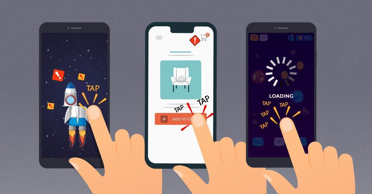
The good news is that the fix is mostly a matter of sizing and spacing. The interaction cost of an undersized target is easy to eliminate once you know the constraints — and they differ depending on where the element sits on the screen.
Sizing By Screen Position, Not Just By Pixels
A common recommendation is to make touch targets 44×44px. That number is misleading without context because CSS pixels, or device-independent pixels (dips), are scaled against physical display resolution. What matters is the element’s footprint in dips, not raw screen pixels.

Precision is not uniform across the screen. Users are most accurate near the center of the display and least accurate along the top and bottom edges. According to Steven Hoober’s research for Touch Design For Mobile Interfaces, comfortable minimums break down roughly as:
- Top of screen: around 11mm, or 31pt / 42px
- Bottom of screen: around 12mm, or 34pt / 46px
- Center of screen: around 7mm, or 20pt / 27px
Those measurements include both the visible element and any padding around it. Hoober’s conversion tables help map points to CSS pixels, Android DP/SP units, iOS points and Windows DIP/px so the guidance applies across platforms.
Where The 44×44 Guideline Applies
The WCAG 2.1 AAA requirements state that all targets should measure at least 44×44px, with one important exception: targets placed inline within a sentence or block of text. For those, 27px is a reasonable floor, but larger is always better.
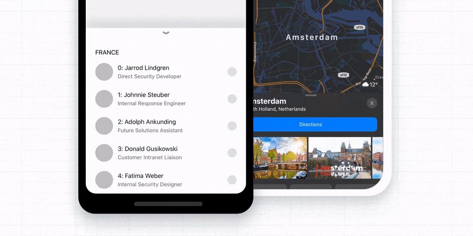
The placement of the element should inform how aggressively you pad it. Sticky headers and bottom navigation sit in the least precise zones, so they deserve generous hit areas of roughly 44–46px, if not more. Links that appear mid-scroll within a body of text will not cause the same level of frustration even at smaller sizes.

That positional constraint is also why mobile bottom tabs rarely accommodate more than five items. Pushing past that limit forces targets into risky territory; a slide-up bottom sheet is often a better pattern than squeezing a sixth icon into the tab bar.
Rethink Hover Actions In Tables
Data tables that reveal icon actions only on row hover are a common source of mistakes. Users navigating horizontally toward those icons frequently land on the wrong row, and a misclick often means starting the whole selection process over.

Testing usually shows that a persistent “Actions” button or a split button on each row does better. The button opens on a single tap or click and does not close automatically. It takes up more room, but it gives users a clear, deliberate point of control inside a dense interface.

Help With Precise Manipulations
Very fine-grained operations, like rotating an image or selecting a sub-region of a larger object, can rely on pinch-to-zoom alone, but that becomes tedious quickly. A better approach is to attach handles to the selection area so users can nudge and resize it directly. Tylko’s shelf configurator, for example, lets mobile users drag a handle to reposition a selection without forcing a zoom step first.

Sometimes, An Extra Tap Is The Right Trade-Off
There are cases where targets simply cannot be large — a row of color swatches in an eCommerce product page is a good example. Forcing each swatch to 27×27px may not be feasible. Rather than accept accidental taps, let a tap open a dedicated selection view with larger choices.

The interaction takes one extra step, but it is far more accurate, and accuracy tends to matter more than raw speed in that kind of choice.
Make The Whole Element Clickable
The easiest win is to avoid leaving dead space inside a control. Wrap entire elements — including their padding — in the clickable area, and aim for that 42–46px range. Accordions and navigation should be full-width or full-height bars wherever possible instead of icon-size targets.


The same principle applies to smaller components elsewhere in the interface: always maximize the area that responds to input.
From Practical Minimums To Safe Defaults
If you want a quick rule to work with:
- 27×27px is the de-facto floor for small links and icons inside content regions.
- 44×44px is the minimum for elements pinned to the top or bottom of the viewport.
To be safer still, the recommendation is to bump those figures up to 30×30px and 48×48px respectively. Combine that with generous full-width or full-height click targets, and most common causes of rage taps disappear entirely.
For further reference, the WCAG target-size guidance and the resources below provide deeper dives into the research and implementation details behind these numbers.
Further Reading
- “Accessible Target Sizes,” Amy Lupe
- “Touch Targets on Touchscreens,” Aurora Hailey
- “Enhancing the Clickable Area,” Ahmad Shadeed
- “WCAG 2.5.5 for Better Target Sizes,” Todd Libby
- “Fitt’s Law In The Touch Era,” Steven Hoober