

Designing For Dense, Enterprise-Style Data
Enterprise tables push responsive design to its limits. These tables pack many columns of complex data, and users rely on searching and filtering to find what they need. While the stacking, accordion, and scrolling patterns from earlier work for simpler data, they fall short here. Stacking produces an overly long, clunky mobile view, while a fully scrollable table becomes tedious to scan.
A more practical approach, as suggested in UX design literature, is to use the stacking concept but only show a reduced set of critical columns—the primary data points a user is most likely to search for.
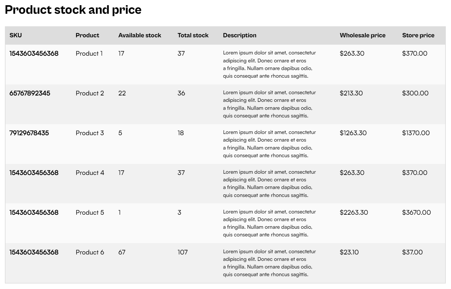
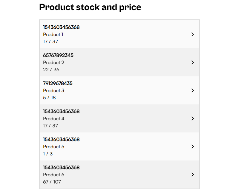
Once a user locates a row via scanning, searching, or filtering, they can tap that row to open a detailed view.

This combination maximizes the use of limited screen space. It keeps as many rows visible as possible for vertical scanning, showing only primary info, before revealing a full-page summary of a single row’s data.
Building The Off-Canvas Detail View
Using the same semantic table markup and ARIA labels from Part 1, the core of this pattern is the off-canvas element. First, we set up a hidden container with empty slots ready to be populated with the clicked row’s data.
<aside id="offcanvas" class="offcanvas" aria-hidden="true">
  <header class="offcanvas-header">
    <button tabindex="-1" onclick="closeOffcanvas()" aria-label="Return to table"><!-- ... --></button>
</header>
  <div><strong id="slot-1"></strong></div>
  <h1 id="slot-2"></h1>
  <dl>
    <dt>Available stock</dt>
    <dd id="slot-3"></dd>
   <!-- ... -->
  </dl>
</aside>
We use CSS to show this element only on smaller viewports. On larger screens, the container remains hidden even if triggered, preventing a broken layout.
@media screen and (max-width: 1260px) {
  .offcanvas {
    display: block;
  }
}
The click handler function populates the off-canvas slots by iterating through the table’s columns and matching the index to the corresponding element ID. It then removes the aria-hidden attribute and moves focus to the container to announce its presence to assistive technology. For a more robust implementation, focus trapping can keep keyboard users within the modal while it is open.
function openAndPopulateAside() {
  if(offcanvas.classList.contains("offcanvas-active")) {
    return;
  }

  const row = window.event.target.closest("tr");
  const columns = Array.from(row.children);

  columns.forEach(function (child, i) {
    const id = `slot-${i + 1}`;
    document.getElementById(id).innerHTML = child.innerHTML;
  });

  offcanvas.classList.add("offcanvas-active");
  offcanvas.removeAttribute("aria-hidden",);
  offcanvas.querySelector("button").tabIndex = undefined;
  offcanvas.focus();
}
A corresponding close function reverses these actions, returning the page to its previous state.
function closeOffcanvas() {
  offcanvas.setAttribute("aria-hidden", "true");
  offcanvas.classList.remove("offcanvas-active");
  offcanvas.querySelector("button").tabIndex = -1;
  document.getElementById("table-wrapper").focus();
}
See the Pen [Enterprise table [forked]](https://codepen.io/smashingmag/pen/oNyaLZj) by Adrian Bece.
Separating Vertical And Horizontal Scans
This next pattern breaks down user actions into two core tasks: vertical scanning, which is searching for a specific row, and horizontal scanning, which is reading across that row’s columns. Design guidance from Joe Winter highlights that users don’t need to process all data simultaneously—only the relevant information for each step of their workflow.
“The game changer in this project was the realization that users don’t need to view a large data set all at once. By focusing on the discrete steps of how information is consumed, we were able to limit the presented content to the absolutely relevant.”
— Joe Winter
Here is how we structure the experience:
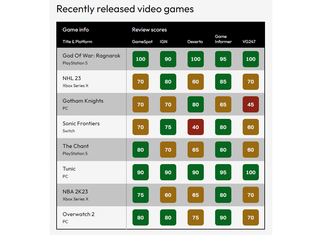
For a table of game reviews, the “Title & Platform” is the only natural primary column. Other columns are equally important but depend on user preference, so picking a fixed second column isn’t feasible. Since users need to compare scores between different review sites, a standard stacked approach won’t help. A simple scrollable table is problematic because both the primary column and the headers carry critical context.
First, we focus on optimizing the vertical scan.

Instead of forcing a universal column set, we provide a control—like a select element—that lets users choose which secondary column to display for comparison. This preference can even be persisted to localStorage so returning visitors see their preferred layout automatically.
<form>
  <label for="filter">Review site</label>
  <select onchange="filterChange()" id="filter">
    <option value="1">GameSpot</option>
    <option value="2">IGN</option>
    <option value="3">Dexerto</option>
    <option value="4">GameInformer</option>
    <option value="5">VG247</option>
  </select>
</form>
const allBodyRows = document.querySelectorAll("tbody > tr");
const mainHeadCols = document.querySelectorAll("thead > tr:last-child > th");

function filterChange() {
  const value = parseInt(select.value);

  mainHeadCols.forEach(function (col, i) {
    const colIndex = i + 1;

    // Skip the first (primary column).
    if (i == 0) {
      return;
    }

    if (colIndex === 1 || colIndex === value + 1) {
      col.classList.remove("hidden");
    } else {
      col.classList.add("hidden");
    }
  });

  allBodyRows.forEach(function (row) {
    const cols = row.querySelectorAll("td");

    cols.forEach(function (col, i) {
      const colIndex = i + 1;

      if (colIndex === value) {
        col.classList.remove("hidden");
      } else {
        col.classList.add("hidden");
      }
    });
  });
}
For horizontal scanning, we reuse the off-canvas pattern from the enterprise table. A tap on any row triggers a full-page detail view that shows every column’s data for that entry.
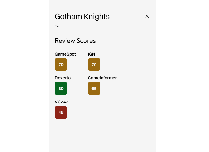
The logic for opening, populating, and closing this panel mirrors the prior example.
function openAndPopulateAside() {
  const row = this.window.event.target.closest("tr");
  const columns = Array.from(row.children);

  columns.forEach(function (child, i) {
    const id = `slot-${i + 1}`;
    document.getElementById(id).innerHTML = child.innerHTML;
  });

  offcanvas.classList.add("offcanvas-active");
  offcanvas.removeAttribute("aria-hidden");
  offcanvas.querySelector("button").tabIndex = undefined;
  offcanvas.focus();
}

function closeOffcanvas() {
  offcanvas.setAttribute("aria-hidden", "true");
  offcanvas.classList.remove("offcanvas-active");
  offcanvas.querySelector("button").tabIndex = -1;
  document.getElementById("table-wrapper").focus();
}
This approach actively addresses the user’s variable needs by adding a secondary column to the always-primary “Title & Platform” column based on individual preference.
See the Pen [Horizontal / Vertical scanning [forked]](https://codepen.io/smashingmag/pen/BaVqLMg) by Adrian Bece.
Responsive Calendars: Lists And Maps
Calendars present another unique responsive challenge. Simple ones with a purely presentational role can scale down fluidly using the spacing and typography techniques covered earlier.

Complex planning calendars, however, contain variable amounts of content per cell and resist simple downscaling.
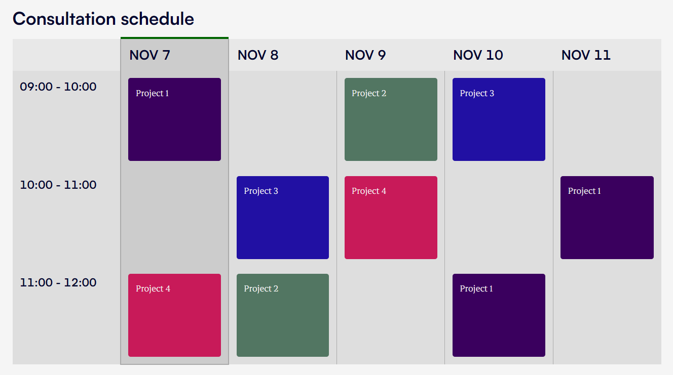
For this use case, neither full stacking nor generic scrolling provides a good user experience. A user needs to see today’s detailed schedule, tomorrow’s plan, and have a high-level overview of the week ahead. The solution is to split the single-table view into two purpose-built elements on smaller viewports:
- List element: A detailed schedule for the current and next day.
- Table element: A high-level, five-day summary for general scanning.
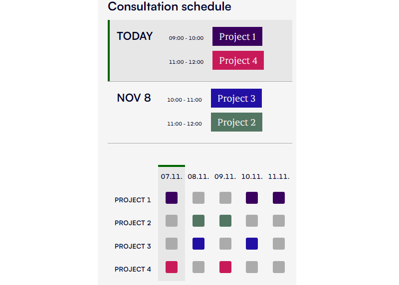
Because these two views differ significantly in structure, CSS alone cannot reliably morph a large screen into a small screen layout. The most direct approach is to duplicate the markup and use CSS to hide the inactive view.
<figure class="table-wrapper">
  <figcaption id="caption">
    <h1>Consultation schedule</h1>
  </figcaption>

  <table aria-labelledby="caption" class="table-full">
    <!-- ... -->
  <table>

  <ol class="list">
    <!-- ... -->
  </ol>

  <table aria-labelledby="caption" class="table-map">
    <!-- ... -->
  </table>
</figure>
This CSS-based duplication also ensures the non-displayed view is fully removed from the accessibility tree and keyboard navigation flow.
@media screen and (min-width: 960px) {
  .table-map, .list {
    display: none;
  }
}

@media screen and (max-width: 959px) {
  .table-full {
    display: none;
  }
}
This setup is straightforward to generate using JavaScript frameworks like React or Svelte, or even with static site generators that output conditional markup based on breakpoints.
See the Pen [Table to list + map [forked]](https://codepen.io/smashingmag/pen/yLERVNg) by Adrian Bece.
Keeping Large Tables Fast
Complex enterprise tables come with a hidden cost: the browser has to manage every node in the DOM. A table with 60 rows and 12 columns already produces at least 780 elements (720 cells plus 60 row elements). That alone puts you dangerously close to the threshold where Lighthouse begins complaining about DOM size — a warning above 800 nodes and an error above 1,400. Add the rest of the page and you've quickly got a sluggish interface.
There's no single fix here, but there are three viable strategies: pagination, virtualization, and a targeted CSS containment trick. Which one you pick depends on how your users actually interact with the data.
Pagination
The simplest approach is to limit what you render. Pagination shows a fixed number of rows per page, which keeps the DOM small and predictable. Libraries like Tabulator and Material UI include this out of the box.

The catch is that pagination isn't ideal for every dataset. If the task requires scanning or comparing across the full table, forcing a page break is an interruption. In those cases, you need the whole table available, without restriction.
Virtualization
Virtualization keeps the full dataset in memory but only renders the rows and columns currently in the viewport. As the user scrolls, the rendered content updates, while padding or placeholder elements maintain the correct scroll dimensions. The result is a table that looks complete but has a fraction of the DOM nodes.
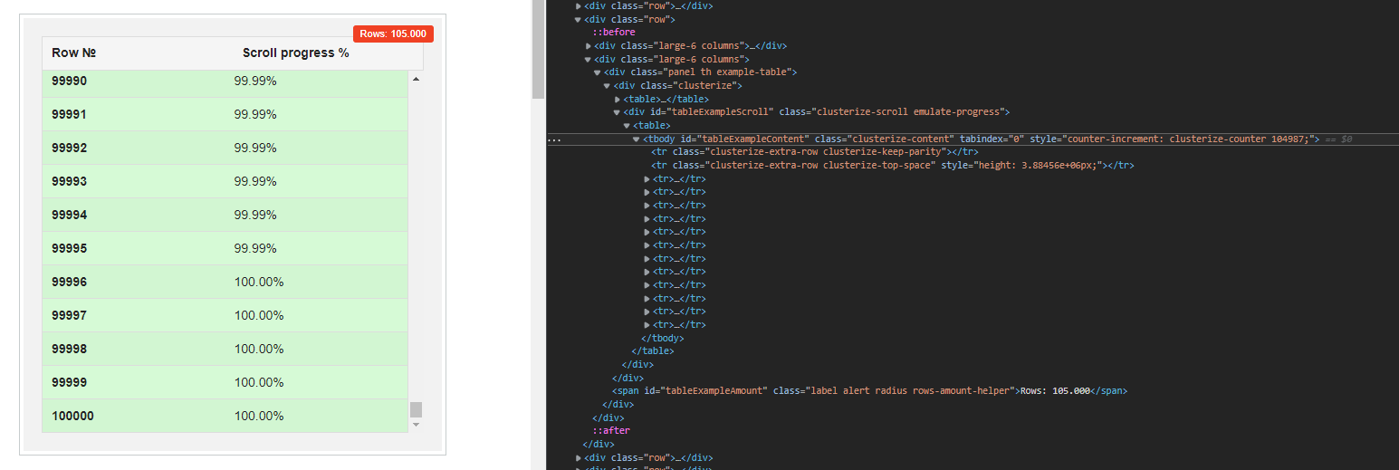
That example renders only a small number of rows out of a total of 100,000. Notice the inline height style on the second tr element — it compensates for the rows that aren't in the DOM. The same principle applies to lists and other scrollable content. Dedicated libraries like Clusterize.js handle this in vanilla JavaScript, and table libraries such as Tabulator provide it as a built-in option.
Virtualization can produce dramatic gains. Robert Cooper of Basedash documented a case where switching to it cut load times substantially:
The root cause of the problem was that we were trying to render the entire table at once, even if most of the data for the table was off the screen/viewport. Also, the React code for rendering a single table cell was quite inefficient, so when we needed to render thousands of table cells on initial load, all those inefficiencies compounded. (…)
Overall, after implementing both virtualization and improvements to our table cell, we were able to speed up table load times by 4-5x in most cases and over 10x in extreme cases. All while increasing the default page size from 50 rows to 100.
Whether you roll your own or use a library, verify that the implementation stays accessible. Keyboard navigation and assistive technology must still work correctly with the dynamically swapped content.
A Purely CSS Alternative
There's also a non-JS option that can help in limited situations. Applying CSS contain: strict to the table element tells the browser that the table's style and layout won't affect anything else on the page. Johan Isaksson used exactly this to speed up Google Search Console's data grid, which at the time rendered over 16,000 DOM elements for 500 rows.
But this isn't a universal fix. contain: strict imposes size containment on the element, and as CSS-Tricks points out, that can cause visual bugs if your table is dynamic. Filtering, search, and reordering all change dimensions, which conflicts with the containment promises.
As the “strictest” of the containment values, this value should be used with careful consideration. This is due to the dimension requirements it imposes on the contained element. With these requirements, this containment value does offer the most potential performance benefits of containment.
For tables that change at runtime — the typical case for enterprise data — pagination or virtualization is the safer, more complete answer.
Libraries Worth Evaluating
Adding search, filtering, sorting, and other enhancements can make a table far more usable on small screens. These features let users reduce the visible dataset to exactly what they need, rather than scrolling through everything.
Tabulator is a zero-dependency vanilla JavaScript library that packs in a large feature set, with dedicated NPM packages for React, Angular, and Vue. For framework-specific work, react-table is built entirely on React hooks, so it enforces no markup or structure — you supply your own HTML and styling.
For virtualization alone, Clusterize.js remains a solid vanilla option. On the React side, react-virtualized exists but hasn't seen maintenance in a while, so test it carefully against your use case before committing.
Before picking any package, check Bundlephobia for its size and dependencies, and look at the repo to confirm it's still actively maintained.


