
Building a playground page with SVG animations and particle effects
The landing page for Whimsical Animations looks minimal at first glance, but hides 14,000+ lines of code across 200+ files. The centerpiece is the "Chaos Toolbar" in the top-right corner, which lets visitors manipulate the page directly—plucking and throwing individual elements with a grabber tool, or detonating a bomb. Each tool icon has its own unique animation, triggered on hover or focus.
Most of the toolbar icons come from Lucide Icons, distributed as SVGs. Like HTML, SVGs are XML-based, which means they can be embedded directly in markup and manipulated at a granular level. The eraser icon, for instance, is composed of three <path> elements—two for the eraser body and one for the surface being erased. By wrapping the first two paths in a <g> group tag and applying a CSS transform, the eraser can slide back and forth while the surface stays put.
The bomb icon takes this a step further. What appears to be a simple transform: rotate() is actually a nested rotation: the entire bomb rotates by 10 degrees, while a <path> inside—the fuse—gets an additional rotation of its own. The key is transform-origin. The parent rotation pivots on the center of the bomb's circle, while the fuse rotation pivots at the fuse's tip.
Particle effects with polar coordinates
The most elaborate tool is the magic wand, which transforms elements on the page with unpredictable results. When an element is transformed, the cursor emits a few star-shaped particles. These particles don't scatter randomly—they all land within a 45° cone.
The trick to generating these positions is thinking in polar coordinates instead of cartesian. With cartesian coordinates, you specify a point by its X and Y displacement. With polar coordinates, you think in terms of angle and distance, which makes it far easier to reason about directional effects:
import { random } from '@/utils';

function generateParticle() {
  // Generate a random angle between 200° and 240°:
  const angle = random(200, 240);
  // Same thing for distance, between 30px and 60px:
  const distance = random(30, 60);

  return { angle, distance };
}
This snippet uses a random utility to pick values within a specified range. Since CSS transforms don't natively accept polar coordinates, the values must be converted to cartesian ones using trigonometry:
function convertPolarToCartesian([angle, radius]) {
  const angleInRadians = convertDegreesToRadians(angle);

  const x = radius * Math.cos(angleInRadians);
  const y = radius * Math.sin(angleInRadians);

  return [x, y];
};

const convertDegreesToRadians = (angle) => (angle * Math.PI) / 180;
Modern CSS has built-in trigonometric functions, which makes this conversion possible entirely in stylesheets when combined with CSS variables:
@keyframes flingAway {
  to {
    transform: translate(
      calc(cos(var(--angle)) * var(--distance)),
      calc(sin(var(--angle)) * var(--distance))
    );
  }
}

.particle {
  animation: flingAway 1000ms ease-out;
}
Each particle gets its own --angle and --distance variable when rendered:
function Particle() {
  const angle = random(200, 240);
  const distance = random(30, 60);

  return (
    <div
      className="particle"
      style={{
        '--angle': `${angle}deg`,
        '--distance': `${distance}px`,
      }}
    />
  );
}

export default React.memo(Particle);
Refinements that make particles feel natural
- Adding random rotation with
transform: rotate(). - Applying a second keyframe animation to fade particles out after they land.
- Randomizing
animation-durationandanimation-delayto avoid a choreographed look. - Garbage-collecting particles to keep the DOM clean.
- Using spring-derived easing curves with
linear().
Polar coordinates are one of the foundational techniques behind many of the effects on this site beyond the landing page. The interactive rainbow on the blog's homepage positions its segments using them, as does the angle control in the Gradient Generator. The generative art project Tinkersynth shifts entirely between cartesian and polar coordinate systems; what was originally designed as a boolean toggle between the two modes turned out to produce far more interesting results when the values were mixed together.
Packing many images into one request
The landing page’s decorative shapes—22 Blender-made objects like tubes, octahedrons, and eggs—presented a performance problem. Each glossy PNG looked best in its native P3 color profile, but tools like next/image strip that data and flatten assets to sRGB, dulling the vibrancy. Keeping the P3 files intact meant shipping 50–150 kb per image, close to two megabytes of decorative weight. Individually loaded images also popped onto the screen on their own schedules, creating visual noise.
The fix was a single sprite: one image containing all shapes packed together.
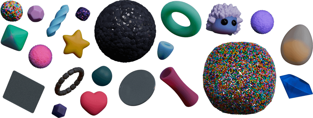
Each shape becomes its own <img> tag, positioned by the object-position property to crop into the spritesheet. The geometry—offsets and dimensions—is measured in image-editing software and stored in a JSON object that gets mapped to elements.
<style>
  .decoration {
    object-fit: none;
    object-position: var(--x) var(--y);
    /*
      Support high-DPR screens by rendering at 50%
      of the image’s true size:
    */
    transform: scale(0.5);
  }
</style>

<img
  alt=""
  src="/images/shape-sprite.png"
  class="decoration"
  style="--x: -387px; --y: -125px; width: 120px; height: 240px"
/>
<img
  alt=""
  src="/images/shape-sprite.png"
  class="decoration"
  style="--x: -42px; --y: -201px; width: 456px; height: 80px"
/>
<!-- ...and so on, for all 22 shapes -->
For crisp rendering on high-DPR displays, the source image is double the displayed size and scaled with transform: scale(0.5). Ideally, multiple spritesheet resolutions would be served based on the device’s pixel ratio, but the single scaled version still looks acceptable on standard monitors.
Sprites also solved the staggered-loading problem. Instead of images appearing whenever their individual requests resolved, all elements fade in sequence from the center outward:
@keyframes fadeFromTransparent {
  from {
    opacity: 0;
  }
}
The stagger comes from per-element animation-duration and animation-delay values:
<img
  alt=""
  src="/images/shape-sprite.png"
  class="decoration"
  style="
    --x: -42px;
    --y: -201px;
    width: 456px;
    height: 80px;
    animation-duration: 800ms;
    animation-delay: 200ms;
  "
/>
Each image gets a custom fadeScale between 0 and 1, normalized against tweakable min/max values to dial in the sequence.
But keyframe animations start the instant an element renders—they don’t wait for the sprite to finish downloading. The React component handles this by rendering nothing on first pass and instead creating a detached dummy image with an onload handler. Only after that fires does the state update, mounting the visible <img> tags and starting the fade sequence with the data already in hand.
function ShapeLayer() {
  const [hasLoaded, setHasLoaded] = React.useState(false);

  React.useEffect(() => {
    const img = new Image();
    img.src = "/images/shape-sprite.png";

    img.onload = () => {
      setHasLoaded(true);
    };
  }, []);

  if (!hasLoaded) {
    return null;
  }

  // Once `hasLoaded` is true, render all of the shapes...
}
Frosted glass shapes
The two translucent shapes were meant to blur anything passing behind them. Blender’s transparency export was too clear, and PNG compression introduced artifacts:
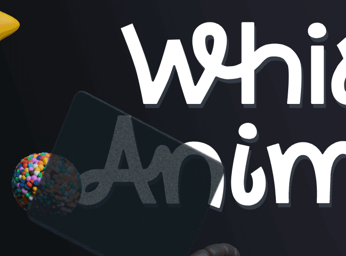
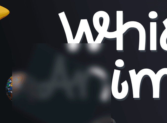
backdrop-filter alone wouldn’t work—it applies to the entire rectangular DOM node, not just the opaque pixels within the image:
The workaround was the clip-path property with a hand-tuned polygon approximating the glass pane’s outline:
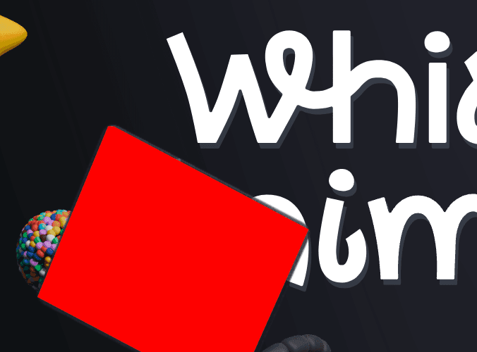
The polygon() function lacks corner-radius support, so the clip isn’t pixel-perfect, but it’s close enough for this use case.
Working synthesizer, UI included
An unintended feature: a fully functional synthesizer, revealed when the signup form is transformed with the “wand” tool. It’s desktop-only and plays via mouse clicks, QWERTY keys, or a MIDI controller. All audio is synthesized live in-browser with the Web Audio API; the only pre-recorded asset is a long echo sample used for the convolution-based reverb. Effects come partly from the tuna library.
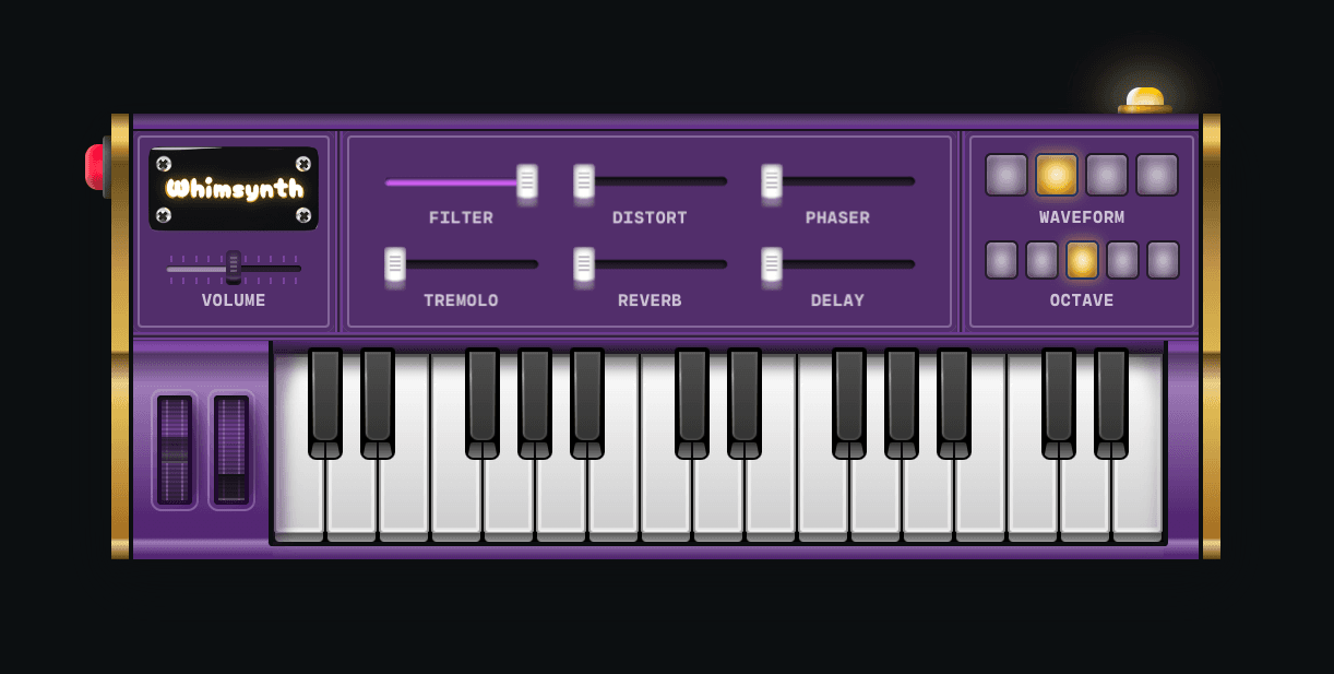
The synth is an indulgence that won’t be covered in the course material. Its interface, however, is a notable UI exercise: aside from the top-left nameplate, zero images are used. The entire control surface is built from layered gradients and shadows—a technique that looks intimidating but works surprisingly well once you start stacking gradients.
The synth contains three hidden secrets, hinted at by the “Whimsynth” nameplate, the “hand” tool, and the “wand” tool (the last of which doesn’t work in Firefox).
Adding sound without adding cringe
Nearly every interactive element on the page emits a sound. It’s a controversial choice—websites aren’t expected to make noise—but tasteful, low-volume effects are acceptable since devices have volume controls.
Finding quality audio is the bottleneck. freesound.org offers a massive, genuinely free library, but sifting for gems takes patience. Paid options like Splice provide curated samples for specific uses, such as the “industrial machinery” clip behind the marble cannon on the confirmation page. The most rewarding approach, though, is recording your own effects with a handheld recorder and household objects—the results are often the best fit.
Several techniques made the audio feel organic:
- Multiple samples: Instead of one sound per event, several variants are randomly cycled. A slider demo contrasts a single repeating sample against five interchangeable ones; the latter sounds notably less robotic when scrubbed quickly.
- Separate press/release sounds: Buttons play a different sample on mouse-down than on mouse-up. Some elements, like the magic wand with its plunger sound, split one recording into two halves for the two events.
- Progress-specific audio: A secret synth button that “pulls up” uses a series of ascending clicks recorded by dragging a pen along plastic fins—each fin is shorter, so each click naturally rises in pitch.
React developers can reuse the underlying hook, use-sound, an open-source wrapper around the battle-tested Howler.js library. It’s not actively maintained in terms of issue tracking, but it remains in personal use and works.
Fireworks from scratch
The course’s waitlist confirmation screen features fireworks built entirely with the 2D Canvas API—no external libraries. The code combines small concepts like polar coordinates into an effect that reads as intricate, though a FIREWORKS PER SECOND slider exposes just how wild it can get. This effect is a course lesson, intended to teach techniques reusable for custom celebratory animations.
The pedagogical point: whimsy relies on novelty. Generic npm-installed confetti and formulaic generated effects grow stale. The goal is to equip builders with core interaction primitives so they can design effects that are distinctly their own.
The Long Tail of a Landing Page
Even a single landing page can hide a surprising amount of engineering. Beyond the headline interactions and visual flourishes, the project’s true depth lay in its physical modeling and community-driven contributions.
For instance, the animated content wasn’t simply toggled on and off. The team implemented real physics for the "explodable" sections, giving each element weight, velocity, and collision behavior so that the dissolve felt tactile rather than scripted. It’s a detail most visitors won’t consciously notice, but it fundamentally changes the feel of the interaction.
The page also became a collaborative effort. Dozens of people submitted translations for the main tagline, turning a simple piece of copy into a globally localized feature. This pushed the supporting infrastructure to handle multiple locales gracefully, a reminder that even "small" text can introduce significant complexity when you treat it seriously.
For those interested in the deeper mechanics of such builds—from the initial concept sketches to the final implementation details—the full discussion is open. The author can be reached directly, and the source project, Whimsical Animations, is available for reference. This accompanying course covers similar ground, from raw ideas to production-ready execution.
Last updated on May 5th, 2026


