
How CSS Keyframe Animations Work
CSS keyframe animations interpolate between chunks of CSS over a given duration. A basic animation is declared with the @keyframes rule, which requires a name. Think of this name as a global variable: if you're writing vanilla CSS, avoid reusing it elsewhere. Modern tooling can auto-generate unique names to sidestep this issue.
@keyframes slide-in {
  from {
    transform: translateX(-100%);
  }
  to {
    transform: translateX(0%);
  }
}
Animations are meant to be general and reusable, so you apply them to specific selectors via the animation property, along with a duration. The browser then interpolates the declarations inside the from and to blocks over that time span, starting as soon as the property is set.
Controlling the Tempo and Repetition
Keyframe animations can use the same timing functions as CSS transitions, with ease as the default. Override this with the animation-timing-function property. By default, an animation runs only once, but you can control this with animation-iteration-count. The special value infinite is handy for things like loading spinners, where a linear timing function often keeps the motion constant.
Multi-Step and Alternating Animations
Beyond from and to—which are sugar for 0% and 100%—you can use percentage blocks for more than two steps. A key nuance: the timing function applies to each individual step, not the whole animation. You don't get one ease across the full sequence; each segment has its own eased progression. This behavior isn't controllable via CSS keyframes, but it is configurable with the Web Animations API.
For effects that need to ping-pong, like an element "breathing" in and out, you can define a 3-step animation that grows and then shrinks. A more elegant approach uses the animation-direction property. Set it to alternate and the animation will reverse on every other iteration, allowing you to declare just the growth phase and let the reversal handle the shrink.
Combining Properties with the Shorthand
You can combine the various animation properties into the animation shorthand.
.box {
  /*
  From this:
    animation: grow-and-shrink 2000ms;
    animation-timing-function: ease-in-out;
    animation-iteration-count: infinite;
    animation-direction: alternate;

  ...to this:
  */
  animation: grow-and-shrink 2000ms ease-in-out infinite alternate;
}
The order of values mostly doesn't matter. The one exception is animation-delay: because it takes the same unit type as duration, it must follow the duration value. For this reason, it's often cleaner to exclude the delay from the shorthand.
.box {
  animation: grow-and-shrink 2000ms ease-in-out infinite alternate;
  animation-delay: 500ms;
}
Making Sense of Fill Modes
Fill modes are a common source of confusion. Consider animating an element to fade out. When the animation completes, the element pops back into full view. The reason is that declarations inside from and to blocks only apply while the animation is running. Once it ends, those styles dissipate, and the element reverts to its default opacity of 1. One solution is to add a fallback opacity declaration to the base selector that matches your final keyframe value.
A cleaner solution is animation-fill-mode. Setting it to forwards persists the final block's declarations after the animation concludes.
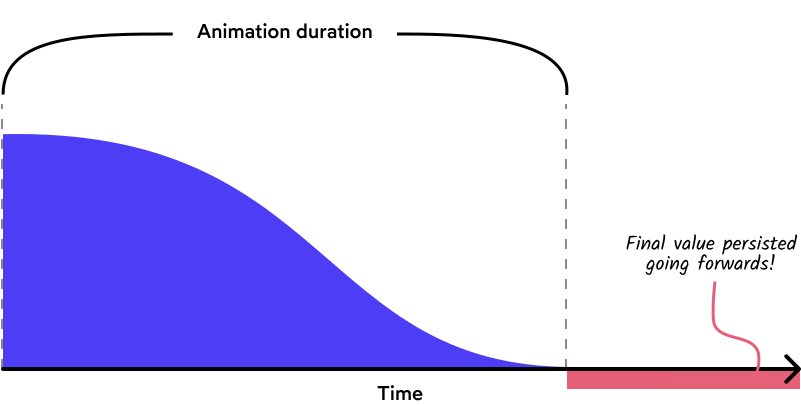
The backwards value solves a related problem with animation-delay. During the delay period, the keyframe styles don't apply, causing a visible flash of the element's default state. Using animation-fill-mode: backwards applies the first block's CSS during that delay.
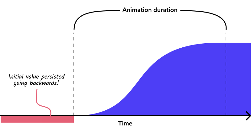
Using both covers both directions, which some find more intuitive. You can include the fill mode in the animation shorthand as well.
.box {
  animation: slide-in 1000ms ease-out both;
  animation-delay: 500ms;
}
Customizing Animations with CSS Variables
Keyframe animations become more powerful when combined with CSS custom properties. A generic bounce animation might always move an element up by 20px. By referencing a CSS variable like --bounce-offset inside the @keyframes rule instead of a hard-coded value, each element that uses the animation can define its own offset. This makes the animation truly reusable and customizable per instance.
These techniques also form a foundation for modern features like View Transitions and the newer animation-timeline API for scroll-driven animations.


